


Illustration Tutorial: watercolor lettering
5 practical exercises with brushes to learn how to write comfortably and find your personal style of lettering to apply to your watercolor projects
Handmade lettering made with watercolors has a personal and natural quality that no other technique can imitate. By creating letters with our brush and some ink, we give them a unique texture that reveals how you are as an artist and contributes to boosting the customer's confidence in our personal style.
If you want to get started in the world of watercolor lettering, painter and illustrator Ana Victoria Calderon (@anavictoriana) offers below 5 tips and practical exercises with brushes, to lose the fear of ink and get excited about one of the world's most beautiful techniques.
1. Create strokes with different brushes
Each brush, depending on their size, thickness, and hardness, will give a completely different texture and stroke. Thin brushes are better to delineate, thicker ones give us bigger letters...
Whenever you start drawing with your brush of choice, remember: for lettering in italics, the strokes are thick when descending and thinner when ascending. You can warm up by doing strokes up and down, or create simple loops to flex your hand.

And do not forget that, the shorter the bristles of your brush, the more control you'll have over the stroke and therefore the more concentrated and accurate it will be.

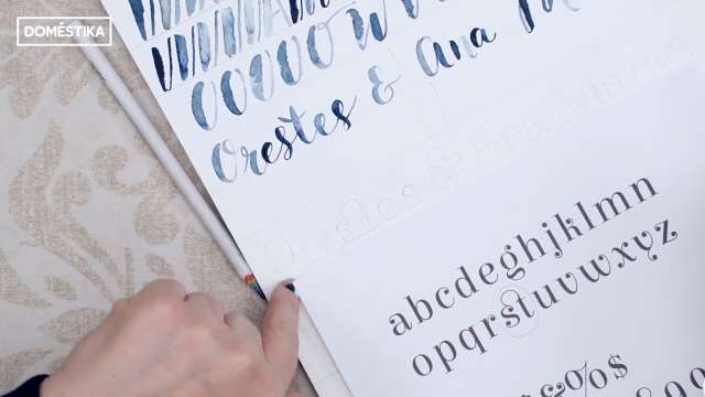
2. Practice with a typeface
Writing the entire alphabet may sound like a daunting task, but it is a great exercise when you are learning to do lettering with watercolors. Just print some classic typeface that you like and use it to inspire you in your first tests.

While practicing with a typeset, dare yourself to make color gradients using different shades. That way your letters will be even more special.

3. Try serifs
Serifs are typographic ornaments that we can incorporate into our lettering, small details at the end of strokes or lines connecting the letters to each other.
If while doing them you end up messing the scale or centering of the composition, do not worry!! We can correct everything later if we scan the letters and edit them in Adobe Photoshop.

4. Draw monograms
A monogram is a letter or a set of interlocking letters that represents something: an initial, a symbol, a logo or a trademark... Working with a monogram helps us focus on the particular design of a letter, and it is a good exercise if we want to further investigate the possibilities of watercolor lettering.

5. Follow your own style
You can get yourself inspired all you want by looking at typesets or the work of other designers or creatives but, in the end, with practice, your goal is to find your own personal style, one you feel comfortable with and separate you from the competition. Practice with cursive, lowercase and uppercase letters... until you find your place in watercolor lettering.
If you liked these tips, remember that you can learn with Ana Victoria Calderon to digitize your own art, sell it and apply it to your design projects on the online course 'Techniques applied to watercolor illustration'.
You may also be interested in these tutorials:
- Watercolor Tutorial: How to Paint with Watercolor Brushes and Pencils
- Craft Tutorial: How to Prepare Your Frame to Start Embroidering
- Illustration Tutorial: The Color Wheel


0 comments