


The FedEx logo: the hidden message you probably hadn't noticed

A brilliant lesson in graphic design with meaning and precision
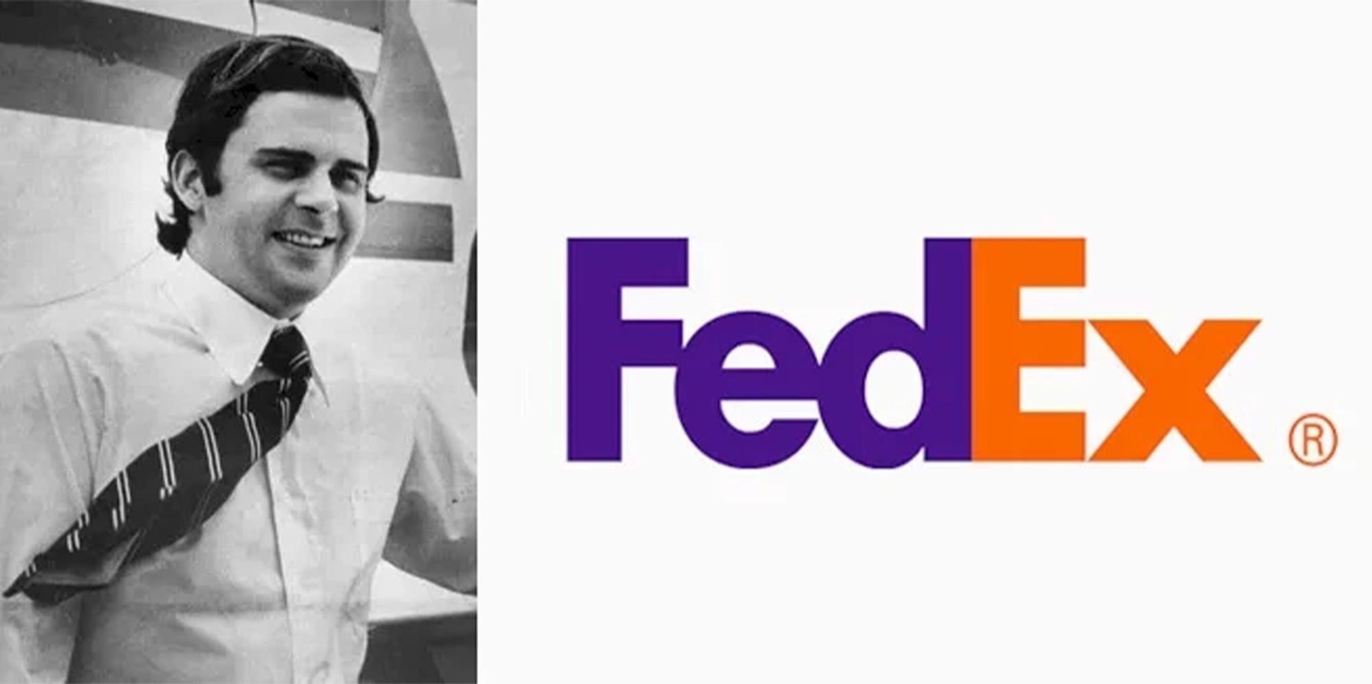
.Looking at the FedEx logo, it may appear, at first glance, to be a clean, modern typographic design. However, this logo holds a visual secret that many overlook: a hidden arrow between the "E" and the "x".
This subtle detail is considered one of the most ingenious examples of negative space design, and makes it an essential reference for anyone interested in logo design.
[What makes the FedEx logo so special?
Created in 1994 by Lindon Leader, under the Landor Associates project, the logo was designed to reflect the company's core values: speed, precision and efficiency. And it achieved this not only with a solid typography, but with a clever idea: inserting a white arrow between the "E" and the "x".
This arrow was not added as an additional graphic element, but arises naturally from the negative space between the letters. In other words, it is "hidden" from view, and only when it is noticed, it becomes a detail impossible to forget.
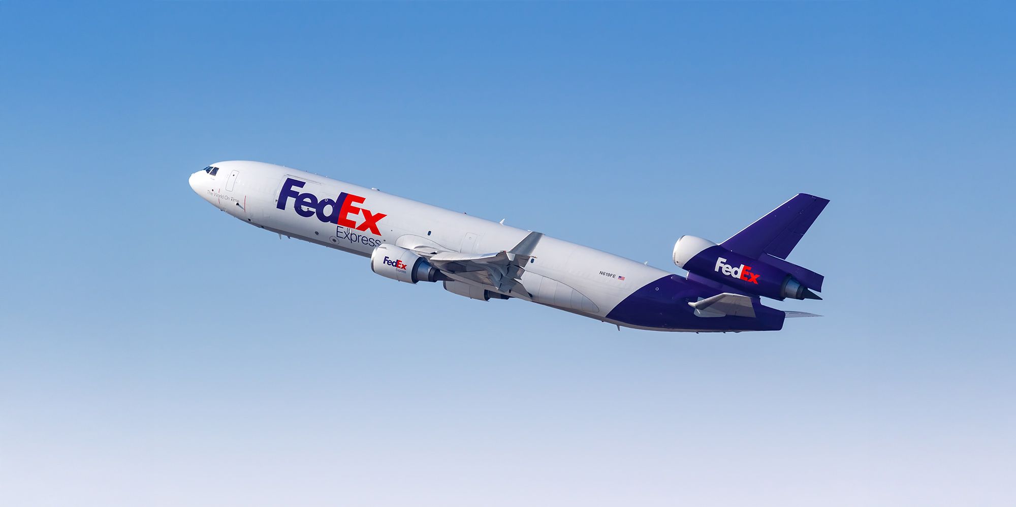
Why is this logo a reference in graphic design?
The arrow visually represents the speed and direction of the FedEx courier service. But beyond its literal meaning, it demonstrates how a logo can communicate complex messages in a subtle and elegant way.
This idea has been studied in design schools and constantly mentioned as an example of minimalist but powerful design.
In the words of its creator,
The arrow is a subliminal symbol of forward motion. Not everyone sees it, but once they do, they can't unsee it.
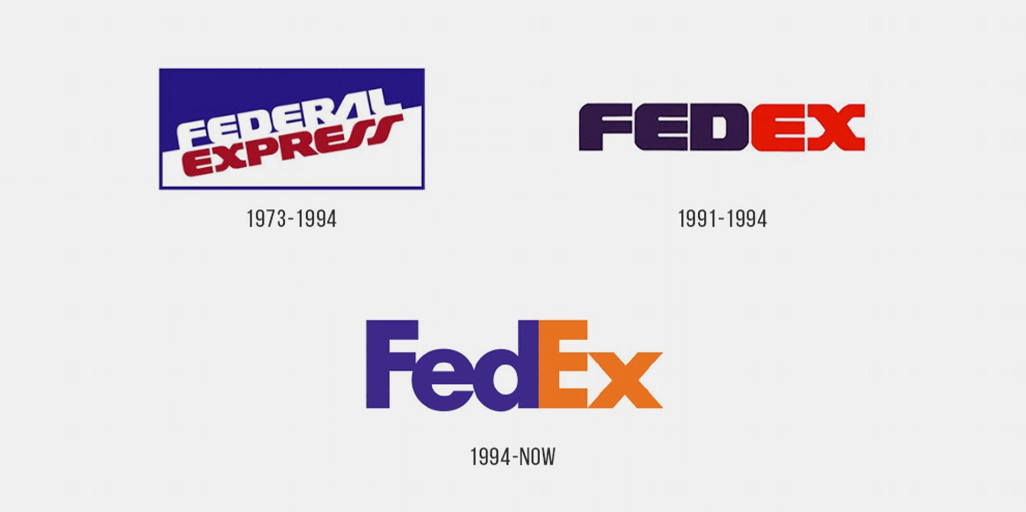
What can we learn from this logo? [/b] What can we learn from this logo?
Less is more: you don't need complex elements to tell a powerful visual story.
Negative space matters: when used with intention, it can add depth and meaning.
Design with purpose: every shape, curve and space should have a functional and symbolic reason.
If you are interested in creating logos that communicate beyond the obvious, we recommend you explore these courses:
Logo design courses at Domestika
Nike: the birth of the swoosh for only $35.


0 comments