


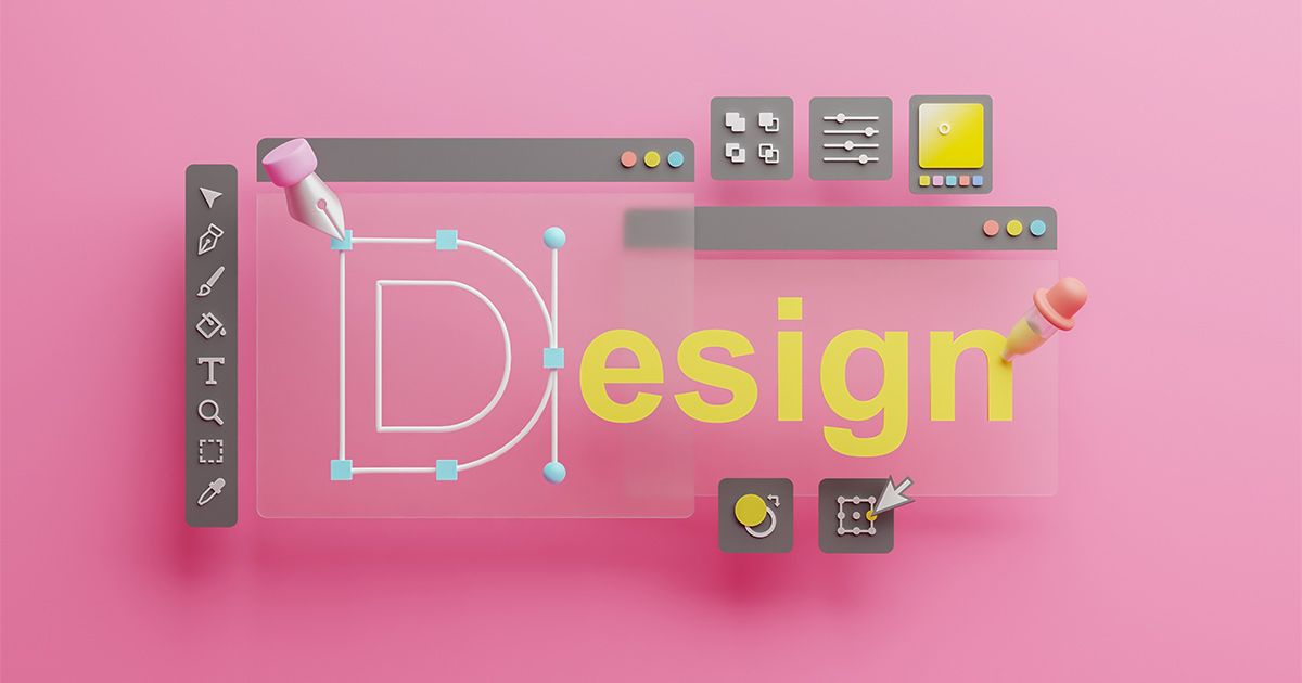
The 7 Main Graphic Elements
Learn the key graphic elements, from the use of colour to visual hierarchy, to create impactful and memorable designs
Graphic design is an intricate discipline that requires a deep understanding of the visual elements that compose it. Beyond mere aesthetics, these elements serve as tools to convey information clearly and effectively, evoking emotional responses and guiding the viewer's perception.

What are the graphic elements?
The graphic elements are each of the components that make up a design and help it attract attention. The combination of these elements is what makes the design more or less successful. Here we tell you more about them and how you should use them to create a perfect project.
1. Color

From the creation of the first colour circle by Isaac Newton in 1706 to the present day, colour experts have been perfecting each of its parts. The modern colour circle has three primary colours (red, yellow and blue) which, in a basic explanation, intermingle to create the rest of the colours.
When choosing the shades you want to use in a project, focus on the colours that appear opposite or adjacent to each other on the colour wheel, as these are the ones that work best together.
You should also bear in mind that each colour provokes a different emotion. For example, in the Coca-Cola logo, bright red is so iconic that it instantly evokes the brand and its message of happiness and refreshment.
2. Line

Lines are like the pillars of your design. They can guide the viewer's gaze, divide space and add visual structure to your design. Whether straight or curved, thin or thick, lines can add rhythm and movement, creating a dynamic visual experience for your audience.
In fact, there is a term called 'mood lines' which shows that, depending on the type of line you use, you can provoke one feeling or another in your audience; from the calmness of a straight line to the dynamism of text that moves along the lines of lightning.
For example, an advertising poster design for a sports brand might use diagonal lines to create a sense of energy and movement.
3. Texture

Texture adds depth and dimension to your design. It can make a design look more realistic, add visual interest and create a tactile experience for your audience. Whether it's smooth and silky or rough and rugged, texture can awaken the senses and bring your design to life.
When you're creating your next design, try the following exercise. Close your eyes and imagine what it would be like to touch the product you want to sell. Write down on a piece of paper how it feels and how it might look in an image. When you are clear about it, make that texture reflect in your design.
For example, you can adapt texture in the world of packaging, taking advantage of the fact that consumers are going to touch your product, use texture to communicate what the brand wants to convey.
4. Images and graphics

Images and graphics are like the stars of your design. They can tell stories, convey complex concepts and instantly grab the viewer's attention. From stunning photography to clever graphics, these images are the key to creating an emotional connection with your audience.
Imagine a Nike ad featuring a sweaty, determined athlete. The image conveys power, determination and the spirit of self-improvement that the brand represents.
5. Blank space

Sometimes, less is more. White space not only helps to organise your design, but also gives it an air of elegance and sophistication. It can direct the viewer's attention to what really matters and create a sense of balance and harmony in your design.
So, when working on your next project think not only about the elements you are going to incorporate, but also about which places are going to be left empty, without any text or form. You have to try to ensure that the distribution of the elements conveys fluidity and order in the image.
Here, too, the brand category is important. For example, a minimalist website uses a lot of white space to highlight your products and create a clean, distraction-free browsing experience.
6. Shape

Shapes are like the puzzle pieces that make up your design. They can create interesting patterns, add visual structure and communicate ideas effectively. From smooth circles to sharp triangles, shapes help convey different emotions and concepts in your design.
For example, the Starbucks logo uses a circular shape to represent togetherness and community, while the mermaid in the centre conveys the very essence of the brand.
7. Contrast

Contrast is like the spice that flavours your design. It can make elements stand out, create visual drama and add excitement to your design. Whether it's through different colours, sizes or shapes, contrast can make your design become more memorable and effective.
For example, if you are creating an advertisement, you can use strong contrast by positioning bold text on a white background and use it to highlight key product features and grab the viewer's attention without distraction.
In addition to these seven graphic elements, you can add others such as balance, hierarchy and alignment. It is essential to consider each of the graphic elements in your next audiovisual design so that you can create effective and memorable messages.
In addition, here are some other links that may be of interest and help to you:
- Graphic Design for Beginners
- Online Graphic Design courses
- 5 African American Graphic Designers You Should Know


0 comments