


10 Tips to Create the Best Designs for Your Business on Canva
Unlock the potential of Canva for your business designs with these 10 graphic design tips. Learn to choose templates, mix fonts, use colors strategically, and more for impactful visual content.

Creating professional designs for your business on Canva is easier than you think, you just need a few graphic design tips!
If you own a business, you know how important the image you project is. That's why having quality designs is essential to attract your customers and create a solid brand.
Graphic design is a powerful tool for any business today. Conveying your brand identity in an effective and attractive way is crucial to capture the attention of your audience.
If you don't have advanced knowledge in graphic design, don't worry, Canva is a very useful and versatile online tool that allows you to create visual content easily and quickly. This design tool has become an essential platform to create professional designs without the need to be a design expert.

Here are 10 basic graphic design tips applied to Canva so you can create the best designs for your business on Canva:
1. Select the right template:
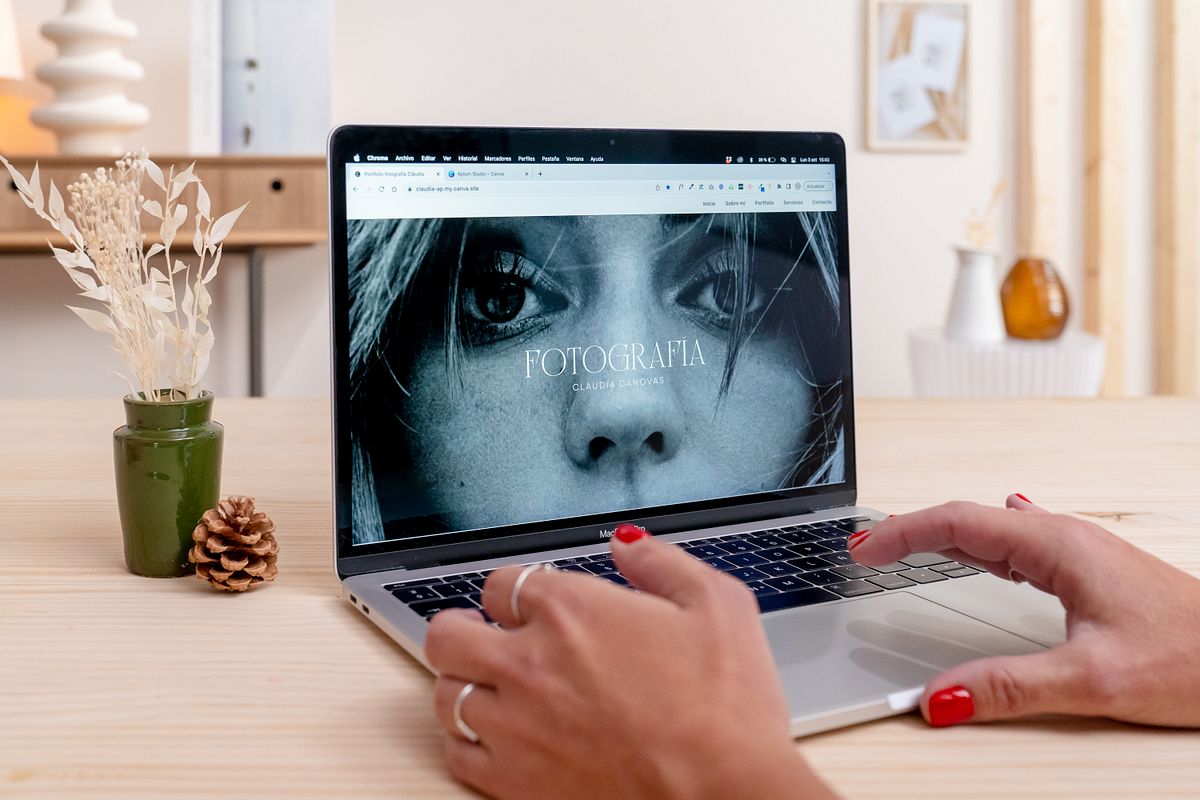
Before you start, choose a template that fits your needs and branding style. Canva offers a wide variety of templates for different types of designs, but you can also customize them to suit your brand. On this same platform you will find designs for all the formats and applications you need for your business: presentations and business cards, publications on social networks, infographics, flyers and posters for advertising... You can even create a simple website! You even have the option to follow the designers you like the most, such as ours here.
2. Combine fonts:
To give a touch of creativity to your designs, mix different fonts that contrast and are legible. Of course, the choice of fonts is crucial for the legibility and style of your designs. Canva offers a variety of fonts, but try to combine only two or three to avoid a cluttered look. One typeface for titles and another for body text, for example, and a serif typeface combined with a straighter typeface is often a good choice.
You can find some ideas for typographic combinations in Canva in this free downloadable I've prepared for you:
Join for Free and download
U3_02_Combinaciones tipográficas Canva.pdf
A tip: use a maximum of 2 or 3 typefaces per design. This way you will see a more coherent, orderly and minimalist composition.
3. Precise alignment and layout:
To make your designs look more professional, make sure that the texts are aligned correctly and are not too close to the edges. The elements of a design should be able to breathe! Canva makes it easy to align on the layout and we also have alignment guides available (File > view settings > show rulers and guides) or the element position feature. This way you can make sure that all the elements of your design are perfectly arranged and aligned.
4. Use of colors:
We are often attracted to bright and flashy colors. However, it is important to recognize that sometimes these colors can be excessive and hinder the clarity of the main message in our design. Therefore, an effective strategy is to opt for a reduced color palette, consisting of between 2 and 4 colors. These colors should be a balanced combination of neutral tones, reserving more intense colors to highlight crucial information. This will simplify communication and will also allow the main message to stand out in a more impactful way. A design with a reduced color palette will not only provide a clean and orderly aesthetic, but will help us identify ourselves as a brand and will achieve greater effectiveness in the transmission of information, prioritizing the message over visual saturation.

5. Create consistent and coherent designs with your brand:
Both in your designs in general and in the graphic elements you include in them, make sure they are coherent with the image of your brand and that they are also coherent in style and size within the design itself. Therefore, I recommend that you use Canva's Brand Kit tool (Canva PRO feature) or, failing that, create a document or style guide to have your corporate colors and fonts at hand whenever you design. This will strengthen your brand recognition in the long run. I also advise you to always use the same typographies according to your brand (maximum 2 or 3) and also the same colors, this will help your audience to identify you quickly, and you will work on your brand identity and recognition.
6. Quality resources:
Always use high quality images in your designs. Canva offers a large library of photos and graphics, but you can also upload your own images. Make sure the images are relevant and fit the message you want to convey, and that the quality is optimal. If you have Canva Pro you can also upload and edit your photos with artificial intelligence with this new tool.

7. Strategic space:
Don't be afraid of white space. Use this resource to give your design a breath of fresh air and highlight the most important elements. A clean and balanced design is more attractive and easier to understand. Canva allows you to adjust margins and spacing to achieve a harmonious design that breathes, remember that LESS is always MORE.
8. Visual Hierarchy:
Highlight the most important information using contrasts such as font sizes, colors and different styles. Canva allows you to highlight key elements and organize the visual hierarchy effectively. For example, if you use a dark background, use light letters and vice versa, or for example, titles and subtitles should always stand out more than the body text. Also, use text alignments and spaces between paragraphs to give harmony and make it easier to read.
9. Less is more:
As I said, in the world of design sometimes the magic lies in simplicity. "Less is more" is the maxim here. Eliminate the superfluous and highlight the essential. A clean, straightforward composition can communicate more powerfully than an excess of elements. Think of your design as a conversation, where every element counts. If you remove something and the message of your design doesn't change, it means it's unnecessary. That's the key: simplicity is often more effective.
10. Trial and error, experiment with custom designs:
Don't be afraid to experiment and try different combinations. While templates are useful, don't hesitate to experiment with custom designs. Use Canva's tools to customize your designs, create unique layouts and add details that make them unique. Sometimes the best design comes from trial and error :)

Want to see how to apply these tips and more in Canva? In my Canva for Beginners: Create Professional Designs course, you can expand in detail how Canva works while you practice designing your own style guide and a complete website.
With these tips and the course, you'll be able to create the best designs for your business on Canva and stand out - don't wait any longer to start designing!


0 comments