Calligraphy for an Ex Libris
Continuous writing (Part I)
A course by Ricardo Rousselot Schmidt , Calligrapher, Typographer, and Designer
Joined February 2015
About the video: Continuous writing (Part I)
Overview
“In this lesson you will see the importance of the angle of the letters and how words are written continuously.”
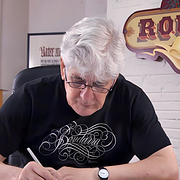
In this video lesson Ricardo Rousselot Schmidt addresses the topic: Continuous writing (Part I), which is part of the Domestika online course: Calligraphy for an Ex Libris. Learn the secrets of Chancery hand with a great maestro.
Partial transcription of the video
“In this case we will do a exercise that I like that is to write corrido write proper names with their separations with their cadences their upper case letters and try to that is a harmonic set this is very important to do when you have time to write words, to try to fill leaves and leaves and leaves is very interesting to be do because it is the way of learn with foundation, to see we are going to do the A first. Ana coma see. Ana see, Carlos. There are places where the letter, logically joins another one that is next, this is very good that happens because it is a cursive letter, which is ...”
This transcript is automatically generated, so it may contain mistakes.
Course summary for: Calligraphy for an Ex Libris
-
Category
Calligraphy & Typography -
Areas
Calligraphy

Ricardo Rousselot Schmidt
A course by Ricardo Rousselot Schmidt
Ricardo Rousselot from a very young age already had a vocation for drawing letters. In 1957, at Enrique Petersen's studio in Buenos Aires, Rousselot ventured into the world of printing presses and type design.
In 1962, he moved to the city of Chicago, and began working at the Ficho & Corley studio. As a designer, he collaborated on publications such as Playboy Magazine, in numerous advertising campaigns for leading agencies such as Wunderman Thompson, Young & Rubicam, and packaging lines for Libbys, Bordens Milk, Seven Up, RG Dunn Tobbaccos, Kleenex Tissues, Kraft Foods, and Conqueror papers, among others. During his stay in Chicago, a lot was happening in Europe in the field of design, with the style of the Swiss School (Helvetica and Univers) leading the fore.
In 1975, he settled in Barcelona, influenced by his Modernist career and established his own design, corporate image, and packaging studio. Already in his own studio, using his knowledge of calligraphy and typography, he designs premium packaging: tobacco, perfumery and liquors for companies such as Tabacalera, Tabacanarias, Tabacos de Filipinas, Domecq, Larios, Miquel y Costas & Miquel (Smoking), Perfumerías Dana, Elida Gibbs, Puig y Myrurgia, La Casera, Kass, and Nutrexpa.
He designed the logo of the newspaper LA VANGUARDIA. In 2009, he redesigned the current logo of this prestigious newspaper.
Rousselot, Designers, from the year 2000 it is called Grupo Erre, SCP counts among its clients Casa Tarradellas, Hacendado, Spanair Líneas Aereas, Reckit Benckiser, Bic Iberia, Miquel and Costas & Miquel, (Smoking), Friskies Purina, Nestlé Purina Petcare, BORGES, Agrícola Marcilla, Juvé & Camps, Casa Claramunt and the wineries: Cavas Avinyó, Miguel Merino, and Borton World Brand. Panrico, Dom Perignon, Nike, Gallina Blanca and MN&A, reusable stands, have recently been added.
Rousselot can be described as a scribe, calligrapher, designer, letter artist... whatever he is called, he is definitely a lover of letters. He has devoted practically his entire life to it in his designs, recently all of which has been very well reflected in the work, jointly published by the Museo de la Illustració i la Modernitat de Valencia (MuVIM) and the publishing house Campgràfic ¡La Calligrafía vive!
- 97% positive reviews (276)
- 3,969 students
- 17 lessons (3h 26m)
- 20 additional resources (15 files)
- Online and at your own pace
- Available on the app
- Audio: Spanish
- Spanish · English · Portuguese
- Level: Intermediate
- Unlimited access forever


