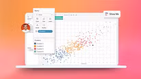
Guided Course: Scraping and Data Visualization with Tableau
Course final project
A guided course by Victor Pascual , Data Visualization Specialist


About the final project for: Guided Course: Scraping and Data Visualization with Tableau
Guided Course: Scrape and Visualize Data with Tableau
“Now it's your turn to put everything you've learned into practice. This project is designed to help you apply the course knowledge in a creative and personal way. If you don't know where to start, don't worry: we'll give you some ideas to kick-start your creative juices. The important thing is to explore, experiment, and enjoy the process as you develop your own proposal. Share your results with the community and be inspired by others! 1. Analyze the evolution of a series over time Explore how a series has changed season after season. Collect ratings data by episode, runtime, and air date, and create visualizations that show its narrative development or audience reception. Project example: Visualize the evolution of Breaking Bad ratings from the first to the last season with a line graph and complementary analysis. 2. Create a visual ranking of top-rated episodes Use the collected data to create a visual ranking of the most notable episodes by audience. Leverage bar charts, heat maps, or interactive diagrams to highlight these key episodes. Project example: Ranking the 10 highest-rated episodes of Black Mirror with a dynamic chart in Tableau. 3. Comparison of main characters through data If your series has multiple protagonists, organize the data by appearance, screen time, or mentions to create visualizations that show their importance or evolution within the plot. Project example: Visual comparison between the characters of Stranger Things throughout their seasons based on presence in episodes and ratings. 4. Explore seasonal themes Scrape descriptions or keywords from each episode to detect recurring themes or shifts in the show's tone. Visualize this with word clouds, thematic timelines, or pie charts. Project example: Thematic analysis of The Crown using word clouds and bar charts by season. 5. Design an interactive visual sheet of a series Create a single, comprehensive visualization that combines key data: overall synopsis, seasons, episode count, average ratings, featured episodes, and time evolution. Project example: Interactive visual sheet of The Office with graphics that summarize the entire series in a clear and attractive way. This is the perfect time to bring data to life and tell a visual story that connects with viewers. Whether you're just starting out or already have experience, the key is to let your curiosity guide you, observe carefully, and translate information into visualizations that spark interest and excitement. Each graph you create can be a window to new questions, discoveries, or even conversations with other data visualization and series enthusiasts. Dare to experiment, make mistakes, and adjust as you go. Remember that working with data is also a creative act. Bring your vision to life and share it with pride!”
Course summary for: Guided Course: Scraping and Data Visualization with Tableau
-
Category
Design, Marketing & Business -
Software
Google Sheets, Tableau Public -
Areas
Infographics, Information Design, Interactive Design, Multimedia

Victor Pascual
A guided course by Victor Pascual
Víctor Pascual is a self-confessed lover of scientific data visualization, who has a doctorate in computer science and digital communication. He dedicated his doctoral thesis to researching new methods for representing web data and has been a data scientist and data visualization specialist since 2009.
After three years as part of the Bestiario team, Víctor began his new adventure as a data analysis and visualization consultant for companies including SIRIS Academic and Mobile Media Content, where he leads a diverse range of R&D projects.
Víctor is also committed to training in information visualization, which led him to codirect Spain's first postgraduate course on the subject (IDEC) as well as participate in a number of different conferences and workshops. He currently collaborates with different master's and postgraduate degree programs.
- 107 students
- 7 lessons (1h 27m)
- 7 additional resources (1 files)
- Online and at your own pace
- Available on the app
- Audio: Spanish, German, English, French, Indonesian, Italian, Dutch, Polish, Portuguese, Romanian, Turkish
- Spanish · English · Portuguese · German · French · Italian · Polish · Dutch · Turkish · Romanian · Indonesian
- Level: Beginner
- Unlimited access forever
Recommended software & tools for this course
Category
Areas