Effective Data Visualization: Transform Information into Art
A course by Sonja Kuijpers , Data Illustrator


Learn to effectively bring data to life with creative shapes, colors, and layouts
For many people, images are the most effective way to communicate information. Whether it be a social issue, a personal story, or something you find joy in, any subject can inspire a visualization. Data illustrator Sonja Kuijpers specializes in turning numbers and information into accessible works of art. She has worked with clients including Philips, the Dutch government, and Frankfurter Allgemeine Zeitung.
In this course, she gives you the tools you need to transform data into captivating illustrations using colors, shapes, and images. Discover how to collect and analyze data sets, as well as how to transform them into a unique poster that tells a story. Are you ready to create your own data art?
What will you learn in this online course?
14 lessons & 22 downloads


- 97% positive reviews (147)
- 9,806 students
- 14 lessons (1h 43m)
- 22 additional resources (7 files)
- Online and at your own pace
- Available on the app
- Audio: English, Spanish, French, Italian, Portuguese, Turkish
- Spanish · English · Portuguese · German · French · Italian · Polish · Dutch · Turkish · Romanian · Indonesian
- Level: Beginner
- Unlimited access forever
What is this course's project?
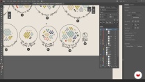
Collect a data set of your choice and turn it into a visually-appealing poster using shapes, colors, and a layout that reflects your subject.

Projects by course students

Who is this online course for?
This course is for anyone with an interest in transforming challenging datasets into engaging visuals.
Requirements and materials
No previous experience is needed for this course.
You will need a computer with access to Microsoft Excel and Adobe Illustrator, or similar programs.

Reviews

Sonja Kuijpers
A course by Sonja Kuijpers
Sonja Kuijpers is an award-winning data illustrator based in The Netherlands. Growing up in a small town meant Sonja was always on the lookout for a creative outlet. She began drawing at a young age before going on to study advertising and public space design. After graduating, she worked as a designer at a landscape design firm before developing an interest in information design that kick started her career.
Sonja currently runs STUDIO TERP, a one-woman data illustration studio where she specializes in making challenging data easy to understand as well as visually engaging. She has worked with clients such as Philips, the Dutch government, Scientific American, Frankfurter Allgemeine Zeitung, Friends of the High Line in New York, and F19 Digital Reporting, and has also been recognized multiple times by the Information is Beautiful Awards.
Content
-
U1
Introduction
-
About Me
-
Influences
-
-
U2
Data and Emotional Subject
-
The Subject of Your Visualization
-
Looking for Data
-
Harvesting the Data
-
The ‘Data’ for Your Visualization
-
-
U3
Creating a Poster
-
Sketching and Storyline
-
Method and Colours
-
Workflow
-
Incorporating the Elements into Your Design 1
-
Incorporating the Elements into Your Design 2
-
Title and Explanation
-
-
U4
Finishing and Sharing Your Work
-
Feedback and Final Edits
-
Sharing Your Work
-
-
FP
Final project
-
Effective Data Visualization: Transform Information into Art
-
What to expect from a Domestika course
-
Learn at your own pace
Enjoy learning from home without a set schedule and with an easy-to-follow method. You set your own pace.
-
Learn from the best professionals
Learn valuable methods and techniques explained by top experts in the creative sector.
-
Meet expert teachers
Each expert teaches what they do best, with clear guidelines, true passion, and professional insight in every lesson.
-
Certificates
PlusIf you're a Plus member, get a custom certificate signed by your teacher for every course. Share it on your portfolio, social media, or wherever you like.
-
Get front-row seats
Videos of the highest quality, so you don't miss a single detail. With unlimited access, you can watch them as many times as you need to perfect your technique.
-
Share knowledge and ideas
Ask questions, request feedback, or offer solutions. Share your learning experience with other students in the community who are as passionate about creativity as you are.
-
Connect with a global creative community
The community is home to millions of people from around the world who are curious and passionate about exploring and expressing their creativity.
-
Watch professionally produced courses
Domestika curates its teacher roster and produces every course in-house to ensure a high-quality online learning experience.
FAQs
What are Domestika's online courses?
Domestika courses are online classes that allow you to learn new skills and create incredible projects. All our courses include the opportunity to share your work with other students and/or teachers, creating an active learning community. We offer different formats:
Original Courses: Complete classes that combine videos, texts, and educational materials to complete a specific project from start to finish.
Basics Courses: Specialized training where you master specific software tools step by step.
Specialization Courses: Learning paths with various expert teachers on the same topic, perfect for becoming a specialist by learning from different approaches.
Guided Courses: Practical experiences ideal for directly acquiring specific skills.
Intensive Courses (Deep Dives): New creative processes based on artificial intelligence tools in an accessible format for in-depth and dynamic understanding.
When do the courses start and when do they finish?
All courses are 100% online, so once they're published, courses start and finish whenever you want. You set the pace of the class. You can go back to review what interests you most and skip what you already know, ask questions, answer questions, share your projects, and more.
What do Domestika's courses include?
The courses are divided into different units. Each one includes lessons, informational text, tasks, and practice exercises to help you carry out your project step by step, with additional complementary resources and downloads. You'll also have access to an exclusive forum where you can interact with the teacher and with other students, as well as share your work and your course project, creating a community around the course.
Have you been given a course?
You can redeem the course you received by accessing the redeeming page and entering your gift code.

Es buen curso, hay herramientas muy simpáticas e interesantes para aplicar
Cours très intéressant, très engageant. Les démonstrations sont très intéressantes. Niveau maîtrise de données, il demande un peu d'expérience, ce qui me l'a rendu un peu difficile d'accès. Malgré tout, il a réussi à m'intéresser au monde de l'analyse de données, et à me donner envie de creuser.
Buen Curso para empezar
Excelente curso!
Really nice course!