Dynamic Vector Illustration: Keys to Color and Composition
Course final project
A course by Pietari Posti / Studio Posti , Illustrator

Joined April 2020


Joined April 2020


About the final project for: Dynamic Vector Illustration: Keys to Color and Composition
Dynamic Vector Illustration: Color and Composition
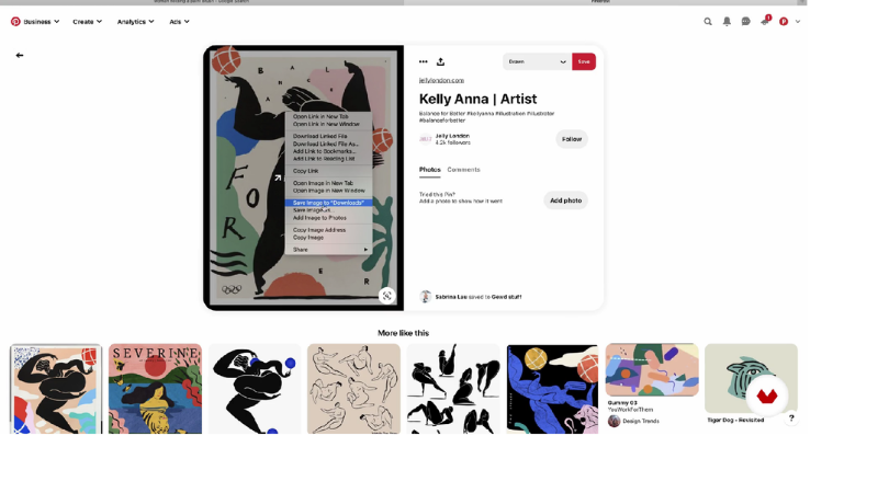
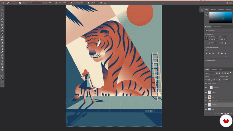
“Hi, We have reached the end of the course. I want to say a big thank you for choosing my course and I hope that you have enjoyed it. I also hope that I left you with some new ideas and ways of working and most importantly that you feel inspired to create something new and exciting to share with others. So, let’s do a quick recap of what we learned in this course and the main tips I gave you throughout the lessons. Collect reference images We started by collecting reference images using Google Images and Pinterest. Finding the right references is important because it will help you visualize your idea and maybe even give you new ideas that you can test out when you create your first sketches.

Partial transcription of the video
“Hi. Now we have reach the end of the course. I want to say a big thank you for choosing my course. I hope that I left you with some new ideas and some ways of working. Most importantly, I hope that you feel inspired to create something new and exciting. Let's do a quick recap of the things you have learned in this course and the main tips I gave you. So we started collecting reference images by using Google Images and Pinterest. Finding the right reference images is important because it will help you to create your new ideas and your first sketches. We went through the basics of composition...”
This transcript is automatically generated, so it may contain mistakes.
Course summary for: Dynamic Vector Illustration: Keys to Color and Composition
-
Category
Illustration -
Software
Adobe Illustrator -
Areas
Digital Illustration, Editorial Illustration, Traditional illustration, Vector Illustration

Pietari Posti / Studio Posti
A course by Pietari Posti / Studio Posti
Pietari Posti is a Finnish-born illustrator based in Barcelona. After studying graphic design in Finland, he founded Studio Posti, a creative studio specializing in design and illustration.
Recognized for his use of bold shapes, sharp contrast, and expressive style, Pietari’s work in advertising, editorials, and publishing has attracted a diverse range of clients including Apple, Nespresso, Random House, Starbucks, Monocle, The New York Times, The Guardian, and more.
In 2013, Pietari won the Victor & Albert Museum Best Book Cover Illustration Award for Arthur Ransome’s Swallows & Amazons.
- 100% positive reviews (307)
- 5,034 students
- 22 lessons (4h 35m)
- 21 additional resources (8 files)
- Online and at your own pace
- Available on the app
- Audio: English, Spanish, French, Italian, Portuguese, Turkish
- Spanish · English · Portuguese · German · French · Italian · Polish · Dutch · Turkish · Romanian · Indonesian
- Level: Beginner
- Unlimited access forever
Recommended software & tools for this course
Category
Areas


