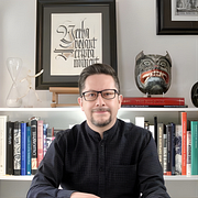
Design Monograms with Style
Sans serif types applied to monograms and logos
A course by GM Meave , Designer, Illustrator, Calligrapher, and Typographer
Joined February 2016
About the video: Sans serif types applied to monograms and logos
Overview
“We will begin to capture what we learned in the lesson before the monograms and logos.”
In this video lesson GM Meave addresses the topic: Sans serif types applied to monograms and logos, which is part of the Domestika online course: Design Monograms with Style. Learn to use calligraphy and lettering to create dynamic and clever monograms.
Partial transcription of the video
“[Music] Well, in this lesson we are going to see the application of the language of sans serif or without skates to the structure of our monogram. Before we get into that, I would like to describe a little about what we did. As in the grid structure we had where we go from a center outwards, In the exercises we did in unit two, here we have a similar structure, but with concentric circles. This comes because "C" and "D" are letters where circles predominate. The "C" is practically a circle and "C" is the most important letter which I am taking as a basis. Therefore, this is a monogram based...”
This transcript is automatically generated, so it may contain mistakes.
Course summary for: Design Monograms with Style
-
Category
Calligraphy & Typography -
Software
Adobe Illustrator, Adobe Photoshop -
Areas
Branding & Identity, Calligraphy, Graphic Design, Logo Design

GM Meave
A course by GM Meave
Gabriel Meave is a graphic and typographic designer, illustrator, and calligrapher, born and based in Mexico City. His work spans editorial and book design, corporate identity, logos, graphic work, calligraphy, and font design and typeface families.
He has illustrated narrative, fantasy and fiction books for authors such as Gabriel García Márquez, Juan Villoro, and Cornelia Funke, and designed special typefaces for companies such as Telcel, the financial newspaper El Economista, Jumex, and El Palacio de Hierro stores, as well as the institutional font of the federal government of Mexico.
His original Arcana and Organic typefaces are distributed internationally by Adobe Systems, and he has carried out design and branding projects for Mexicana de Aviación, Corona, P&G, McMillan, Pearson Education, Fondo de Cultura Económica, Ogilvy & Mather, and various agencies, publishers, and design firms.
Throughout his career, he's received five awards from the Type Directors Club of New York and three from the Association Typographique Internationale and several of his photographs have been selected for the Tipos Latinos biennials in 2006, 2008, 2010, and 2012.
His calligraphic and illustrative work has been exhibited in various forums and spaces, including the solo show "La mano que mece la pluma" at the Diego Rivera Mural Museum in the historic center of Mexico City. In addition, his work has been published in the main international design magazines, such as Communication Arts, Novum, Ètapes, Typo, and How. Phaidon Books, in their book Area_2, published in 2009, listed Meave as one of the hundred most important emerging designers in the world today.
- 100% positive reviews (232)
- 4,248 students
- 28 lessons (5h 15m)
- 28 additional resources (26 files)
- Online and at your own pace
- Available on the app
- Audio: Spanish, English
- Spanish · English · Portuguese · German · French · Italian · Polish · Dutch · Turkish · Romanian · Indonesian
- Level: Beginner
- Unlimited access forever
Category
Areas


