@harry_davies
How To Combine Colors in Interior Design

Learn to create harmony and impact with these simple tips for combining colors in interior design from Miriam Alía
Miriam Alía’s (@miriamalia) designs have featured in editorials like Architectural Digest, Elle Decor, Interiores and more. Here she shares basic rules for combining colors that you can play with and can help you establish what works best for you.
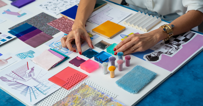
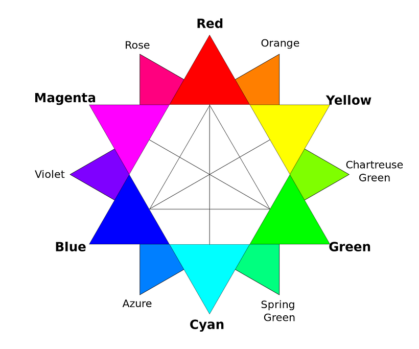
A crucial tool in your color selection is the color wheel. Using this useful circle, you will be able to apply the theories that artists and interior designers have been taking advantage of for centuries.
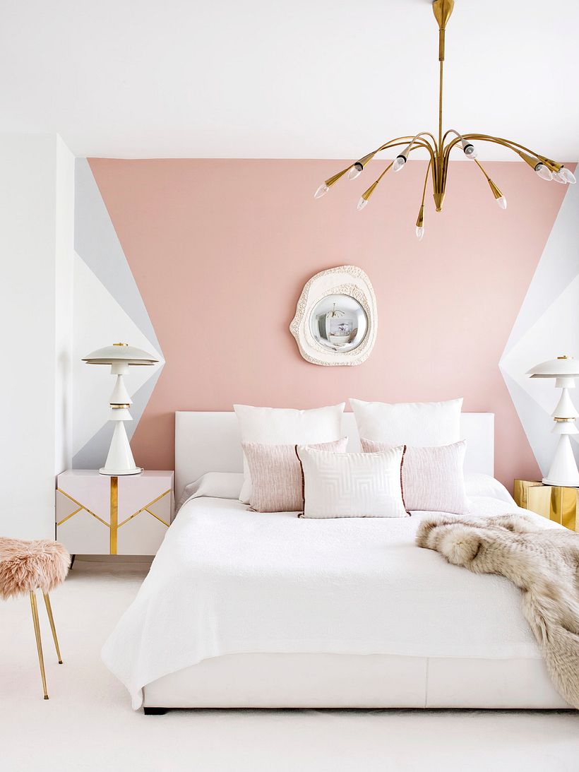
Monochromatic: one color, many shades
The simplest type of color combination is monochromatic. All you need to do is choose one color, adjusting its hue, brightness, and saturation according to the space and your taste. This means the only decisions you have to make is where to have stronger and brighter colors, and where to go for more neutral ones.
The cohesive palette leaves little room for definition and distinction, often creating a softer effect and a relaxing environment.
Analogous: next to each other on the color wheel
This sort of combination adds a little more spark to the design without disrupting it too much. You combine one color on the color wheel with the two adjacent to it. The spectrums can create a warming effect–red-orange-yellow–or a cooler look–green-blue-violet–for example.
Complementary colors: opposite on color wheel
Now, it’s time to use complementary colors from opposing sides of the color wheel for more vibrant combinations. Putting orange with blue or purple with yellow will always make a powerful statement as they work together to bring out the strength of the other.
Triadic combination: three colors equidistant on color wheel
Ok, now you’re really getting into it. This method is going to bring great contrasts into your design by using three colors equal distance apart on the color wheel. To set about using this type of combo, you can draw an equilateral triangle on the wheel, using the three colors at each of its points.
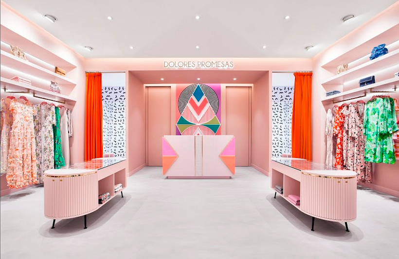
You can see other colors in Miriam’s design for Dolores Promesas but the colors that generate the most impact come straight from the points of the triangle, playing off each other to great effect.
Tetradic or double complementary combinations
This sort of combination isn’t for the light-hearted. You choose two pairs of complementary colors to give a design a lot of shape. This many colors allows you to really play with your space, adjusting brightness and saturation. It’s often a good idea to go for lighter tones for broader areas and then accent the look and highlight the parts you want to with more powerful colors and tones.
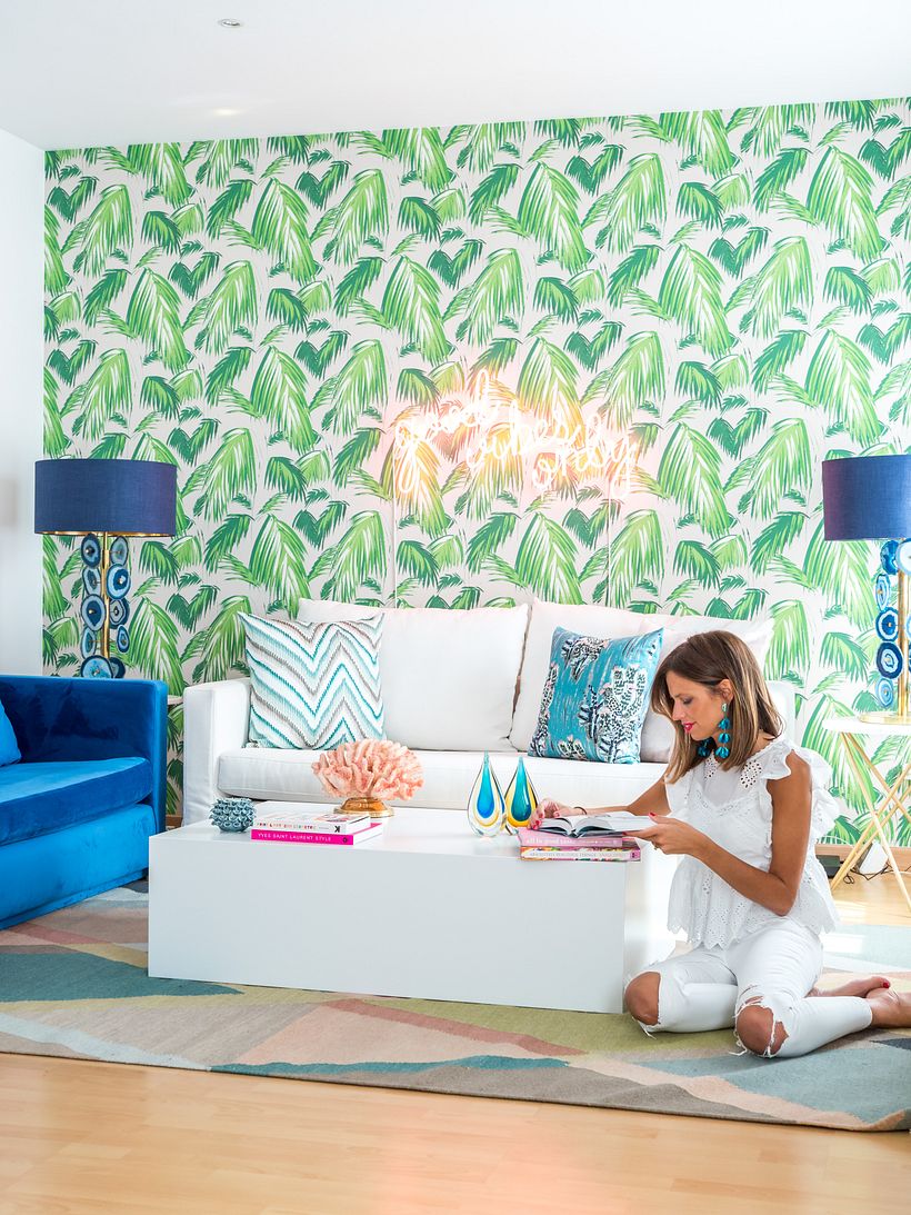
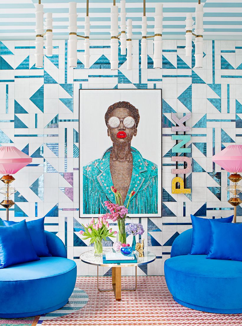
As you start to develop your own style, you are likely to find yourself returning to the same color combinations. A particular favorite of Miriam’s is pink and blue and, if you look at her Instagram, you’ll see the pairing pop up time and again. White and pink is another stalwart of her portfolio and, as she admits, it’s a safe bet that pink will pop up wherever you see her work, “it goes with everything.”
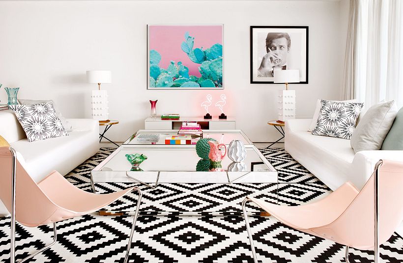
When designing for homes, it’s a good idea to start with clear and neutral colors. White walls and ceilings, maybe with a light touch of yellow or blue to give some life to the tone, can be accented with bright powerful colors, like the green and fuchsia, without loosing the light and cohesive palette of the room.
Now you know these basic rules, you can put them to good use in your next interior design creation.
If you enjoyed these tips and want to learn more about how to use color in your designs, check out Miriam’s course: Color applied to Interior Design.
You may also like:
- Interior Design from Start to Finish, a course by Nook Architects.
- Introduction to Interior Design, a course by Masquespacio.
- Interior Design for Multifunctional Spaces, a course by DecoStudio.


0 comments