


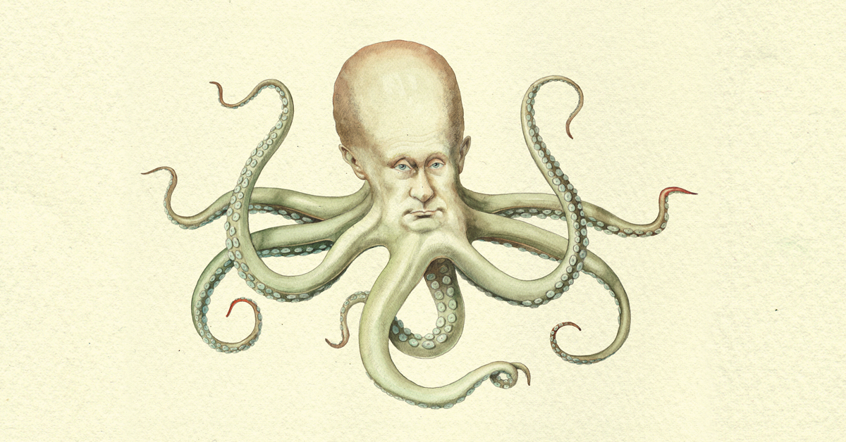
@harry_davies
7 Questions To Answer Before Every Illustration
The 7 questions award-winning illustrator and author Jon Berkeley asks before starting any illustration
Jon Berkeley has illustrated over 150 magazine covers during his career for publications including The Economist, Newsweek, and Nature, and has worked on numerous commercial projects for the likes of Vodafone, Smirnoff, and Ted Baker.
In this article, Jon, who teaches the course Acrylic Techniques for Creative Illustration, shares the 7 questions that three decades of illustrating have taught him are crucial to answer before embarking on a project.
1. Where’s it going to be?
The location of your image is one of its most definitive elements. There are ideas that only work vertically or horizontally and considerations change according to a picture’s position.
2. What’s the page layout?
For example, if you are creating a piece for the front cover of a magazine, the design is probably going to have to strictly adhere to an established layout. Elements that will affect your concept and its effectiveness include titles, prices, barcodes and dates.

3. What are the non-negotiables?
Many magazines are likely to be able to provide a template that will show you where the immovable elements shall be placed. Any adjustments beyond that may be open to discussion with the art director.

A frequent client of Jon’s is the Dutch magazine V. They are clear that any cover illustration for them must somehow incorporate the letter v, a creative challenge that may actually help inspire your final piece.

4. Will it bleed?
No, your average magazine will not expect you to spill blood for your art. Bleeding refers to an illustration covering an entire page, up to the very edges, as opposed to being framed. If the print will bleed, you will have to provide a few extra millimeters on your measurements to ensure the color does not stop short.

5. What can you play with?
Jon says that many editorials are responsive to creative suggestions: a healthy artistic discussion should lead to a better end product and may make the art director’s job more interesting too.
In one job, V magazine wanted the faces of the “targets” of Michael Moore’s documentaries to be included in Jon’s illustration. He suggested their faces be painted onto bowling pins that Moore would be looking to bowl over–inspired by Michael Moore’s most famous documentary Bowling for Columbine and that the elements of the illustration could be framed by the text. The open dialog between the two created a visually engaging and funny piece for the article.

6. Will it end up in the gutter?
The gutter is the line down the middle of a spread where two pages meet. If your work is going to stretch across the gutter, be sure to place any key details far enough away from the center to ensure they’re not lost.
7. What’s the brief?
This might seem like an obvious one but it’s easy to stray too far from the brief. Jon shares this simple brief for an article titled “The New Obscurantists”, a piece about people who are led more easily by emotion than reason and will readily believe conspiracy theories.

Jon suggests noting down whatever comes to mind as you read the brief, avoiding any considerations of whether an idea will work or not and bearing in mind that even cliches can work in your favor: now is not the time to worry about originality.

You can then pick out the elements you like, order them and compose them into a set of more legible ideas, and, when you’ve got around 6-10 clear ideas, send them off to the artistic director or commissioning editor and see what they think.

If you liked this tutorial, you can learn more from Jon with his online course, Acrylic Techniques for Creative Illustration, where he will run you through the process of creating a conceptual illustration to show you how to use your imagination to make your own.
You may also like:
- Editorial Illustration Tutorial: How to Adapt to Different Layouts
- Turn Your Designs Into Products You Can Sell
- Illustration Tutorial: How to Promote Your Work


0 comentarios