Urban Lettering: From Drawing to Digital

Course final project

A course by LetterMafia , Creative Collective

Creative Collective. Buenos Aires, Argentina.
Joined July 2019
100% positive reviews (2)
144 students
Audio: Spanish
Spanish · English · Portuguese · German · French · Italian · Polish · Dutch

About the final project for: Urban Lettering: From Drawing to Digital

Urban Lettering: From Drawing to Digital

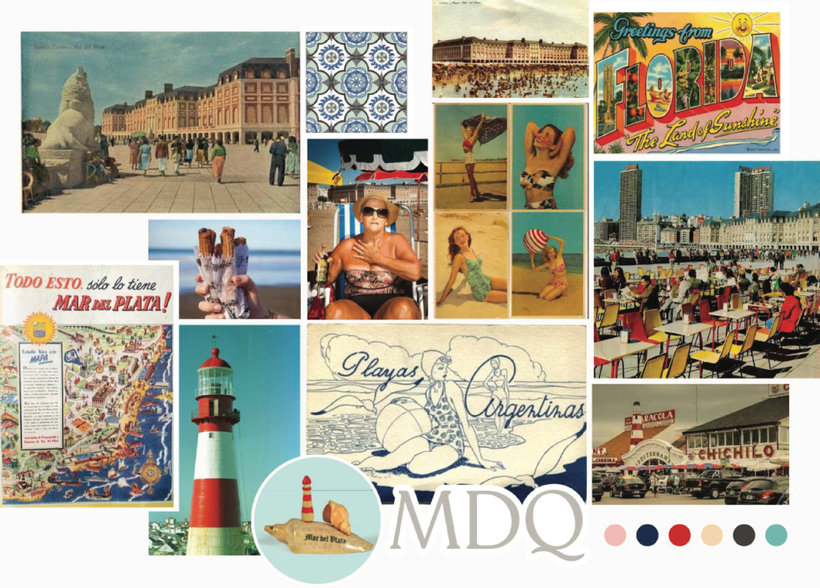
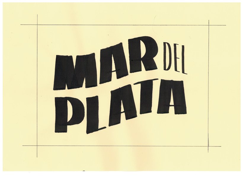
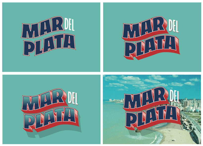
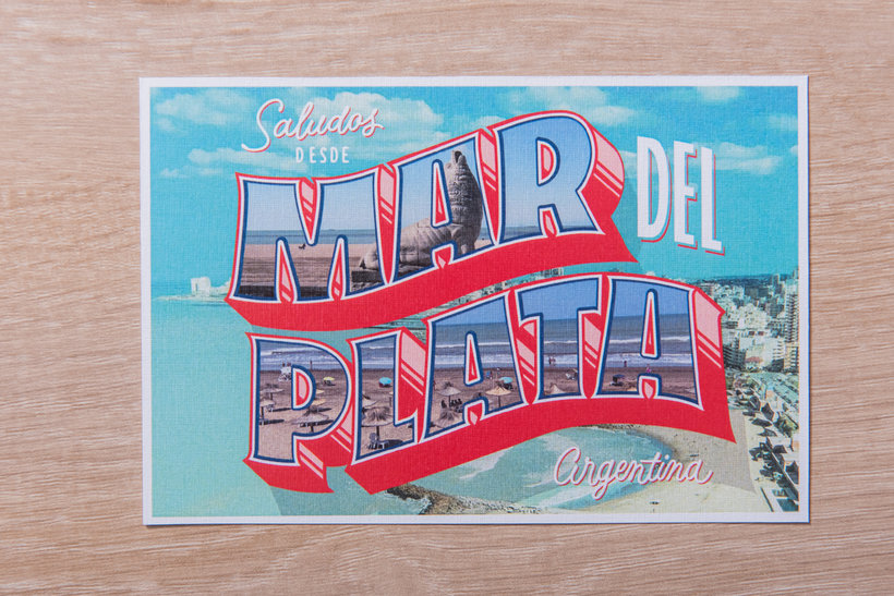
“We have reached the end of this course! Thank you very much for joining us. We hope you enjoyed it. Now it's time to make your postcard! You'll probably want to experience the flashier features like effects and color, but we recommend taking the time to go through each instance of the process. This will make you achieve an incredible result. Enter the code of the postcards "Greeting from" Although we have seen many examples of typical postcards, you can also search for your own references. These will help you understand the code (structures, shapes, styles, elements and use of color). Research and mood board Choose the city you want to work with. We chose Mar del Plata, a city on the coast of Buenos Aires, Argentina. But you work with the city that excites you the most. Collect images that convey information about the history, activities, customs, tourist places, geography, color palette, materials, etc. I chose the elements that most represent the spirit that you want to transmit from the city. For that you can ask yourself: · What do you like the most about the place you chose? What do you feel most connected to? · Do you want to talk about the city from an architectural and artistic point of view? Traditional or modern? From the chromatic? From customs?

Structure sketches Remember that what matters to us at this time is to structure a general idea. Therefore, you have to define and prioritize the elements that you are going to use: · The name of the city will be the most important element of your design. · A second reading level could be “greetings from”, “greetings from” or any additional text. · A third element could be a photo, an illustration, an icon, which, if you decide to use it, you should also think about its place in the field.
Use the flat tip With just one tool you can generate infinite possibilities to have different starting points and, in this way, start working on your design. I chose a flat-nose tool. It can be a traditional pen, one with a cartridge, or even one that you make yourself. Before you start designing anything, familiarize yourself with the tool, ink, and paper you're going to use. Do the different exercises to understand the shapes that will later help you build letters. It is important that at this point you experience what happens when you change the angle of the pen in relation to the line.
Once you feel comfortable, use these different strokes to make the letters of the name of the city you chose. Remember that with the simple fact of making the line taller or making the sign wider, you will discover new characteristics in the letters. In this way you will have a small catalog of options that will help you decide on a starting point. The more tests you carry out, the more options you will have to generate the type of letters that best suits what you want to communicate.
Postcard design At this point, have your references, your mood board, your first sketches and your catalog of words at hand. I chose the sketch that you like the most. Having drawn it neatly in real size, you will draw the word on it, using the logic, the angle and the proportion that best suits what you want to design.
Refine these decisions in pencil. Make the appropriate adjustments taking into account the neatness, the weights of the strokes, the relationship between thin and thick, etc. Give it even more personality by modifying the endings of the strokes. Remember that, since all the letters are different, the important thing is that all the endings look like they belong to the same family.
Lastly, take a few minutes to analyze your piece and check if you need to make any final weight and spacing adjustments. Once ready, ink it neatly with a black marker and scan it.
Effects and color in Adobe Illustrator Insert your design into Adobe Illustrator and vectorize it using the Pen Tool (P). Remember to draw stroke by stroke, just like you did analogically.
Once it's vectorized, you can start trying out different depth and shadow effects. Also play with what happens inside the letters using masks, photos and internal effects to the letters. Finally, I defined exactly the colors that you are going to use and how you are going to distribute them.
And ready! Share your final project using the "Create your project" button. In addition to the final result, I also shared the previous steps. In this way you can inspire your classmates and provide feedback on the design process of this course. This will be super useful for us to give you a much richer return.
We also invite you to share it on your networks using the hashtag #LetterMafiaDomestika and #GreetingsFromLetterMafia. Something very important is that any questions that arise can be shared in the forum. We will answer you as soon as possible, and you will also have the feedback of the beautiful Domestika community available to exchange information and generate an even larger network of contacts. Thank you very much again for joining the course and sharing this beautiful process with us!”

Partial transcription of the video

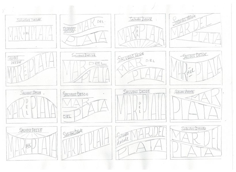
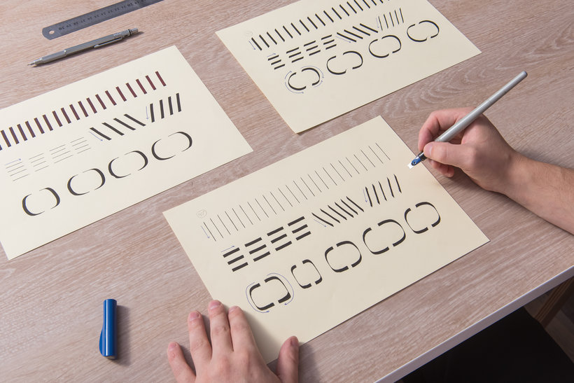
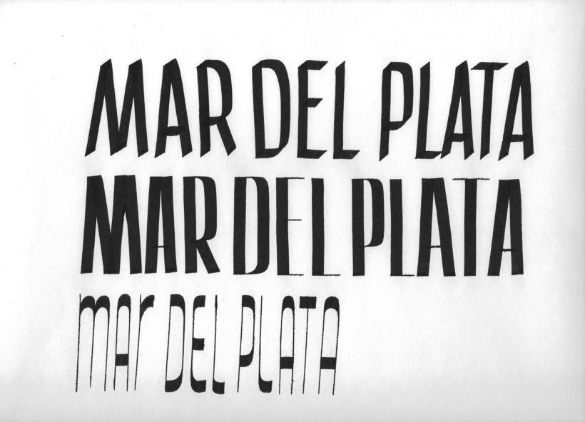
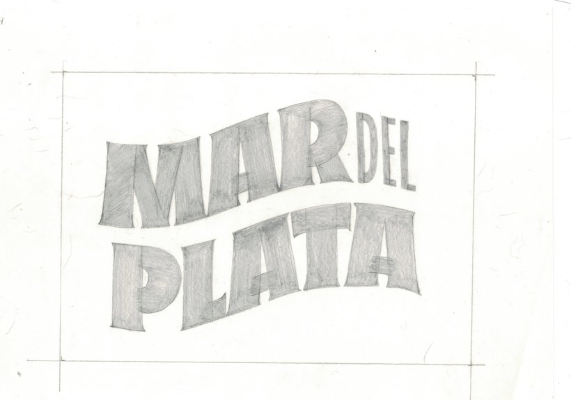
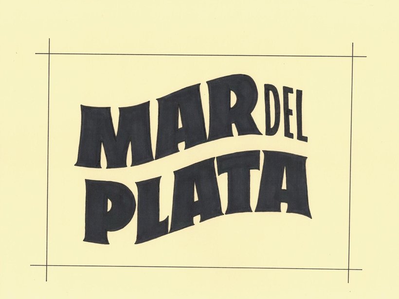
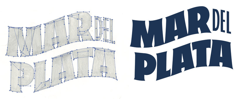
“Final project Congratulations, we have reached the end of our journey. Thank you for trusting our proposal. We start from scratch doing a little research on the place we chose. We find the elements to create our mood board and from that design our piece. We learned tools to generate different types of strokes and we explore its possibilities to understand calligraphic logic. Then, having that base, we learned to refine the letters using the pencil, we chose terminations and made optical adjustments. With these insights we were able to give it the personality we wanted to our manual sketch. ...”

This transcript is automatically generated, so it may contain mistakes.


Course summary for: Urban Lettering: From Drawing to Digital

  • Level: Beginner
  • 100% positive reviews (2)
  • 144 students
  • 5 units
  • 17 lessons (2h 59m)
  • 11 downloads
  • Category

    Calligraphy & Typography
  • Areas

    Digital Design, Digital Lettering, Lettering

LetterMafia

LetterMafia
A course by LetterMafia

Teacher Plus
Creative Collective

LetterMafia is a group of designers specializing in lettering, calligraphy, and typography who take a collective approach to their projects, combining their skills to overcome challenges while exploring the rich versatility of letters. Since 2018, they've collaborated with major clients like Hermès, Spotify, Bodega Portillo, Persol, the Buenos Aires City Government, and Canal Encuentro.

In addition to working with letters, they've organized a variety of initiatives to foster learning and the exchange of knowledge: they held three workshops at the eighth Bienal de Tipografía Latinoamericana Tipos Latinos, participated in TRImarchi with an intensive lettering workshop, and hosted a comprehensive one called Letterbondi at Prints&Crafts. They also have their own podcast titled Familia Tipo.


  • 100% positive reviews (2)
  • 144 students
  • 17 lessons (2h 59m)
  • 25 additional resources (11 files)
  • Online and at your own pace
  • Available on the app
  • Audio: Spanish
  • Spanish · English · Portuguese · German · French · Italian · Polish · Dutch
  • Level: Beginner
  • Unlimited access forever

Areas
Urban Lettering: From Drawing to Digital. Calligraphy, and Typography course by LetterMafia

Urban Lettering: From Drawing to Digital

A course by LetterMafia
Creative Collective. Buenos Aires, Argentina.
Joined July 2019
  • 100% positive reviews (2)
  • 144 students