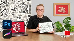
Vintage Lettering: Custom Compositions From Scratch
Styling the Letters
A course by Mark van Leeuwen , Lettering Artist and Type Designer
About the video: Styling the Letters
Overview
“To embellish and add weight to your letters, here I will teach you about contrast and body. You will see how important it is for the style of your letters.”
In this video lesson Mark van Leeuwen addresses the topic: Styling the Letters, which is part of the Domestika online course: Vintage Lettering: Custom Compositions From Scratch. Learn the fundamentals of typography to create an original typeform composition by hand and bring it to life in Procreate.
Partial transcription of the video
“Styling the Letters In this lesson, we'll see how to add weight and style to our letter forms. Before adding weight to the sketch we finished up in the previous lessons, I'll quickly talk about contrast and type design, which determines the way we'll add weight to the letters. Contrast is the way that thick strokes and thin strokes alternate within the letter shapes. There are four main categories of contrast systems that we'll see now. To show you different contrast styles, I'll quickly draw the two main basic characters from the alphabet in the skeleton form. First, we'll look at the diff...”
This transcript is automatically generated, so it may contain mistakes.
Course summary for: Vintage Lettering: Custom Compositions From Scratch
-
Category
Calligraphy & Typography -
Areas
Calligraphy, Digital Lettering, Lettering, Typography, Typography Design

Mark van Leeuwen
A course by Mark van Leeuwen
Mark van Leeuwen is an Italian-Dutch freelance lettering artist and type designer based in Berlin, Germany. Over the past decade, he has worked with independent clients, agencies and a number of international businesses, creating logo designs, posters, murals, books and album covers.
His client list includes Cadillac, Etsy, Apple Music, DJ Tiësto, Jägermeister, Harper Collins, Penguin Random House, and Adobe. He has been featured in numerous publications including AIGA Eye On Design, Goodtype: The Art of Lettering, Rizzoli, and Yearbook of Type. He is also the recipient of the CommArts Typography Annual Award, both in 2020 and 2022.
- 100% positive reviews (32)
- 1,284 students
- 15 lessons (2h 3m)
- 11 additional resources (4 files)
- Online and at your own pace
- Available on the app
- Audio: English
- English · Spanish · Portuguese · German · French · Italian · Polish · Dutch · Turkish
- Level: Beginner
- Unlimited access forever
Category
Areas


