Design a Digital Font from A to Z
Horror, the kerning!
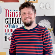
A course by Juanjo López , Graphic Designer and Typography Expert
About the video: Horror, the kerning!
Overview
“Kerning is one of the most hated processes when it comes to making types, but if we have taken care in the previous step, you will see that it is not so much. ”
In this video lesson Juanjo López addresses the topic: Horror, the kerning!, which is part of the Domestika online course: Design a Digital Font from A to Z. Learn to design a font from scratch with Glyphs, Illustrator, and OpenType functions.
Partial transcription of the video
“Kerning is often joked about in typography circles as being the step everyone knows. While it may seem trivial. it’s more akin to dealing with Comic Sans than most realize. However. if proper attention has been given to letter spacing and design during initial font creation. kerning becomes a straightforward and swift Once our basic character set is drawn and spaced. and we have thoroughly tested to ensure the spacing is accurate. we can proceed with confidence. Proper spacing is crucial before moving to the next steps. To properly space our text. we must first address letter pairing. known...”
This transcript is automatically generated, so it may contain mistakes.
Course summary for: Design a Digital Font from A to Z
-
Category
Calligraphy & Typography -
Software
Adobe Illustrator, Glyphs -
Areas
Graphic Design, Traditional illustration, Typography, Typography Design

Juanjo López
A course by Juanjo López
When Juanjo López joined Domestika in 2004, he decided to him to call himself Juanjez. Since then, it has stuck!
He is a freelance designer and passionate about graphic design and typography, always trying to keep learning whether it's vectors, lettering, calligraphy, or composing with lead or cast iron levers. His digital typefaces, under the name Huy! Fonts, are distributed by YouWorkForThem and MyFonts, among others. He is part of the Familia Plómez, a pre-digital typographic collective from Madrid, and Unostiposduros.com, the biggest typography website in the Spanish-speaking world. In addition to being a designer, he loves teaching and has taught a wide variety of courses and workshops on typography, lettering, and letterpress.
- 98% positive reviews (198)
- 4,531 students
- 34 lessons (8h 37m)
- 27 additional resources (19 files)
- Online and at your own pace
- Available on the app
- Audio: Spanish, English, French, Italian, Portuguese, Turkish
- Spanish · English · Portuguese · German · French · Italian · Polish · Dutch · Turkish · Romanian · Indonesian
- Level: Beginner
- Unlimited access forever
Category
Areas


