Design a Digital Font from A to Z
Course final project
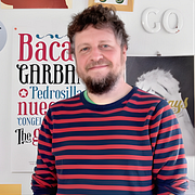
A course by Juanjo López , Graphic Designer and Typography Expert
About the final project for: Design a Digital Font from A to Z
Design of a digital Typography from A to Z
“Well, dear ones, we have already reached the end. Throughout the course we have learned a couple of things about myself and what moves me to get into these fregaos, we have talked about how to approach a typographic project, what programs you can use and how to order your files. We have started to investigate about Glyphs, some peculiarities of this type of programs and our field of work, the character game. Then we have tried the handwriting part, both in theory and in practice, we have learned to place them correctly, draw them using their modular features and take advantage of Glyphs tools to make the task easier. Once we draw our alphabet we have taken care of the white spaces between the letters that will give the correct texture and rhythm to our lyrics. We have achieved this by spacing and creating kerning pairs. Then we have dealt with the issue of making our source really useful: we have expanded the character set to write anything with our lyrics, we have applied OpenType functions to make it more versatile, we have learned how to use scripts that make our work easier, how to improve its aspect on screen and how to expand our family using our friends mathematics. I thank you for your attention, and I congratulate those of you who have arrived here, because this typesetting is not a matter of a couple of hours. But hey, nobody said it was easy! Remember that you have me for the forum of the course to solve your doubts. Regards!!”
Partial transcription of the video
“Well. we've now reached the end of our course. I've had a couple of eucalyptus candies and my voice is back after all this talking. It seems like we managed to cover quite a bit today. Now. let's first do a brief summary of what we have covered so far. highlighting the most important points. First. i introduced myself since some of you might not have known who I am. Next. we delved into the literary influences that shape me. discussing the books I adore and which ones inspire my views on letters. I sincerely hope at least a few of these works resonated with you and that you've had the chanc...”
This transcript is automatically generated, so it may contain mistakes.
Course summary for: Design a Digital Font from A to Z
-
Category
Calligraphy & Typography -
Software
Adobe Illustrator, Glyphs -
Areas
Graphic Design, Traditional illustration, Typography, Typography Design

Juanjo López
A course by Juanjo López
When Juanjo López joined Domestika in 2004, he decided to him to call himself Juanjez. Since then, it has stuck!
He is a freelance designer and passionate about graphic design and typography, always trying to keep learning whether it's vectors, lettering, calligraphy, or composing with lead or cast iron levers. His digital typefaces, under the name Huy! Fonts, are distributed by YouWorkForThem and MyFonts, among others. He is part of the Familia Plómez, a pre-digital typographic collective from Madrid, and Unostiposduros.com, the biggest typography website in the Spanish-speaking world. In addition to being a designer, he loves teaching and has taught a wide variety of courses and workshops on typography, lettering, and letterpress.
- 98% positive reviews (198)
- 4,529 students
- 34 lessons (8h 37m)
- 27 additional resources (19 files)
- Online and at your own pace
- Available on the app
- Audio: Spanish, English, French, Italian, Portuguese, Turkish
- Spanish · English · Portuguese · German · French · Italian · Polish · Dutch · Turkish · Romanian · Indonesian
- Level: Beginner
- Unlimited access forever
Category
Areas


