


@micaela_mh
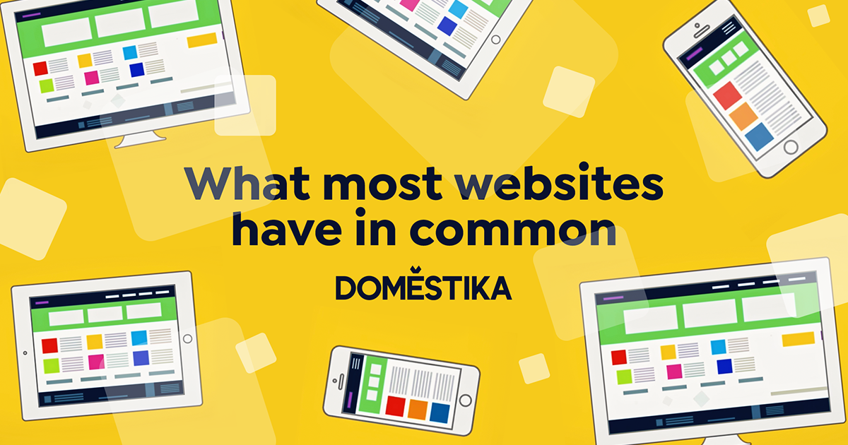
What Most Websites Have In Common
Why similar looking websites aren’t necessarily a sign of bad design
Have you ever noticed that a lot of web pages look the same? You aren’t just imagining it: one study of over 10,000 websites found an increase in design conformity over the last few years.
From large banner images to hamburger menus (those three horizontal lines that reveal a list of pages), the visual language of the internet has become more standardized.
Why has this happened? Is this uniformity a sign of lazy design? We spoke with experts to discover the challenges, and needs, that web designers today are responding to.
Turns out, there are a few major reasons why designers are creating similar looking websites, but that doesn’t mean there isn’t room for creativity.

So, why do so many websites look so similar? “I think that’s a really hard question. It's sort of like, why don't architects build better buildings?” says Khoi Vinh, the Senior Director of Design at Adobe.
These are the three main challenges that web designers face:
Challenge #1 Make the site intuitive
Much like a physical building, a functional website has basic structural needs that must be met before designers can begin adding other elements.
One of those needs is functionality: a site has to be easy to use. Users expect to arrive at a webpage and be able to navigate it immediately: recognizable icons, like that hamburger menu, make this possible. If the ultimate goal of a website is to convert or inform users, unfamiliar design can make it difficult to navigate and prevent it from achieving its objectives.
But, what people understand intuitively when surfing the internet can vary between demographics and audiences, warns Jeff Gothelf, the author of Lean UX and Forever Employable. If you mindlessly repeat visual elements that work for one website on another, you might not have the same success. Designers must constantly consider the user experience of their target audience and what intuitiveness means for them.
Challenge #2 Make the site responsive
An ever-increasing number of devices means designers have to think about how each website will look on a variety of different screen sizes. Making websites responsive ensures the quality of the user experience, regardless of how they access the site.
One common solution to create consistency across devices is a grid design. Many frameworks and template-driven website builders incorporate this into their designs, making it easy for amateur designers to quickly create responsive web pages. This means pages often look similar.
While there are reasons to be concerned about "the site in the box tool", says Vinh, there's also a benefit to more people having access to good design, and having the opportunity to interact with it, since it will help to further "fuel the appetite for good design."
Challenge #3 Make the site stand out
While a visually appealing design can have a major impact on branding, it’s generally not the first priority, says Gothelf.
The requirements that designers are asked to meet, and the often tight deadlines they’re given to meet them, typically means prioritizing other features over innovative design.
Playing it safe with intuitive and widely used web designs doesn’t always have to be a bad thing, but it can be dangerous if the competition takes the opportunity to stand out with a one-of-a-kind website that is both powerfully branded and easy to use.
“Novel solutions aren't necessarily unintuitive, they just require more investment, more time, more care, to make sure that they are both novel and intuitive and understandable to the user,” explains Vinh.
Today's web designers face many challenges, but they also have more tools at their disposal than ever. Great web design is about creating something unique that's also familiar and functional - something that no template can do on its own.
You May Also Like:
- 5 Free Lessons to Learn UX Design for Beginners
- Dos and Don'ts of UX Design


2 comments
Great!
Standardization is really useful on the internet, so the users don't have a hard time to understand what button or menu does what. Even me, when there is a different structure, it takes time for me to figure out what it does. On the other side, I would leave quickly if it didn't make any sense, or it consumes too much of my time.