The Deeper Meaning Behind Apple's Logo

Explore the unique curiosities of the Apple logo and learn what makes it a symbol of innovation and creativity.
Well, if you are Windows user, you could read the symbology of Apple's logo to mean greed and fraud, instead... Which is a valid point! Yes, Apple's tech can be overpriced but I don't think they were trying to sell it as such... Or were they? In the end, what signals luxury and high status more than an anabashedly overpriced product?
Anyways, here is another article for the Apple nerds, like if there weren't enough, already!
You'd like to know all the secret meanings behind the famous logo... Is it a call back to Eve's forbidden fruit? Is Steve Jobs the biblical serpent in this analogy, then? Is Jobs a real surname? Sure, these are all valid questions but what are you gonna do with the answers? Text about it with your deep web friends on your Macintosh computer?
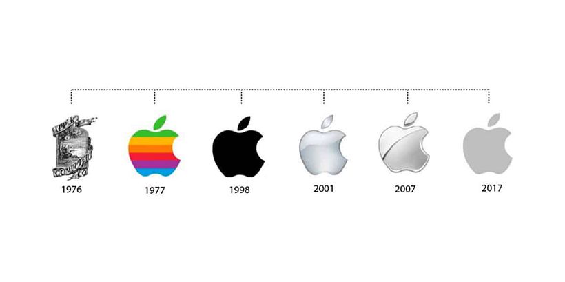
Chronology

What is that tiny doodle above "1976" in the chronological picture? The first Apple logo wasn't just an apple actually! The design by co-founder Ronald Wayne, showed the famous Isaac Newton apple story... The drawing is good but talk about readability...!
Oh and as a side note, Wayne sold his shares for $800 just a few weeks after Apple began manufacturing its first computer equipment. Just two years later, his shares would've been worth 7000 million dollars... He says he doesn't regret his decision. Maybe he was still offended by the removal of his logo that only lasted a year representing Apple...
1977:
Graphic designer Rob Janoff was tasked by Steve Jobs to design a new logo for the growing tech company. Jobs was looking for the simple and immediately recognizable logo we know today. This petition caused him $100,000. Money for which Janoff sketched apples diligently, for two weeks...
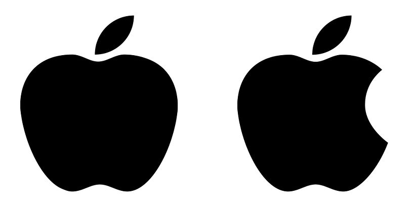
But what about the "bite"? There are all kinds of rumors concerning the characteristic bite... Some believe this is a tribute to Alan Turing, computer science's founding father who committed suicide bitting into an apple laced with cyanide... Well, when his body was discovered, an apple lay half-eaten beside his bed, and although the apple was not tested for cyanide, it was speculated that this was the means by which Turing had consumed a fatal dose...
Another theory states that the bite was added to the design to distinguish the apple from a tomato or other fruits and yet another just compares the word "bite" with "byte"... Too cheap and nerdy for my "taste"... Get it...? But if I was payed that amount of money to design a logo that simple I would definitely come up with all the explanations and hidden meanings I could to back it up!

From 1998 until now:
The colors in the 1977 logo refer to the Apple II’s screen color capabilities. But in 1998 that wasn't a selling point anymore, so they introduced a plain black version known as the monochromatic logo, which was used briefly until 2001. Did the funerary black referenced Wozniak's departure from the company in 1992? Or was it just cool looking?
From 2001 until 2007, Apple used the famous chrome logo. In 2007, with the launch of the iPhone, Apple introduced a logo known as the ‘Sliced Apple’ logo... And finally, in 2017, Apple returned to a monochromatic logo, this time opting for a dark gray color... What could all this possibly mean?
Janoff himself denied the rumored deeper meanings of his design years ago, though: "The apple shape itself didn't have anything to do with computers. It's to get people to notice that an Apple computer was not some piece of hard-edged metal that has no place in your home and that your kid wouldn't want to be near. Lots of different fruits have a stem, are sort of round with a leaf dangling off of it. So the bite in the apple was initially meant to indicate that it was an apple, and not something else. Also metaphorically the bite indicated biting into all the knowledge users would get out of this computer."

Did you hear about these Apple logo rumors before? Did you expect me to tell you a new one...? Well, this is not new, but I heard that Steve Jobs had the habit of eating the same food, like carrots or apples, for weeks before abruptly stopping or switching to another food or fasting... And that after eating enough carrots his skin turned orange...
Oh, and Steve Jobs isn't dead and is hiding out in Egypt! I almost forgot...! Egypt... What a great choice! I'm sure he couldn't afford an island for himself, like other infamous millionaires!
With or without Jobs, Apple continues to be one of the world’s most successful and influential brands. As the company changed and evolved, Apple evolved its branding too.
In Domestika we can help you rebrand your company! But don't name it after the only fruit that you eat: Banana®... Take yourself, seriously!
- Course on Logo design: from concept to presentation
- More courses on logo design
- Logotype, Isotype, Imagotype, Isologotype: What's The Difference?


0 comments