Discovering Stories with Data: Luiz Ludwig's Insights in Dataviz
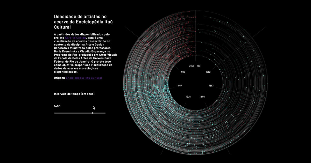
Explore the captivating world of data visualization with Luiz Ludwig, a designer and visual artist. Discover how to transform data into creative, graphical, and interactive narratives using accessible platforms and valuable tips.

Dataviz, or data visualization, has always fascinated me. It's not just about conventional graphs and information-packed tables; it's an art form that turns the coldness of numbers into impactful visual narratives. I'm Luiz Ludwig, a designer and visual artist who found a passionate path in the world of data without needing to be a programming expert. I'll share with you how data can become creative graphical and interactive pieces through free and accessible platforms.
In my adventure through the Dataviz universe, I learned that it's not just about collecting numbers, but about discovering and telling stories hidden behind them. Let me share some tips that can transform your data presentations:
Use Colors and Shapes Purposefully:
In data visualization, everything communicates! Colors and shapes aren’t just decorative, they're codes conveying information. Use palettes that enhance data understanding.

Tell a Story:
Every dataset has a story to tell. Use visual elements to guide your audience through this narrative, showing causes and effects, relationships, hierarchies, comparisons.
Choose the Right Type of Chart:
Bar, line, scatter charts - each serves a purpose. Select the one that best represents your data and makes it easier for your audience to understand.
Contextualize the Data:
Provide context, so your audience can understand more about the data. Explaining more, adding captions, notes usually help the audience understand better.

Applying these principles, I dived into the final project of the course: creating a Dataviz on the theme of Oscar winners. The idea was to go beyond presenting who won; I wanted to show trends, patterns, and curiosities that only careful analysis could reveal.
The process began with scraping data from HTML pages, a technique that allowed me to collect information directly from Oscar-related websites. These data, once organized and analyzed, proved to be a gold mine of insights.
The benefits of this technique are vast. Data visualizations can:
Enhance Understanding: Complex data is more easily understood when presented visually.
Facilitate Discovery of Trends and Patterns: Patterns that might be overlooked in numerical tables become clearer in a visualization.

Make Information Memorable: A strong Dataviz can leave a lasting impression and be remembered long after a presentation is over.
Engage the Audience: Attractive visual elements capture attention and can encourage the audience to engage more deeply with the content.
Provide a New Perspective: By visualizing data creatively, new questions can arise, paving the way for further discoveries and insights.
By the end of the course, participants not only became capable of creating impressive and original visualizations but also learned to see data as a rich source of stories waiting to be told. If you're curious and have some data, I can show you how to turn numbers into visual narratives that speak, move, and inform.



0 comments