What Is Editorial Design? 6 Innovative Print and Web Examples

Learn the principles of creating distinctive editorial publications, by uniting strong branding with eye-catching design
Every publication or media brand needs a recognizable personality, and it’s a designer's job to express that visually.
Editorial design encompasses the design systems used to tell stories for magazines, websites, newspapers, and more. Direct and meaningful communication lead to reader trust, and ensure your audience returns over and over.

Designer Mark Porter (@mark_porter) has worked with some of the most well-known media outlets in Europe and was also the Creative Director of The Guardian. He aims to create work for audiences to fall in love with, communicating a publication’s attitude, philosophy, and values from the first time you pick up a copy, or visit their site.
Here, he explains the principles and goals of editorial design, and the components and elements to consider, through six examples from his portfolio.
The basics of editorial design
The essence of what Mark and other designers do for publications is “creating form for content”:
- Content means the storytelling and ideas that a publication wants to share with their audience. It could include essays, articles, interviews, and photos, for example.
- Form is the visual manifestation and representation of these stories.
An editorial designer takes the core brand along with its content and tries to unite them through four key pillars of form: layout, typography, color, and imagery. These four elements should come together on the page to tell the audience everything they need to know—both about the content itself, and the brand that’s sharing the story.
Mark notes that you may begin with basic technical requirements like readability and navigability, but from this foundation you want to also create a personality in your design.

How to ensure a strong editorial design system
When approaching an editorial project (like designing a new print magazine), you have to make a lot of design decisions. Before you can even consider the four pillars above, you need to know the brand and the audience. Here are some of the questions you might explore.
1. How does the brand want to be perceived? E.g. friendly, or authoritative?
2. How visually literate is the audience? Can you communicate ideas metaphorically, or does imagery need to be clear and representative of reality?
3. How structured should it be? How will people read it: quickly, or leisurely? This will affect how busy and/or rhythmic the design can be.
4. What are people expecting from this content? What do they want, and what do they need?
These questions among many others will give you an idea of where to start. From there, typography, layout style, color, and imagery will work together to build a visual language that communicates to the audience and gives the brand an identity.

How editorial design relates to branding
Mark explains that early in his career, print was king and the key focus of editorial design. Now, people consume media and content in a variety of ways, predominantly via digital means.
An editorial designer in the 2020s is a bit more like a brand designer, but there are key differences. A branding agency is usually given a product that’s ready to go. An agency working with Starbucks, for example, already knows the coffee is good and can work from there. But the editorial design process is to actually develop the product. The magazine, website, or newspaper is the product. This means you start from the core brand and work upwards.
But like any brand, you don’t just want the singular experience to work: you want buyers to return. You need to build an emotional relationship. Some media companies are reluctant to be called brands, as they worry it could devalue their journalism. However, much of what they do is branding: Marks explains, “the fact is they have values, and culture, that we’re trying to communicate to their audience to build loyalty.”
Six examples of editorial design
So, now we have an understanding of what editorial design is, and how it’s tied to building a brand and product for a publication, let’s explore a sample of Mark’s portfolio, to see these complex systems in action.
1. Domus Magazine
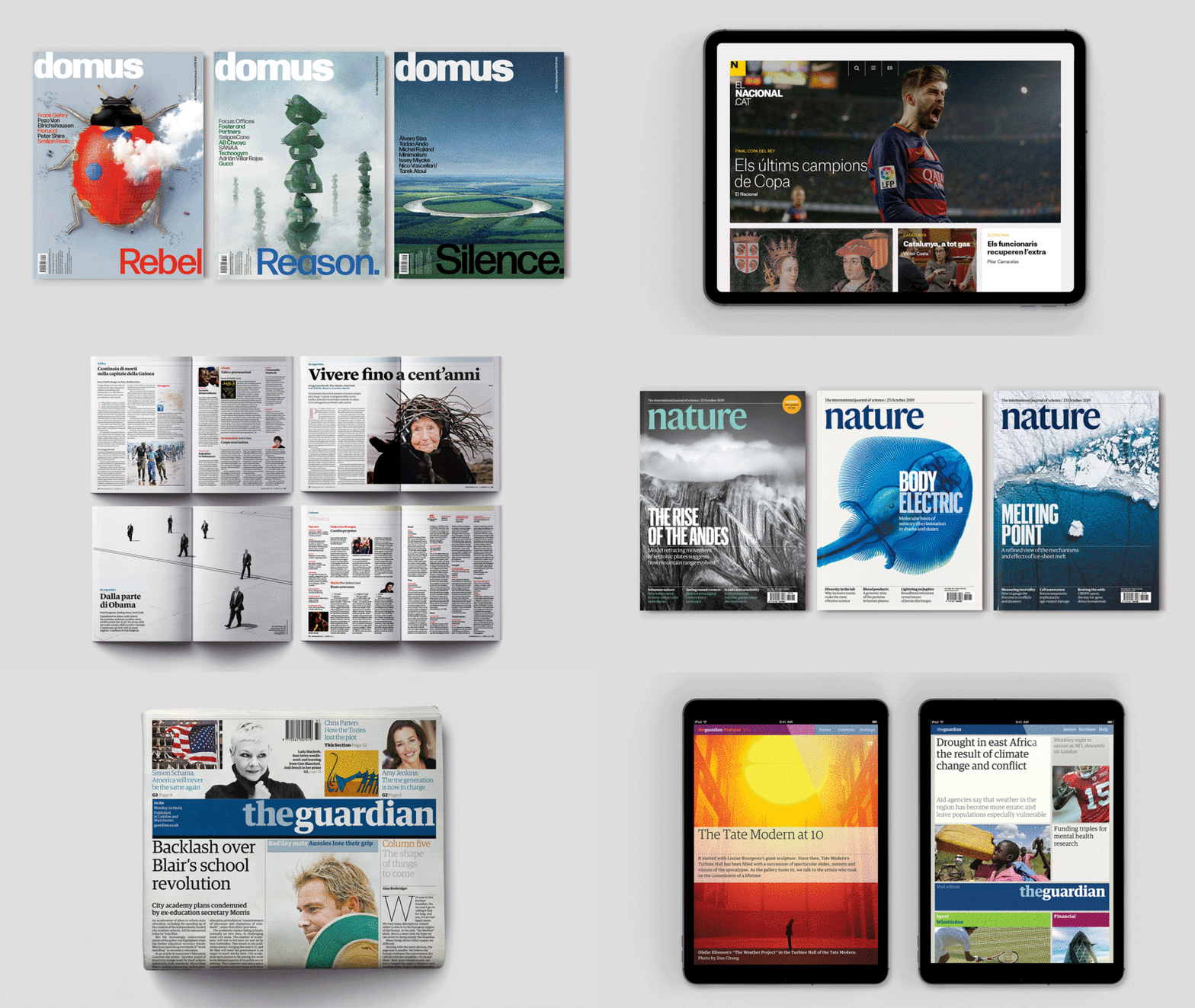
The Italian magazine Domus is for architects and designers, so is clean and structured. It’s printed on high-quality, thick paper, and feels luxurious. The colors and forms can be suggestive and not literal, because this audience is very visually literate.
Domus has been around for many years and has a long tradition of using color, so the interior reflects that. Both Italian and English are printed, so space is also key.

2. De Tijd newspaper
This Flemish newspaper is a broadsheet that covers business and finance. It’s made with disposable, thin paper. The tone of voice is authoritative, serious, and meaningful.
Layout-wise, there are many stories per page, with careful typeface choice emphasizing readability with clarity and impact. The design breaks up dense pages with large numbers and infographics that draw the eye.

3. Nature magazine
Nature is the world’s leading weekly scientific journal. The front half looks like a news magazine with dense editorial journalism, news in brief, and larger features.
However, the back half is very different, being made up of scientific papers—the scientific community expects certain information in a rigorous form, so clarity is key. Columns are wide to allow for equations to be written fully. The magazine even required a special typeface to include greek letters and other characters.

4. Público newspaper
The Público newspaper in Lisbon targets a much wider audience, including all ages. So, it has a lively, illustrated cover that’s inviting to the reader. It’s in a small format, with a more tabloid feel. Magazine-like pages are mixed with others resembling a traditional newspaper. There are some journalistic images and some more accessible graphics: all in balance, to reflect that broader readership.

5. Internazionale
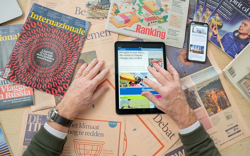
Internazionale is a weekly news magazine in Italy, and Mark's relationship with this brand began from the print magazine, but shifted to digital when the need to design a website emerged. For this project, multiple formats had to be considered—laptop, desktop, tablet, mobile.
More recently, they launched a range of spin-off magazines, published quarterly, that carry the branding of the weekly paper into occasional products. Finally, videos for the web and content for social media also needed a series of branded assets, to ensure a smooth identity.

6. The Guardian
When Mark was redesigning The Guardian in print, their online presence was inconsistent and their website was called ‘Guardian Unlimited’. Many publishers felt distanced from their websites at the time. Even Mark’s first redesign of their site was titled “guardian.co.uk”, as they were reluctant to fully claim it as “The Guardian”.
But over time the truth became clear: however you encounter this brand, it should be one smooth experience. Web, social, and print should feel cohesive, and reflect the newspaper’s editorial rigor and thought.

Turn over a new leaf and build stronger editorial designs…
Editorial design constructs brands from the ground up and tells stories through visuals as much as through the content itself. If you want to create distinctive designs and recognizable branding that works across platforms and channels, here is some further reading to explore.
- Start by visiting Mark’s full course, Innovative Design Systems for Editorial and Digital Media.
- Broaden your design horizons with ten online graphic design courses that work up from a beginner level, covering both print and digital.
- Read these eighteen graphic design books to fill the creative well.
- Get to grips with the design process and learn why it’s so important in a professional context.


0 comments