My project in Data Visualization and Information Design: Create a Visual Model course
di C Rof @em_curator
- 247
- 4
- 0

I was hyper-excited to start the course and to get tricks to expand my portfolio.
Therefore I watched the entire course in one shot. I thought I was ready to design a data visualisation about children's rights.
1st project dropped
I spent 1 day searching data suitable for the classe. The issue of that project: how the F**** do you represent emptiness? lack of data? lack of interest? after few days, I realised I would be able to answer those questions in a satisfying way (for myself) with time and practice.
2nd project dropped
Then I shifted to another topic dear to my heart: Water and focus on European countries. Again, it was difficult to find yearly data over a significant period of time and for numerous countries. I was happy to have less data at hand. It meant less repetitive and boring repetition to design (yes I don't like this part of the job, even listening to a podcast).
However, another difficulty emerged. The range of the data was huge a 10^4 factor between Luxembourg and France for example. Even using math (logarithm) to deal with a reasonable scale for my deisgn then the visualisation did not really work. Also, I struggled building a legend to ensure the readibility of my graph.
Looping to the starting point
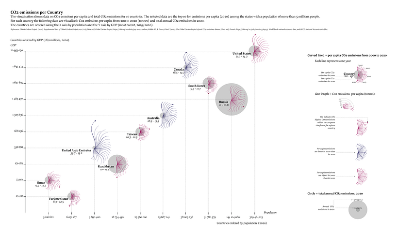
So, I decided to start all over again and "simply" reproduce exactly the CO2 emission data-visualisation. Everything was clear to me and provided me with a lurring feeling of ease. I estimated I would need only 2 hours top.
Finally, it reminds me of all the times I thougth I will need only 2 minutes to print a form. And, it turns to be 30 min.
It took me 14h30 to complete the copy project - from data downloading to publication.
Lessons learnt: Ensure ALL your (radar) graphs have the same scale on their axis!
It is only after I designed the visualisation of 9 out of 10 countries that I thought the design were quite similar and blunt. I lost at least 90 min with this mistake (~10% of the total time)
Now I have a baseline to estimate the time necessary for similar projects. Also, I have a tangible baseline to benchmark my progression from amateur to professional. I am happy about it.
I would be curious to hear about the time it takes others data vizualisers to get it done. I don't intend to launch a competition at all. I ask because I think clients as well as any person who ever appreciated a data-viz piece have no idea how much work is necessary to deliver. In my opinion, it is a common struggle in the field of design: showcase the value and effort to get a specific output. In a time where timelapses are king, being open about the time spent to work might help educate the consumers, or to "adjust the focal point" for some "viewers" ;).


0 commenti
Accedi o iscriviti gratuitamente per commentare