A House in Kyoto - Expressive Architectural Sketching with Colored Markers
par Alek Kowalski @a_r_kowalski
- 198
- 7
- 3
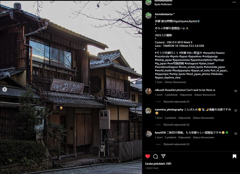
Reference image by @tomokotoamu from IG: - the second one in that post.
I found this course to be very challenging, but not because of the technical issues like perspective. This style of drawing is against all my preconceptions and assumptions. I already mentioned it in a comment on Albert's YouTube channel under one of the recent videos: I always imagined architectural drawing as something very strict and precise - think Piranesi, almost like a technical drawing. And yet, my drawings lacked life and had way too many lines. It occured to me that I was much more on the side of trying to draw everything what's really there, instead of trying to represent the effect that it has on the viewer. I like how loose the @housesketcher-style drawings are, how deliberate Albert is in being not very strict and precise, in letting air and space into the drawing by leaving white space between marker strokes, and letting lines to cross or not align even if they do align in reality. I love the space that is left in the drawings for the viewer to fill it in with who they are. Trying to do the same, to let go of the strictness, exactness and precision, to do less instead of more, was the main challenge for me in that project.
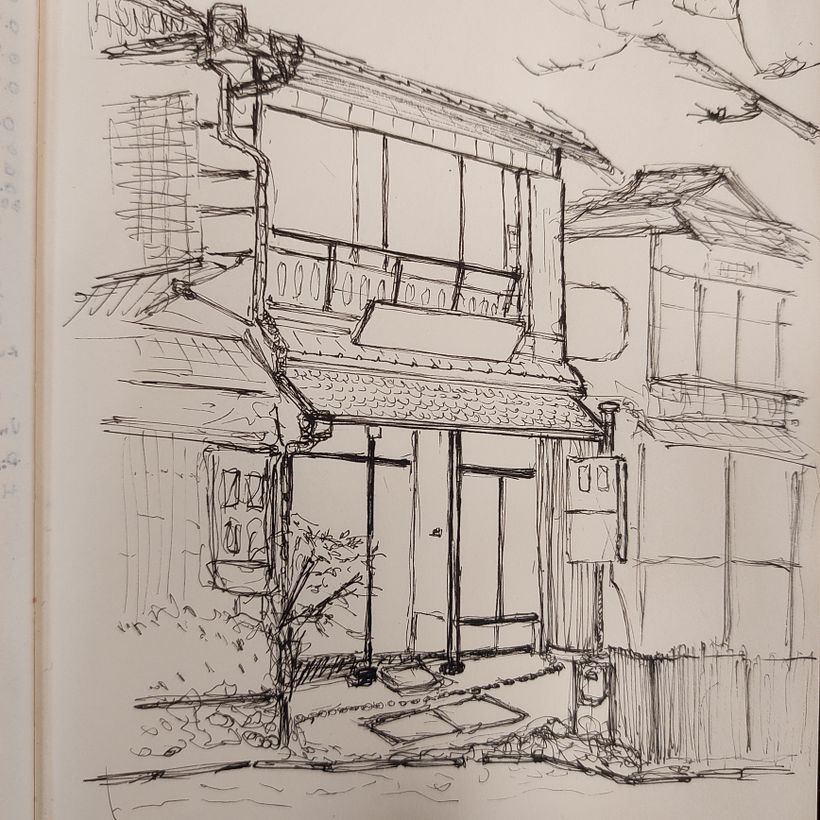
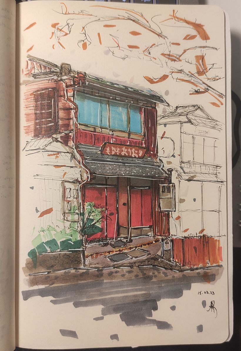
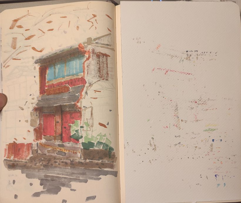
This was my first drawing in this style. Also, for the record, I started to draw only 2 months ago, so it's all still very new to me. It took me about 2.5h to complete, half of that being the black&white ink sketch, and the rest was coloring and finishing touches. I'm working with Micron fineliners - the first sketch was done with 003, some bold lines were added later with 01 and 04. I used Windsor Newton Promarkers and Probrushes and some cheap makers from the Tiger shop for greys. I use Moleskine sketchbook, but it's a plain 400p A5 sketchbook with really thin pages (80g max I think), so it bleeds like hell. On the other hand, the reverse side of the page with the picture looks really interesting in itself - I think I like it to some extent even more than the actual picture, so I attach it too :)
I didn't really think of recomposing or reimagining the picture too much, neither about the backstory - I took it more or less verbatim and treated it as a first attempt in using colored markers, blending them, trying to give some depth to the pictures. As I look at it now, I feel like I overdid pretty much everything: the sketch was too precise, the colors are not what I intended and the picture lacks the depth - what was supposed to be the shadow underneath the roofs is mainly a big patch of grey resulting from all the colors melting together (and I do remember Albert distinctly warning us against that); the white posca highlights are too bright and I wasn't really able to tone them down afterwards as much as I wanted. I think my stippling is chaotic and all over the place, distracting the viewer instead of creating the mood.
But I'm happy I made this first picture, and I'm really happy about some parts that I think are not that bad. I'm happy I was able to restrict myself from coloring the neighboring buildings. I'm pretty happy with the simplicity of the bushes on the left side. I'm super happy I was able to reproduce the markings on the sign quite close with the white posca pen. I think linework is generally OK, even if it's too much in some places (especially where I automatically went for some texture effect without waiting to give precedence to color).
All in all, I think it could be worse. I'll definitely try to do some more in that style (it would be stupid not to, given how many of those markers I already have bought...), but I think I'd pick something simpler for the next one - maybe a facade of one or two buildings, and something with more obvious and more contrasting color scheme.
Thank you, Albert, for a great course and a great adventure!


3 commentaires
housesketcher
Professeur PlusAlex ! Tout d'abord : quelle belle observation sur votre travail !! C'est un aspect tellement important de tout dessin! Et c'est exactement cette capacité qui vous donne un excellent aperçu du processus et des «prochaines étapes» pour les futurs dessins! Cela dit : ne soyez pas si dur avec vous-même !!! J'aimerais faire une comparaison que j'essaie d'illustrer un point régulièrement :
Je suis un grand fan de rock et j'adore le jeu de guitare d'Eddy Van Halen ! Il était si incroyablement expressif dans son style de jeu, voir gratuitement ! Maintenant, je n'ai jamais vraiment joué de la guitare (pas beaucoup en tout cas…) Mais je ne peux pas m'attendre à pouvoir jouer comme lui après avoir acheté une copie exacte de sa guitare, de son ampli et même de son équipement supplémentaire. Cela ne lui ressemblerait toujours pas, car ses décennies d'expérience dans le jeu me manquent. Il utilise son instrument d'une manière qui ne peut être atteinte qu'en jouant jour et nuit. Il en est de même pour les croquis. Soyez patient, continuez à travailler, vous avez pris un excellent départ et vous avez une grande capacité de réflexion !!! Le reste… n'est que pratique. Vous arriverez certainement là où vous voulez aller avec ça !!
Afficher le texte original
Masquer le texte original
a_r_kowalski
Plus@housesketcher merci beaucoup pour vos commentaires et vos encouragements !
Afficher le texte original
Masquer le texte original
housesketcher
Professeur Plus@a_r_kowalski Vous êtes le bienvenu !! 🍀
Afficher le texte original
Masquer le texte original
Connectez-vous ou inscrivez-vous gratuitement pour commenter