


Watercolor Tutorial: How To Create A Color Palette
Learn to create a color palette for your next nature-inspired illustration project with Antonia Reyes
Nature is bursting with color. A blue bird is not only blue, its feathers will mix blues and violets and spots of grey. This is why it’s important to think carefully about your color palette when drawing a subject from nature.
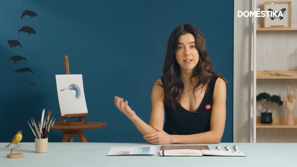
In this tutorial, illustrator Antonia Reyes (@paraiso__perdido) explains how to create your own color palette for a nature-inspired illustration project. Discover more in the video below:
6 tips for creating your own color palette
1. Learn to look at nature’s colors
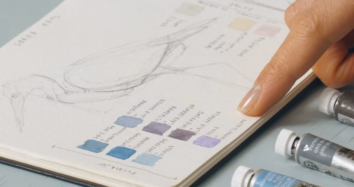
While an art shop can only offer a limited selection of colors, nature presents an infinite spectrum. Therefore, it’s important to spend time examining the different tones, undertones, and hues that you can see in your reference image. In this tutorial, Antonia Reyes has chosen to illustrate a blue heron, whose feathers are a mix of different blue, violet and grey tones. Zoom in and examine all of the colors in detail.

2. Choose colors that are most similar to those you see in your reference image
Create a list with samples of the colors you have and choose the ones that are most similar to the colors visible in your reference image. Mix different colors to create new tones.

3. Note down which colors you’ll use for each part
You should assign each part of the animal that you want to draw a color. We recommend making a guide in your sketchbook–sketch the animal and indicate which paint mix you’ll use for each section. Note down the tones you’ll use for the neck, body, feathers, feet, and details on their head… In other words, all of the elements that make up your illustration.
Don’t forget to write down how you make your colors. If you run out of a color or want to reproduce it for another illustration, your guide will remind you how.

4. Add your paint to your palette and get mixing
Once you’ve chosen the colors you’re going to use, add them to your palette. When working with watercolors, you only need a little pigment as they go far. Leave enough space between the different colors to make sure that they don’t run.

Don’t be afraid to start mixing and adding each tone to what will turn into your project’s color palette. Take your time and use the reference image of your animal as a guide for mixing colors to create new tones. Once you have a mix that has you convinced, mark it and jot down the “recipe”.

5. Fill in the rest of the color palette
Once you have decided on the blue tone that we want to use for the body, continue mixing paints until you achieve the colors you want to use for the other parts of your heron. When you have arrived at a mix you want to use, don’t forget to mark it and jot down how you made it.

6. Don’t forget: it’s just a guide
The colors that you end up using for your color palette are just a guide to help you with your project. Watercolor paints, given their characteristics, will create transparent effects and different hues depending on how you overlap colors. Don’t worry about replicating them exactly–see them simply as a suggestion to get your nature-inspired illustration project underway.

If you have enjoyed this tutorial, remember that you can learn to master watercolor techniques to capture a bird’s feathers, shapes, and magnificent colors in Antonia Reyes’ online course, Naturalist Bird Illustration with Watercolors.
You may also like:
Botanical Watercolor for Patterns, a course by Isabela Quintes
Negative Watercolor Painting for Botanical Illustration, a course by Cristina Cilloniz.
Botanical Illustration with Watercolors, a course by Paulina Maciel


0 comentarios