7 Typography Mistakes Designers Should Avoid

Typography plays a significant role in design, as it can enhance the readability and visual appeal of any project. However, even the most skilled graphic designers can fall victim to typography errors. Let’s take a look at the most common mistakes and how to avoid them.

Common typography errors designers should avoid
Typography is a crucial aspect of design, and avoiding common errors is essential for creating visually appealing and readable projects.
1. Using too many fonts
Using too many fonts in a design can have a significant impact on its overall appeal and coherence. When an excessive number of fonts are used, it can result in an inconsistent style and visual discord within the design. This can confuse the audience.
One of the main issues with this is it can make the design look cluttered and overwhelming. Each font has its unique characteristics, such as weight, style, and spacing, which can create a jarring effect when they are combined haphazardly. This can disrupt the visual hierarchy and make it difficult for the audience to navigate the design.
Establishing a consistent style and limiting the use of different typefaces to two or three choices helps create a cohesive and harmonious design. Thus, it becomes easier to maintain a consistent visual identity throughout the design project. This allows for a more unified and professional look.

2. Text Is centred in the wrong places
Centred text can be visually appealing and add a touch of elegance to a design. However, it should be used sparingly and with thoughtful consideration. When used incorrectly, centered text can create typographic errors and hinder readability.
One common mistake is centering long paragraphs of text. While it may seem visually balanced, centered text in long paragraphs can make it difficult for readers to follow the flow of the text. The uneven line lengths disrupt the natural reading rhythm and can strain the reader's eyes.
In terms of readability, left-justified text is preferred. The predictable left alignment allows readers to quickly locate the beginning of each new line, leading to a smoother reading experience. Left-justified text also makes it easier to scan and find specific information within a paragraph.
There are instances when centered text is appropriate, such as in short headings or titles. It can create emphasis and draw attention to key elements. However, even in these cases, it's important to ensure that the centered text aligns with the overall design and doesn't create confusion or hinder readability.

3. Not considering hierarchy
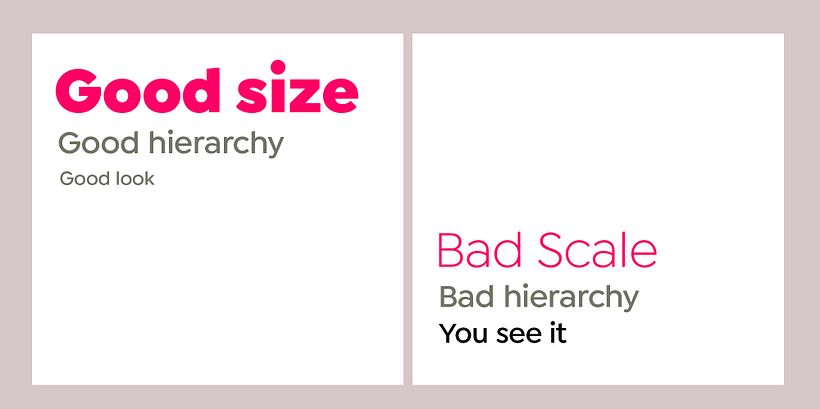
In typography design, one of the most important considerations is hierarchy. This design principle plays a critical role in guiding readers and viewers to focus on the most important content first and then shift their attention to secondary information.
Ignoring hierarchy can lead to a cluttered and confusing design. Without clear visual cues, readers may struggle to differentiate between important and secondary information, resulting in a poor user experience.
On the other hand, a well-executed hierarchy allows designers to strategically emphasize key elements. By utilizing differences in font size, weight, color, or spacing, designers can create a visual hierarchy that guides readers through a piece of content. This ensures that the most important information is easily noticed and digested.
Consider a news article, for example. The headline, typically set in a larger and bolder font, immediately catches the reader's eye. This serves as a visual cue, signaling that it is the most important element on the page. Subheadings, in a slightly smaller font size, further divide the text into sections and help readers navigate through the content.

4. Forgetting to proofread
Forgetting to proofread can be a costly mistake when it comes to typography. Even with visually stunning typefaces, typos and grammatical errors can quickly undermine the credibility of a design.
When working with text, it's essential to take the time to review and revise all content. Proofreading ensures that any mistakes or inconsistencies are corrected before the final product is presented to the audience.
Reading the entire piece out loud can be an effective way to catch errors that may have been missed during silent reading. This technique is especially useful for longer manuscripts, where it's easy to overlook small typos or grammatical errors. Breaking the reading into chapters or sections and pausing to listen for mistakes after each break can help maintain focus and improve accuracy.

5. Unnecessary typeface stretching
Unnecessary typeface stretching is a common typography error that can have a detrimental impact on the overall design. This mistake occurs when designers stretch letterforms beyond their natural width or height in an attempt to make the font look larger or more spacious.
One of the main problems that arise from unnecessary typeface stretching is compromised legibility. When letterforms are stretched, their proportions become distorted, making it harder for readers to decipher the text. This can lead to a frustrating reading experience and may cause readers to lose interest or abandon the content altogether.
Readability is also affected by this error. Stretched letterforms can disrupt the natural flow of the text, making it difficult for readers to follow along. The inconsistent spacing and proportions can create visual inconsistencies, further exacerbating the readability issues.
Professional graphic designers understand the importance of maintaining the integrity of typefaces and respecting their inherent design. By stretching letterforms, designers disregard the intended proportions and aesthetics of the typeface and this practice can lead to an inconsistent and visually unappealing design.

6. Contrast
Inadequate contrast in typography can have a significant impact on both readability and visual hierarchy. When text and background tones are too similar, it becomes difficult for readers to distinguish between the two. This can result in a frustrating reading experience and may cause readers to abandon the content altogether.
For example, choosing colors that are too close in tone can make it challenging for the text to stand out against the background, especially for individuals with visual impairments. Similarly, using a tinted semi-transparent background can diminish the contrast and make the text harder to read.
To ensure readability, it is crucial to stress the eyes by providing enough contrast between the text and the background. This helps the reader to easily identify and comprehend the content. By selecting colors with adequate contrast, designers can improve the legibility of the text, making it easier for readers to follow along.
In terms of visual hierarchy, contrast plays a crucial role in guiding the reader's attention. B
y using contrasting colors for headers, subheadings, and body text, designers can create a clear hierarchy and facilitate content navigation. This helps readers to quickly scan and understand the information presented.

7. Abusing capital letters
Abusing capital letters in typography is a common mistake that can significantly impact the effectiveness of communication. While capitalizing letters is appropriate and necessary in certain instances, such as at the beginning of sentences or for proper nouns, using capital letters excessively throughout the body of the text can create negative connotations and disrupt the intended message.
One primary concern with the overuse of capital letters is the appearance of yelling or anger. When text is written entirely in capital letters, it can give the impression that the writer is shouting or expressing strong negative emotions. This can inadvertently convey a hostile tone and create a barrier in interpersonal communication.
Furthermore, it can dilute their impact when they are genuinely meant to emphasize a particular point. By resorting to capitalization for every other word, the intended emphasis becomes lost, and the text loses its impact.
As a general rule of thumb, it is advisable to use capital letters sparingly and purposefully. They should be reserved for situations where true emphasis is necessary, such as headings or important keywords.
Conclusion
In conclusion, understanding and avoiding typography errors is essential for any designer striving to create visually appealing and professional work. Identifying and rectifying common typography mistakes, such as poor font usage or typographical errors, can significantly enhance the overall quality of a design project.
Master typography principles with our course 'Basics of typography from A to Z', and watch your designs become visually appealing and powerful communicators.
You may also like:
- 8 typography examples
- Books about typography to inspire you
- How to become a graphic designer


0 comentarios