Love and Unite with Pride
by Oksana Vusyk @oksanavusyk
- 20
- 4
- 1
Introduction
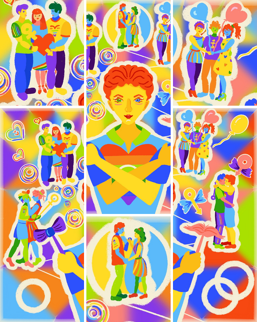
The contest topic brought up by Domestika this month was pretty challenging and that's why it's so exciting for me. Living in a country with mostly conservative views, neither I nor my social environment have first-hand experience of pride or fighting for the right to be accepted. Still, I know how important it is to be the person you are all the time and not to pretend while inventing another, "acceptable" identity. Also, I am usually not into drawing people, so this seems to be a step towards artistic development. This illustration depicts different types of love with the focus on self- (and only self) love: being just a person who does not experience romantic feelings toward other people is also a possible and not less fascinating way to live.
Supplies
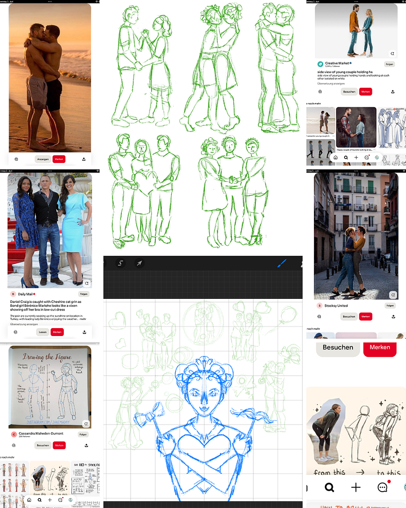
Pinterest – for inspiration; Procreate – for main execution; Canva – for creating a collage.
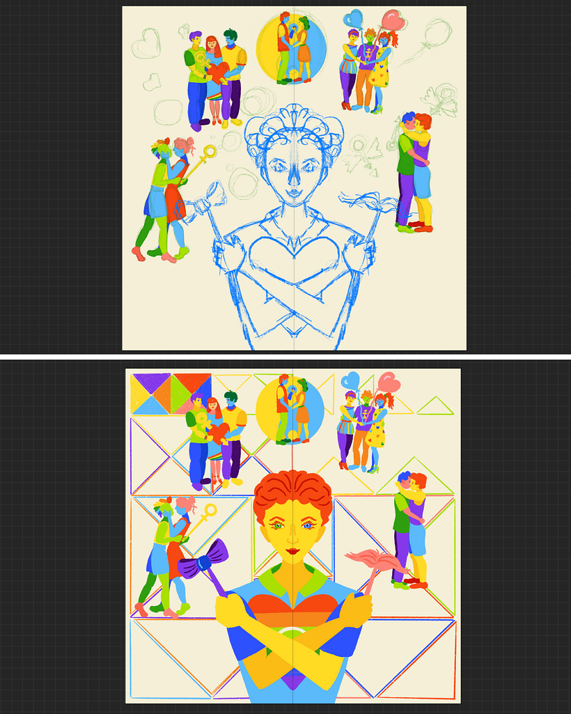
Sketching the Idea
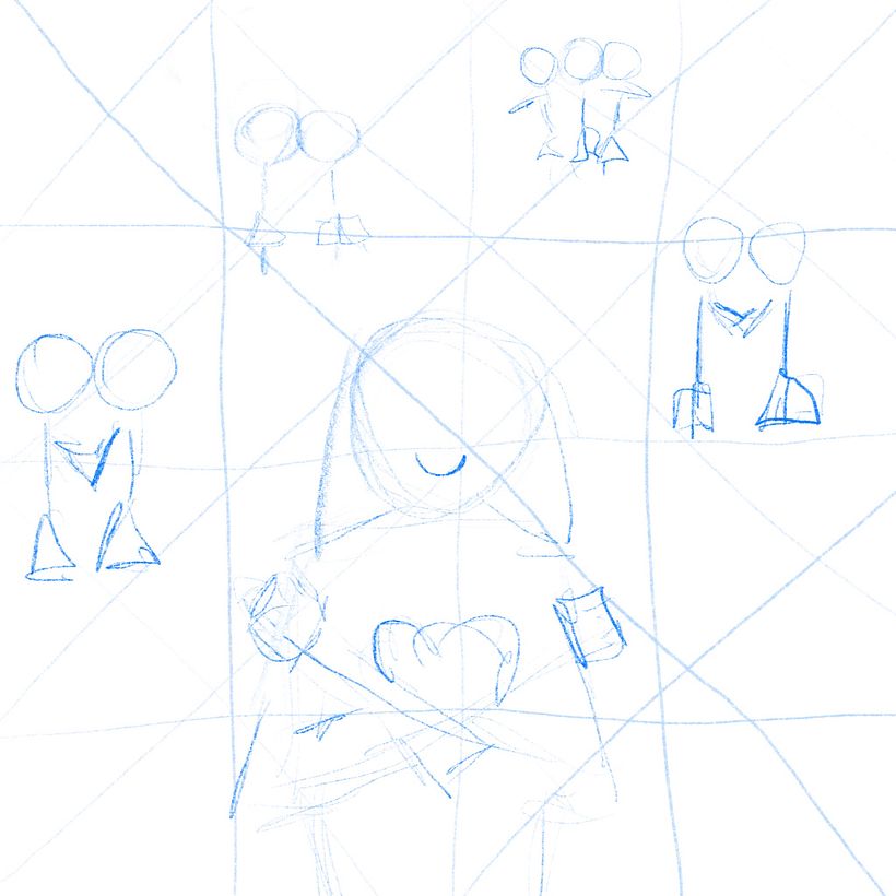
I got this image in my head suddenly, while doing housework. So, it was crucial to sketch the main concept without researching much or distracting by others' artworks.
Sketching the Main Character
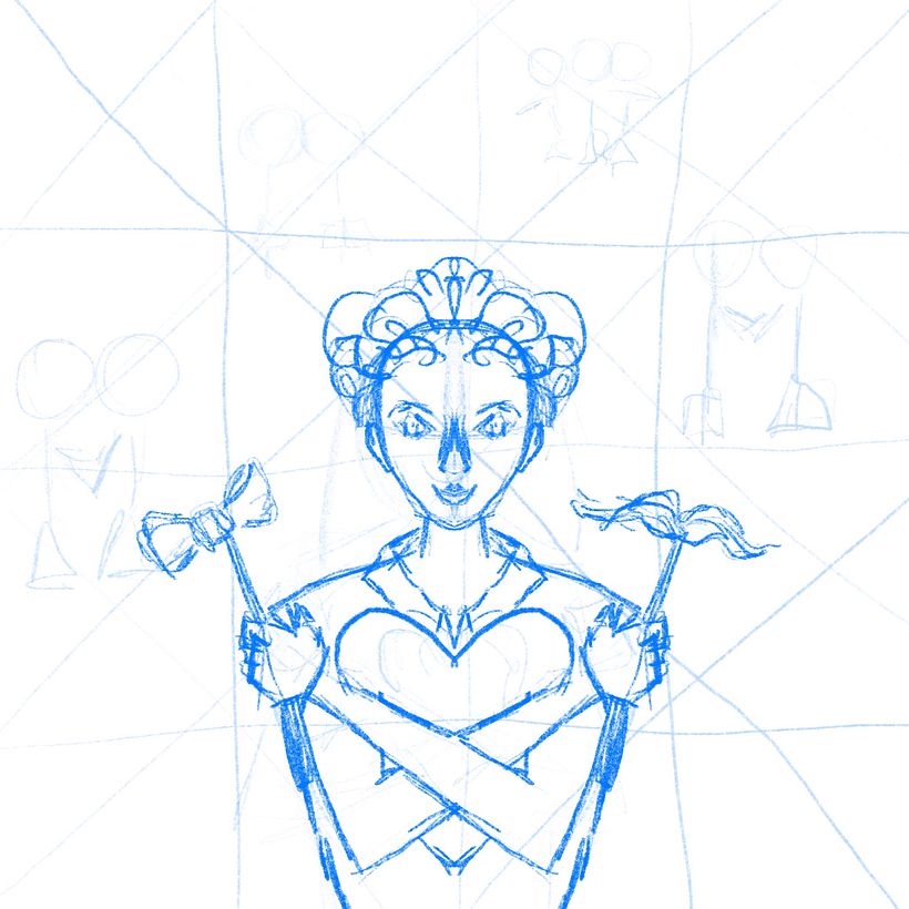
At the next step, I wanted to focus on the character central to this artwork. I decided to make it symmetrical and used a Symmetry Guide help available in Procreate.
Finding and Drawing the Models
Now, that I understood what types of postures I would need to draw, I started researching for the reference models. Then, I sketched them quickly without getting into much detail, as far as I knew I would use the simplest shapes.
Painting the Figures
Finally, the real fun came: I got to paint people, and I made up their clothes and accessories almost on the way. I used unusual colours for skin and hair to emphasise diversity and the unlimited choices one can make in their life. Also, I added some gender-related symbols to support the main topic of the illustration.
I used the only brush: Dry Ink, size 5%; and all colours of the rainbow:
lemon-yellow #ffdb24
honey-yellow #fbbc15
orange #f6851b
bright-red #f64810
crimson-red #cc1203
rose-pink #fc8476
darker-pink #f7614a
light-blue #5bbafa
ultramarine-blue #2d51fd
lime-green #aae001
grass-green #2f9e0e
neon-purple #8538e9
dark-purple #430a68
and butter-yellow for the background and further outlines: #f5efd8.
Painting the Background
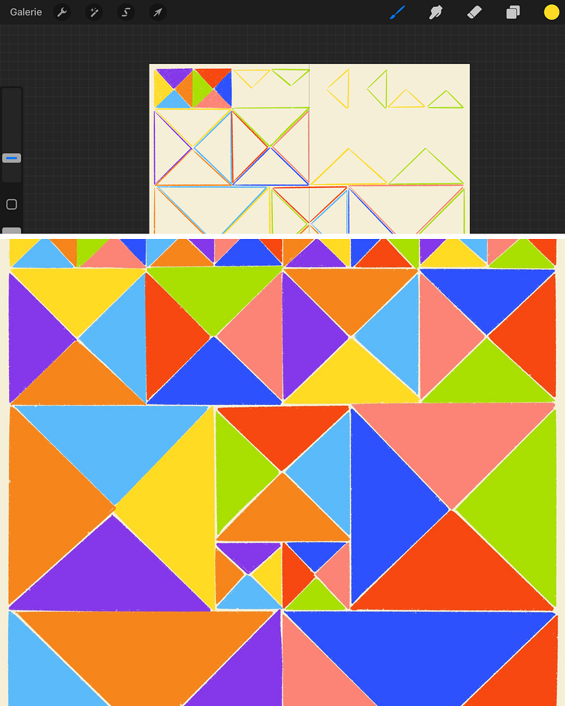
As soon as my characters got their colour, I realised the emptiness of the space around them. So, I designed a triangular background in the same rainbow colours. This mosaic symbolises the unity of different pieces and various combinations, in which they can be coupled. Moving from the smallest shapes in the top to the biggest in the bottom, I created an illusion of perspective that will be handy in the next steps.
Adding Final Touches
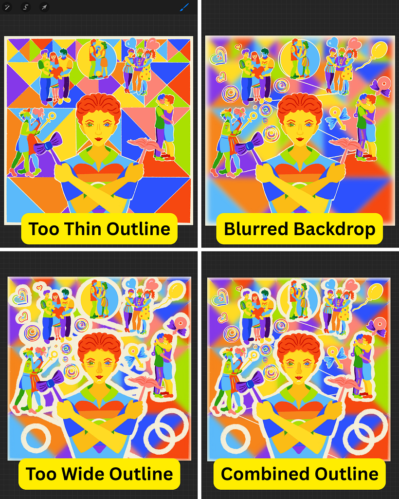
When the background was ready, I found out that the characters blend with it. So, first I outlined them with thin white contour. Also, I connected them with a diagonal line to strengthen the perspective effect. Then, I blurred the background with Gaussian blur. When I saw this didn't help much, I experimented with the width of the outline, finally stopping at widening the outline for the characters and thinning the outline for the additional symbols. That improved the perception, however, something was still missed out.
Creating a Collage
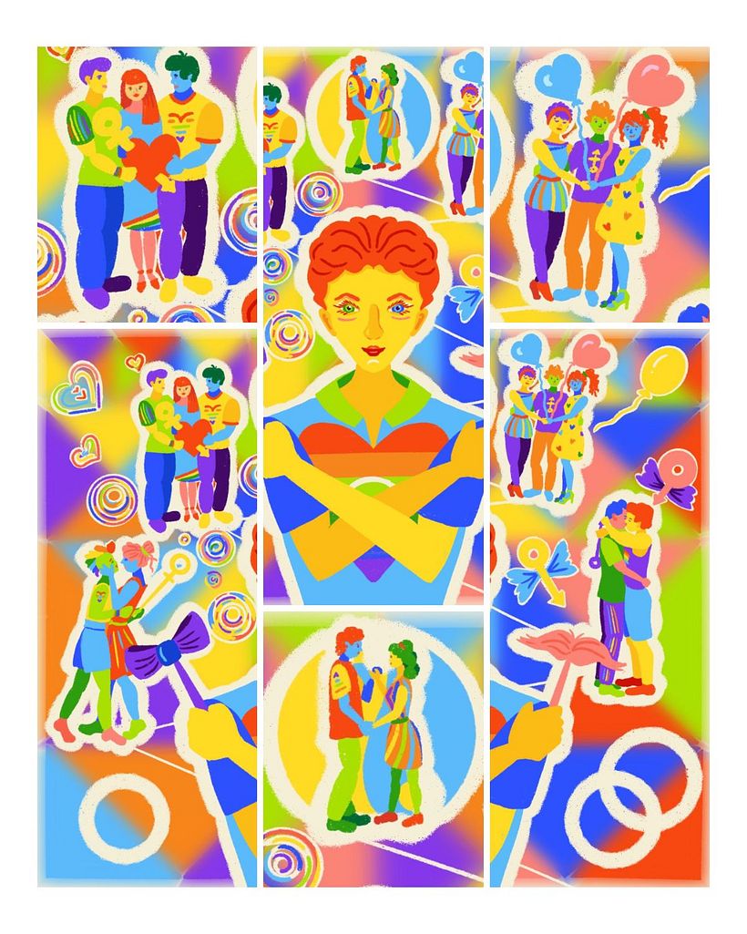
Still struggling and endlessly zooming in and out, I found out that separately all the characters look well. So, the problem was in composition. Taking into account that all the painted details (like body parts, clothes, symbols, etc.) were in different layers, changing the composition was not an easy option. And then I decided to leverage this fault and decompose the illustration into pieces to unite them further into a collage! And here it is: bright, powerful, and engaging.
Below I added the creation video, so you can more easily follow the process. I hope you enjoy it, just as I did! And thank you for your interest to my work!


1 comment
regiglezz
PlusI love how unique the illustration is!
Log in or join for Free to comment