Course project
Meu projeto do curso: Criação de infográficos: combine arte e dados
Meu projeto do curso: Criação de infográficos: combine arte e dados
by Pedro Baleroni @gutobale
- 111
- 3
- 2
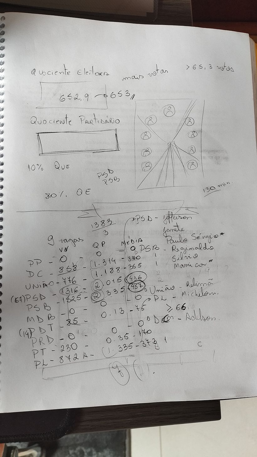
Com os resultados das eleições recem realizadas, queria algo mais educativo sobre o processo de escolha dos vereadores da minha cidade, algo com dominio público, e com informações não tão explícitas, então escolhi o tema para realização do meu infográfico.

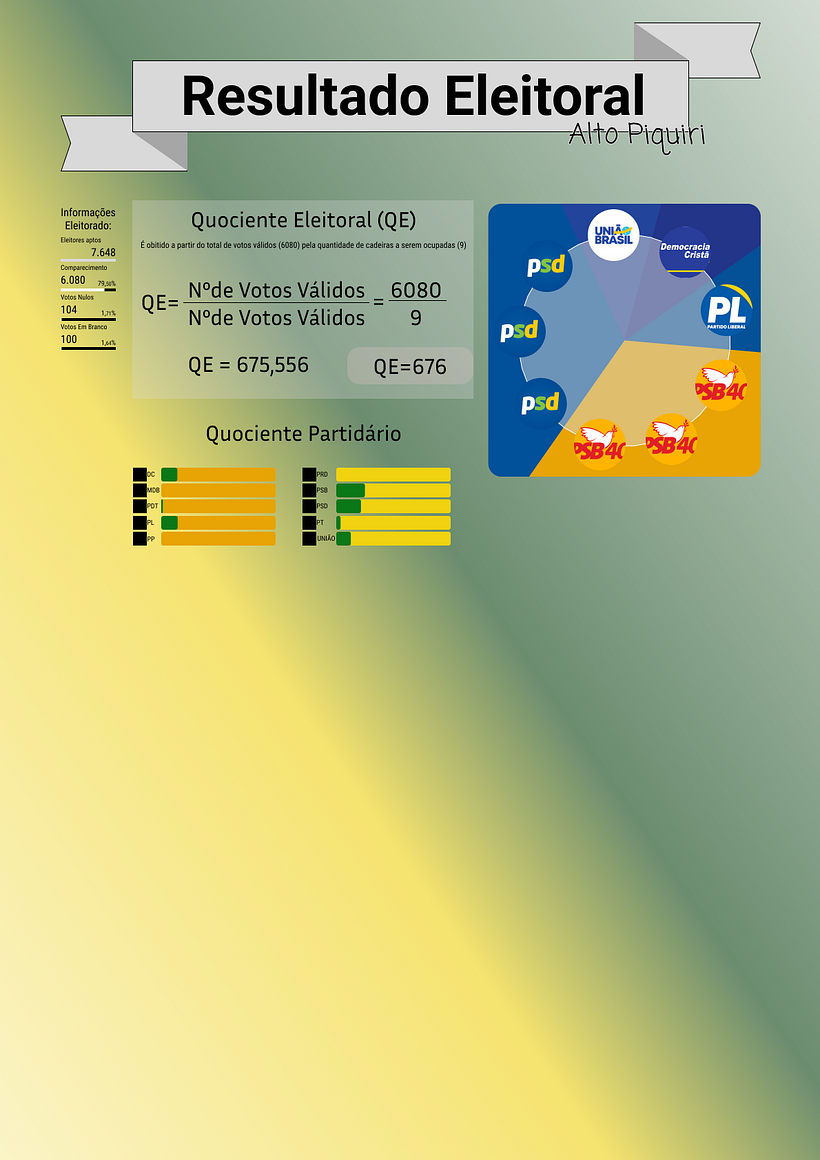
Com o esboço em mão, foi hora de agrupar no figma, não tinha todas as referências em mãos ainda, e precisava filtra muito dos dados obtidos.

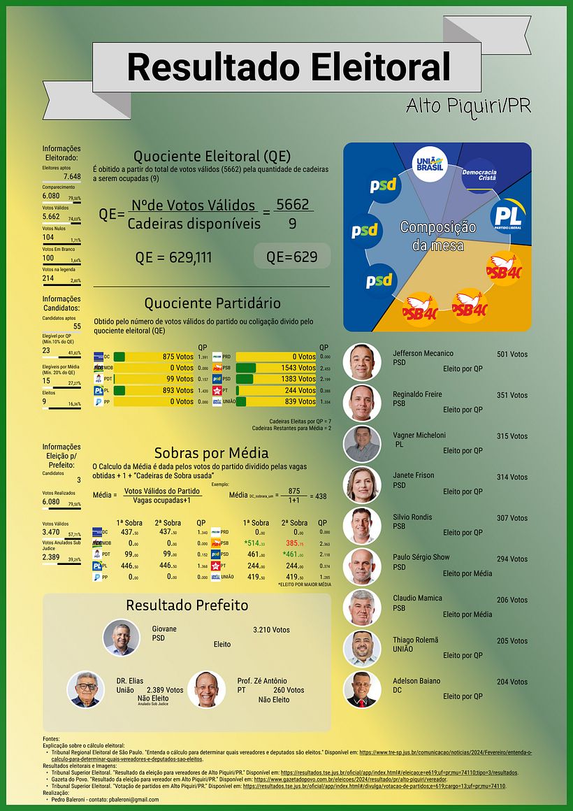
O final do projeto foi esse, utilizei as cores de outras divulgações do eleitoral como referência, o estilo artístico e equilibrio de informações ainda não foram 100% do meu agrado, mas acredito que atendeu minha expectativa e cumpriu o seu objetivo.

P.s. O projeto foi divulgado e utilizado como parte educativa pelo eleitorado da minha cidade.

2 comments
Very good, Pedro ☺️ Your project reminded me a lot of Dashboard design due to the composition and alignment of data. This is where and when we have access to more complex information.
For me, the three most important pieces of information are, in order: 1. Elected mayor (perhaps a direct title would be easier for the reader to absorb); 2. Composition of the board; 3. Councilors (or you can reverse this and put councilors at the top, since it is the priority, and the mayors at the bottom as tertiary information).
'Information about the electorate' and 'Information about the candidates' are also very important to show the scenario of the elections, so in this case the 'Electoral and Party Quotients' can also be moved down a point in the hierarchy because they actually emphasize the methodology, but they do not necessarily bring the information that the voter needs. What do you think?
I really liked the colors, the content respecting sources and methods, the photos to bring what the reader needs – which is to recognize the verbal and visual content – and the column layout applied. Your page is very well thought out! Congratulations on the project!
@thalesmolina Thanks for the points! I really liked the suggestions.
First, I appreciate that you noted the influence of a dashboard, as that was my inspiration. The information was based on a data analysis course I teach.
My only caveat is regarding the educational aspect that I intend to emphasize. Although the information about the mayor is more relevant in the context, my intention was to highlight how the seats are calculated and other issues regarding the councilors, since this is a recurring question that I have observed.
As for the other points, I will incorporate them into the draft, including the suggestions on hierarchies. In addition, I would like to add more details on the composition of the electoral board, such as the "percentage of women candidates" and the distinction between "re-elected and non-elected councilors", topics that I have still had difficulty presenting adequately.
Log in or join for Free to comment