Course project
My project for course: Color Theory: Exploration & Application
by Nick @nicktheartist
- 223
- 5
- 2
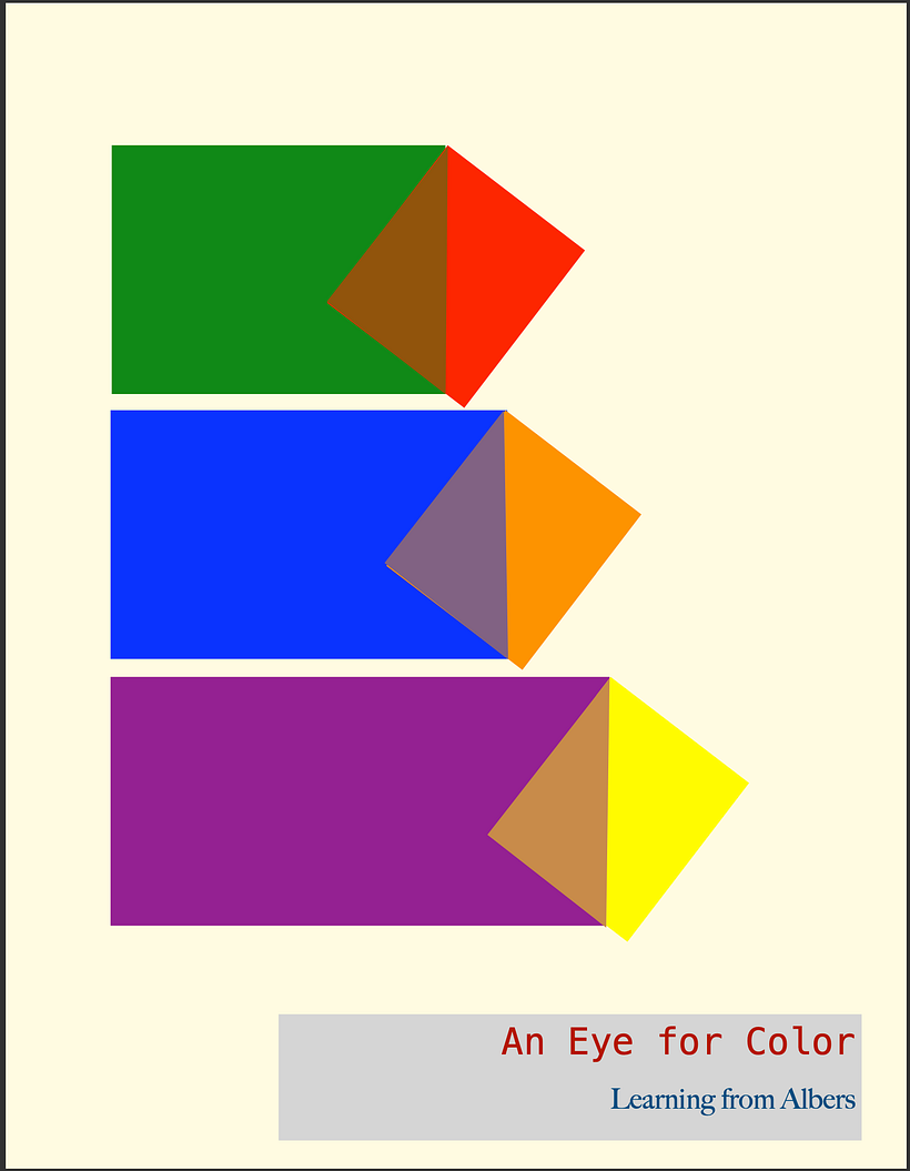
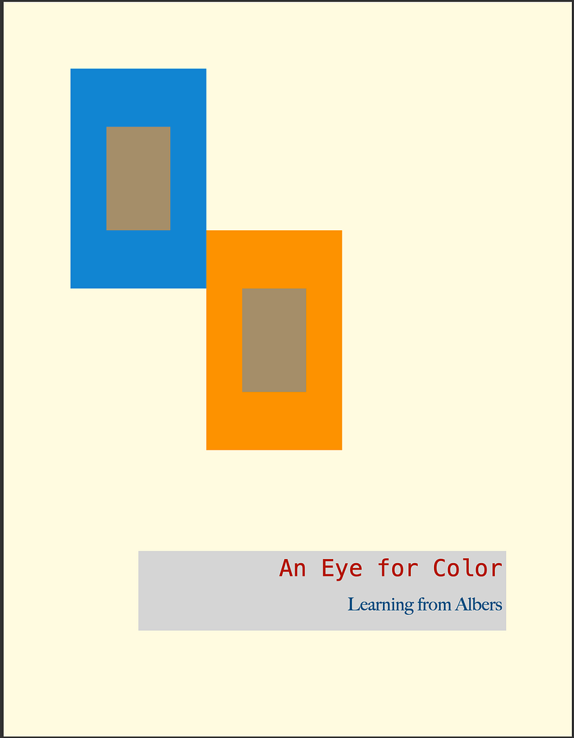
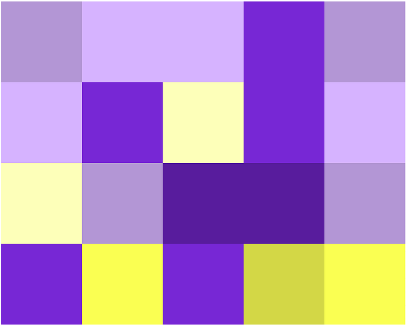
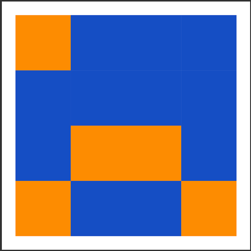
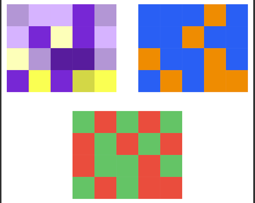
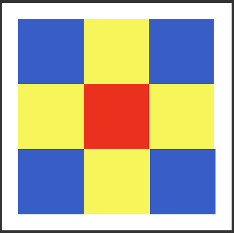
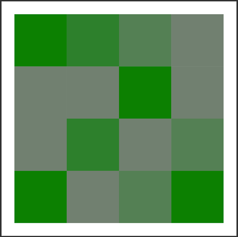

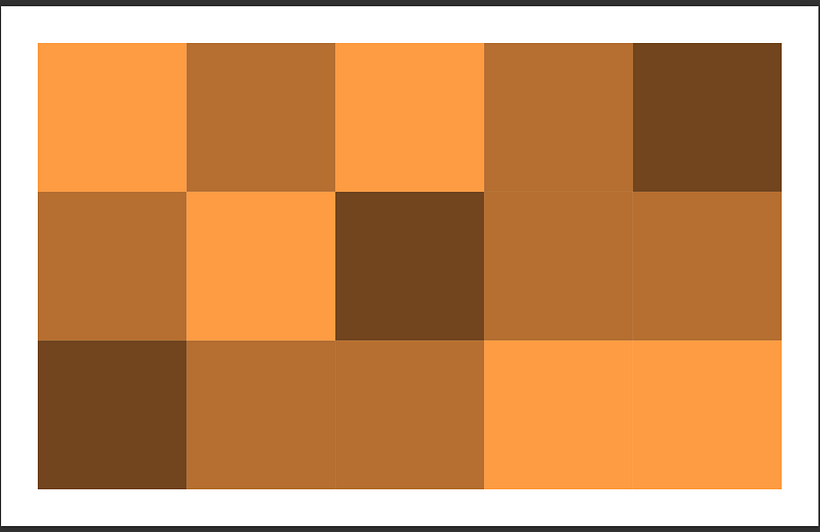
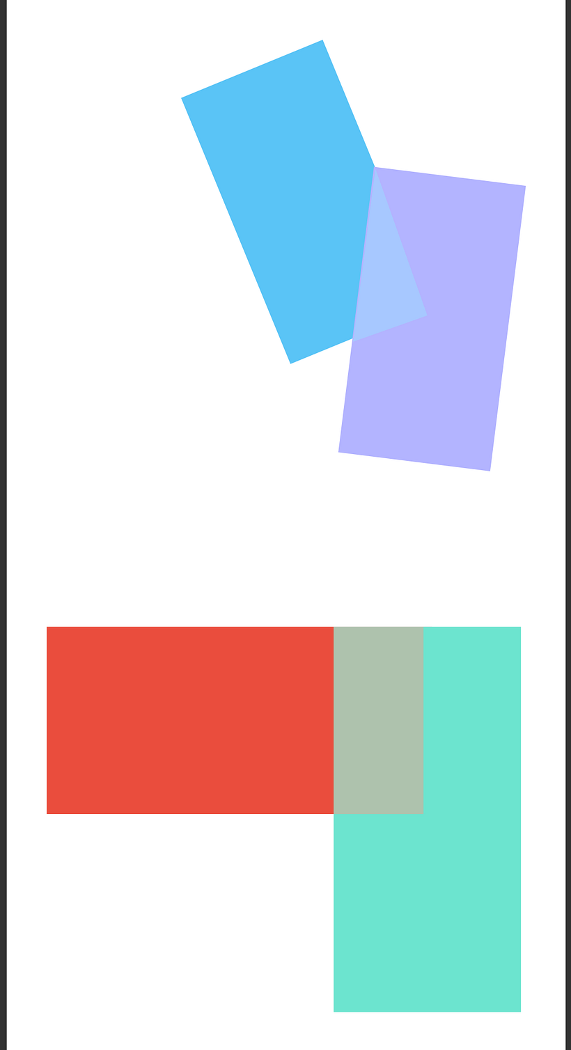
Some personal notes of mine while taking this course
- I used Freeform and Pages on macOS Sonoma 14.3. I don't have any Adobe software, but I am glad I could use those programs.
- I do not wish to pursue graphic design, but I know this course will help with my painting compositions. I hope that if you are a fine artist, please consider taking this course.


2 comments
richardmehl
Teacher PlusExcellent work Nick! I love the transparency illusion imagery on the poster. But I wonder about the bright yellow on the cream colored background... the contrast effect is very different compared to the red and orange, which have similar contrast against the background. My instinct is to go for unity--three colors with similar contrast to the background. Or, three colors with 3 different levels of contrast, perhaps in a progression. Color grids look good too. I'm happy that you enjoyed the class!
nicktheartist
PlusThank you Richard! Yes, I really enjoyed the course. I hope that all artists take it. I did second guess the cream colored background after posting. Initially, my thought was to go neutral but not to use gray. I will take your advice and play with contrasts, especially with the background. A question I have is, is it better to choose the background color first, then the foreground colors?
Thank you again!
Log in or join for Free to comment