
Discover what each type of font tells us and how to choose the right one for your project
In this online course, discover the ins and outs of selecting fonts for your work alongside graphic designer Enric Jardí. As a font and publishing expert, Enric guides you through the world of fonts from a unique perspective, leaving the lengthy lists of parts and classifications behind. Understand the origins and evolution of fonts, as well as how to choose, combine, access, and manage them to become an expert at choosing the perfect font.
What will you learn in this online course?
17 lessons & 3 downloads
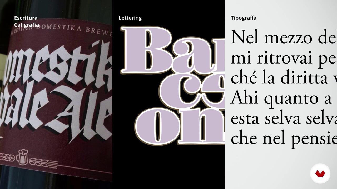
Choose a way to write the words
10 minutes, 12 seconds
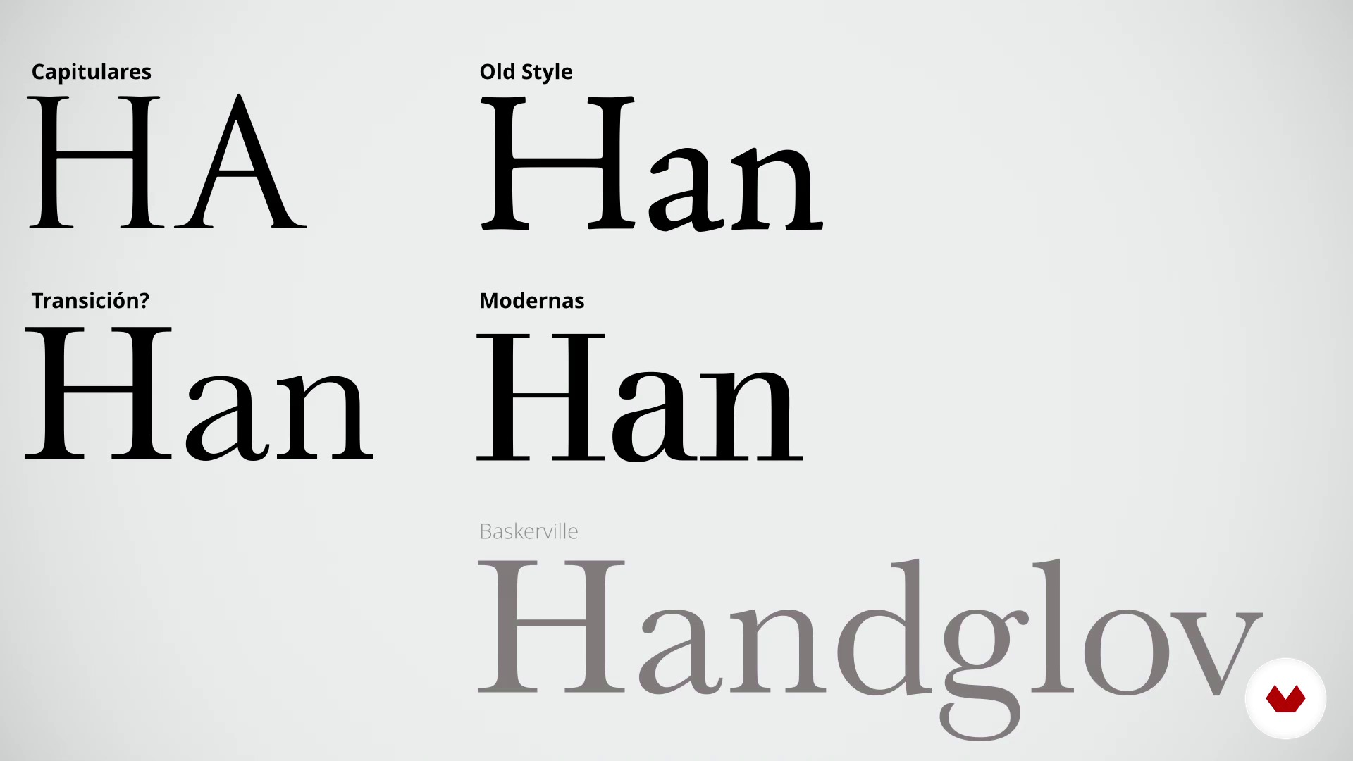
How should we look at the letters
15 minutes, 16 seconds
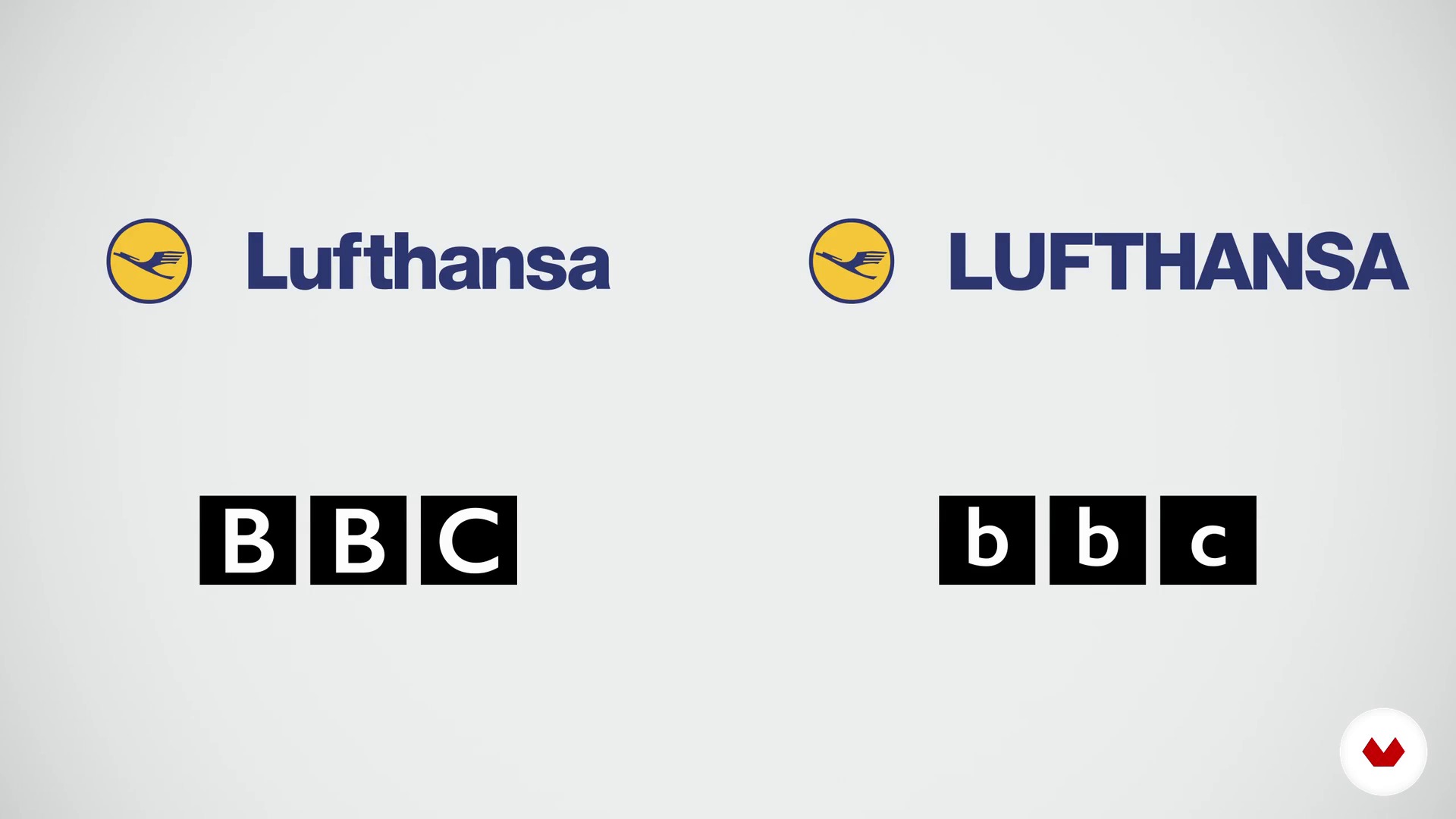
Readability: uppercase and lowercase
12 minutes, 43 seconds
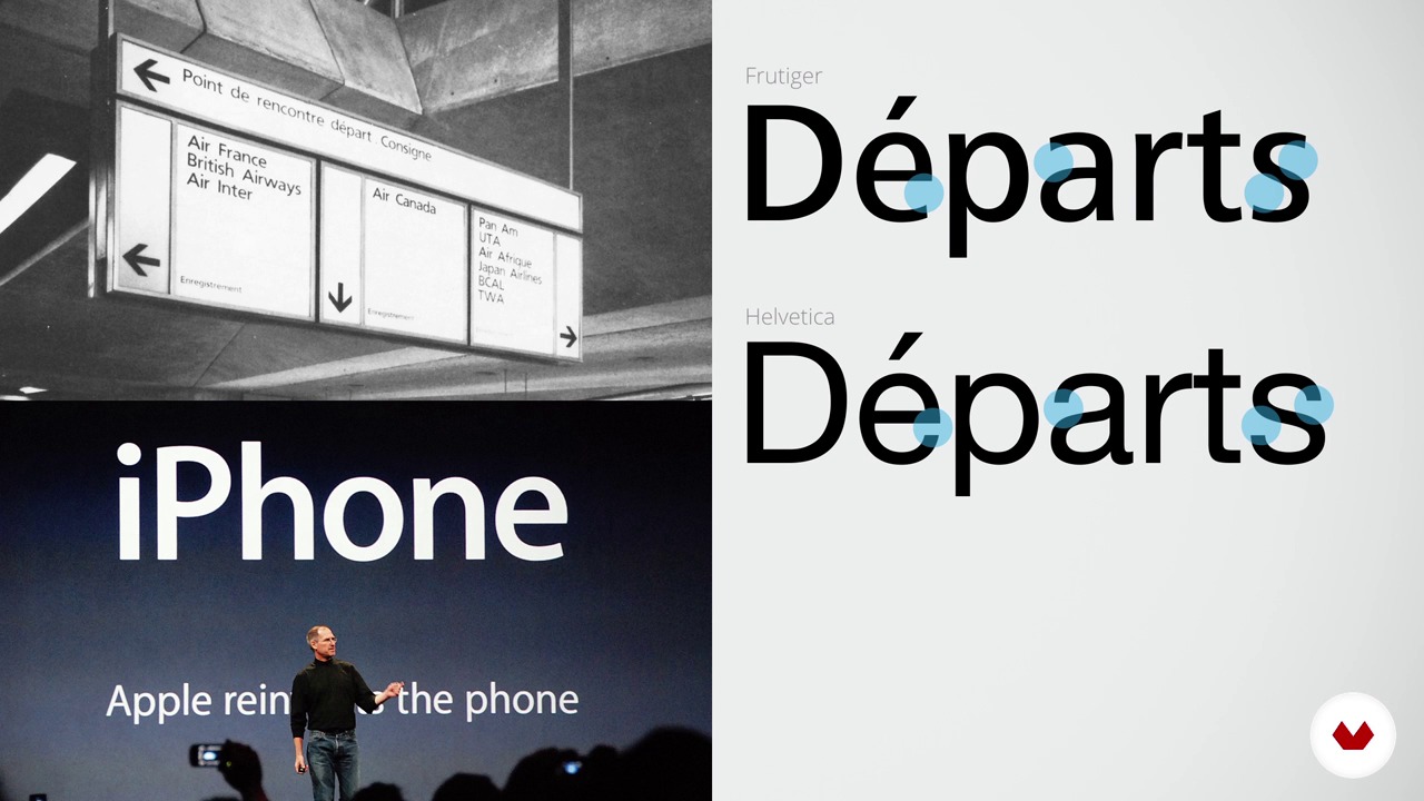
Legibility: small texts and large texts
9 minutes, 7 seconds
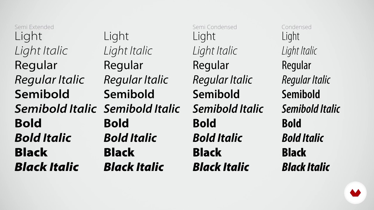
The family
12 minutes, 19 seconds
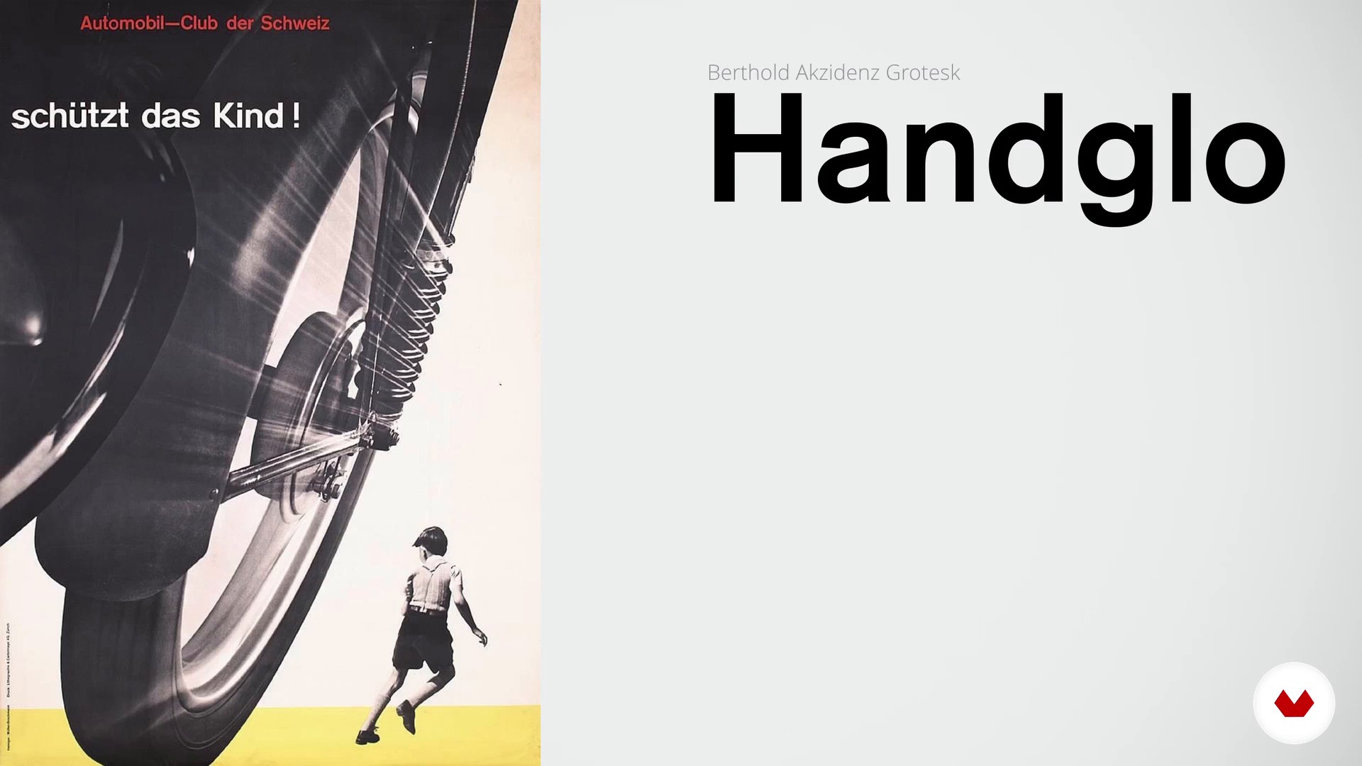
The letters of the twentieth century
16 minutes, 16 seconds
What's included in this course?
Start by getting to know Enric Jardí, his work, and his influences.
Next, analyze a text by understanding how it's constructed and distinguishing editable and non-editable texts.
Gain a deeper understanding of key concepts like legibility, capital and lowercase letters, and small and large text. Then, expand your knowledge of different font families by reviewing the history of letters from the 20th century and the different characters of the alphabet. Enric also offers insights into the best fonts for both paper and screen.
Finally, discover what OpenType is and how to combine fonts while avoiding the most common mistakes. Round out the course by taking a closer look at some real-life projects and review practical and legal information regarding the use and management of fonts on your computer.
What is this course's project?
Put everything you learn into practice by choosing a series of fonts for a newspaper publication, working with a complex, flexible hierarchical structure.
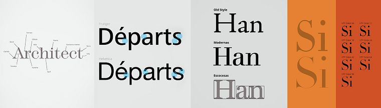
Projects by course students


Who is this online course for?
Graphic design and publishing professionals who regularly work with digital or printed fonts, as well as those who don’t have much experience but are looking to learn more about fonts and their function.
Requirements and materials
No special knowledge of fonts is required as this course covers the fundamentals. However, the course does include useful tips regarding text management in InDesign, Illustrator, and MacOS for professional graphic designers.
HOW DO DOMESTIKA COURSES WORK?
Domestika’s online courses guide students toward completing a final project that they can upload and receive feedback on from a vast creative community.
Through video lessons that can be accessed at any time, teachers explain techniques and offer tips to provide you with the necessary skills to carry out your project.
Once you've purchased the course, you can start it whenever and wherever you want. There are no due dates or end dates for the course.
The idea is to learn at your own pace, fostering a long-lasting connection with your course community.

Reviews
- 3 months ago
Me pareció muy interesante, muchas bases que no conocia, y definitivamente muy util
- 4 months ago
Muy buen curso practico, me ayudo a entender aspectos de mi carrera que no entendia
- 6 months ago
Un excelente curso para iniciarse en el mundo del diseño gráfico, excelentemente explicado.
- 6 months ago
Me encanta este curso, segunda vez que lo veo
- 6 months ago
Buen curso

He is passionate about lettering and typography. He has published several books, including Veintidós consejos sobre tipografía (que algunos diseñadores jamás revelarán) y veintidós cosas que nunca debes hacer con las letras (que algunos tipógrafos nunca te dirán) and Pensar con imágenes, which have both been translated into several other languages.
Enric combines his professional career with teaching at multiple academic centers such as the Universitat Autònoma de Barcelona, the Blanquerna foundation, the Universitat Ramon Llull in Barcelona, ELISAVA, the Universitat Pompeu Fabra in Barcelona, the University of Lapland in Finland, and IDEP Barcelona.
He was president of the Association of Art Directors and Graphic Designers ADG-FAD for several years and has received several awards for his professional work in the field of design, including: a European Design Award, a Laus, a D&AD Award, and a Malofiej for infographics and the National Culture Award in the design category, granted by the Generalitat de Catalunya.
Content
- U1
Introduction
- Presentation
- Influences
- U2
How is the text
- Choose a way to write the words
- How should we look at the letters
- Readability: uppercase and lowercase
- U3
Choose fonts
- Legibility: small texts and large texts
- The family
- The letters of the twentieth century
- The characters of the alphabet
- Types for screen
- U4
More reasons to choose fonts
- What the types tell us
- More types that tell us things
- Combine types
- Other letters you should know
- How to obtain and manage sources
- U5
Two case studies
- Letters for a logo
- Letters for a newspaper
- FP
Final project
- How to choose fonts
What to expect from a Domestika course
Learn at your own pace
Enjoy learning from home without a set schedule and with an easy-to-follow method. You set your own pace.
Learn from the best professionals
Learn valuable methods and techniques explained by top experts in the creative sector.
Meet expert teachers
Each expert teaches what they do best, with clear guidelines, true passion, and professional insight in every lesson.
Certificates
PLUSIf you're a Plus member, get a custom certificate signed by your teacher for every course. Share it on your portfolio, social media, or wherever you like.
Get front-row seats
Videos of the highest quality, so you don't miss a single detail. With unlimited access, you can watch them as many times as you need to perfect your technique.
Share knowledge and ideas
Ask questions, request feedback, or offer solutions. Share your learning experience with other students in the community who are as passionate about creativity as you are.
Connect with a global creative community
The community is home to millions of people from around the world who are curious and passionate about exploring and expressing their creativity.
Watch professionally produced courses
Domestika curates its teacher roster and produces every course in-house to ensure a high-quality online learning experience.
FAQs
You’ll learn how to select, combine, and apply typefaces in editorial projects, create visual hierarchy, improve readability, and develop criteria for choosing the right fonts for books, magazines, newspapers, covers, and branding.
The course is designed for people with basic graphic design knowledge, making it ideal for intermediate learners. If you have prior experience in design or typography, you’ll get even more out of it.
Basic knowledge of tools like InDesign and Illustrator is recommended, as they’ll be used for practical exercises in composition and typographic adjustments.
You’ll need a computer with access to design programs like Adobe InDesign and Illustrator, plus digital font libraries. Having a sketchbook and scanner can be helpful if you want to experiment with hand lettering.
You’ll learn to create hierarchical typographic systems to organize information, set styles for headlines, subtitles, and body text, and enhance readability in periodicals.
Yes, the course covers criteria for selecting and combining typefaces in logo creation, visual identity, and branding elements, taking into account trends and communication consistency.
The course distinguishes each discipline: typography as digital letter design, lettering as hand-drawn letters, calligraphy as manual writing, and hand lettering as artistic letter composition.