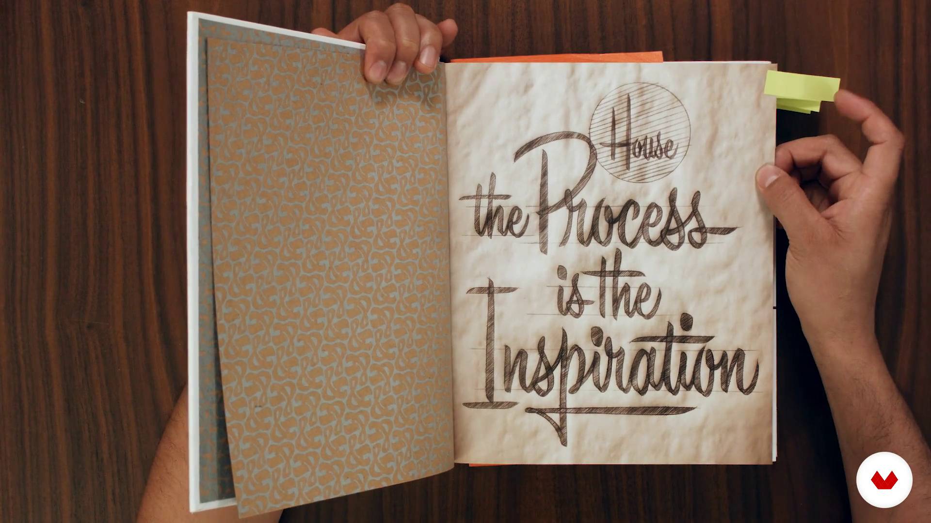
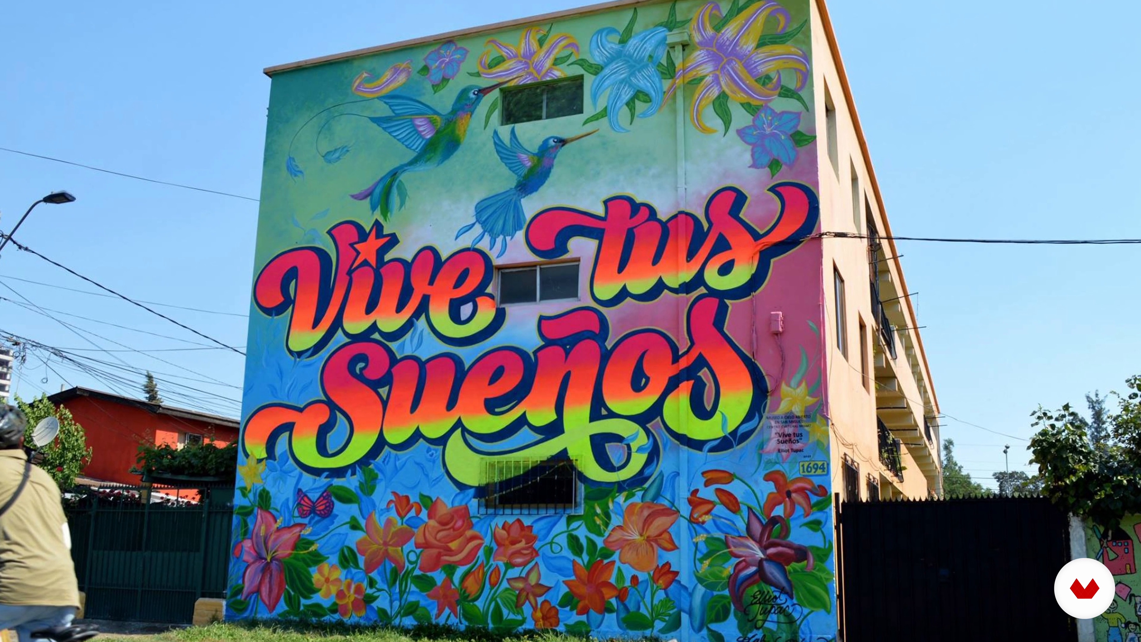
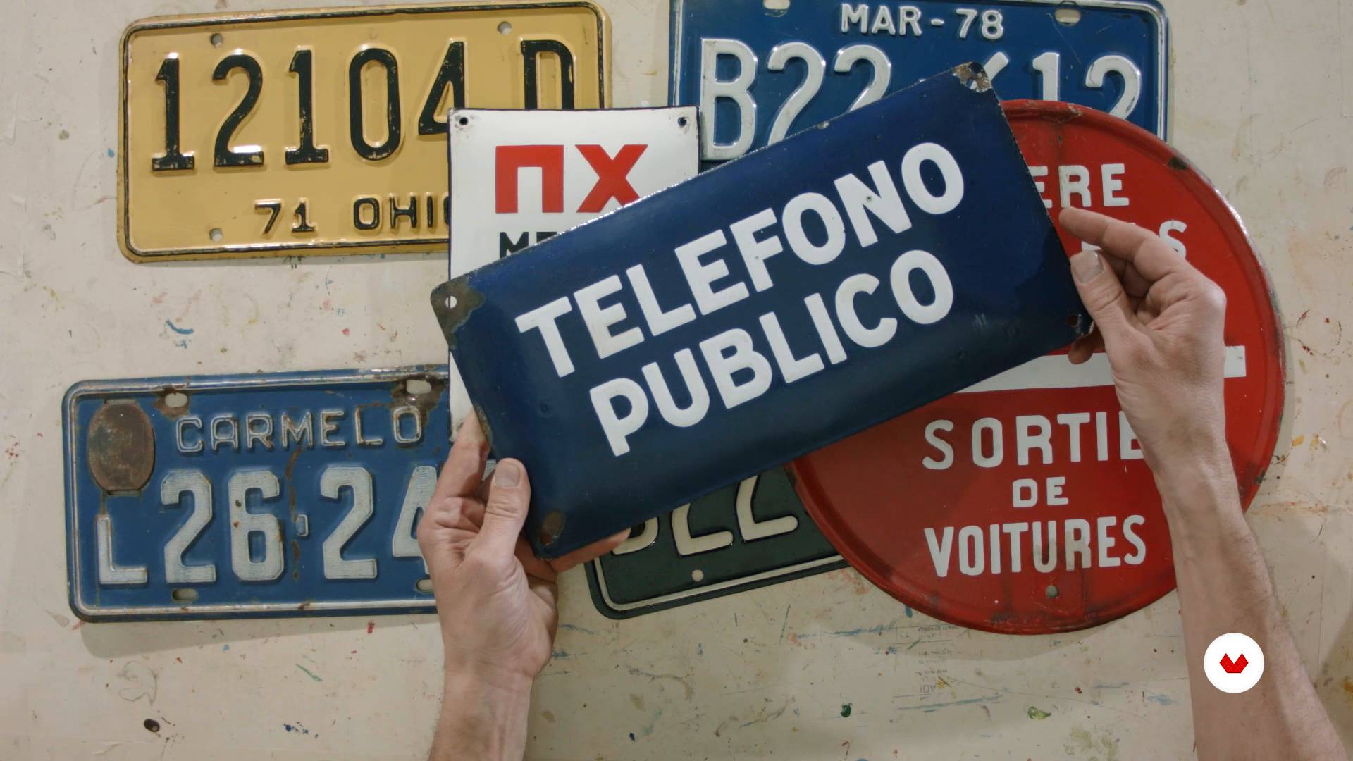
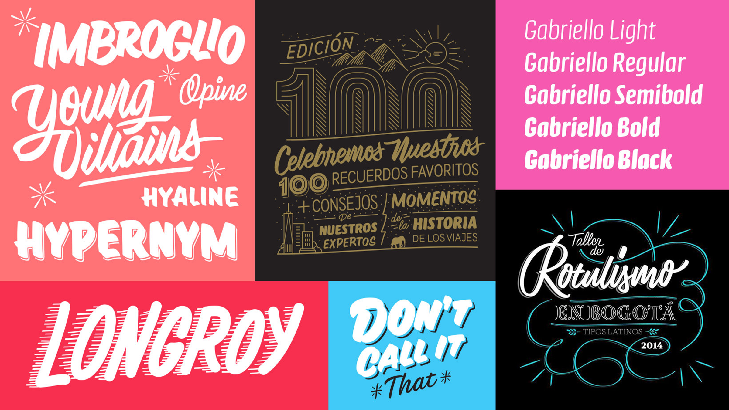
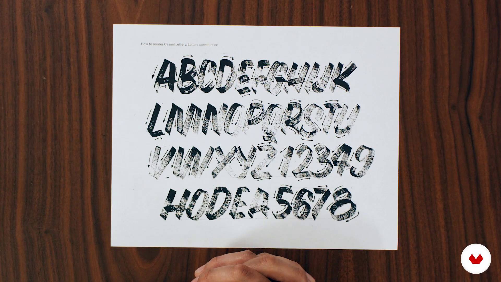
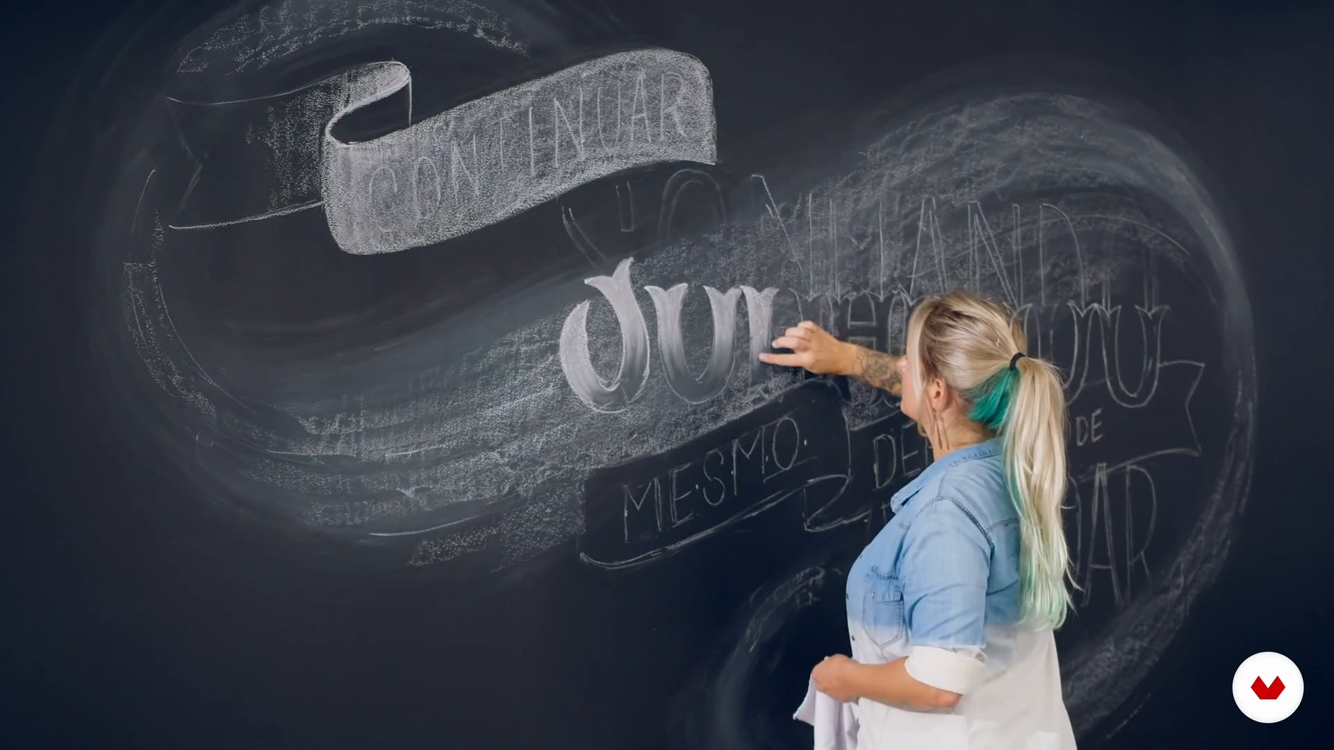
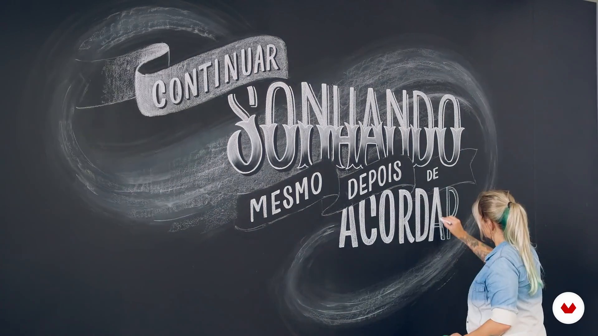
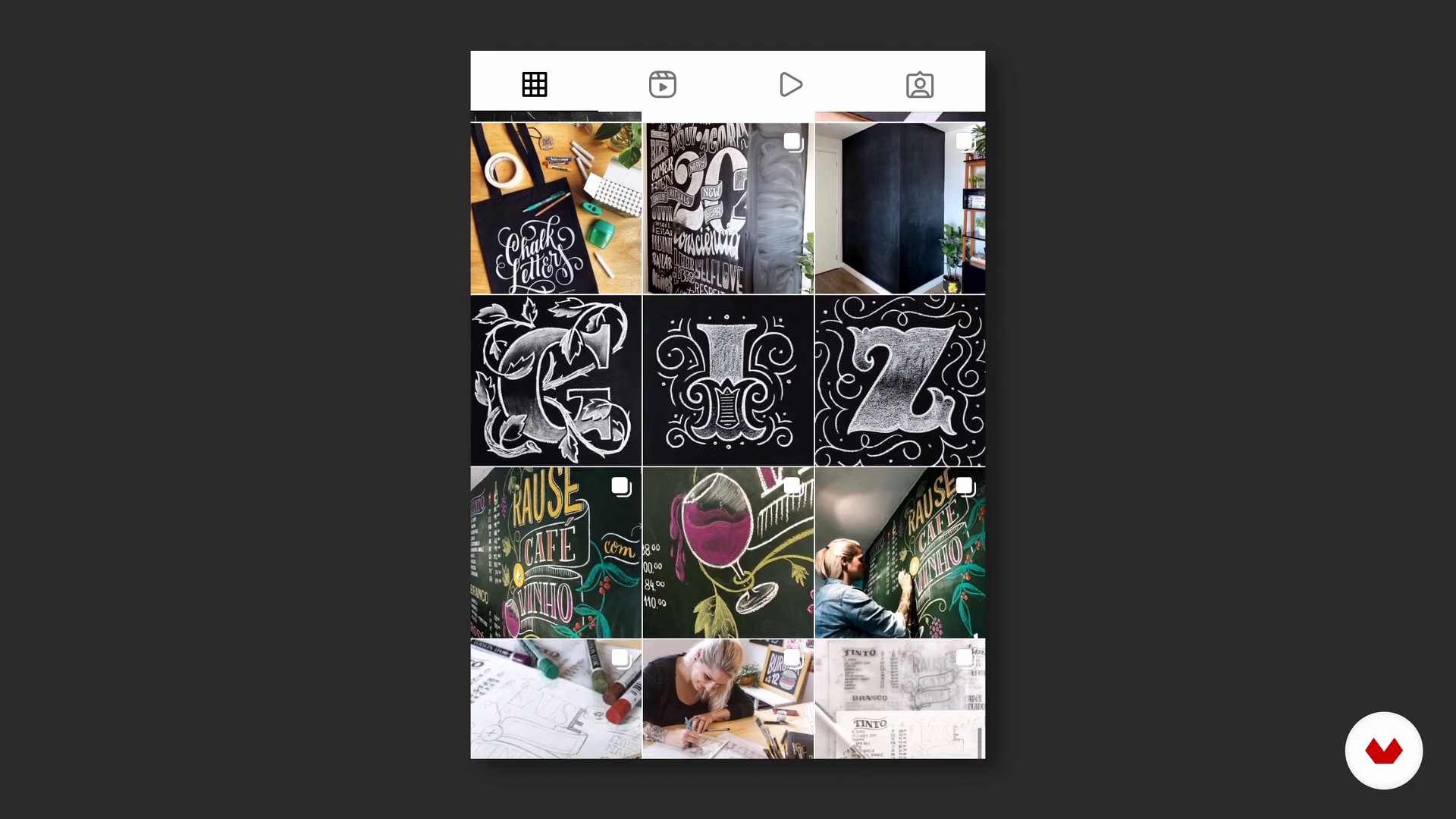
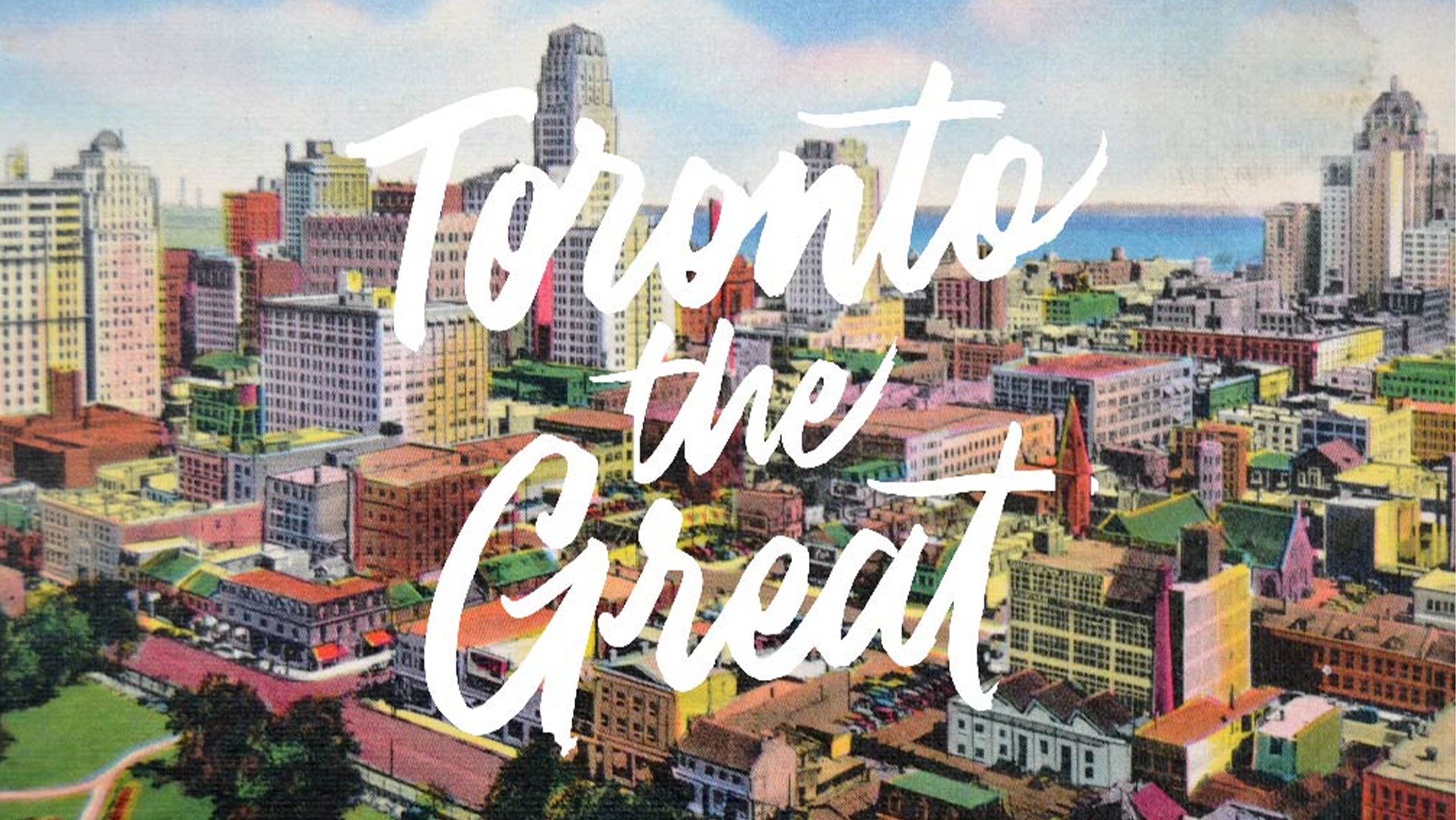
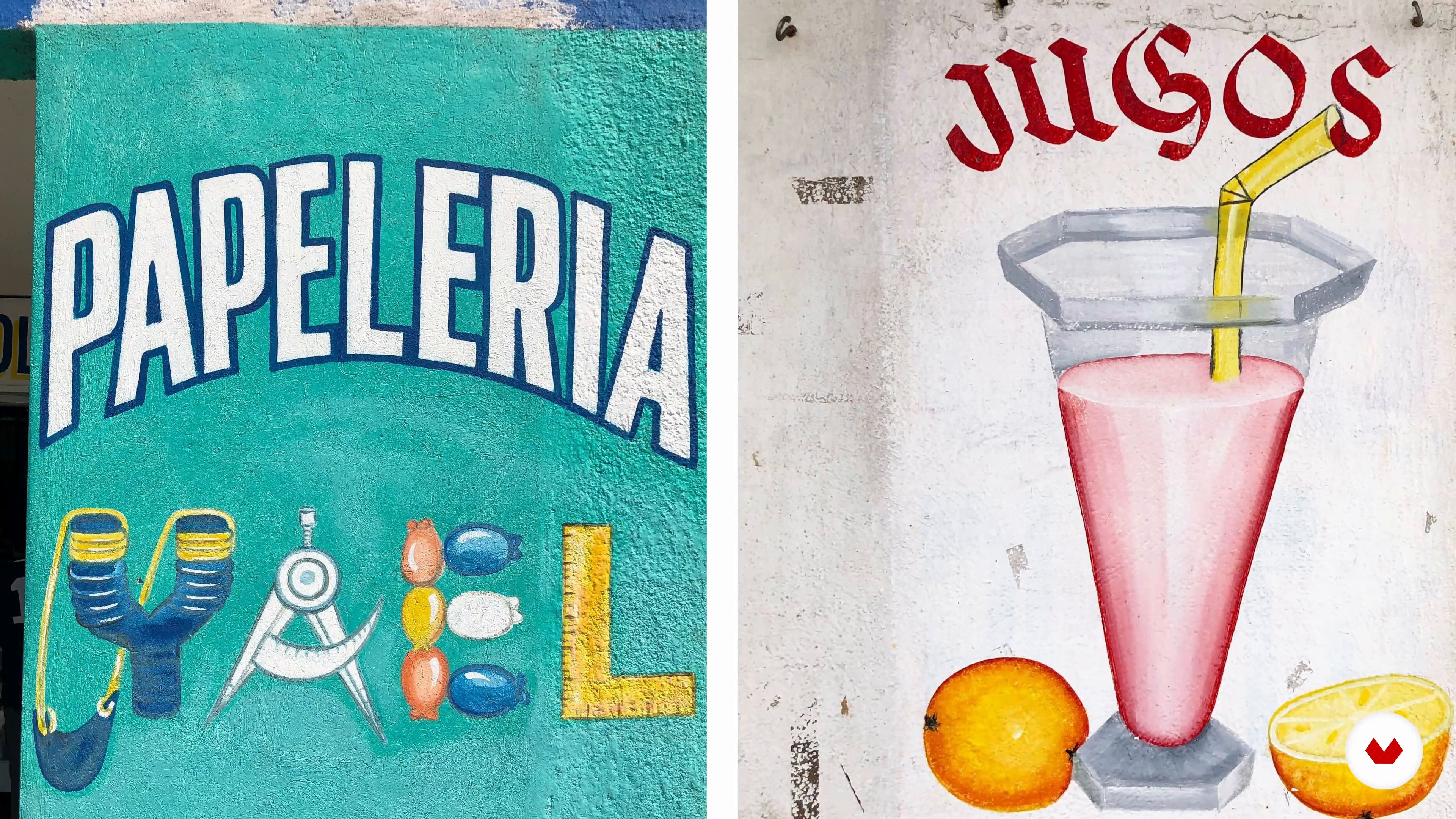
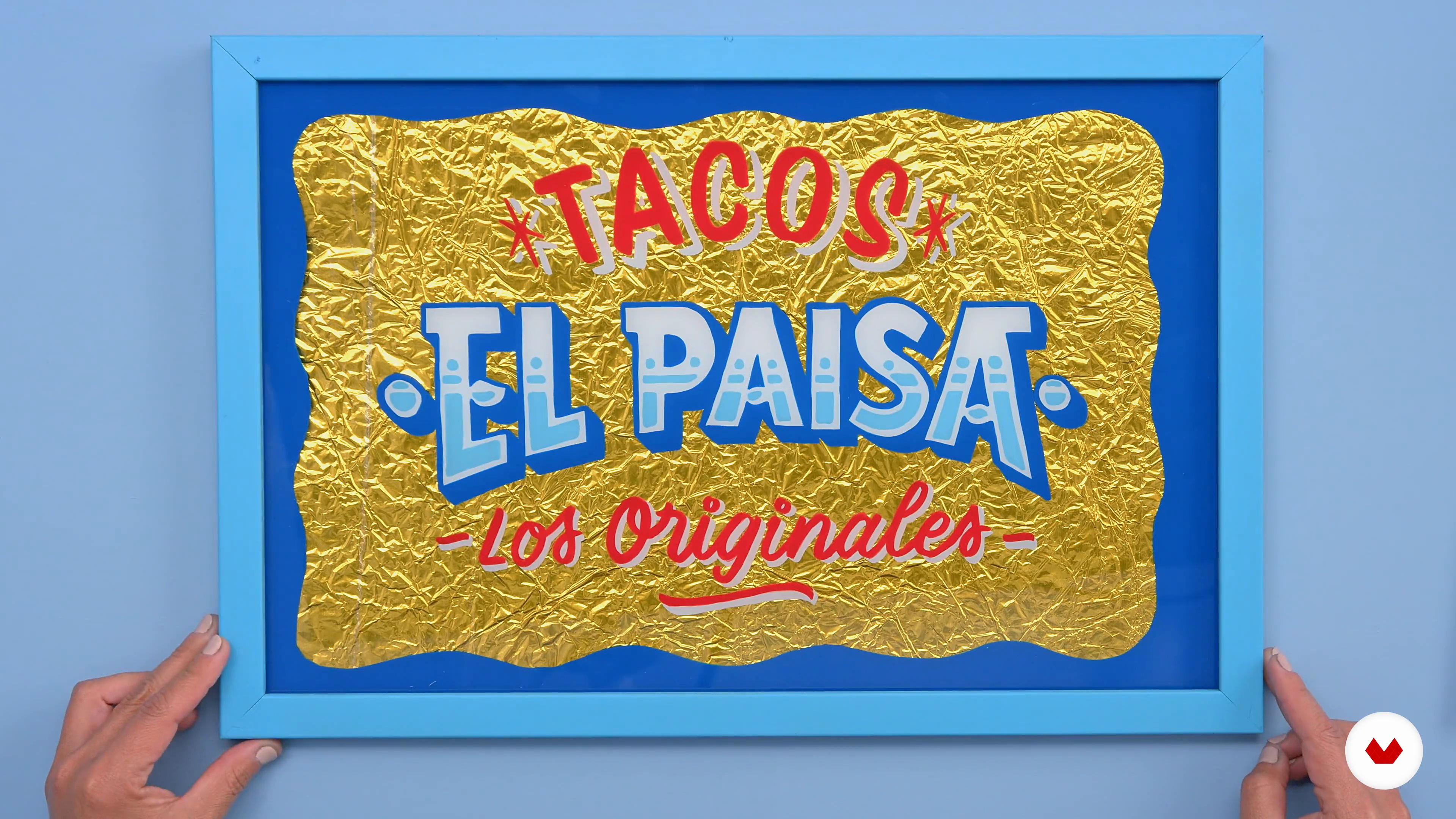
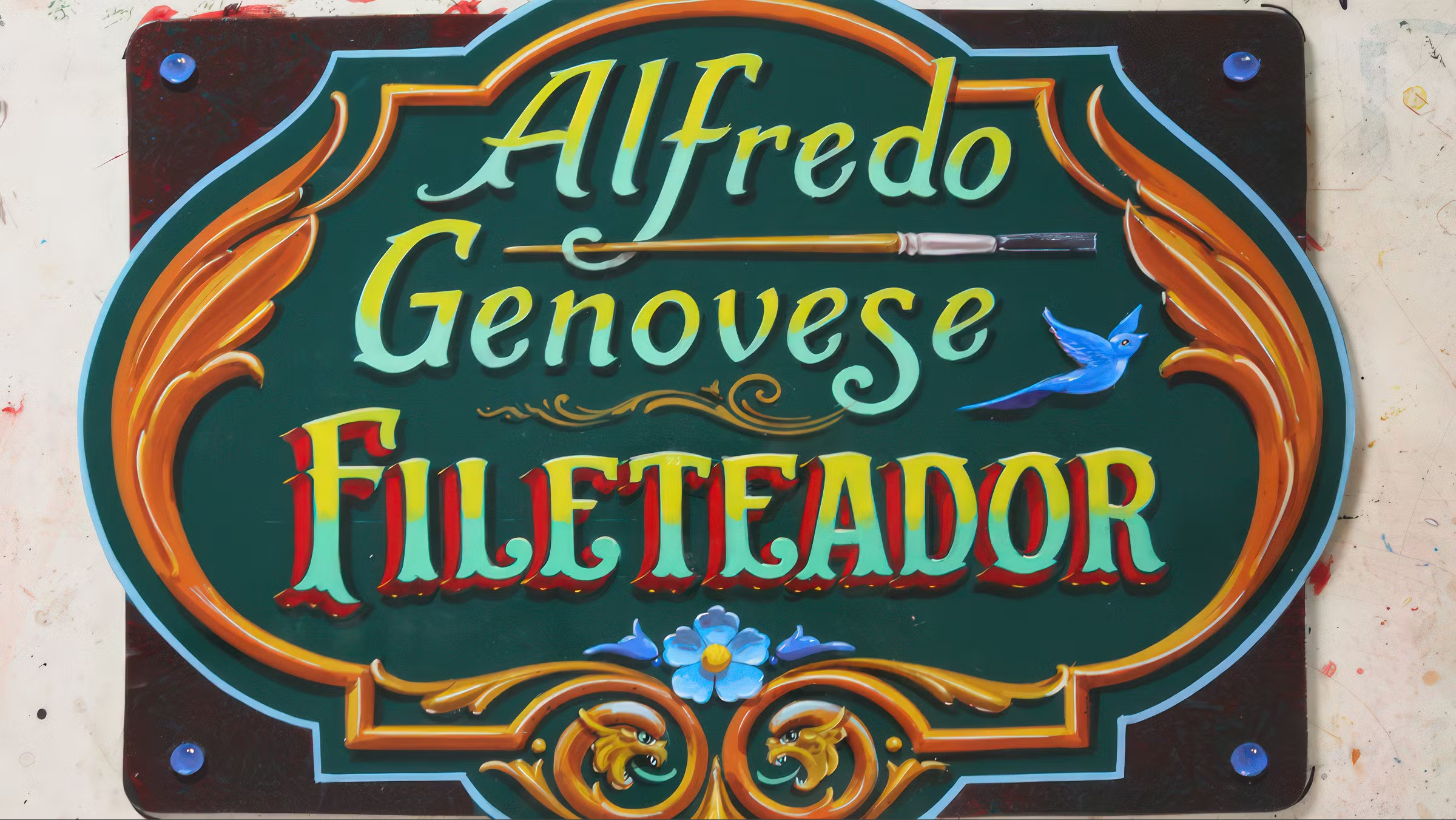
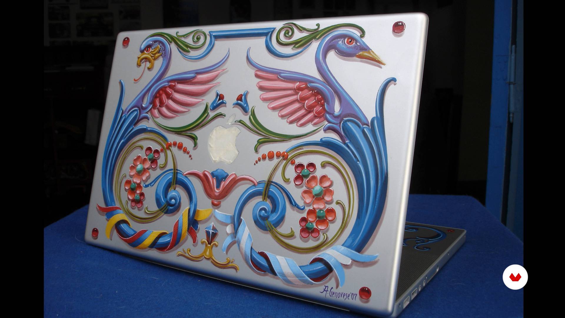
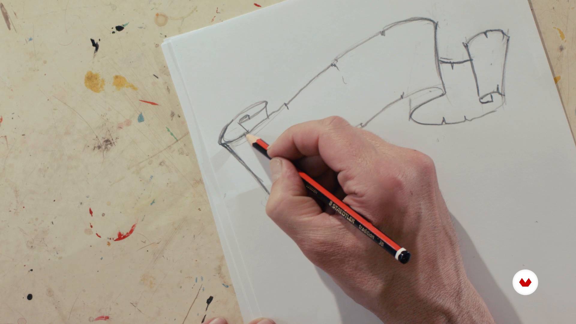
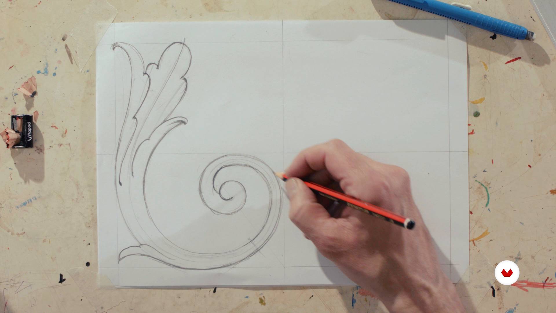
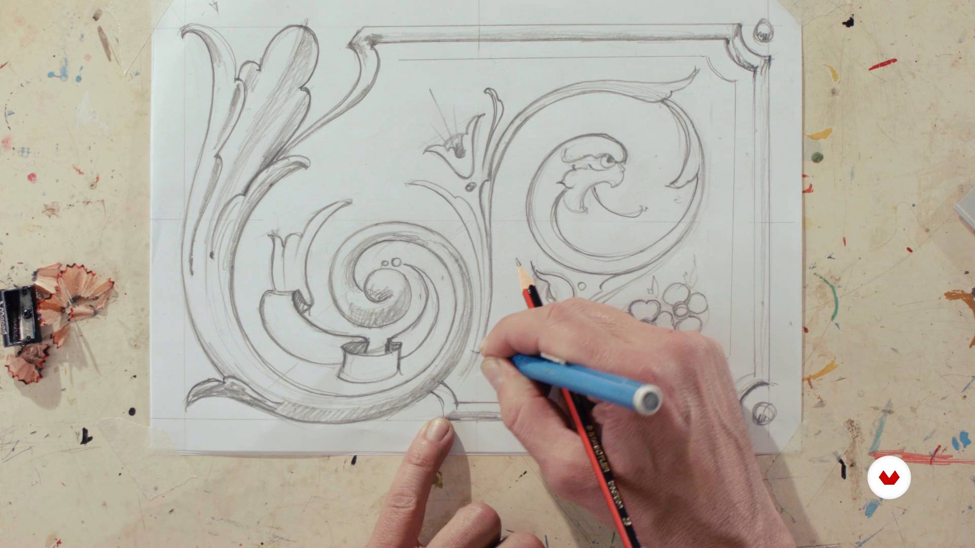
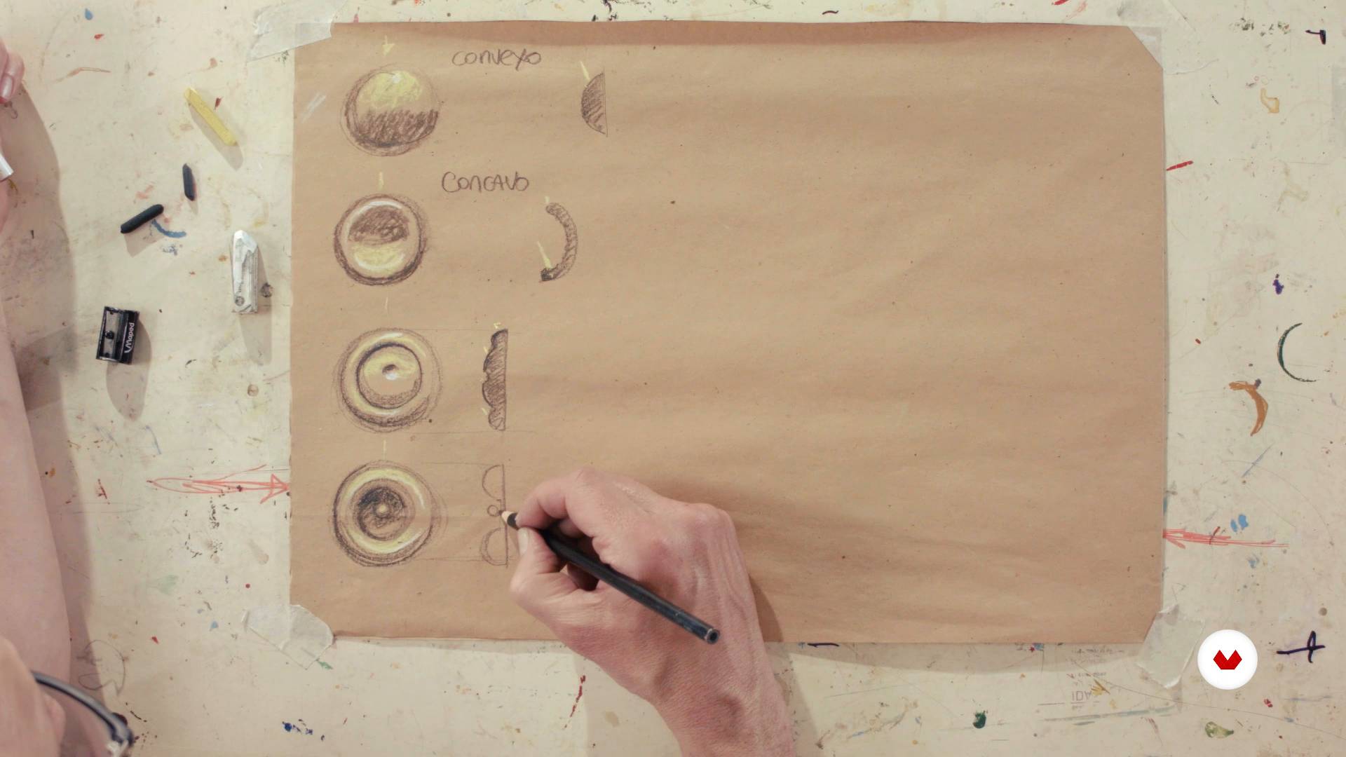
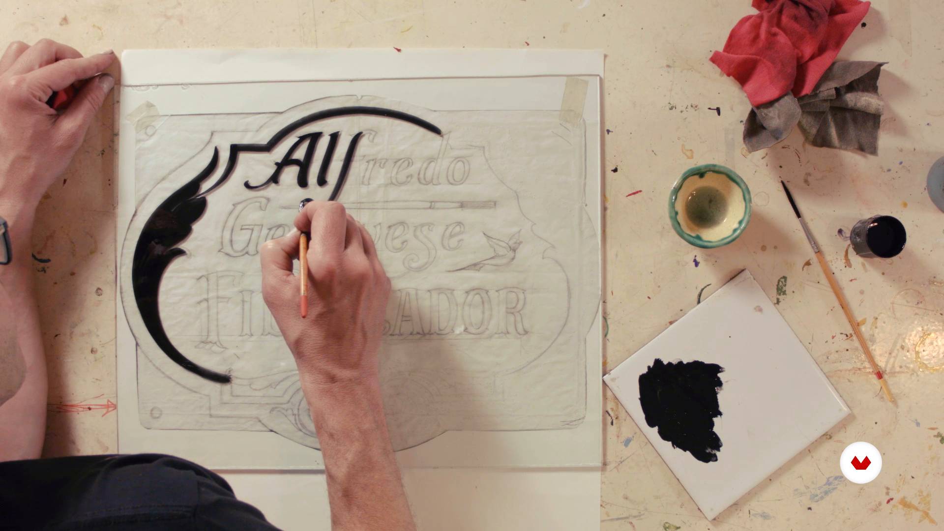
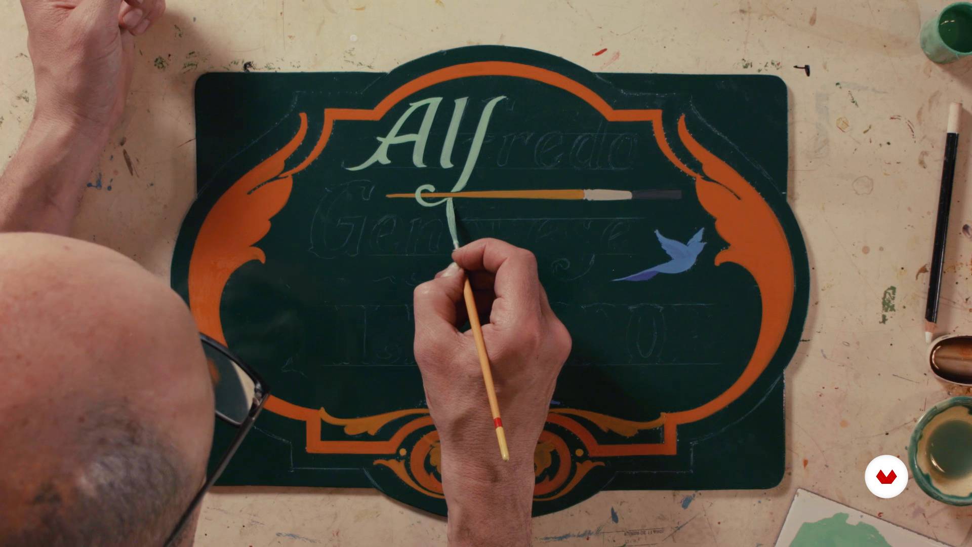
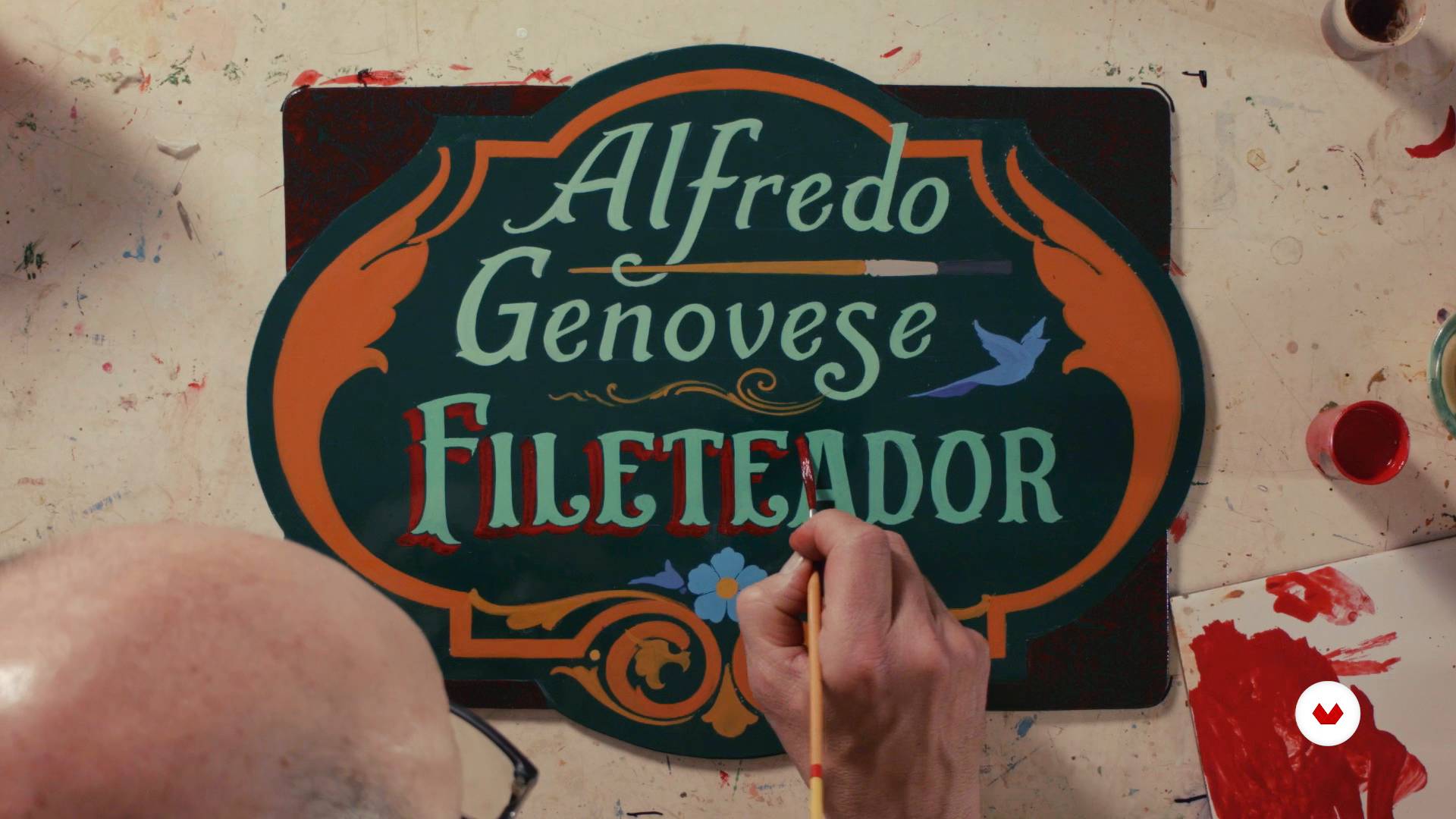
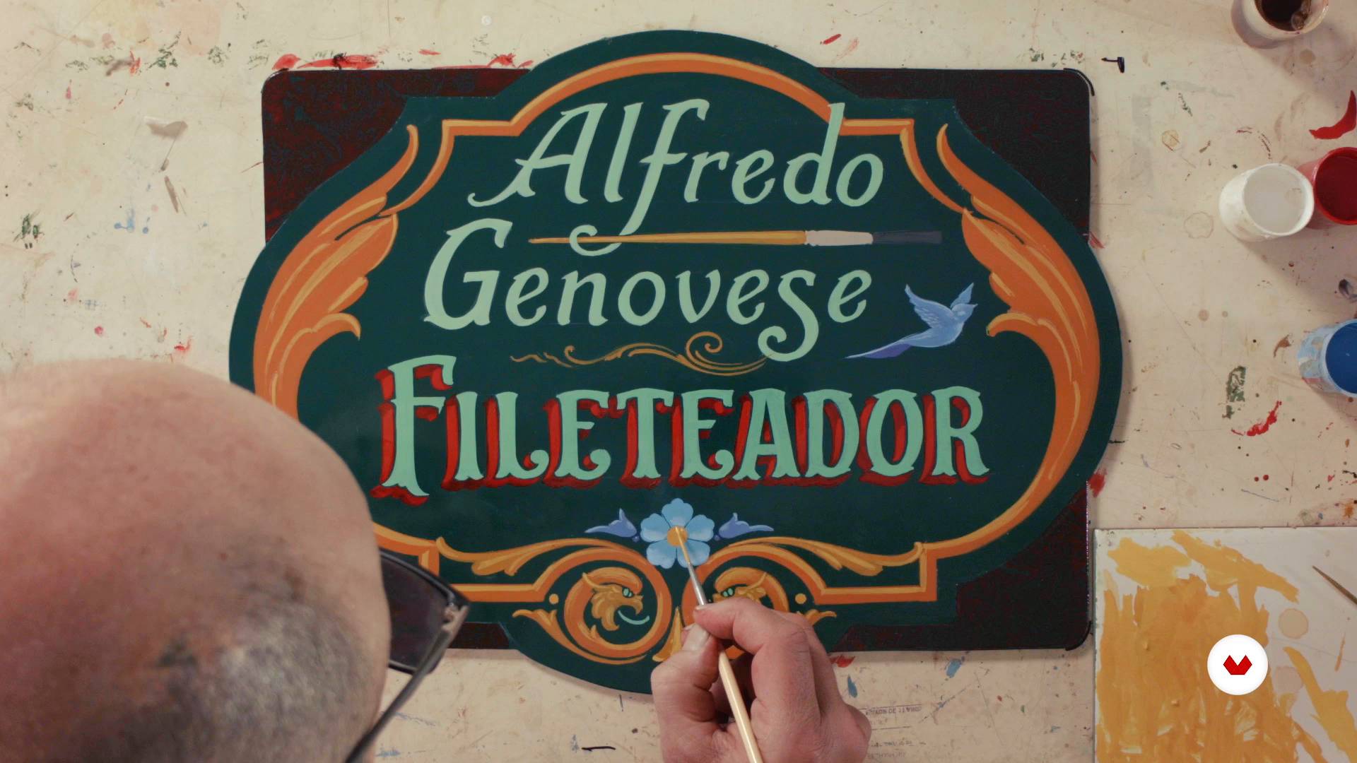
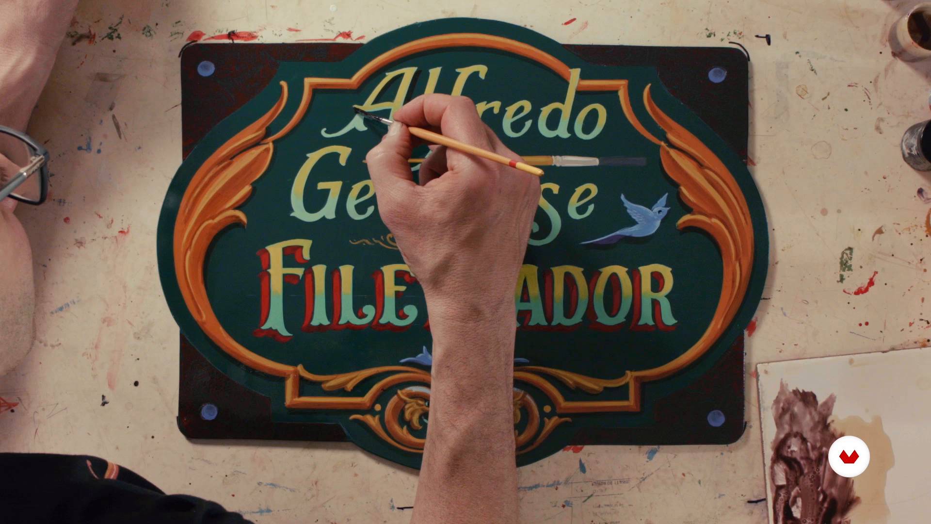
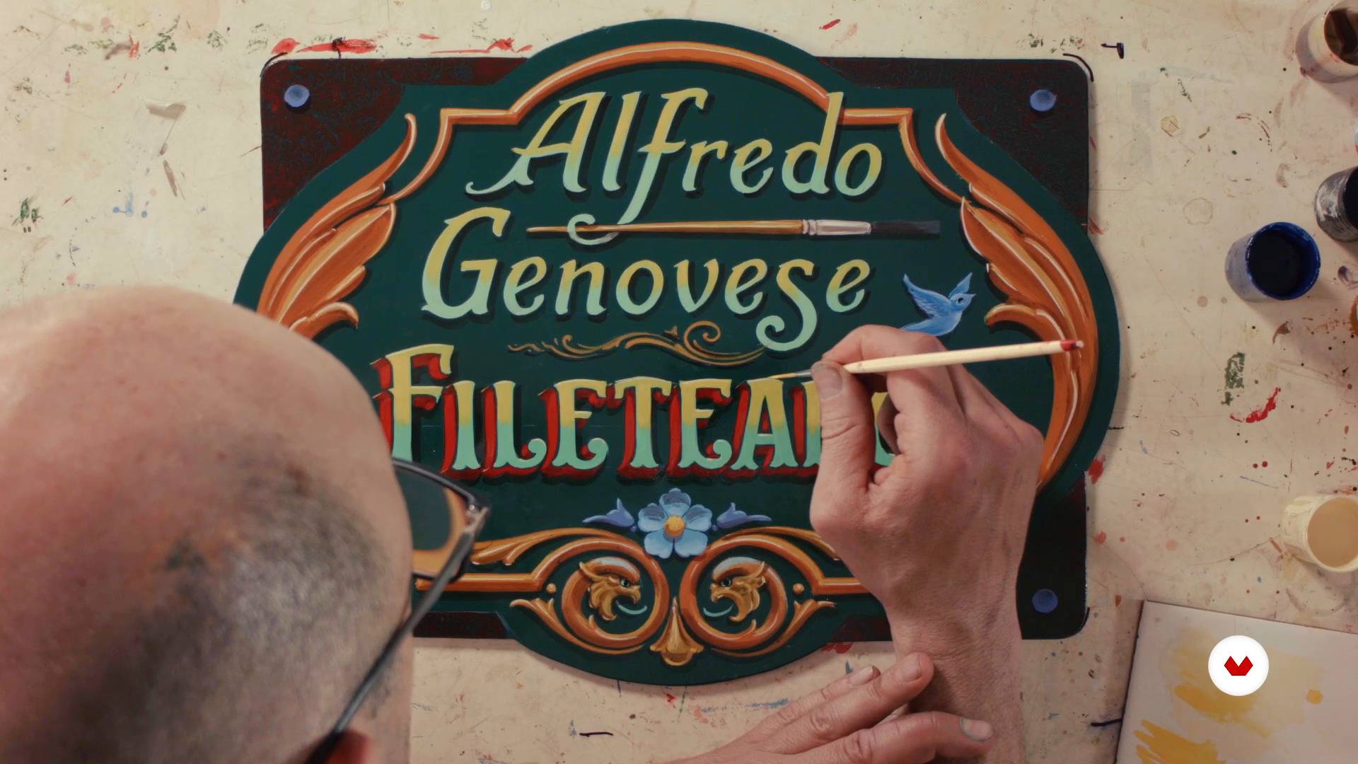
Explore the fascinating world of handcrafted sign painting and discover how hand-painted letters come to life on different surfaces. Learn to master traditional lettering techniques with Miguel Reyes, who will guide you through the fundamentals of sign painting, and Cristina Pagnoncelli, a specialist in chalkboard murals. Immerse yourself in creating handcrafted posters with Christopher Rouleau, who will teach you how to integrate composition and visual hierarchy into your designs.
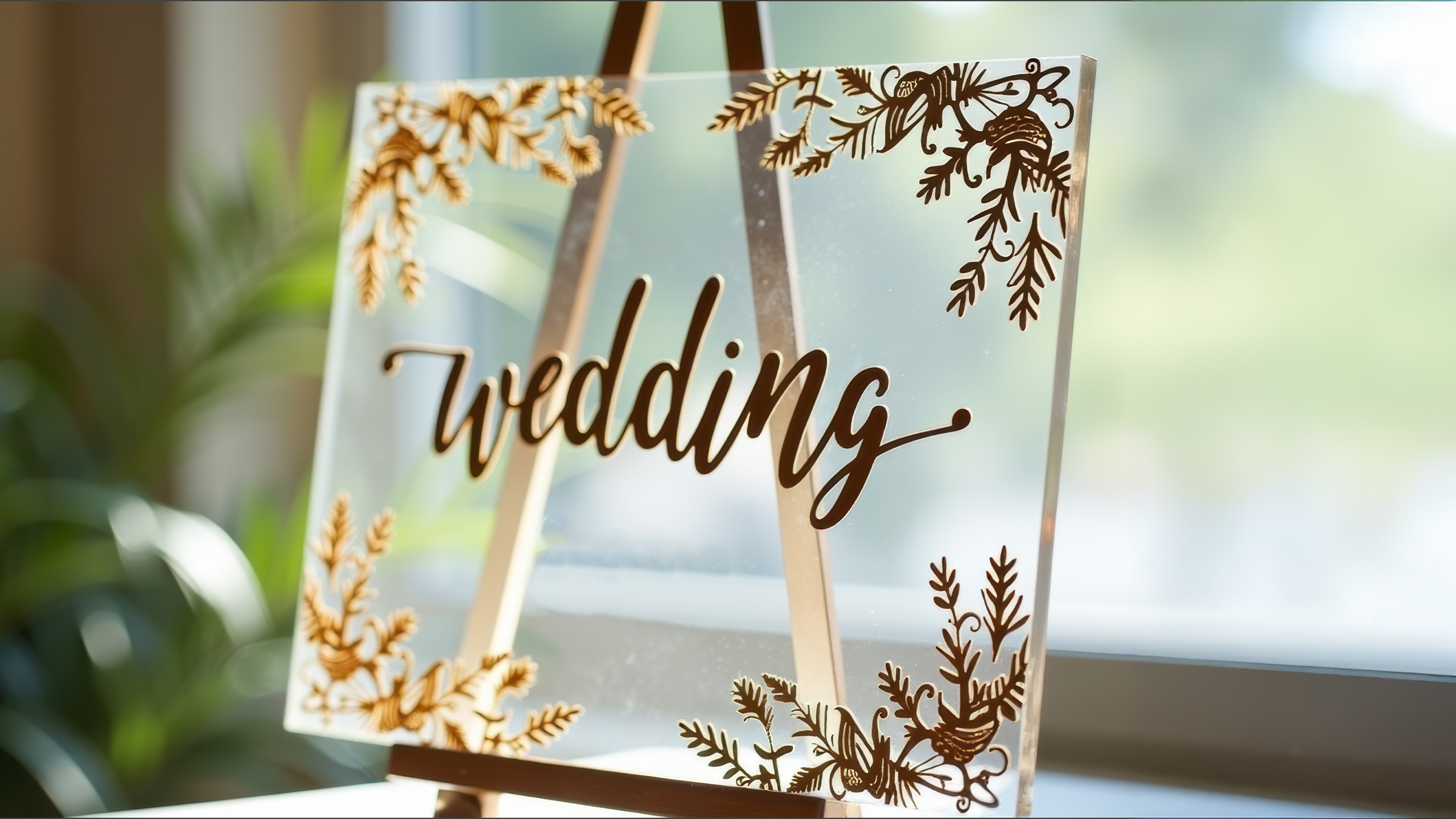
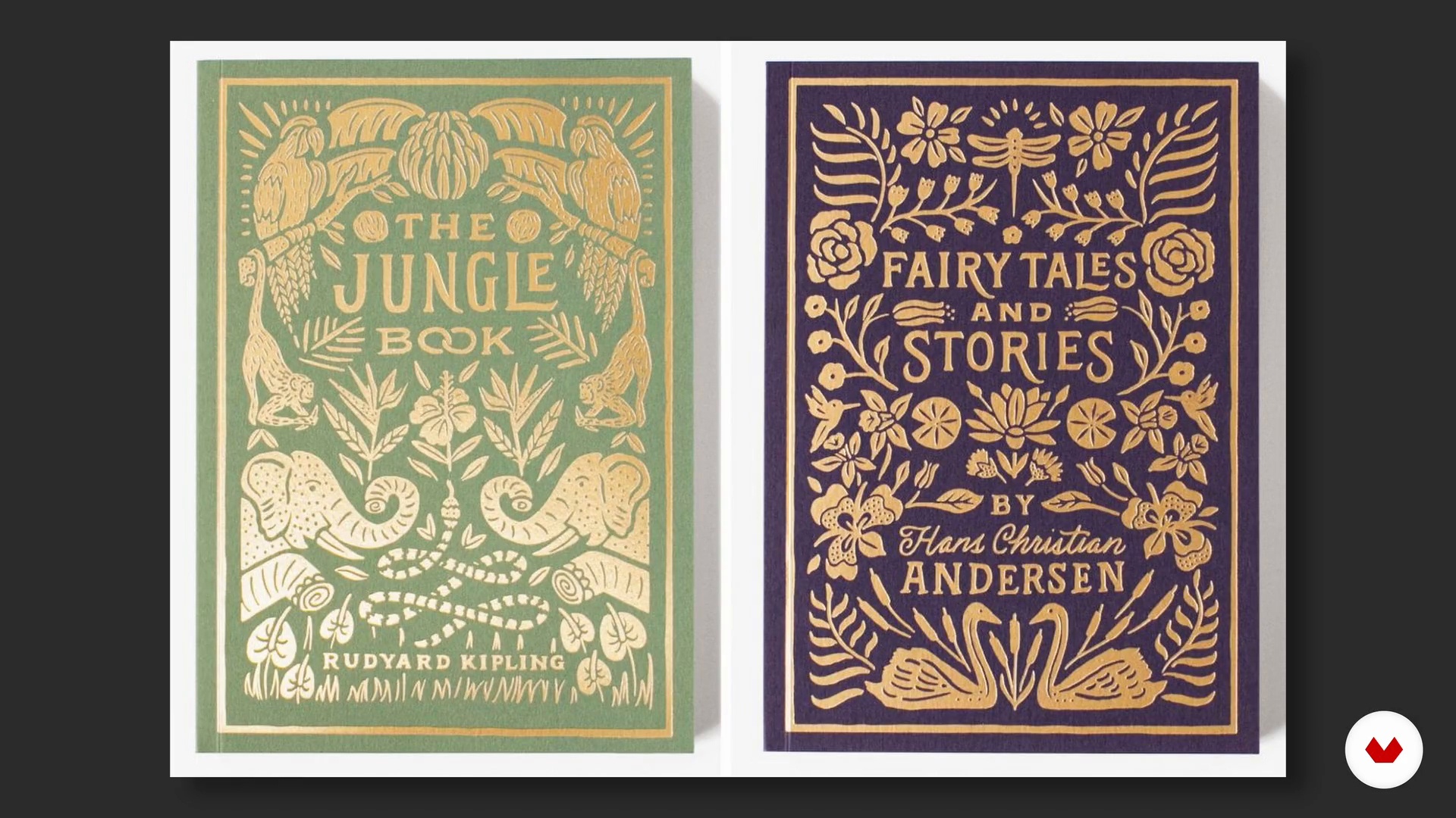
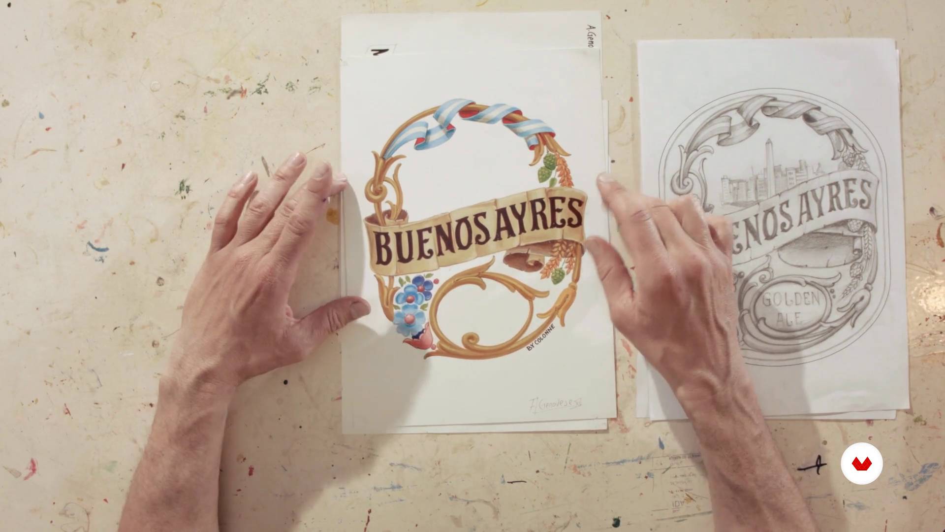
Hone your glass lettering skills with Alina Kiliwa, learning to use specific materials for long-lasting finishes. Then, delve into the art of porteño filleting with Alfredo Genovese, discovering how to combine lettering with colorful ornamentation and symbolic elements. This training program is ideal for those seeking to fuse tradition with contemporary applications, creating unique pieces that reflect authenticity and mastery in the art of hand-painted lettering.
1Introduction
Immerse yourself in the world of handcrafted lettering, where every hand-drawn stroke reflects history, skill, and creativity. Discover how this art form blends tradition and contemporary design, transforming letters into vibrant cultural expressions. An invitation to appreciate the human element behind each symbol and awaken your eye for detail.
1m
2Influences | Miguel Reyes
I will talk a bit about my influences, who are also important characters in the labeling and typographic design.
6m
3My inspirations in chalk and lettering | Cristina Pagnoncelli
In this class, I'm going to share with you some of the artists and visual references that have most influenced me in recent years.
3m
4Influences | Christopher Rouleau
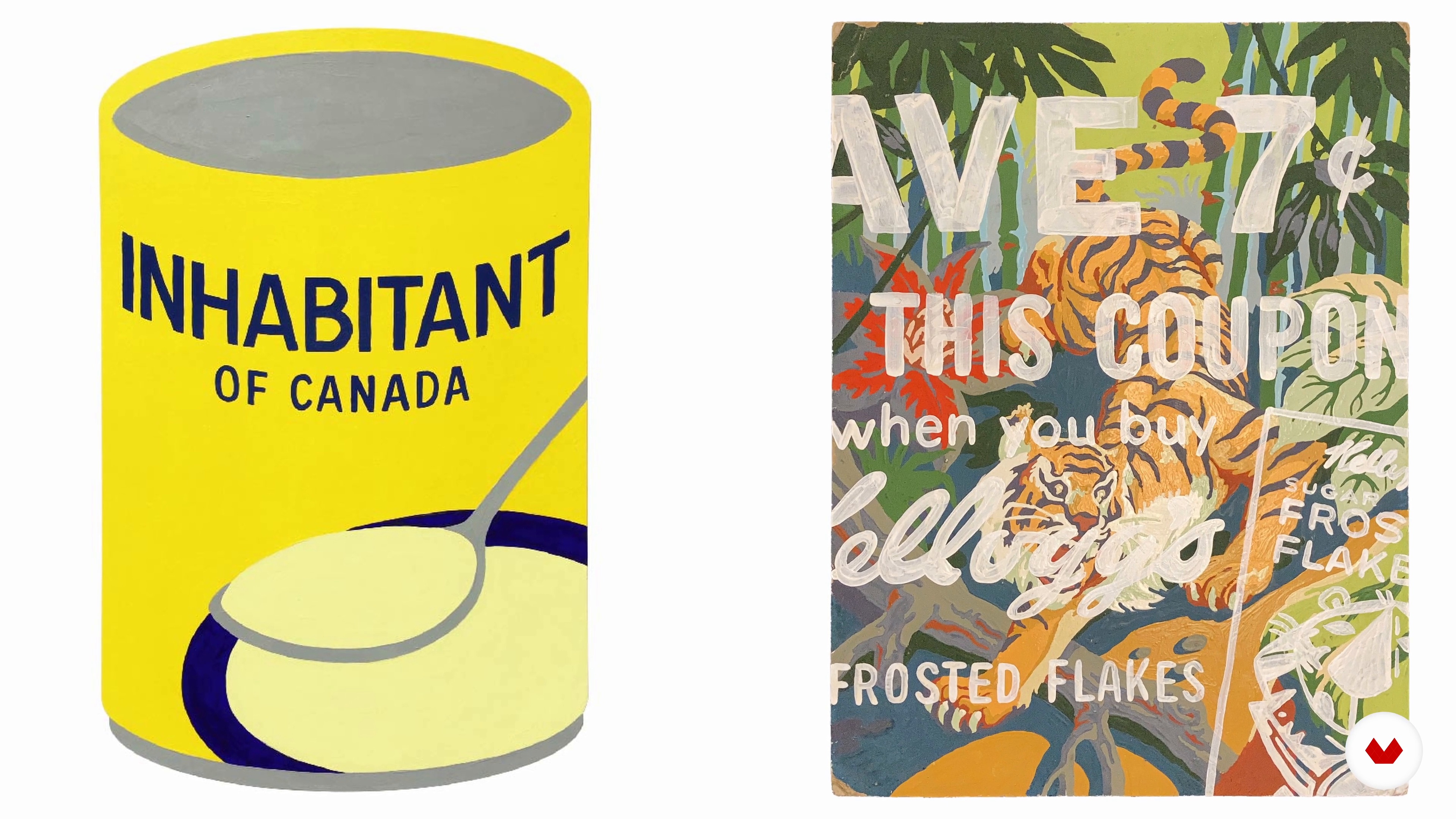
In this lesson, I will share some of my favourite artists, designers, and sign painters, and why their styles and techniques appeal to me, thus influencing the work I create.
3m
5Influences | Alina Kiliwa
Throughout my life I have had several references that have inspired what I do, starting from what I find on the street, such as the work of sign makers, to new design trends. I will show you the work of some people that I admire, without neglecting formal calligraphy and typography.
3m
6Influences | Alfredo Genovese
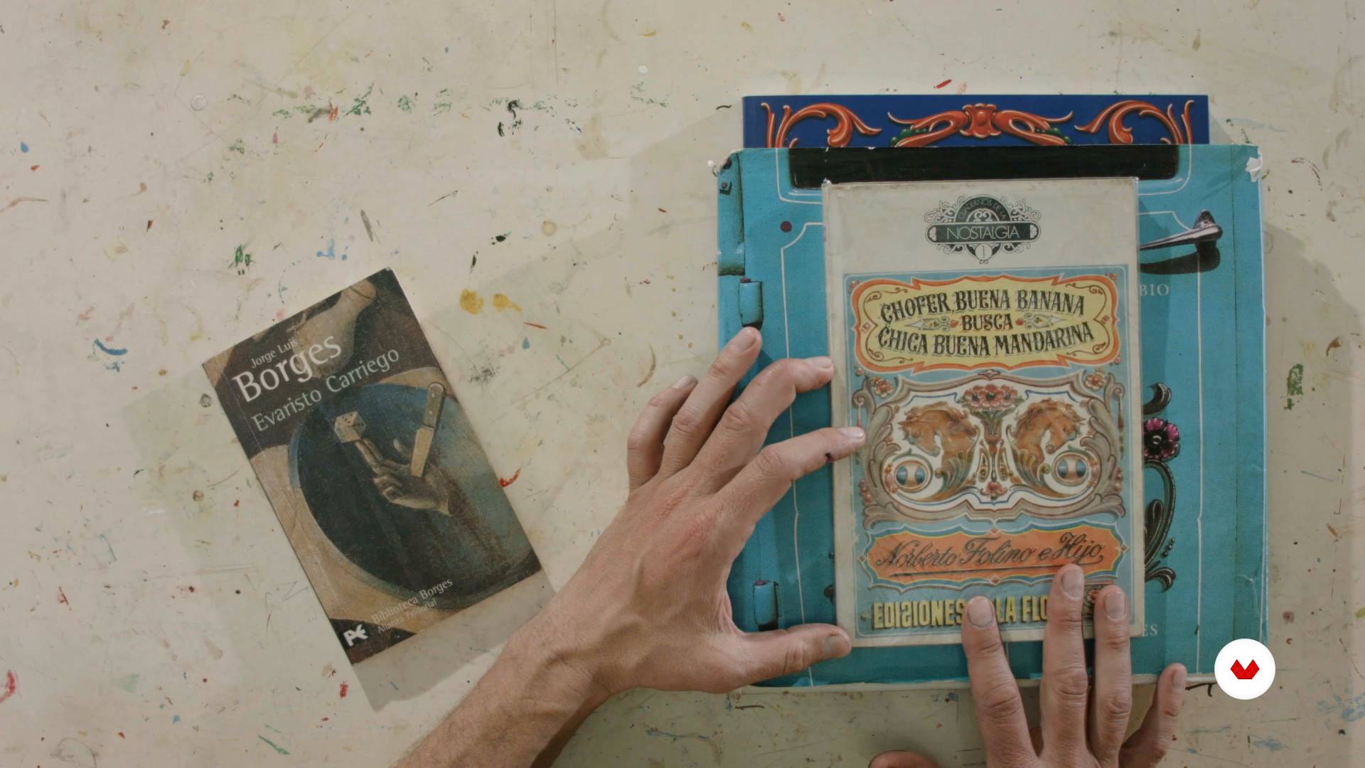
Now I will tell you who my teachers were and who are my references. I'll show you traditional filleting jobs.
8m
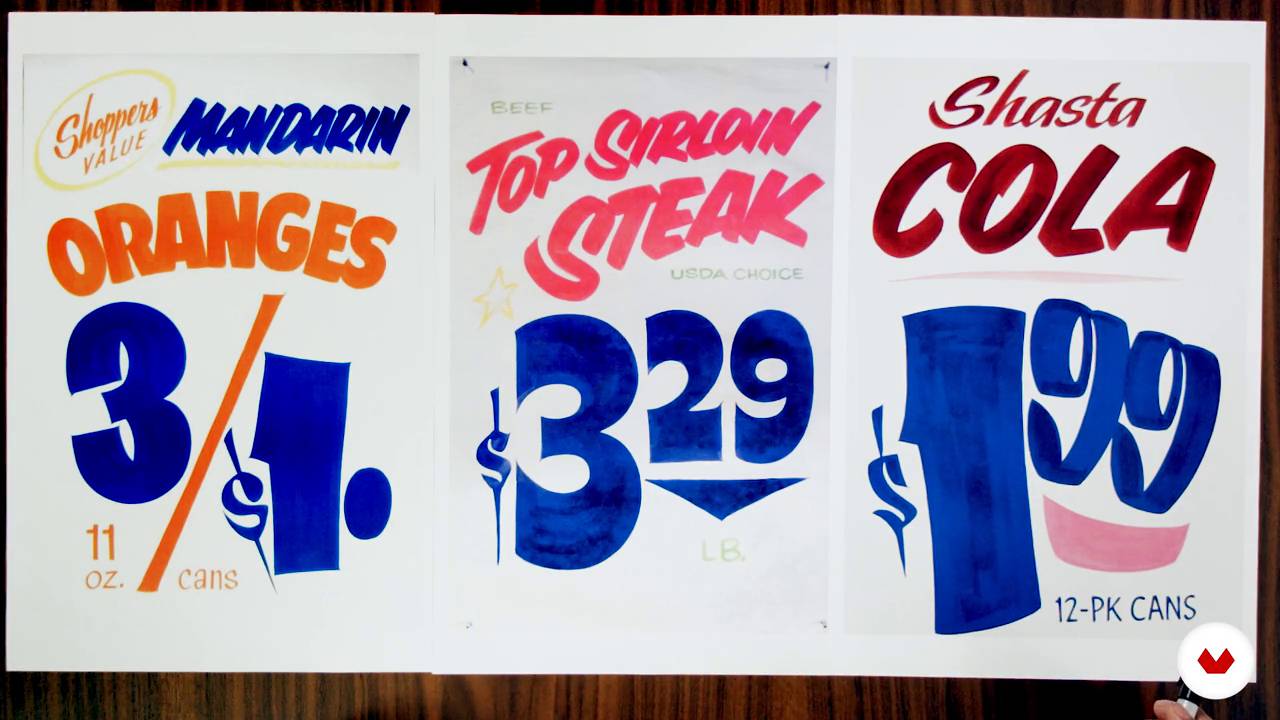
3Lettering and casual lettering
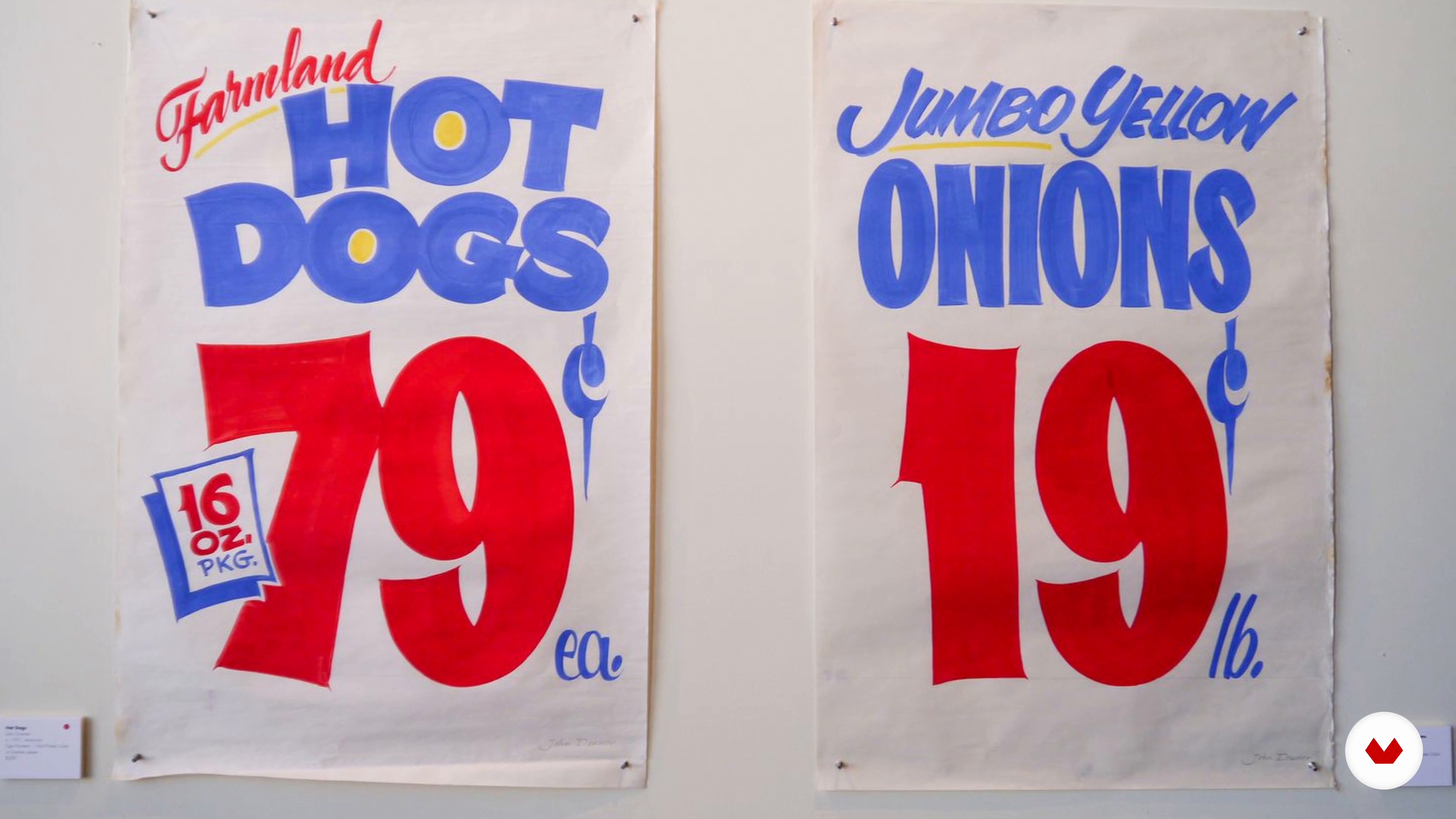
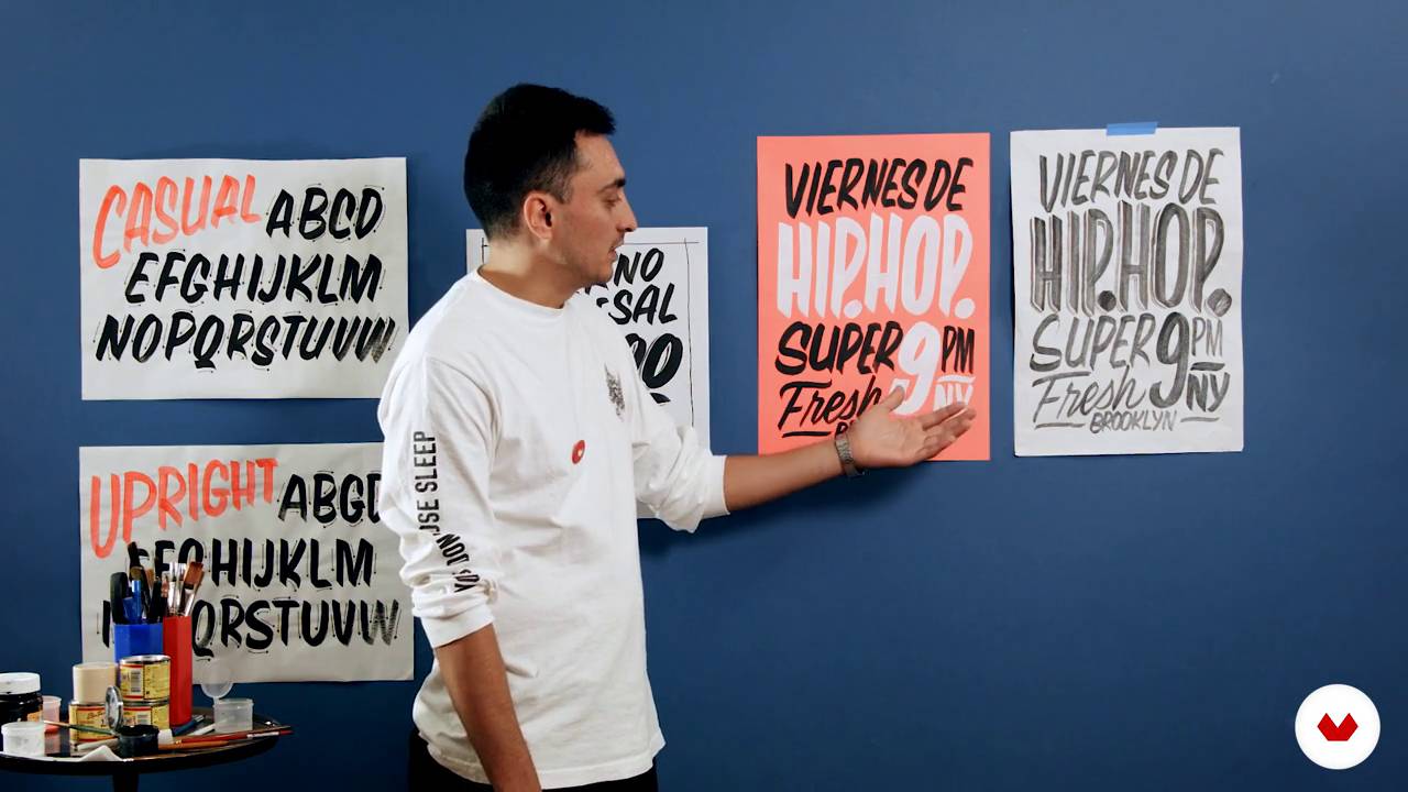
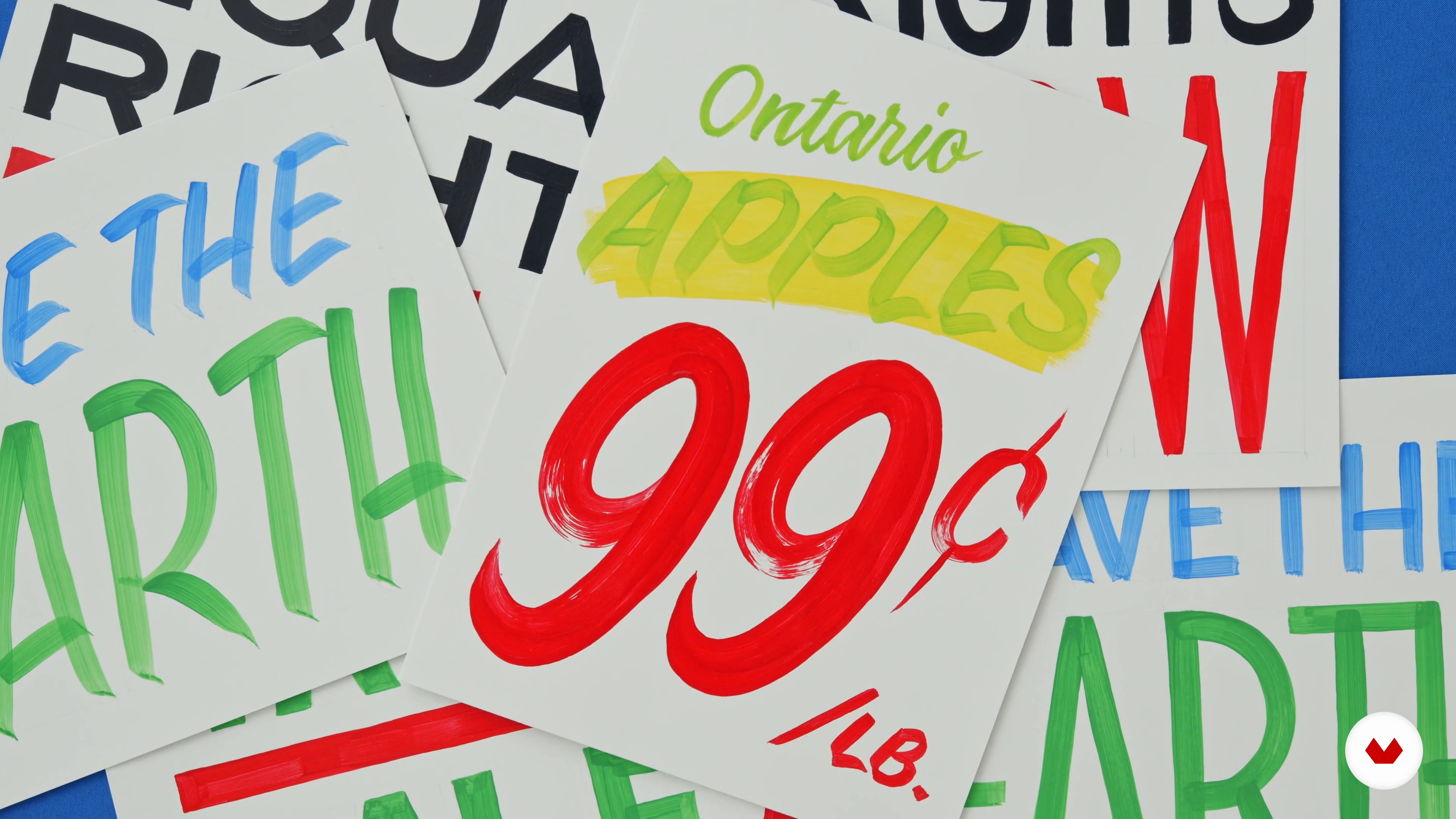
In this lesson we will learn what is the labeling and we will talk about the differences with other ways of representing letters. We will also see the formal characteristics and a little of the history of one of the most popular styles in brush-type labeling, casual letters; very used in the supermarket signs.
1m
4Description of materials
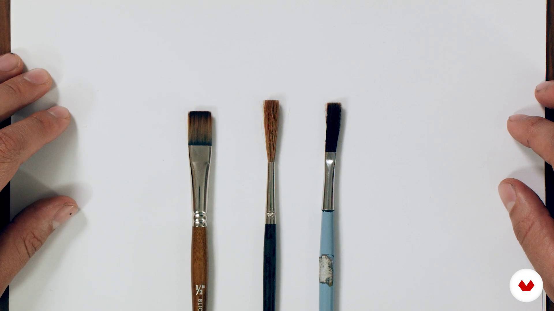
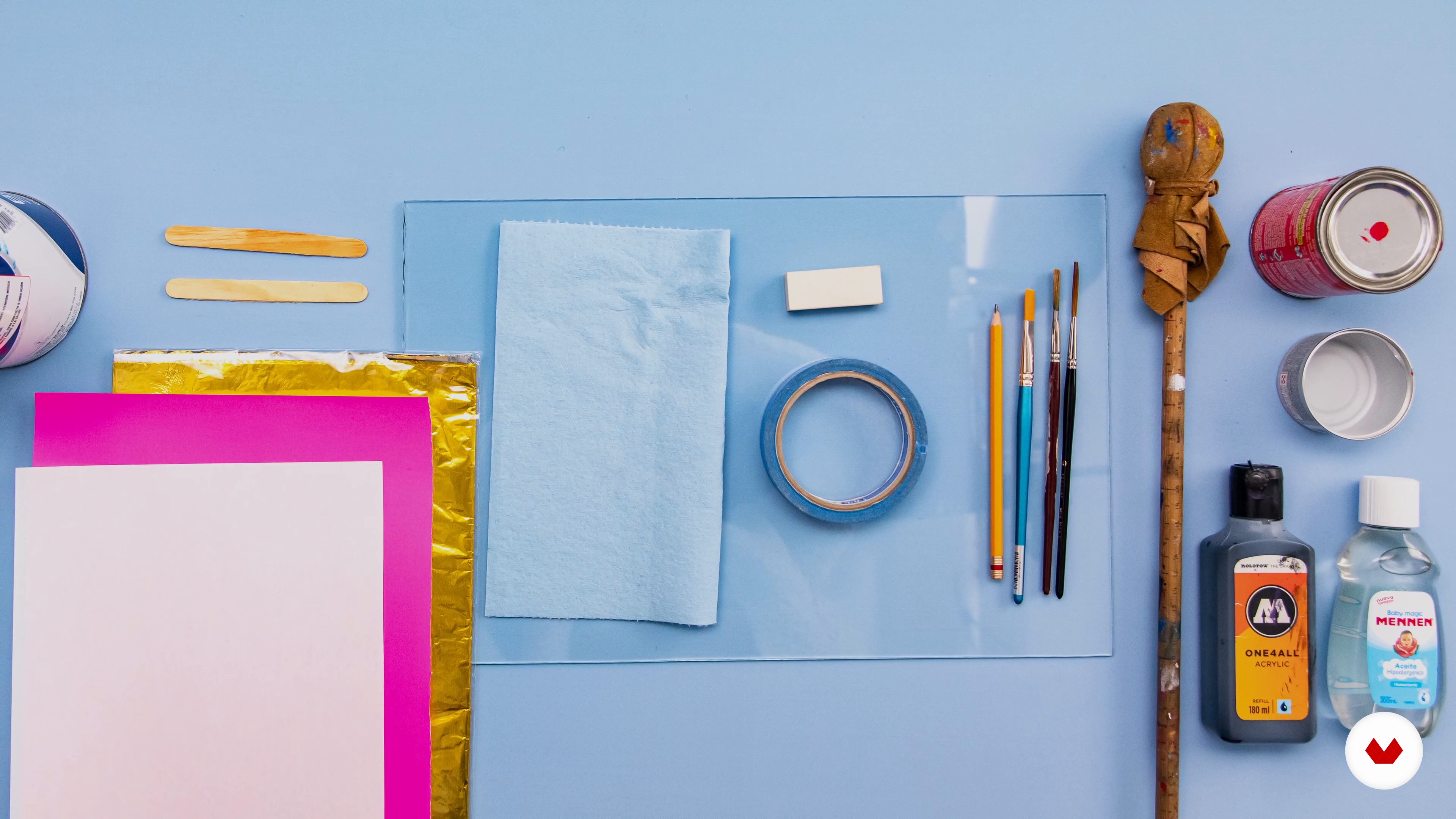
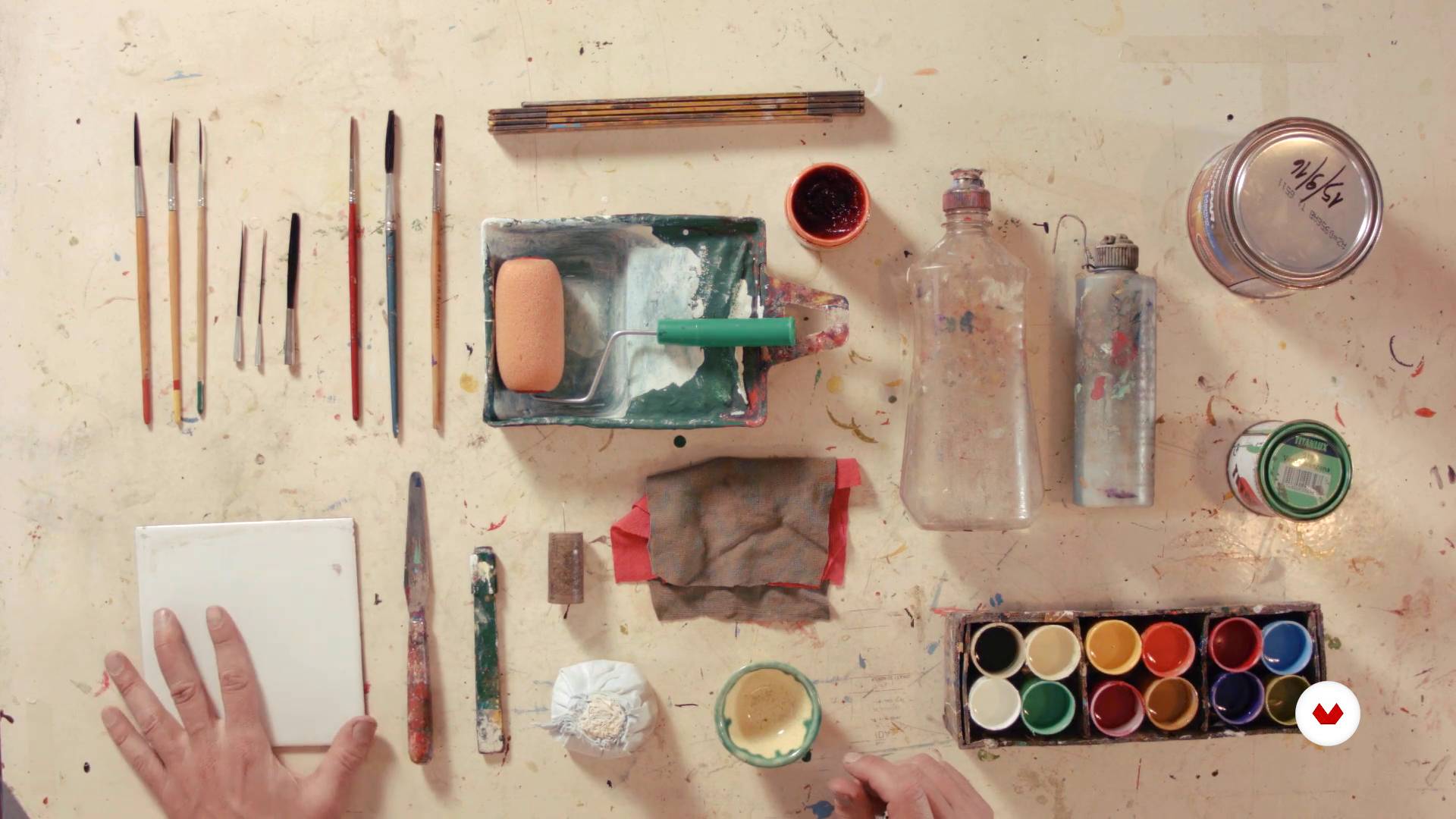
To start working we do not need much: paper and pencil, some drawing tools; water-based paint such as acrylic or tempera and kraft paper or newsprint. Later we will need a stitch marker, chalk or chalk, blue ribbon and sandpaper. Perhaps the most important tool is the brush, here I will talk about different types of brush used in the labeling and what brush to use to begin to dirty our hands.
2m
5Basic strokes and first exercises
In this lesson we will know the practical basis, the template; the basic strokes and their formal characteristics. Practice enough until you achieve constant traits in weight, shape and consistency, until you master them. We must be self-critical with our work and move forward only until we have noticed improvements in our practice.
18m
6Uppercase
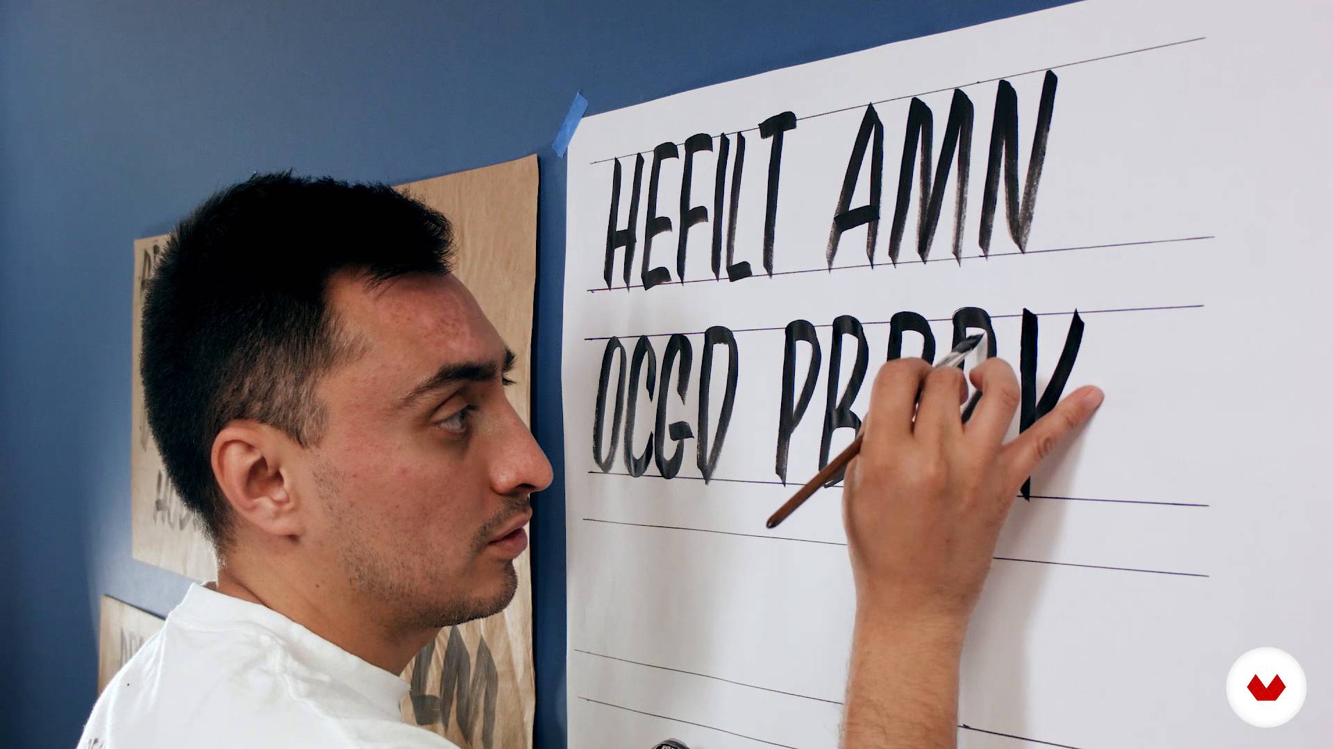
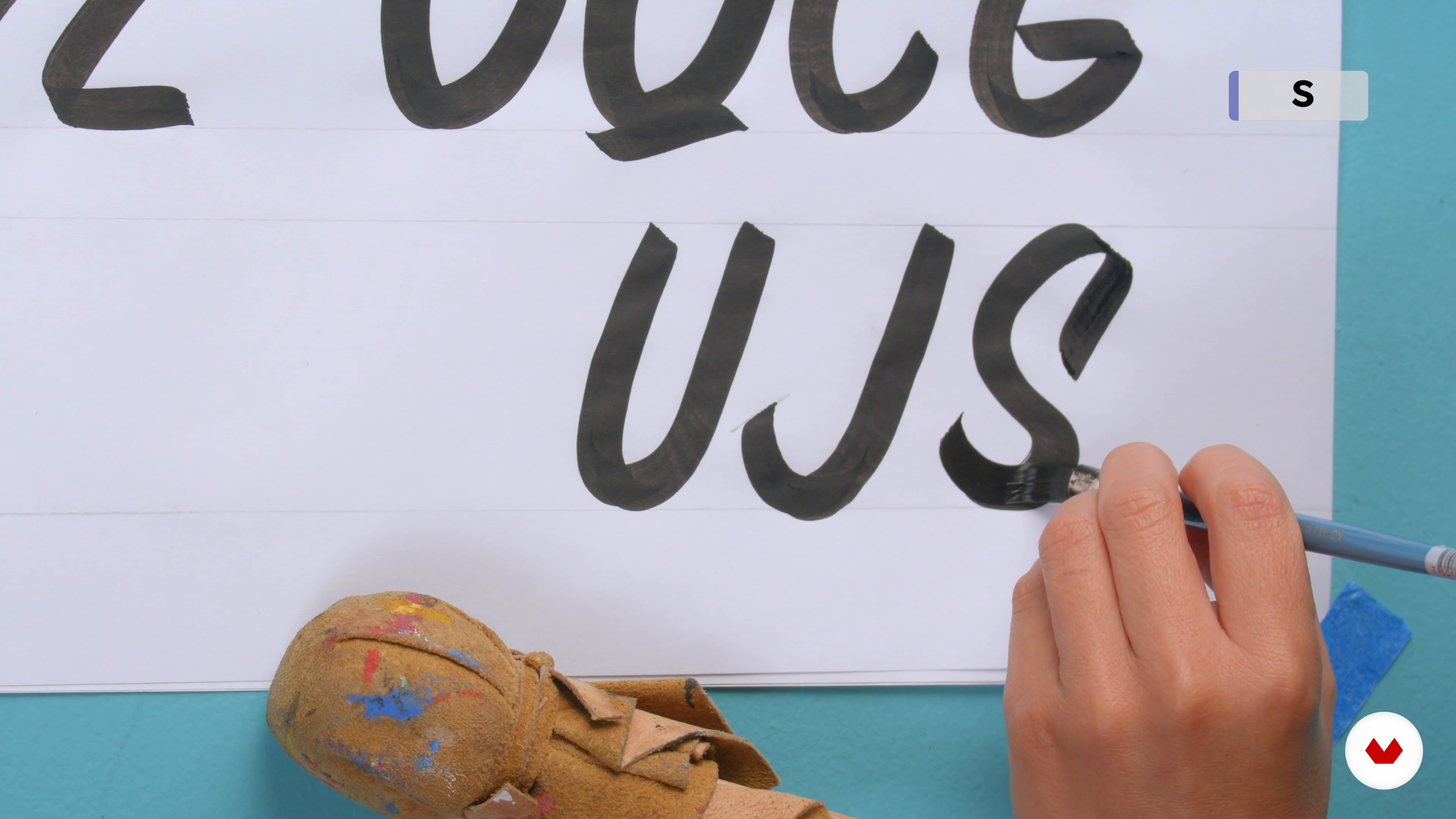
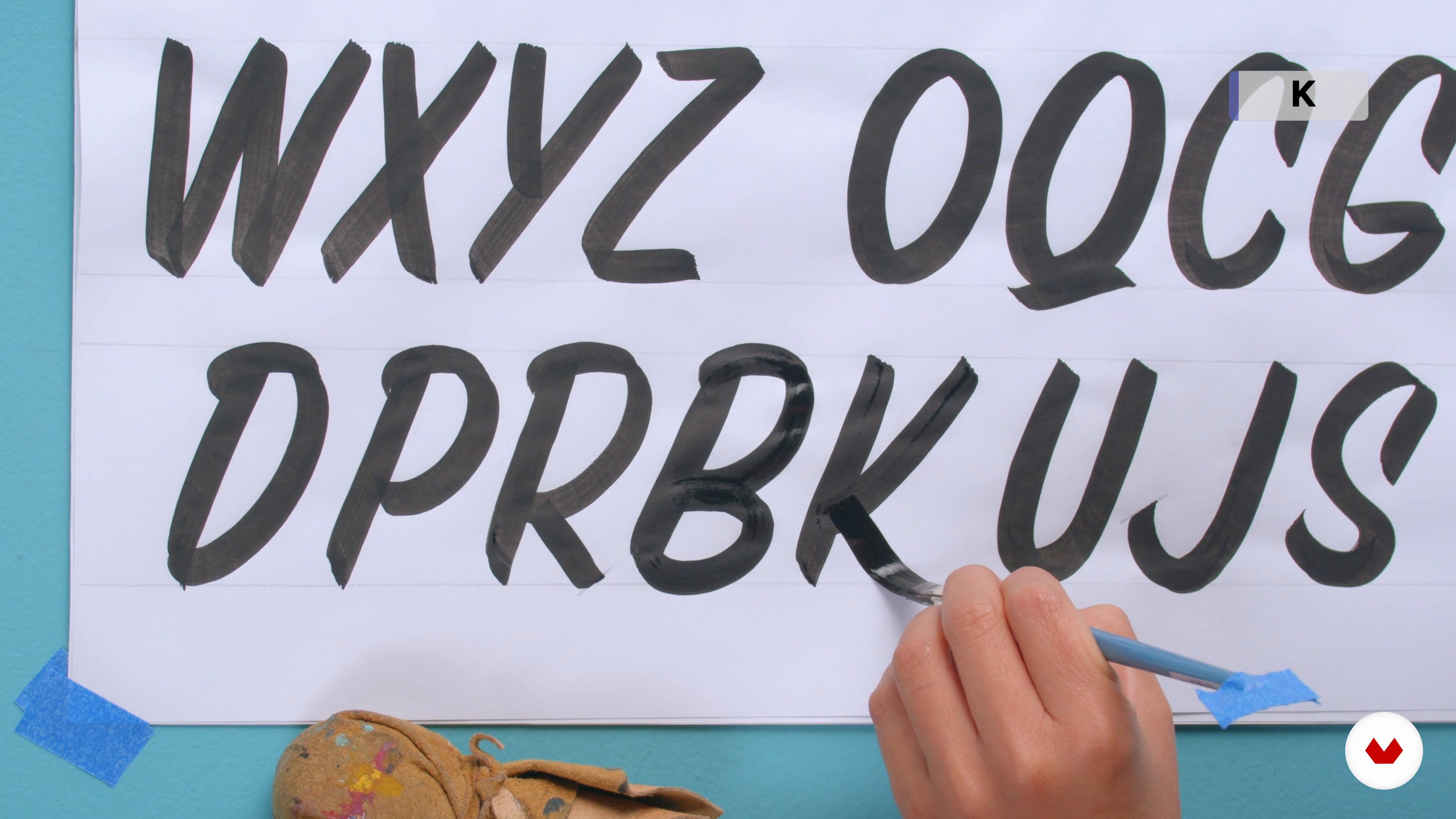
After learning and practicing the basic strokes enough, we will begin to see the first letters: capital letters; which are the most recurrent letter model in casual letters, for the time they take to reproduce in comparison with lowercase letters. We will group the letters in different sets of letters that are made up of similar basic strokes, to facilitate their learning and practice.
19m
7Numbers and special characters
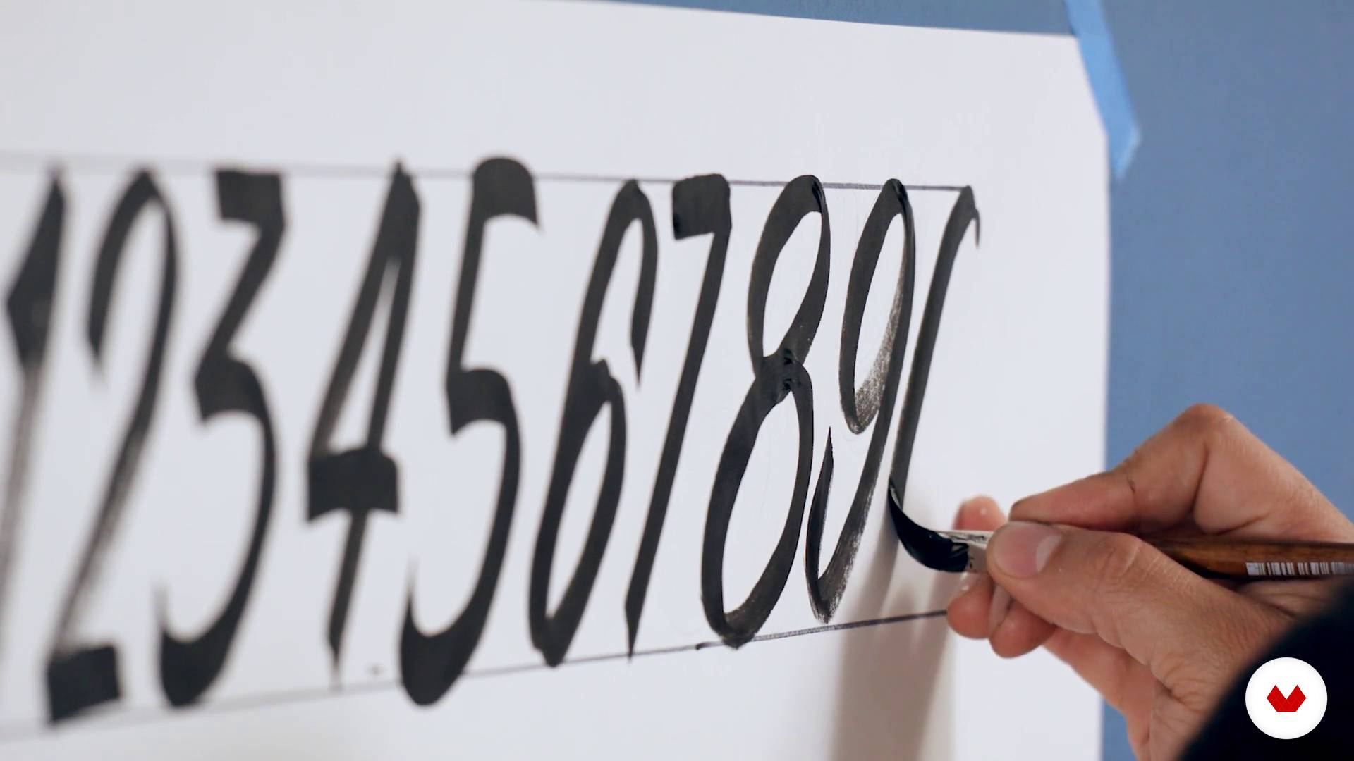
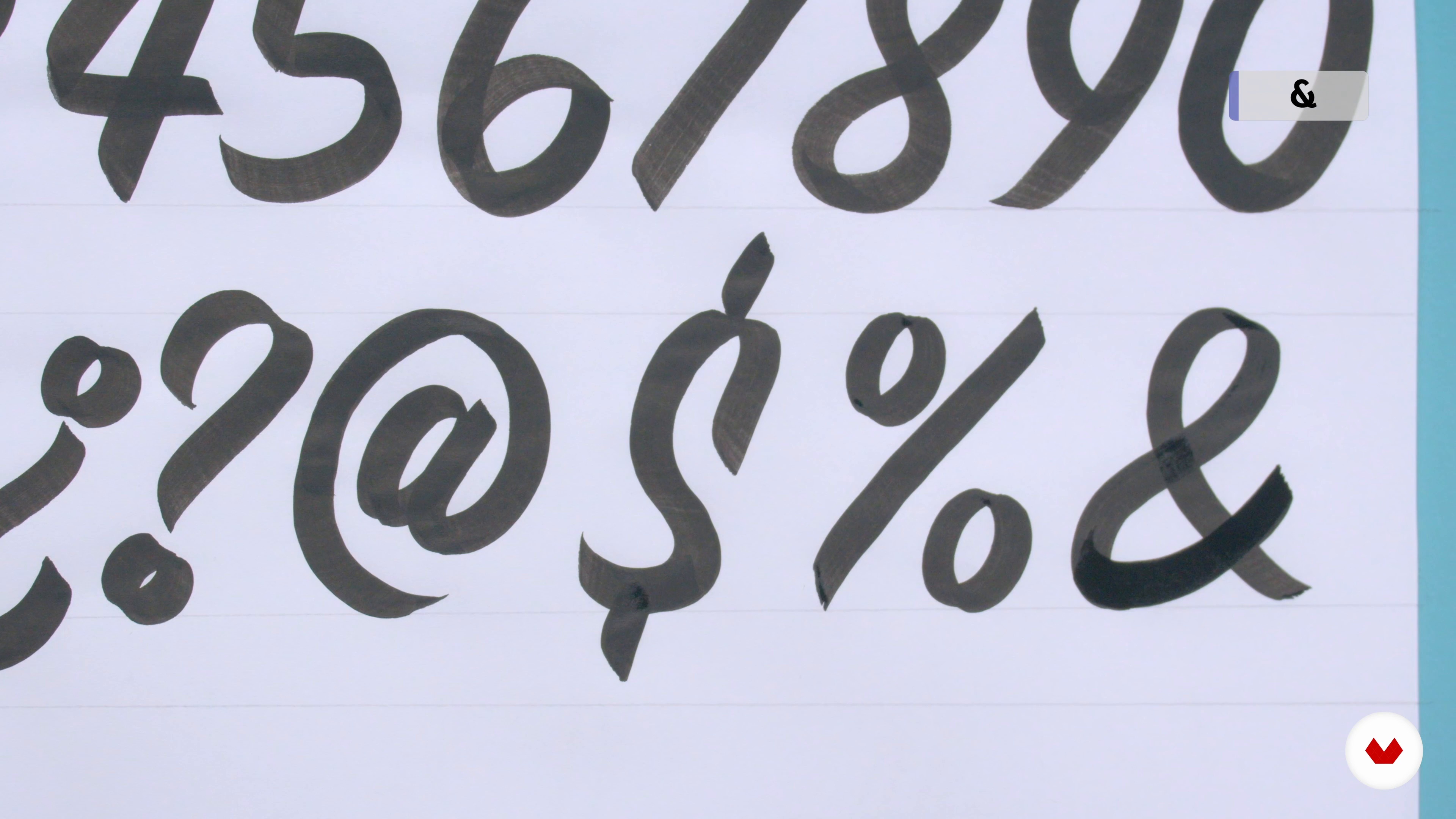
Another important group to practice, are numbers, probably the most important element in a supermarket sign. Now we will learn how to build them, along with some punctuation marks and other elements of the alphabet.
11m
8Upright / Bold
The first model that we have learned has an inclination, but the Upright version, could be in roman typographical terms; that is, this variant has no inclination. It is important to know and practice this style, just like the Bold versions. How we saw it in the beginning, the brush works with pressure, if you use more pressure you can generate this style through thicker and heavier strokes.
6m
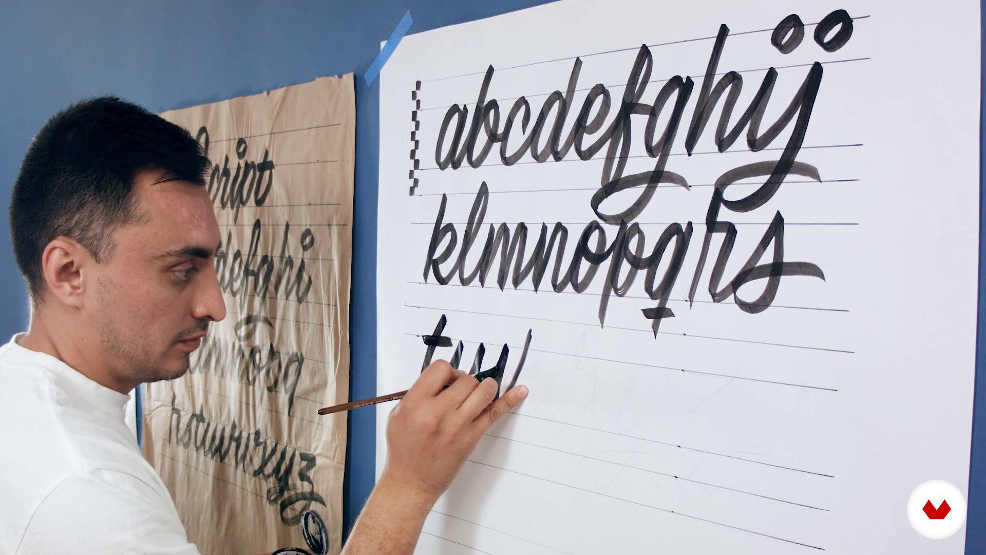
9Script
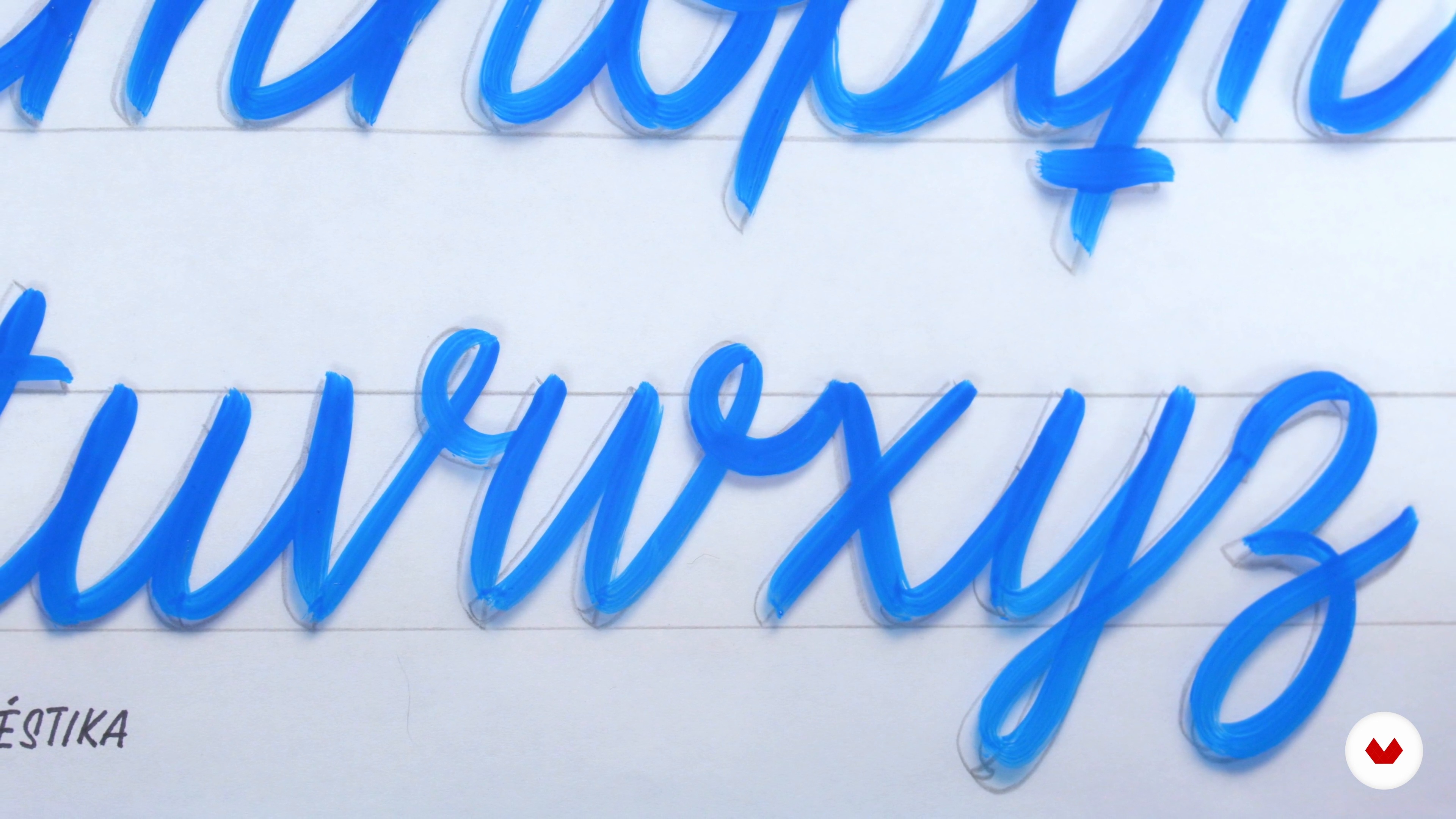
All the basic traits that we have learned can also be used to reproduce the Script model. Here we will learn how to do it, through the practice of the alphabet in lowercase letters.
15m
10Definition of the project and references
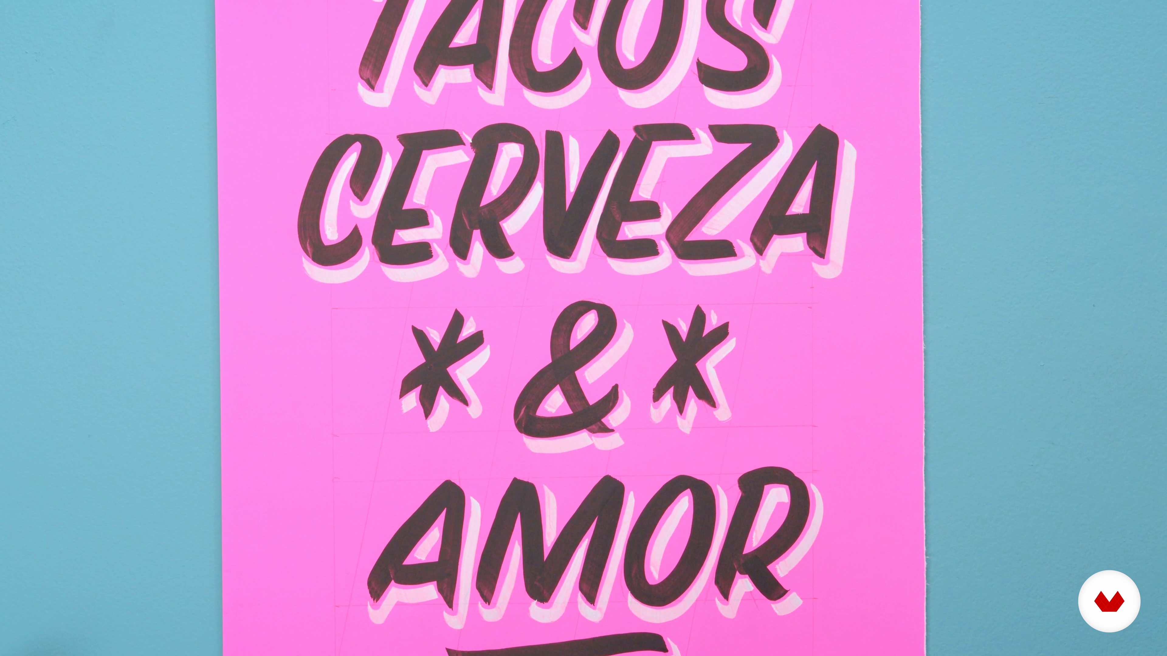
The project consists of creating a promotional poster, inspired by the supermarket signs and made with casual letters. For this, we will analyze some posters, to find the meeting points in their composition and learn why they are efficient. The main idea is to inspire us in the supermarket sign, but we can have some other visual references and decontextualize our project a bit. Here I will tell you where the idea for my project came from and I will give you some ideas to make yours.
4m
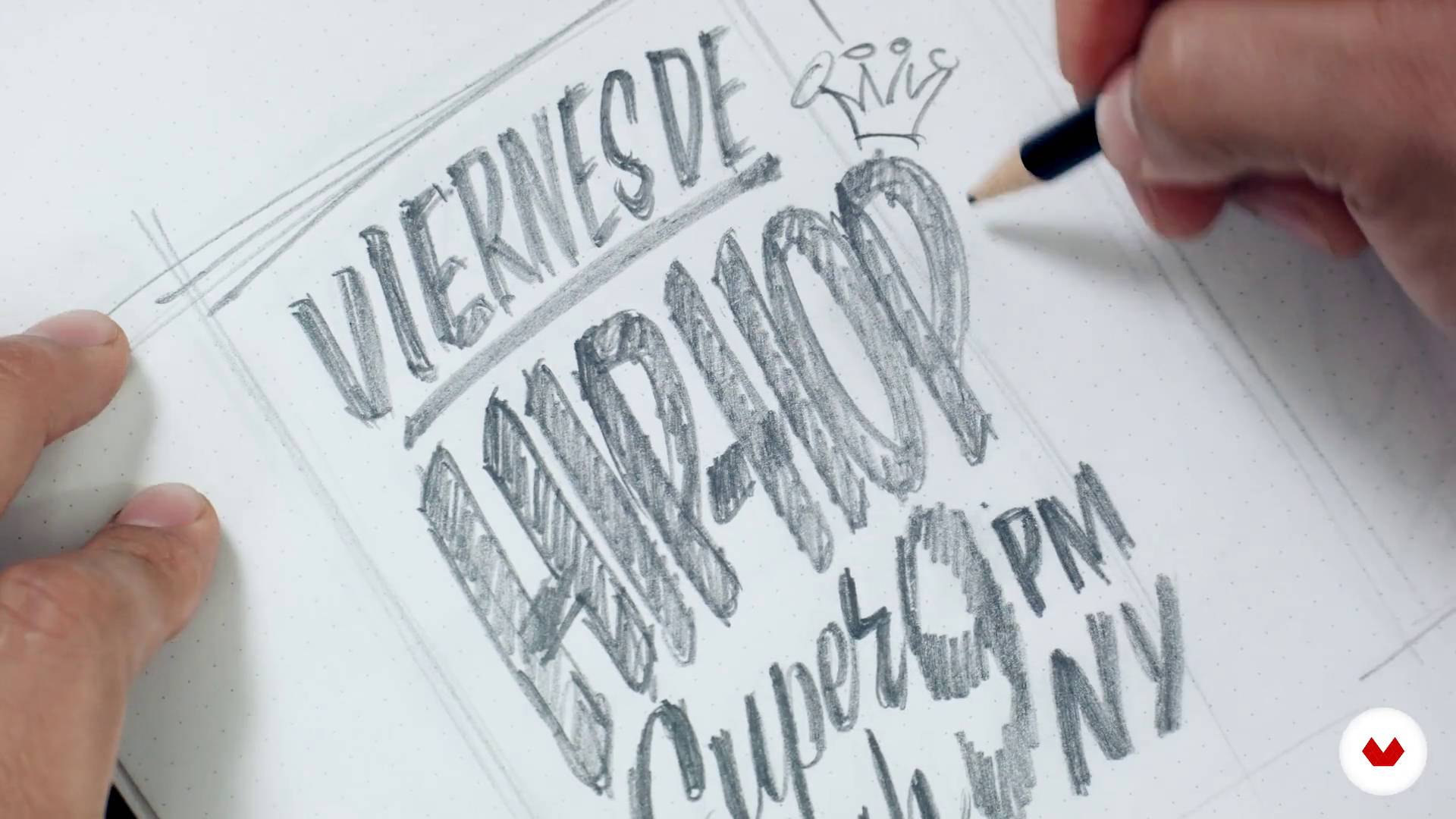
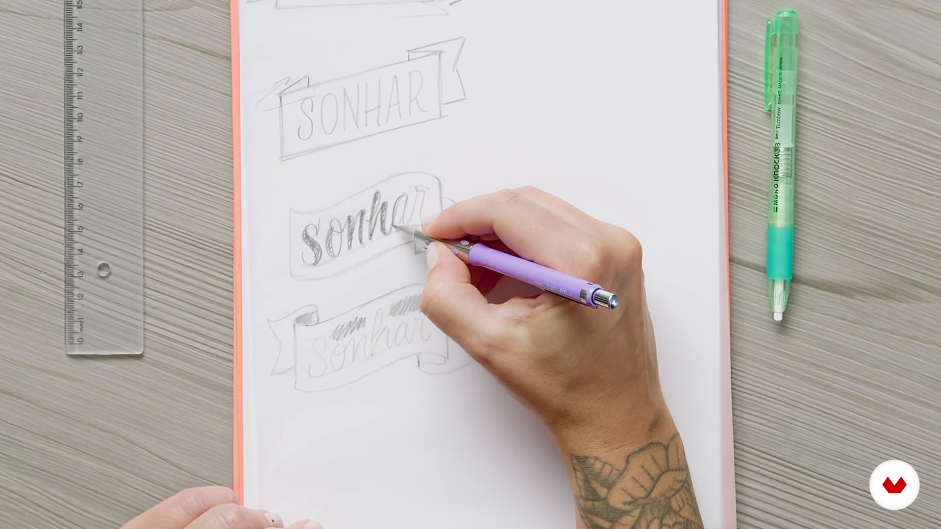
11Bocetaje
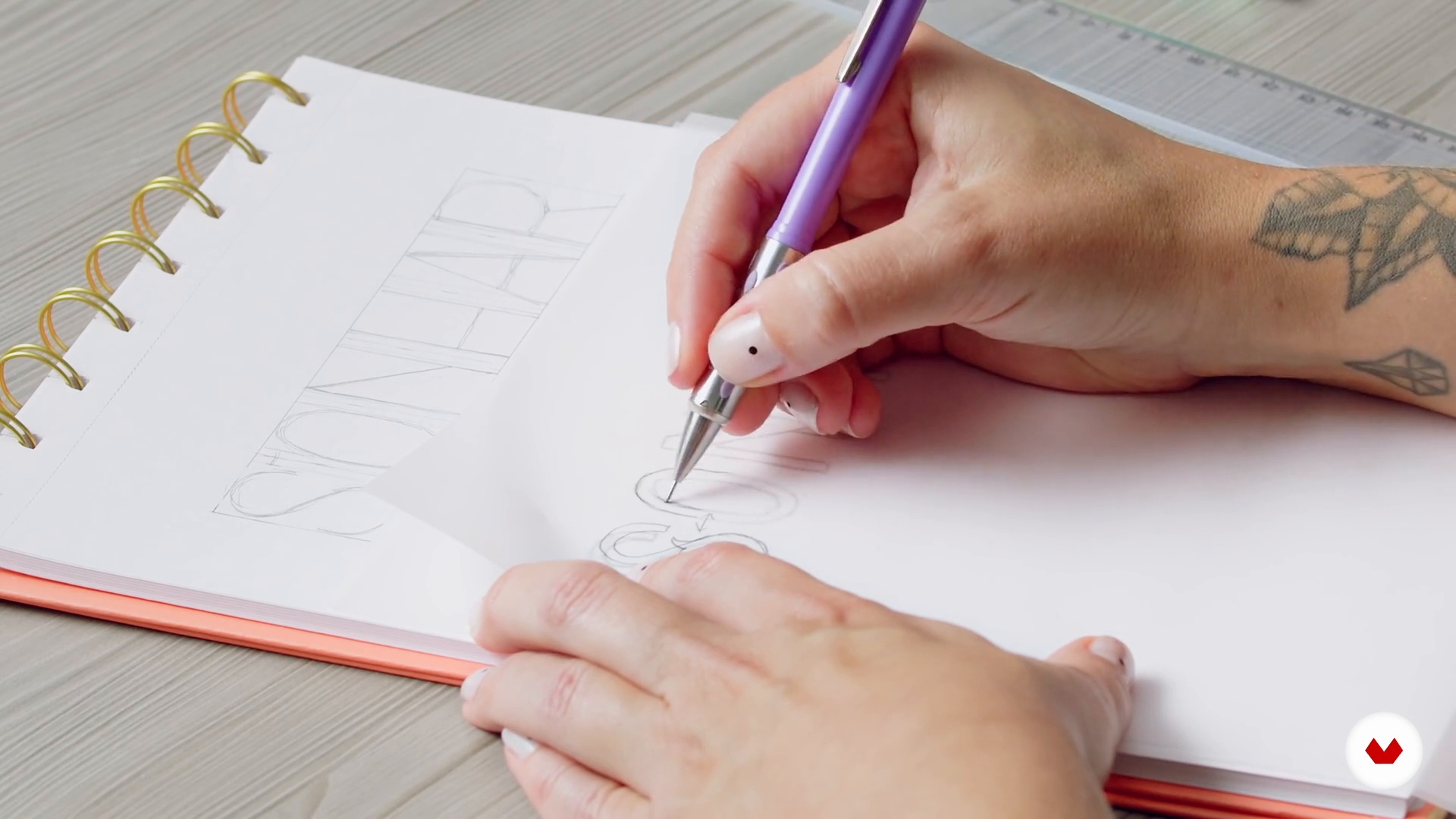
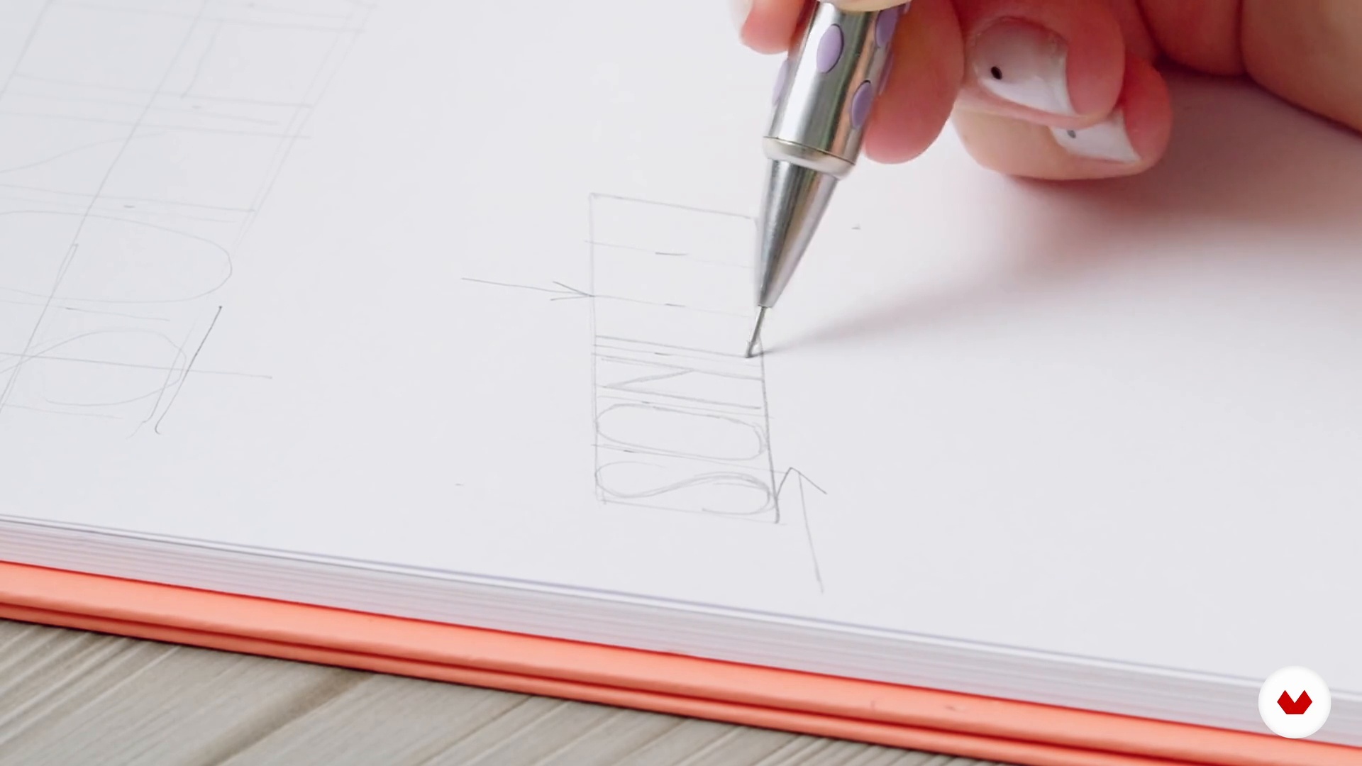
It's time to download our ideas to paper. The important thing is to try different compositions and combinations, it is also not necessary to work each idea in detail and with a brush. We will practice different options, but do not forget that the only styles of letters that we will use are those learned in this course.
8m
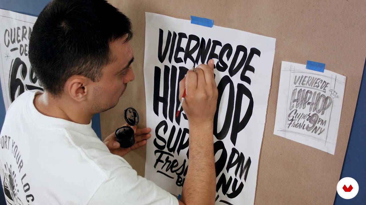
12Development of the poster
Of the options or layouts that we have sketched it is necessary to select the best options and now yes, reproduce them with the brush. From here, we will work on the best idea over and over again, repeating as many times as necessary.
10m
13Refinement and final piece
Now I will show you how to transfer the sketch to our final support. Then, we will apply everything we have learned so far, taking care of our lines and detailing them so that they are very well done. Make it readable, nice and clean. Ready!
20m
3Chalk, support materials and the ideal blackboard
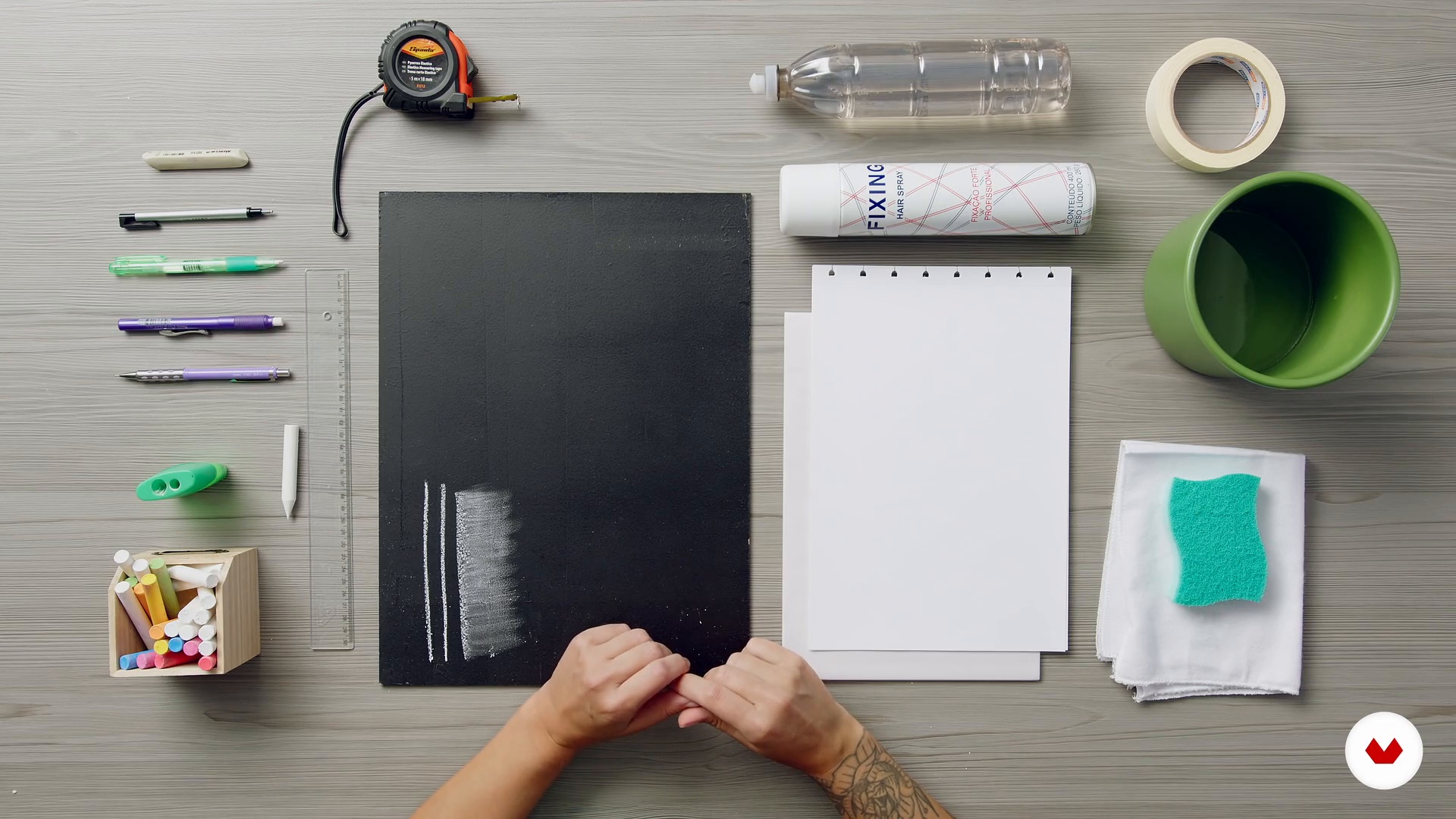
In this class, I will present all the materials I use to make my arts with chalk. I'll also tell you the secret to preparing an ideal blackboard surface to take advantage of all the nuances and textures possible with only school chalk.
5m
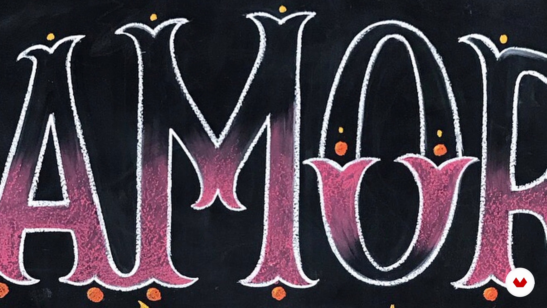
4Textures and drawing possibilities with chalk
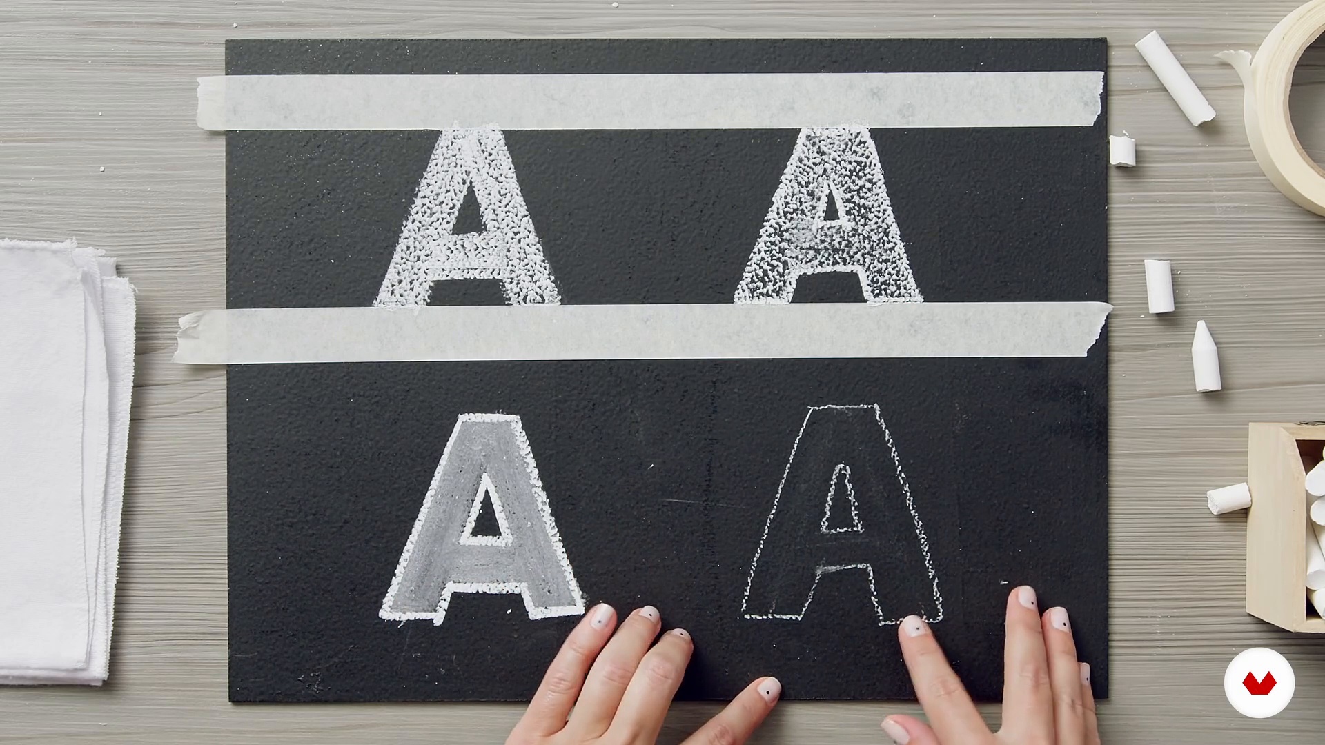
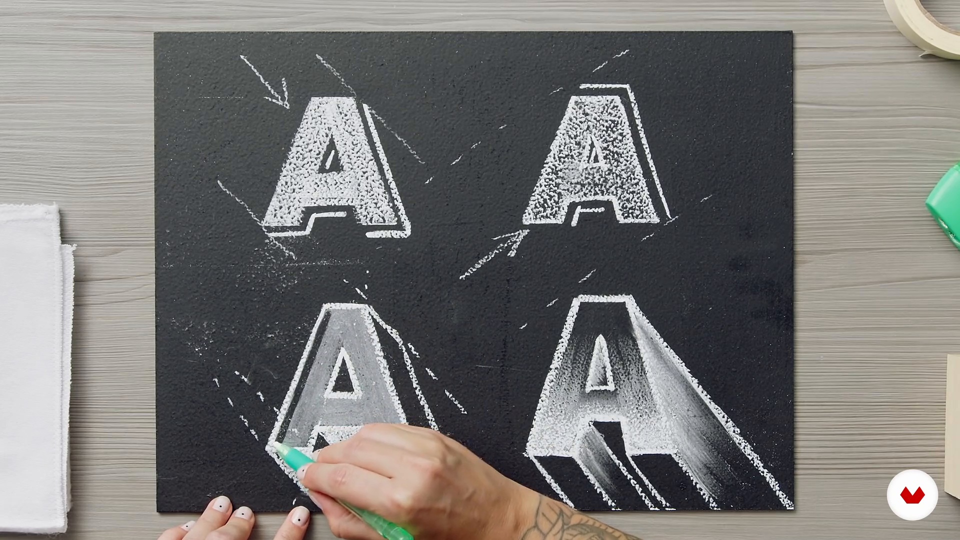
In this class, I'm going to prove how it's possible to make amazing things with just white school chalk. You'll learn how to handle the tool to use it in infinite ways: make beautiful gradients, smoky or textured effects, taking advantage of everything that the technique allows.
14m
5Cleaning and finishing tips
In this class, I'll give you tips on how to clean up and keep your chalk art under control. I know chalking isn't always as easy as it looks, but with the right tricks, you'll master this technique in no time!
5m
6The choice of phrase for the project wall
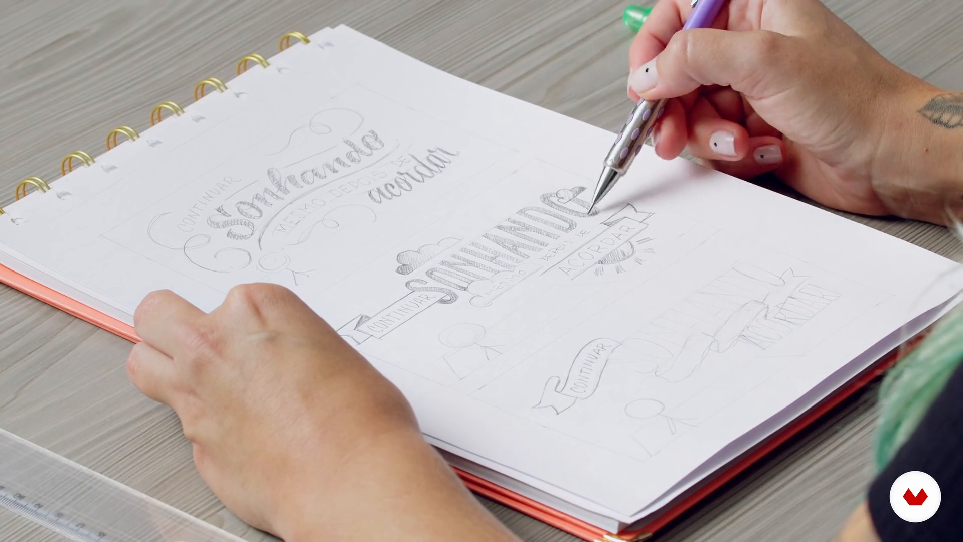
Shall we start thinking about the project? In this class, you will see how to choose a phrase, brainstorm ideas of what can be illustrated, in addition to studying the possibilities and making the first drafts for the chalk board. Here we go?
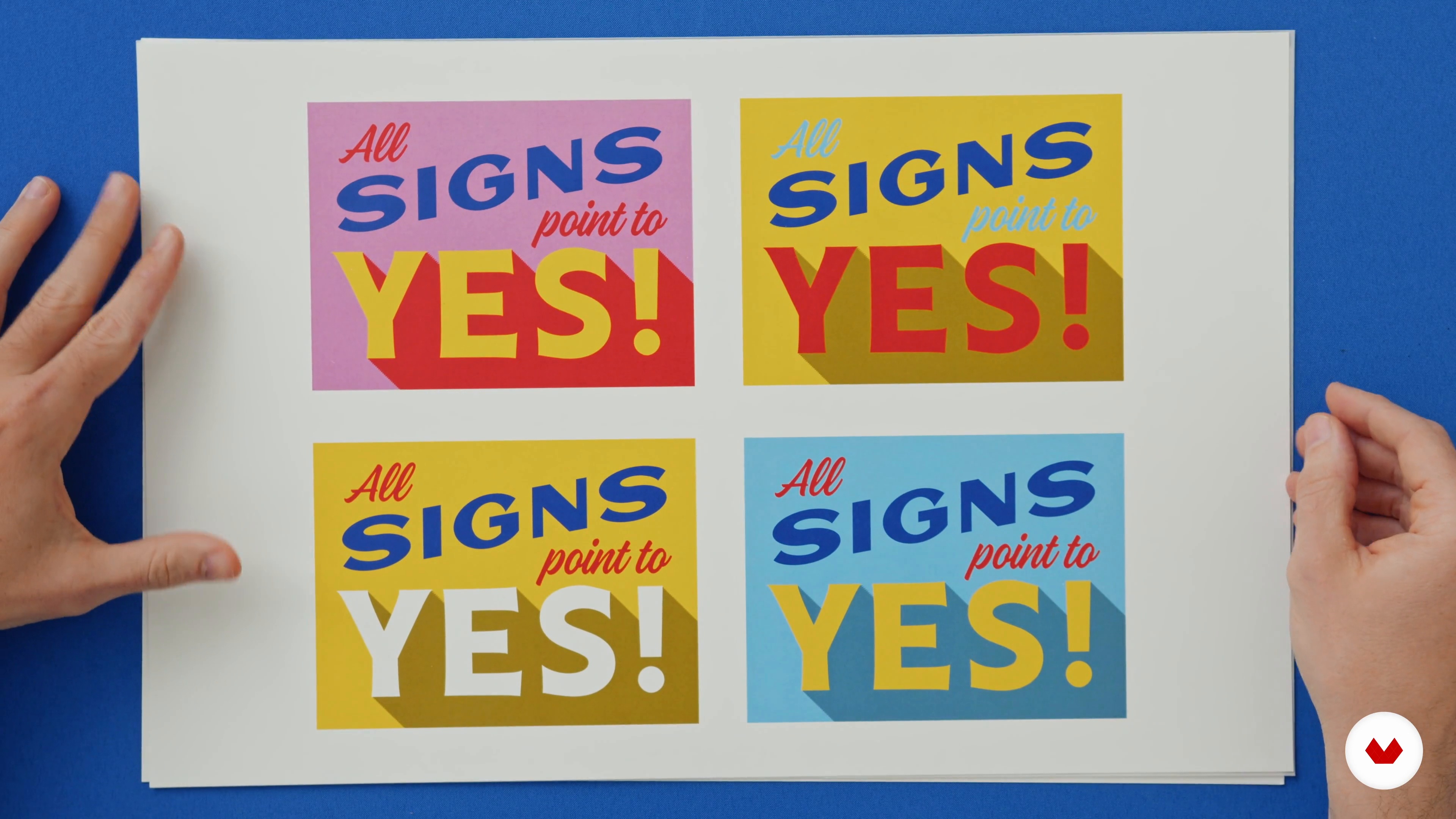
10m
7Step by step lettering design
In this class, I'll show you step by step how I think about my letterings from the beginning. By choosing just one word from my project sentence, I will teach you how to add more elements, volume and depth to enrich the final result of the lettering.
9m
8How to give more movement to your arts
In this class, we're going to build on what we learned from the previous class and add movement. You can use distortions in a variety of ways, always looking to use guidelines to maintain the proportions and orientation of the letters.
6m
9Add other decorative elements and depth
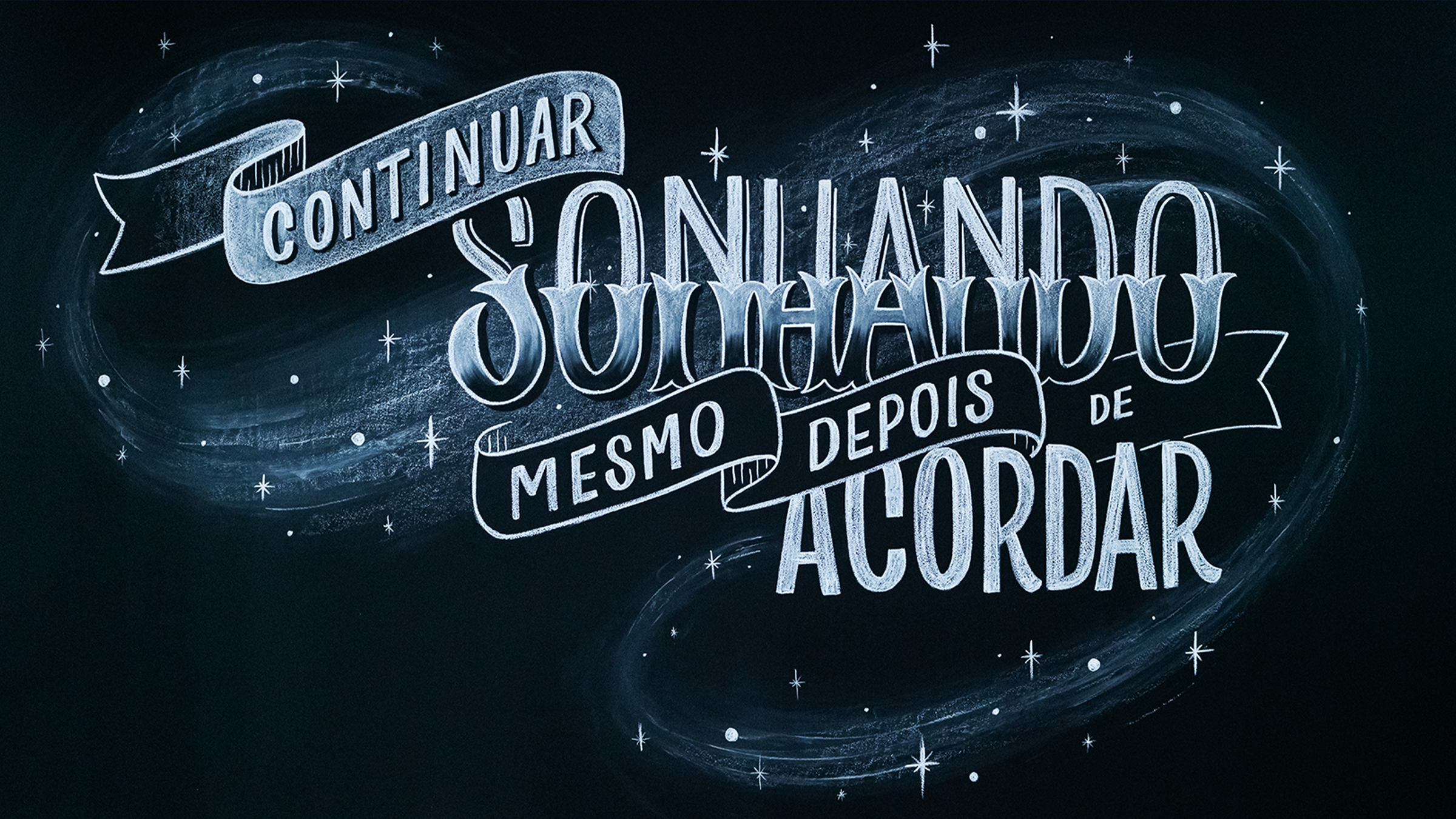
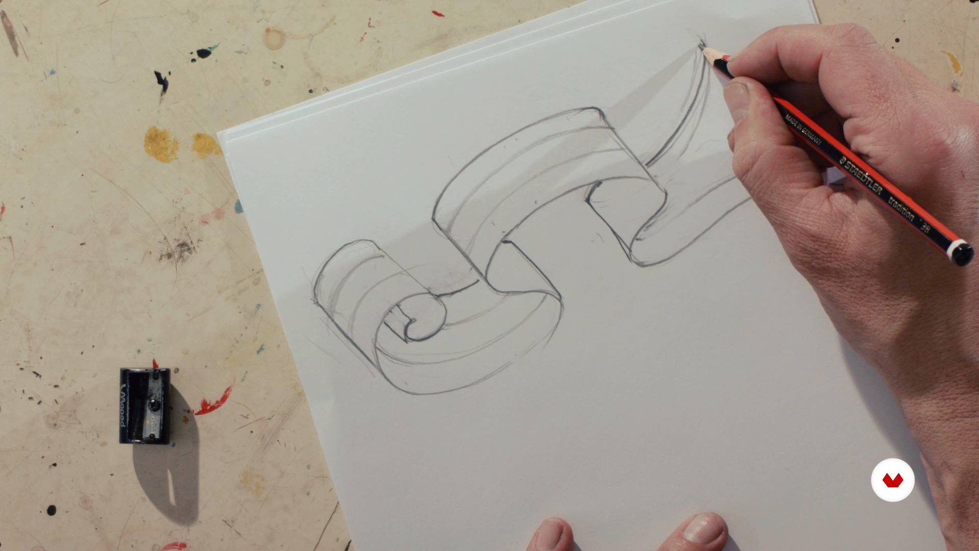
Continuing with the learnings of this unit, your word can be inserted inside a banner or pennant to give more prominence and movement to the letters. Or, simply, you can work on shadows or 3D perspectives to give your art more depth.
6m
10The choice of styles and visual elements
In this class, I will talk about the importance of choosing all the elements of an art for good communication. From the font style and decorations to the color that will be used. Everything we draw communicates something. Images, figures and colors always convey a message beyond the written word.
2m
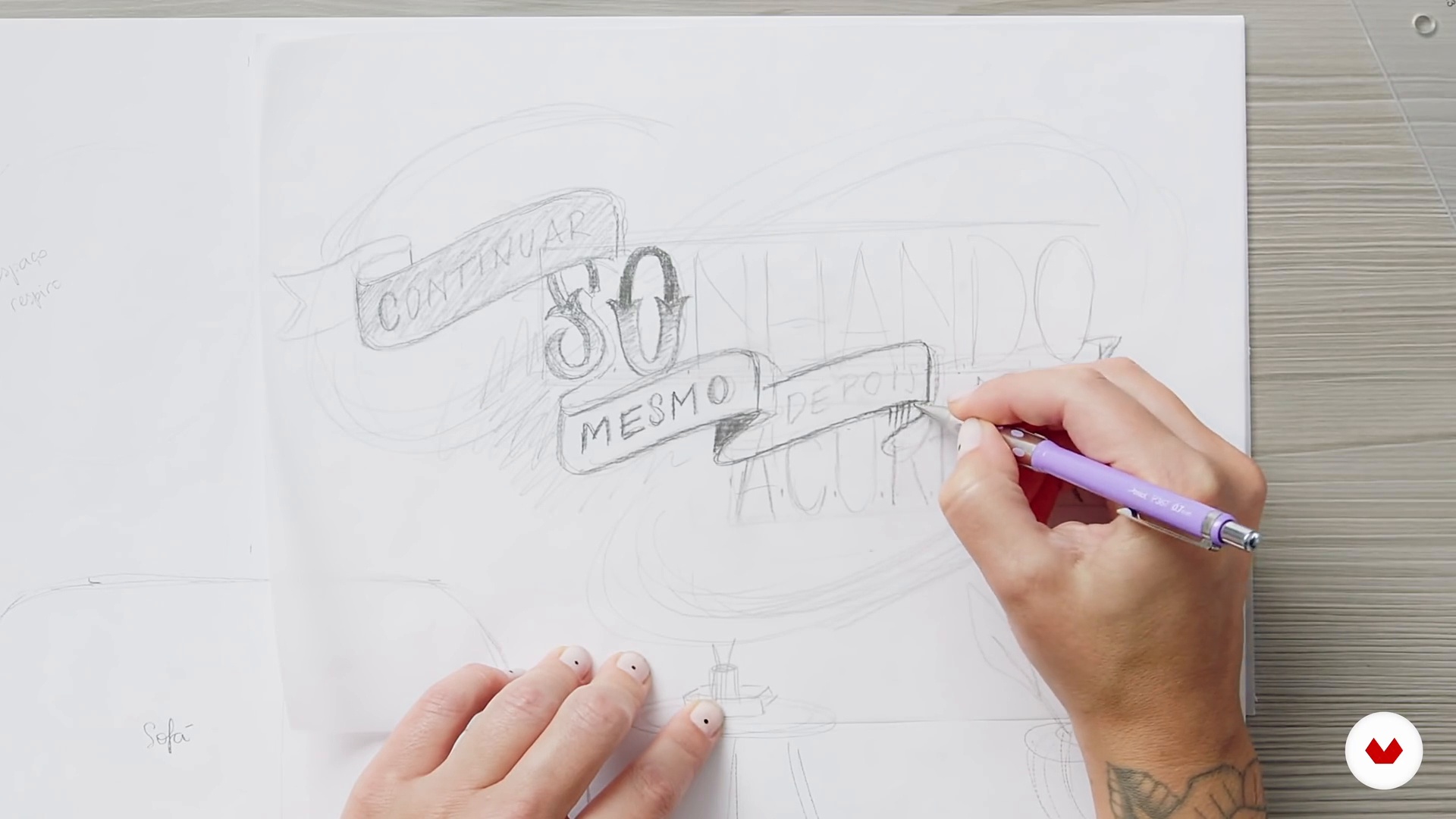
11Defining your artwork
After studying all these possibilities, it's time to define the final study of your project before moving to large format. Planning well in advance on paper and defining how to occupy the space on the wall is essential for a good result.
12m
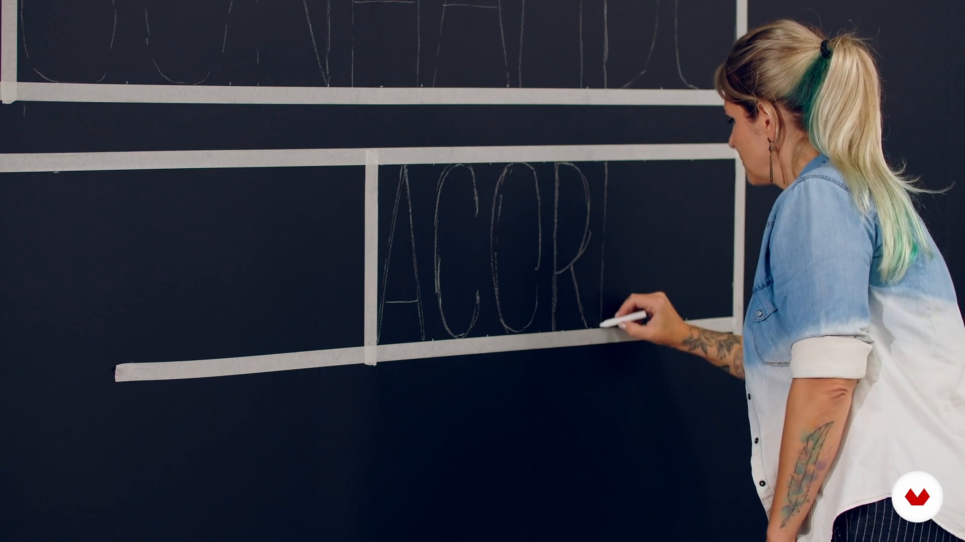
12Enlargement of drawing for chalkboard wall
In this class, I'll explain how to enlarge paper art for the wall with scaled measurements if you don't have a projector.
3m
13Fills and textures
In this class, we're going to start filling in and fleshing out the art. You always need to start with the details of gradients and textures before defining the contours well.
2m
14Defining contours and details
The time has come to give more definition to the finishes of shadows made with rubber and delineate the strokes and contours well to provide more contrast and sharpness between the illustrated elements.
2m
15Finalization and registration
To close with a golden key, it's time to erase those little dirt left over from the chalk, give the last touches that are necessary, apply a fixative, if desired, and register to put this beauty on display for the world to see and enjoy!
5m
3Presentation of Supplies
In this lesson, I will review all the standard sign painting tools and materials. I’ll then show you the supplies you'll be working with to make your custom sign.
4m
4History of Sign Painting
Let's go back in time! In this lesson, we will take a brief look at the origins of sign painting. I will provide some historical context and introduce the traditional styles of lettering.
2m
5Hand-Painted Lettering Techniques 1
Now, I will show you how the magic happens! First, I will demonstrate how to set up your painting station. Then, I will model how to handle your paints and brushes. Finally, I will introduce how to start creating letterforms using precise, controlled paint strokes.
17m
6Hand-Painted Lettering Techniques 2
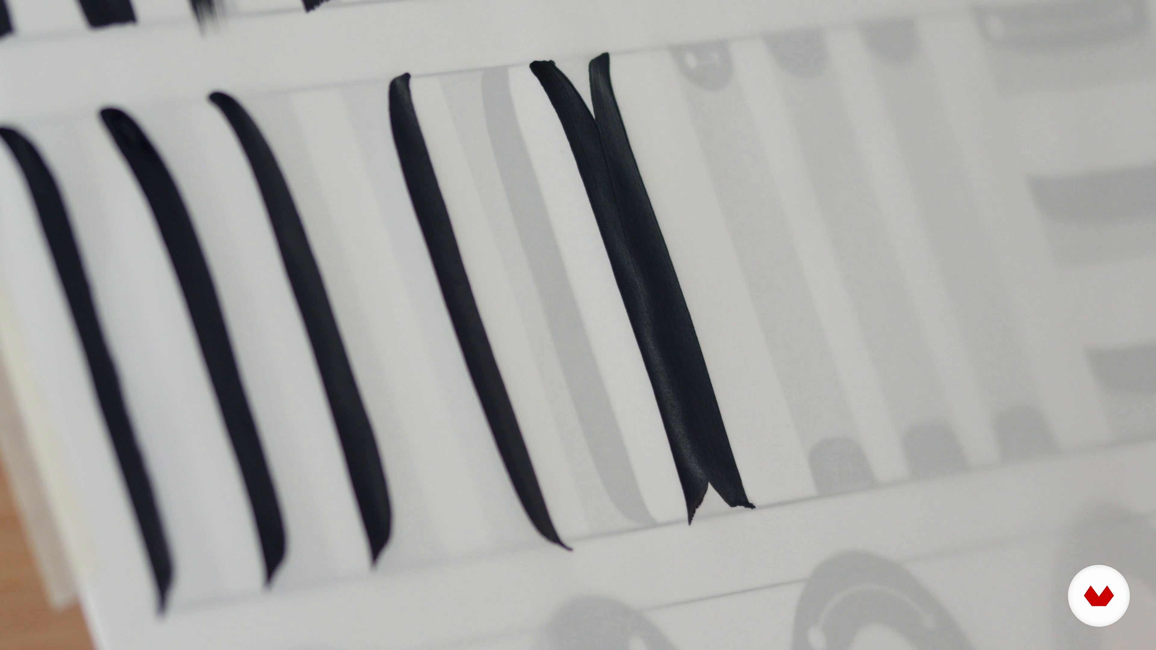
In this lesson, we will continue the theme of practising our brushstrokes. You will create rounded, tapered, and uninterrupted lettering before starting your sign.
16m
7Project Ideation, Sketching, and Refinement
In this lesson, I will show you how to approach the creative process from start to finish, with lots of examples of sketching and refinement.
10m
8Sign Prep and Image Transfer
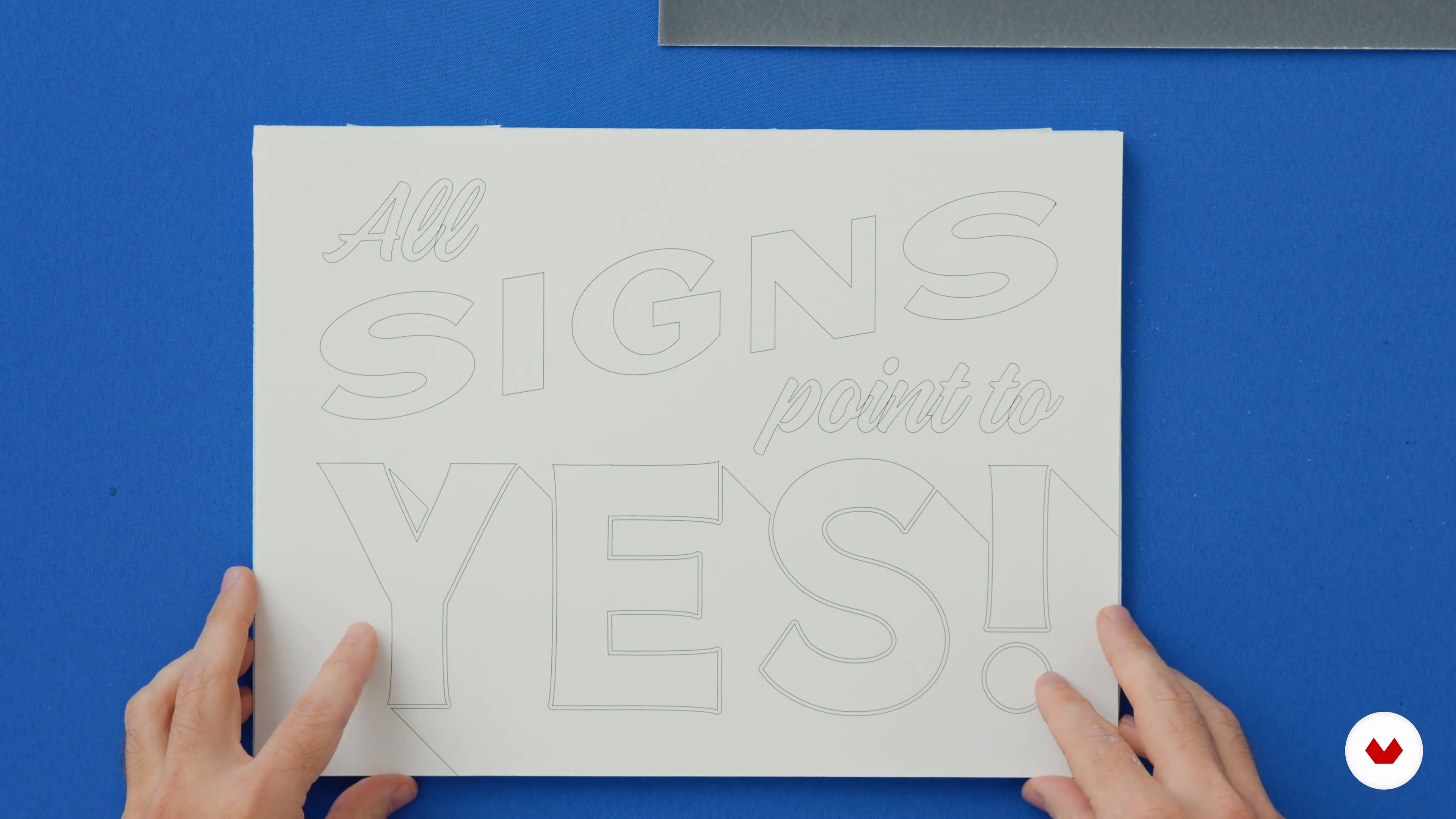
This lesson will explore how to transfer your final design onto its surface.
11m
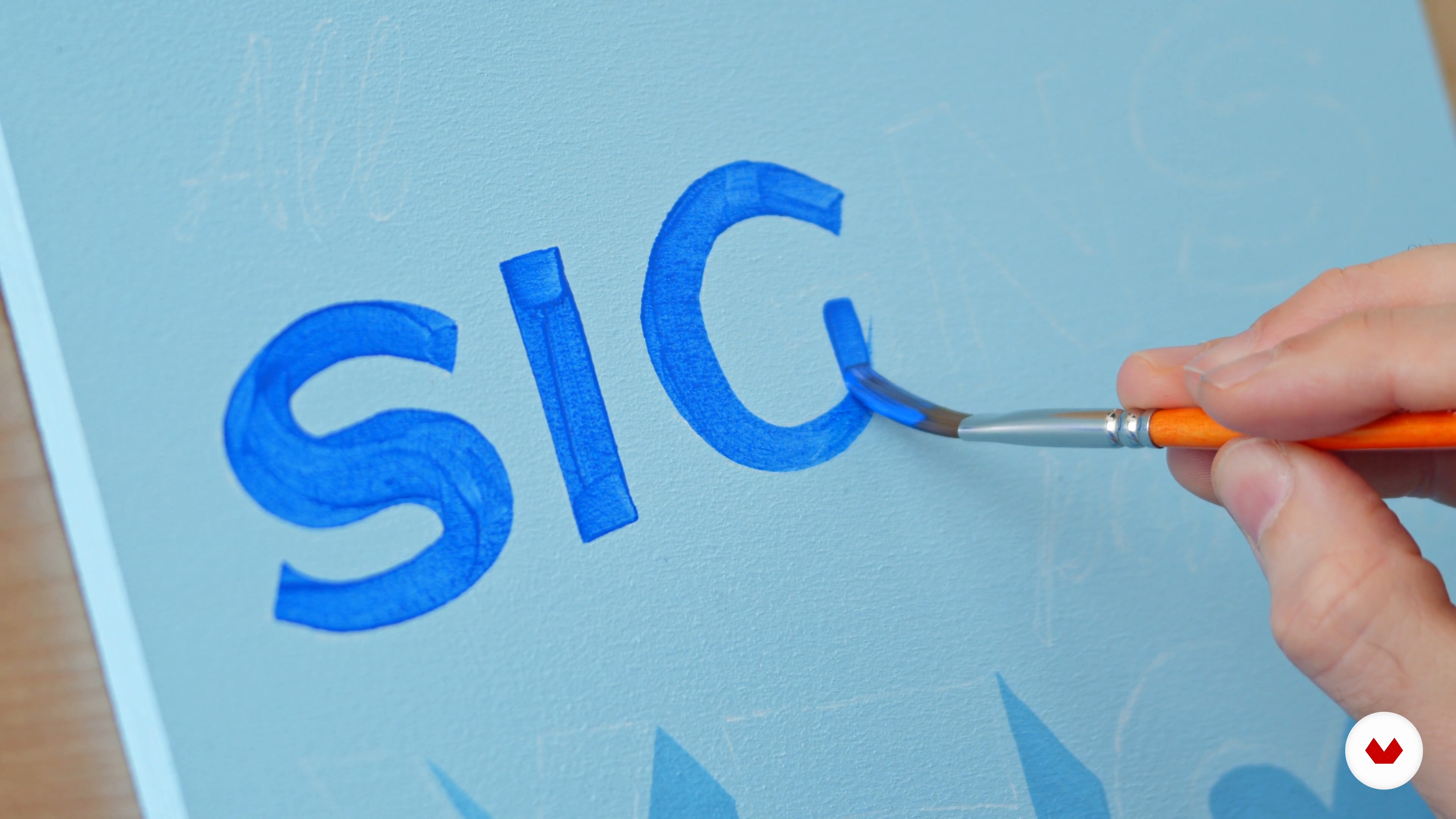
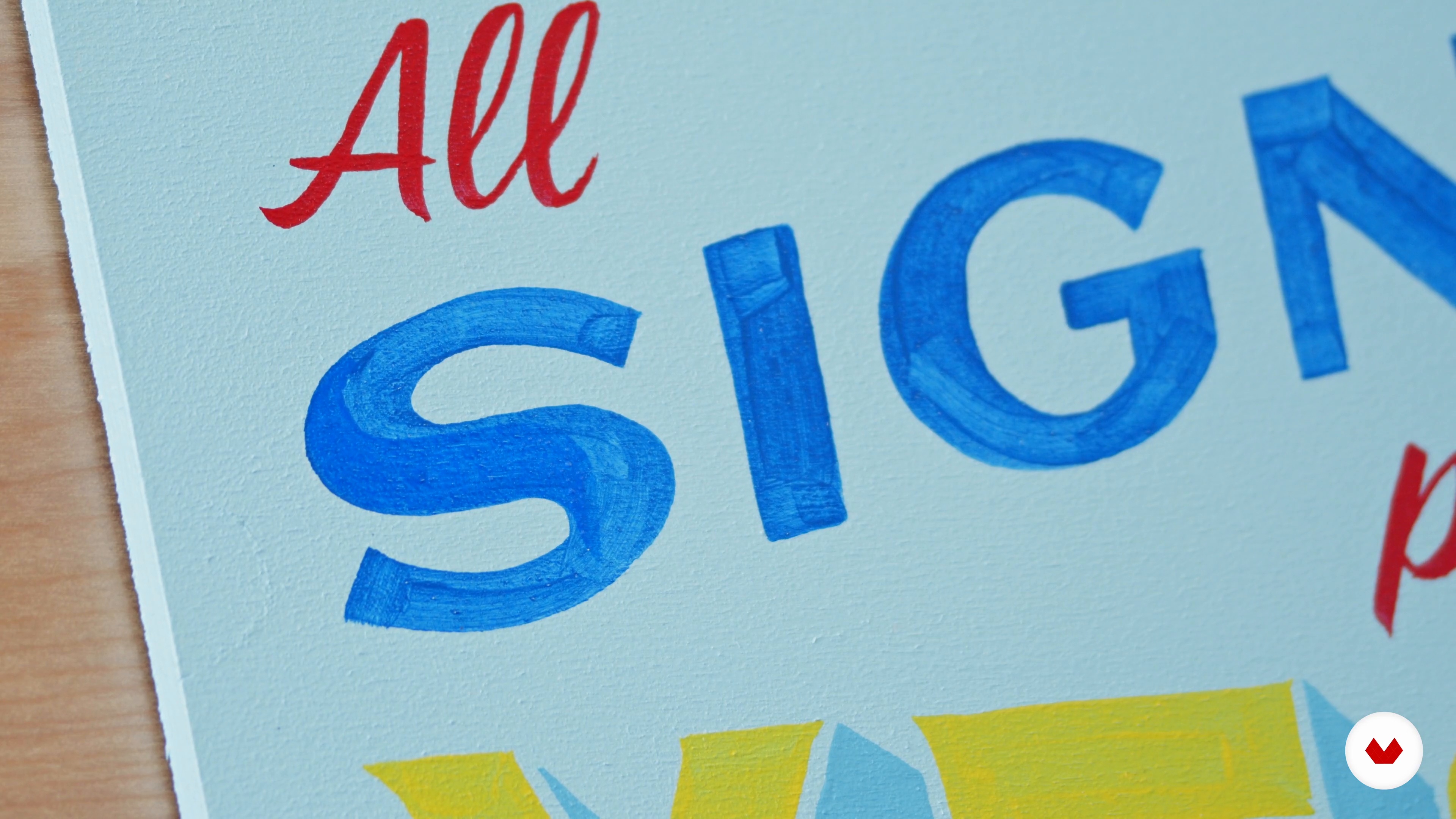
9Painting Your Sign Blue
In this lesson, I will guide you in painting the first part of the text.
12m
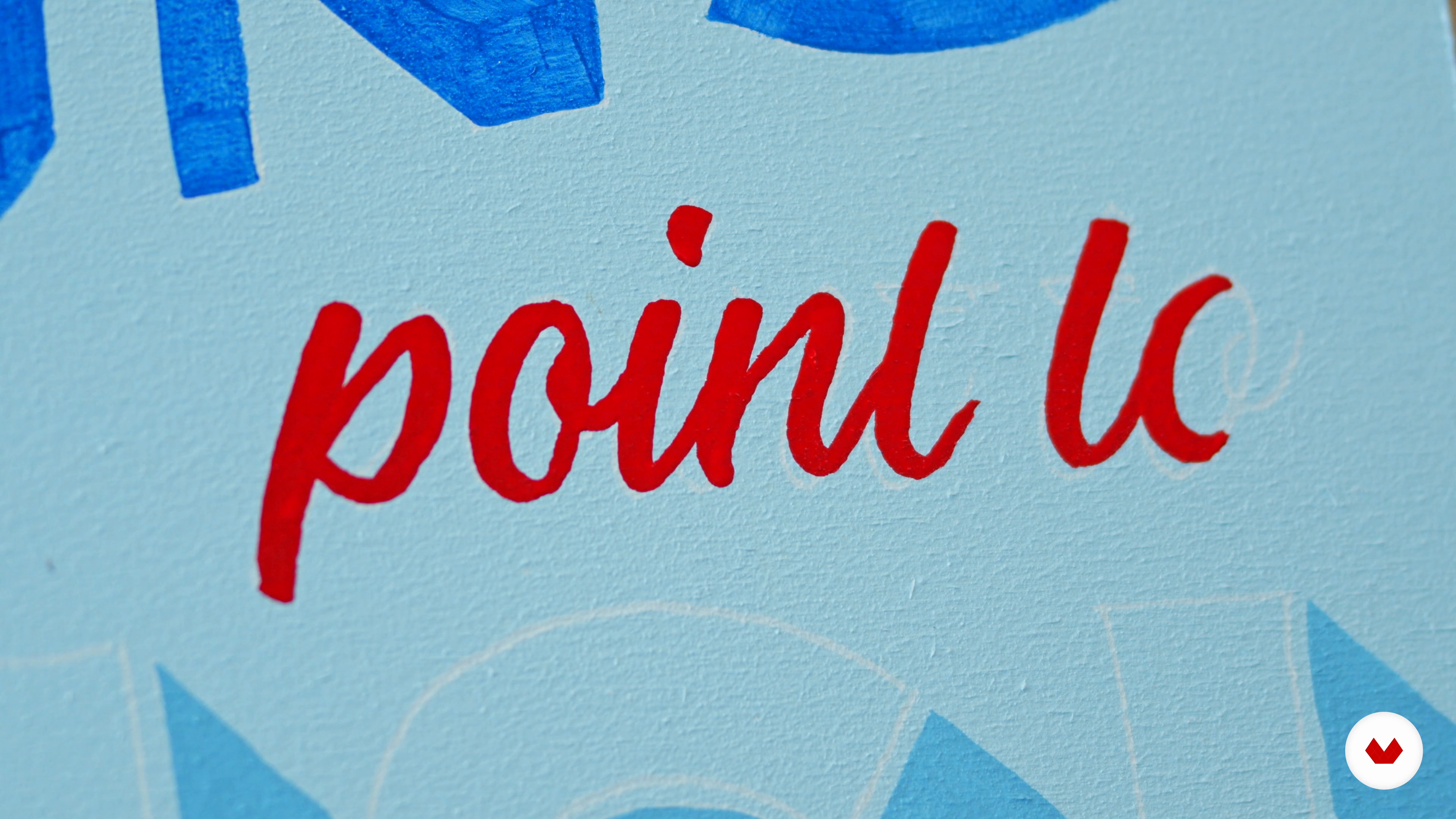
10Painting Your Sign Red
Here, we will move on to the second part of the text.
8m
11Painting Your Sign Yellow
Now, we will paint the third part of the text.
6m
12Touch-UPS
This lesson will focus on the special additions that will refine your piece. Namely, I will show you how to achieve a good level of opacity and do the necessary touch-ups.
7m
13Finishing and Hardware
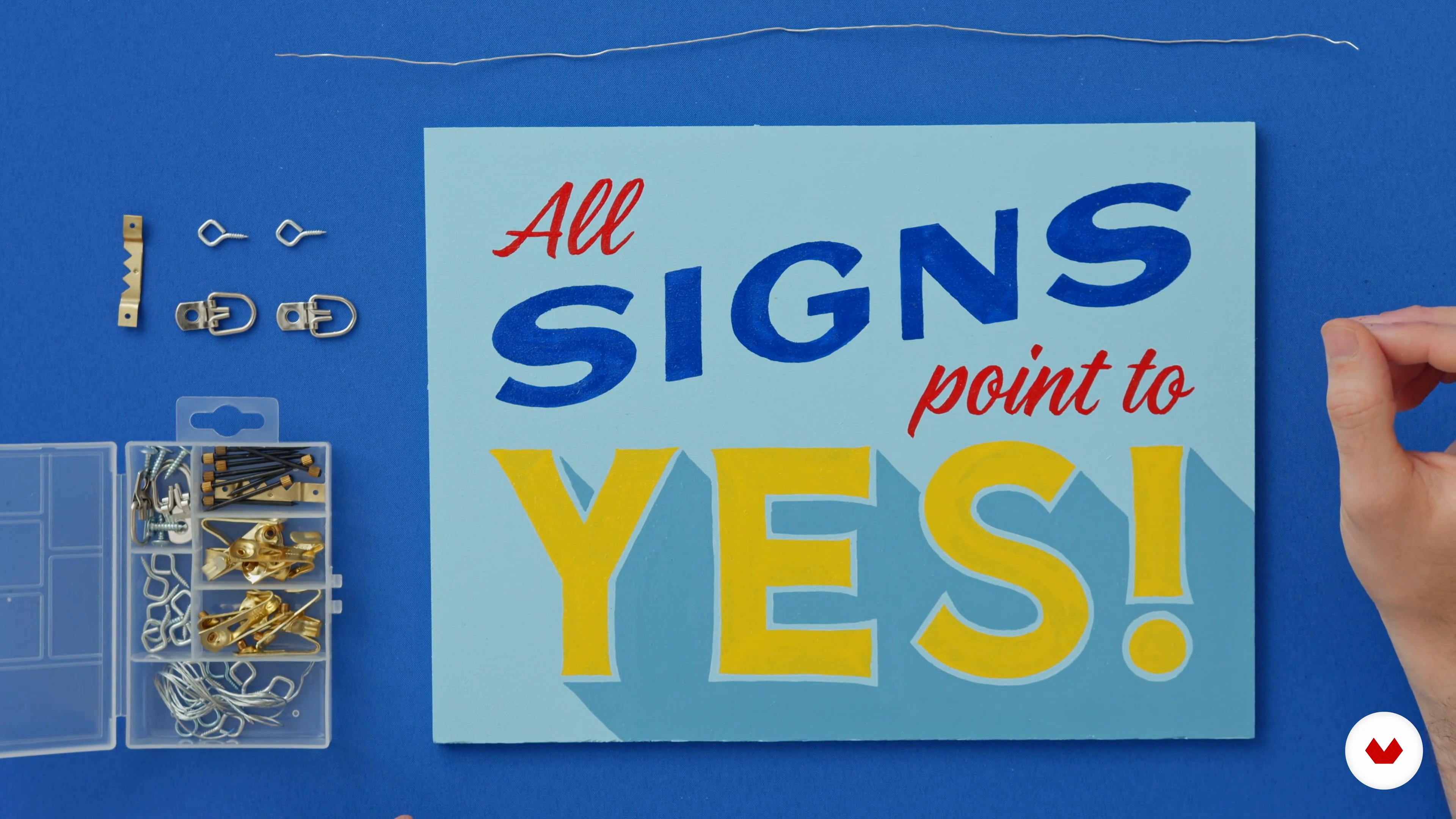
Finally, let's take a moment to admire our finished signs. Now is the time to add a clear coat or layer of varnish. This will preserve and professionalize your image. Then, I will guide you in installing simple hardware to hang your sign.
6m
14Sharing Your Sign on Social Media
In this lesson, I will teach you how to professionally photograph your sign and thus make it shareable on social media. Then, you can build your portfolio!
2m
15Using Your Skills to Do Good in Your Community
To finish, I will talk about how to find sign painting opportunities in your community.
1m
3What are signs, calligraphy, lettering and typography?
In this lesson you will learn to differentiate a label from calligraphic work, lettering and typography. These concepts are important to understand the lyrics and be able to do a better final job.
3m
4Signage and popular graphics
I want to talk to you about the importance of the label maker's trade and share a little history with you.
1m
5Materials
I will explain the importance of knowing how to choose your materials. I will show you the brushes, paint and other tools that help us do our job better.
7m
6Vertical and horizontal strokes
In this unit you will become familiar with brushes and painting and I will teach you the first brush strokes and letters. I will talk to you about the correct way of working, as well as the importance of the position of our body and our work space.
11m
7Diagonal strokes
With a little practice, I will teach you the family of letters with diagonal strokes to complete the alphabet.
4m
8Curved strokes
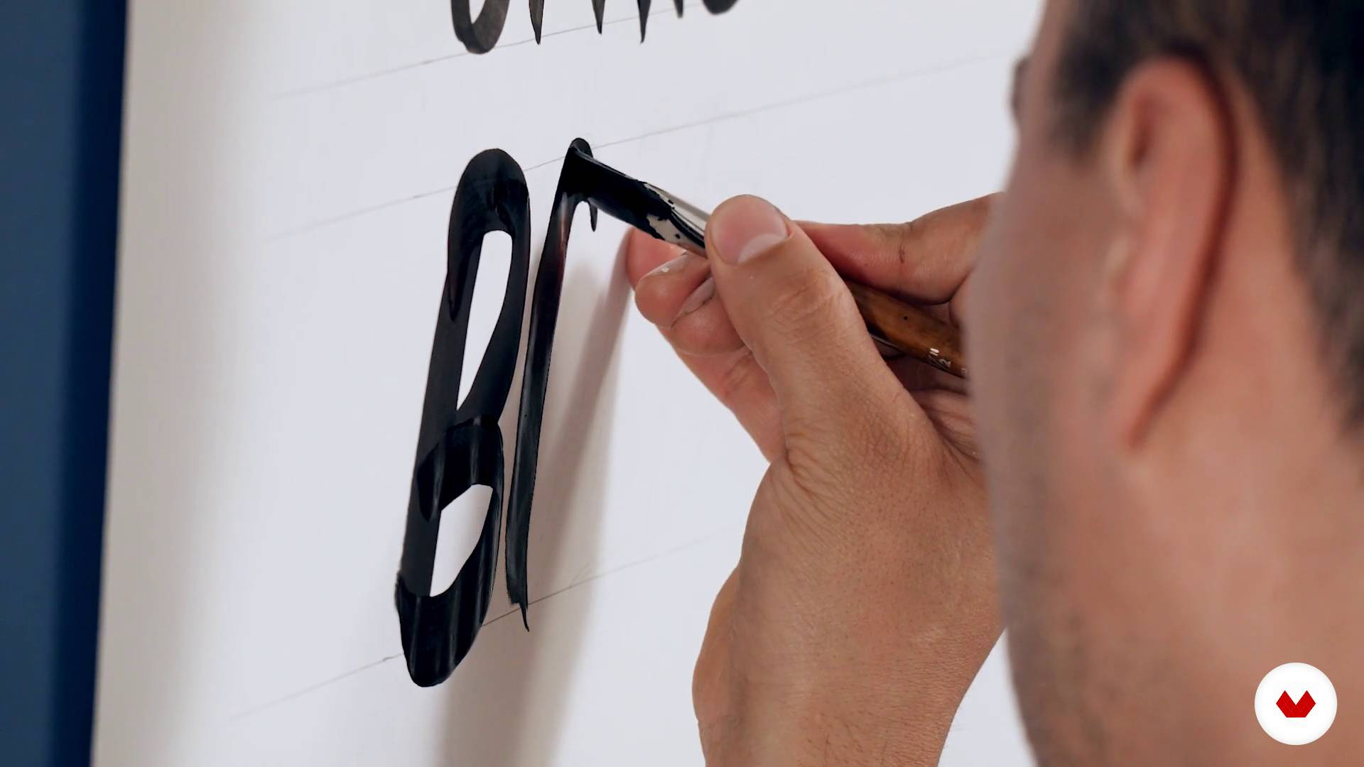
The family of curved strokes is a bit particular in the unions of the curves, in this lesson I will teach you how to achieve them.
5m
9Compound strokes
To finish the alphabet, I will explain how to make letters that combine curved, diagonal and vertical strokes.
4m
10Numbers and punctuation marks
Finally, you will see how to draw the numbers and some signs.
11m
11Preparation of the poster
In this lesson we will make a poster with the alphabet practiced and learned.
14m
12Conceptualization and sketching of the phrase
For this first lesson you are going to find a nearby business to make a sign for them. You will learn composition basics and apply word ranking as in the previous unit, but we will add some reference alphabets.
13m
13Practice on glass
Before I continue, I'll show you a practice on glass that comes in handy to loosen up your hand.
10m
14Start painting
In this lesson you will practice some strokes on the glass and then start applying color to the glass.
12m
15Last details
Finally I will teach you to give the last details, such as applying shadows and painting decorations.
10m
3Some works and bibliography I
We will see in this lesson some filleted work aggiornados and adapted to more current supports.
10m
4Some works and bibliography II
I keep showing you more material
14m
5Facing a project
First of all, we'll talk a little about how to tackle a new filleting project.
9m
6The Drawing, the basis of everything 1
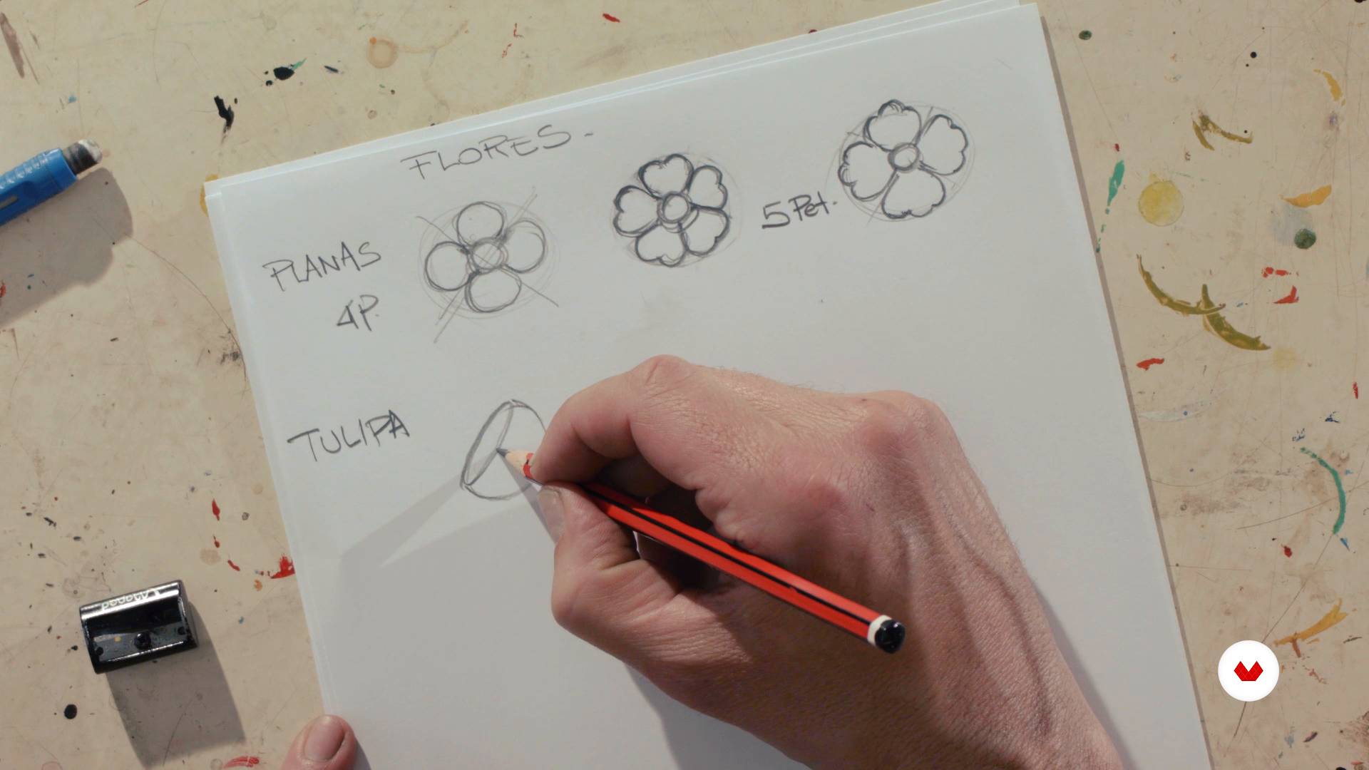
Now, I will teach you how to draw the basic figures of this style.
9m
7The Drawing, the basis of everything 2
This is the second part
13m
8The Drawing, the basis of everything 3
And this is the third part.
14m
9Design of a simple filleted composition 1
Since you master the loose elements, I will teach you the rules of filleting to compose.
14m
10Design of a simple filleted composition 2
This is the second part.
6m
11The volume in drawing 1
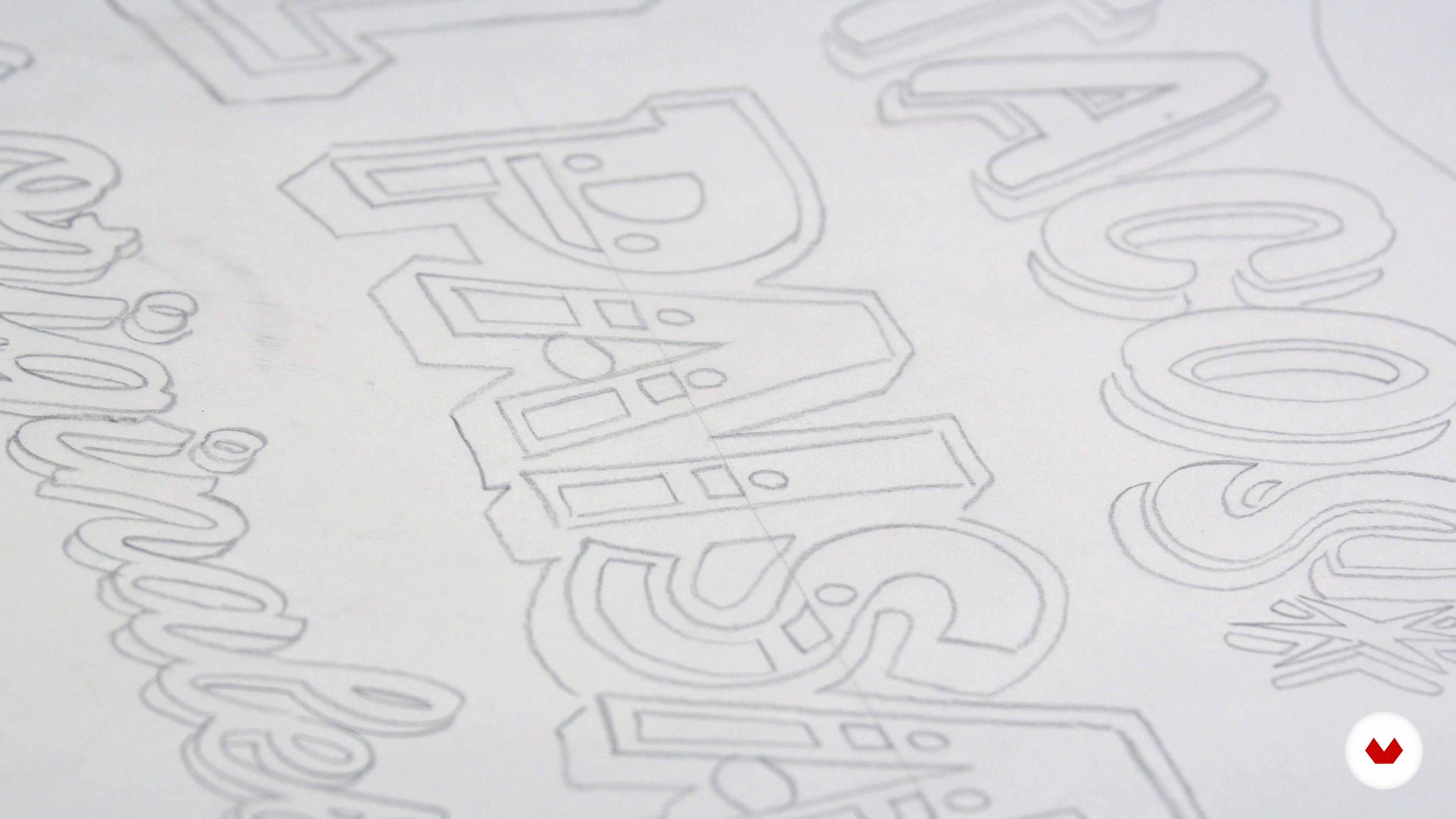
Once we have the poster designed, I will tell you what is the basic technique to give volume to the figures. We will start practicing in pencil and then we will reproduce it with paint in the next unit.
11m
12The volume in drawing 2
This is the second part.
12m
13Design of a poster
In this lesson we are going to define the final form of our poster. We will write the central sentence, compose the image with the rules learned, and finally we will drill it to make it ready for the next step.
7m
14Materials and preparation of the support 1
Now I am going to tell you which are the materials that we will use to paint and how you should prepare the support for the poster.
9m
15Materials and preparation of the support 2
The second part
10m
16Stroke exercises to warm the hand
We are almost ready to start painting. But before, I leave you in this lesson some exercises with the brush, so that you loosen the hand and you can be more precise when filleting in the final support. It is important that you do this practice before moving on to the poster, because it will free you from the stress of being wrong.
12m
17Flat colors
In this lesson, we will do the basic painting of our poster with flat colors.
13m
18Painting of light planes 1
Once the first layer has dried, we will proceed to paint the light planes to achieve greater depth and realism.
12m
19Painting of light planes 2
Second part.
12m
20Application of shadows
Now, we will apply the shadows. This way we will be able to complete the play of lights that will give volume to our composition.
10m
21Glitter paint
Our poster is almost ready. We only have one last layer of very subtle paint. In this lesson, I will show you how and where to add a few small highlights to highlight some elements and add luminosity.
11m
22Final tips
We finished the poster! To conclude, I will explain to you in what ways you can give finishing and protection to your support. In addition, I will talk about the passage of the piece to digital: the scan or photo and the possibilities of digital edition of the poster.
5m
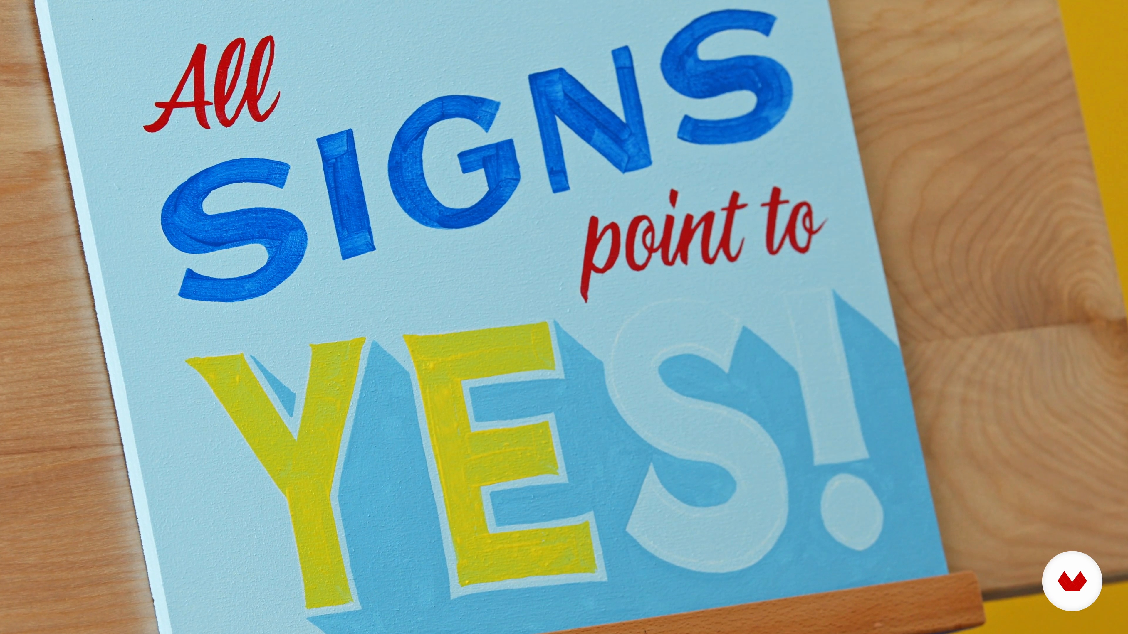
The course project consists of creating a basic sign applying fundamental sign painting techniques, demonstrating mastery of proportions, brushstrokes and professional finishes, which will allow the student to develop essential skills in classic artisanal sign painting.
This course is aimed at artists and designers who wish to perfect their skills in traditional hand lettering techniques, exploring varied surfaces such as slate and glass, to create unique pieces that merge tradition and contemporary applications.
No advanced knowledge is required. You will need brushes, paint, chalk, and specific markers. It's also helpful to have surfaces like a chalkboard, glass, or paper to practice on. Just be open-minded and eager to learn.

Enjoy learning from home without a set schedule and with an easy-to-follow method. You set your own pace.
Learn valuable methods and techniques explained by top experts in the creative sector.
Each expert teaches what they do best, with clear guidelines, true passion, and professional insight in every lesson.
If you're a Plus member, get a custom certificate for every specialization course. Share it on your portfolio, social media, or wherever you like.
Videos of the highest quality, so you don't miss a single detail. With unlimited access, you can watch them as many times as you need to perfect your technique.
Ask questions, request feedback, or offer solutions. Share your learning experience with other students in the community who are as passionate about creativity as you are.
The community is home to millions of people from around the world who are curious and passionate about exploring and expressing their creativity.
Domestika curates its teacher roster and produces every course in-house to ensure a high-quality online learning experience.
Yes, this course is designed for beginners and covers the basics of sign painting, including tools, techniques, and foundational skills needed to start creating hand-painted signs.
You'll need basic materials like acrylic or enamel paints, a variety of brushes, painting surfaces such as wood, metal, or Bristol board, masking tape, chalk, and finishing hardware. The course provides a full list of recommended supplies.
You will learn traditional sign painting techniques, color mixing, brush control, surface preparation, hand lettering styles, creating vintage effects, and professional finishing methods for both storefront and decorative signs.
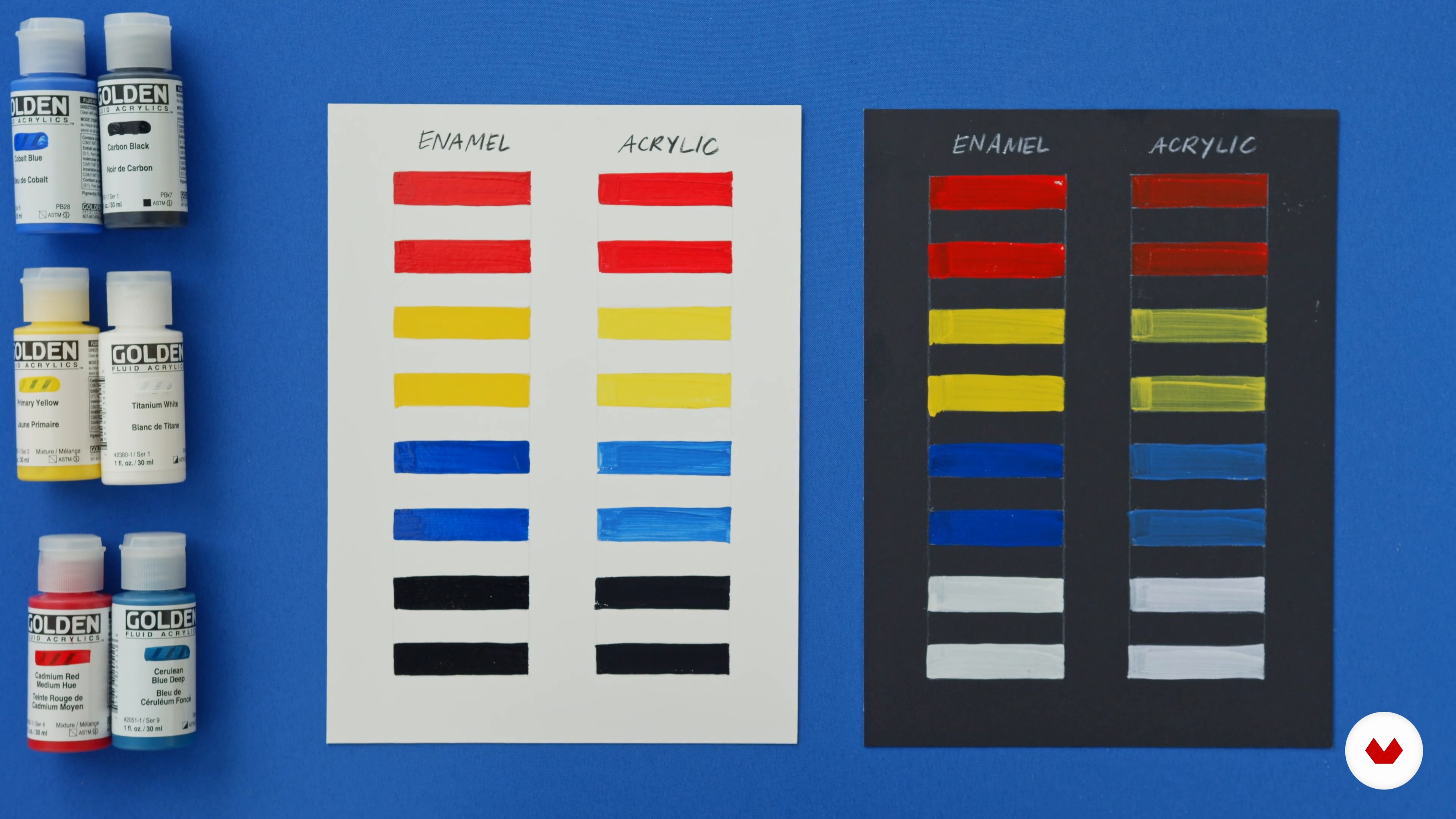
Yes, the course teaches the differences between acrylic and enamel paints, including application, opacity, drying time, and when to use each type for various signage projects.
The course explains how to select brush sizes and types for different effects, such as chisel tips for sharp corners and script brushes for smooth lines, plus guidance on choosing paints for opacity and color vibrancy.
Yes, you’ll learn surface preparation, painting, and finishing techniques tailored for wood, metal (aluminum), and Bristol board so your signs look professional and last longer.
The course covers gothic, script, and casual hand-lettering styles, parallel shadow techniques, and how to create clean, consistent strokes for both uppercase and lowercase letters.