
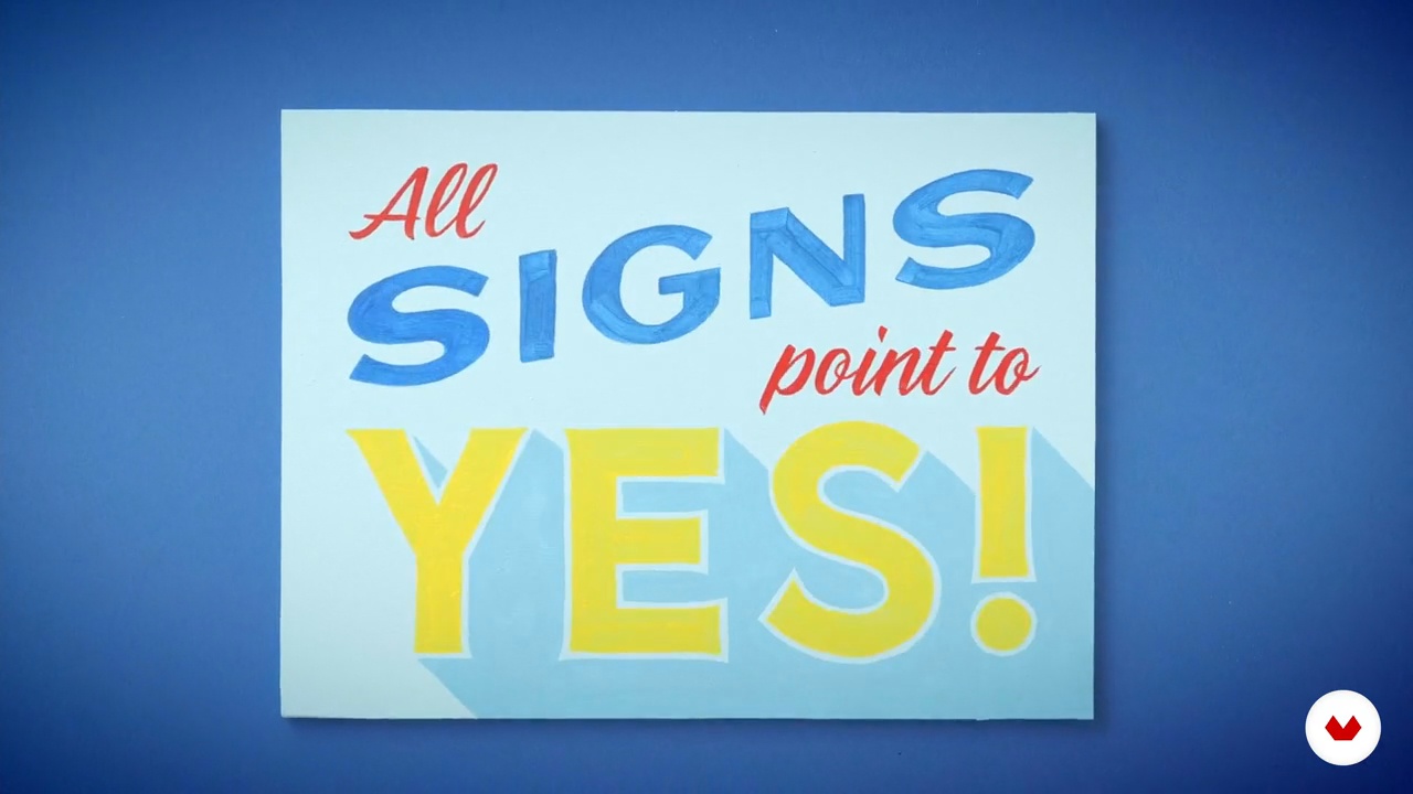
Learn hand-painted sign creation by mastering lettering techniques, brush handling, and color application for unique signage
Embark on a creative journey through the world of lettering with a focus on both handcrafted designs and digital innovation. This specialization covers a range of techniques guided by talented instructors like Christopher Rouleau, Nico NG, Dan Forster, Jimbo Bernaus, and Rylsee (Cyril Vouilloz). Discover the art of hand-painted signs, learning traditional methods such as layout design, brush handling, and color application to create eye-catching signage. Dive into hand-lettering for inspirational quotes, where composition, color theory, and decorative elements transform meaningful messages into visually appealing artwork.
Elevate your skills by mastering expressive lettering with swashes and flourishes, adding elegance and movement to your designs. Explore custom letter design with Procreate, embracing digital techniques like sketching, refining letterforms, and applying textures for various applications. Finally, venture into the realm of animation, crafting dynamic lettering GIFs to boost your online presence. This comprehensive journey ensures a well-rounded skill set, blending analog and digital artistry for a complete lettering experience.
What will you learn in this specialization?
 1
1Introduction
Explore lettering as more than just writing—it's an expressive art form that blends typography, calligraphy, and illustration. From historical roots to modern digital tools, discover how letters tell stories, shape moods, and capture attention. This lesson will inspire you to craft unique letterforms that enhance branding, social media, and beyond. Let your creativity flow and turn words into art!
2m
 2
2Inspiration / Christopher Rouleau
In this lesson, I will share some of my favourite artists, designers, and sign painters, and why their styles and techniques appeal to me, thus influencing the work I create.
3m
 3
3Inspiration / Nico NG
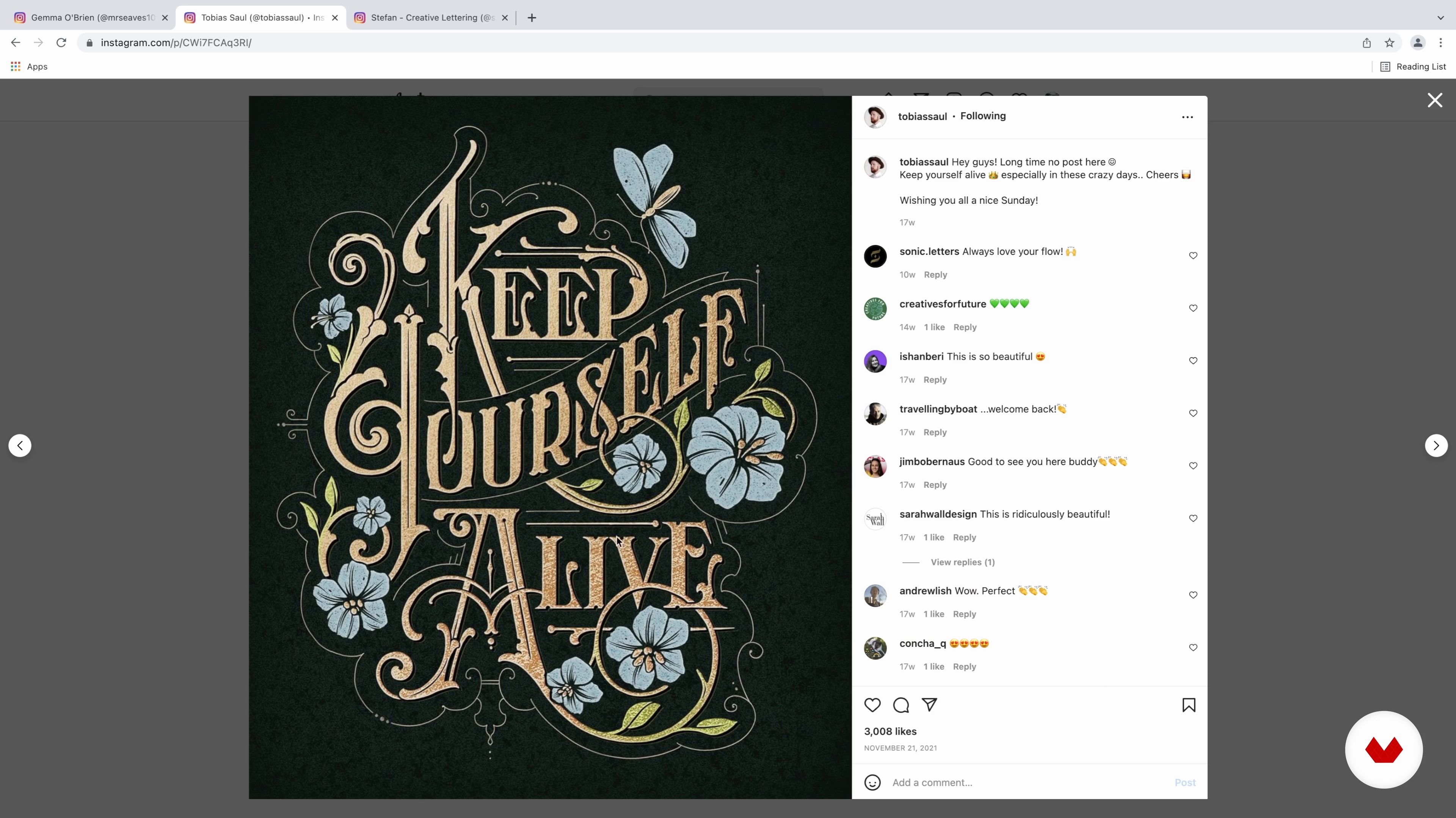
Now, I will share with you my biggest influences, what I learned from them, and how they have shaped my artistic style.
6m
 4
4Inspiration / Dan Forster
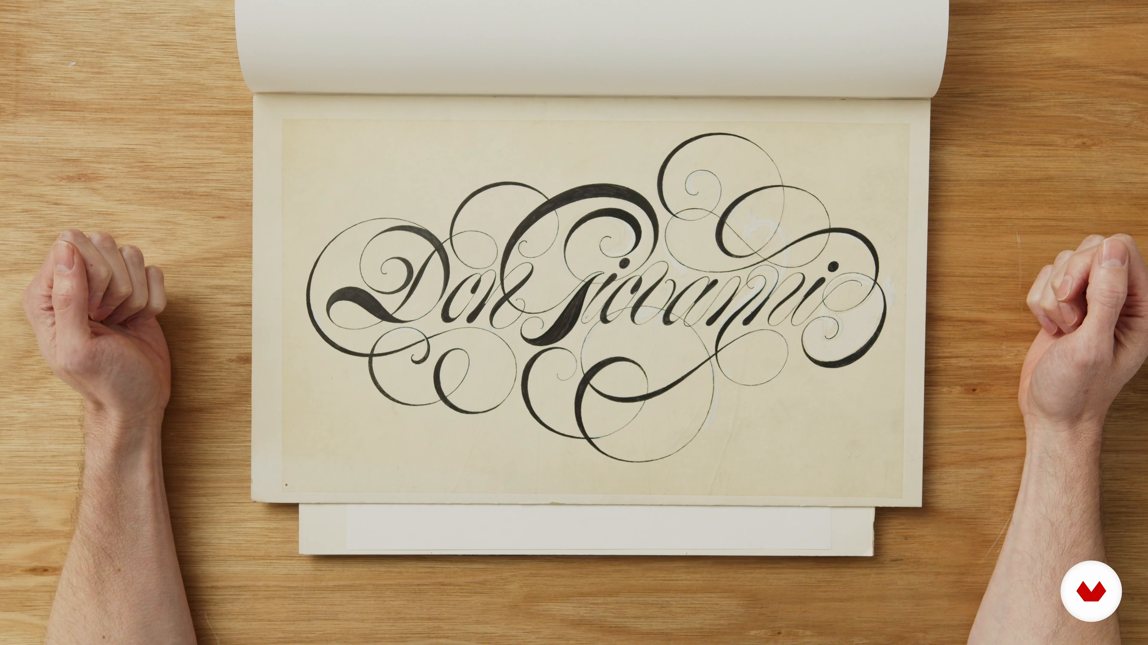
We all have people in our lives who have influenced us with their work or helped us along our career path. In this lesson, I'll talk about some designers and lettering artists who have been big inspirations to me in my career.
14m
 5
5Inspiration / Jimbo Bernaus
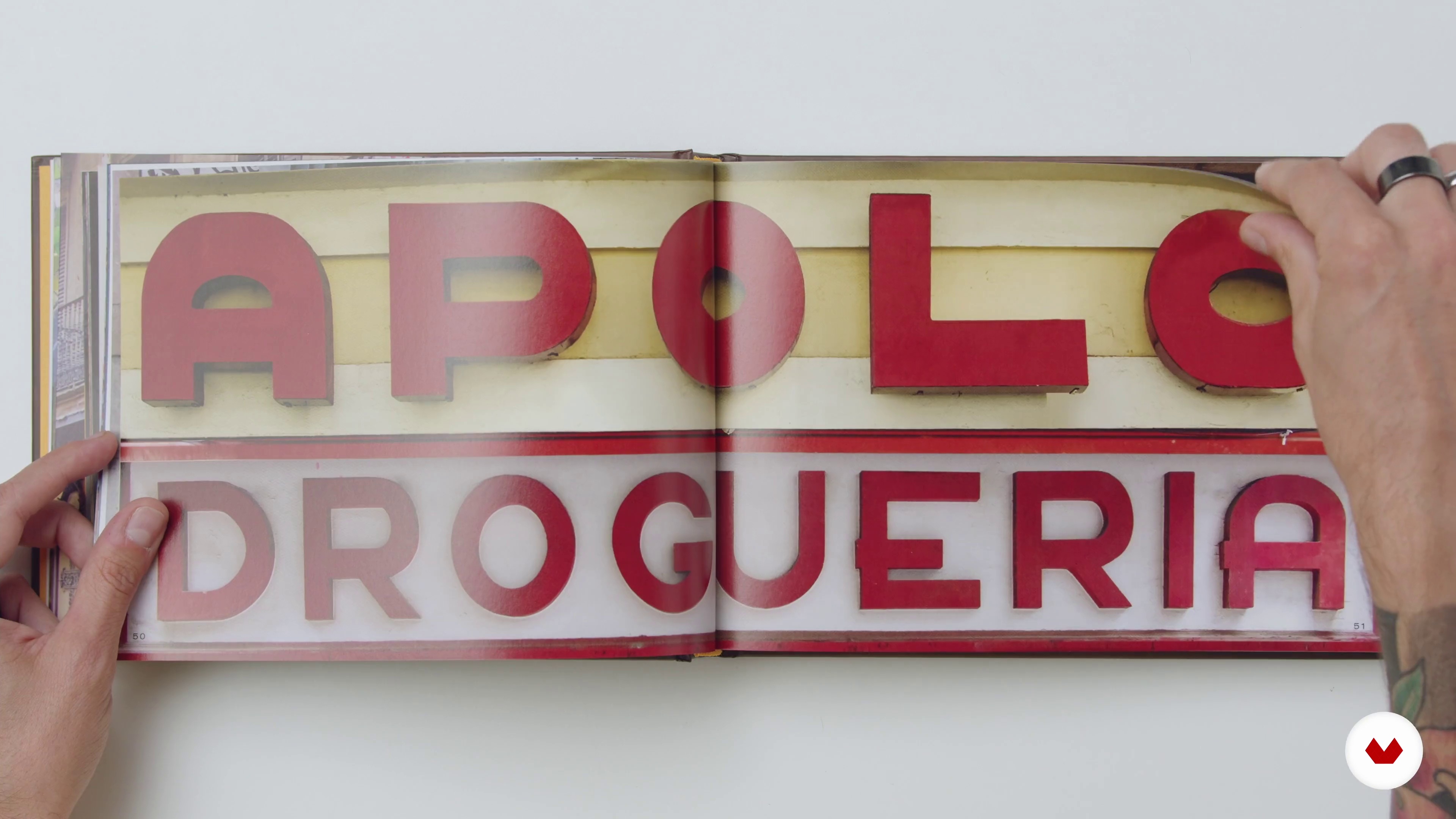
I’ll be showing you that you can get inspired from almost everything. Even though my visual aesthetic is clearly influenced by certain artists, I would like to show you people, things and experiences that inspired me beyond my work and somehow shaped the person and designer I am nowadays.
8m
 6
6Inspiration / Rylsee
I'm inspired by moments of everyday life, the city, and my passions. In this lesson, I'll show you how random things I see influence what I create.
10m
 1
1Presentation of Supplies
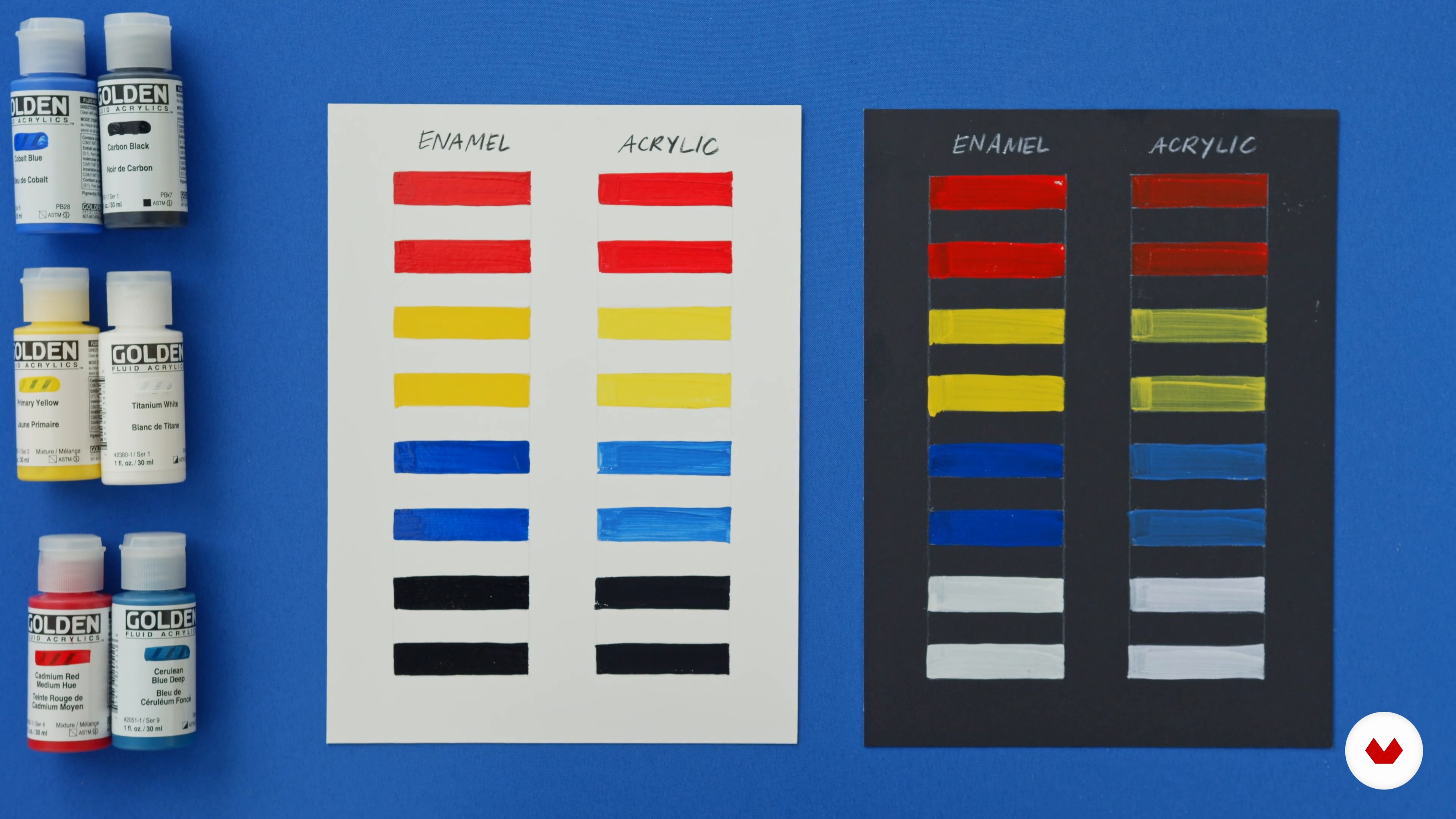
In this lesson, I will review all the standard sign painting tools and materials. I’ll then show you the supplies you'll be working with to make your custom sign.
4m
 2
2History of Sign Painting
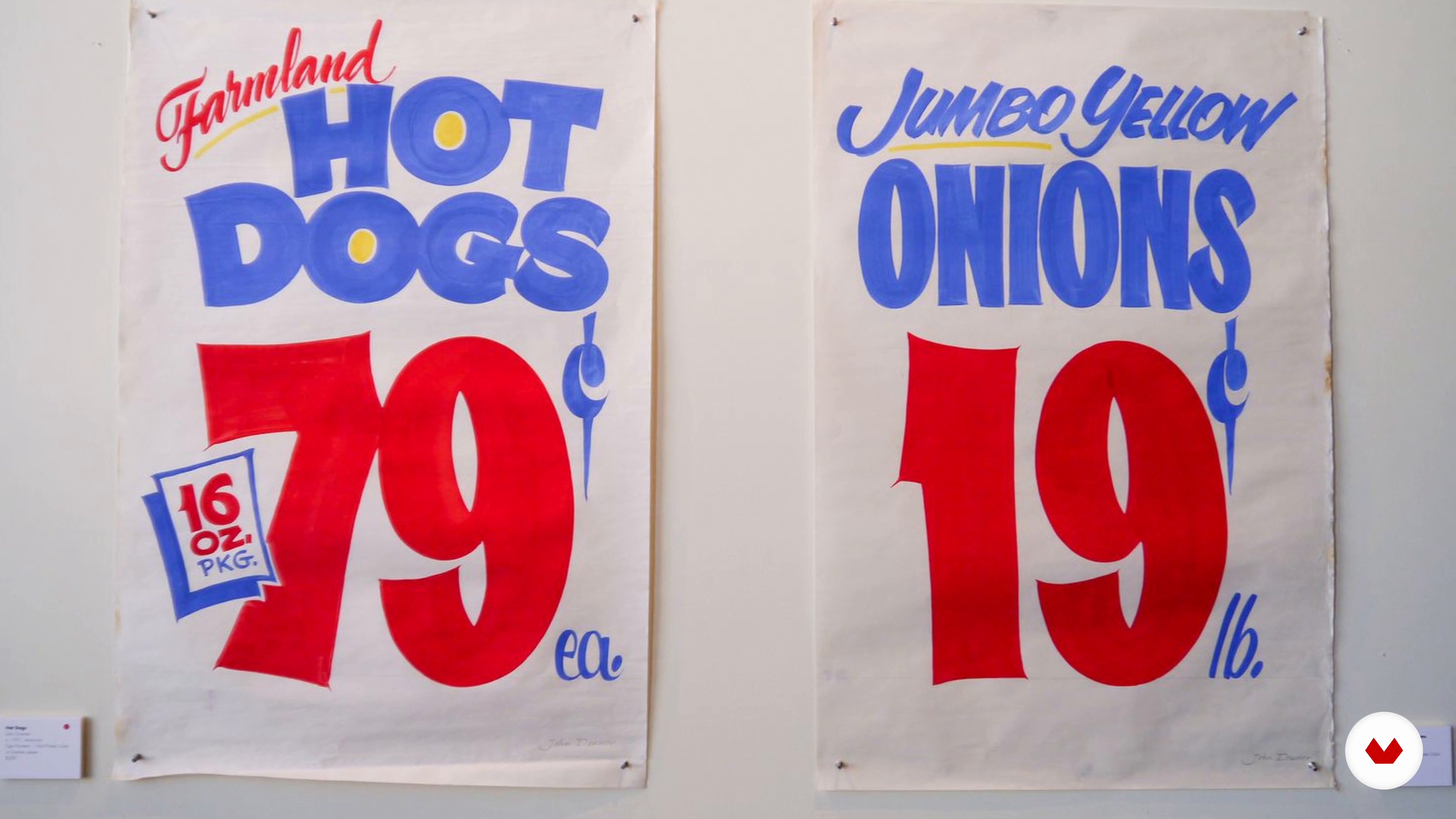
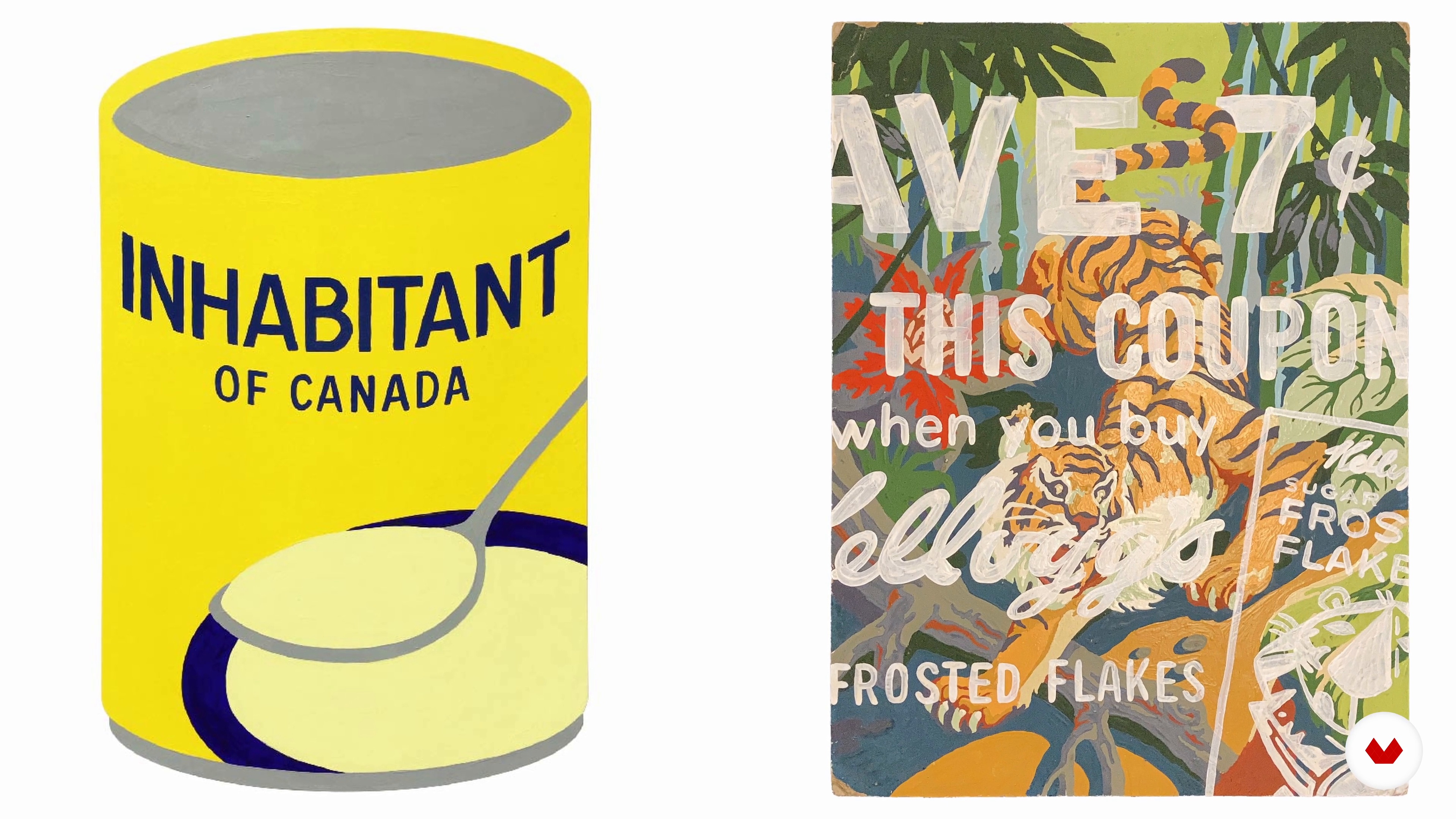
Let's go back in time! In this lesson, we will take a brief look at the origins of sign painting. I will provide some historical context and introduce the traditional styles of lettering.
2m
 3
3Hand-Painted Lettering Techniques 1
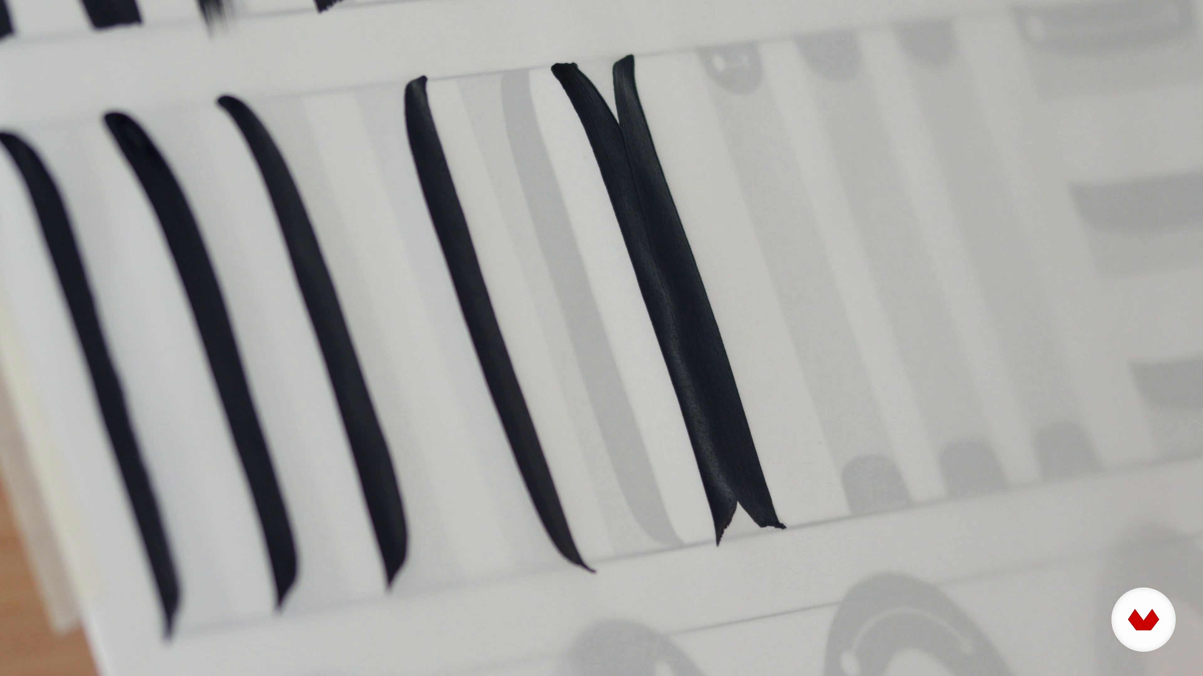
Now, I will show you how the magic happens! First, I will demonstrate how to set up your painting station. Then, I will model how to handle your paints and brushes. Finally, I will introduce how to start creating letterforms using precise, controlled paint strokes.
17m
 4
4Hand-Painted Lettering Techniques 2
In this lesson, we will continue the theme of practising our brushstrokes. You will create rounded, tapered, and uninterrupted lettering before starting your sign.
16m
 5
5Project Ideation, Sketching, and Refinement
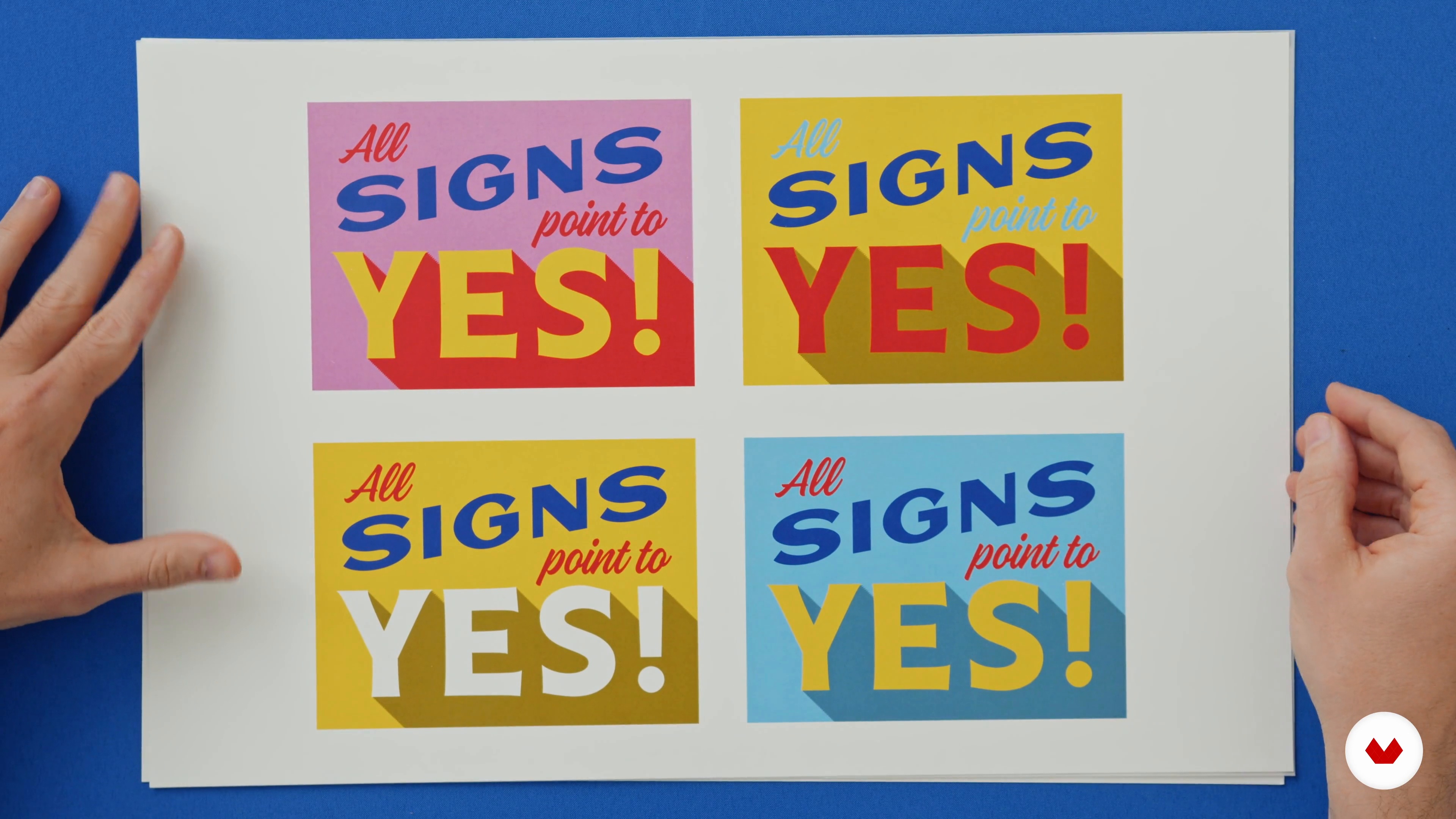
I will show you how to approach the creative process from start to finish, with lots of examples of sketching and refinement.
10m
 6
6Sign Prep and Image Transfer
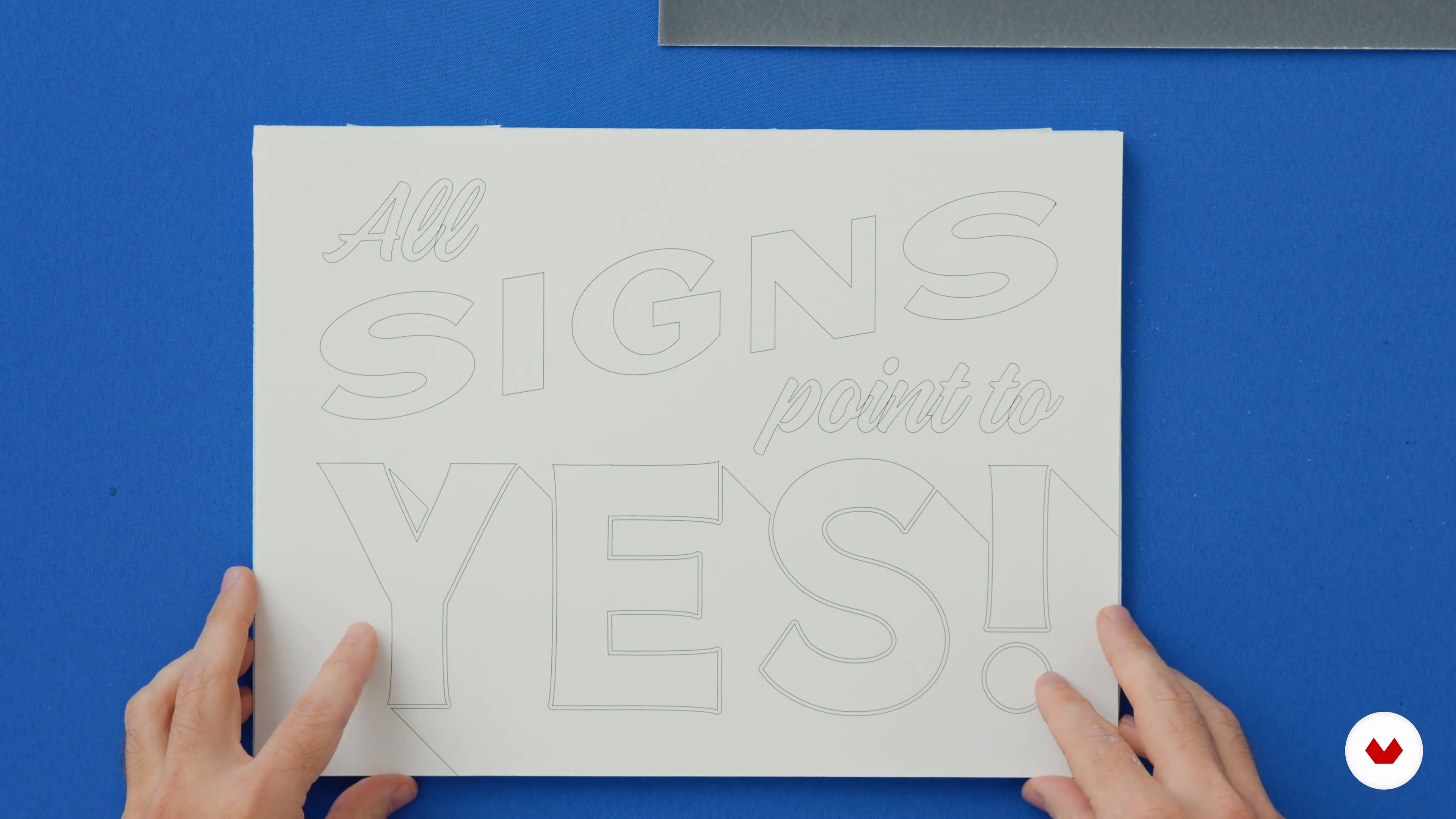
This lesson will explore how to transfer your final design onto its surface.
11m
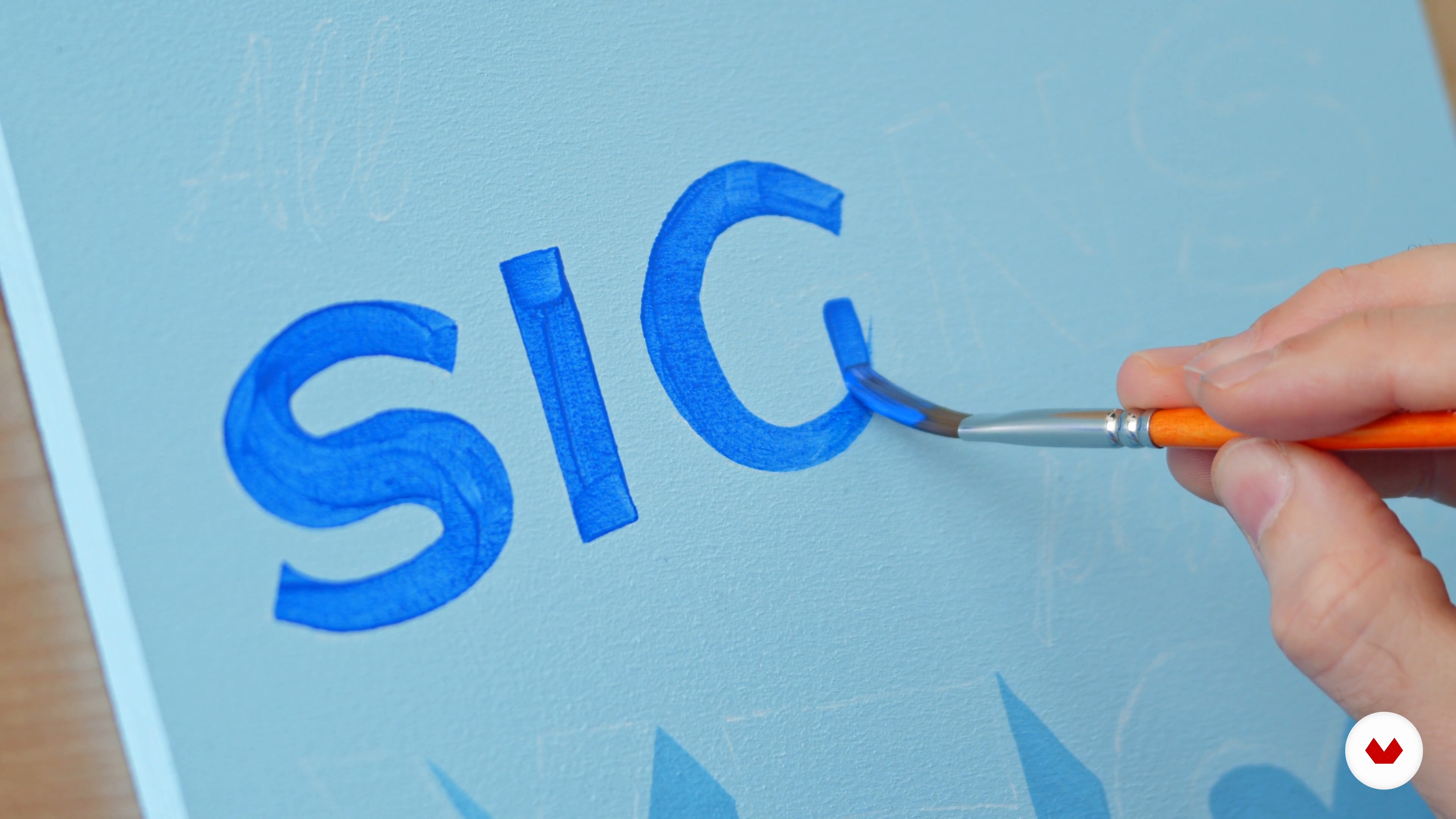 7
7Painting Your Sign Blue
It's time to begin painting! In this lesson, I'll teach you in detail how to paint the first part of the text.
12m
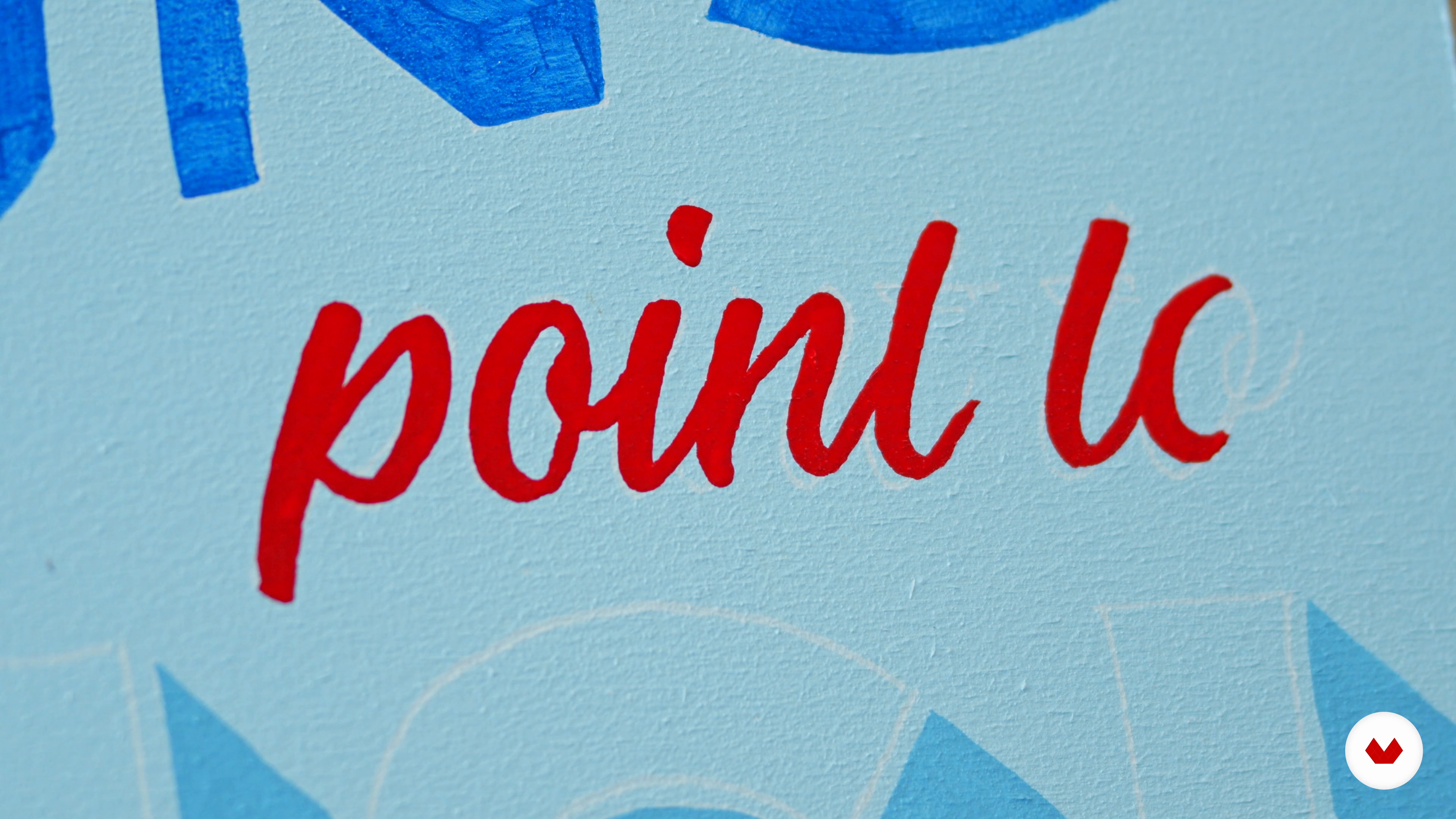 8
8Painting Your Sign Red
Here, we will move on to the second part of the text. I will share my best tips and tricks to achieve better results.
8m
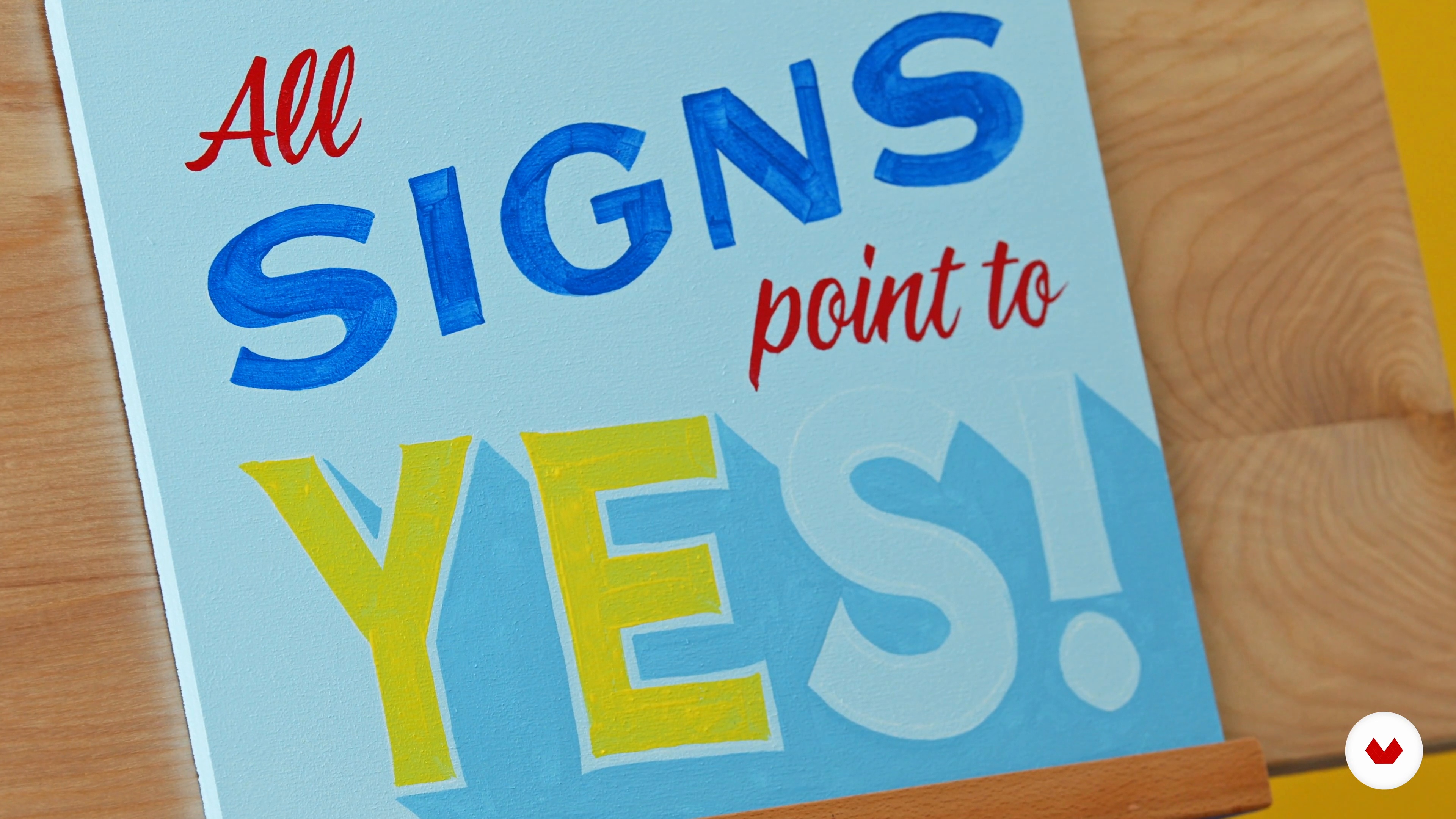 9
9Painting Your Sign Yellow
It's time to move forward! Therefore, I'll show you how to paint the third part of the text.
6m
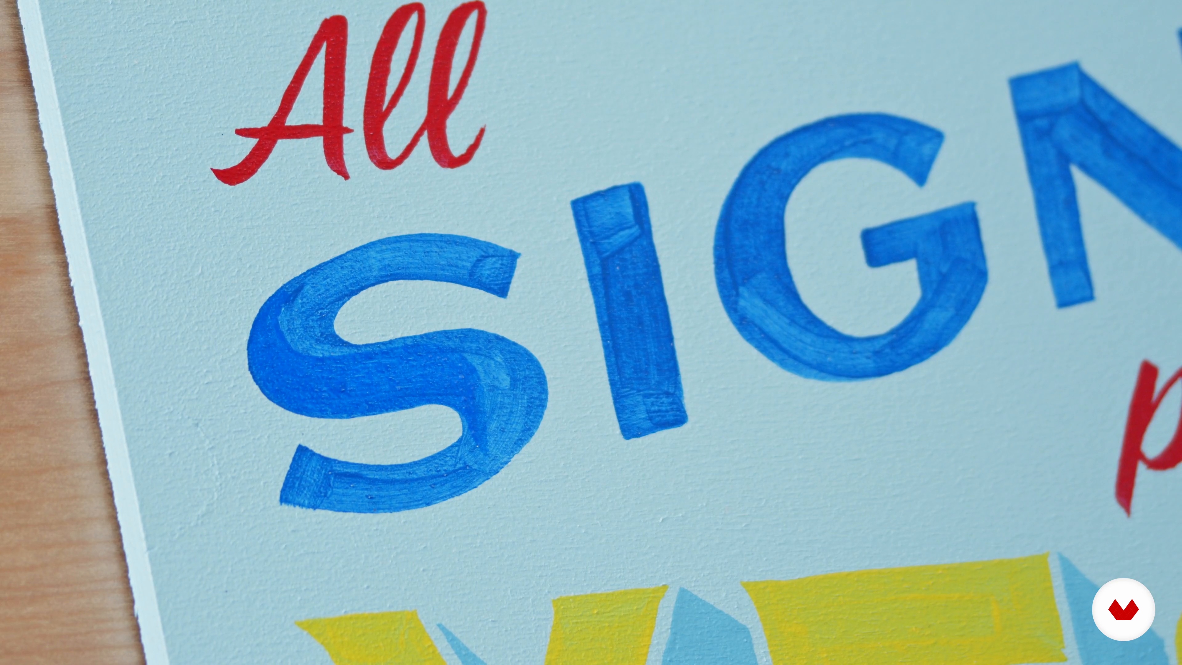 10
10Touch-Ups
This lesson will focus on the special additions that will refine the piece. Namely, I will show you how to achieve a good level of opacity and do the necessary touch-ups.
7m
 11
11Finishing and Hardware
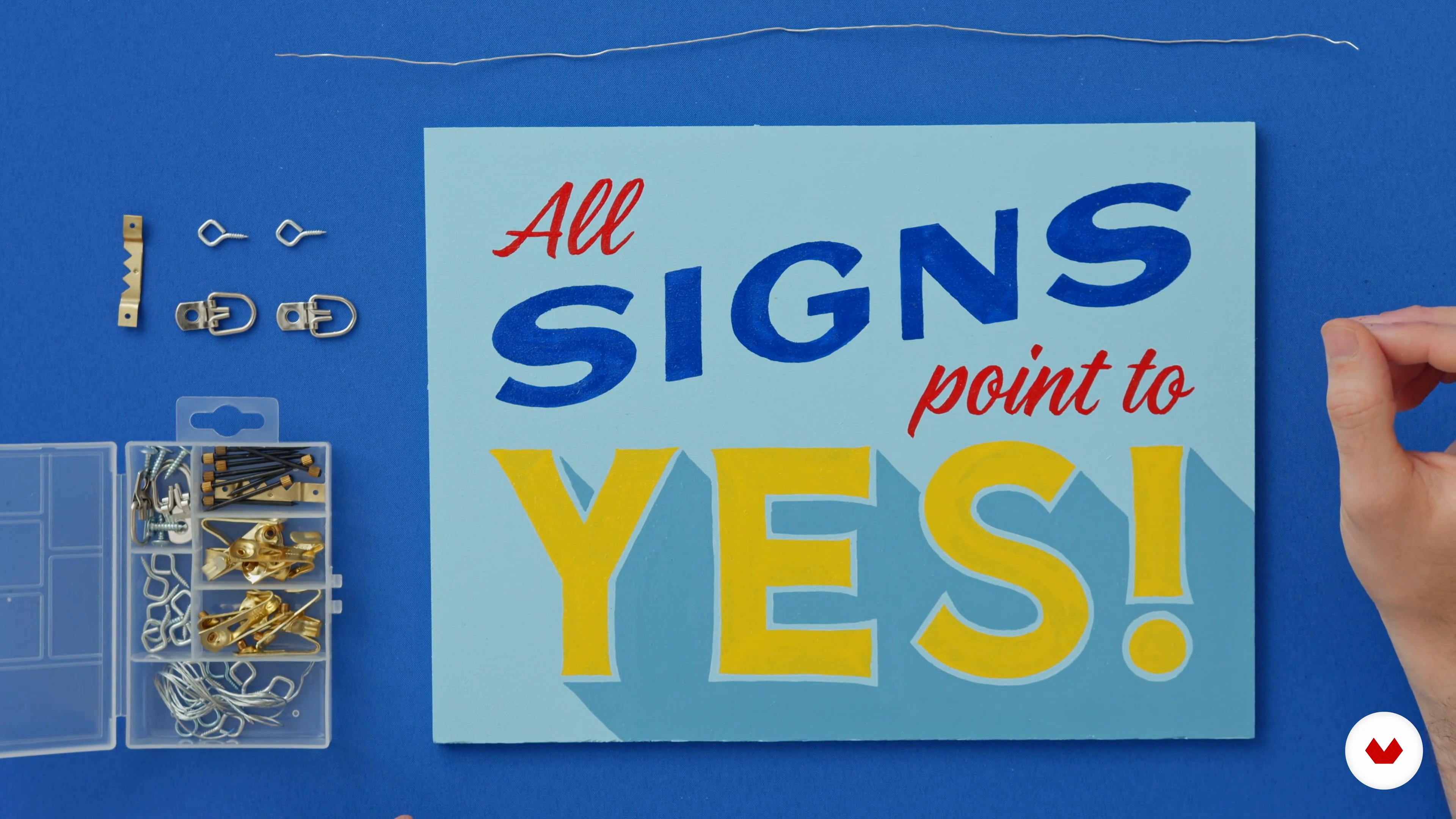
Let's take a moment to admire our finished signs. Now is the time to add a clear coat or layer of varnish. This will preserve and professionalize your image. Then, I will guide you in installing simple hardware to hang your sign.
6m
 12
12Sharing Your Sign on Social Media
In this lesson, I will teach you how to professionally photograph your sign and thus make it shareable on social media. Then, you can build your portfolio!
2m
 13
13Using Your Skills to Do Good in Your Community
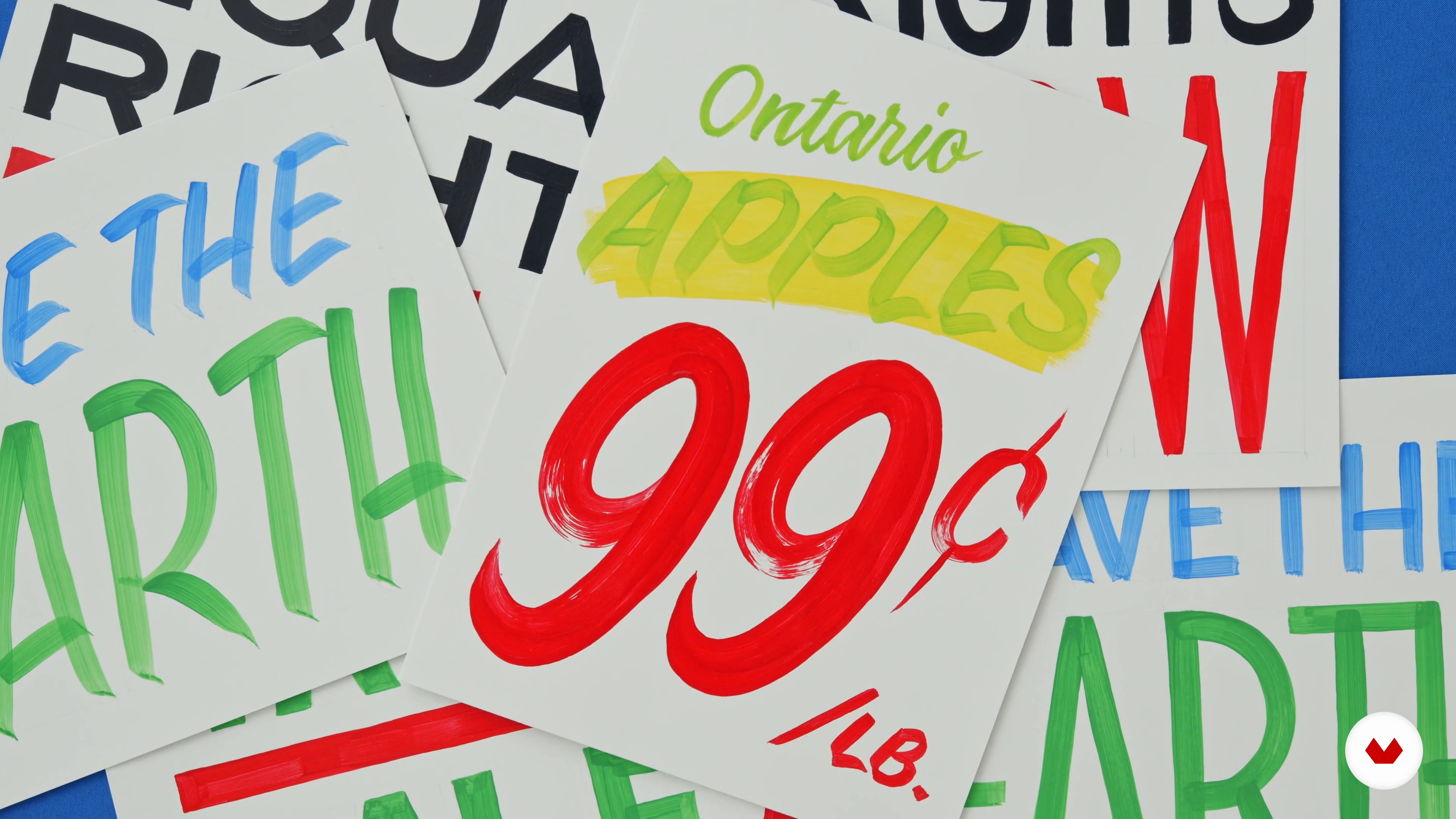
To finish, I will talk about how to find sign painting opportunities in your community.
1m
 1
1Tools and Materials
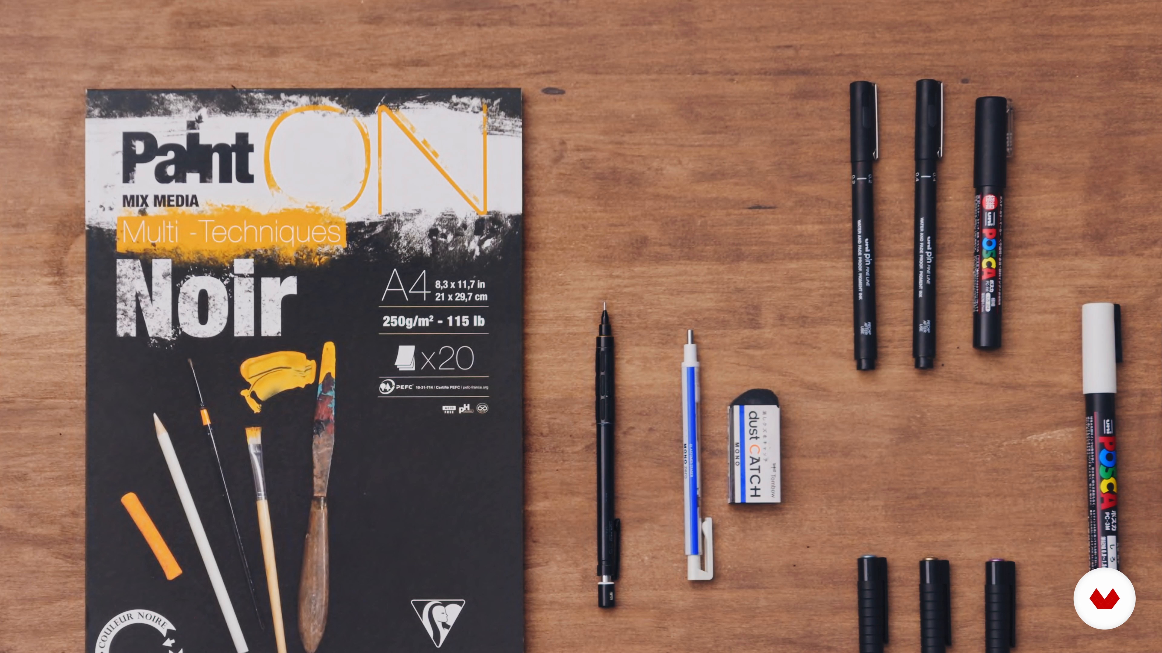
In this lesson, I will share my favorite lettering tools and materials. Then, I will teach you how to pick the right tools for your project.
5m
 2
2Harnessing Creativity: Successful Lettering Compositions
In this lesson, you will learn the power of lettering and the secrets to successful compositions.
4m
 3
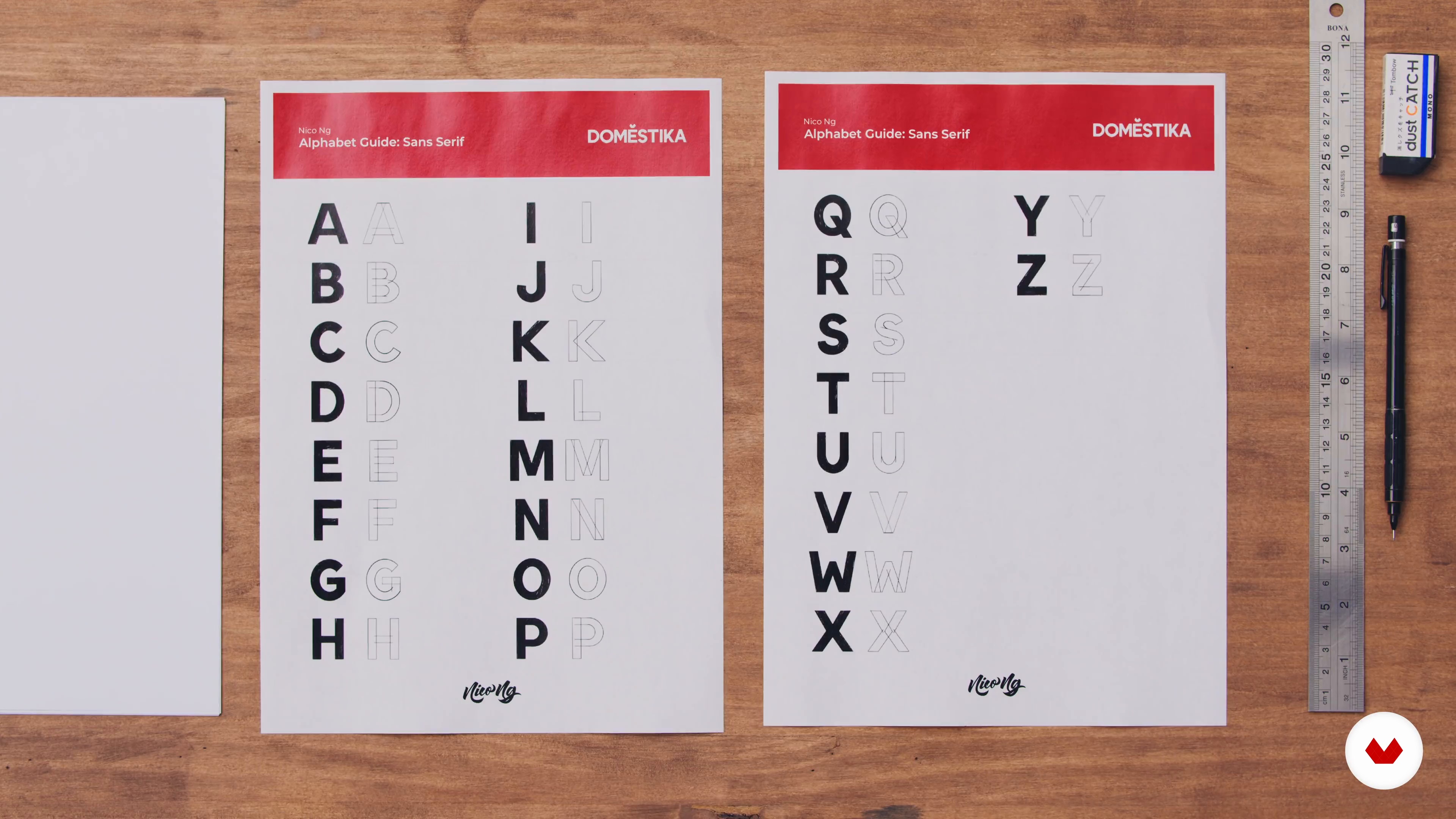
3The Basic Lettering Styles 1
Before we go straight to the concepts of lettering composition, we need to get the foundations right – which is drawing letters correctly. In this lesson, I will introduce you to the three basic lettering styles: Sans Serif, Serif, and Script. I won’t go through how to draw every single letter. Instead, I will teach you how to use the alphabet guides to draw your letters correctly, paying attention to the basic shape, size, and weight.
12m
 4
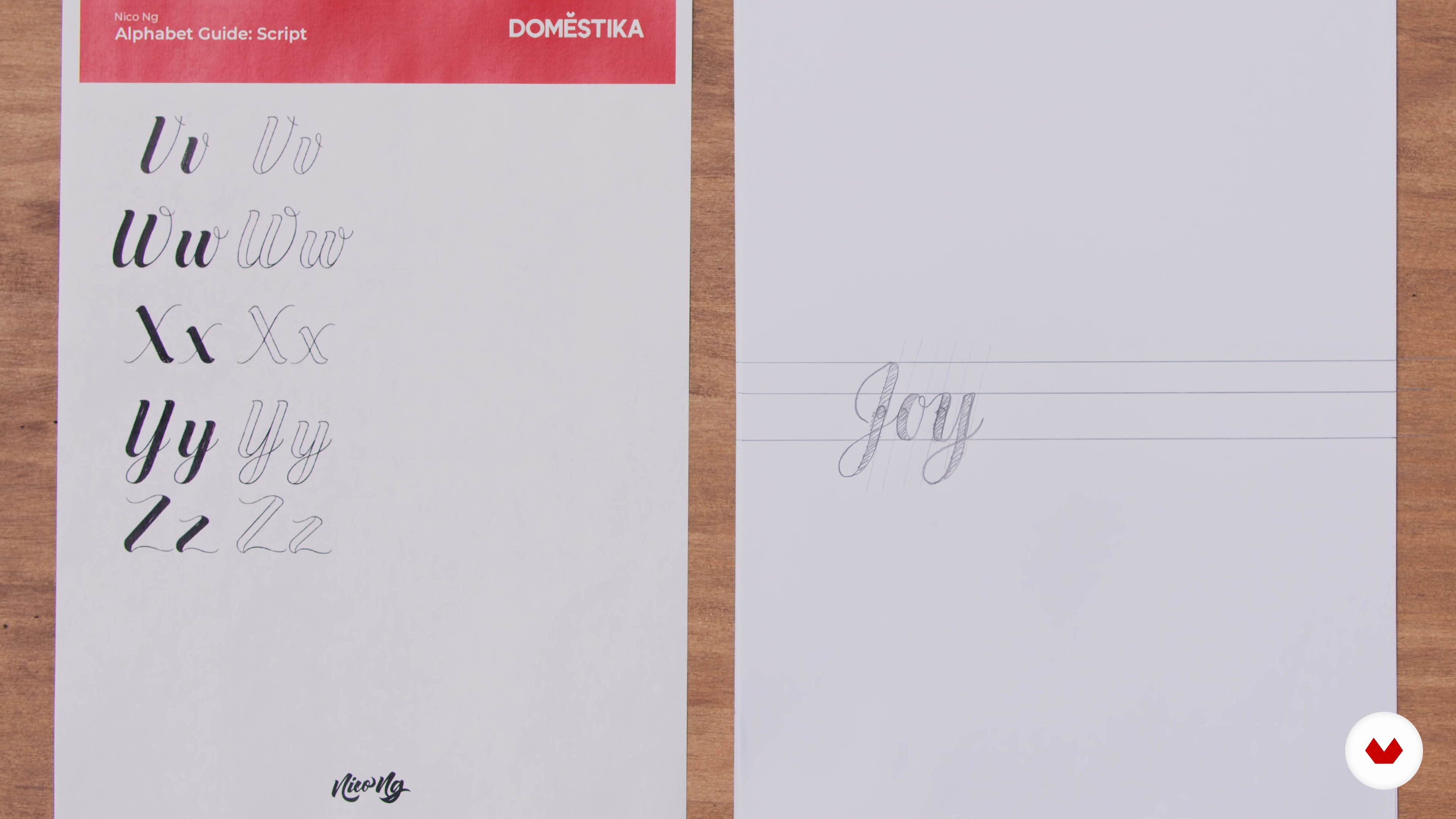
4The Basic Lettering Styles 2
Here I will complete the Serif exercise, before demonstrating the third lettering style: Script. This style is one of elegance; it captures the artistry of calligraphy with a handwritten aesthetic. For this reason, it can be more challenging to master. In this lesson, you will learn key tips and tricks.
14m
 5
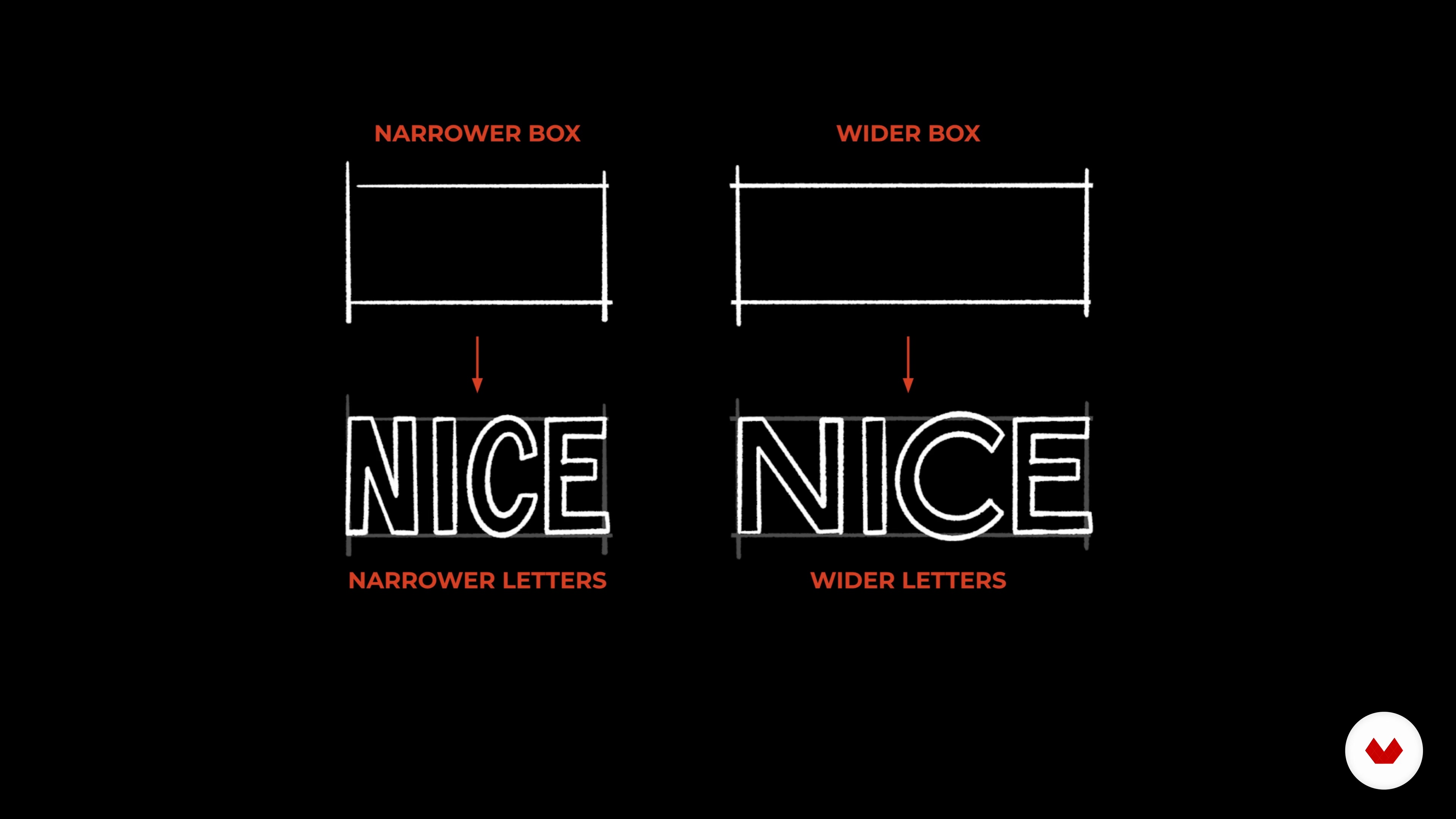
5Lettering Properties
There are an infinite number of ways to create your letters. Aside from choosing and combining different lettering styles, you can play with the lettering properties to create a more dynamic, interesting, and unique design. Let’s go through the different lettering properties and how they affect the appearance of your letters in this lesson.
4m
 6
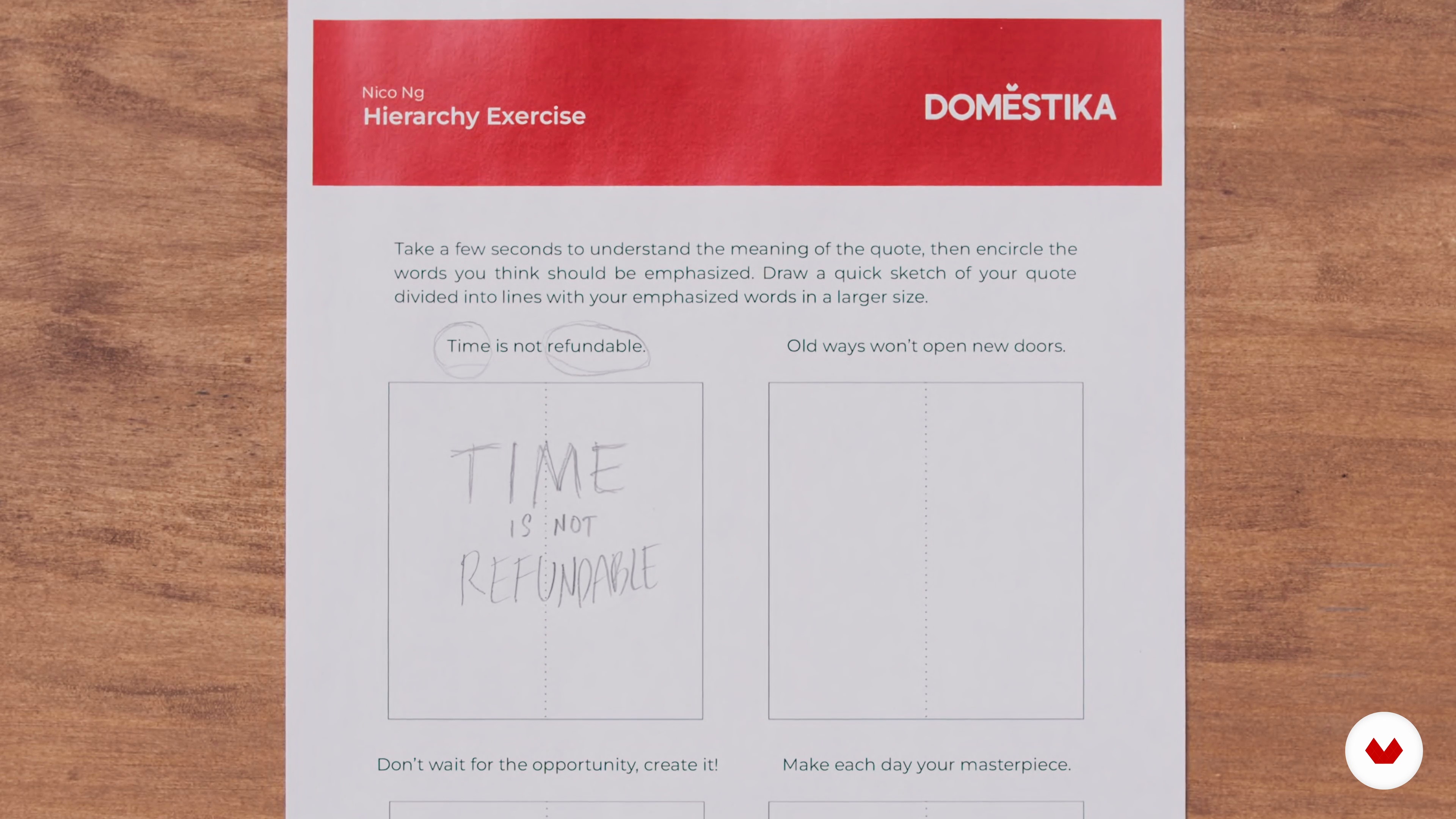
6Hierarchy
In this lesson, you will learn the benefits of having hierarchy in your composition and how to apply it.
9m
 7
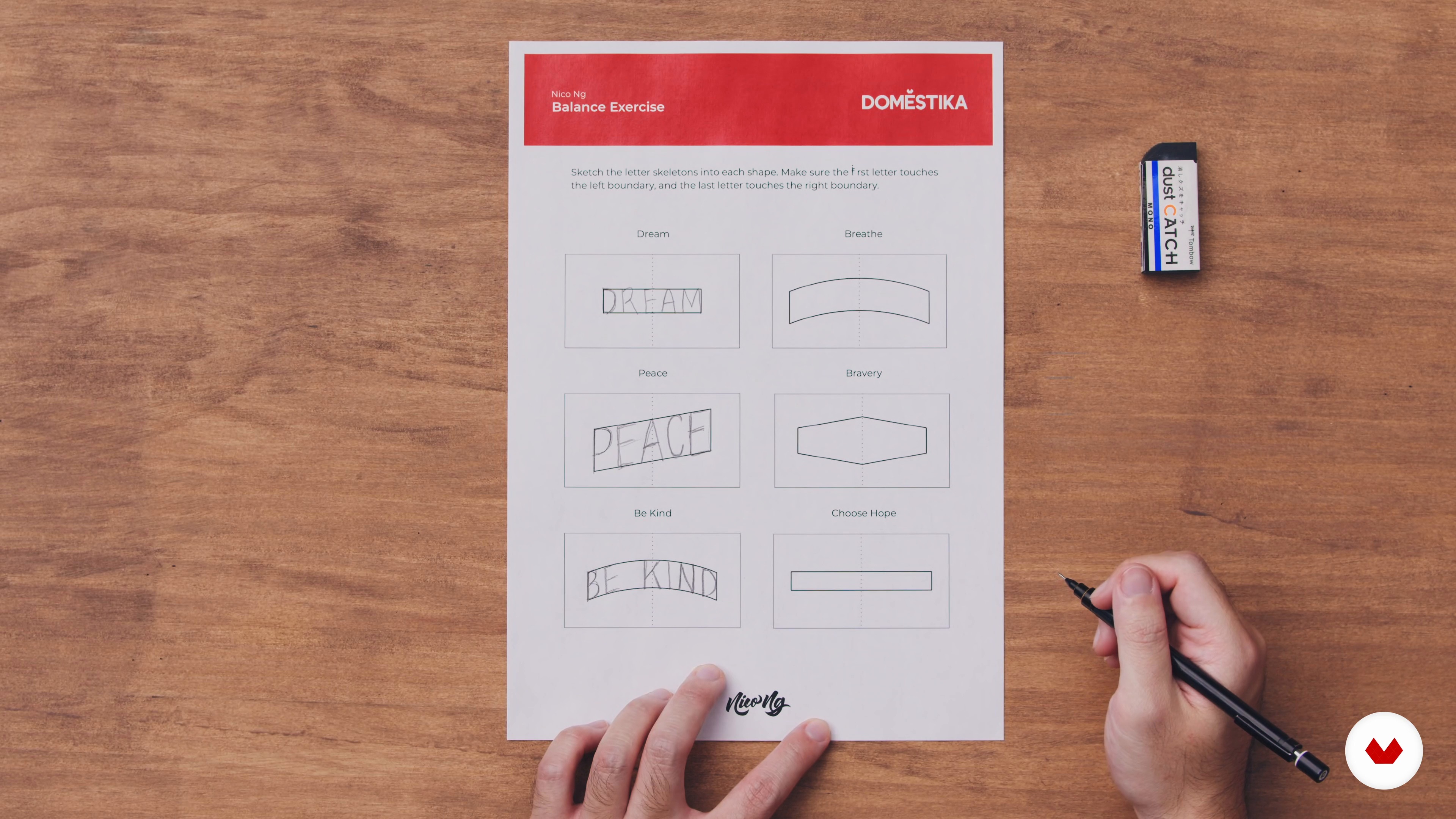
7Balance
Next, you will learn how to plan and develop a balanced lettering composition. This will create a more stable, neat, and orderly finish.
11m
 8
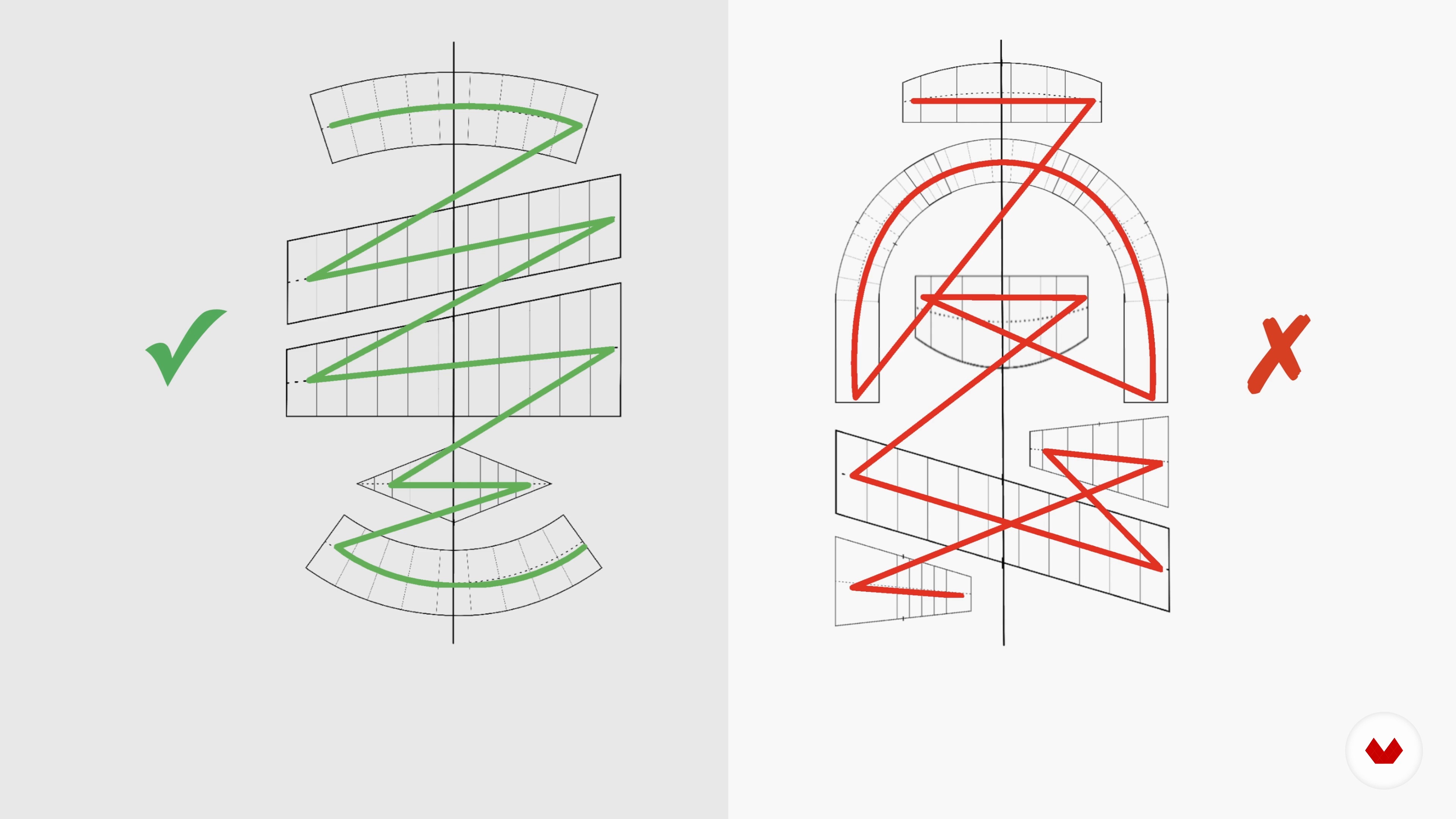
8Flow and Harmony
In this lesson, you will learn how to make your lettering composition easy to read by achieving a good flow. I will guide you in an exercise to practice bringing harmony to your piece.
11m
 9
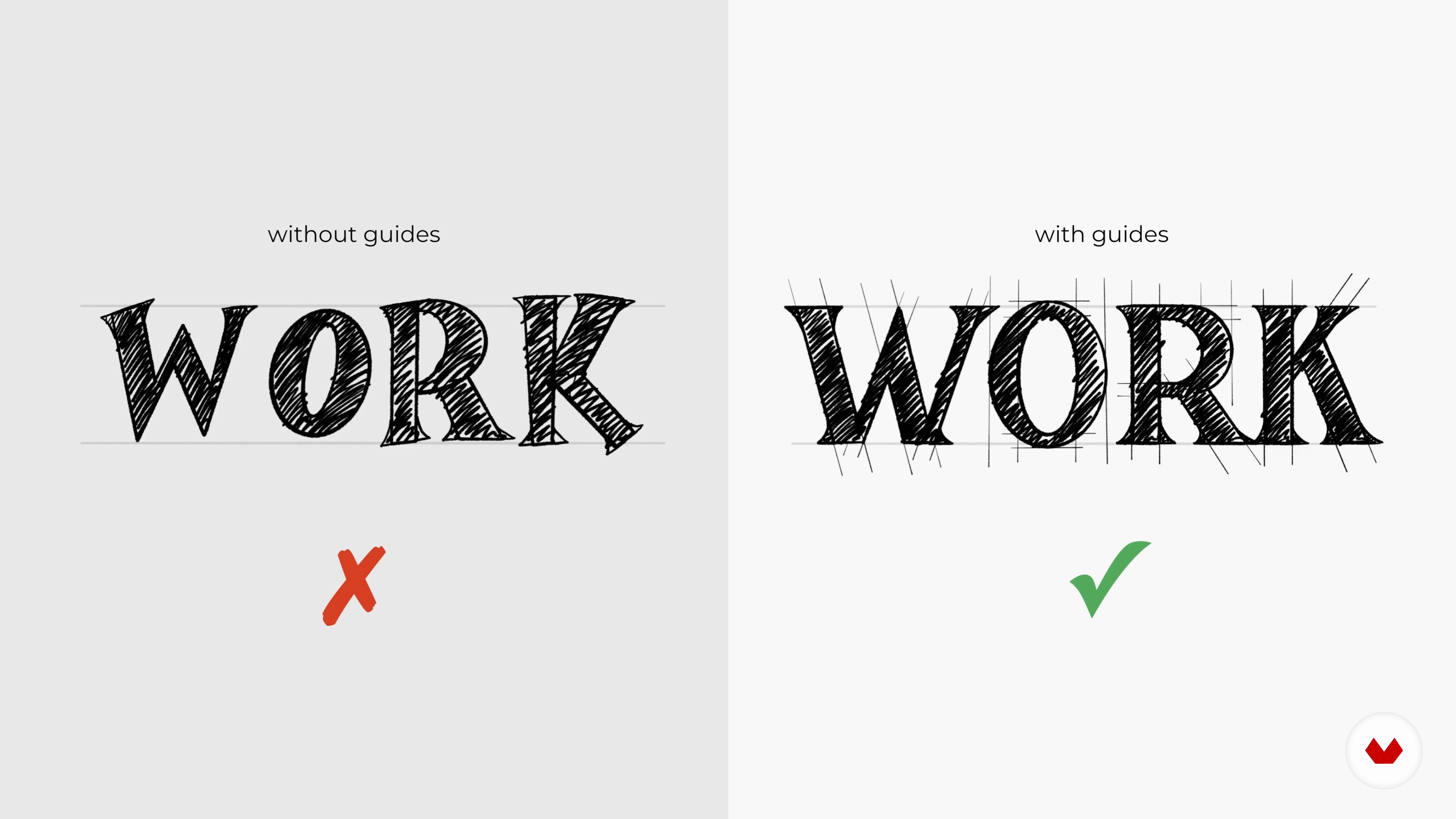
9Consistency
During this lesson, you will learn the importance of creating your lettering consistently and the techniques you can do to achieve it.
2m
 10
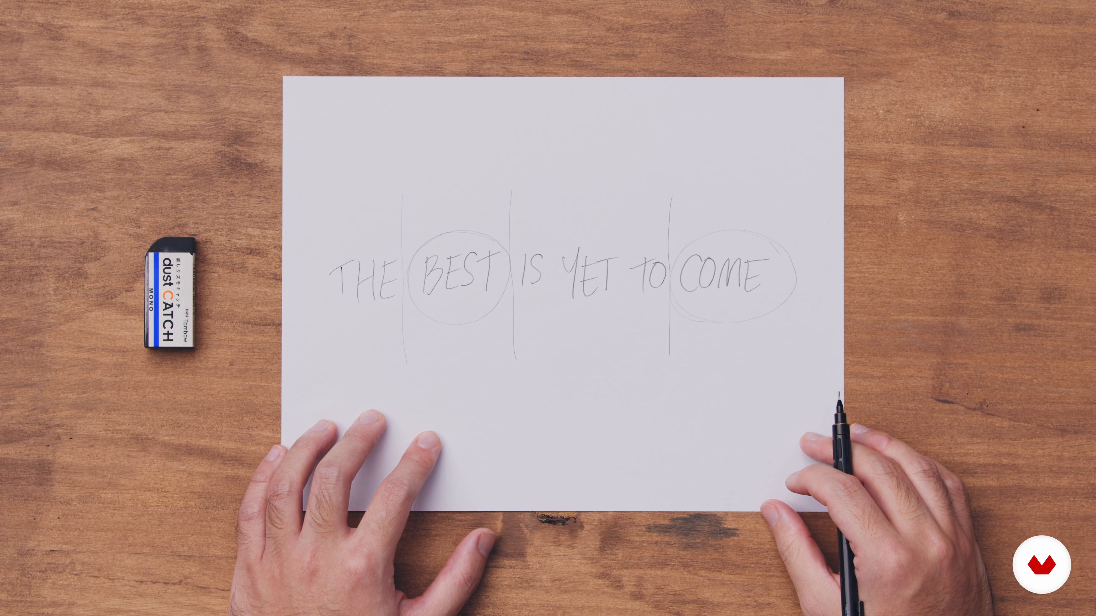
10The Quote
In this lesson, I will show you how to properly plan the first three steps of choosing a quote, assigning hierarchy, and dividing your quote.
4m
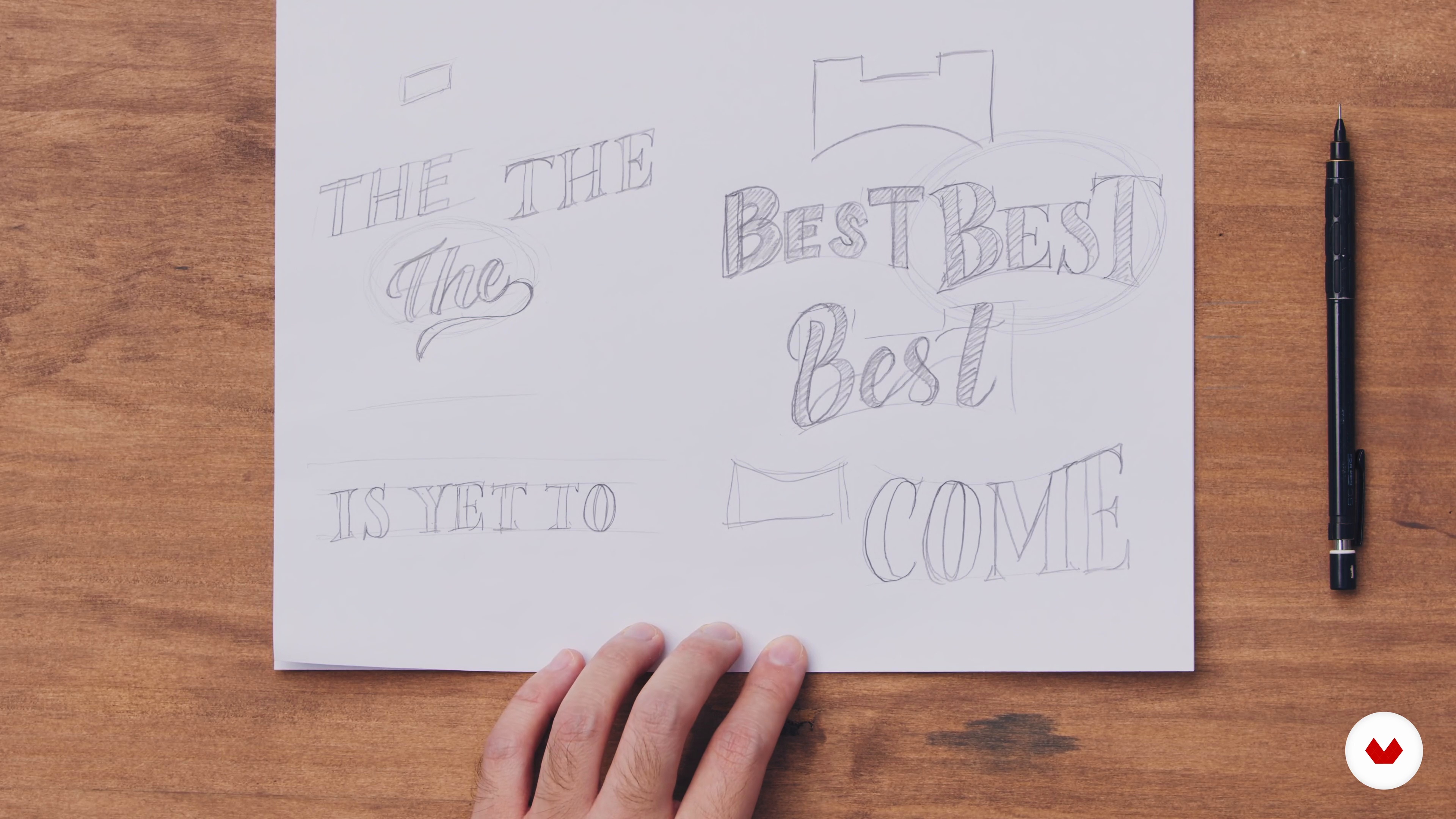 11
11Layout and Style
Now that you've picked a quote, assigned a hierarchy, and divided it into lines, it's time to test the different layouts and match lettering styles. Let me show you an example of how to do this!
16m
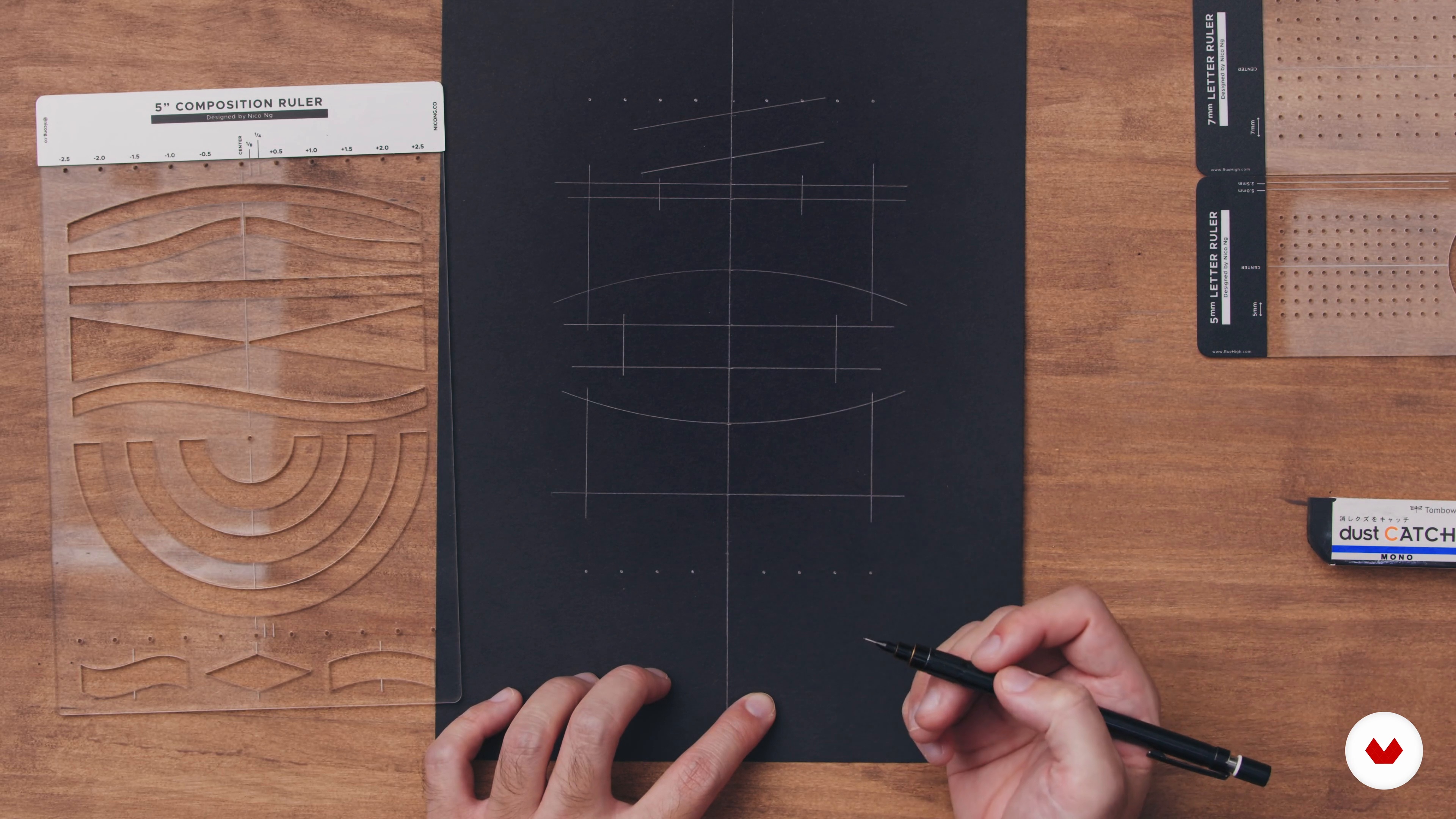 12
12Sketching
Once the composition has been planned and finalized, the next step is to sketch out the layout and letter guides accurately. In this lesson, I will guide you through this process.
12m
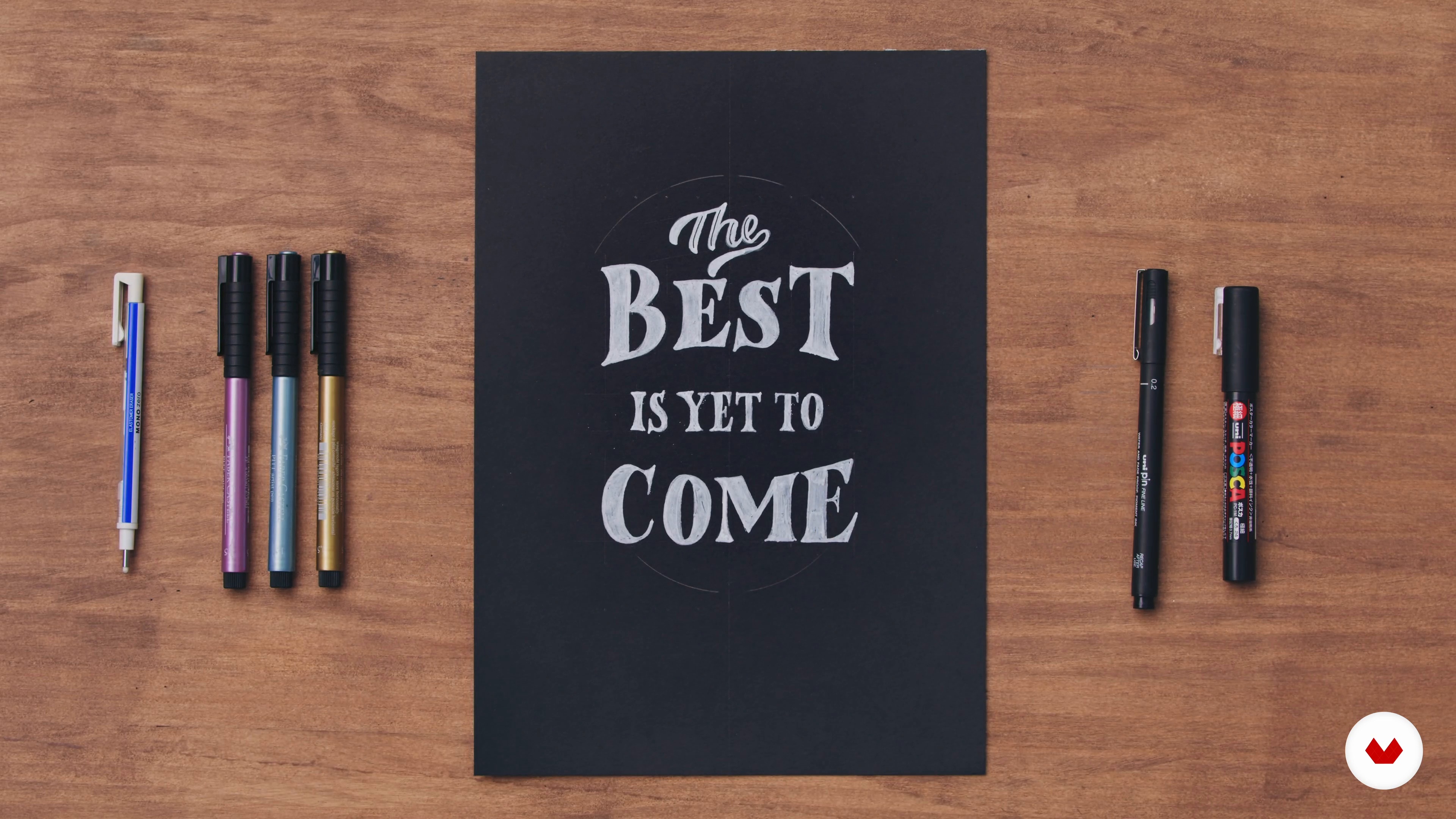 13
13Effects, Color, and Decoration 1
With the layout and letter guides set up, let’s ink the final piece. I will show you how to add interesting designs and decorations.
12m
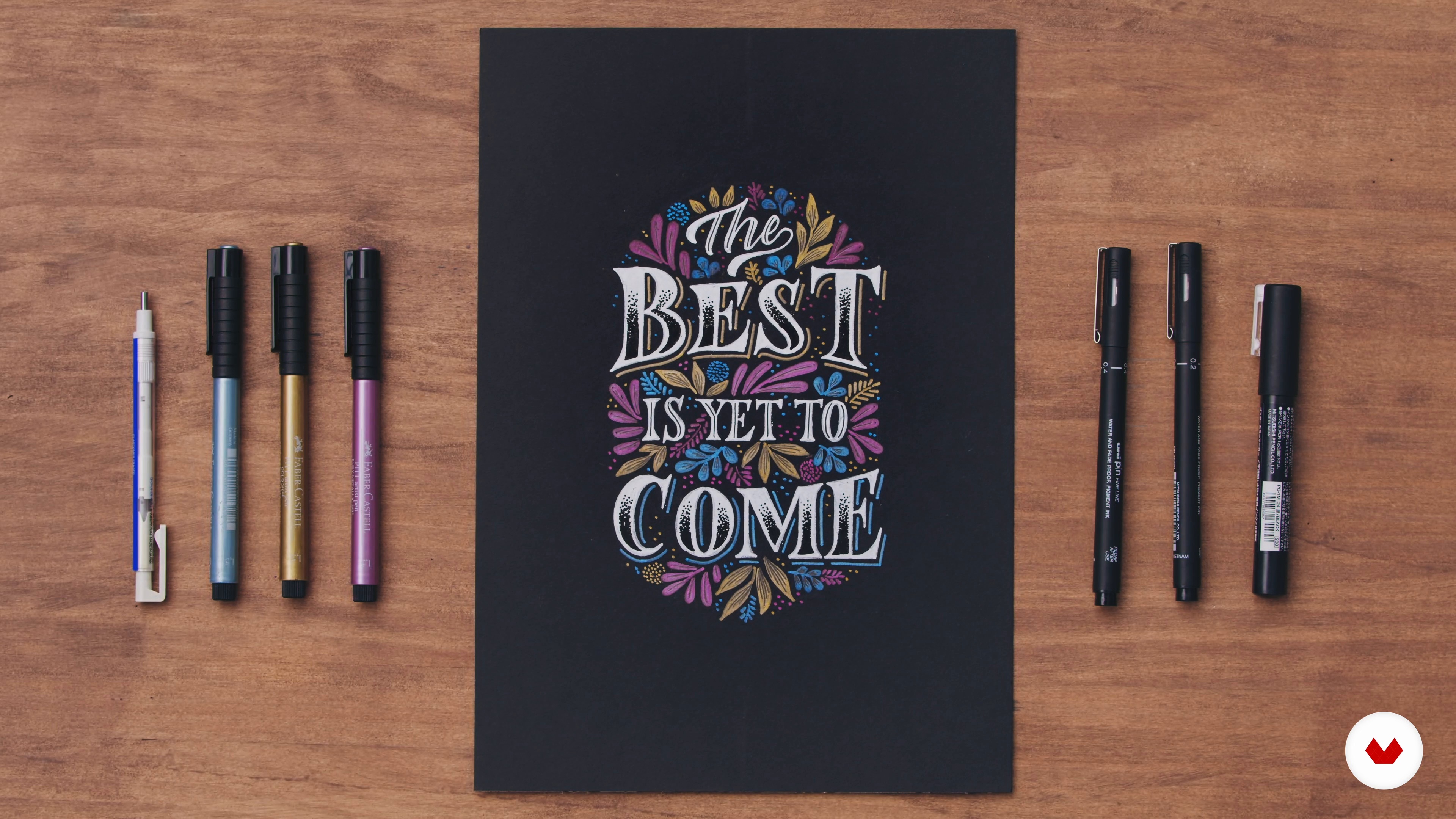 14
14Effects, Color, and Decoration 2
Here I will continue to enhance the piece. You will learn how to add shadows. To do this, imagine that there's a light source coming from the top left-hand corner that's casting a shadow from the bottom right of your letters.
15m
 15
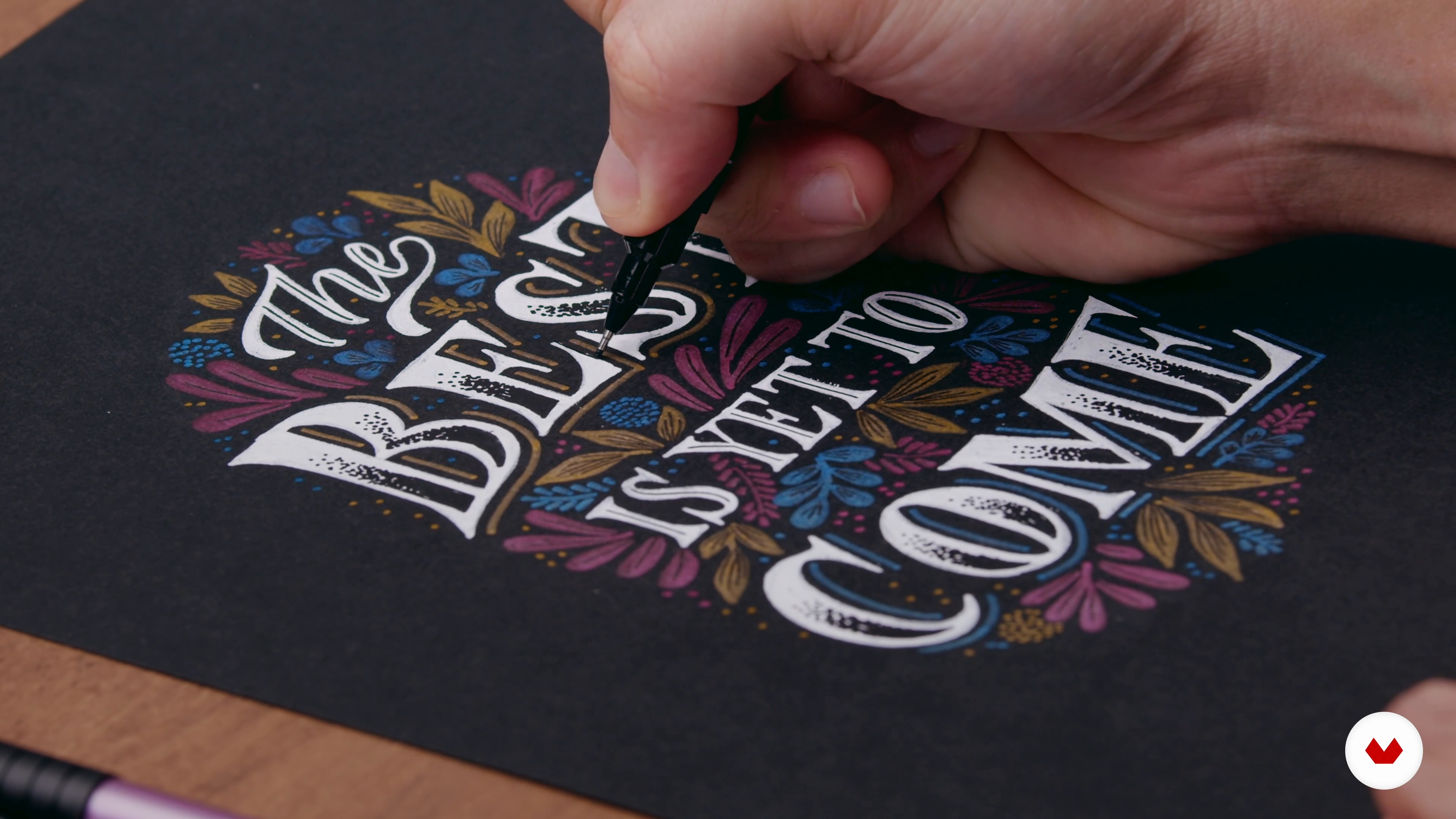
15The Final Touches
Congratulations! You're done. But wait! Before packing up all your materials, there’s always a way to refine and improve your work. Personally, I like to leave my work for a few hours and come back to it with a fresh perspective.
2m
 16
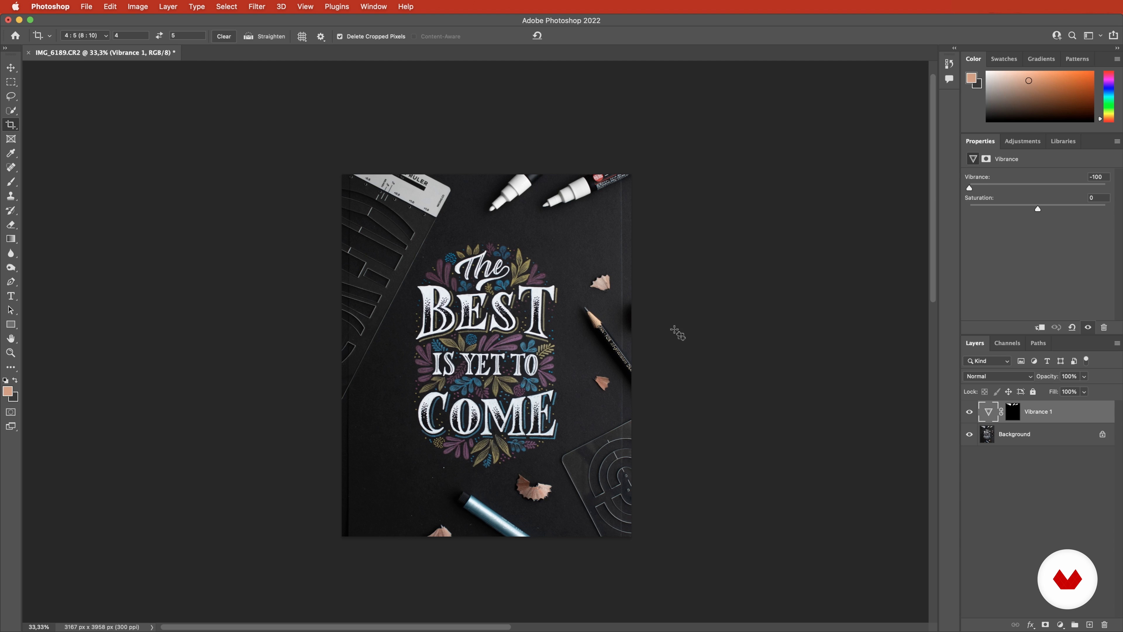
16Capturing and Editing the Photo
Want to know how to make your lettering composition look even better? By styling it up on a flat lay and taking a photo of it. I’ll show you how to achieve this in this lesson.
9m
 17
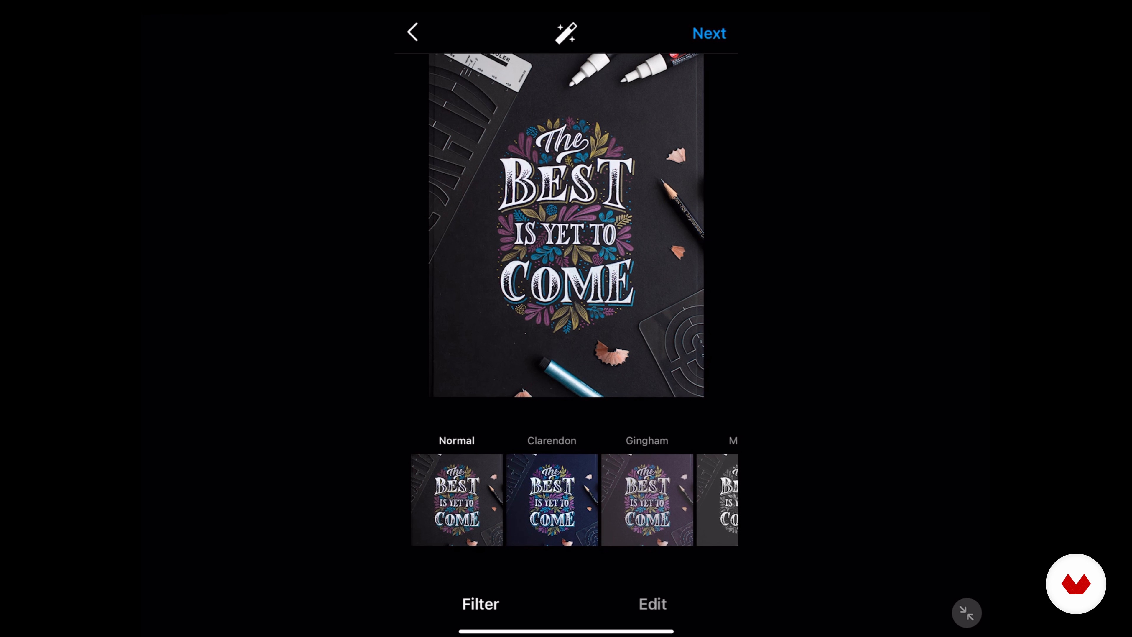
17Sharing Your Work Online
Do you know that you can create more than one content for every lettering composition you make? In this lesson, I will show you how to make the most out of your lettering content.
5m
 1
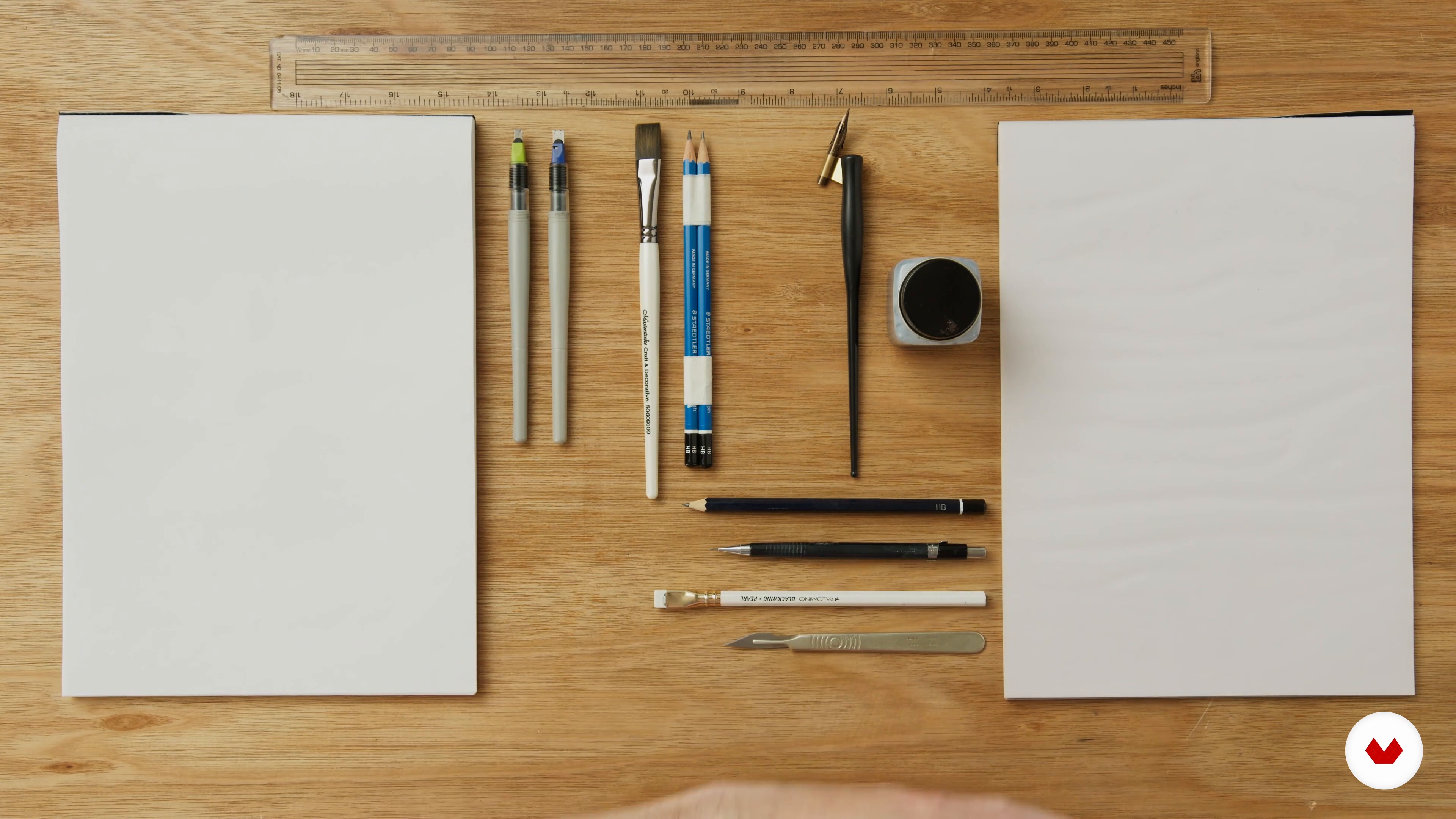
1Materials
In this lesson, I'll tell you about the materials that you'll need and their properties, before walking you through the module project.
3m
 2
2Definitions
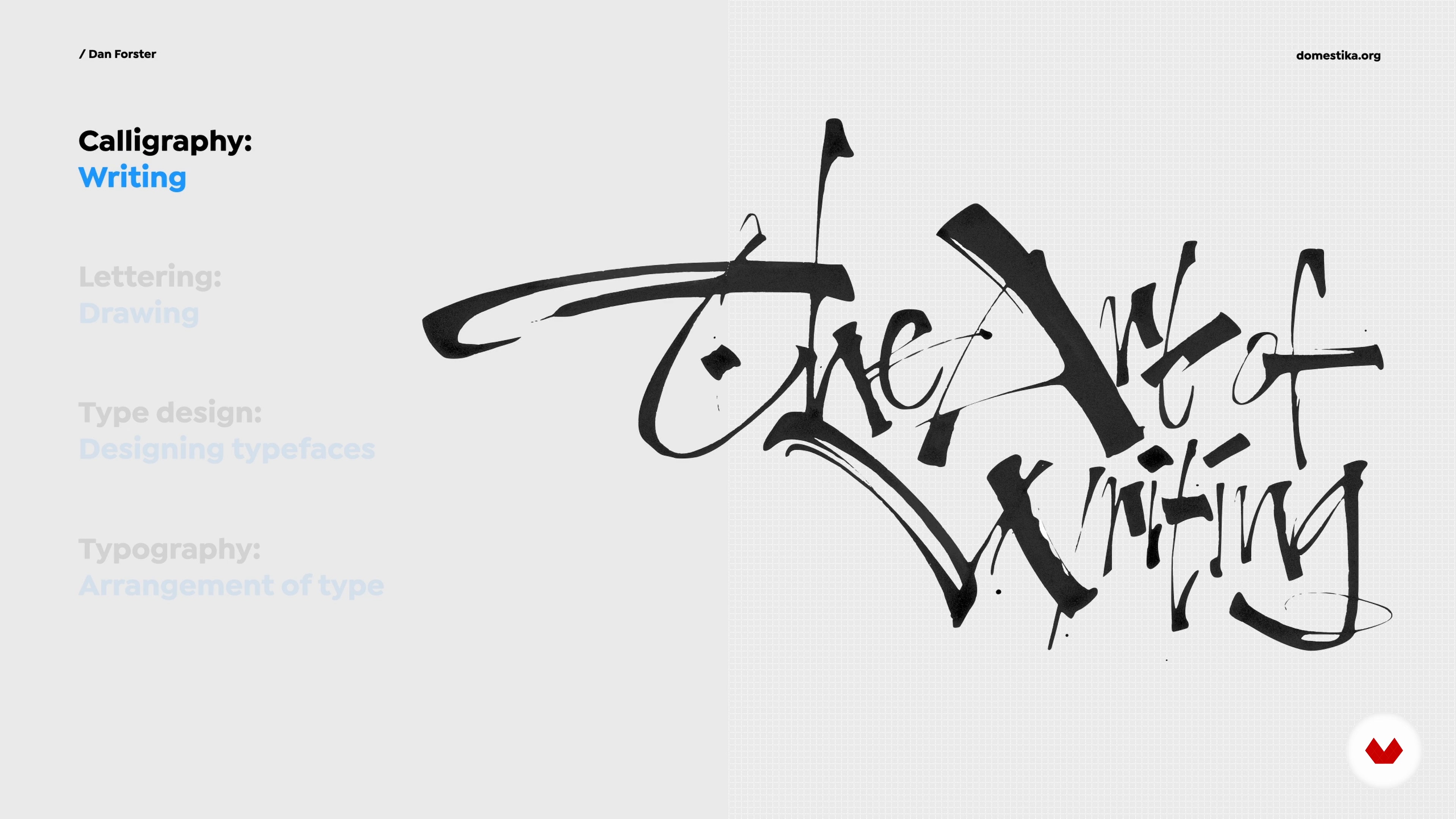
Calligraphy, lettering, typography and type design are all different but related disciplines. In this lesson, I will teach you about some differences by looking at examples.
11m
 3
3Lettering Principles
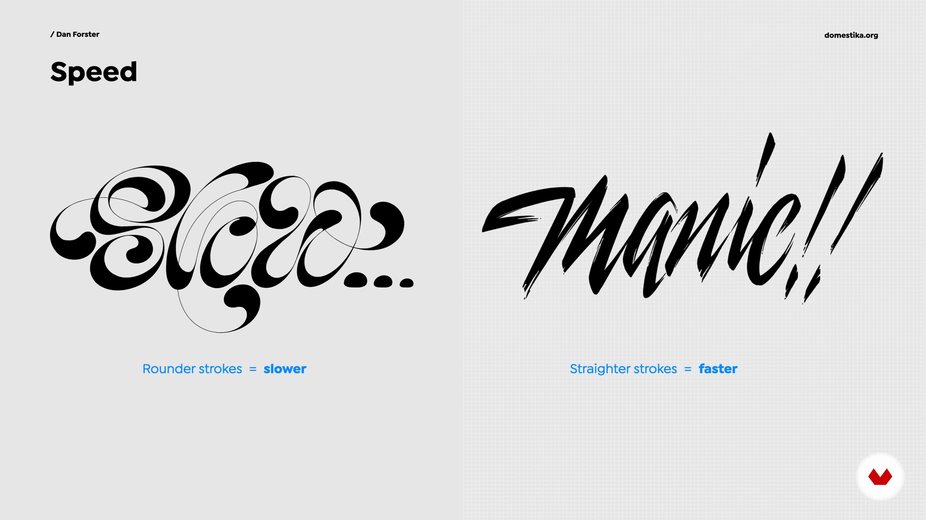
I will now talk about what I believe to be some of the most important principles of lettering. These are some things you should pay close attention to and endeavour to study further. Get these details right and you'll be on your way to becoming a great lettering artist.
14m
 4
4Attitude and Approach
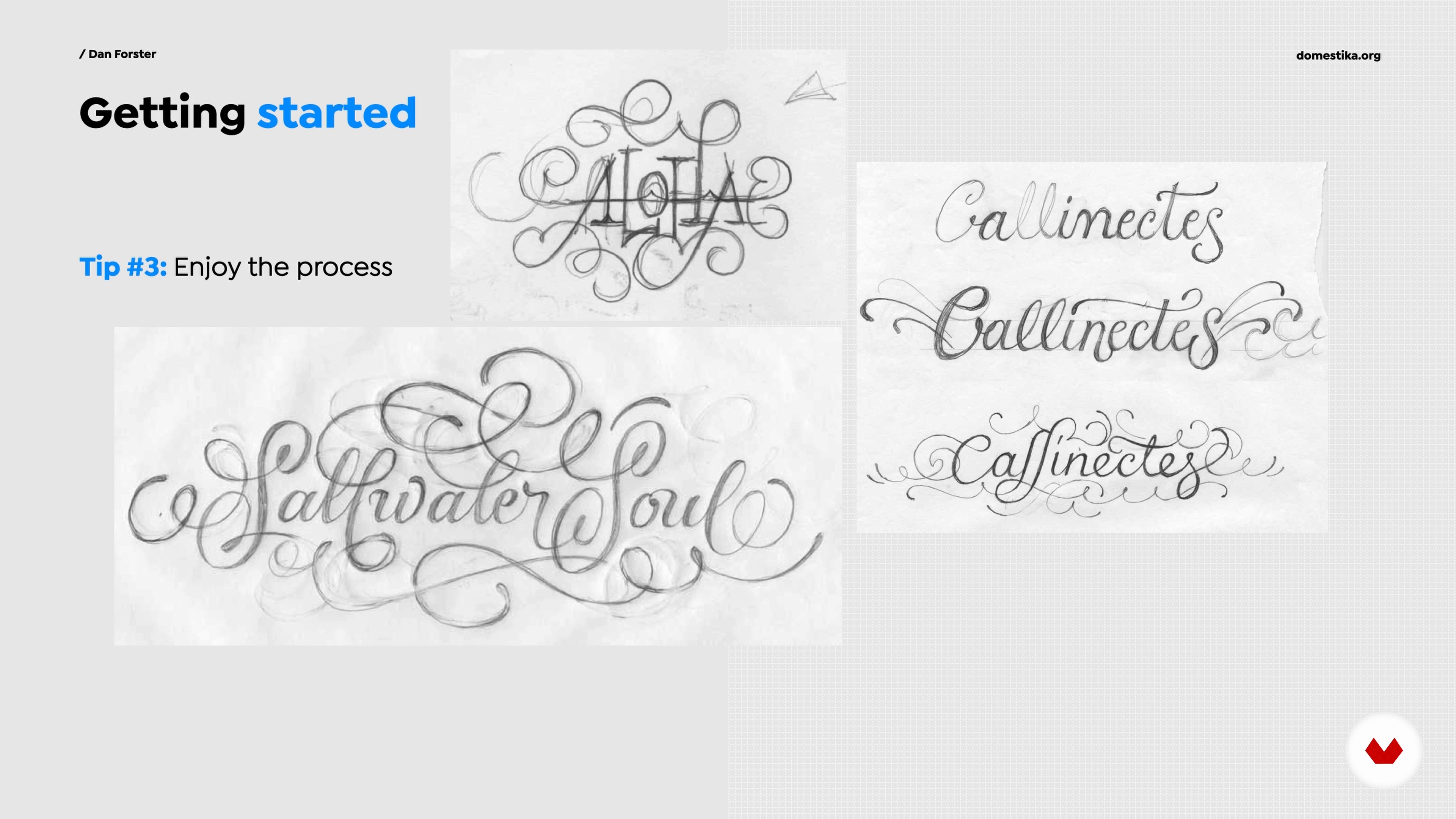
One thing that I believe can make or break your success as a lettering artist is having the right mindset. In this lesson, I will discuss some of my recommendations for building the right attitude and approach towards your work. I'll share some of the things that have helped to keep me going when things have become challenging, along with insights that have encouraged me to keep striving to make my best work.
15m
 5
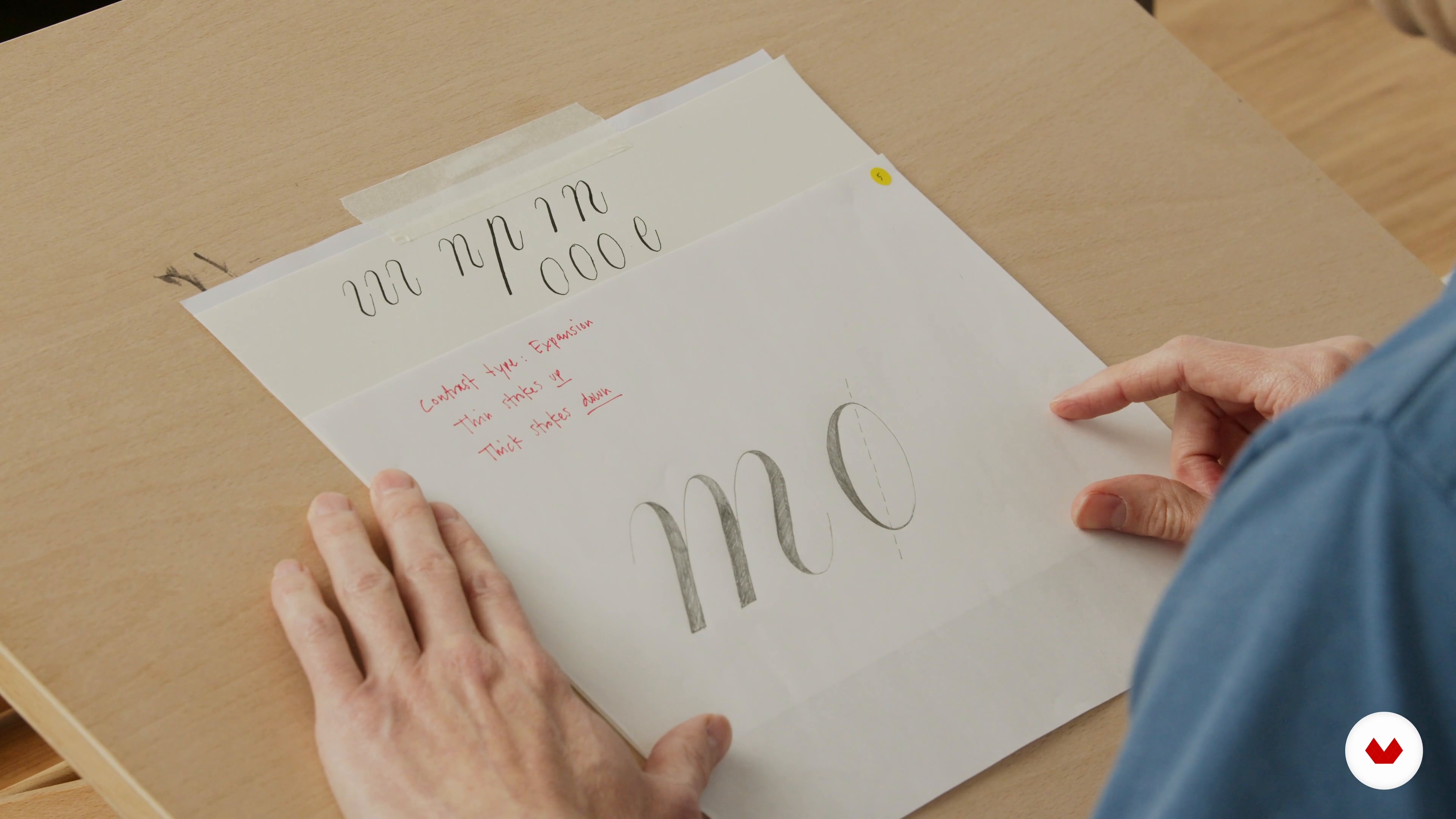
5The Importance of 'Pen Influence': How Calligraphy Informs Lettering
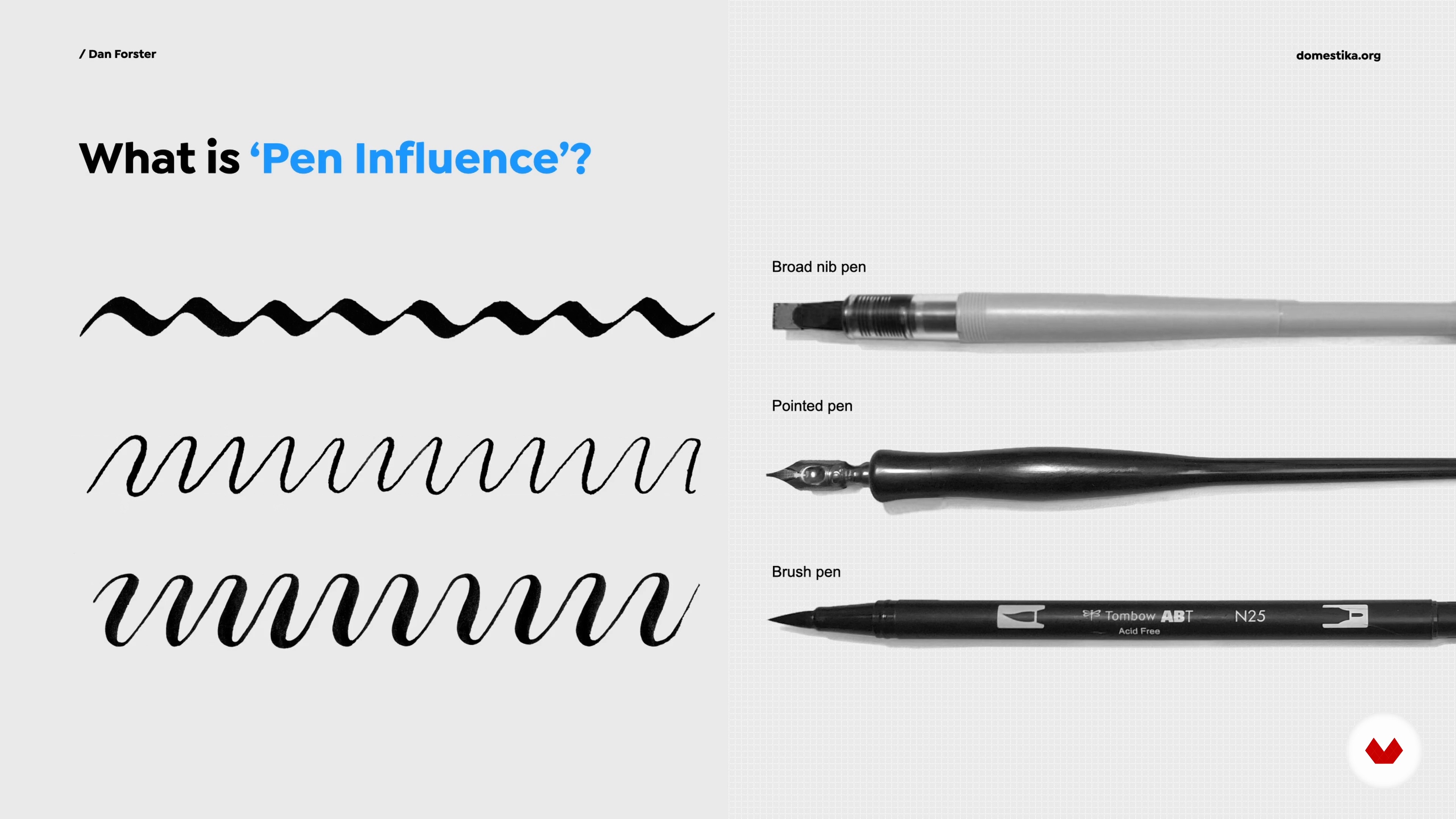
Pretty much all lettering styles can be traced back to the pen. In this lesson, I will explain the importance of understanding the concept of 'pen influence'. This was one of the most crucial lessons for me in my early career – a light-bulb moment when it came to understanding correct letterform construction, the placement of weight and other aspects of drawing letters.
11m
 6
6'Pen Influence' in Practice 1
Continuing on from the previous lesson, you'll now see how 'pen influence' works in practice, by trying your hand at some calligraphy. Don't worry, you don't have to be a good calligrapher to be a great lettering artist.
20m
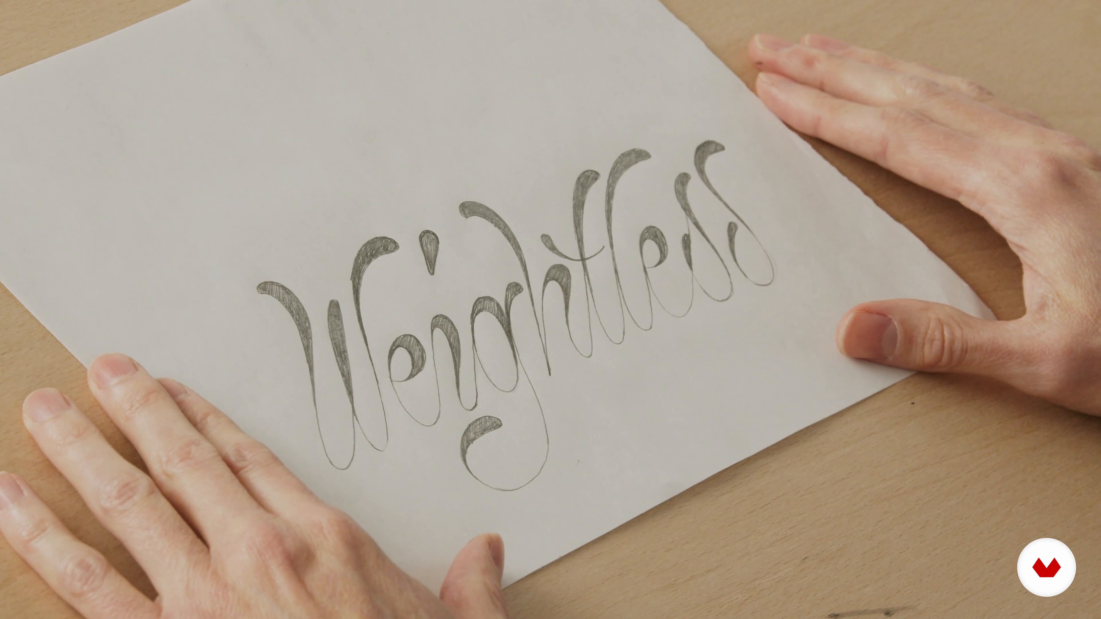 7
7'Pen Influence' in Practice 2
In the second part of this lesson, I will continue to demonstrate how the practice of calligraphy can help to improve your lettering. I will home in on the importance of flow, showing how to merge lines without the formation of any kinks.
3m
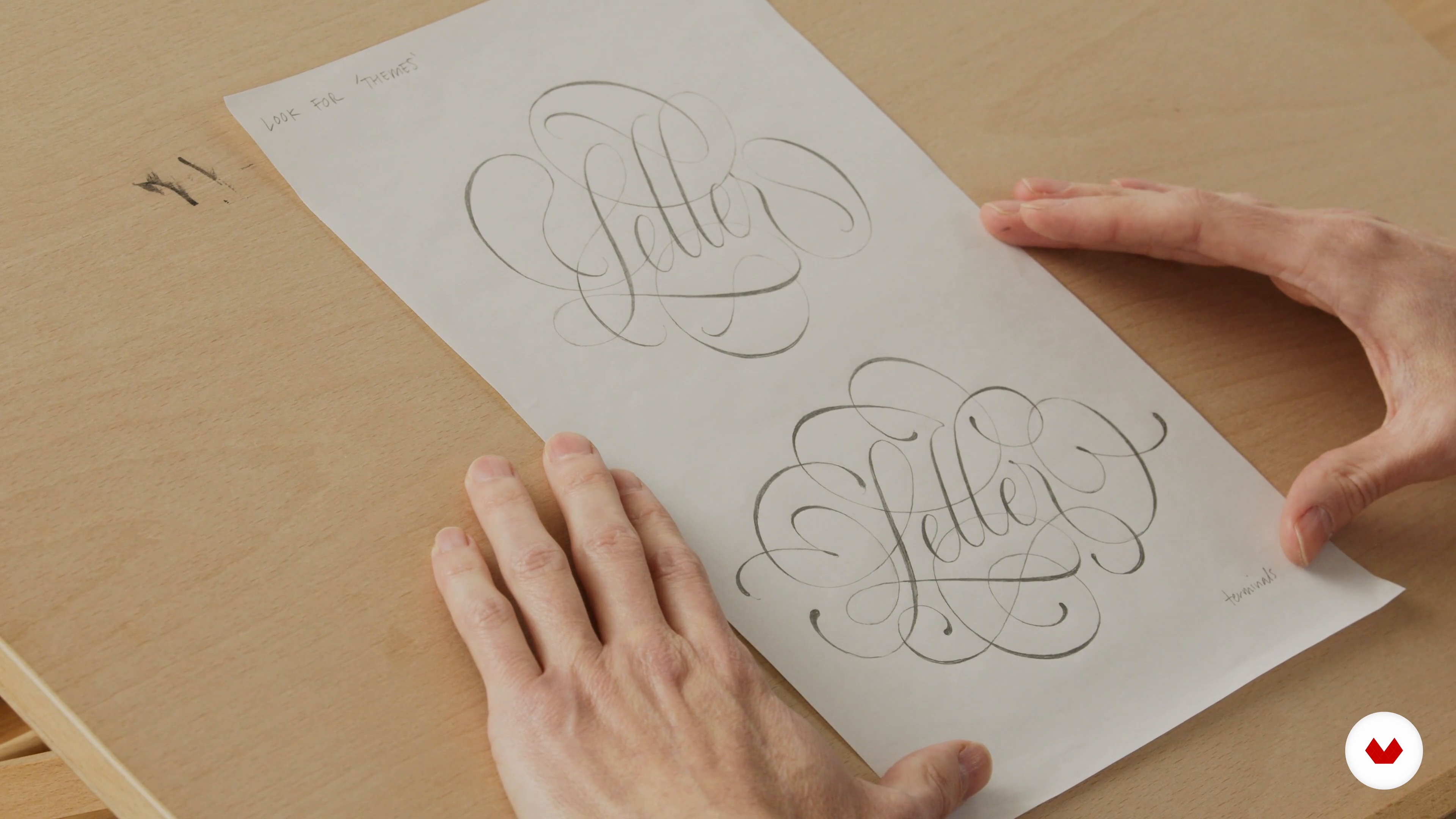 8
8Swashes and Flourishes Basics
In this lesson, you'll learn about some of the basics of flourishing, how to get started, and some warm-up exercises you can do to practice.
20m
 9
9Options for Sketching
I'll now show you the techniques I use for creating iterations of my designs for both analogue and digital sketching. The principle is very similar for both, and either approach will be fine for this module.
5m
 10
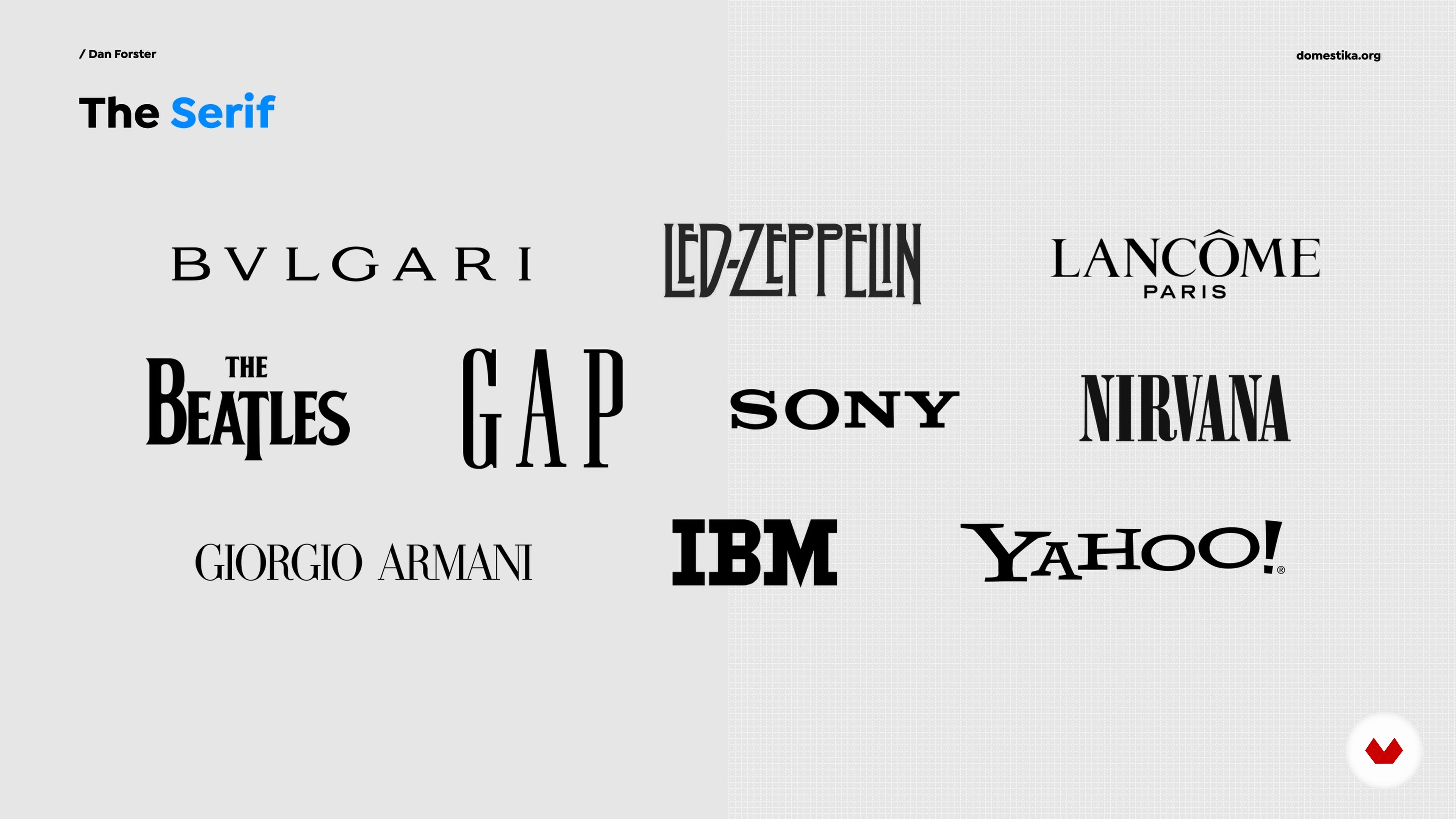
10Serif Style: Brief History and Examples
The Roman serif is the foundation of modern, western type and lettering. In this lesson, you'll learn a little about its history, including where it comes from, its construction, and its different interpretations. I'll also showcase some examples of this style with flourishes for inspiration.
13m
 11
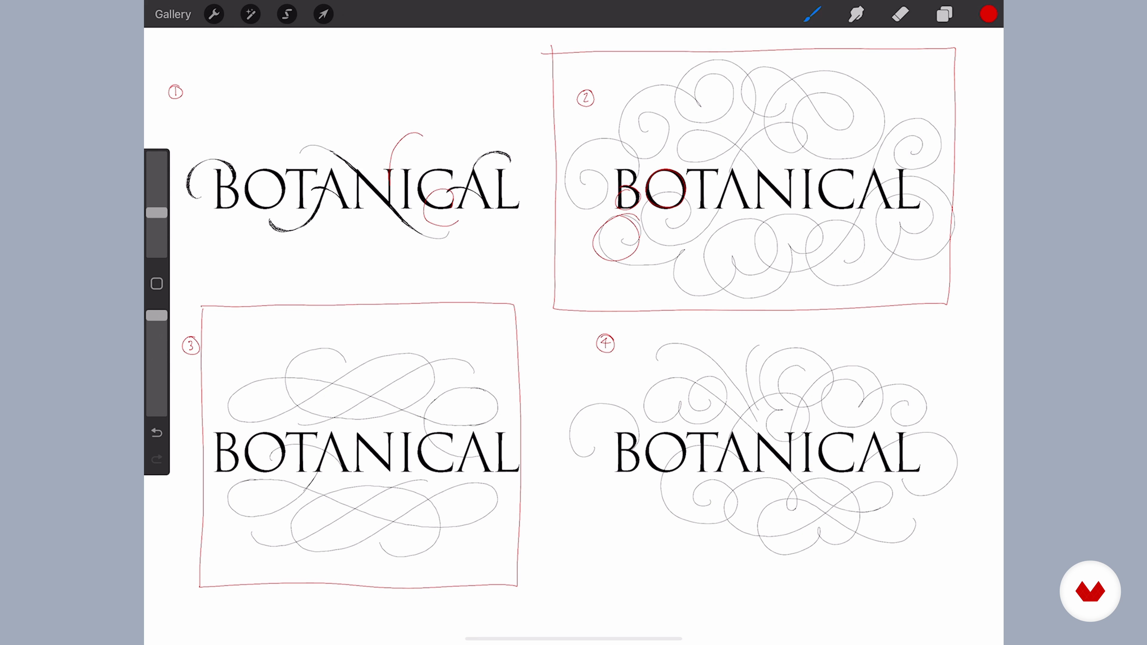
11Serif Style: Making a Composition with Flourishes 1
It's time to take all the things you've learnt about the serif style – from the calligraphy to the history – and make an expressive piece of serif lettering with flourishes.
20m
 12
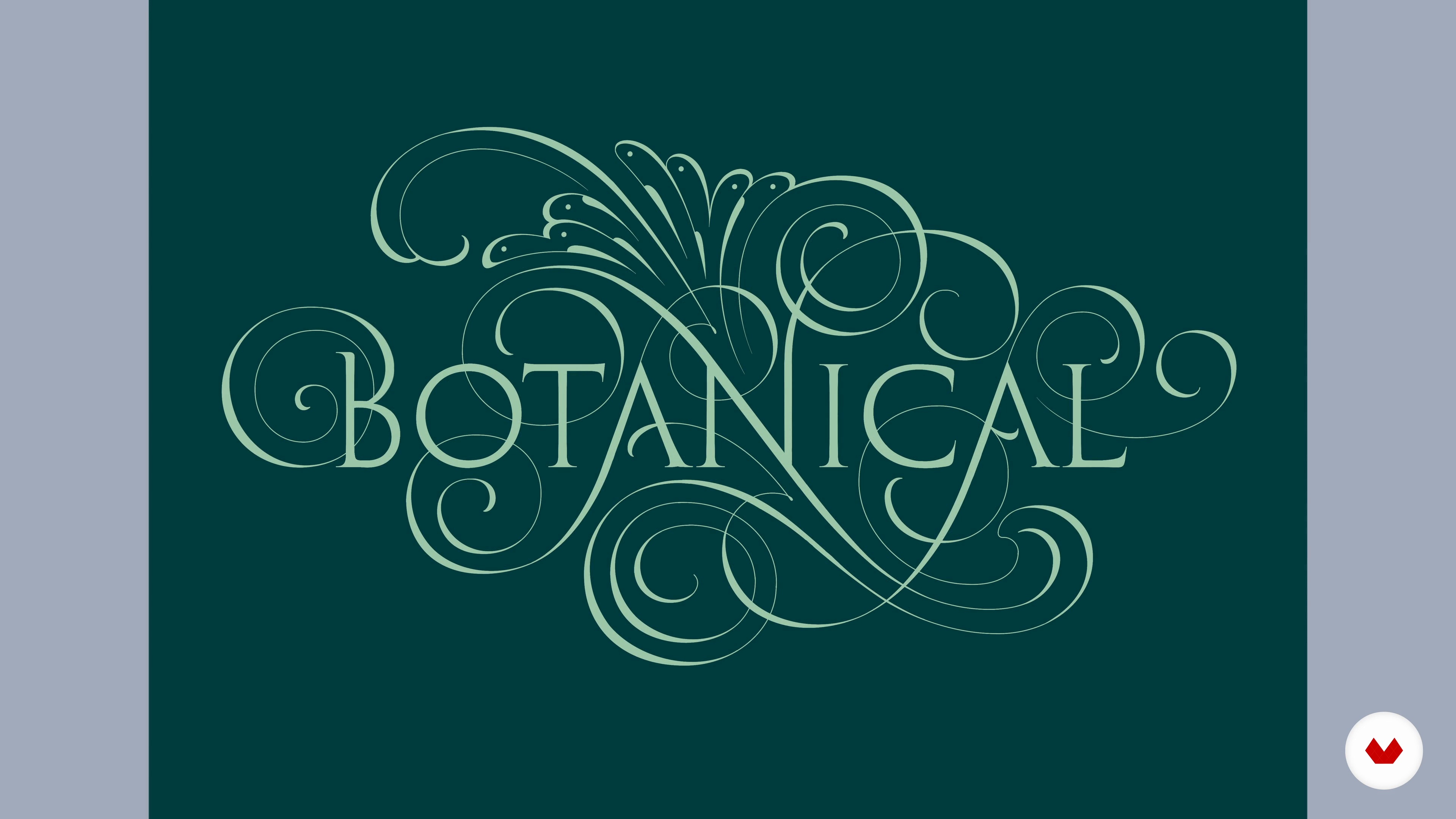
12Serif Style: Making a Composition with Flourishes 2
I will now gather the designs I've sketched so far to extract the elements that I like and create a composition I'm happy with. You will see how I adapt the word 'Botanical' to create a unique piece.
6m
 13
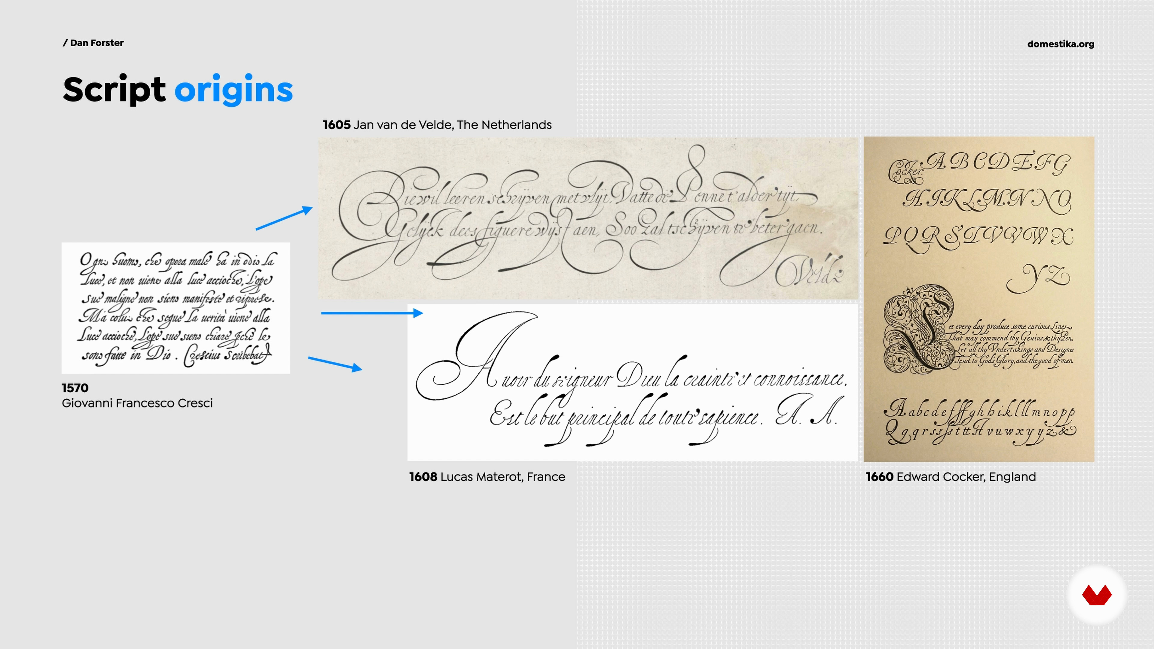
13Script Style: Brief History and Examples
Script styles come in many different forms, but they can all be traced back to a common origin point. In this lesson, I will teach you about the history of this style, including where it comes from, how it's constructed, different interpretations of it, and examples of this style with flourishes.
13m
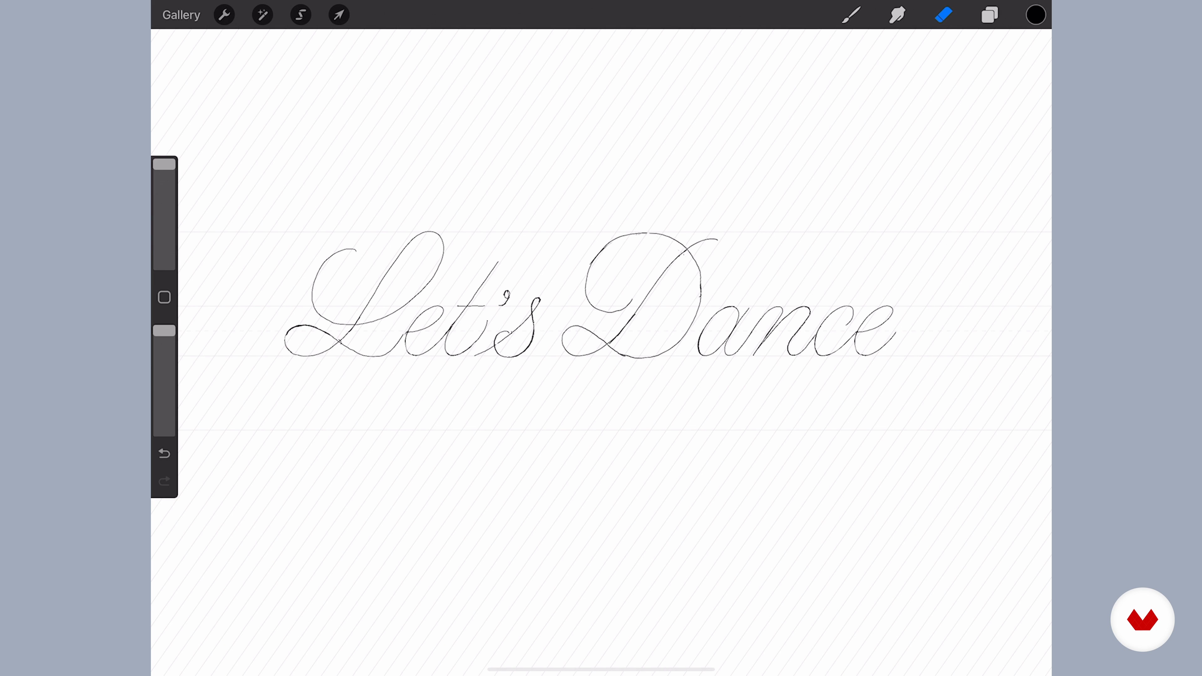 14
14Script Style: Making a Composition with Flourishes 1
As with the serif style, it's time to take all the things you've learnt to make an expressive piece of script lettering with flourishes. I will guide you through this process.
14m
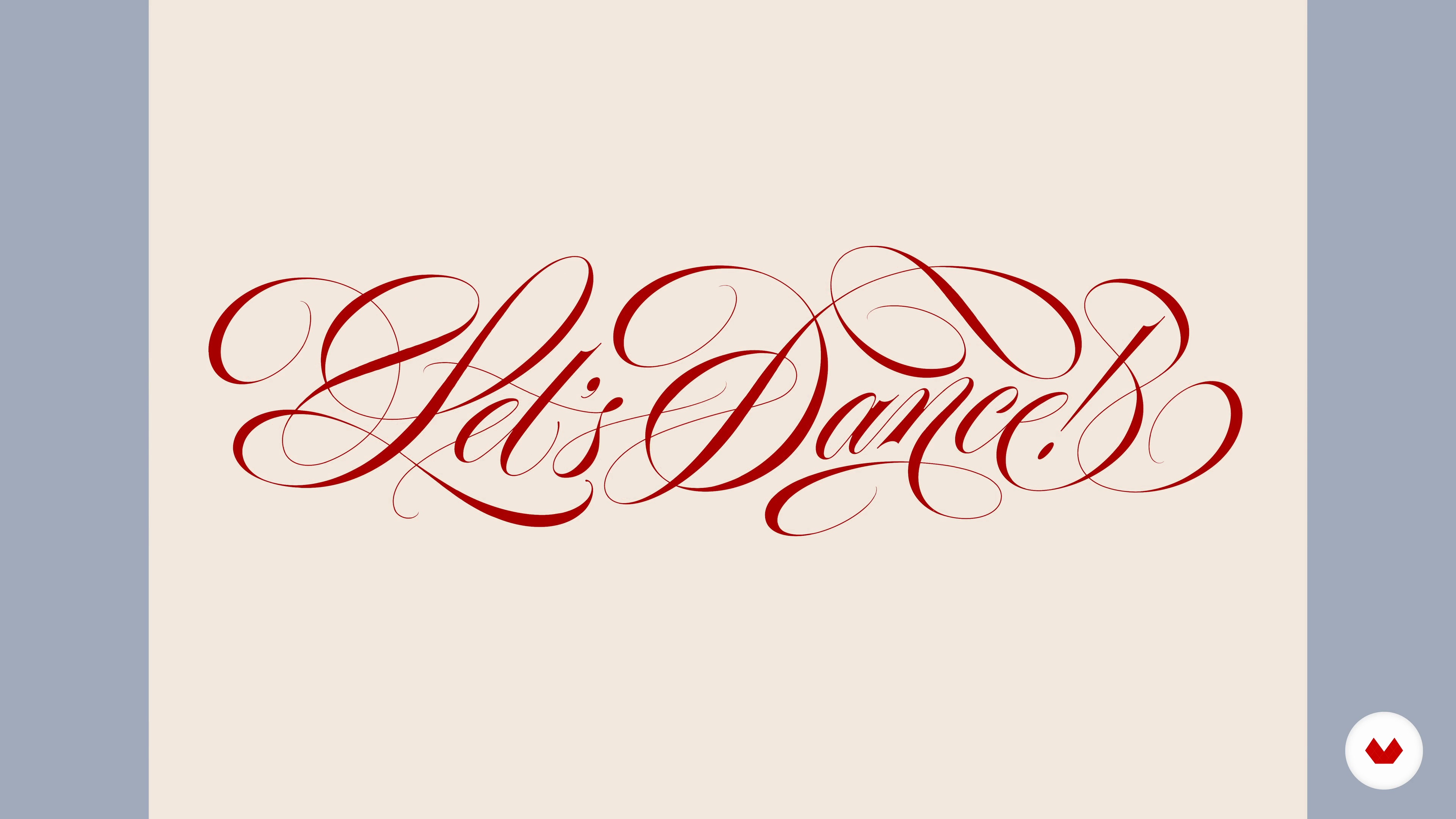 15
15Script Style: Making a Composition with Flourishes 2
From the sketches I've drawn so far, I prefer the second version. In this part of the lesson, I will add weight to the skeleton and nudge it closer to its final form.
20m
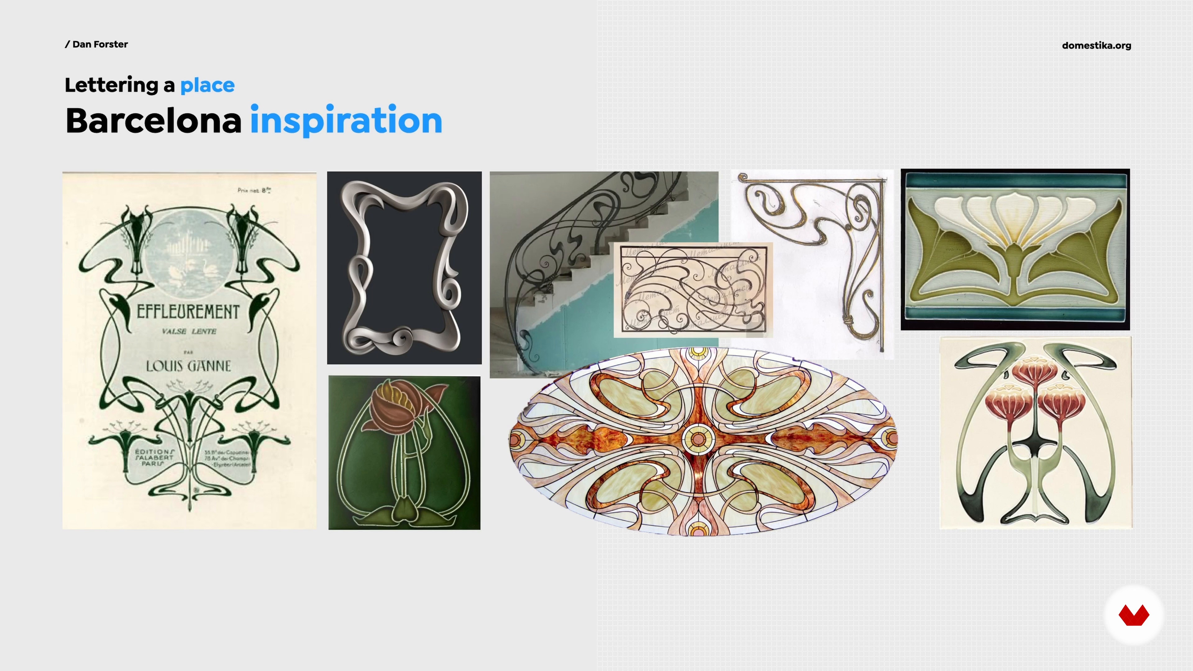 16
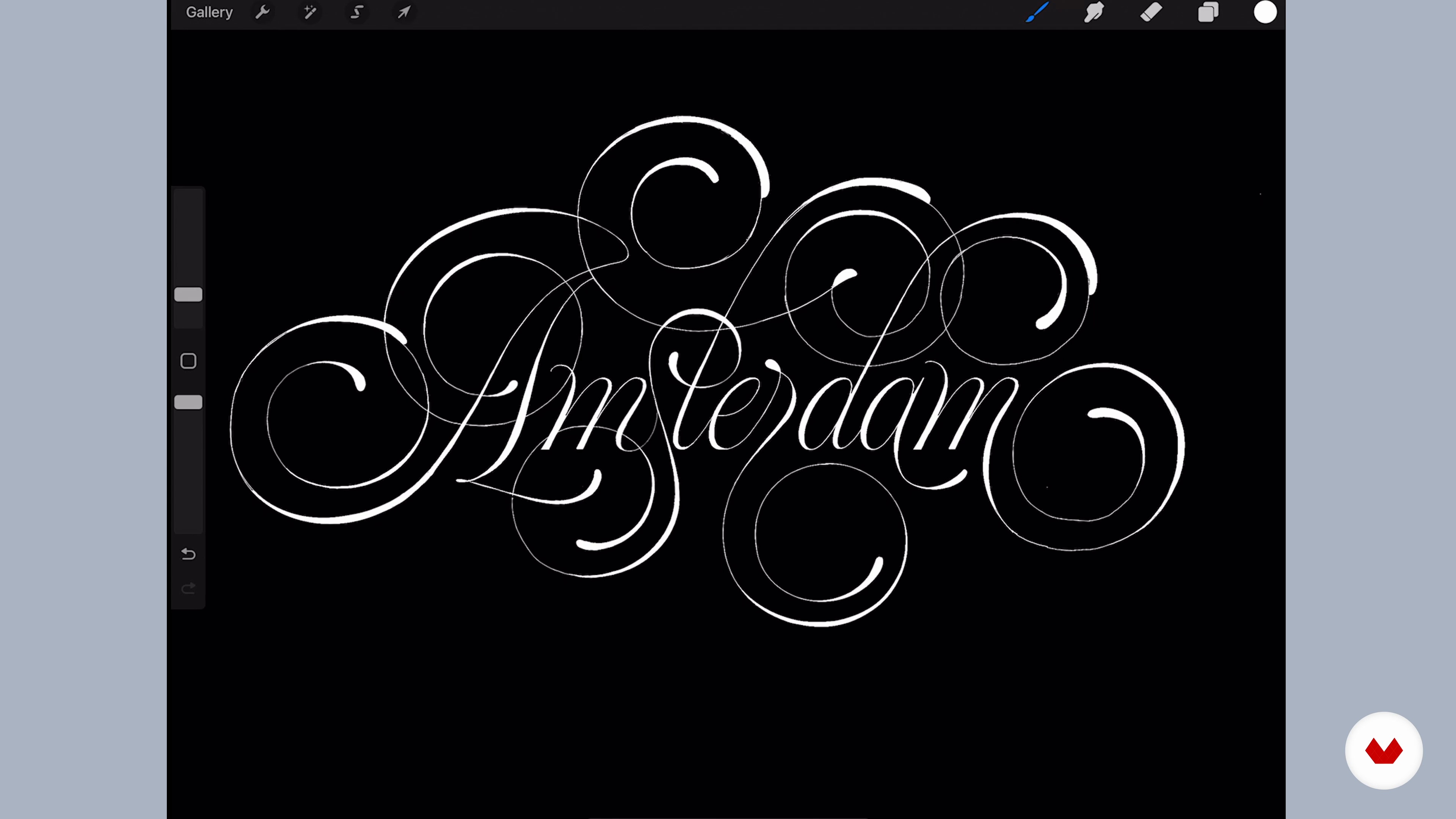
16Project Planning: Gathering Ideas and References
Let's get started! You will choose your city or place name, consider initial ideas for the lettering design, and begin some research by gathering references.
6m
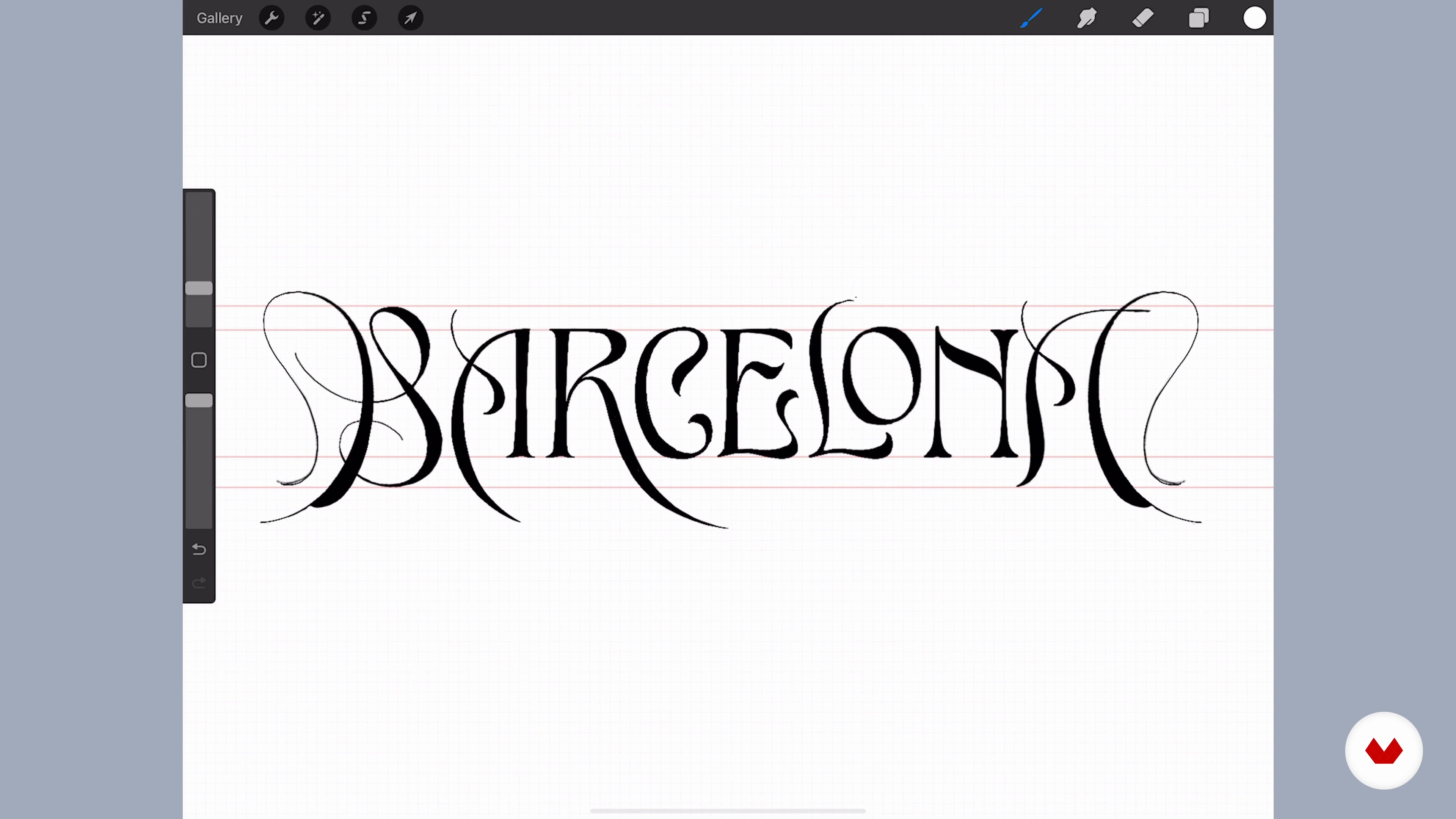 17
17Sketching the Composition in Procreate or with Pencil and Paper 1
In this lesson, I will demonstrate how to begin sketching the lettering for the city. We'll build in the flourishes too and make several iterations using the techniques you've learnt so far.
17m
 18
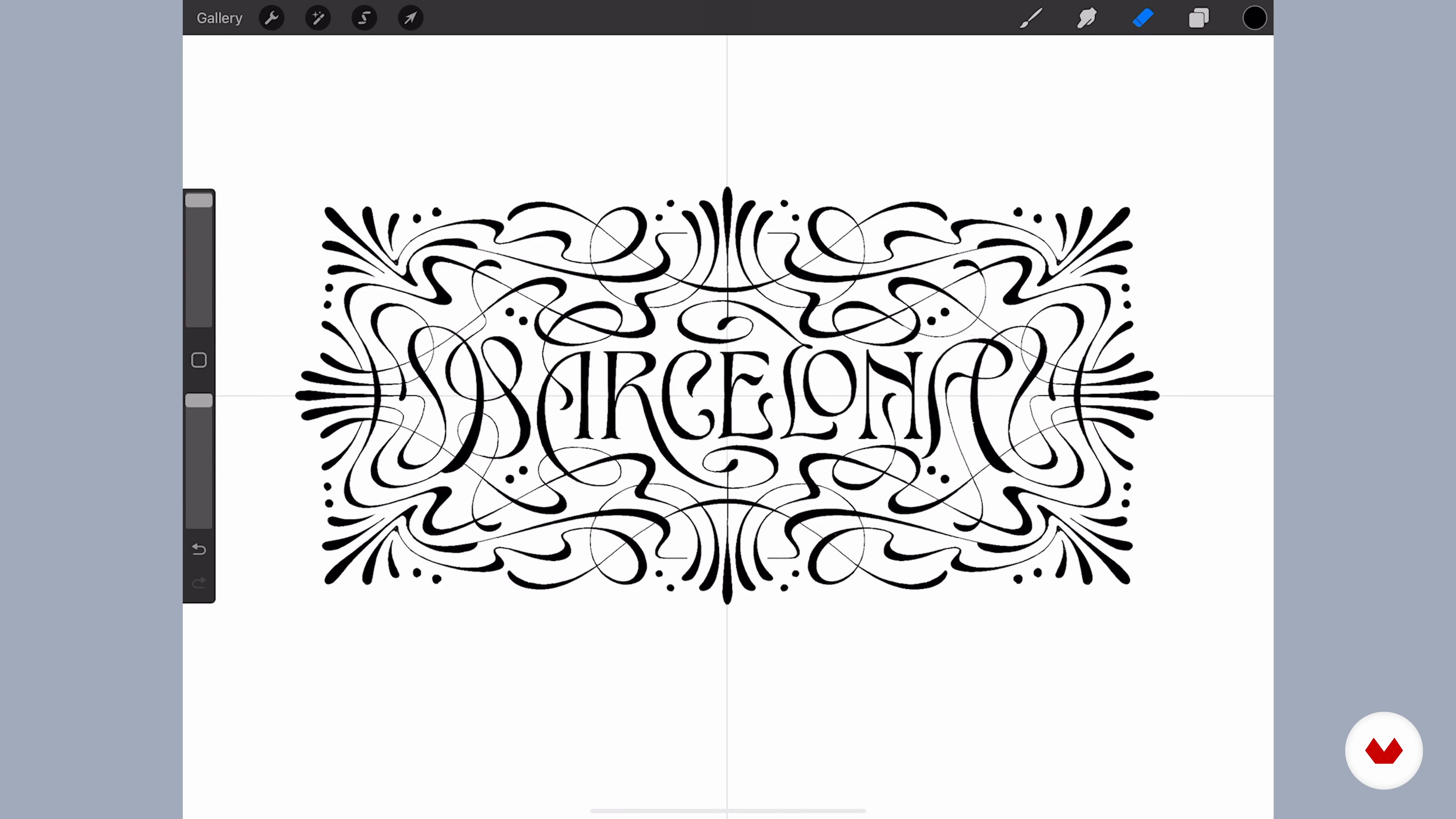
18Sketching the Composition in Procreate or with Pencil and Paper 2
I will now introduce you to a trick to quickly and effectively replicate any symmetrical aspects of your design. To finish, I will work on refining the shapes a little.
17m
 19
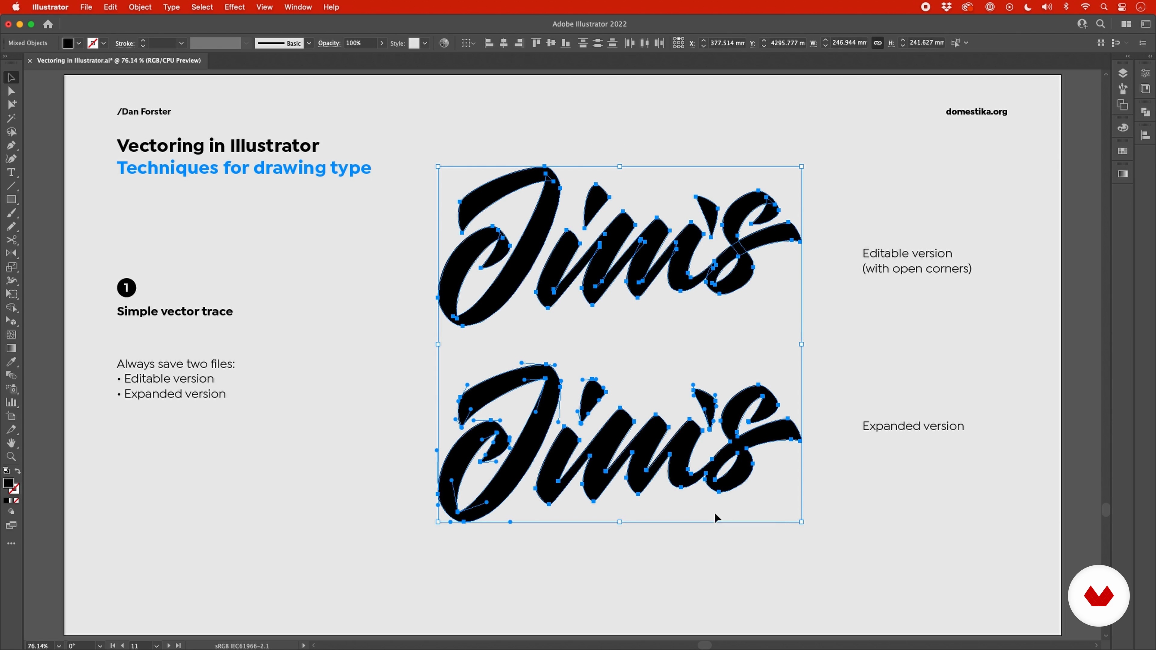
19Vectoring Techniques and Adobe Illustrator Set-up
The next step is to transfer your sketch into Adobe Illustrator. I'll show you how to set up the software and demonstrate some different techniques I use for vectoring depending on the style of lettering.
15m
 20
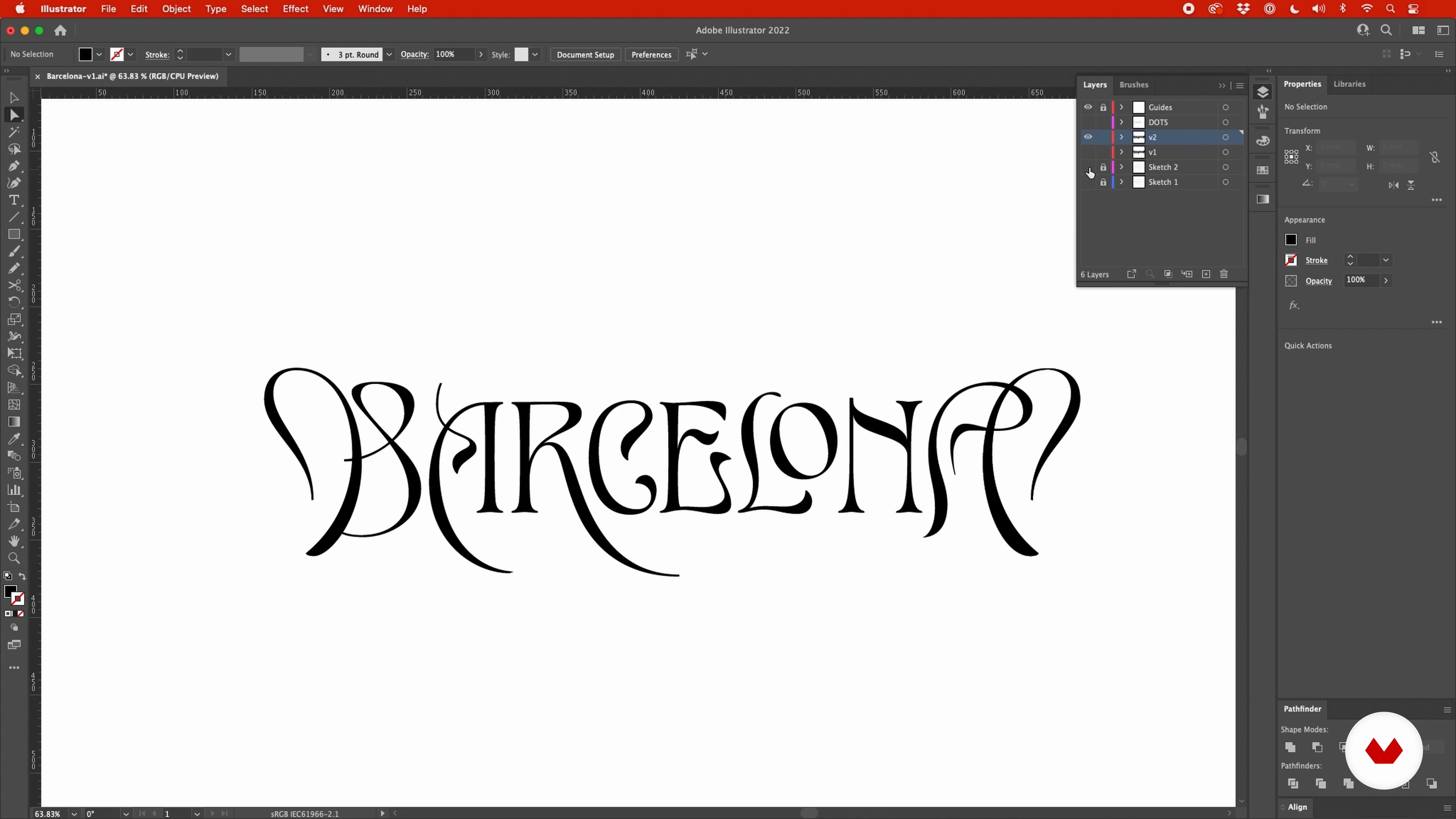
20Creating a Vector of the Composition in Illustrator 1
In this lesson, you will learn how to vector the lettering piece. Once I've defined the positive and negative shapes clearly, I will give them a black fill.
17m
 21
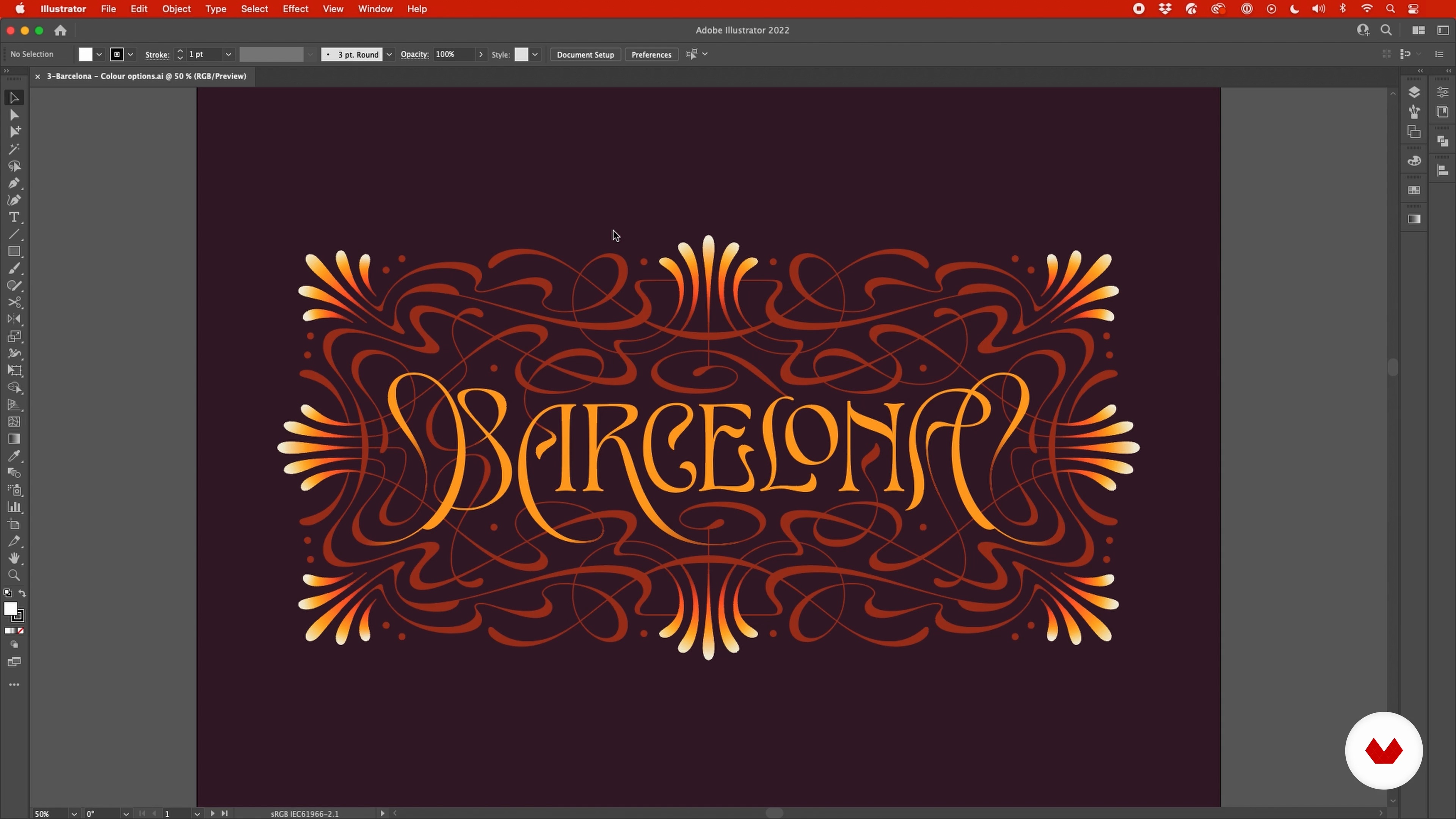
21Creating a Vector of the Composition in Illustrator 2
With the type complete, I will now turn my attention towards the flourishes. I will then choose a color palette and apply some corrections.
20m
 22
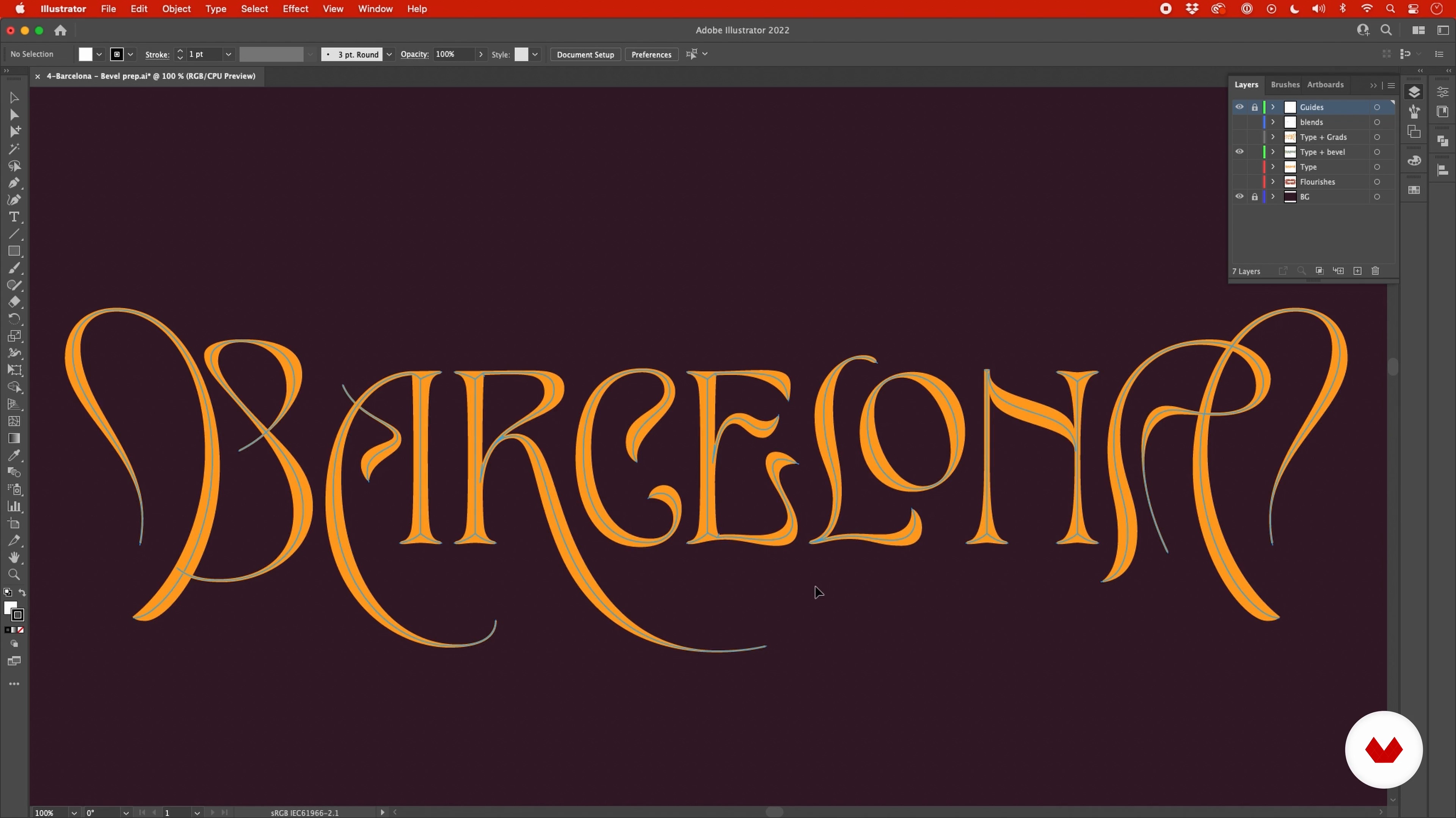
22Preparation in Illustrator: Lighting the Design
Before bringing the artwork into Photoshop, let's make the necessary preparations in Illustrator. I will teach you how to create a bevel effect on your letterforms and look at some techniques for simulating the lighting. You will see how this helps to enhance the effect and give depth to the letters.
19m
 23
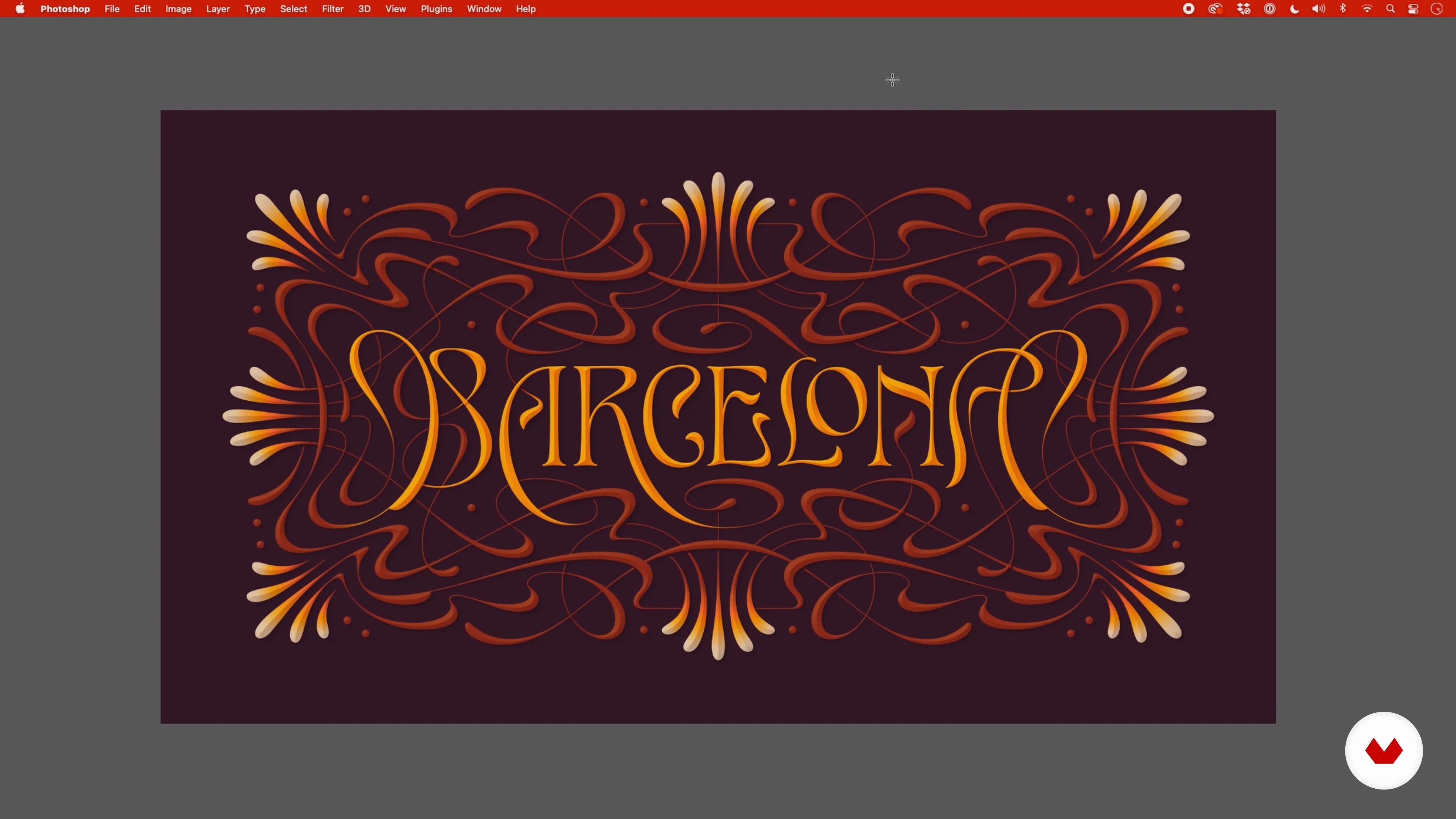
23Finishing Touches in Photoshop
We will now look at different methods for taking the vector artwork into Photoshop, how best to organise it in layers, and look at some options for adding texture.
19m
 1
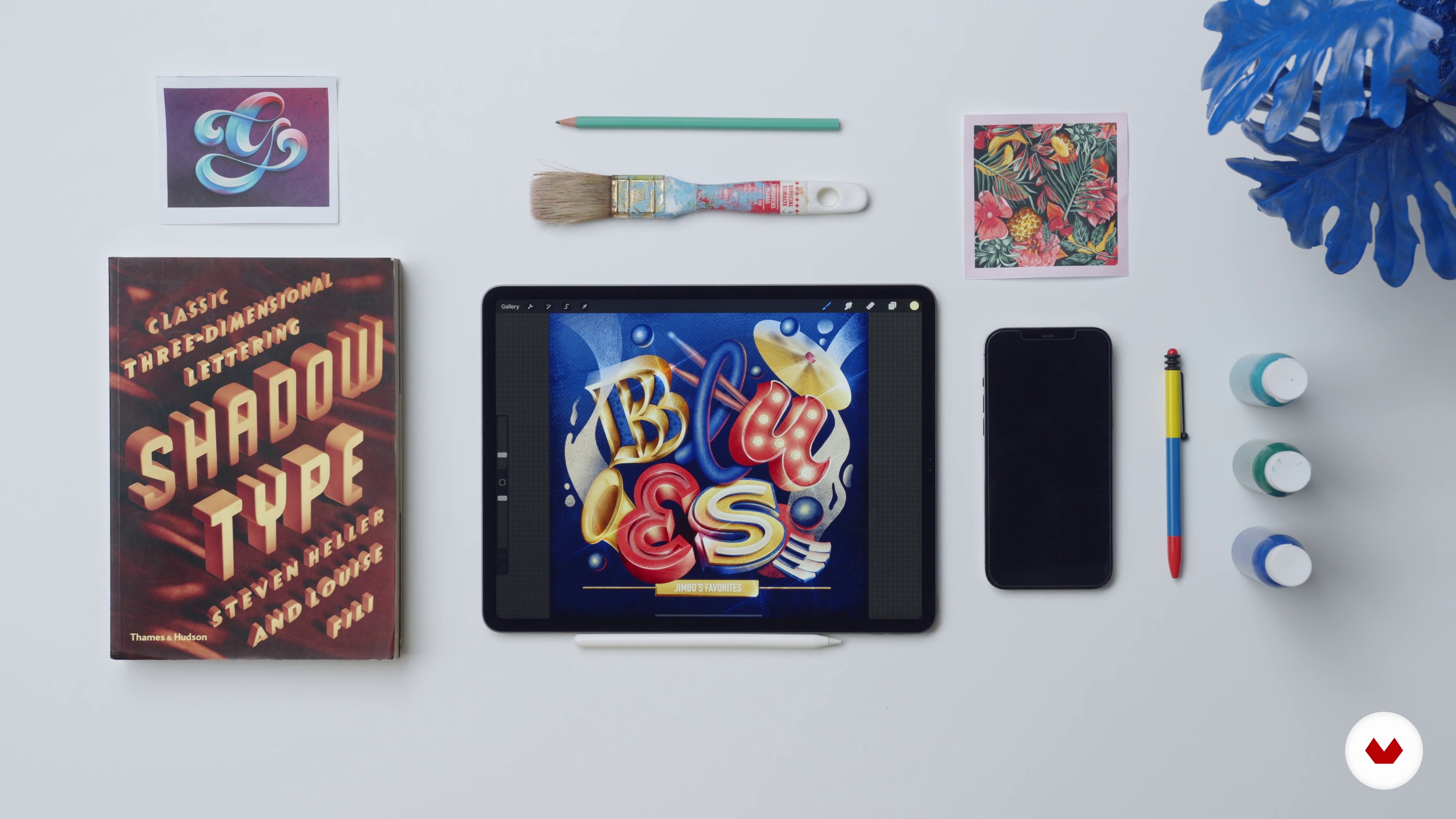
1Introduction to Lettering
Lettering is the art of drawing and illustrating letterforms. It’s really important to understand the difference with calligraphy, which is the art of writing letters with tools such as a brush pen or nips.
2m
 2
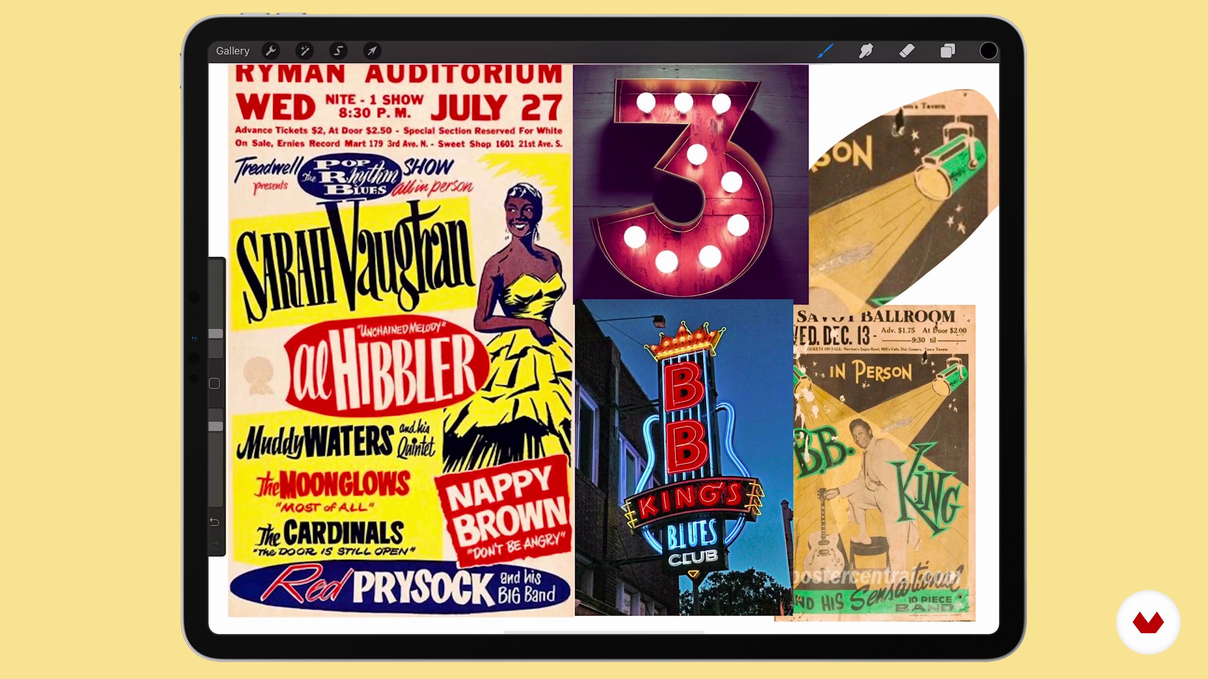
2Mood Board
Mood boards are the key for a successful project. Getting a sense of what our project is about and analysing trends and styles is the key to understanding what we want to do. In this lesson, you will choose a music genre and do a Pinterest research about aesthetics and color palettes of references you will later be inspired by to create your project.
13m
 3
3Selection and Sketching 1
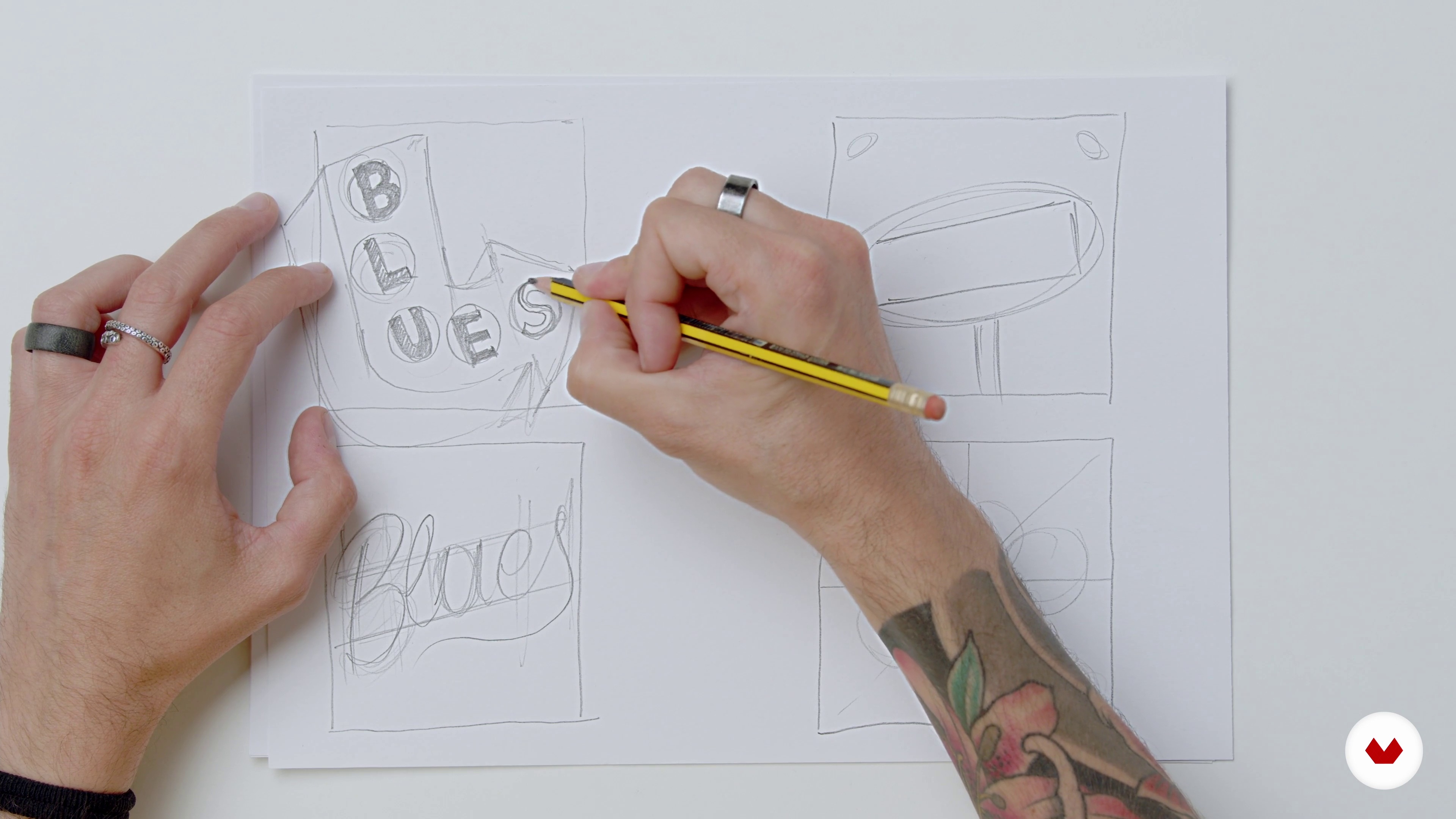
In this lesson, you will go back to basics and, with the help of a blank paper and a pencil, you’ll create rough sketches of your lettering piece. For this, you’ll select the parts of the mood board that inspire you the most or serve a better purpose for your project idea and you’ll understand what could work best while sketching.
13m
 4
4Selection and Sketching 2
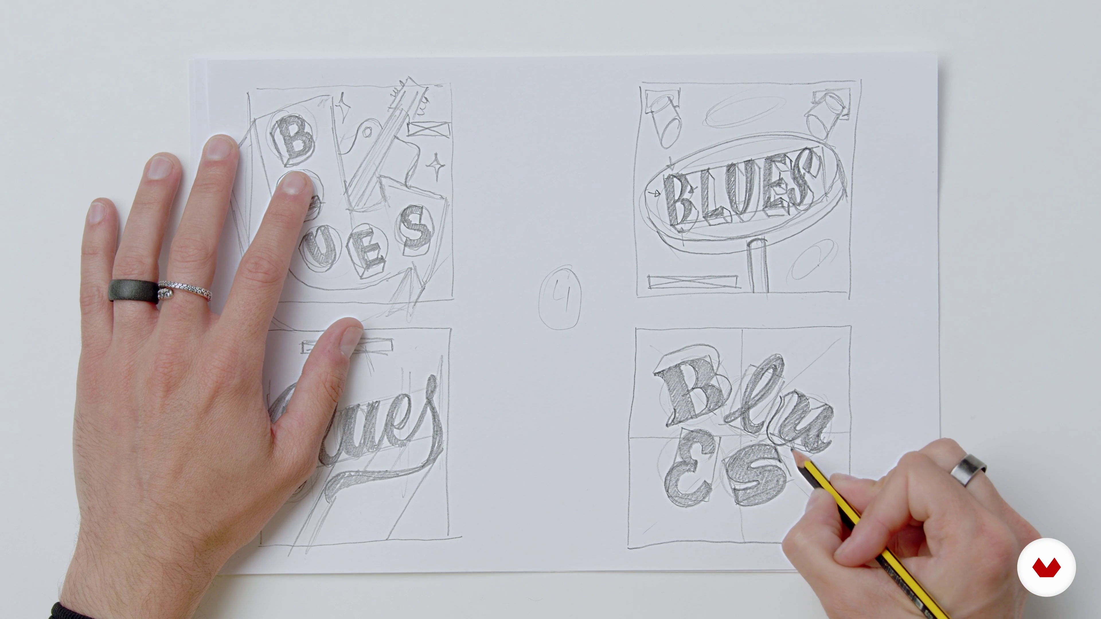
During this second part of the lesson, I'll keep sketching my options for my lettering piece.
10m
 5
5Transfer from Paper to Procreate
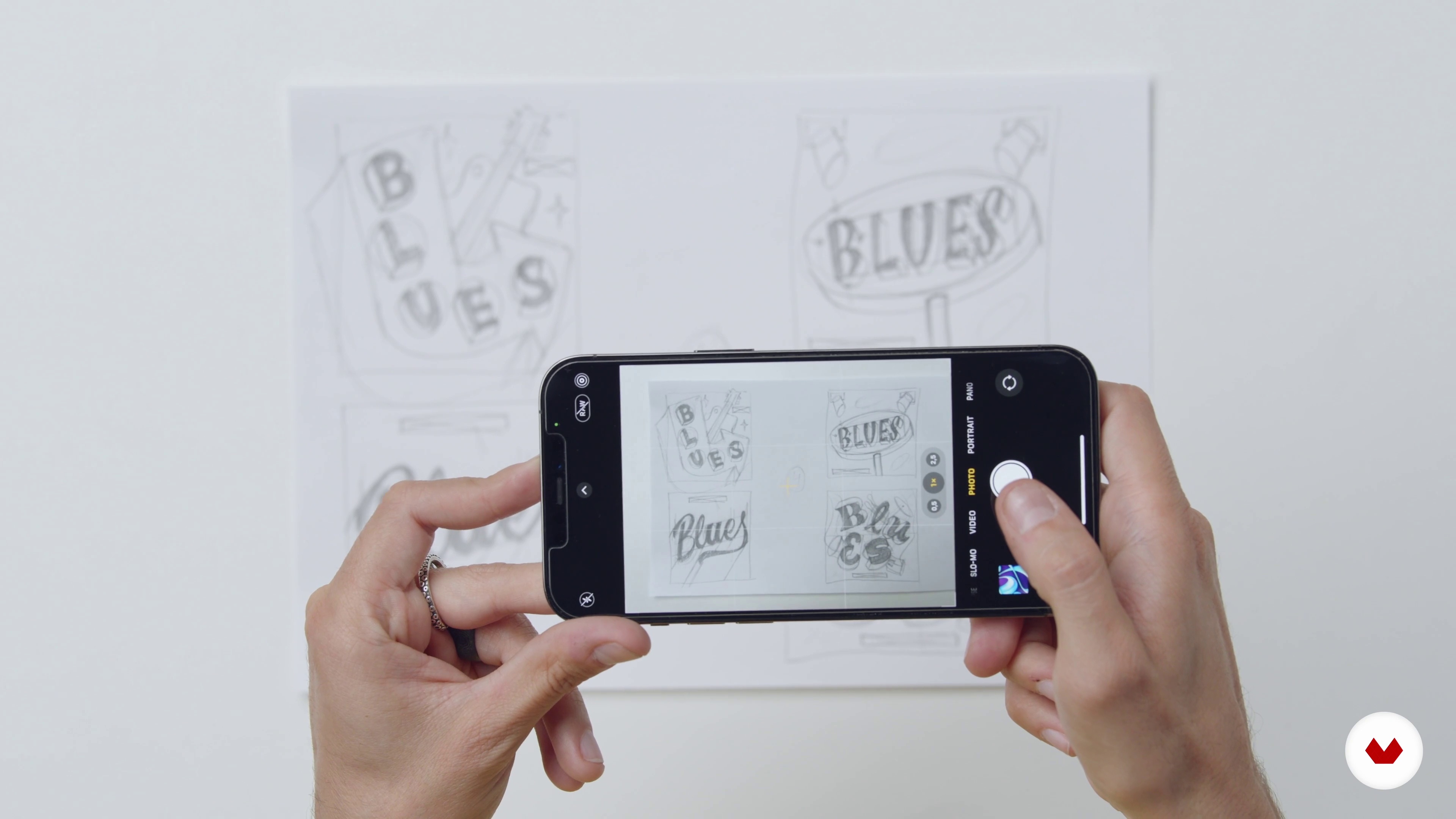
Once you feel comfortable with your rough ideas, you’ll transfer them to procreate. I’m going to show you my easy method in this lesson.
2m
 6
6Start Working in Our Main Sketch
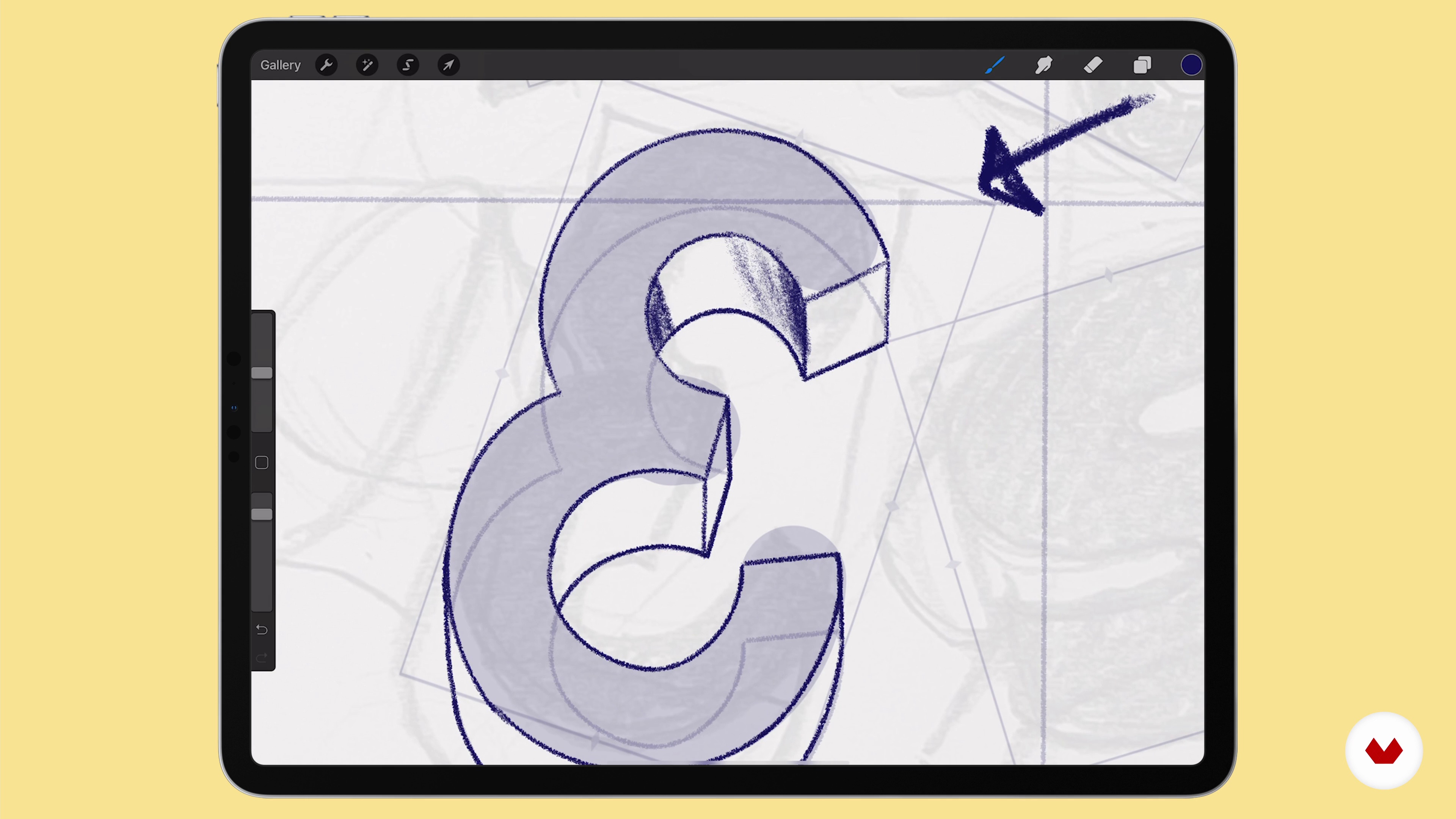
In this lesson, you will learn the importance of having an accurate sketch of your piece to later develop the project with a perfect guide. To do so you’ll create your first layer on Procreate and with the help of a pencil you’ll refine the rough sketch.
17m
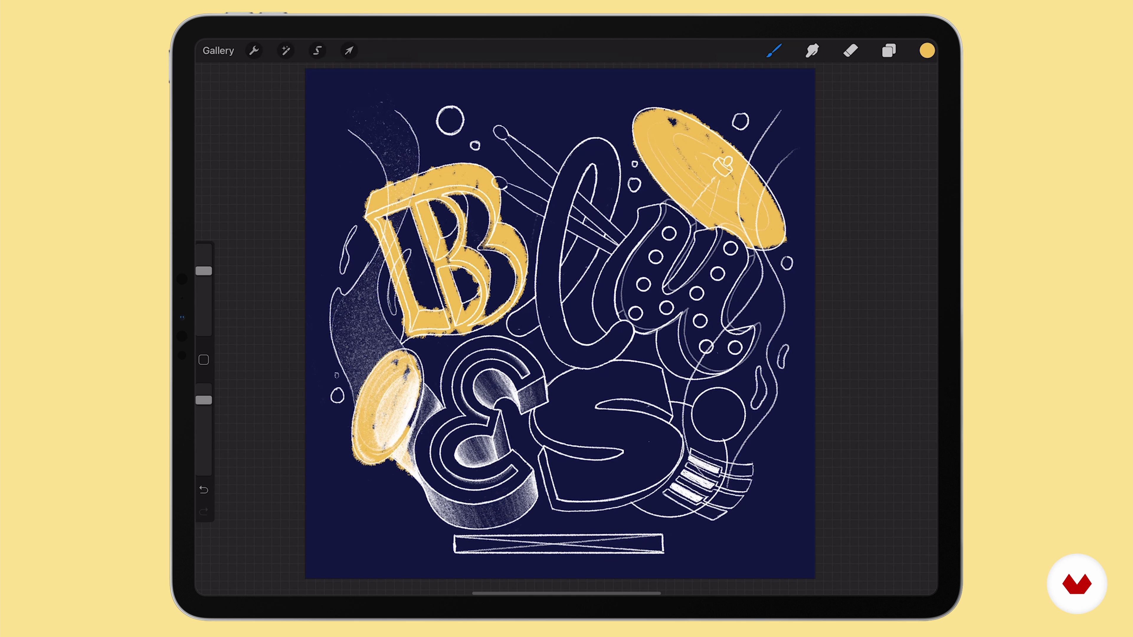 7
7Deciding the Color Palettes
Before starting cleaning up your sketch, you will learn how to find colors in your mood board and how I create my own color palettes. By the end of this lesson, you will have a final color palette to work on and you’ll be applying it roughly to the final sketch.
5m
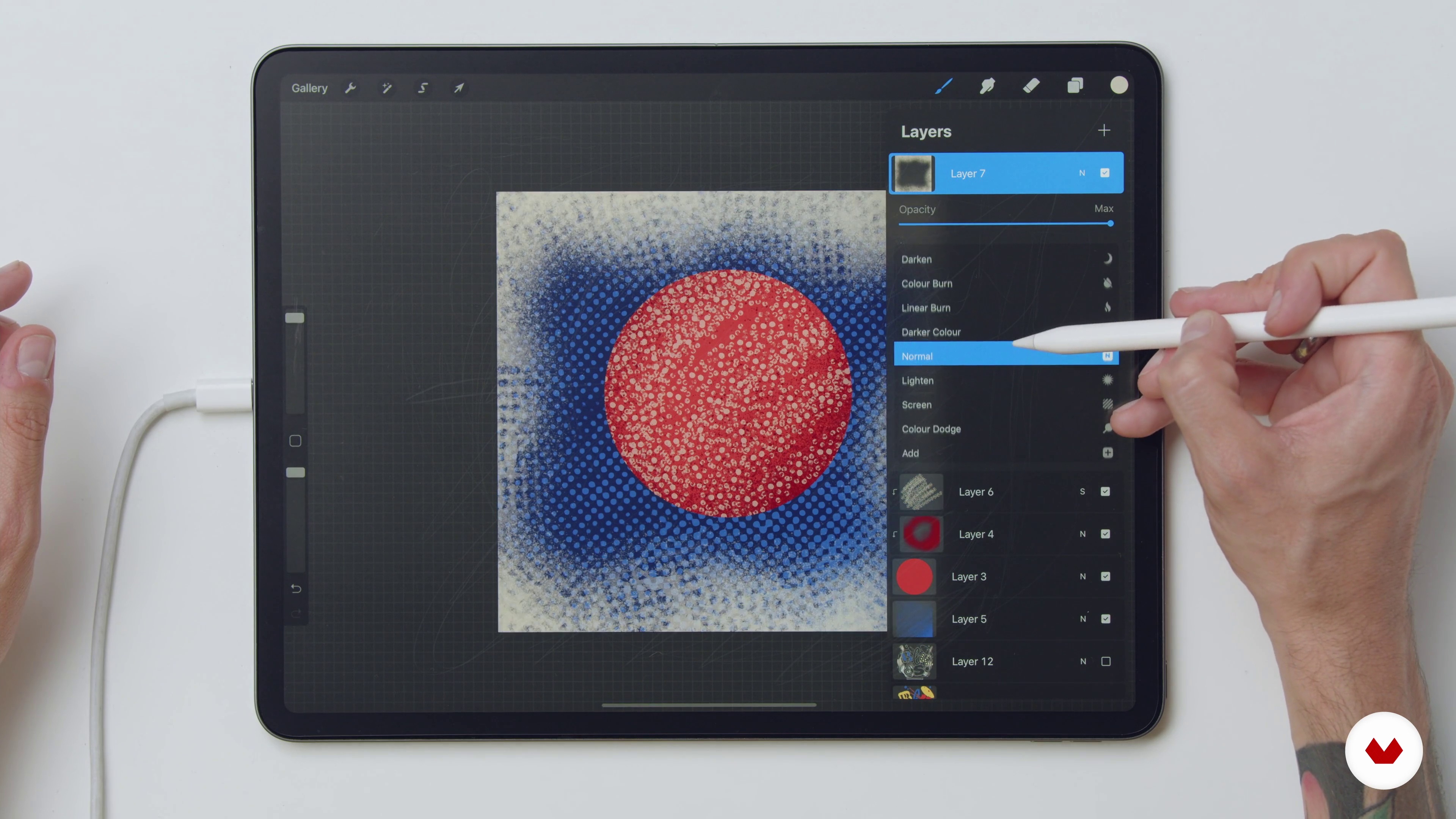 8
8Texture Brushes Explanation
I will show you what brushes to use in your piece while I explain each brush I created exclusively for this course.
8m
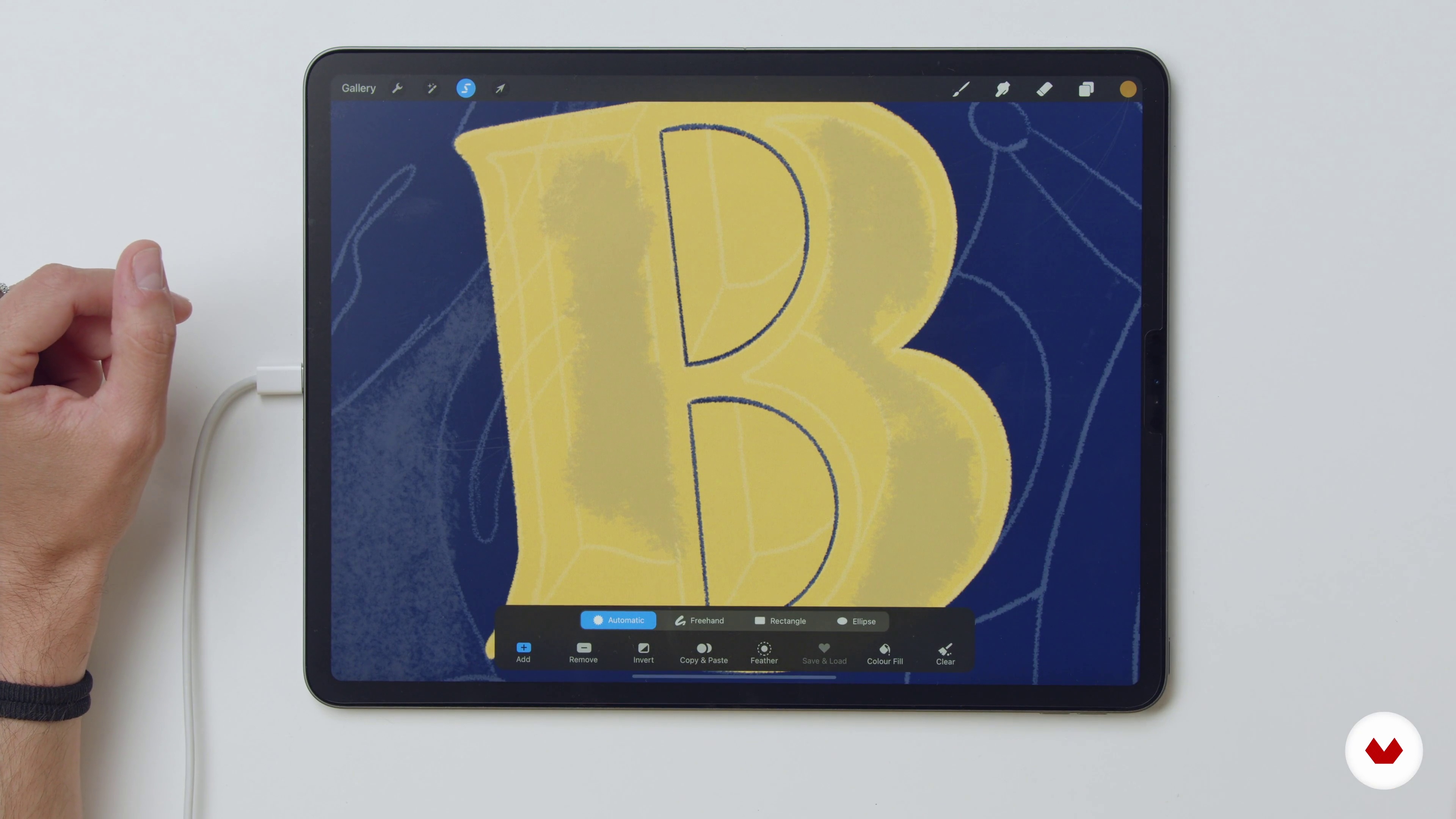 9
9Teaching Letter Style: B 1
In this lesson I will teach you the first style of my first letter and for the first time you will see all the steps I use to craft every single detail.
14m
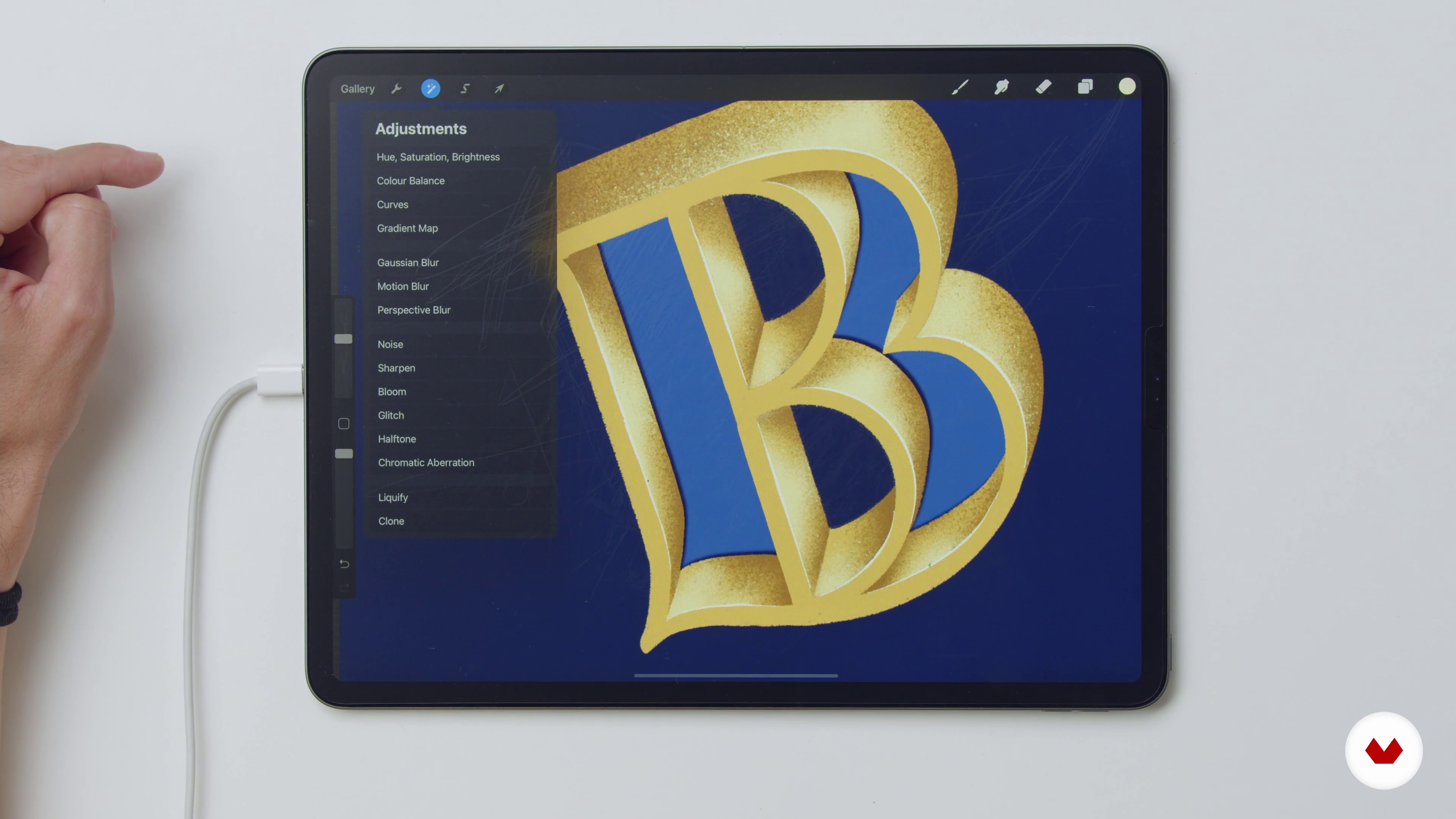 10
10Teaching Letter Style: B 2
Here I will continue working on the first letter, adding a shadow and lighting effects to it.
17m
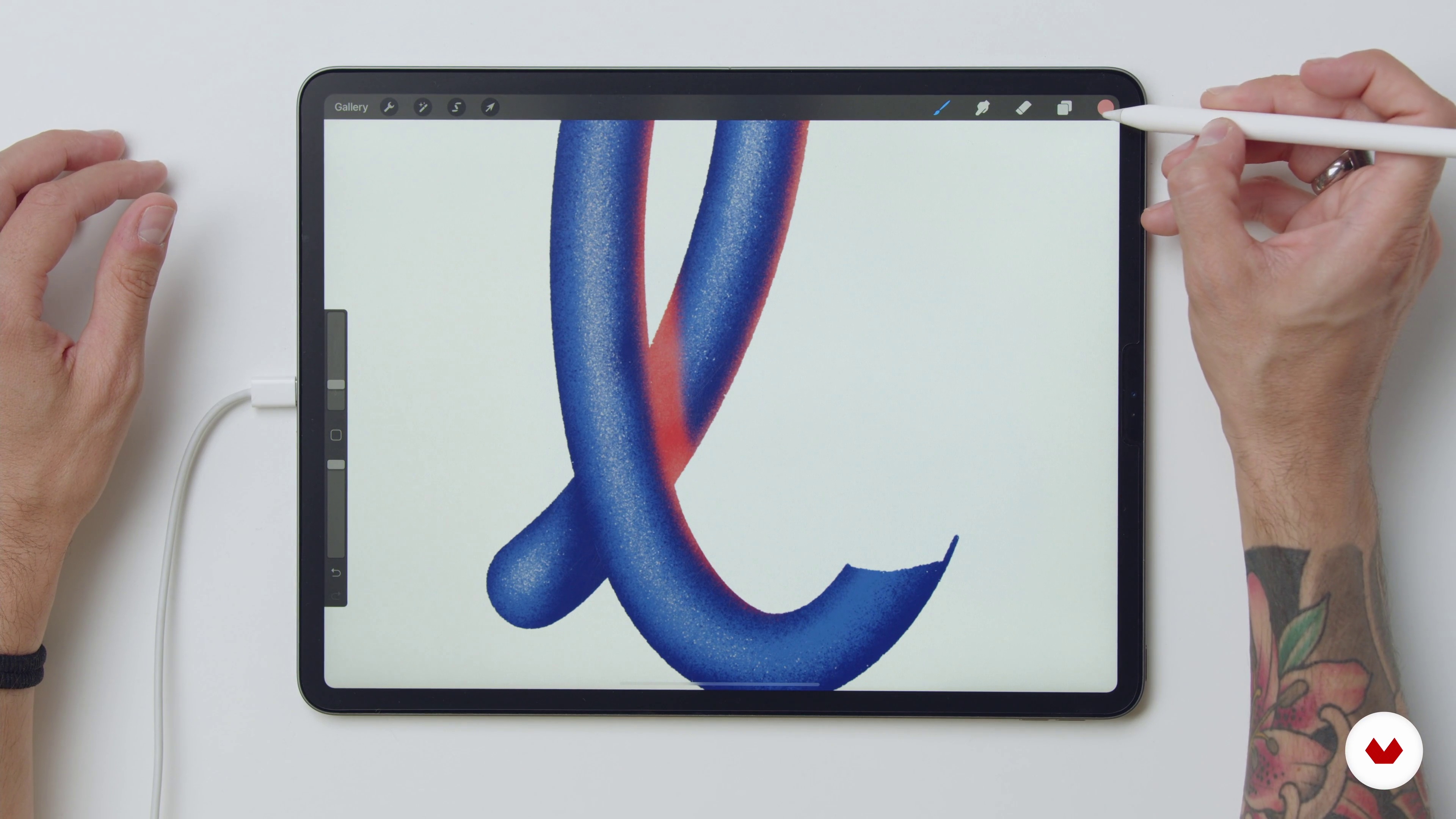 11
11Teaching Letter Style: L
Let's now move on to the second letter of the composition.
12m
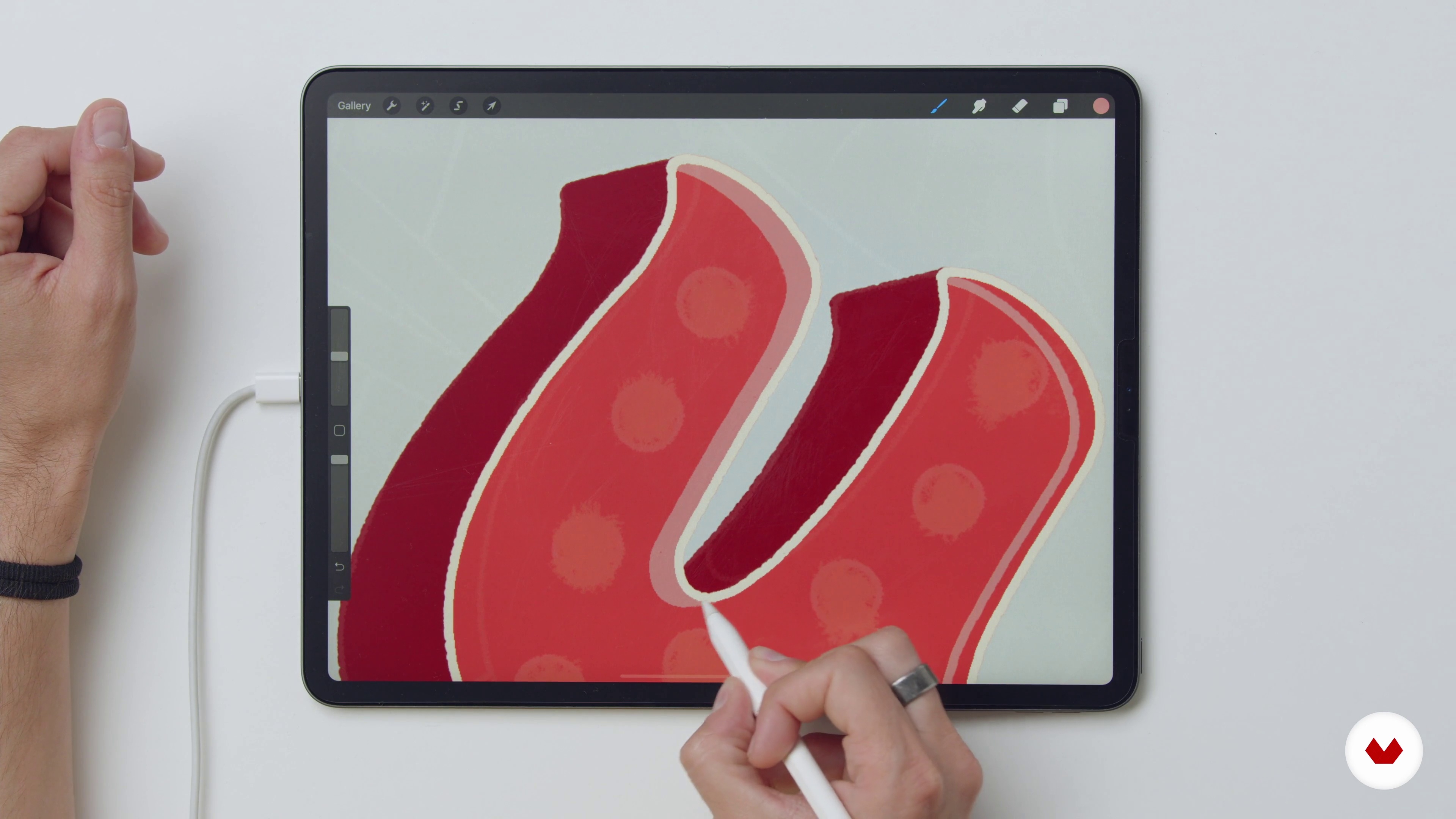 12
12Teaching Letter Style: U
In this lesson, I will focus on working on the third letter of my word, using the same techniques I have showed you previously.
20m
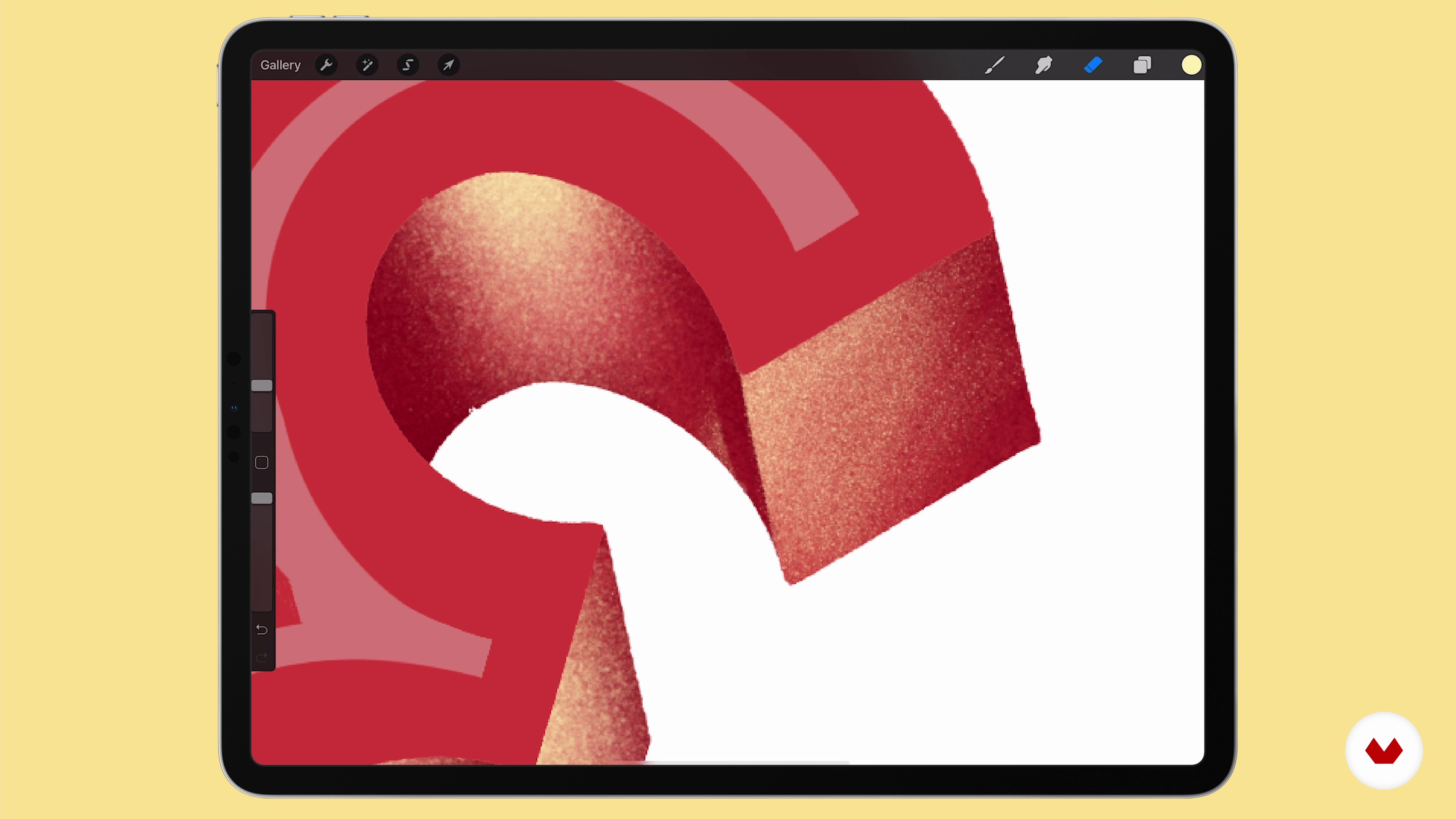 13
13Teaching Letter Style: E
I will show you the process for creating the fourth letter of my composition, E.
14m
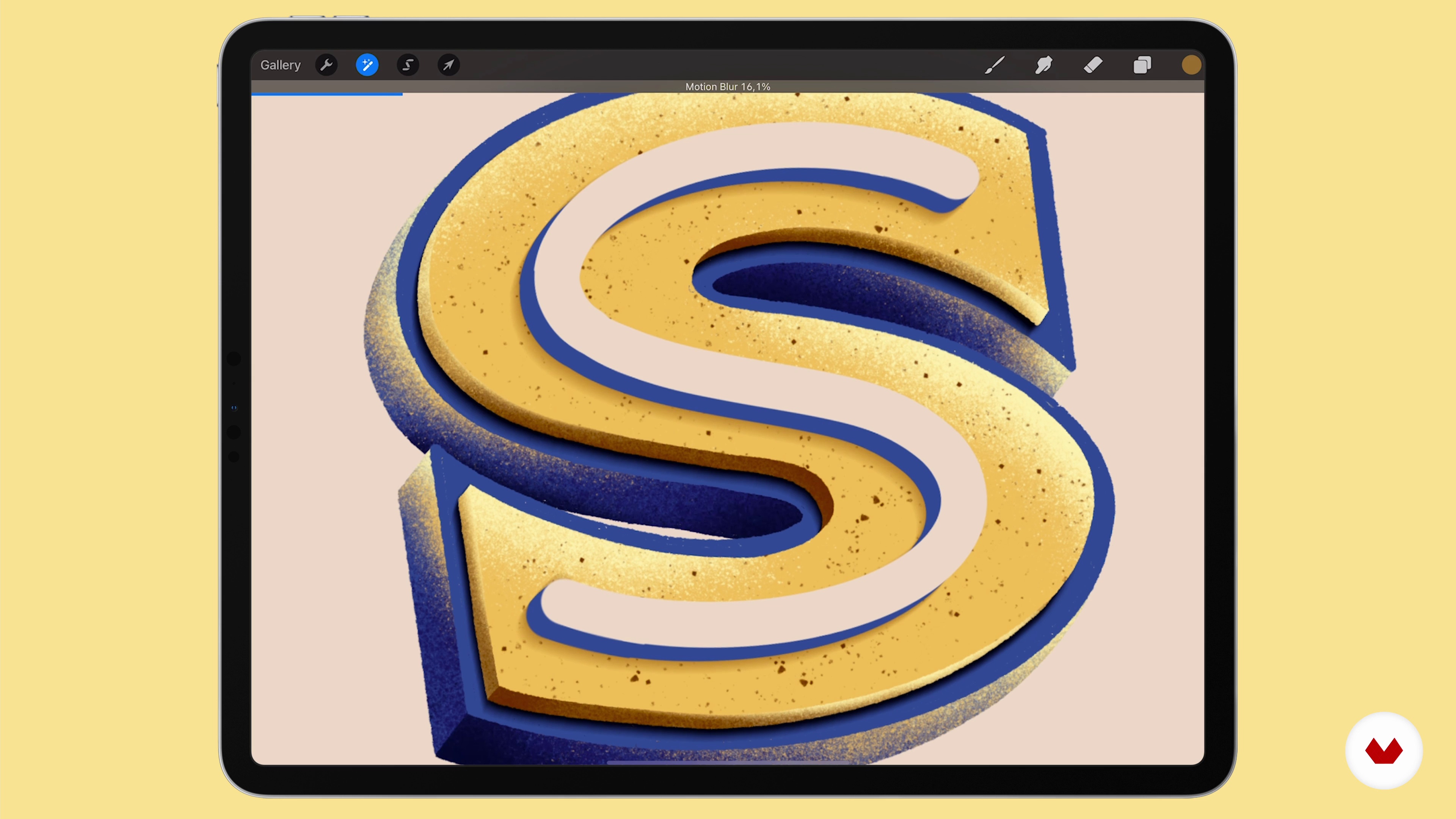 14
14Teaching Letter Style: S
We will wrap up the letter creation with the S.
17m
 15
15Adding Extra Elements to Our Lettering Composition
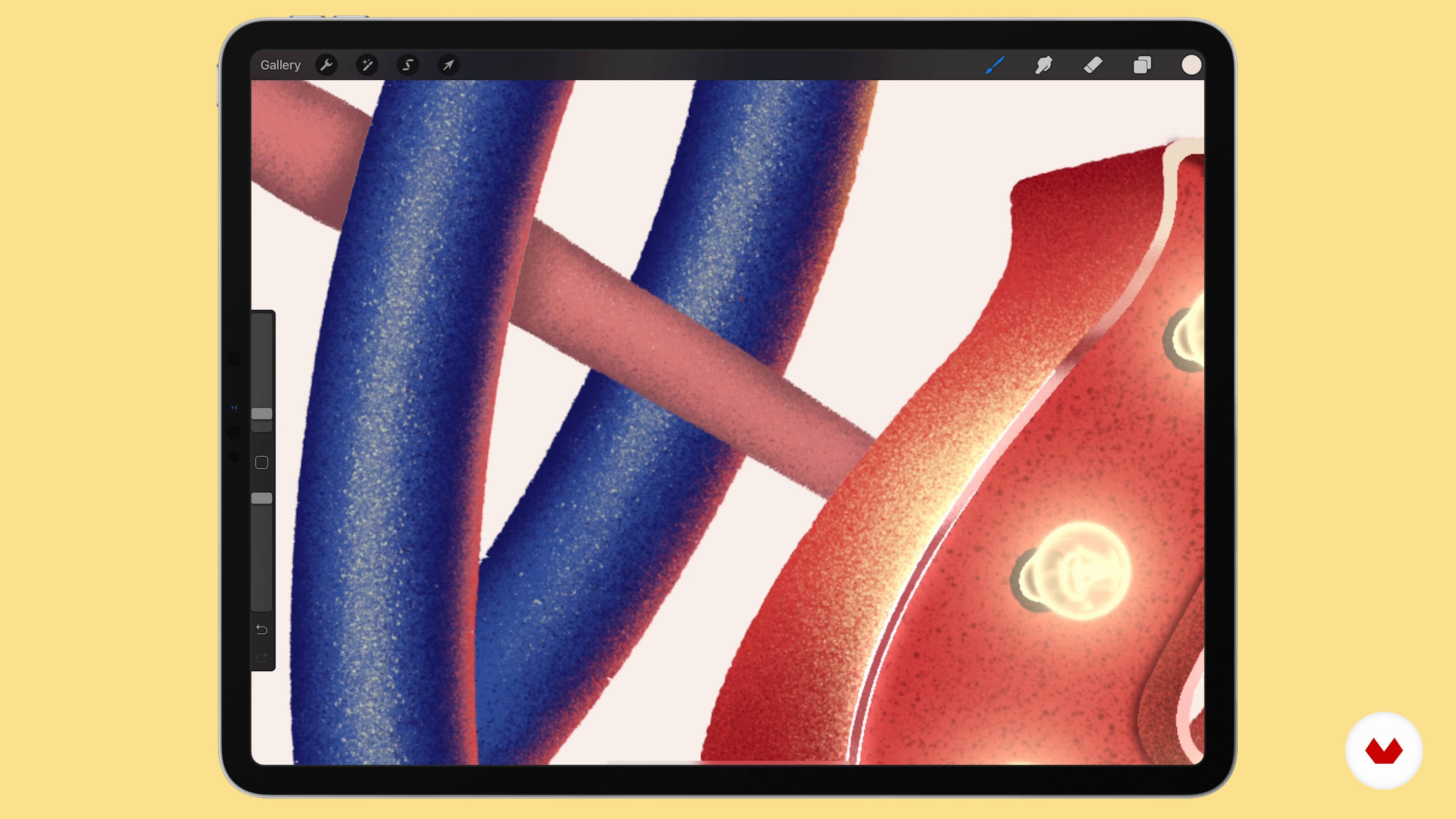
In this lesson I’ll be showing you why reinforcing the message of your lettering piece with illustrations is important and I’ll be guiding you through my piece so you get a better picture of different possibilities.
13m
 16
16Extra Light and Texture
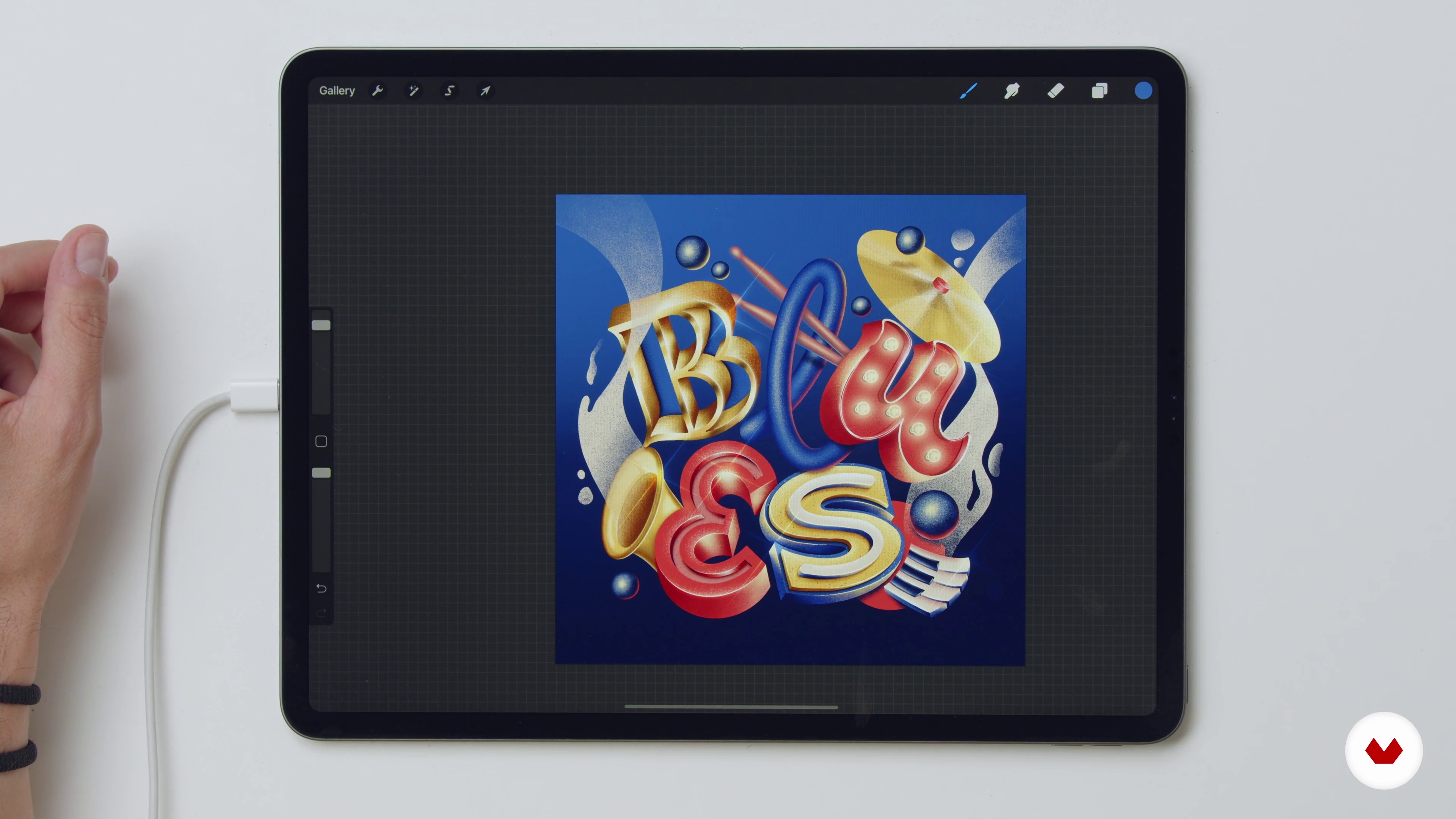
With the help of the brushes, you will add extra lights, flares and color touch-ups. You’ll also see how letters interact with each other and what that means when it comes to your color and shadows.
11m
 17
17Final Additional Touches: How to Export and Share
You have finished your piece! The last step is sharing it in social media and importing the final image to your Spotify playlist! In this lesson, you will learn how and my recommended best practices to achieve better results.
18m
 1
1Introduction
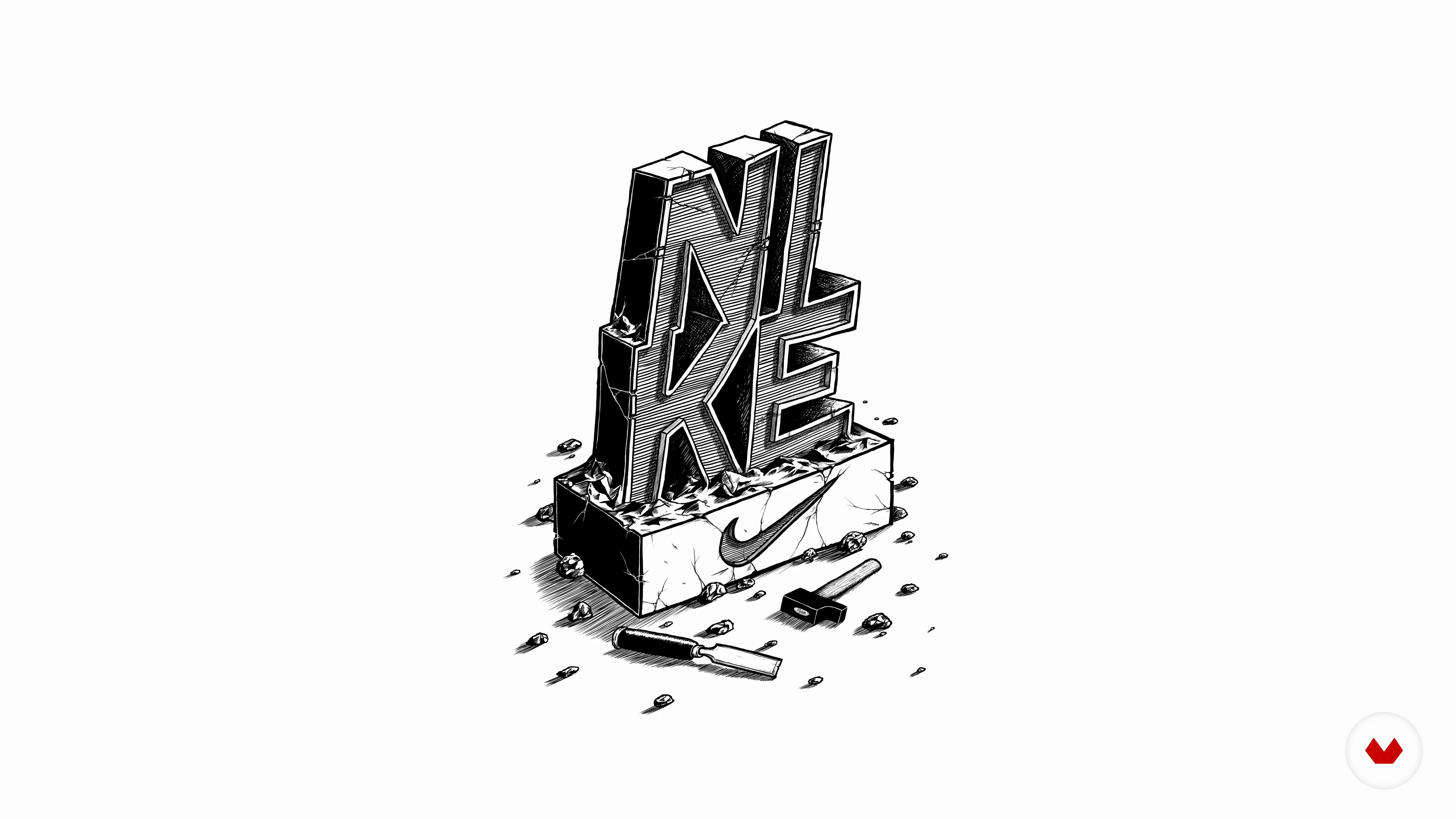
First, I will start by sharing the necessary tools for this course. You won't need a lot of materials or anything too expensive. Your power is your mind, not your tools. I will also talk about letters, what they are, and how to use them.
3m
 2
2Script Letters
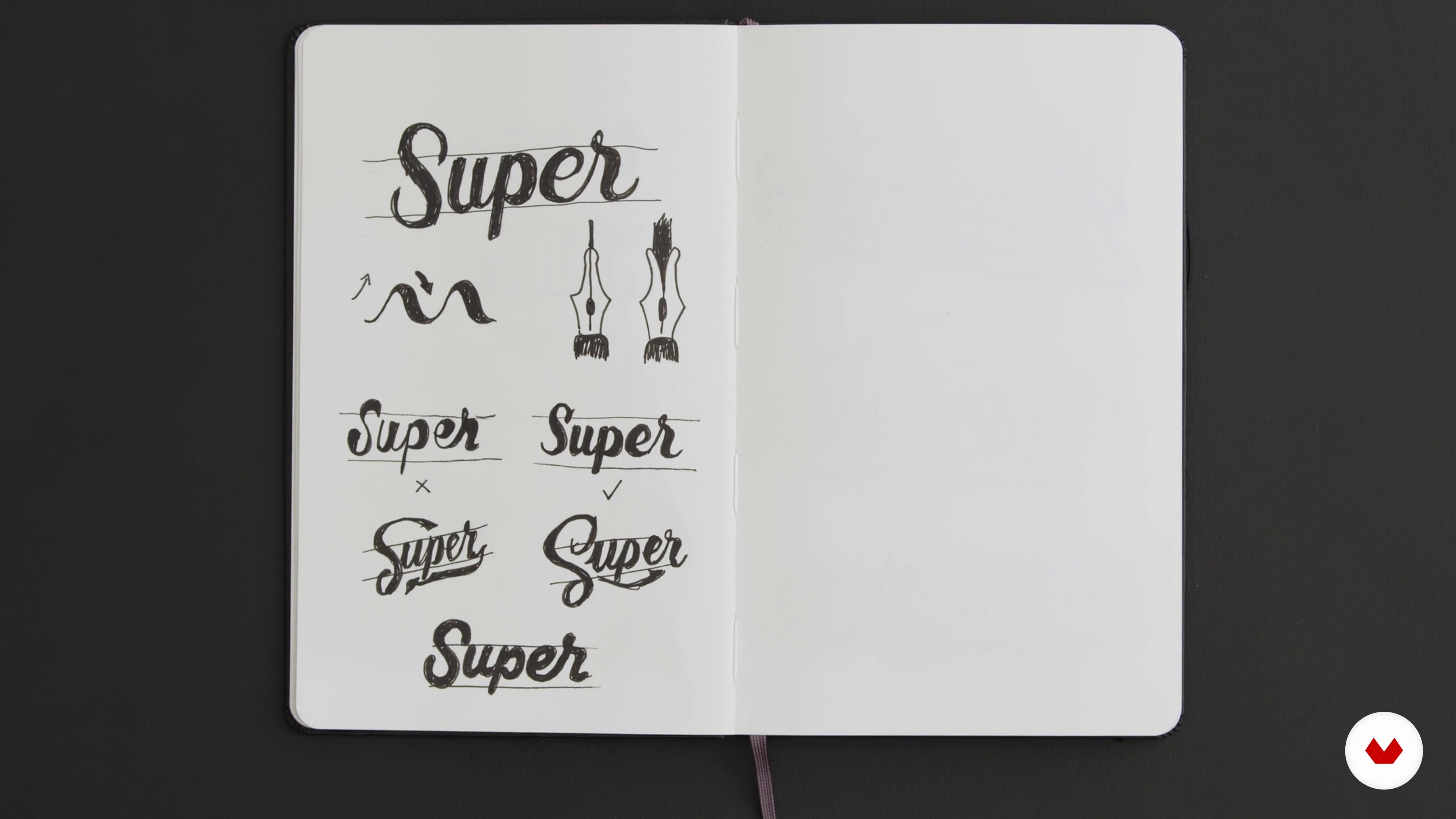
Most of us have learned how to write "cursive" during the early years of school. Nevertheless, how many of us can say that we've mastered this art? In this lesson, I will show you valuable tricks to turn basic script handwriting into stunning lettering.
16m
 3
3Block Letters
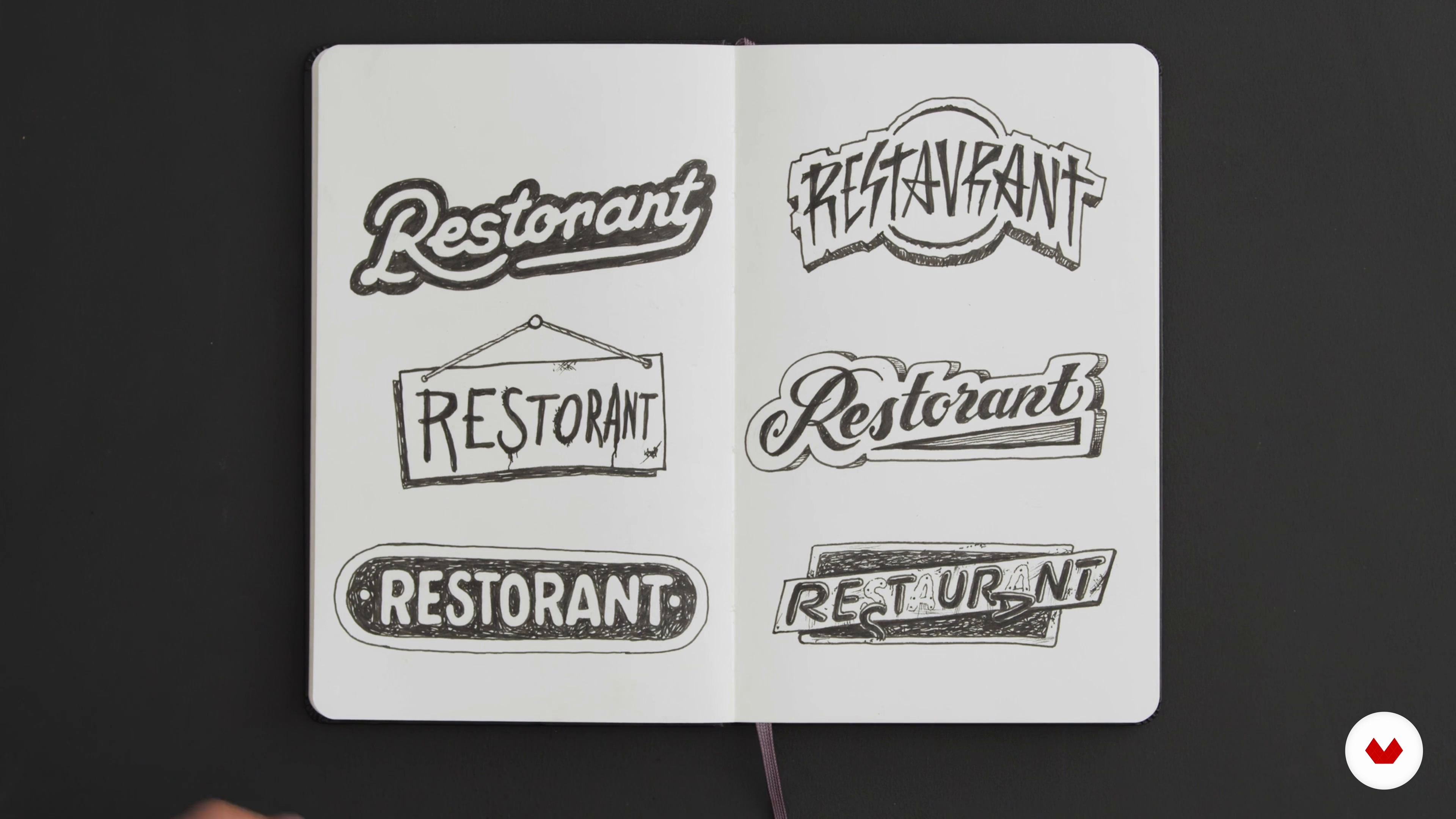
From blockbuster movies to your favorite musician, restaurant, or brand: block letters play a huge role in our daily landscape. Here I’ll show you some simple tricks that will give visual impact to your message.
12m
 4
4Font Personalities
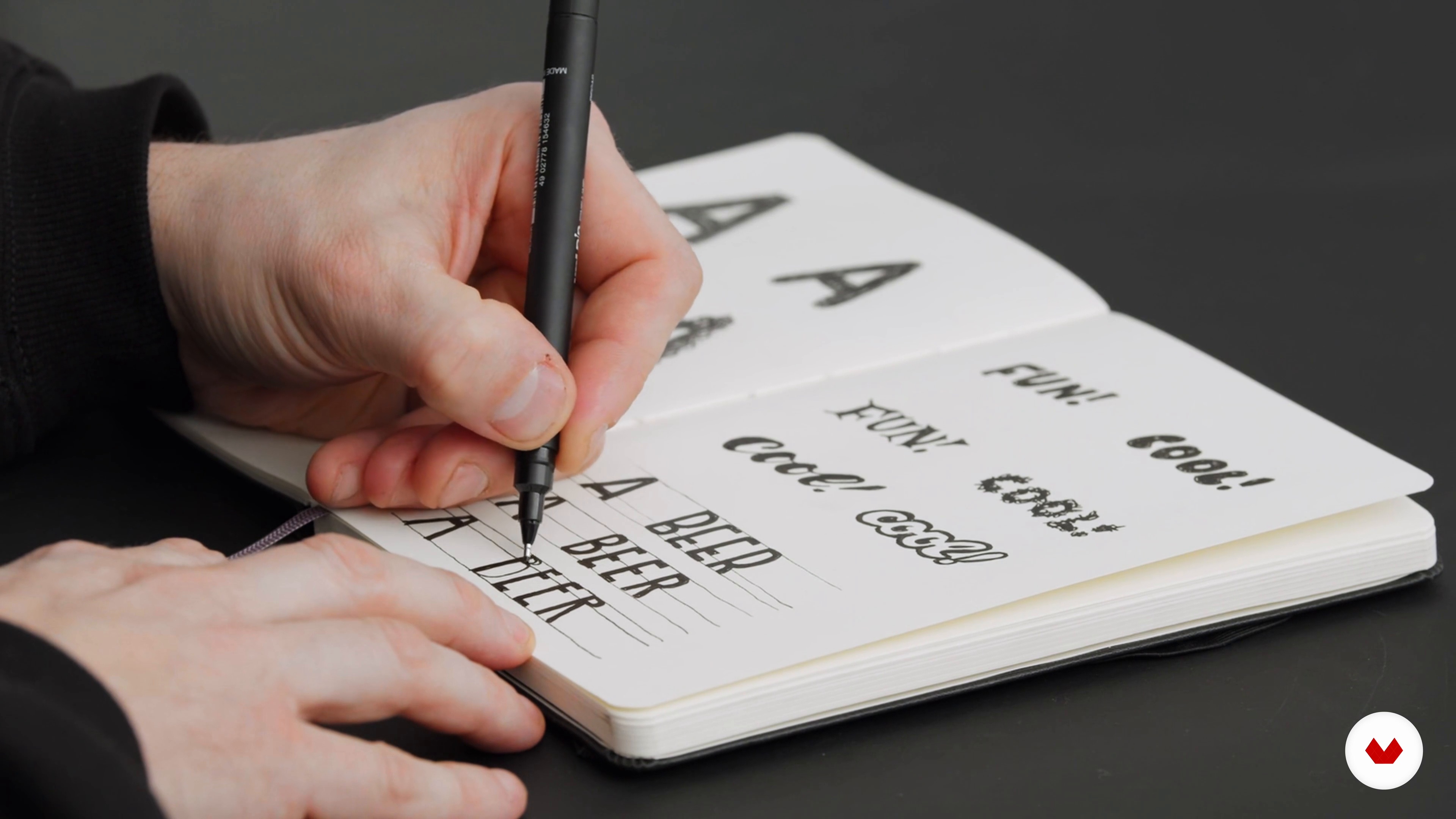
Letters are pretty much like humans: they come in different shapes and sizes. Their styles are so diverse and can be combined to create infinite possibilities. Their unique personality conveys much more than just information, and choosing the right font for your project is fundamental when you want to communicate what you are offering to the world. In this lesson, I will teach you how to understand the basics of fonts’ personalities to guide you in choosing the one your project deserves.
10m
 5
5Consistency
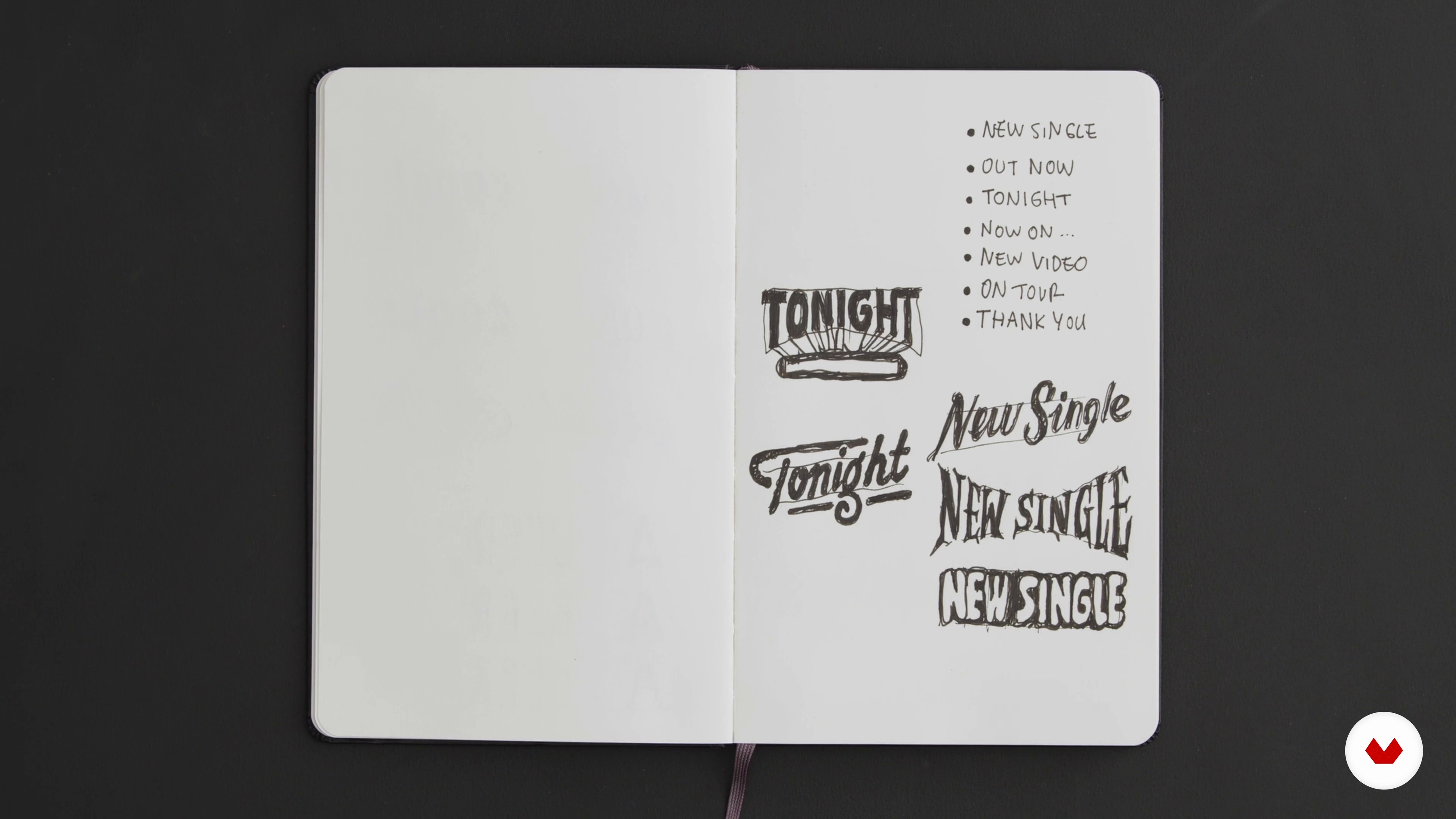
This might sound obvious, but consistency is one of the most important factors of great visual communication. By following simple rules, you'll make your project recognizable in the blink of an eye.
11m
 6
6Your Message
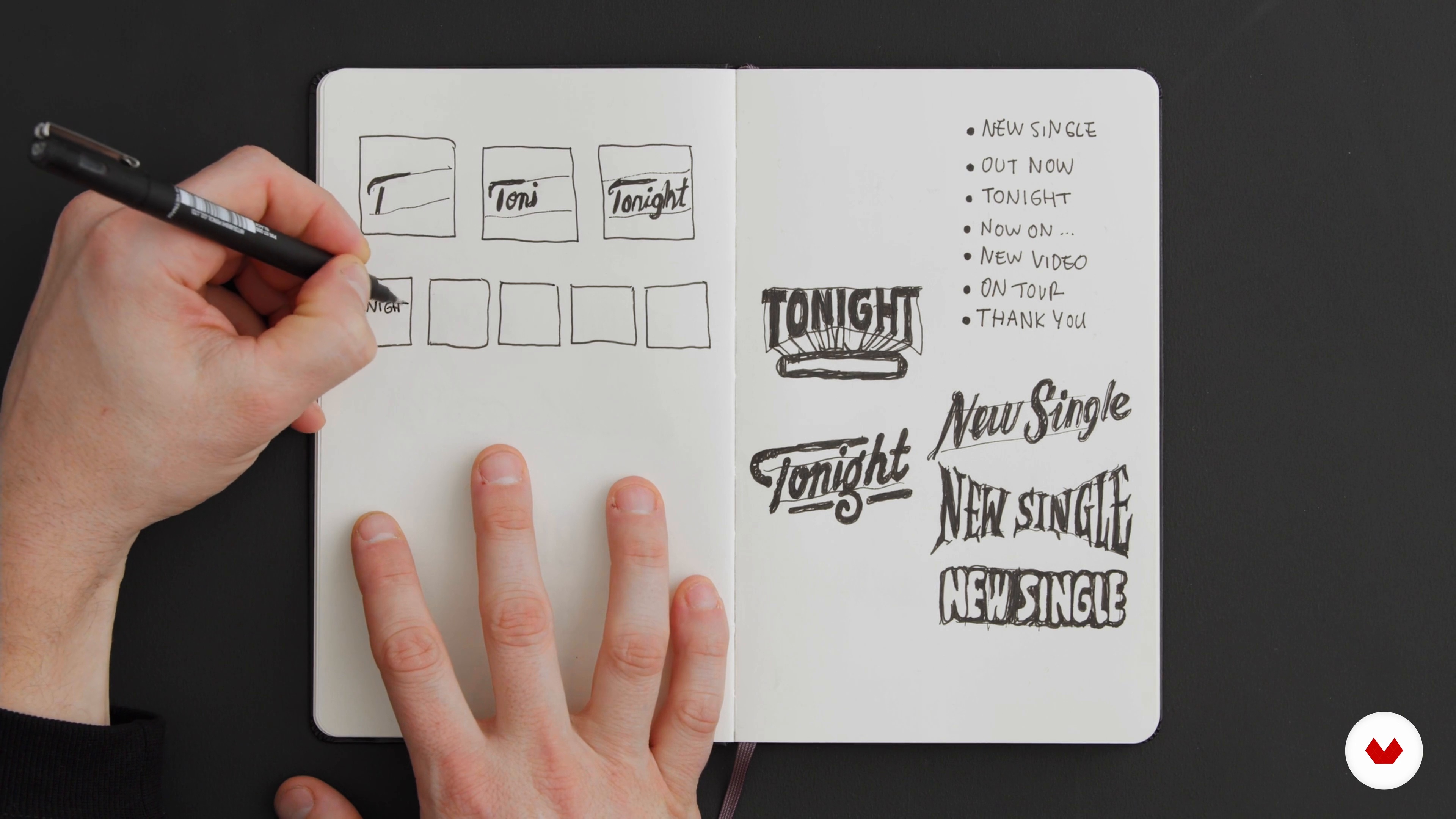
First of all, you'll need to ask yourself: what is my aim, and what does my project want to communicate to the world? This is a question that seems easier than it really is. Let’s figure out how to identify your needs.
11m
 7
7How It Moves
Before I animate a word, I usually consider what the natural motion of this word would be. Drawing isn’t totally necessary at this stage, but you can do it if you want. Here the primary aim is to imagine how your chosen words could move, focusing on their behavior.
12m
 8
8Basics of Motion
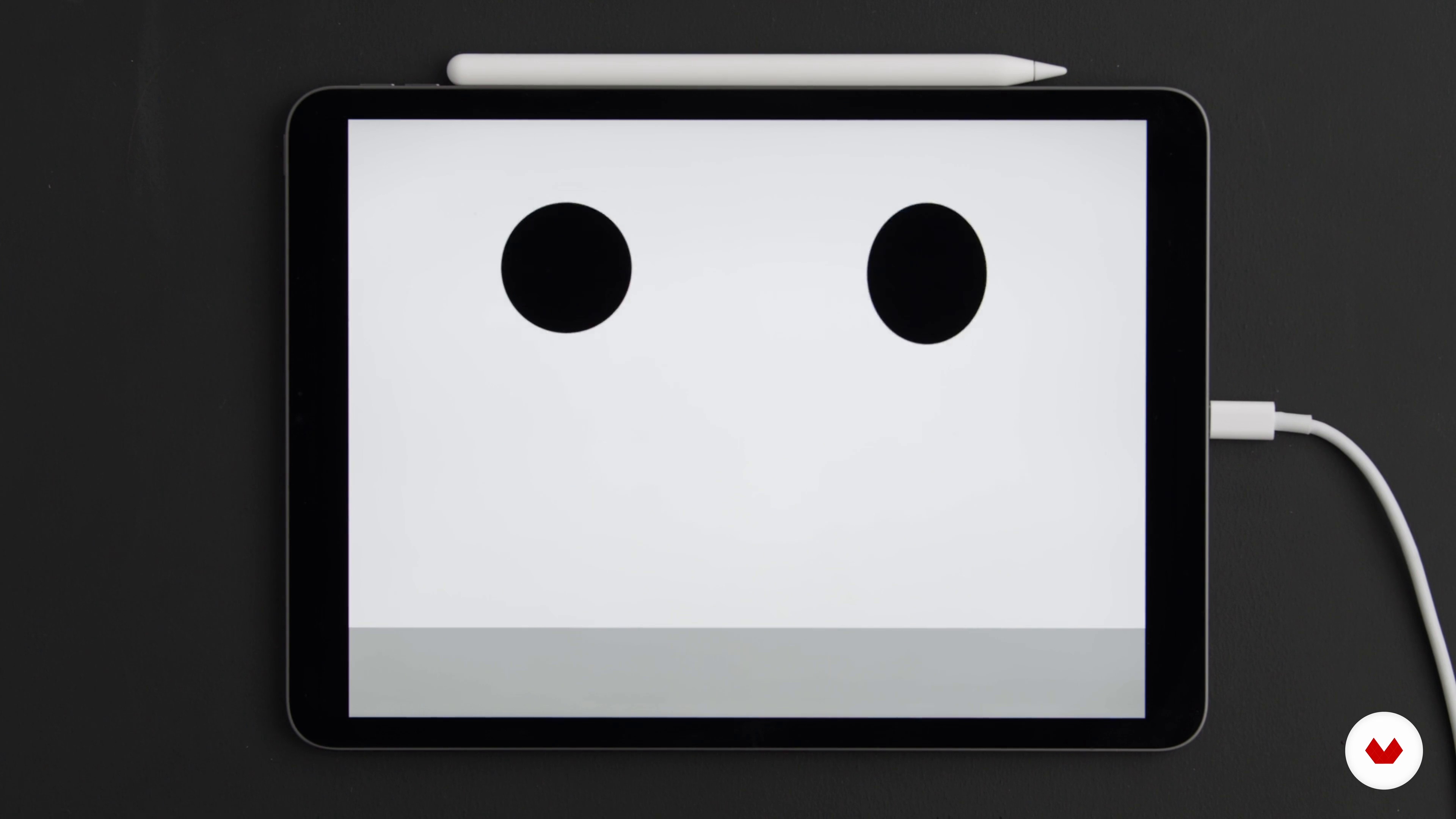
To create the illusion of movement (because, yes, it is an illusion), there are a few tricks that will help to give life to your creations. I'll share them with you here!
2m
 9
9How to Animate 1
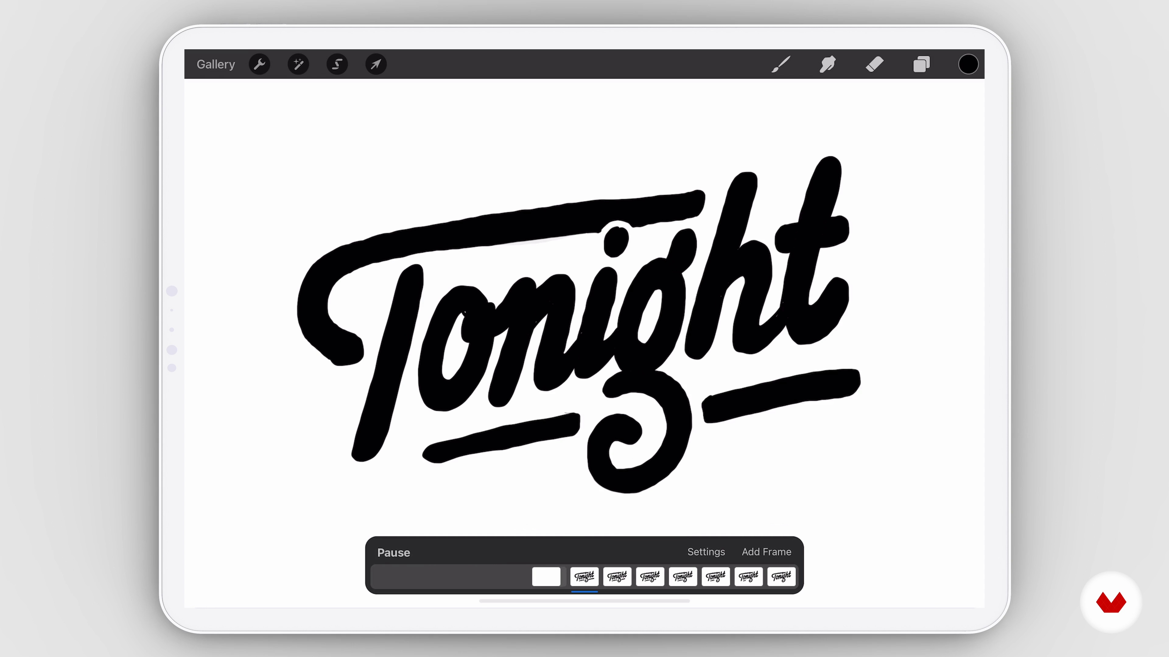
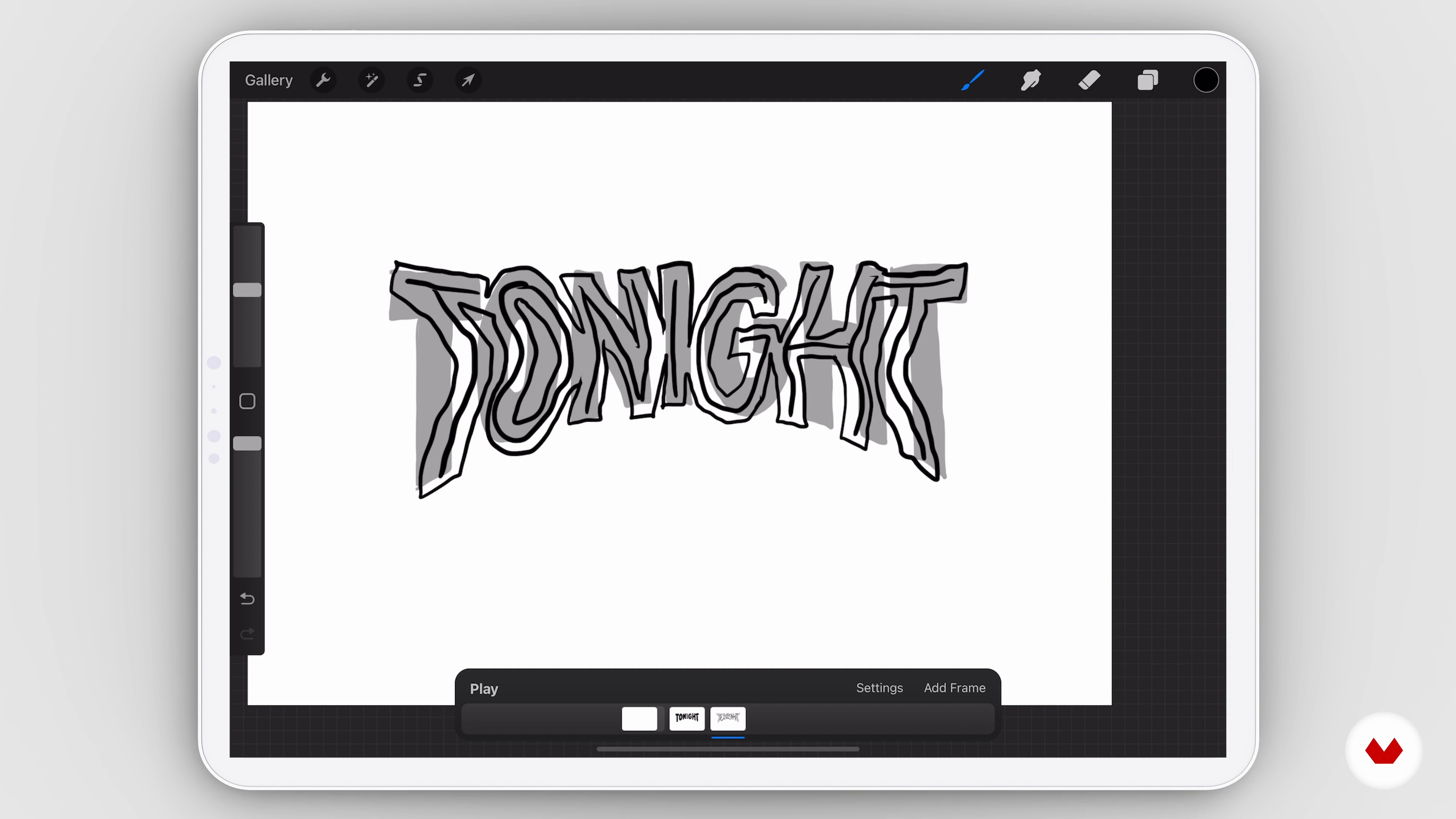
I will now show you how to give life to your word(s) using a well-known drawing software called Procreate. It's simple to use, affordable, and portable, as it's a tablet app. This will allow you to work on your animation wherever you are.
18m
 10
10How to Animate 2
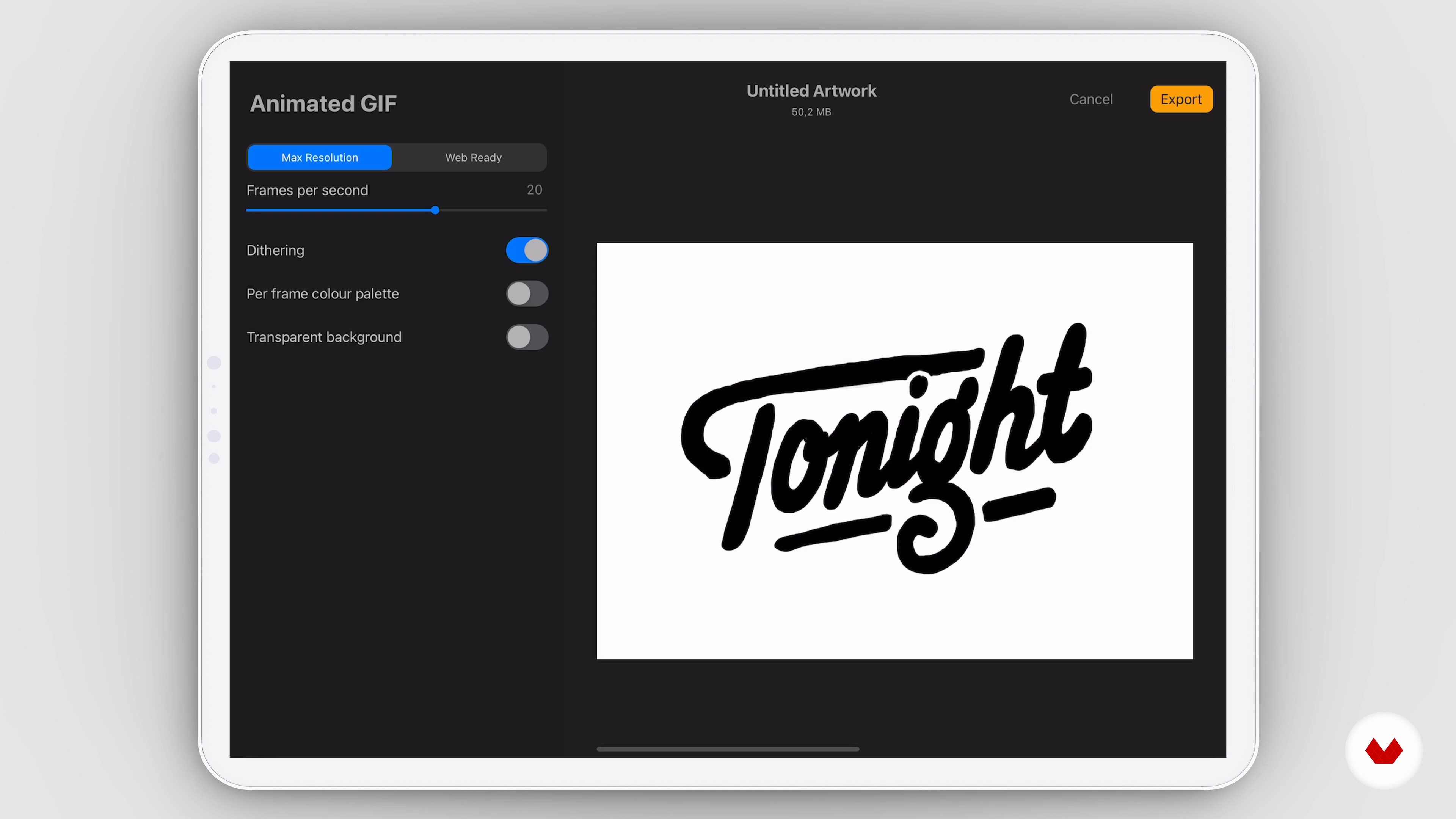
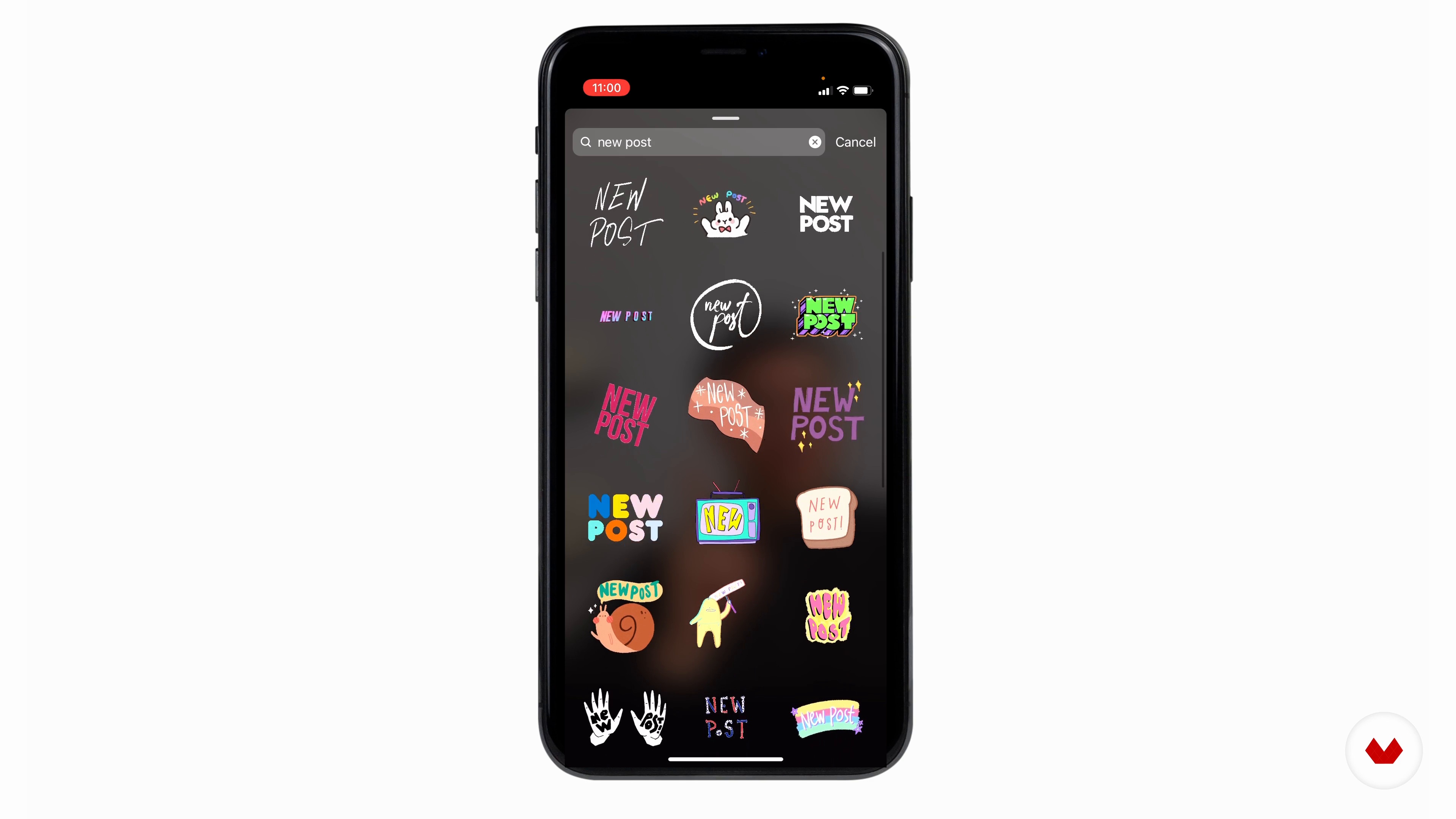
In this lesson, I will showcase the ping-pong animation. I will then explain how to export it according to how you would like to use the animation, whether that's as a GIF, Instagram sticker, video insert, and so on.
4m
 11
11Alternative Motions
During this lesson, I will demonstrate some other ways of animating the words you’ve chosen.
19m
 12
12GIPHY and Instagram
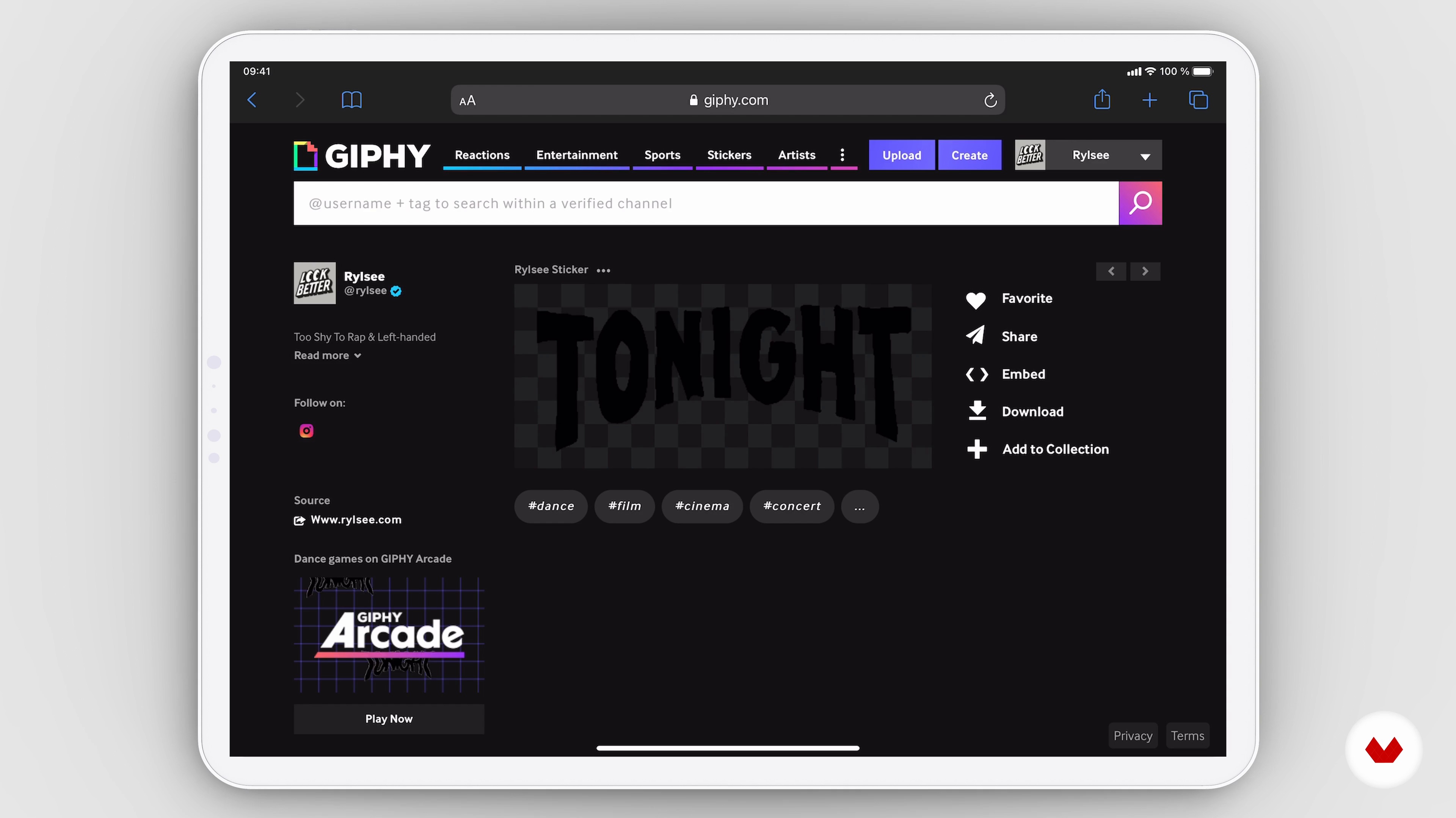
You'll learn how to set your profile like a boss to welcome your GIF family! I'll show you how to upload your creation, how to choose the correct hashtag, and how to make it appear on Instagram.
9m
 13
13Last Words
Now that you are reaching the end of the course, I’d like to share some tips I wish I had known when I first started out.
5m
What is this course's project?
Design a hand-painted sign featuring an original message using traditional lettering techniques and paint methods to craft a unique piece. Use effective composition, stylistic choices, and decorative details to create an inspiring, visually appealing project.
Who is this specialization for?
Ideal for creatives eager to master both traditional and digital lettering techniques, this course attracts artists, designers, and hobbyists aiming to elevate their skills in sign painting, hand-lettered quotes, expressive embellishments, digital design, and animated lettering for online use.
Requirements and materials
No extensive prior knowledge is needed. Basic necessities include art supplies like brushes, paints, an iPad with Procreate, and digital tools for creating GIFs. Enthusiasm and a willingness to explore both traditional and digital lettering techniques are essential.
Reviews
- 9 months ago
Excelente! Fascinante!!!
- 11 months ago
Excelente
- 1 year ago
Buenas explicaciones
- 1 year ago
EXCELENTE
- 1 year ago
As someone who normally does calligraphy, this course has given me new inspiration to expand how I use my hand calligraphy skills.
Select to get to know your teachers in this specialization course


What to expect from this specialization course
Learn at your own pace
Enjoy learning from home without a set schedule and with an easy-to-follow method. You set your own pace.
Learn from the best professionals
Learn valuable methods and techniques explained by top experts in the creative sector.
Meet expert teachers
Each expert teaches what they do best, with clear guidelines, true passion, and professional insight in every lesson.
Certificates
PLUSIf you're a Plus member, get a custom certificate for every specialization course. Share it on your portfolio, social media, or wherever you like.
Get front-row seats
Videos of the highest quality, so you don't miss a single detail. With unlimited access, you can watch them as many times as you need to perfect your technique.
Share knowledge and ideas
Ask questions, request feedback, or offer solutions. Share your learning experience with other students in the community who are as passionate about creativity as you are.
Connect with a global creative community
The community is home to millions of people from around the world who are curious and passionate about exploring and expressing their creativity.
Watch professionally produced courses
Domestika curates its teacher roster and produces every course in-house to ensure a high-quality online learning experience.
FAQs
Yes, this course is designed for beginners and guides you step by step through both traditional and digital lettering techniques, including creating dimensional typography and using digital tools like Procreate.
You’ll need basic sketching supplies (pencil, paper, eraser), a brush pen, and an iPad with Procreate for digital projects. Access to Pinterest or similar for mood boards is also recommended.
You’ll learn to create various lettering styles, design dimensional typography, build digital mood boards, extract color palettes, digitize sketches, and apply shading, color, and texture using both traditional and digital tools.
Yes, the course includes detailed lessons on using Procreate, covering digitizing sketches, manipulating layers, adding color and texture, and exporting your artwork for sharing or print.
While digital techniques are featured, many lessons focus on traditional sketching, brush pen use, and analog lettering. However, to fully benefit from all modules, having an iPad with Procreate is recommended.
Yes, you’ll explore techniques for building dimensional letterforms, adding perspective shading, extrusion, and realistic lighting effects to create eye-catching 3D typography.
Yes, you’ll learn to design neon sign-inspired lettering and apply Art Nouveau techniques, enhancing your style range and creative versatility.