Creative Data Visualization for Beginners
A course by Gabrielle Merite, Information Designer

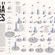


Learn to create captivating narratives by combining digital illustration and collage techniques to design informative and eye-catching images

Want to learn how to stop people in their tracks with inspiring and thought-provoking infographics? Information designer Gabrielle Merite specializes in creating engaging data visualizations which have seen her work with, clients including the United Nations, WeTransfer, and the Rand Corporation.
In this online course, discover how to bring numbers to life through evocative data visualizations using collage art and illustration. Capture your audience’s attention and tell the stories that need to be heard.
What will you learn in this online course?
22 lessons & 19 downloads
What's included in this course?
Meet your teacher for the course, Gabrielle Merite. She talks about herself, her creative journey so far, and her biggest sources of inspiration.
Dive right into the differences between data visualization and data illustration. Then search for references to help you write a brief, and define a creative direction for your design.
Next, explore different chart types, sketch some initial thumbnails, and gather images for your collage, before working on your prototype.
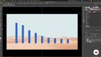
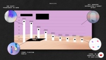
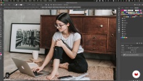
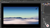
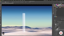
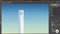
Once you’re happy with your design, it’s time to refine it. Start by removing the background, then clean up the images and organize them according to your composition plan. Add 3D elements along with some realistic details to make your visuals more exciting.
To bring the course to a close, Gabrielle shows you how to export your work for social media and printing, as well as how to prepare an alternative text to make your piece more accessible.
- 100% positive reviews (31)
- 2,235 students
- 22 lessons (2h 58m)
- 19 additional resources (5 files)
- Online and at your own pace
- Available on the app
- Audio: English, Spanish, French, Italian, Portuguese, Turkish
- English · Spanish · Portuguese · German · French · Italian · Polish · Dutch · Turkish · Romanian · Indonesian
- Level: Beginner
- Unlimited access forever
Recommended software & tools for this course
 Adobe Illustrator
 Adobe Photoshop
What is this course's project?
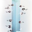
Compose an informative and eye-catching illustration for a data visualization, combining collage and digital illustration.

Projects by course students


Who is this online course for?
This course is for anyone with an interest in learning to turn data into engaging imagery.
Requirements and materials
To take this course, a basic working knowledge of Illustrator, Photoshop, and Excel is recommended.
In terms of materials, all you need is access to a computer with these software. If you don’t have Excel, any other spreadsheet software would do.

Reviews

Gabrielle Merite
A course by Gabrielle Merite
Gabrielle Merite is a French information designer living in Los Angeles, who specializes in producing engaging and inspiring data-based imagery. With an educational background in biology and immunology, her desire to have a more immediate impact on society led her to study scientific journalism. Her aim is always the same: to connect with people and incite action about the biggest issues we face today.
Throughout her career, she has collaborated with clients including WeTransfer, the MIT Technology Review, the Rand Corporation, and the United Nations. Gabrielle also produces personal projects on topics close to her heart, such as gender inequality, racial disparity, and climate change. She is especially dedicated to helping ethically driven organizations communicate their analytics with honesty, rawness, and compassion.
Content
-
U1
Introduction
-
About Me
-
Influences
-
-
U2
Building Solid Foundations
-
What is Data Illustration?
-
The Quest for Inspiring Data
-
Creating a Data Brief
-
Creative Direction and Conceptualizing
-
Visual Research
-
-
U3
From Numbers to Prototype
-
Exploring Data Charts
-
Quick Thumbnail Sketches
-
Finding Photography
-
Creating the Prototype 1
-
Creating the Prototype 2
-
-
U4
Refining Your Design
-
Cleaning Up the Images
-
Setting the Scene
-
Creating the Chart Element in 3D
-
Adding Chart Icons 1
-
Adding Chart Icons 2
-
Adding the Human Element and Realistic Touches 1
-
Adding the Human Element and Realistic Touches 2
-
Legend and Typography
-
-
U5
Getting the Piece Ready for Publishing
-
Exporting the Data Illustration
-
Alternative Text for Accessibility
-
-
FP
Final project
-
Creative Data Visualization for Beginners
-
What to expect from a Domestika course
-
Learn at your own pace
Enjoy learning from home without a set schedule and with an easy-to-follow method. You set your own pace.
-
Learn from the best professionals
Learn valuable methods and techniques explained by top experts in the creative sector.
-
Meet expert teachers
Each expert teaches what they do best, with clear guidelines, true passion, and professional insight in every lesson.
-
Certificates
PlusIf you're a Plus member, get a custom certificate signed by your teacher for every course. Share it on your portfolio, social media, or wherever you like.
-
Get front-row seats
Videos of the highest quality, so you don't miss a single detail. With unlimited access, you can watch them as many times as you need to perfect your technique.
-
Share knowledge and ideas
Ask questions, request feedback, or offer solutions. Share your learning experience with other students in the community who are as passionate about creativity as you are.
-
Connect with a global creative community
The community is home to millions of people from around the world who are curious and passionate about exploring and expressing their creativity.
-
Watch professionally produced courses
Domestika curates its teacher roster and produces every course in-house to ensure a high-quality online learning experience.
FAQs
Data illustration combines artistic elements with data to create visually engaging stories, while traditional data visualization focuses on clear, accurate charts and graphs. Data illustration emphasizes creativity and emotional impact alongside data clarity.
Yes, this course is designed for learners with intermediate experience in design or illustration, especially those familiar with basic Photoshop, Illustrator, or PowerPoint tools.
You’ll need access to Adobe Photoshop, Adobe Illustrator, PowerPoint, Excel, and Pinterest. Basic familiarity with these tools is recommended for following along with the course.
You’ll learn to analyze datasets, create compelling infographics, apply mixed media techniques, design scientific illustrations, and integrate storytelling, empathy, and accessibility into visual communication.
The course covers infographics, digital painting, collage and mixed media, photomontage, scientific illustration, 3D chart textures, data storytelling, research and data sourcing, and accessibility in design.
No, coding or advanced math skills are not required. The course focuses on visual design, concept development, and creative techniques rather than programming or complex calculations.
You’ll learn to design impactful data visuals that raise awareness, foster empathy, and communicate key social issues effectively using storytelling and accessible visual strategies.
 Adobe Illustrator
 Adobe Photoshop
Really like the style & visual of the instructor 🧑🏫
Very clear and interesting course! Good both for beginners and for experienced designers/data visualizators.
Highly recommend this course especially if you're a beginner.
A very useful course presented through a practical example. I recommend.
Easy to follow.