Creative Typesetting for Editorial Projects
A course by Fraser MuggeridgeTypographic Designer
A course by Fraser Muggeridge, Typographic Designer

Learn to apply practical typographic details to a piece of text to communicate tone, feeling, and emotion
To have an eye for detail in editorial design, it is important to understand the tone and emotion of typography and how it affects the entire layout. Through his studio, Fraser Muggeridge has been helping clients like Metronomy, Hot Chip, Taylor Swift, and Thames and Hudson communicate messages, values, and ideas.
In this online course, Fraser takes you through his creative process to design an editorial layout, ready to be printed on the page. Learn how to rearrange a complex text into **an original and communicative piece. **
What will you learn in this online course?
15 lessons & 15 downloads
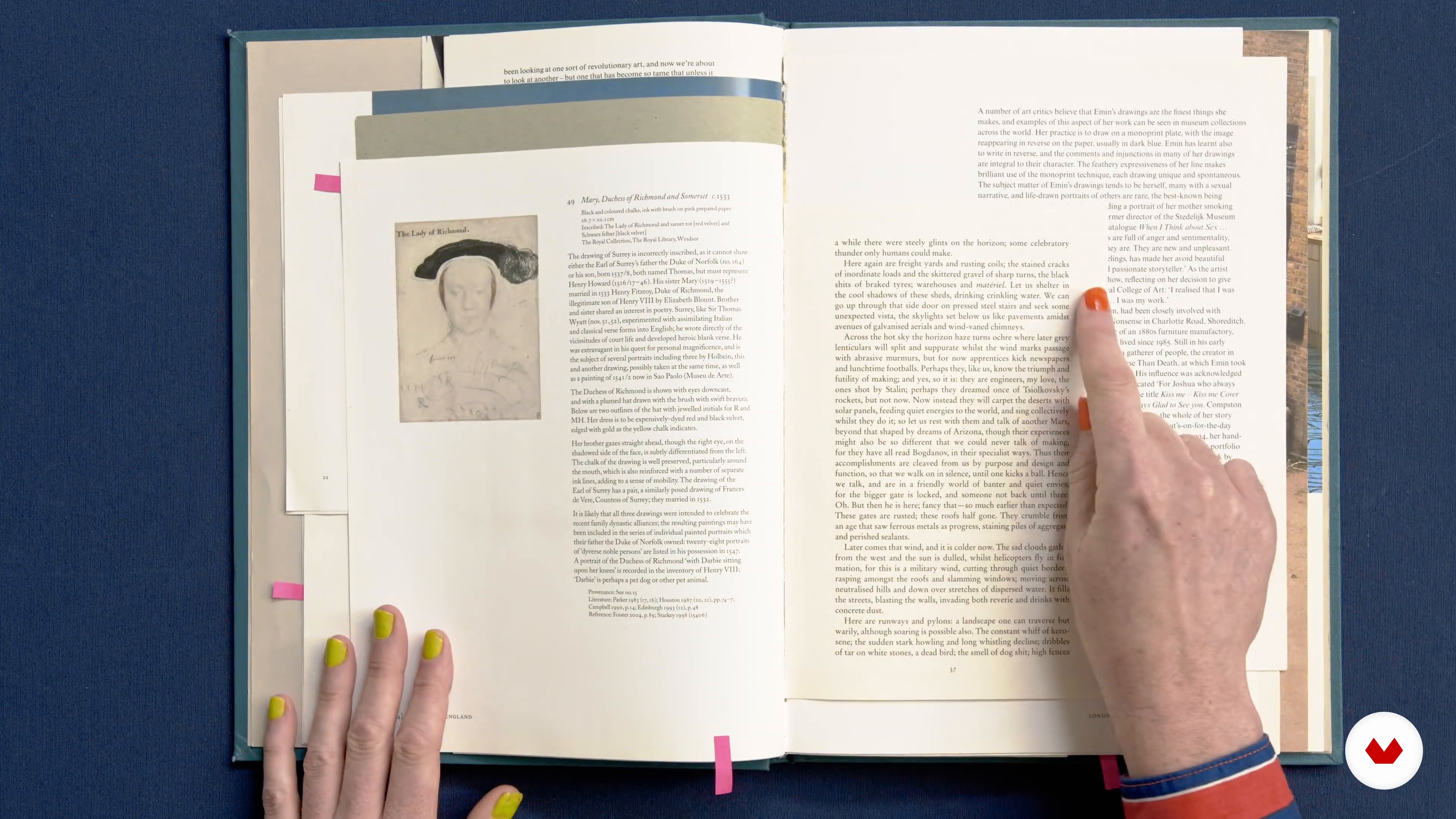
Learning to See
14 minutes, 29 seconds
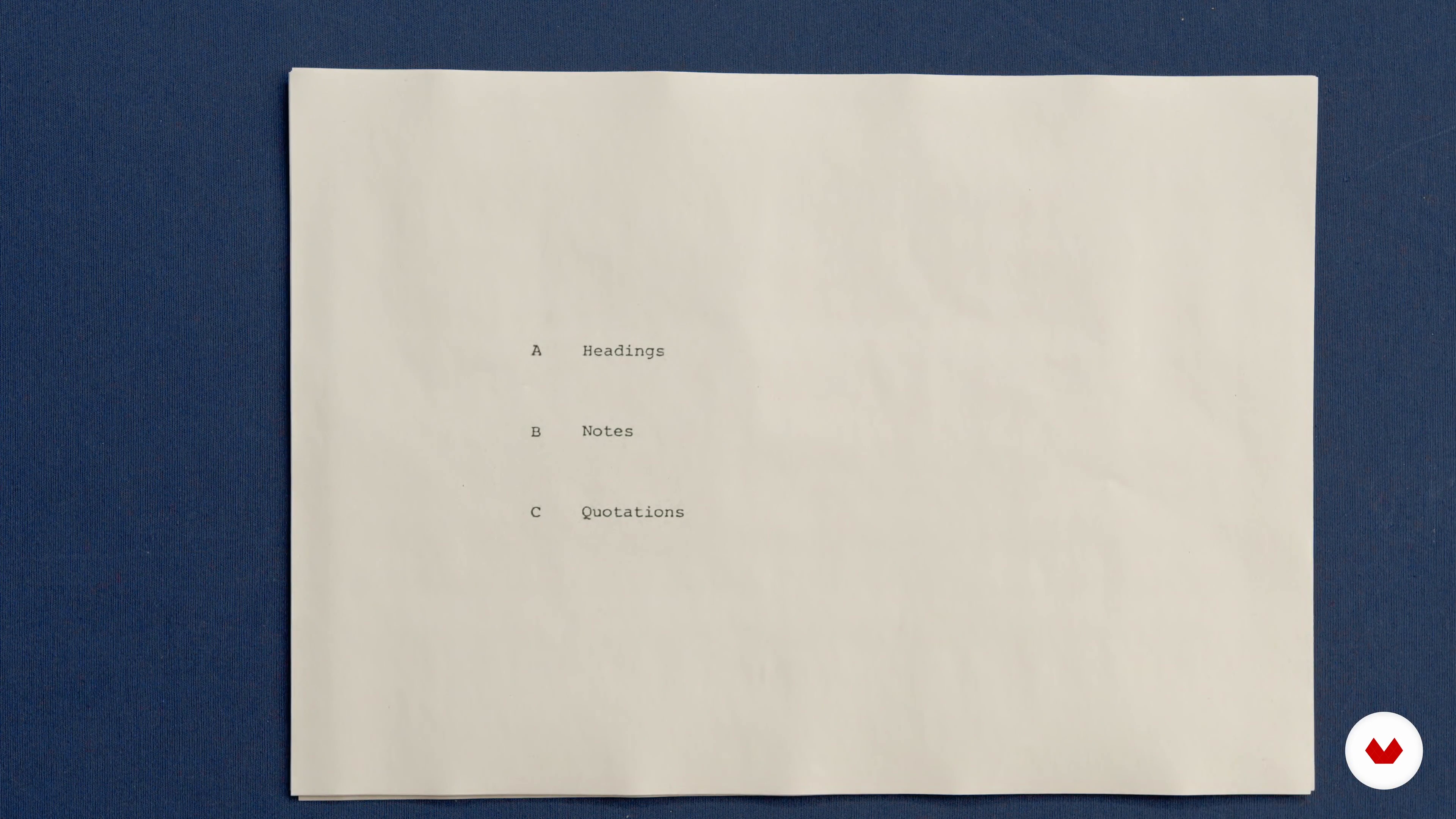
Principles of Typography 1
19 minutes, 19 seconds
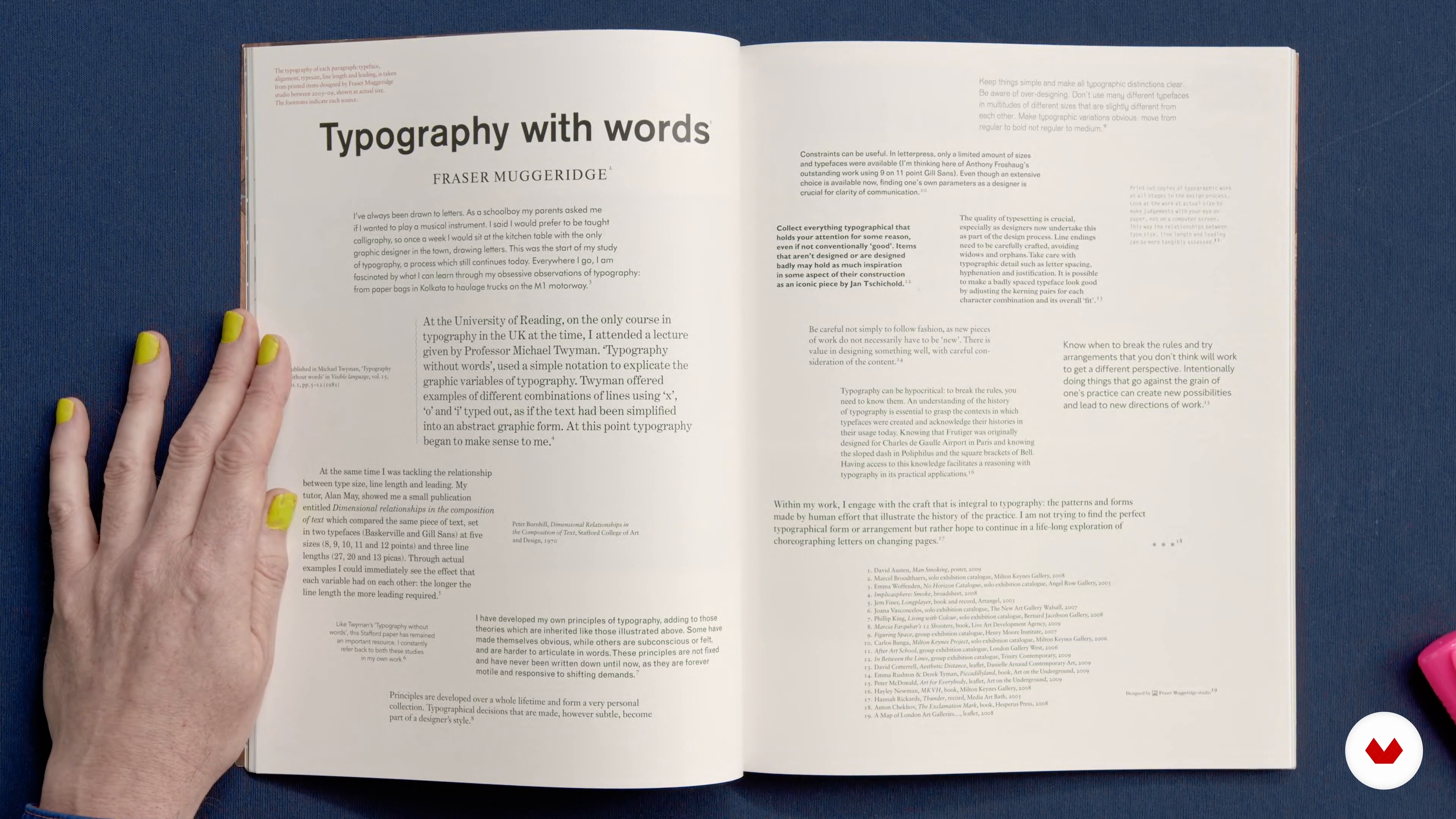
Principles of Typography 2
11 minutes, 40 seconds
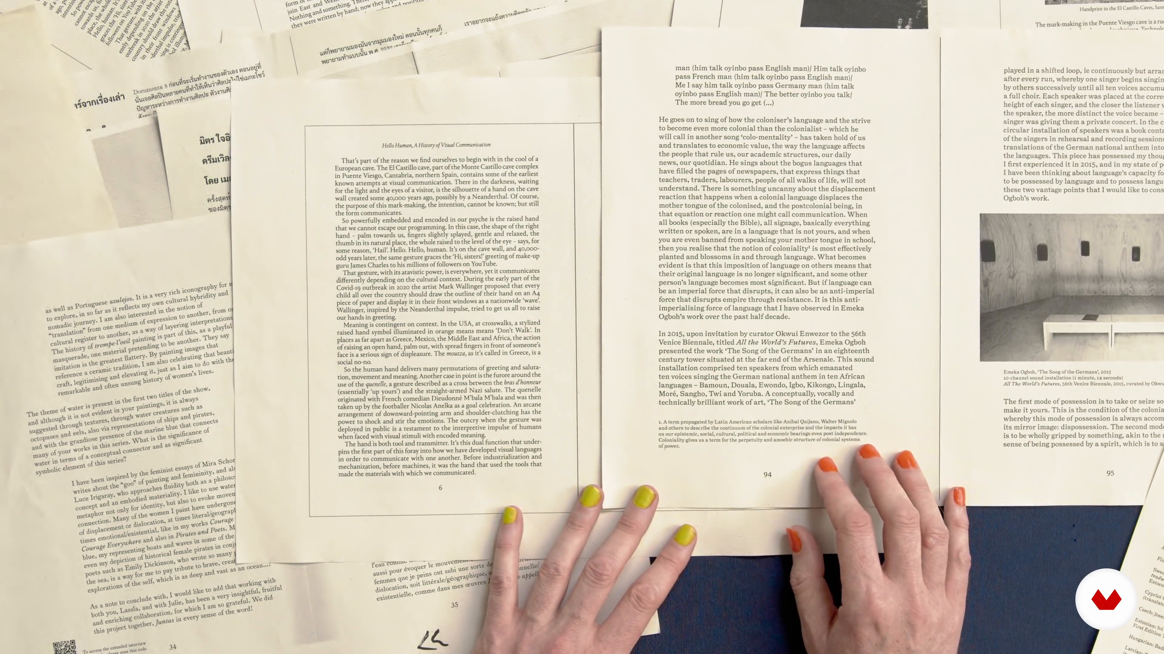
Printing and Proofing
9 minutes, 5 seconds
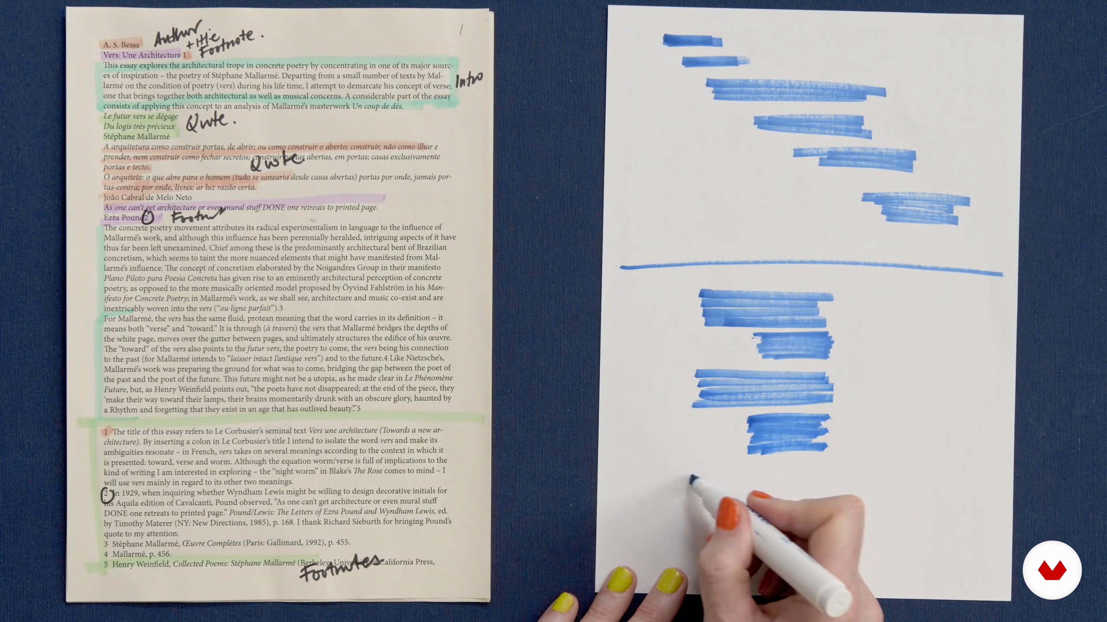
The Brief and Hierarchy
10 minutes, 1 second
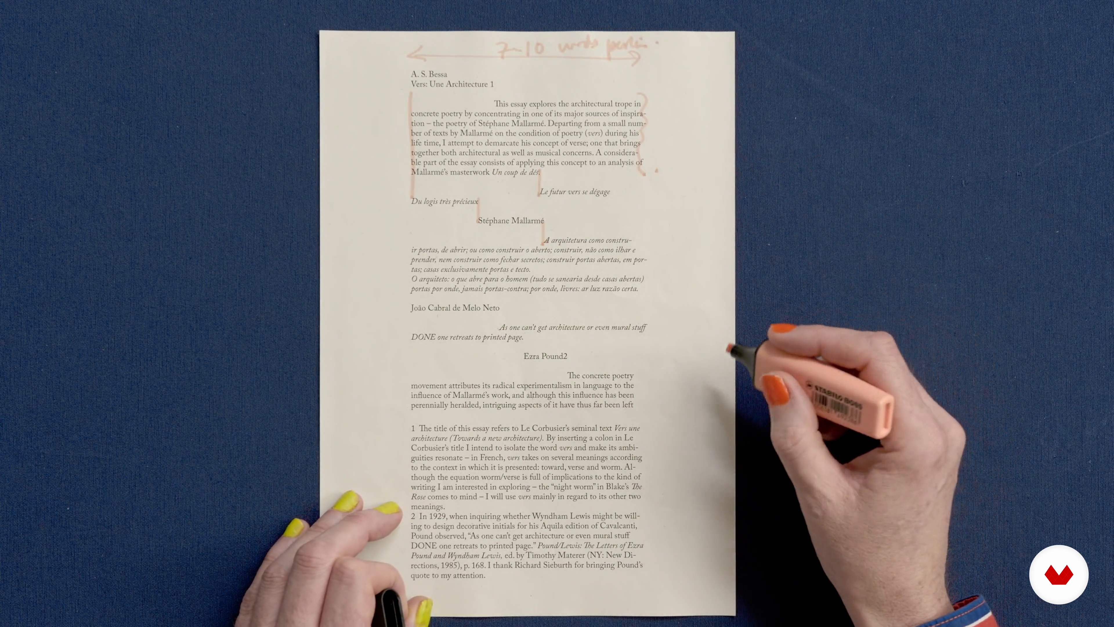
The Paragraph
9 minutes, 31 seconds
What's included in this course?
Meet Fraser Muggeridge, a typographic designer based in London, and your teacher for this course. Hear about his creative journey that led him to found Muggeridge Studio, and work with artists like Taylor Swift and Hot Chip. He also shares his sources of inspiration.
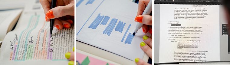
Get an overview of the** theory of detail in typography **and explore innovative ways of typesetting. Fraser also shows you how to use a printer as a tool in the design process
Next, learn how to organize your text by defining its hierarchy, designing paragraphs, and creating layouts based on grids. Discover the importance of mathematics and** how to use InDesign with an efficient workflow.**
Delve into the finer details, such as word spacing, typographic marks, and paragraph shapes. Learn how to pay close attention to detail for a striking and professional end result.
Create a mock-up of your work using an actual size printout. To wrap up the course, Fraser guides you through how to reflect on and improve the final result.
Recommended software & tools for this course
What is this course's project?
Redesign a complex piece of text for a printed page, tackling creative issues like hierarchy, structure, and details.
Who is this online course for?
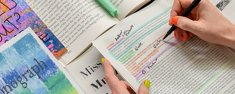
This course is ideal for graphic designers who want to explore the editorial world.
Requirements and materials
To take this course, you need an understanding of graphic design, as well as access to Adobe InDesign, and a printer.
Reviews
- 23 days ago
Este curso me ha resultado muy inspirador. Me llevo un montón de recursos, referencias y datos interesantes, y se agradecen especialmente los consejos y reflexiones sobre la práctica del diseño. Lo recomiendo tanto para quienes empiezan como para quienes quieren volver a conectar con el ejercicio editorial.
- 2 months ago
Kurs bardzo dobry i inspirujący, ale, moim zdaniem, nie dla początkujących. Fraser pokazuje kilka ciekawych opcji rozwiązań typograficznych. Niestety nie wszystkie funkcjonują w moim InDesign. Była to dla mnie fajna lekcja.
- 5 months ago
It's very inviting to get the details right. At the same time it is inviting to be playful. So - it's about understanding the rules in order to creatively tweak and break them. I love it!
- nazlidenizoguzPLUS7 months ago
Full of inspiration + very valuable case studies and I am already a fan of Fraser Muggeridge so I definitely recommend this course to everyone who's into editorial design and typography.
- 9 months ago
Chiaro, utile, prezioso.

Fraser Muggeridge founded and is a tutor at Typography Summer School, a week-long program of typographic study for recent graduates and professionals, held in London (since 2010) and New York (since 2013). He is a visiting lecturer at The University of Readingon the MA Book Design Course and Camberwell College of Art, London, 2nd Year of BA Graphic Design. His work is showcased in the Special Collections at Chelsea College of Arts Library, London; The Metropolitan Museum of Art, New York; The Museum of Modern Art Library, New York, and The Stedelijk Museum, Amsterdam.
Content
- U1
Introduction
- About Me
- Influences
- U2
Examples
- Learning to See
- Principles of Typography 1
- Principles of Typography 2
- Printing and Proofing
- U3
System
- The Brief and Hierarchy
- The Paragraph
- Grids and Marginalia
- Mathematics
- U4
Details
- Letter and Word Spacing
- Typographic Detail
- Paragraph Shape
- U5
Sharing Your Typographic Work
- Finalising Your Project
- You Are Not the Designer
- FP
Final project
- Creative Typesetting for Editorial Projects
What to expect from a Domestika course
Learn at your own pace
Enjoy learning from home without a set schedule and with an easy-to-follow method. You set your own pace.
Learn from the best professionals
Learn valuable methods and techniques explained by top experts in the creative sector.
Meet expert teachers
Each expert teaches what they do best, with clear guidelines, true passion, and professional insight in every lesson.
Certificates
PLUSIf you're a Plus member, get a custom certificate signed by your teacher for every course. Share it on your portfolio, social media, or wherever you like.
Get front-row seats
Videos of the highest quality, so you don't miss a single detail. With unlimited access, you can watch them as many times as you need to perfect your technique.
Share knowledge and ideas
Ask questions, request feedback, or offer solutions. Share your learning experience with other students in the community who are as passionate about creativity as you are.
Connect with a global creative community
The community is home to millions of people from around the world who are curious and passionate about exploring and expressing their creativity.
Watch professionally produced courses
Domestika curates its teacher roster and produces every course in-house to ensure a high-quality online learning experience.
FAQs
This course is designed for intermediate designers who already have a foundational understanding of graphic design and want to deepen their skills in typography and typesetting for print and editorial projects.
A basic understanding of graphic design principles and experience with design software are recommended. Prior exposure to typography fundamentals will help you get the most out of the course content.
You’ll learn creative typesetting, typographic hierarchy, manual and digital typesetting workflows, footnote placement, combining text and images, and practical print production techniques, including proofing, print testing, and creating professional book layouts.
Yes, the course explores manual typesetting, phototypesetting, and modern digital workflows, giving you hands-on experience with both traditional and contemporary techniques.
Yes, the course includes lessons on letterpress, wood type printing, and creative applications of physical printmaking methods within typographic design.
You’ll learn to organize footnotes, use typographic hierarchy, arrange dense content, and structure information for clarity and accessibility in complex book layouts.
Yes, practical exercises include print proofing, creating physical mockups, evaluating layouts on paper, and producing finished print artefacts like booklets.