
Fonts: Build your Word
A course by GlíglifoGraphic designers specialized in typefaces
A course by Glíglifo, Graphic designers specialized in typefaces

Design a font with the double pencil technique
Do you love the letter? Well wait to master the word. In this online course, you will learn the theoretical and practical knowledge to get closer to the world of typography. You will design your own word step by step within a typographic system, from the manual creation to double pencil until the last adjustments in the computer.
What will you learn in this online course?
18 lessons & 8 downloads
Bibliography
9 minutes, 58 seconds

Basic forms
2 minutes, 55 seconds
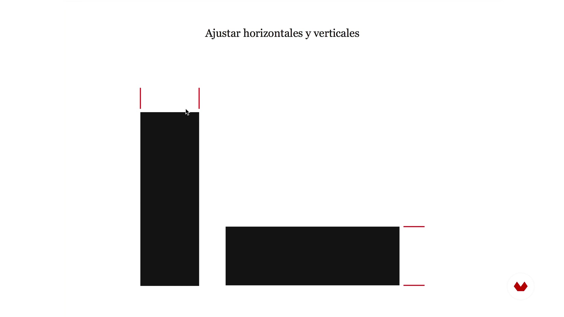
Optical laws
3 minutes, 59 seconds
Spacing and rhythm
5 minutes, 46 seconds
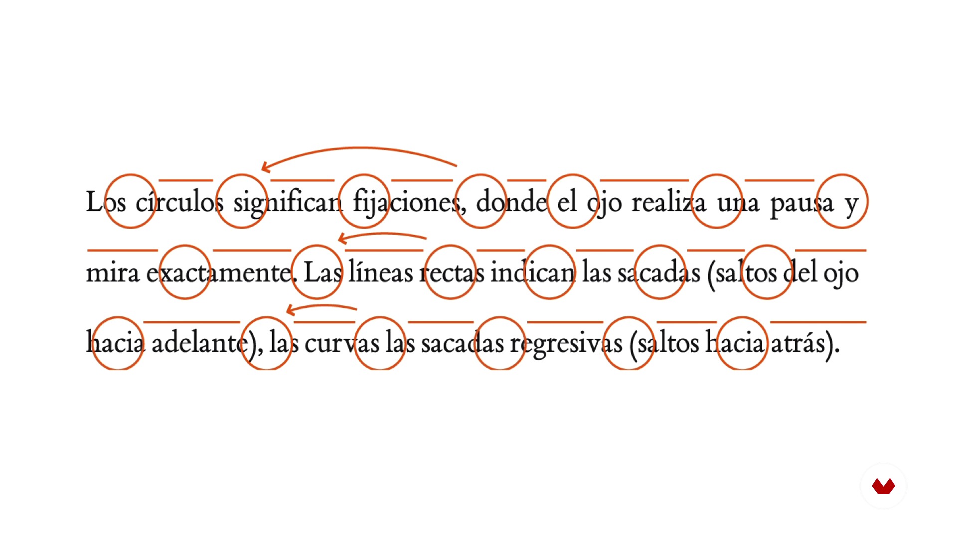
Reading and readability
4 minutes, 40 seconds
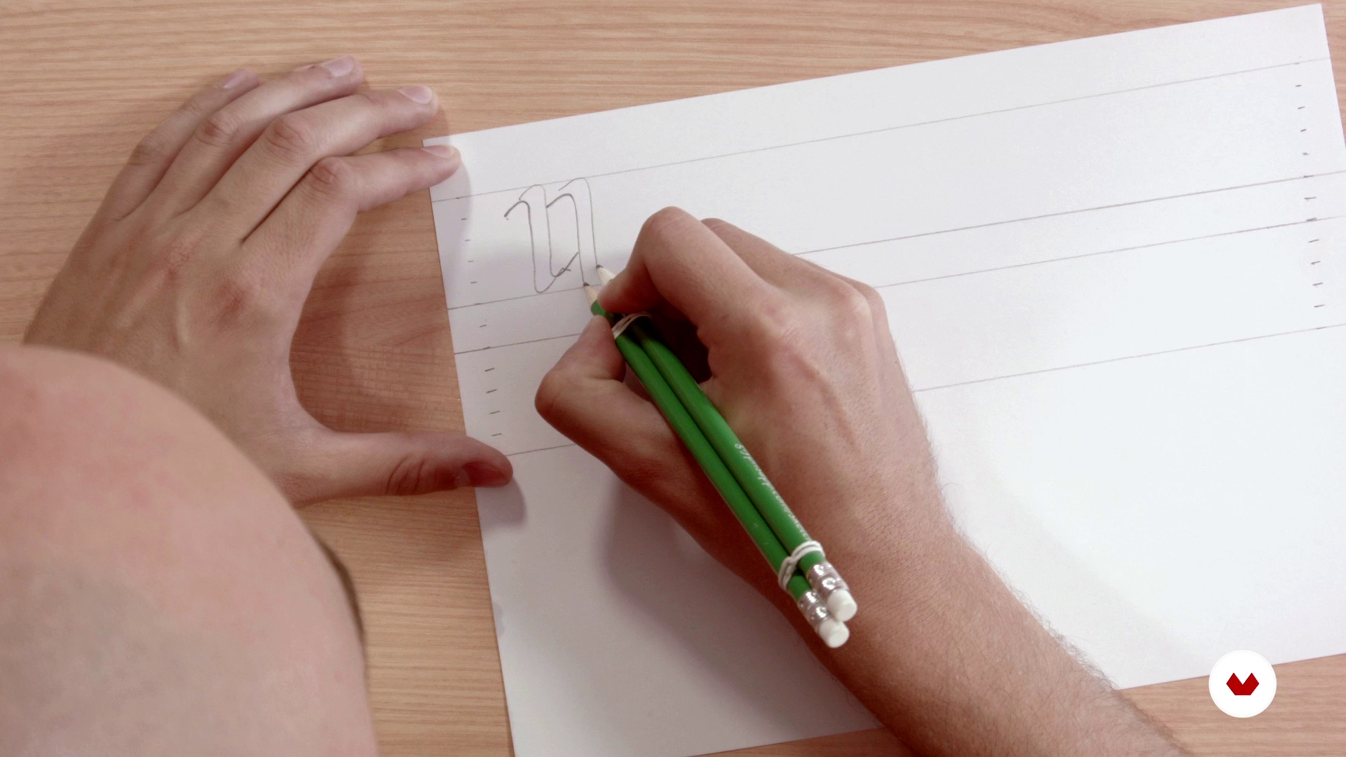
Structure and rhythm with double pencil
4 minutes, 50 seconds
What's included in this course?
In this course of typography you will begin by laying the theoretical bases of construction and anatomy of the letter starting from basic forms, playing with the optical laws, taking into account the spacing, the rhythm and the readability.
Next, you will define the typographic form with the double pencil technique, a simple tool that will allow you to learn to manage the rhythm and structure of the letters.
Then, you will go to the digitization phase using Illustrator and Glyphs (software for Mac), for the final obtaining of a typographic font. Finally, you will learn to apply certain tweaks and adjustments to then export the new type and be able to use it on your computer.
Recommended software & tools for this course
What is this course's project?
The professors of Gliglifo will propose you a series of words taken from literature to find "their aroma" and begin to design a typeface that you can install on your computer. From there, you will already have the base to develop your own typographic system.

Projects by course students


Who is this online course for?
To all letter lovers.
Requirements and materials
You do not need any prior knowledge in typography to create your final project. As for materials, you will need a normal paper, vegetable paper, two pens, two rubber bands to join the pencils and a computer with the Glyphs and Illustrator software (although the course offers alternative programs to be able to work on the typography design).

Reviews
- 2 months ago
Muy buen curso, grandes herramientas
- 2 years ago
Molto interessante.
- 3 years ago
Esperaba más de este curso, pero en cualquier caso merece la pena hacerlo porque siempre se aprende algo.
- 3 years ago
This course is an absolute necessity for anyone who plans to begin their journey to become a professional typeface designer.
- 3 years ago
Este curso es una pequeña maravilla. Muchos tips, muy buenos

-
Pedro Arilla (Ejea de los Caballeros, Zaragoza, 1984). Graphic designer specialized in typography design. Their types can be purchased in the independent digital foundry pedroarilla.com . Diploma in Graphic Design by the Higher School of Design of Aragón, author and speaker of the blog and podcast on typography Don [url=http://donserifa.com/] , member of ATypI (Association Typographique Internationale), Some tough guys and Lletraferits, organizer of Glíglifo, disseminator of typography through articles in blogs and magazines and workshops and conferences throughout Spain, speaker of the podcast on design Losing the forms and founding partner of Detalier estudio creativo.
Content
- U1
Introduction
- Presentation
- Understand the letter, aroma and exercise
- Bibliography
- U2
Anatomy of the letter
- Basic forms
- Optical laws
- Spacing and rhythm
- Reading and readability
- U3
Architecture of the letter
- Structure and rhythm with double pencil
- Base drawing
- Adjustment and refinement
- U4
Digitization
- Introduction to vectorization
- Digitization with Illustrator
- Digitization with Glyphs 1
- Digitization with Glyphs 2
- Export and testing
- U5
Microtype, diacritics and spacing
- Microtypegraphic adjustments
- Diacritics
- Spacing between letters and end
- FP
Final project
- Typography: Build your word
What to expect from a Domestika course
Learn at your own pace
Enjoy learning from home without a set schedule and with an easy-to-follow method. You set your own pace.
Learn from the best professionals
Learn valuable methods and techniques explained by top experts in the creative sector.
Meet expert teachers
Each expert teaches what they do best, with clear guidelines, true passion, and professional insight in every lesson.
Certificates
PLUSIf you're a Plus member, get a custom certificate signed by your teacher for every course. Share it on your portfolio, social media, or wherever you like.
Get front-row seats
Videos of the highest quality, so you don't miss a single detail. With unlimited access, you can watch them as many times as you need to perfect your technique.
Share knowledge and ideas
Ask questions, request feedback, or offer solutions. Share your learning experience with other students in the community who are as passionate about creativity as you are.
Connect with a global creative community
The community is home to millions of people from around the world who are curious and passionate about exploring and expressing their creativity.
Watch professionally produced courses
Domestika curates its teacher roster and produces every course in-house to ensure a high-quality online learning experience.
FAQs
A glyph is the specific visual representation of a character, which can be a letter, number, or symbol. A character is the abstract unit, while the glyph is its concrete visual form within a typeface.
The course is aimed at people with basic knowledge of graphic design or typography, so it’s intermediate level. Familiarity with visual concepts and digital tools is recommended.
You’ll need a computer with vector design software like Adobe Illustrator and preferably a specialized typography program such as Glyphs or FontLab. Tracing paper, pencils, and a scanner are also recommended.
You’ll learn how to create custom glyphs, design letters from scratch, adjust proportions, spacing, and typographic rhythm, digitize your work, and apply optical principles to enhance legibility and consistency in your fonts.
The course guides you from manual sketching and anatomical understanding to digitization and optical adjustment of each letter, using techniques like the double-pencil method, calligraphic proportions, and visual tweaks in professional software.
Typographic consistency ensures all glyphs in a font share a unified visual and expressive logic, improving communication, readability, and strengthening the visual identity of any graphic design project.
The optical center is the visually balanced point of a letter, usually slightly above the mathematical center. Adjusting based on the optical center improves the look and legibility of characters.