Data Visualization for Editorial Projects
Course final project
A course by Diana Estefanía Rubio , Graphic Designer

Joined September 2015


Joined September 2015
About the final project for: Data Visualization for Editorial Projects
Data Visualization for Editorial Projects
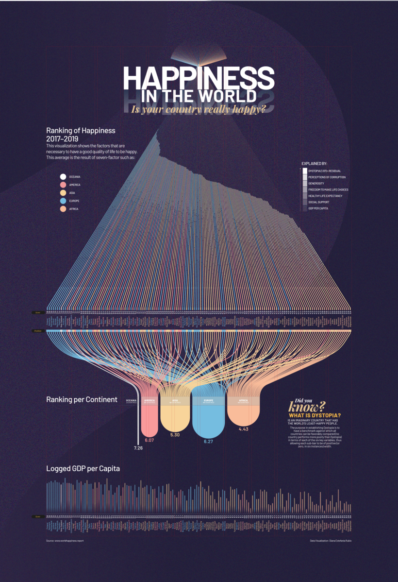
“Thank you so much for taking the time to learn data visualization techniques with me! I hope you had fun and gained new skills and ideas to incorporate into your work. Remember that, in addition to the video lessons, in the additional resources of the course you will find relevant support information to give that different touch to your project. This is the result of my project:
Partial transcription of the video
“Final Project This is the end of our course. I was really happy to share my creative process with you. Now you have all the tools to create your data visualization, keep in mind the four key parts of your project: the story you're telling, your data, the message you want to convey, all of that portrayed with good design. Use other resources and any web page that'll offer you tools to play with your fonts, to find a balance and the right color contrast. When you're building your project in Illustrator, focus completely on every step you take. Remember that a tiny mistake in your dataviz can ...”
This transcript is automatically generated, so it may contain mistakes.
Course summary for: Data Visualization for Editorial Projects
-
Category
Design -
Software
Adobe Illustrator -
Areas
Editorial Design, Infographics, Information Design, Interactive Design

Diana Estefanía Rubio
A course by Diana Estefanía Rubio
Diana Estefanía Rubio is a graphic designer and data visualization expert with more than 10 years of experience in the field. She currently runs her own studio and works with different brands on data visualization projects or collaborates as an art director.
She also coordinates the Data Visualization department at Data Lab MX and is a professor of a Data visualization at the University of Central Mexico. Throughout her career, she has worked with brands like CNN International, Turner Broadcasting, Grupo Expansión, MMKG, and McMillan; she has also won several awards including the SND36 Award of Excellence from the Society for News Design.
- 98% positive reviews (202)
- 5,960 students
- 18 lessons (2h 2m)
- 19 additional resources (11 files)
- Online and at your own pace
- Available on the app
- Audio: Spanish
- Spanish · English · Portuguese · German · French · Italian · Polish · Dutch
- Level: Beginner
- Unlimited access forever