Realistic Portraits with Pen

Course final project

A course by Joaquín Rodríguez , Graphic artist

Graphic artist. Madrid, Spain.
Joined February 2015
99% positive reviews (179)
3,329 students
Audio: Spanish, English
Spanish · English · Portuguese · German · French · Italian · Polish · Dutch · Turkish

About the final project for: Realistic Portraits with Pen

Realistic Portraits with Pen

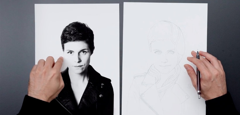
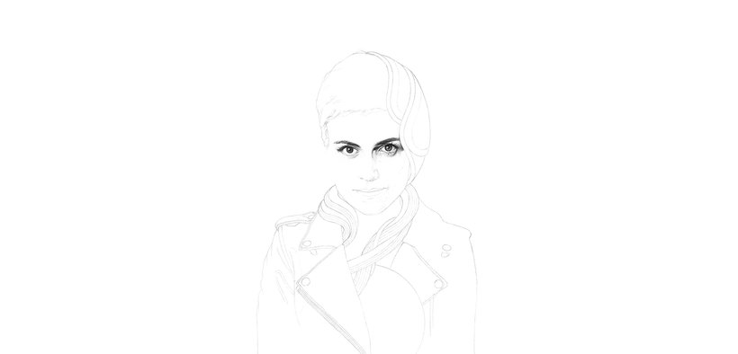
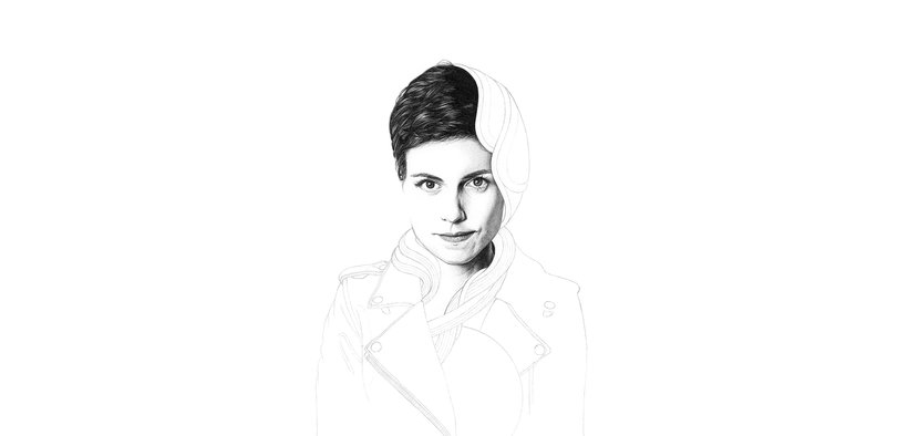
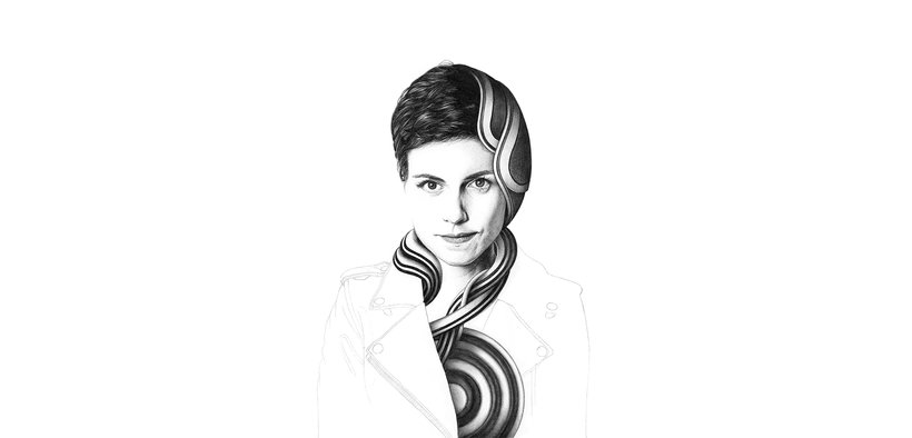
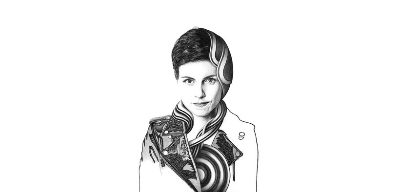
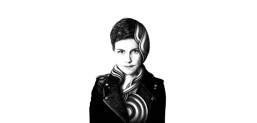
“If you have come this far, I want to thank you for accompanying me in each of the steps we have taken and I hope you have enjoyed them as much as I did. Personally, I like to understand learning as a two-way process, and that is why I encourage you to review those lessons that you think may contain interesting details. If I have managed to give you the impulse to create and propose your own works, the course will have been successful. These are the steps you must follow to complete the final project of the course: Reference image and sketch: First, choose your reference image. To select the image it is convenient that you take into account the position and lighting values, always looking for the volume expressed based on these two factors to suit the effects you are looking for. When you have selected the photo, you will have to sketch your drawing in pencil. I have used the resource of the grid, although you can choose another more comfortable technique such as tracing. The important thing in this phase is to differentiate the contour lines of both the shapes and the lighting areas in the drawing. When you have the figure already fitted, it is time to add the elements that you think can enrich and improve the image. Remember to take into account the bases of the position and perspective of your figure to be able to integrate them in a coherent way. Remember also that in the additional resources of Unit 3 I left you support material to explain all these topics.

Transfer the drawing to the work paper and start drawing the face: In the preparation process, I have told you how I like to transfer the main lines of my lace to a new paper for reasons of cleanliness and visual clarity. This process is absolutely voluntary and the important thing in any case is that you have the necessary lines defined to guide you through the main contours and eliminate the rest. I have chosen to start the work in pen on the part of the eyes, since they provide a base of expression and intensity to the drawing on which it is easier to work. Again, choose the order that best suits you and remember the importance of distinguishing between the different levels of shading and intensity of the contours, because they will be factors that will greatly help the success in the realistic aspect of the drawing. Finally, I recommend that you try the different movements and grips of the pen to find the way that is most natural for you when handling it. You can find some tips in the additional resources in Unit 3.
Finish the face areas: In my process we have given a separate section to the drawing of the hair area, since it had some graphic peculiarities that I was interested in telling you about, such as, for example, the differentiation of the areas of pure shadow and the work of the hair strands. Whichever order you have followed, I recommend you close the part of the face before starting with the drawing of the additions because this way you will have defined most of the lighting of the figure based on the reference image.
Shades and gives texture to the added elements: Whether, like me, you have chosen some elements that are not referenced to any image or if you have chosen specific objects whose original lighting adapts to that of your figure, in this phase you will have to pay special attention to achieving visual coherence between both parts. of the composition. Keep in mind that the reference photo is our guide to understanding the light of the set and that the missing information for this phase can be deduced from it. In my case, I have focused on giving an appropriate volume to each of the elements in which I was intervening and I have also emphasized the relationship of shadows that occur between them when they interact with each other. This is the most experimental part of the drawing and for me the one that offers the most possibilities, so I propose that you try different configurations with different types of objects. I think the compositional learning in this phase is tremendously interesting. Even at the risk of repeating myself, I remind you again that you will be able to find other proposals for schemes in the additional resources of the course.
Draw the rest of the image: In this last phase, it is time to finish the body based on your reference image. In my case, I went on to try and interpret the different textures of the leather of the jacket and I told you about the types of technique I use to face the different finishes. Here the type of image you have chosen will require a certain level of adaptation, so I encourage you to dare with complex textures that test your observation skills and comment on the problems you have encountered in the forum. Regarding the area painted with a marker, remember that it is only a resource and that if you see that the finish of said ink differs a lot with respect to the tone of the pen and that result bothers you, you can always work the same area in pen with something else of patience.
Integrate all the elements and edit your image: If you have followed the same drawing order as me, the integration phase of the elements that we have added to our figure will be pending. Until now each element was defined in itself and we needed to draw the cast shadows that will make the drawing completely finished. Again, you will have to imagine the direction of the light to be able to execute the shadows consistently. This is a phase that continues the previous work on shading each element. If you have been applying the correct principles throughout the drawing, you should not have problems in this phase and, in any case, we are in the forum to help you with any questions that may arise. In the last unit we saw how to edit the image according to the file and printing requirements and also the personal finish that each one seeks. I usually pay attention to the faithful preservation of the textures and the line and to achieve a range of blacks according to my interests. Carry out your own process and editing and ask me in the forum any questions that arise both in editing and in relation to Fine Art printing.
Now it's your turn, share your final project with all of us by clicking on "Create your project". As I have done up here, remember to share both the final result of your drawing and the steps that have led you to it. Remember that patience and perseverance are a fundamental part of working with a pen, and now is the time to get your own voice out. The course exercise aims to generate a framework to serve as a guide and start for any other type of proposal. There are a multitude of themes that can be explored in the visual field (nature, technology, culture) and that can be combined with the portrait. I will be present at the forum as often as I can and I hope that we can generate an interesting debate there to enrich our proposals. I hope you have enjoyed this course and I hope to see your proposal soon. A greeting! ”

Partial transcription of the video

“Final project In this lesson we are going to review what we have learned throughout the course. To start your drawing, first you got the basic materials as they are paper, pencil and pen. Remember to give the different pen ranges a try that you can find in a very accessible way in the market. Then we select a reference photo to work on. and we saw how important factors such as position are, illumination, focal length of the lens you used and the definition of the image so that you are comfortable with your project. Then we go on to sketch our drawing and incorporate a series of elements int...”

This transcript is automatically generated, so it may contain mistakes.


Course summary for: Realistic Portraits with Pen

  • Level: Beginner
  • 99% positive reviews (179)
  • 3329 students
  • 4 units
  • 18 lessons (4h 15m)
  • 9 downloads
  • Category

    Illustration
  • Areas

    Artistic Drawing, Drawing, Portrait Drawing, Realistic Drawing, Traditional illustration

Joaquín Rodríguez

Joaquín Rodríguez
A course by Joaquín Rodríguez

Teacher Plus
Graphic artist

Graphic artist Joaquín Rodríguez has a degree in architecture, but found his true calling in drawing. Using a pen as his main creative tool, his work mostly combines abstract geometric figures with cyberpunk culture.

He has collaborated with the La Fiambrera gallery in Madrid and with Spanish magazines like Jaleo and Yorokobu. He has also participated in solo and group exhibitions in several galleries throughout Europe.


  • 99% positive reviews (179)
  • 3,329 students
  • 18 lessons (4h 15m)
  • 22 additional resources (9 files)
  • Online and at your own pace
  • Available on the app
  • Audio: Spanish, English
  • Spanish · English · Portuguese · German · French · Italian · Polish · Dutch · Turkish
  • Level: Beginner
  • Unlimited access forever

Category

Areas

Realistic Portraits with Pen. Illustration course by Joaquín Rodríguez

Realistic Portraits with Pen

A course by Joaquín Rodríguez
Graphic artist. Madrid, Spain.
Joined February 2015
  • 99% positive reviews (179)
  • 3,329 students