Creating your own typography
Course final project
A course by Wete , Graphic Designer and Typography Artist


About the final project for: Creating your own typography
Creating your own typography
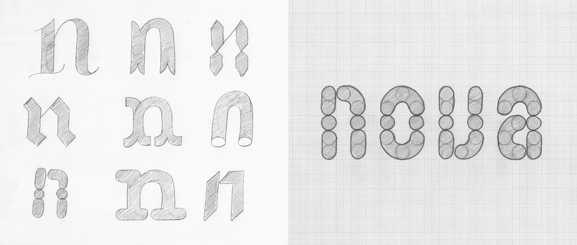
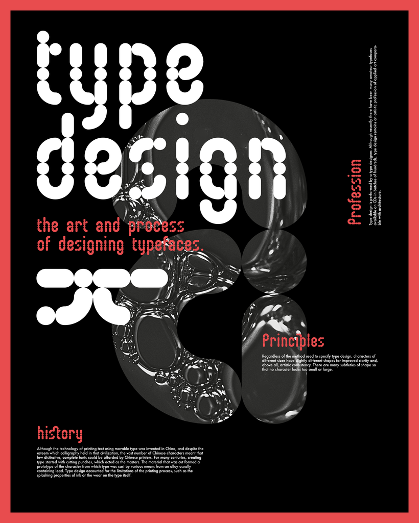
“We have made it to the end of the course! First, I would like to thank you for getting this far. I hope you enjoyed it a lot. The point here is not only to see the final result but also to focus on the process. How we got here is as important as the end product. What I would like to do is to summarize the main stages of the process. Similarly, I would love to see your journey, the decisions you took throughout the way, and what led you to come up with your design. Now that we went over the intent of the Final Project, let's delve into my journey: Sketching the typography I started by drawing the letter "n" in different ways to establish which one I wanted to digitize. Once I picked the one I wanted to develop, I composed the whole word on graph paper to shape it up. At this stage, being precise is of the utmost importance. The clearer the sketch is, the easier it will be to digitize it.
Partial transcription of the video
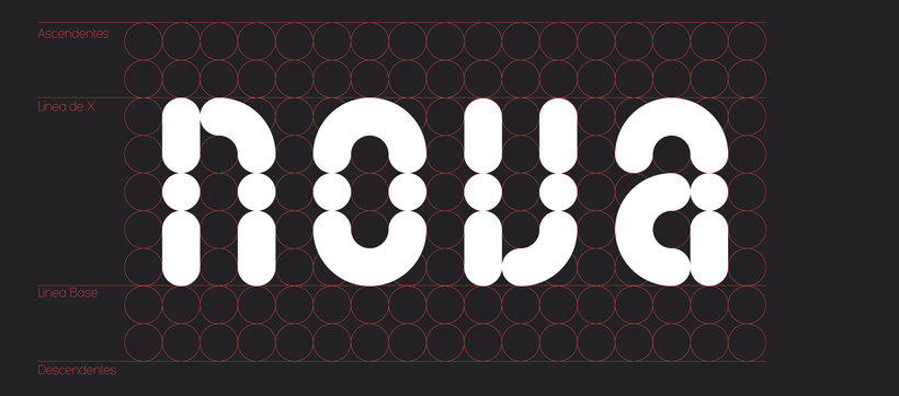
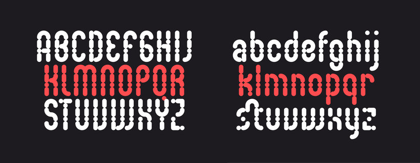
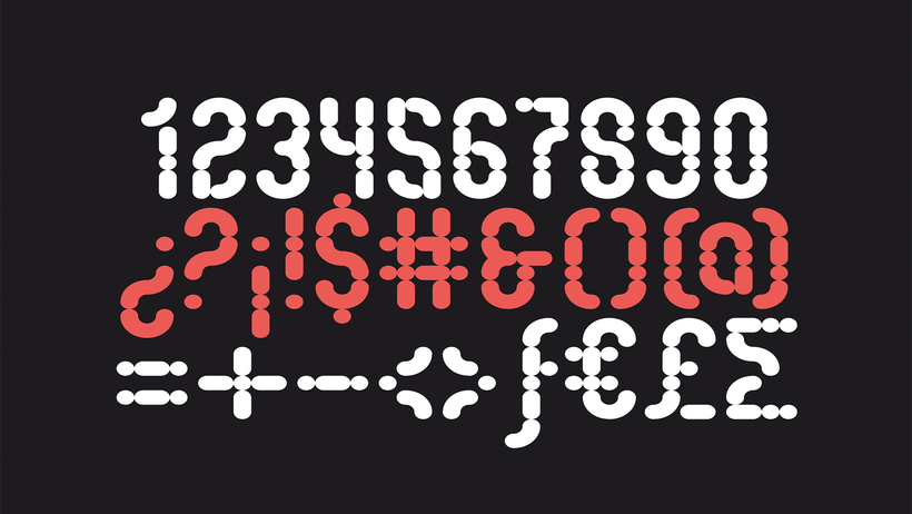
“WETE Final project You have already finished the course. I hope you learned the steps to create your own typeface, and then apply it to your design projects. If you follow the right steps, you will see that creating your own typography is easier than it seems, but be very careful with the spacing, it is as important as the letter itself. Above all, be careful to export the font correctly, so you can install it on any computer. When uploading the final project, be very original and upload all the phases of the process, from the sketch of the word "nova", the derivation of the entire alphabet...”
This transcript is automatically generated, so it may contain mistakes.
Course summary for: Creating your own typography
-
Category
Calligraphy & Typography -
Software
Adobe Illustrator, Glyphs -
Areas
Design, Graphic Design, Typography, Typography Design
Wete
A course by Wete
Juanra, better known as Wete, is a graphic designer specialized in typography. After working for various studios in Barcelona, he decided to carve out his own path and focus on what he loved most: typography. With that goal in mind, he founded his own studio, and alongside several friends, he created Ultra Types, a small online type foundry that specializes in display typefaces with a unique approach that sets it apart from larger type foundries.
He has worked on projects for top brands like Adobe, HP, Reebok, Desigual, W Hotels, and Mobile World Congress, among others. His work has also been featured in The Complete Guide to Designing Handmade Type by Charlotte Rivers, Page Unlimited (Sandu 360 Japan), Typodarium, Étapes, Computer Arts, and many more.
- 98% positive reviews (180)
- 4,582 students
- 24 lessons (2h 55m)
- 18 additional resources (12 files)
- Online and at your own pace
- Available on the app
- Audio: Spanish
- Spanish · English · Portuguese · German · French · Italian · Polish · Dutch · Turkish · Romanian · Indonesian
- Level: Intermediate
- Unlimited access forever
- Updated on 08/25/2020
Recommended software & tools for this course
Category
Areas

