


What is Molecular Typography?
An unexpected perspective on letters as living beings
Molecular typography is the study of letters from a radically new perspective. In molecular typography, letters are considered molecules and have certain physical and chemical properties. All characters are formed from seven basic atomic blocks called typtoms. When these are combined, letters, numbers, and punctuation are formed, just as in chemistry different simple elements can form complex molecules.

Types are alive
Molecular typography, according to its supporters, is not a theory, nor a metaphor or a typographic analysis tool. Letters are studied as real organic entities. For example, tips have positive and negative poles that attract and repel each other and help to bring the final shape to life. These principles work in different font types and typographic styles, in upper and lower case, as well as in non-Latin alphabets.
Each letter, number, and punctuation mark has an equation and a “chemical” formula that indicates the structure of its typtoms, as seen in this diagram for the letter H.

In this video, Jacob Ford walks through his pop-up book on molecular typography and helps understand several of its principles.

Scientific inspiration
This approach to typography, which proposed that letters are living organisms, emerged in the 1950s, through the work of Aaron Edwards and Charles Harrington. They equated molecular typography to scientific fact: they claimed that print is made of real molecules, and being a real, physical object, it has particular chemical and physical structure.
In this example, the letter A is formed from the typtoms vtom and etom. You can see how the electrical charges on the faces of the letter attract (positive attracts negative) or repel each other, causing the final letter orientation.

Comeback
In the 1990s, H. F. Henderson compiled the findings of molecular typography in his book Understanding Molecular Typography. The book became an instant hit and made the theory digestible to a non-expert audience.
In 2019, long after it was discontinued, the publisher Ugly Duckling Presse republished it with a careful analysis from binder Woody Leslie, a true authority on the molecular typography field. The goal was to recover Henderson's peculiar work, and "show the frequent scientific misconceptions that humanity has had".


Woody Leslie talks about how this book took him by surprise when he found it, and something similar will happen to all typography lovers. The book is a source of inspiration, a meticulous approach to the essence of letters. Thanks to its study, molecular typography is receiving a renewed interest among typographers and designers.
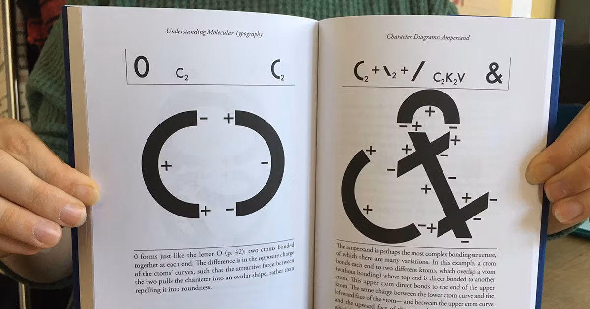
The book contains detailed studies of the roman characters, and it is fascinating to view them from this perspective. In this example, we see the ampersand, "perhaps the most complex link structure". The charges in the typtoms that attract and repel give us the peculiar twist of this letter and allow some to overlap without being linked.

You can buy a copy of Understanding Molecular Typography by Woody Leslie and H.F. Henderson. All images courtesy of Ugly Duckling Presse.
You may also like:
- Take Part in the 36 Days of Type Challenge.
- Typographic Anatomy: the Different Parts of a Letter.
- What Is Foundational Calligraphy?


0 comments