


The Story of Logos II: From Coca-Cola to MTV
What do the most recognizable logos of the 20th century have in common?
Find out in the second part of “The Story of Logos”
After learning about how logos have been a part of our world for longer than we previously thought, in part two of “The Story of Logos”, we focus on the development of the discipline–from its origins at the end of the 19th century to the present day. Find out more in the following video:

A New World
At the end of the 19th century, the world changed forever: industry and the mass production of goods became the foundations of a newly-organized society. Huge companies emerged and cities were filled with inhabitants who had, only decades before, been granted the right to free time and work breaks. All of these different elements contributed to the birth of a consumerist society–the one in which we live today.
With this also arrived modernism: an artistic and philosophical movement that wanted to be at the forefront of this new world. Its intention was to break with the past through new ways of creating, thinking, and designing.
In Germany, a group of artists took this idea very seriously. They called themselves “Deutscher Werkbund”, and wanted to transform everything “from the sofa cushions to the way cities were built”. They were the first to seriously contemplate the idea that commercial brands each needed to construct their own solid image. As a matter of fact, it was one of their group, Peter Behrens, with whom the story of the modern design of logotypes begins.
The Legacy of Peter Behrens
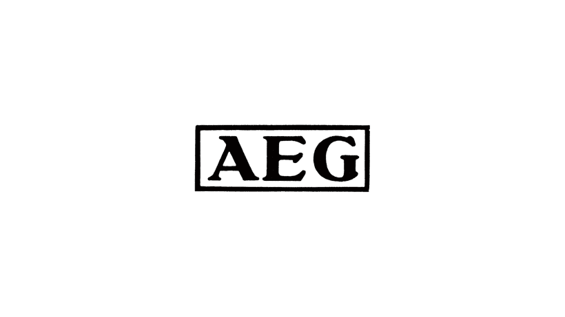
In 1907, Peter Behrens–a trained architect–took on the role of art director for the German electrical appliance company, AEG. There, Behrens designed practically everything that fell into his hands: publications, logotypes, lamps, factories, and even housing for the employees.
Behrens became the first industrial designer and the first person to come up with creating a complete visual identity for a brand. While his ideas would still take decades to properly catch on, this hasn’t stopped Behrens from being considered one of the fathers of modern design of logotypes. He is an important figure to know in order to understand everything that would come next.
The Bauhaus and Modernism
Looking at the history of logotype design, one cannot deny that the modernist theory linked to order, control, and the search for the most simple solution has influenced the majority of design solutions. Minimalism would dominate the most part of the 20th century, thanks to the influence of the German school–the Bauhaus–and its successors.
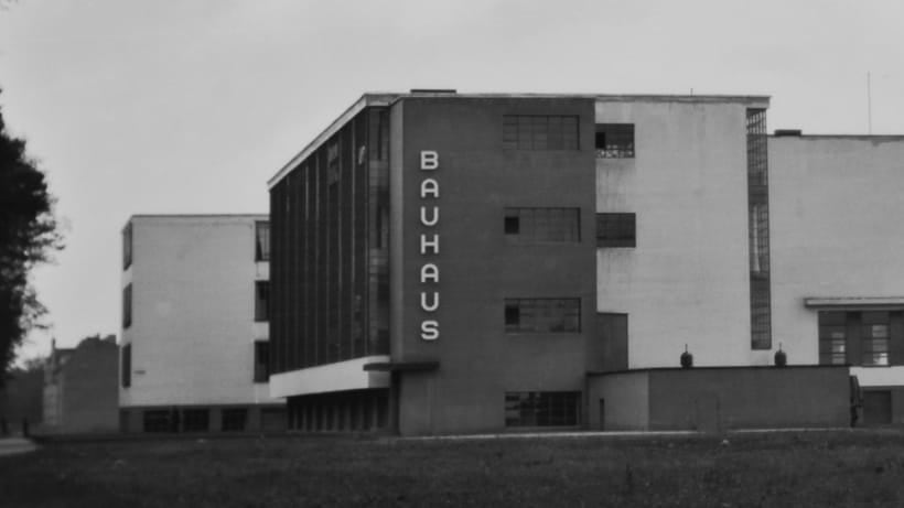
The Bauhaus, founded in 1919 by Walter Gropius, embraced many of the same ideas as the Deutscher Werkbund, adding an educational component that would influence countless designers. The school’s very own logo, designed by Oskar Schlemmer in 1922, encapsulated all of the main theories of the Bauhaus.
For the logo, a human face is transformed with abstract shapes and geometric figures. As Johannes Molzahn said, “Just like a machine, an aesthetically-pleasing form is no more than the result of perfect construction combined with the objective of achieving the best performance possible.'' Countless logos that we see on a daily basis were designed with these principles in mind, widely developed by the Bauhaus and its successors.
But then, WW2 arrived…

The USA and the Boom of Corporate Identities
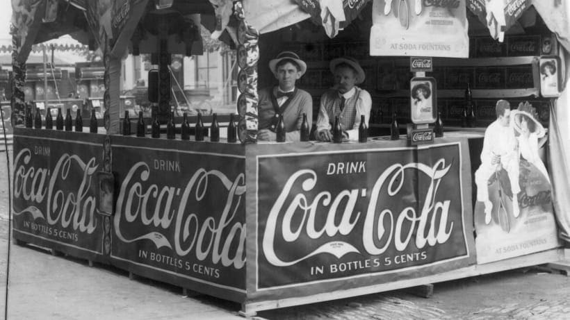
Once the war was over, with Europe destroyed and the USA experiencing an economic boom, the next chapter of our story unfolds in America. From the beginning of the 20th century, the big American conglomerates continued to grow, and soon they realized they needed more than just a logo.
What they needed–just as Behrens had proposed 50 years before–was a corporate identity. A visual program that covered all aspects of the company, that could be applied to tens or hundreds of different formats. It was during this time that some of the most influential logotype designers began working–among them figures such as Paul Rand, Saul Bass or Milton Glaser.
Rand applied the key ideas of European modernism to his work for the biggest American conglomerates. The designer was key in persuading brands of the importance of design and worked to define many of their visual identities. Bass, also known for his film posters, would merge pop culture with the refined style that had been brought from Europe. Milton Glaser, the creator of the incredibly well-known New York logo, would be a pioneer when it came to creating a visual identity for a city.

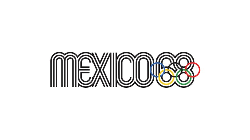
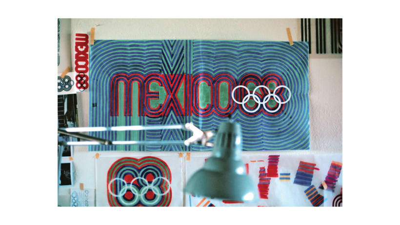
Lance Wyman and the Olympic Games in Mexico ’68
Another young American designer, Lance Wyman, would be the author of one of the most influential corporate identity and logotype design projects of the subsequent decades: the visual program for the 1968 Olympic Games in Mexico.
Taking the basic form of the Olympic rings, Wyman designed an entire universe of curved lines. The rings served as the inspiration for the Games’ visual identity. A closed structure, that can also be opened up and applied to all sorts of necessary formats.
The 80s and MTV
The modernists–beginning with Peter Behrens–had all pursued an idea: improve the world through design.
However, in the 80s, once the turbulent 60s and 70s were over, it began to seem clear that modernism had failed its mission to change society. What followed was postmodernism, and with it, a new aesthetic.
At the beginning of the 80s, Manhattan Design studio designed what would be the logotype for MTV for the next two decades. The channel quickly became a reference of the postmodern movement, and so did its logo.
Self-control was over: MTV wanted to represent so many different things that it was decided that the logo would mutate and its shape and the colors would transform. It was a design that went on to survive both the 80s and 90s. However, recently, in a time in which simplicity is preferred, it was discarded.
Flexible Visual Identities
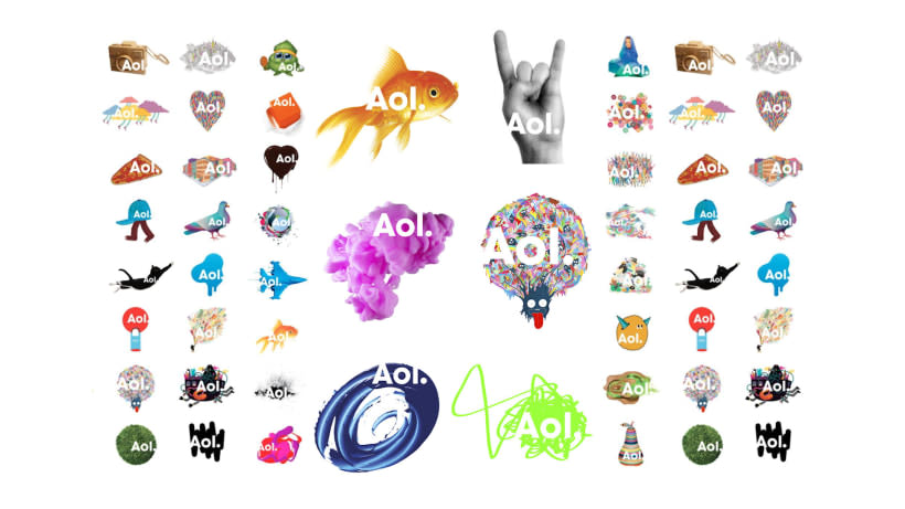
That same logotype for MTV was the beginning of flexible visual identities–open systems such as Wolff Olins' recent design work for AOL. It is a universe of meanings in which the only constant is the name of the brand, and which adapts itself perfectly to the digital world in which we find ourselves.
At the end of the second decade of the 21st century, studios like Chermayeff & Geismar & Haviv, Landor, Pentagram, Wolff Olins or Siegel+Gale–global references in branding–continue to work on breaking the boundaries of design that have been in place until now.
With the emergence of digital technology, creating is easier than ever, and design is more accessible. It’s still to be seen where this paradigm will take us and what to expect in the near or distant future in the story of logotype design. But one thing is clear, logos behold something that goes one step further than the commercial side. Something that’s been deep inside of us ever since someone decided to draw a bison on a wall thousands of years ago.
Discover part one of The Story of Logos.


0 comments