


Typographic Anatomy: the Different Parts of a Letter
Learn the correct terms for the different parts of a letter and familiarize yourself with its anatomy to better work with them
Although letters are part of our daily lives and we see them written in millions of ways, with different typefaces and shapes, there are many of us who do not really know their anatomy. Learning to name each of its parts correctly is just one of the things that we must consider if we want to work with them.
Nubikini (@nubikini), a true expert in lettering and everything that has to do with letters, breaks down the basic parts of letters:
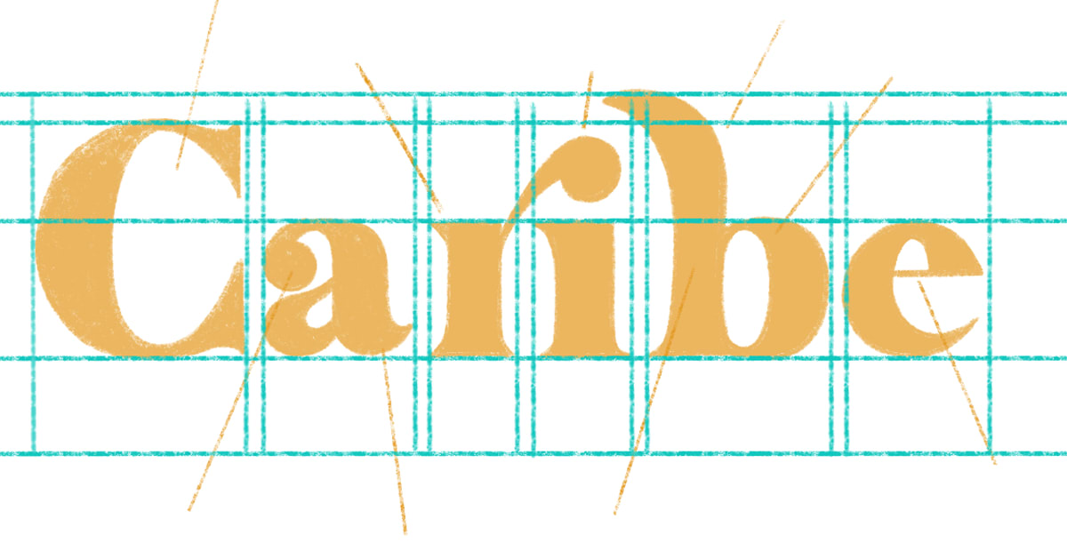
Baseline is the horizontal line on which lowercase letters rest.
Height of X or meanline corresponds to the height of the lowercase letters of a typeface.
Uppercase or capline height is the height of high box characters or capital letters. It always goes from the baseline and, sometimes, although not necessarily, it corresponds to the height of the ascender.
Ascender or topline height is the distance between the height of X and the letters that rise, like 'd' or 't'.
Descender height is the line used to mark the strokes of the letters that go down, like 'p', 'j', 'q'.
Counter is the internal space of a letter, which can be completely–as in the case of the letter 'O') or partially enclosed–as in the case of the letter 'C' .
Drop or tear is the end of a stroke that does not end in a grace but with a rounded or circular shape.
Terminal is a small projection of a stroke, which gives the letter personality.
Serif is the finishing stroke of an arm or tail. It is usually an ornamental element, not essential for character design, but gives personality.
Ligature is the union of one or more glyphs. It is often used to give an elegant or classic touch to a typeface.
Stem is the main feature of the letter, the one that defines its essential form. The ascending stem, as in the case of the 'b' protrudes above the height of the X.
Loop or belly. Curved stroke enclosing the counter.
Crossbar is the horizontal line between verticals, diagonals or curves.
You can learn more about letter shapes and how to create digital lettering in the Domestika course "Calligraphy and Lettering for Instagram with Procreate" by Nubikini.
You may also like:
- Hand Lettering Tutorial: How To Draw An Ampersand
- How the ‘Joker’ Logo Was Made


0 comments