


@whitney_ryan
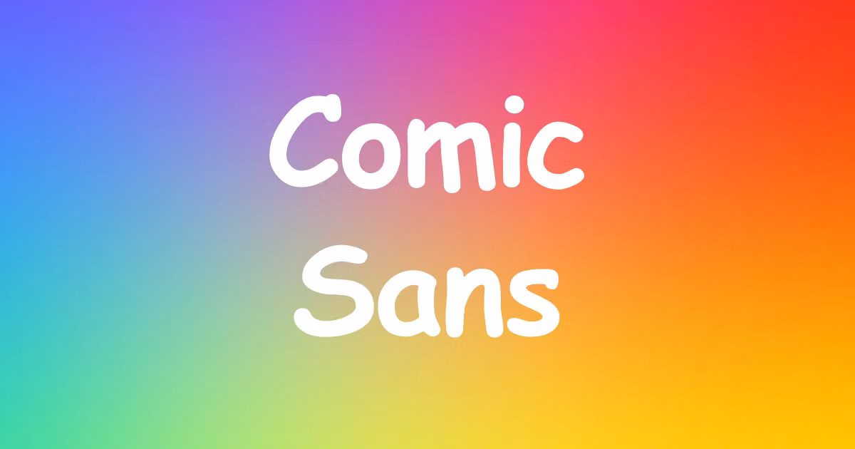
Comic Sans: The Font Everyone Loves to Debate
Take a closer look at its history, charm, and debate surrounding the font Comic Sans.
Few typefaces stir up as much passion as Comic Sans. What started as a lighthearted, approachable font has become one of the most polarizing designs in the world. For some, it’s a friendly and useful tool; for others, it’s a designer’s worst nightmare. But why does this humble font inspire such strong opinions?

How Comic Sans Came to Be
In 1994, Vincent Connare, a designer at Microsoft, was tasked with creating a font for speech bubbles in a children’s software program called Microsoft Bob. Drawing inspiration from comic book lettering, he sketched a typeface that felt playful and easy to read.
Ironically, Comic Sans never made it into Microsoft Bob. Instead, it was included in Microsoft’s font library, where it quickly caught the attention of users looking for something casual and approachable. Its childlike charm made it perfect for flyers, school projects, and anything that needed a friendly vibe.
Why People Fell in Love with Comic Sans
In the early days of personal computers, most fonts were stiff and formal. Then came Comic Sans—a breath of fresh air. It was easy to read, warm, and didn’t take itself too seriously. Teachers loved it for classroom posters, parents used it for party invitations, and its accessibility made it a favorite for beginners experimenting with digital tools.
It wasn’t just its look; Comic Sans also has practical benefits. Its irregular letter shapes help some people with dyslexia distinguish characters more easily, making it a genuinely useful tool for improving readability.
Why Designers Can’t Stand It
While Comic Sans won over everyday users, it quickly became the font designers loved to hate. Its uneven spacing and inconsistent shapes make it look amateurish compared to professional fonts. But the real issue wasn’t the font itself—it was the way people used it.
Comic Sans started popping up everywhere: corporate presentations, official documents, and even gravestones. To many designers, this misuse turned Comic Sans into a symbol of poor taste and a lack of design awareness.
In 1999, two design students launched the "Ban Comic Sans" movement to protest its overuse. What began as a joke gained traction, solidifying Comic Sans as a cultural punchline.
But Wait… There’s a Defense for Comic Sans
Despite the hate, Comic Sans has its defenders. Many argue that it does exactly what it was designed to do: be friendly, casual, and easy to read. The backlash, they say, has less to do with the font and more to do with how people misuse it.
For fans, Comic Sans represents simplicity and fun. It’s not trying to be perfect, and maybe that’s part of its charm. In a world of sleek, professional fonts, Comic Sans feels refreshingly human.
Comic Sans and Internet Fame
Over time, Comic Sans became more than just a font—it became a meme. Its overuse and ironic appearances led to countless jokes online. Some designers even use it intentionally to make a statement or poke fun at design snobbery.
Brands have also joined in on the joke. On April Fool’s Day, companies like Yves Saint Laurent have playfully swapped their logos for Comic Sans versions, showing the font’s ability to spark laughs and engage audiences.

When to Use Comic Sans (and When Not To)
Love it or hate it, Comic Sans has its place. Here’s where it shines:
-Kids’ projects: Perfect for classroom materials, kids’ party invites, or anything playful.
-Personal notes: Holiday cards, casual flyers, or family newsletters are fair game.
-Accessibility: If someone struggles with reading, Comic Sans might actually help.
But think twice before using it for:
-Professional settings: Boardroom presentations need fonts that mean business.
-Formal documents: Legal contracts or wedding invitations call for something elegant.
-Sensitive materials: Comic Sans on a memorial plaque? Not the best choice.
The Comic Sans Legacy
Like it or not, Comic Sans is here to stay. It’s more than a typeface—it’s a conversation starter, a cultural icon, and a reminder of how design can connect (or divide) us. It challenges our ideas of what’s “good” or “bad” in design and proves that even a font can have a story.
So next time you come across Comic Sans, pause for a moment. Whether it makes you cringe or smile, remember: it’s just a font—one that somehow made the whole world care about typography.
You might also like:
Online Courses in Calligraphy and Typography
10 Inspiring Lettering Artists, by @whitney_ryan


0 comments