


Typography Tutorial: how to choose typography for your illustration projects

Sindy Ethel gives you the keys to success when choosing a font style
Each style of letter is a world, and each of these worlds refers us to a completely different type of sensations. Using a classic serif font is not the same as a modern sans serif, just as working with a script is not the same as working with a display with fantasy motifs. Understanding what each of these styles means and what they can communicate is an essential skill for any creative who works with lettering.
In the following video, designer and illustrator Sindy Ethel (@sindy_r3do), who together with Alan Rodríguez forms the creative duo R3DO, shares with you her essential keys when choosing a font style for your lettering projects.
Look for inspiration in existing lyrics
That is, work with references. Depending on the type of project you are facing (lettering for a restaurant, for example, is not the same as for a daycare center), you will have to look at different historical periods, well-known designers or styles already worked on, and which refer to sensibilities or aesthetics. individuals. Don't be afraid to do research, not only on the Internet, but also in archives or libraries.
Make sure the lyrics convey what you are looking for
In that sense, do not forget that each letter style conveys a completely different thing. Serif letters, for example, can refer to a certain classicism while sans serif letters, without ornaments, are usually linked to a more modern aesthetic. Choosing a lyric that is not in line with what you want to convey can be a serious mistake.
Clearly define what you will work with
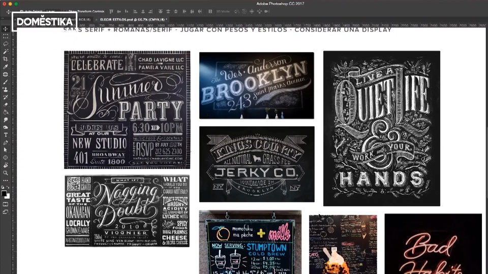
Once you have reviewed references and know exactly what you want to convey, you must establish what letter style or styles you will work with. Only starting from these styles can you begin to organize your typographic composition. For example, you can note that you will work mainly with sans serif and perhaps some Roman font, you will focus on playing with weights and styles and you will consider introducing a display font (a type of letters with a lot of personality, created to be used in large format).

If you liked these tips, remember that you can learn with Sindy Ethel and Alan Rodríguez to combine letters and illustration effectively in their online course 'Lettering and Illustration: Composition, techniques and application'.
You may be interested
- How to choose fonts, a course by Enric Jardí.
- The golden secrets of lettering, a course by Martina Flor.
- Domestika Basics: Adobe Illustrator for typography, lettering and calligraphy, 5 courses by Andrés Ochoa.
- Illustrated lettering: creativity and experimentation, a course by Alex Trochut.


0 comments