"Put on a happy face" - Joker
"Put on a happy face" - Joker
de Carlos Rodríguez Casado @carlosrodriguezcasado
- 9,818
- 87
- 3
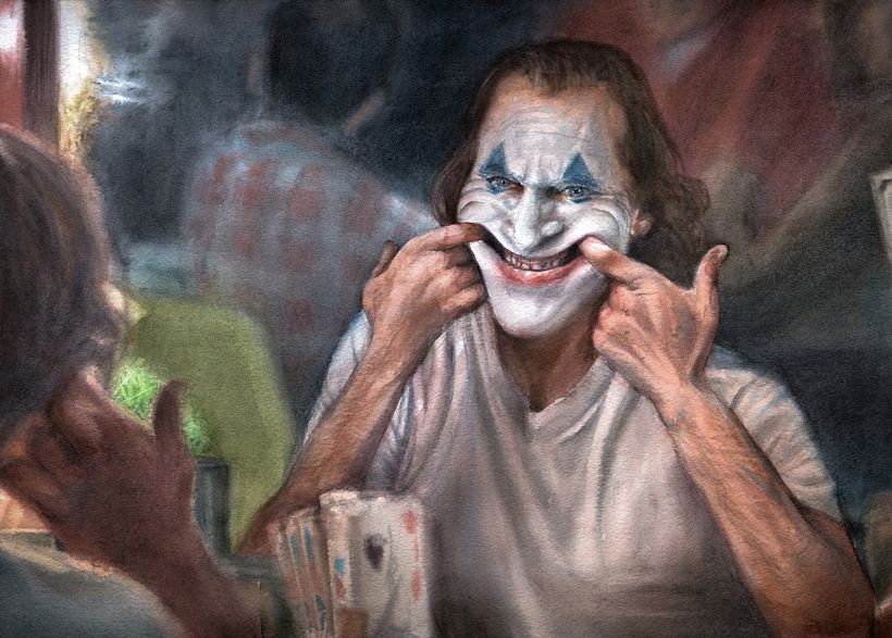
This illustration is not only one of my favorites of all the ones I made for the filming of my course " Watercolor Illustration: Recreate Your Most Iconic Scenes ", but it was also the first one I worked on. Scenes from Joker, among other films, served as inspiration for me to develop the techniques to create depth of field with focuses and blurs explained during the course.

To create this illustration, I worked on a sheet of Gvarro fine-grain watercolor paper (300g), which wouldn't have been my first choice, as I usually work with 100% cotton paper, while this one only has 60%. I find that watercolor papers with a lower percentage of cotton don't hold up well to layering, lifting the pigment from the layers below when you add new brushstrokes. This really posed a problem when it came to creating an atmosphere for this glazed scene.
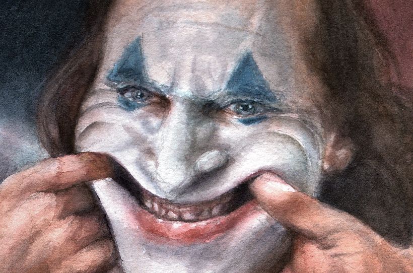
However, the paper has a very particular velvety texture and is very soft to the touch, and this is also reflected in the final appearance of the drawing.

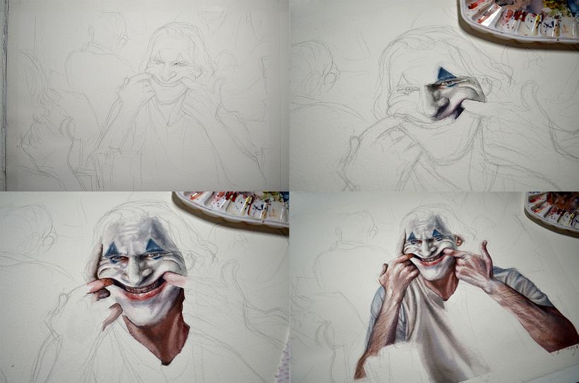
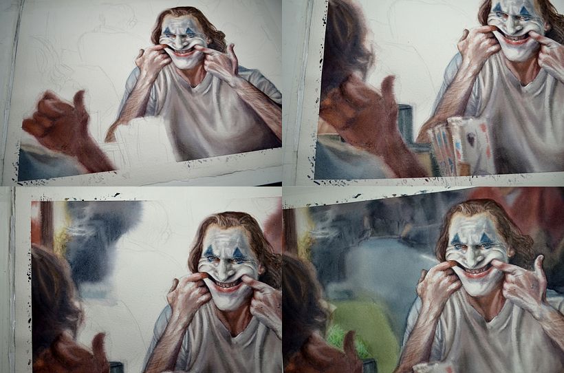
As always, I started from a free sketch, respecting the composition of the original image without being too exact (this helps me distance myself from the photograph), but when it came to adding color I used a slightly different process than the one explained in the course, since instead of starting by working with blocks of color on wet surfaces, I first added the details of the most focused plane when dry, which is the reflection of the character in the mirror, to expand towards those in the background later.
It's the same process I use for my caricatures and portraits, and although it's true that I don't make a big difference between shots in them, I do combine wet and dry work to achieve an effect of depth.

At this point in the illustration, all that was needed was some general glazes to enhance the contrast between light and shadow, but as I mentioned before, the paper was not good for superimposing layers, as it erased the first ones when I went over them with the brush, so I had to correct those rings that you can see in the last image with a lot of patience, painting only the parts that I wanted to homogenize (and with the precision of a watchmaker!).
After so much effort, I was very happy with the final result, and I'd say this illustration was key to defining the process I teach in the course. Sign up to create scenes like this! ;)


1 comentariu
Profesorul meu de portret preferat!!!
@marialuisaguijarro cea mai dedicată elevă a mea! :)
Uau! Impresionant! Îți admir talentul.
Conectați-vă sau înscrieți-vă gratuit pentru a comenta