
My project for course: Style Exploration for Illustration
de Tholbjorn @tholbjorn
- 362
- 5
- 2
Introduction
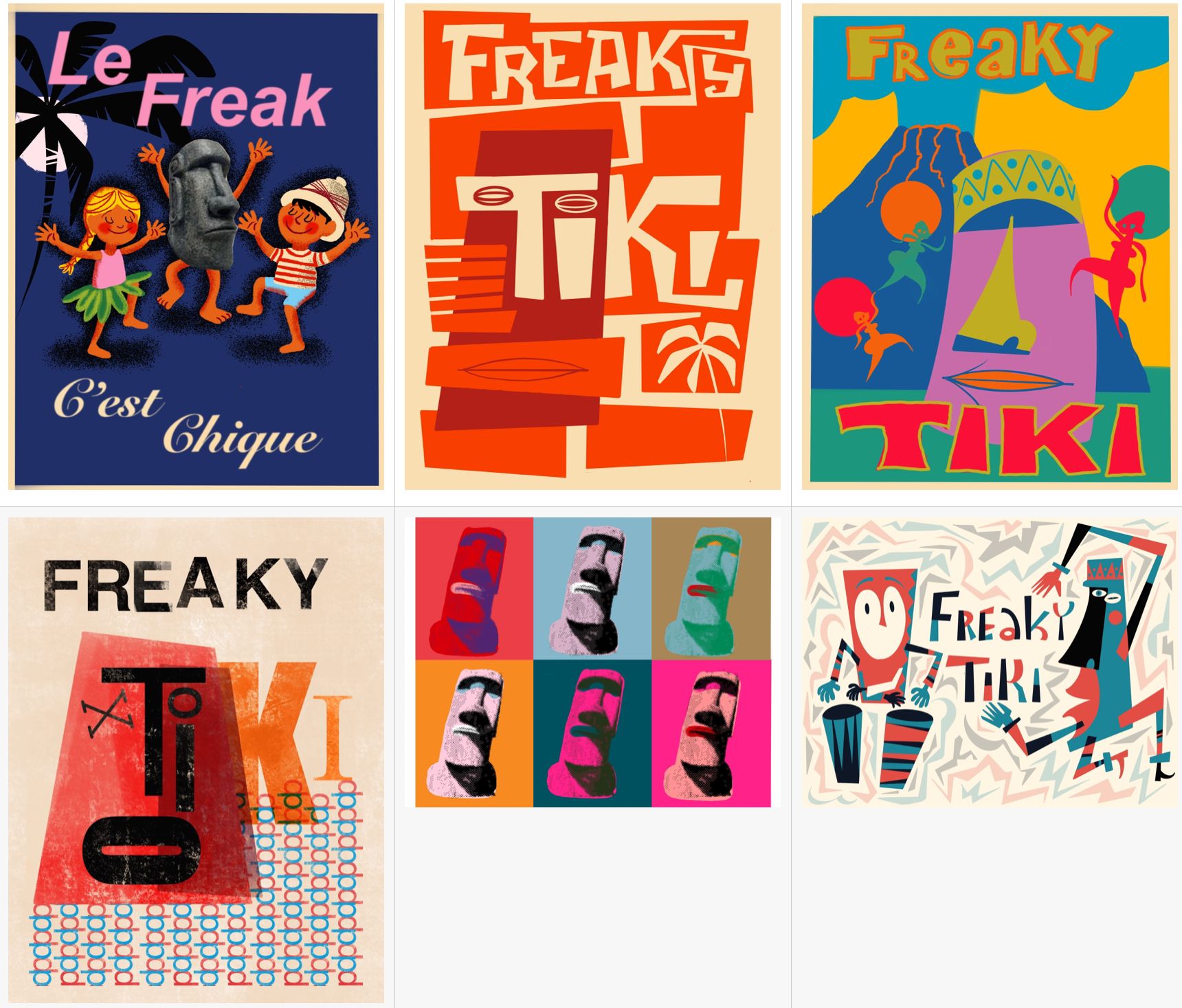
For this course I looked at different poster styles that I tried to incorporate in my own posters. As a topic I took a tiki statue and a tropical setting and "Freaky Tiki" because it has a nice ring to it.
For each poster style, I will show some examples of the style which inspired me for my own poster version. The styles I copied are: Herve Morvan, Saul Bass, Cuba style, Hendrik Werkman, Andy Warhol and Jim Flora.
I really enjoyed this project a lot!! I tried out a lot of different styles also different from what other people tried to add to the possible options.
Supplies
I used my ipad and procreate to create the posters. For the Andy Warhol poster I used Photoshop.
Hervé Morvan Poster
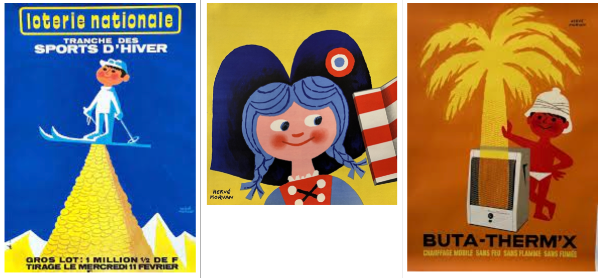
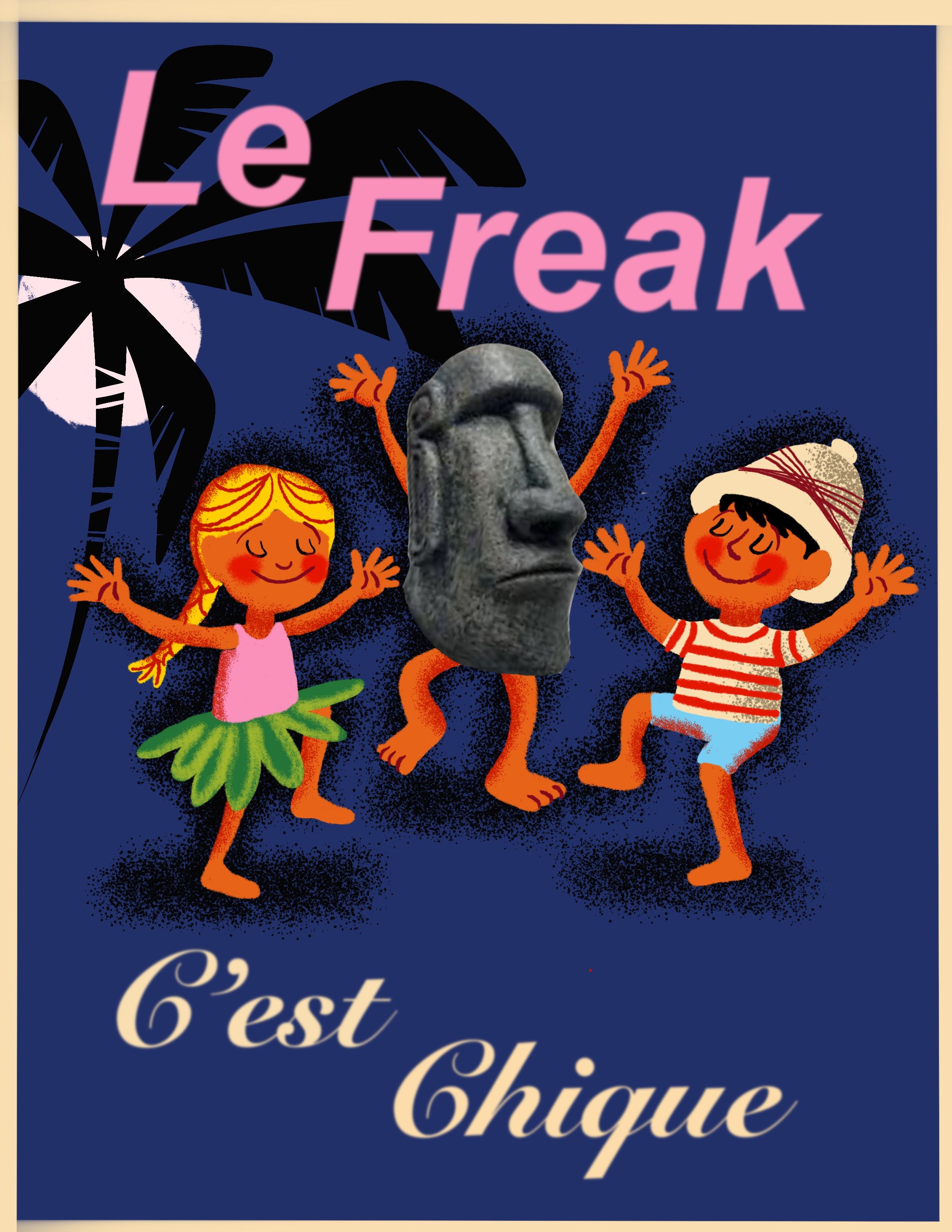
For the first poster I looked at Herve Morvan. The 50s naive style is something I really like. Below are some examples on which I based my own poster. I used the style of characters, the way the hair is drawn and the dark blue background. I added a photo of an easter island statue as a contrast to the simple drawing style.
To stay with the French style, I change "Freaky Tiki" to something a bit more French. The letters on the posters of Hervé are not hand drawn so I used a font from procreate. Because the font turned out a bit sharp on the dark blue background, I applied a gaussian blur to get a bit of a softer look you also see in the poster.
First I had a version with open eyes (which I posted on the forum) but I liked it more if they have their eyes closed.
Saul Bass Poster
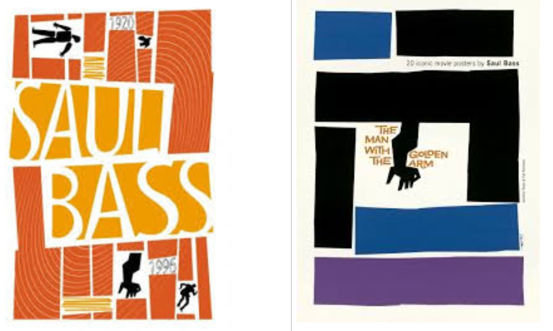
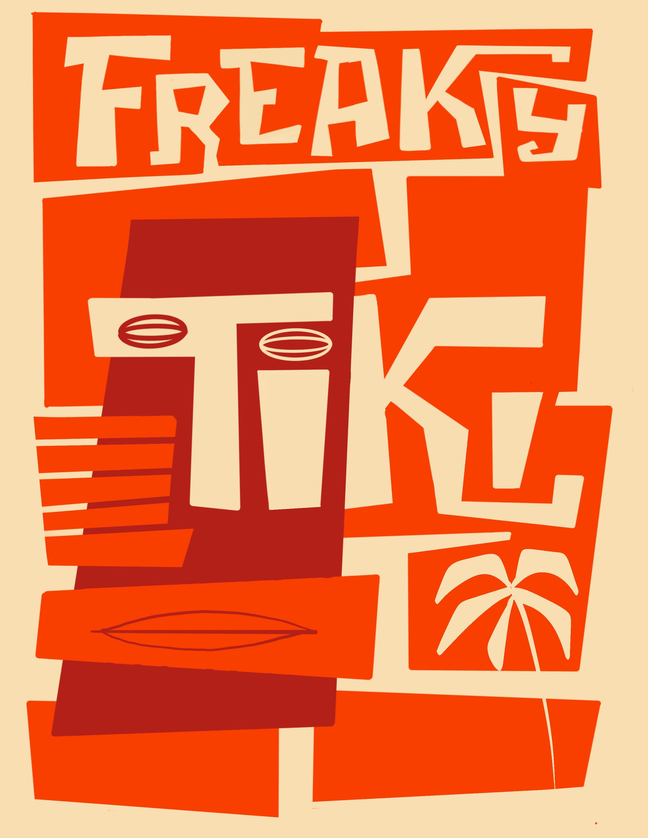
Saul Bass has a very free and simple style with only a couple of colours and a few shapes. I liked the hand-drawn blocks with their crooked edges and the play with positive and negative space. The letters seem as if cut from a paper, I exaggerated that in my own poster.
I liked the letter cutouts of “Saul Bass” in the first image. After playing around with the letters I noticed the "T" makes a perfect nose and forehead of the tiki. The dot on the eye could function as an eye. I added a palm tree in the lower right corner to add something to the blocks in that corner.
Cuba Style Poster
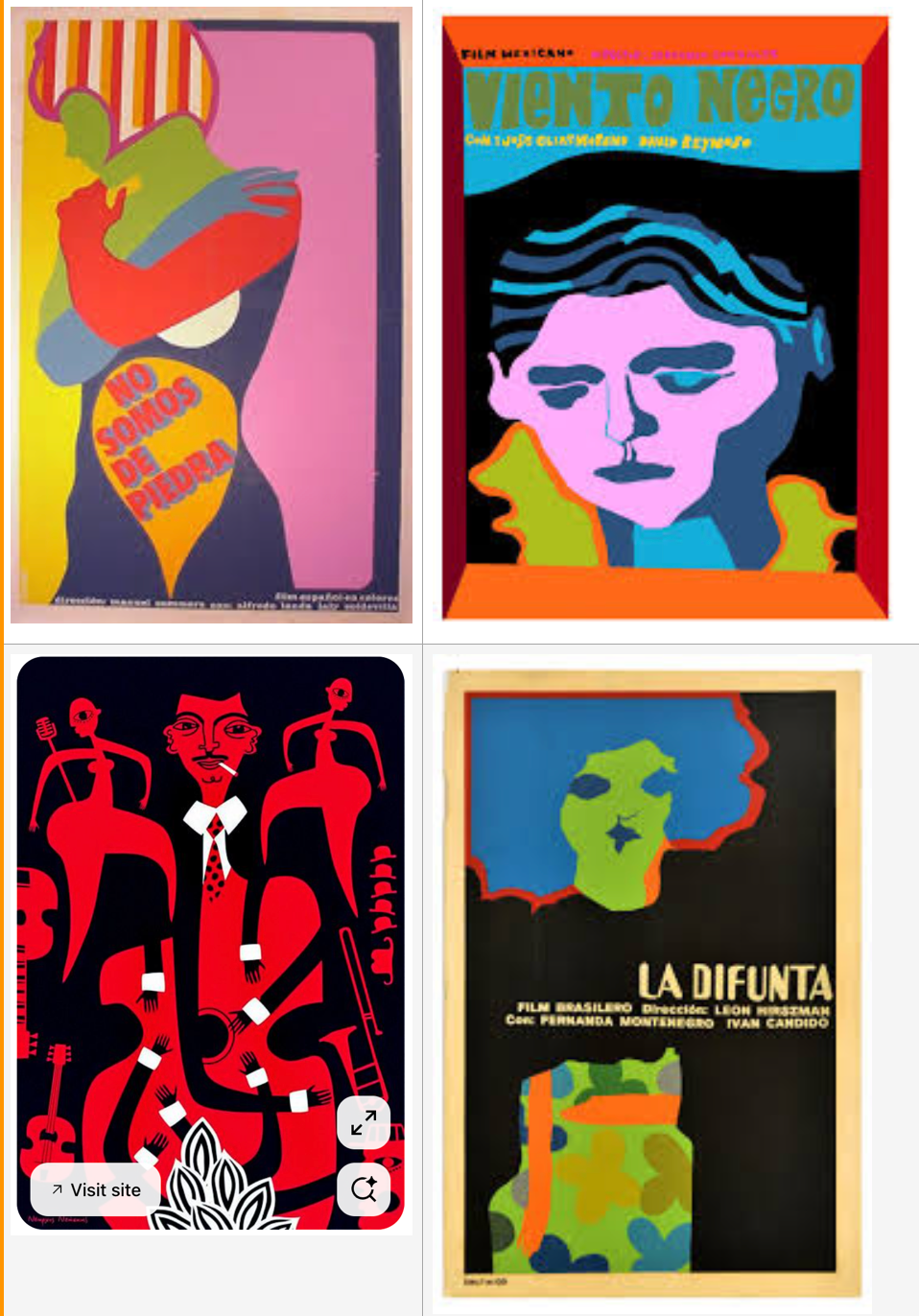
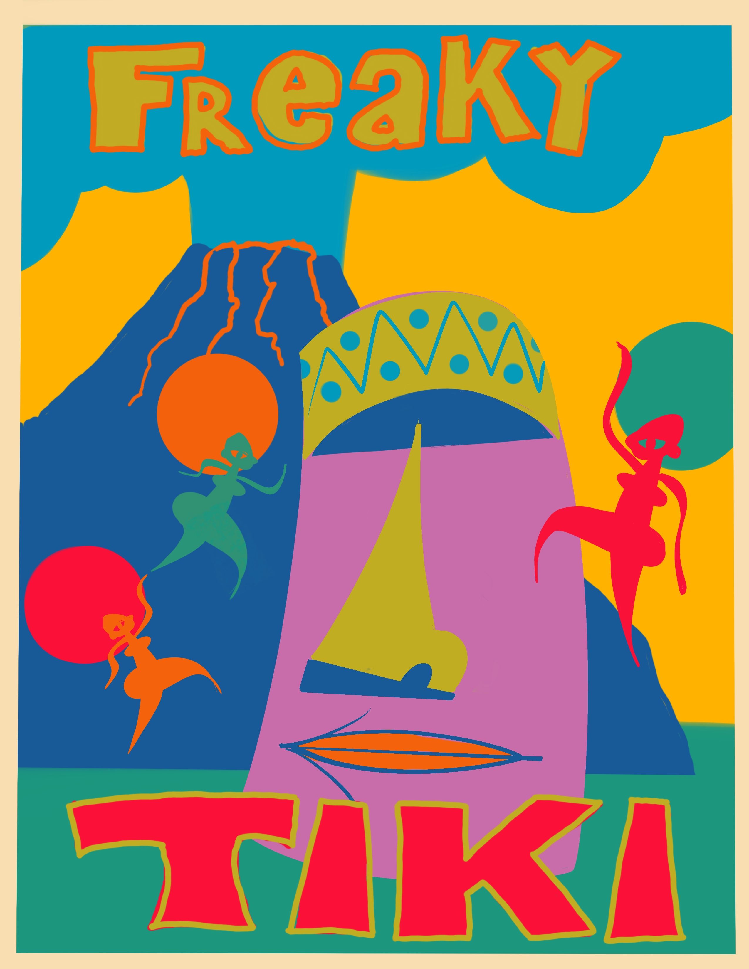
Cuban posters are really colourful and they try to obtain the maximum emotion with only a few shapes. I tried to create a cuban style poster with big colourful shapes. The hand drawn letters of "Viento Negro" I really liked and also the line tracing around the form of the jacket. I used these lines around the letters to make them stand out more.
On pinterest I found an illustration with very basic dancers that I really liked I used these dancers as if they were dancing around the big tiki head.
H. N. Werkman Poster
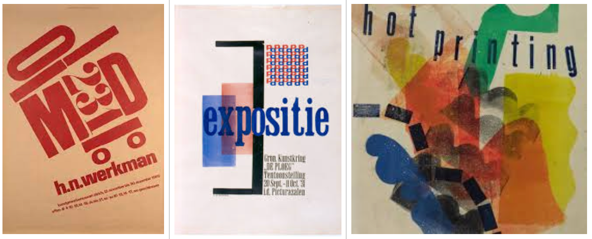
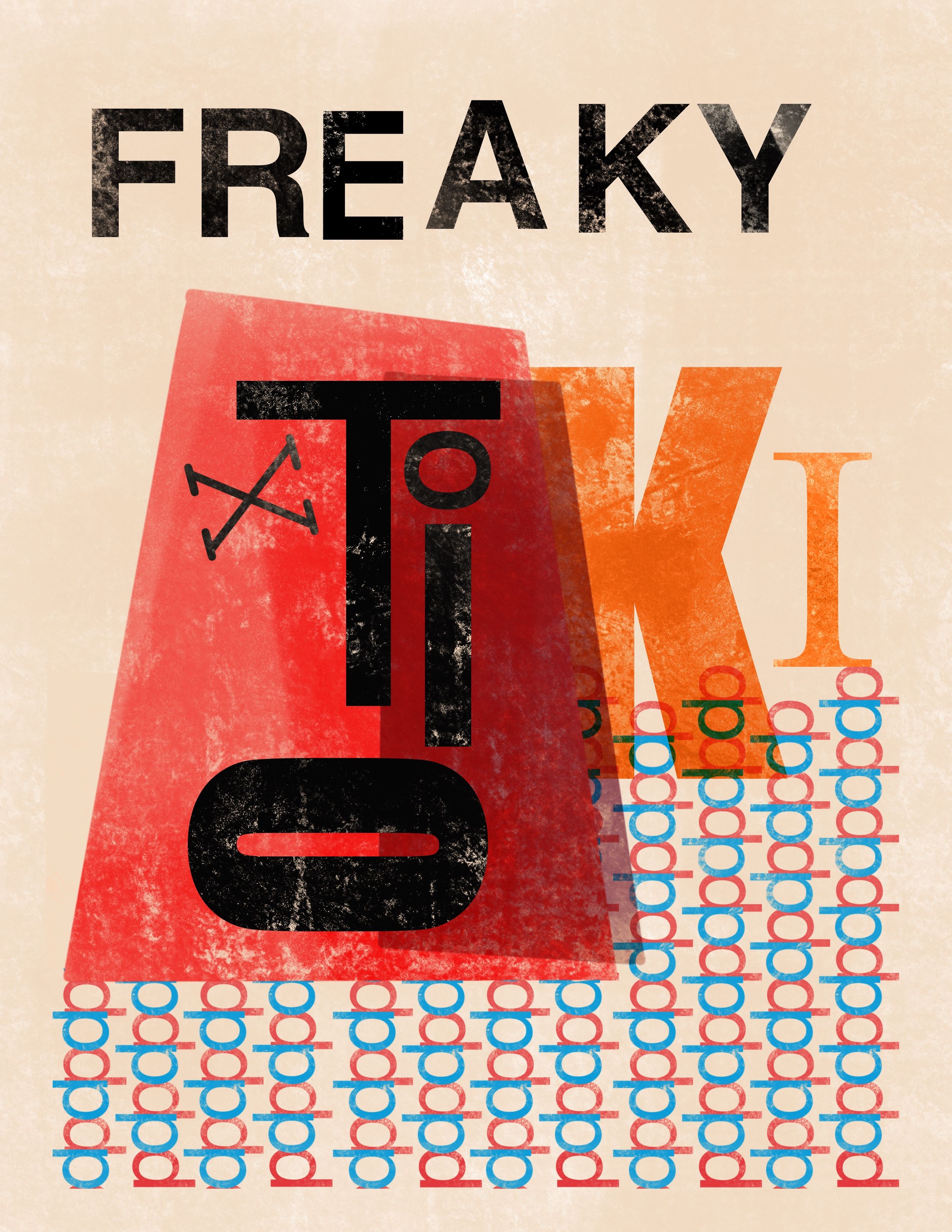
Hendrik Werkman rolled the ink directly on the paper using templates. He also used letters as shapes in his work. He has a very free playful way of working. I really liked how he used the red "p" and blue "d" repetitively as a decoration in the second image so I want to use that as well.
I used basic shapes as if they were cut out templates and used the Nikko Rull brush to recreate the lines of an ink roller. Letter are used as shapes as well. The letter "T" can function as a nose again and a capital "O" on its side as a mouth. The letters of "Freaky" are placed as if they were placed and inked separately with different spacing giving it a very handprinted feel.
Andy Warhol Style Poster
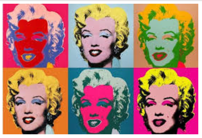
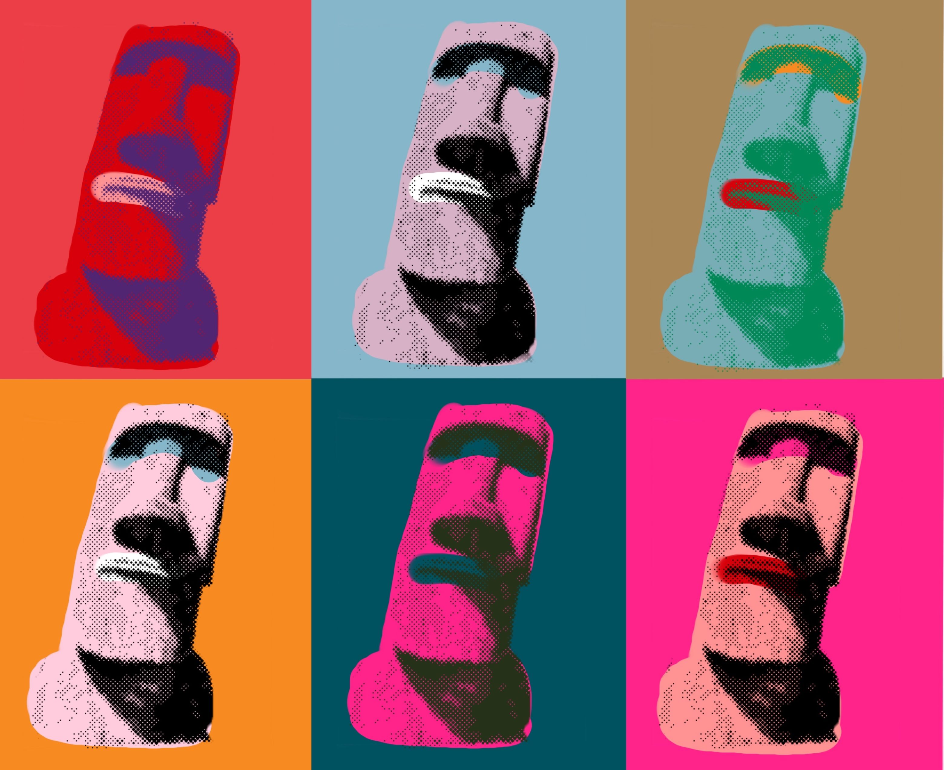
Andy Warhol used screen printing and bright colours and repetition. I used his Marilyn Monroe as an example for the colours. This poster will not have any text.
First I looked for an image of an easter island statue and used photoshop to make it grayscale and then halftone. I used a colour selection and only selected black to get a mask and the rest will be transparent. I divided my procreate canvas in six and put a different colour on each part. On a layer on top I inserted the statue image and duplicated that six times. On a layer below the statue image I drew the face colour and the eyes and lips.
I used an image of a statue but you could do the same with a photo of your own drawing.
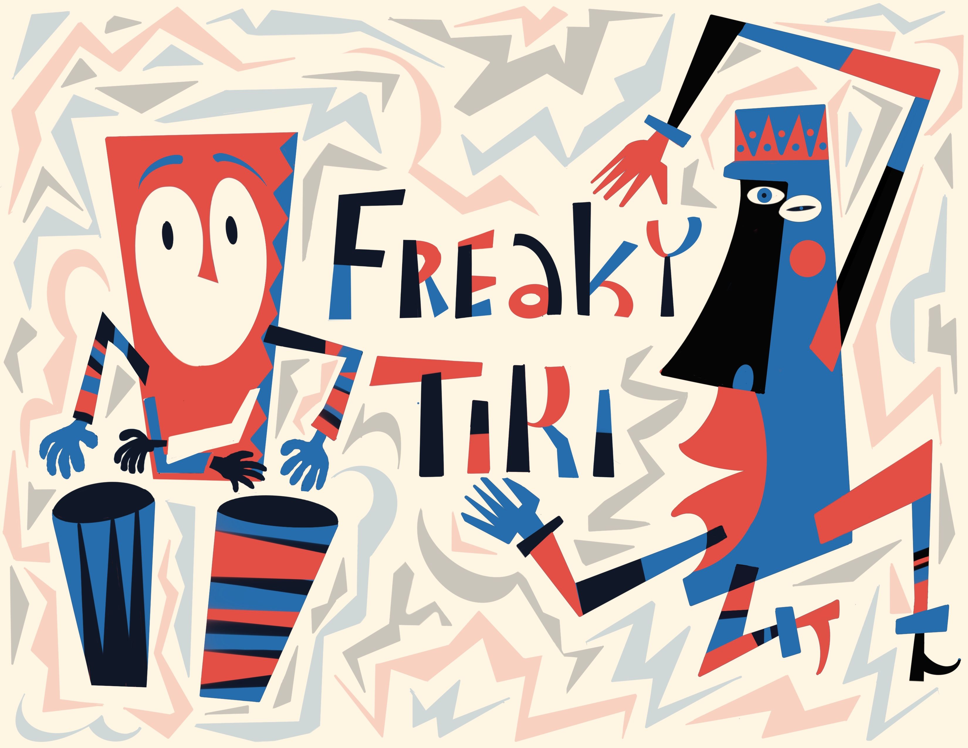
Jim Flora Poster
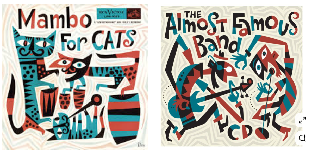
Another great illustrator from the 50s is Jim Flora. He seems to be able to draw music, especially jazz, with rhythmic blocks of colour.
For this poster I used the Mambo for Cats illustration of Jim Flora. Crooked lined arms and legs which are broken in several colour blocks. Around the figures are thin transparent shapes which give the whole drawing a dynamic feeling as if they are drumming and dancing.


1 comentariu
THANK YOU SO MUCH for such a lovely and interesting presentation! I feel that you have really understood the course and its purpose. It looks like you had a lot of fun and it´s very stylishly executed, all of them. Very very well done :)
@hello_ingela WOW thank you so much for your very kind words!!! I really loved the course and I really want to continue making posters in different styles. There is so much more to discover with this :)
Thank you for this fantastic and inspiratonal course and also for taking the time to respond.
Conectați-vă sau înscrieți-vă gratuit pentru a comenta