Introduction to Data Visualization

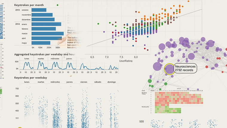
Introduction to Data Visualization
Un curs de Victor PascualSpecialist în vizualizarea datelor
Un curs de Victor Pascual, Specialist în vizualizarea datelor

Create interactive visualizations and learn to represent data from your favorite series
In this course by Víctor Pascual, discover what data visualization is, seeing how to distinguish between static and dynamic or interactive graphics.
Learn the basic rules to take into account when developing a visualization to help your critical analysis. As well as analyzing and communicating data, end up answering questions you hadn't even considered before!
Ce vei învăța în acest curs online?
1 lecție & 1 descărcare
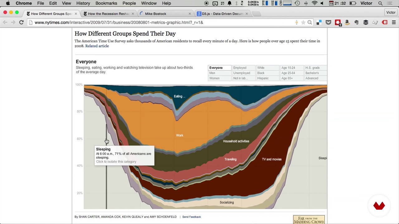
Influences
1 minut, 1 secundă
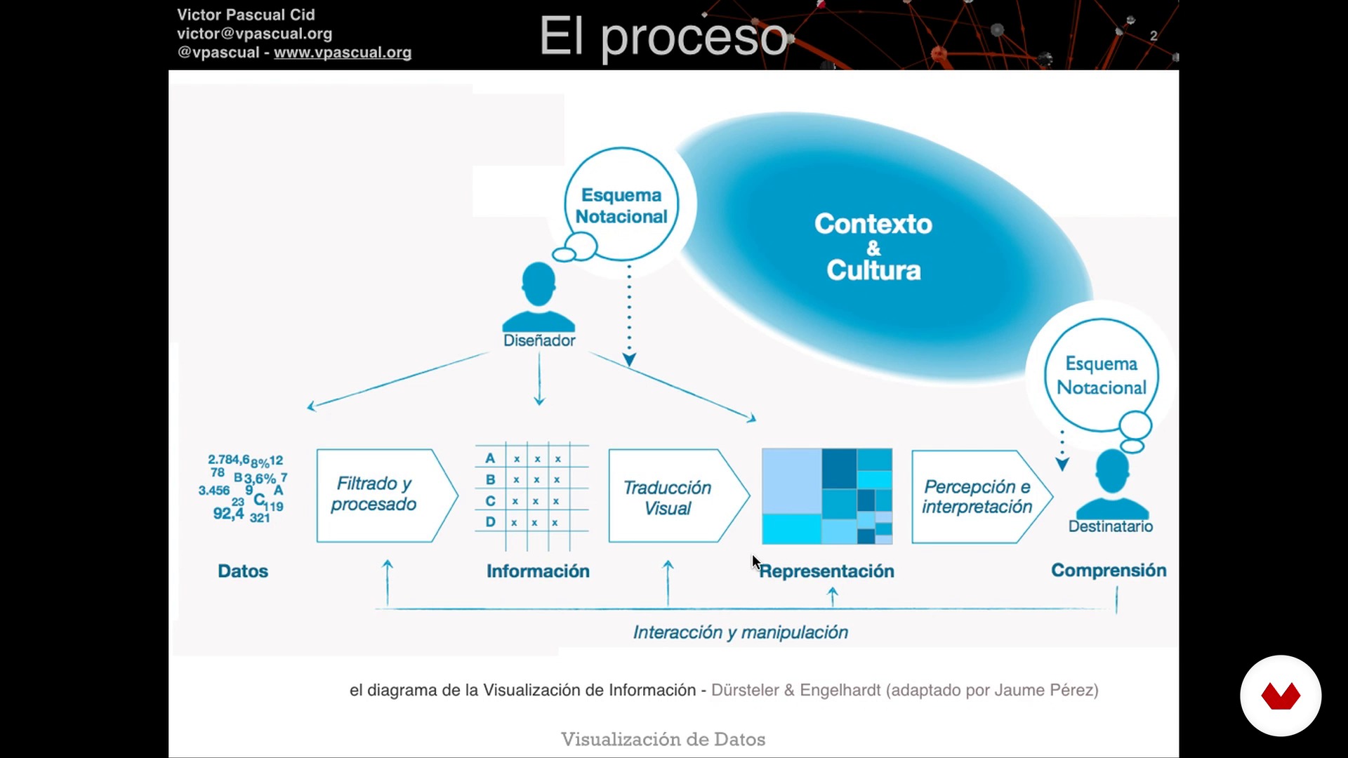
The process of data visualization
1 minut, 1 secundă
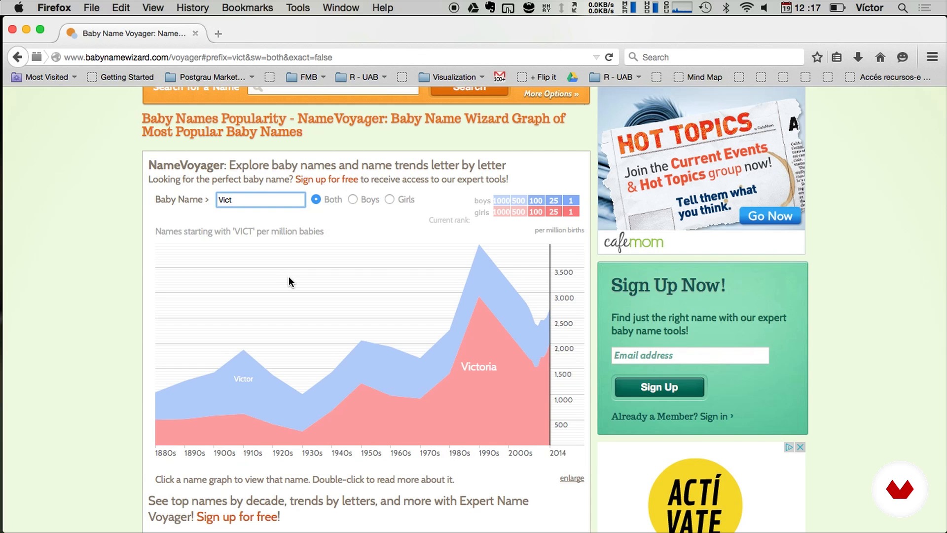
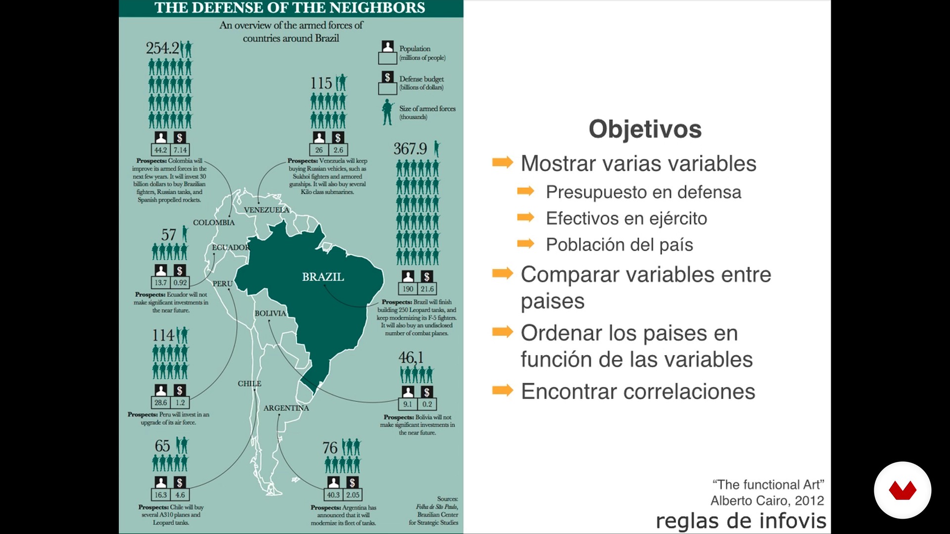
Objectives and examples
1 minut, 1 secundă
Basic rules
1 minut, 1 secundă

Explanation of the project
1 minut, 1 secundă
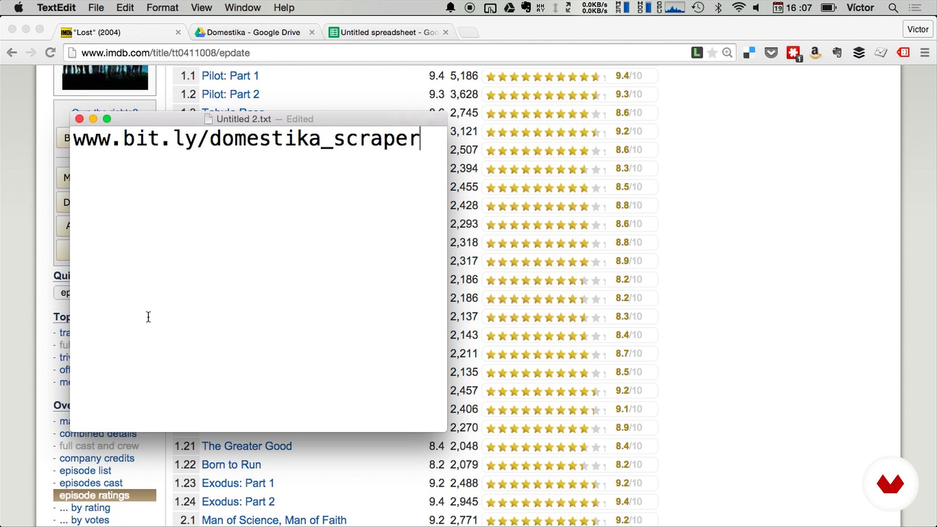
Introduction to data scraping
1 minut, 1 secundă
Ce include acest curs?
Start by getting to know Víctor Pascual and his work a little better, and discover exactly what data visualization consists of.
Next, learn to develop effective visualizations by familiarizing yourself with the process, the objectives, and the basic rules. All information is accompanied by practical examples to help you consolidate your knowledge more effectively.
Now it's time to carry out data collection and analysis! Learn data scraping, basic statistics, and what distribution is as well as what it's for. Víctor also shows you some useful tricks for Google Sheets (online spreadsheets similar to Excel) along with z-score calculations and forecasting models.
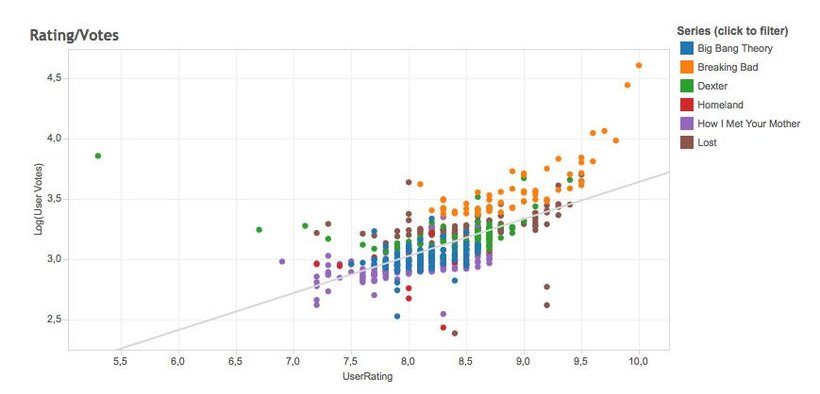
Round out the course by creating a data visualization using Tableau Public, a data analysis software that allows you to see patterns, identify trends, and explore visual information in seconds to envisage the data from your favorite series.
Software și instrumente recomandate pentru acest curs
Care este proiectul acestui curs?
Visualize your favorite series interactively by learning to "scrape" or collect data on www.imdb.com and process it all in a spreadsheet. As a final result, discover the stories hidden behind the data by uncovering details that reflect how viewers have experienced these series.
Proiecte ale studenților cursului


Pentru cine este acest curs online?
This course is completely transversal and can be taken by people with all kinds of backgrounds. It is of special interest to designers, journalists, analysts, and online marketing professionals who want to learn how to extract value from and represent data.
 professionals who want to learn how to represent and extract value from data.
Cerințe și materiale
No previous knowledge is required for this course.
In terms of materials, you need a computer with an internet connection and access to Google Sheets and the Tableau Public software.

Recenzii
- 5 luni în urmă
me encanto , buena explicación en cada unidad
- herbiapothecaryPLUS6 luni în urmă
The content was clear however the presentation needs to be available in English. The instructor spoke English but used visuals from another language. The resources need to be updated as some of the urls do not work. The fact that Domestika is using a bot to respond to questions indicates to me a disconnect between themselves and instructors. The instructor for this course has not updated course resources. Domestika uses content from original courses to create guided material. Pay twice same.
- geor_gin_aPLUS7 luni în urmă
¡Me encantó!, Víctor hace que parezca muy sencillo trabajar con datos. Estaría buenísimo explorar más sobre las posibilidades gráficas de Tableau, he encontrado visualizaciones muy interesantes con formas que parecen personalizadas y quiero aprender a hacer eso, ¿me pueden recomendar un curso para profundizar en la herramienta?
- 8 luni în urmă
Un curso claro que te lleva a traves del proceso, desde la toma de datos hasta la visualización. Muchos tips buenos
- 9 luni în urmă
Las explicaciones super claras y el curso es muy util.

Conţinut
- U 1
Data Visualization
- Víctor Pascual
- Introduction to Data Visualization
- Influences
- U 2
How to develop effective visualizations
- The process of data visualization
- Objectives and examples
- Basic rules
- U 3
Data collection and analysis
- Explanation of the project
- Introduction to data scraping
- Cleaning and data processing
- Preparing the data
- U 4
Display data with Tableau
- Introduction to Tableau Public
- View data from our series
- FP
Proiect final
- Introduction to data visualization
La ce să te aștepți de la un curs Domestika
Învață în ritmul tău propriu
Bucură-te de învățarea de acasă, fără un program fix și cu o metodă ușor de urmat. Tu îți stabilești propriul ritm.
Învață de la cei mai buni profesioniști
Învață metode și tehnici valoroase explicate de experți de top din sectorul creativ.
Întâlnește profesori experți
Fiecare expert predă ceea ce face cel mai bine, cu îndrumări clare, pasiune adevărată și perspicacitate profesională în fiecare lecție.
Certificate
PLUSDacă ești membru Plus, primești un certificat personalizat semnat de profesorul tău pentru fiecare curs. Distribuie-l în portofoliul tău, pe rețelele sociale sau oriunde dorești.
Obțineți locuri în primul rând
Videoclipuri de cea mai înaltă calitate, pentru a nu rata niciun detaliu. Cu acces nelimitat, le poți viziona de câte ori este nevoie pentru a-ți perfecționa tehnica.
Împărtășește cunoștințe și idei
Pune întrebări, solicită feedback sau oferă soluții. Împărtășește-ți experiența de învățare cu alți studenți din comunitate care sunt la fel de pasionați de creativitate ca și tine.
Conectează-te cu o comunitate creativă globală
Comunitatea găzduiește milioane de oameni din întreaga lume, curioși și pasionați de explorarea și exprimarea creativității lor.
Urmărește cursuri produse profesional
Domestika își gestionează lista de profesori și produce fiecare curs intern pentru a asigura o experiență de învățare online de înaltă calitate.
Întrebări frecvente
Data visualization is the process of representing information through charts and images to make it easier to interpret large datasets and quickly spot patterns, trends, or anomalies.
The course is designed for people with intermediate skills in data handling and digital tools, covering everything from theoretical basics to advanced visualization techniques.
You’ll need access to Google Sheets or Excel, Tableau Public, and some basic knowledge of R and D3 if you want to explore advanced options. Prior experience with all these tools isn’t required.
You’ll learn how to analyze, clean, and prepare data, apply perceptual and theoretical principles in visualizations, create both interactive and static visuals, and choose the right chart type for your context and audience.
Scrollytelling is a storytelling technique that combines web scrolling with sequential visualizations, guiding users interactively through the story the data tells.
The course teaches you how to import, clean, and analyze data in Google Sheets and Tableau Public, and how to use their features to build interactive charts, maps, and custom dashboards.
Yes, the course covers basic web scraping techniques to gather data online, as well as methods to clean and organize that data in spreadsheets before visualizing it.