


Packaging Qualität
di Alacuerno @alacuerno
- 245
- 22
- 0
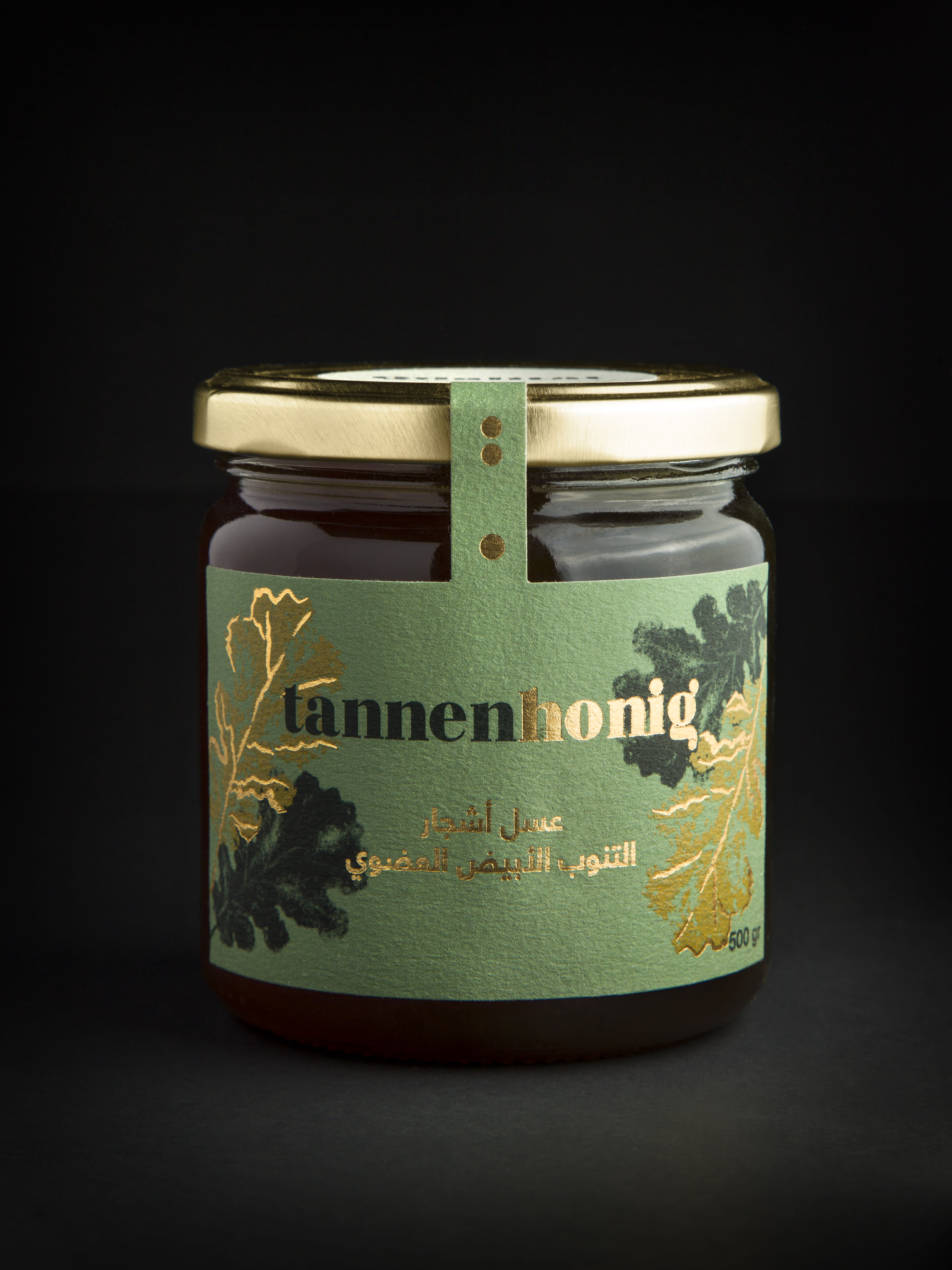
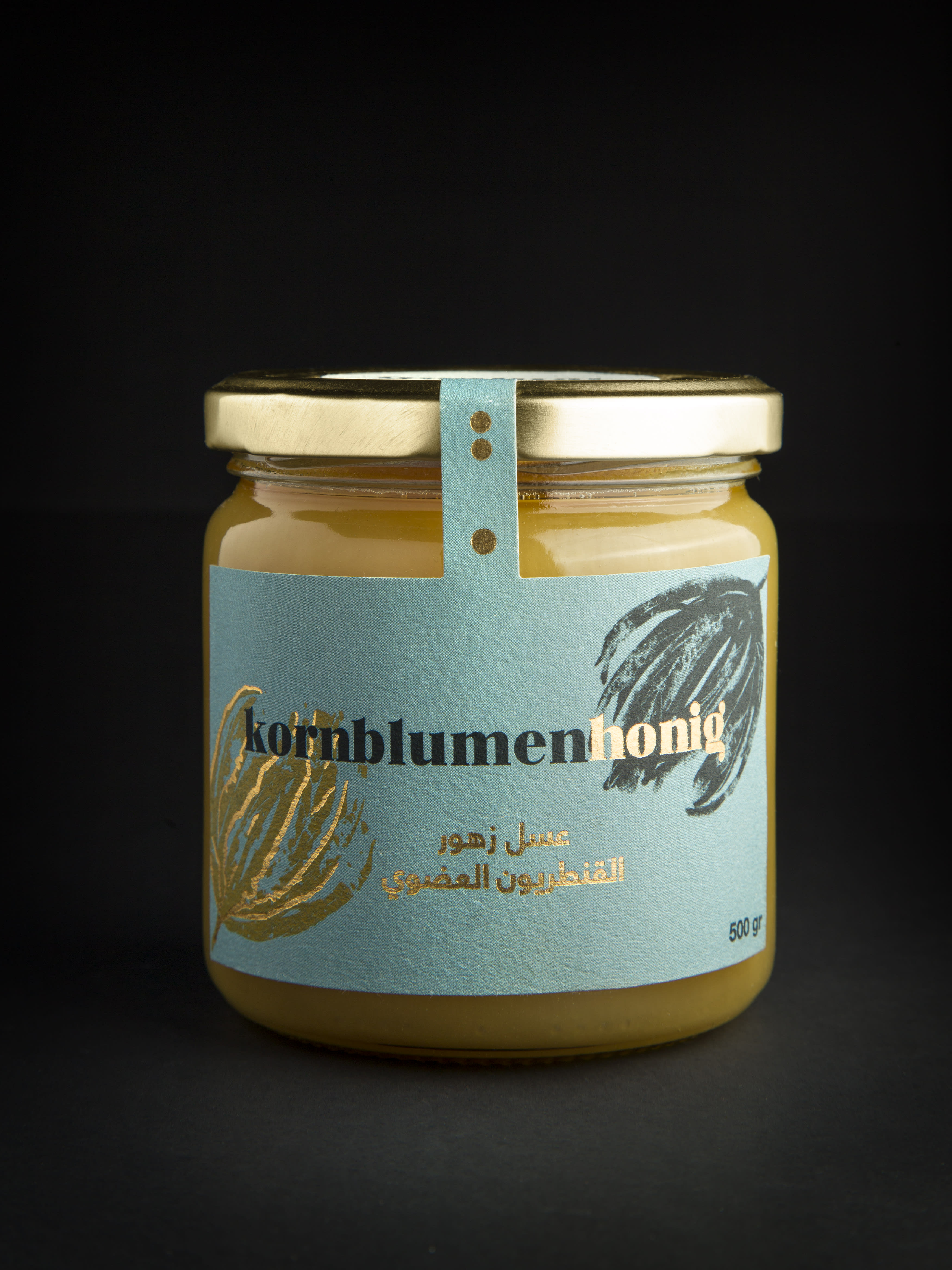
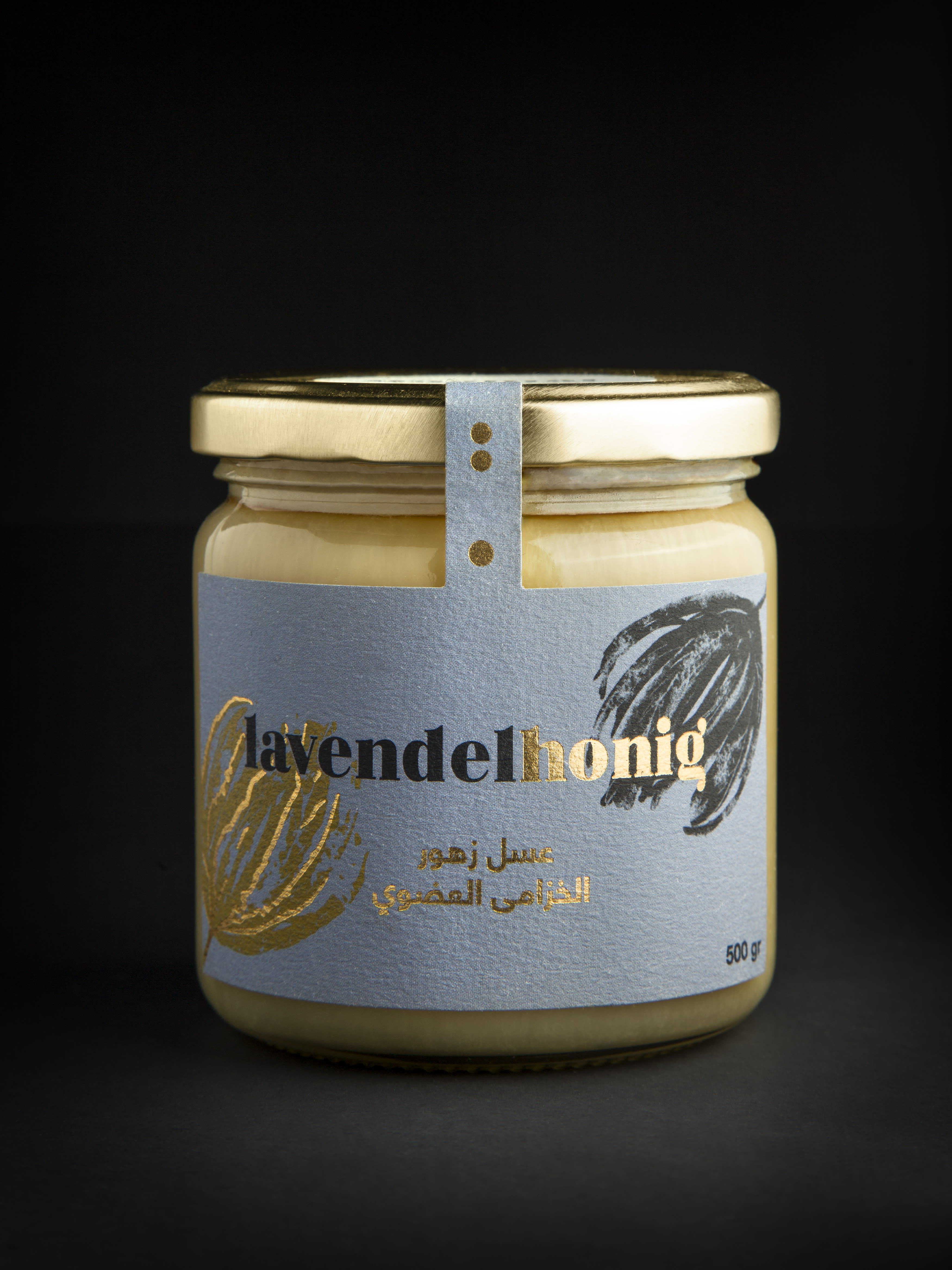
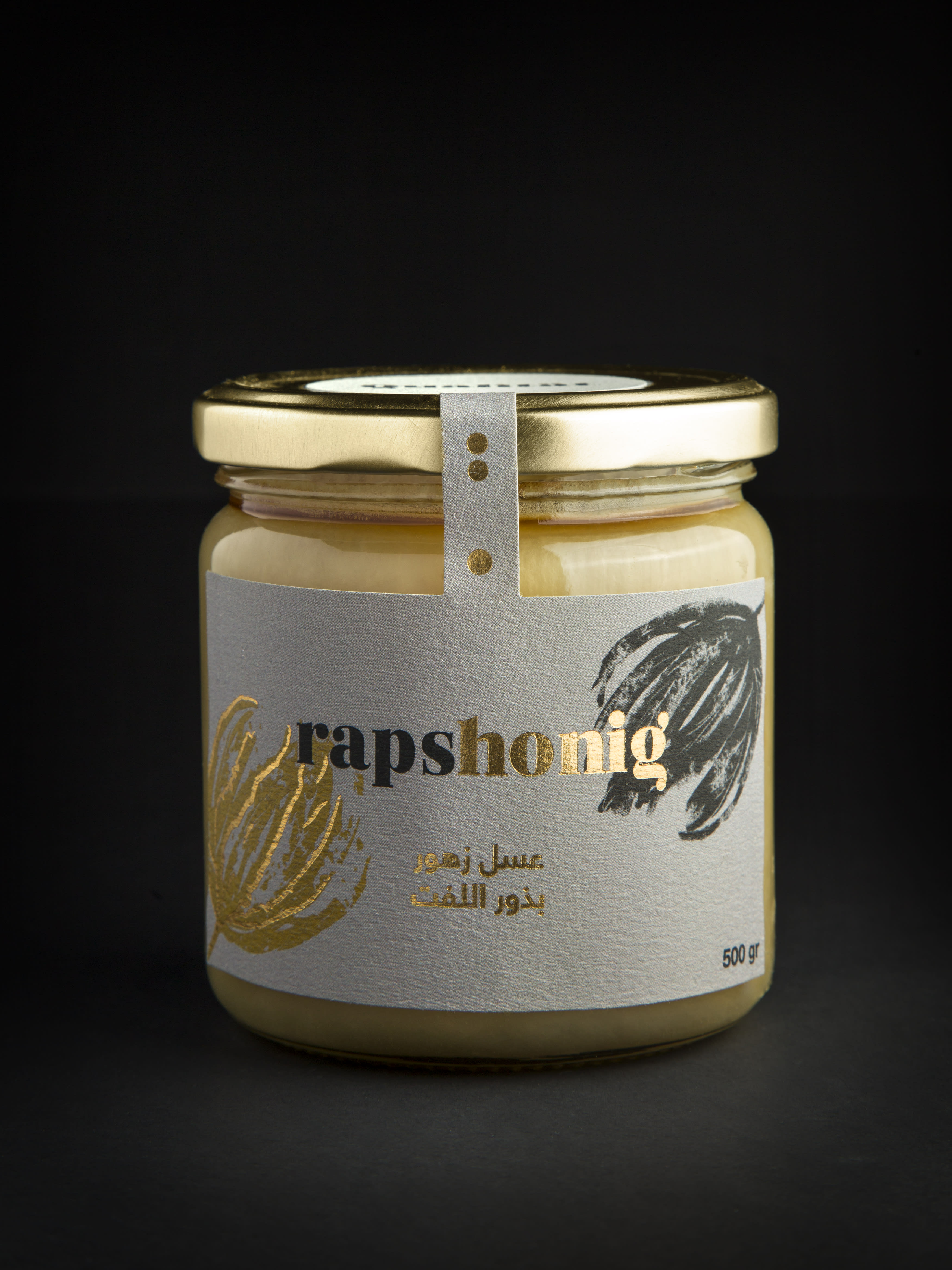
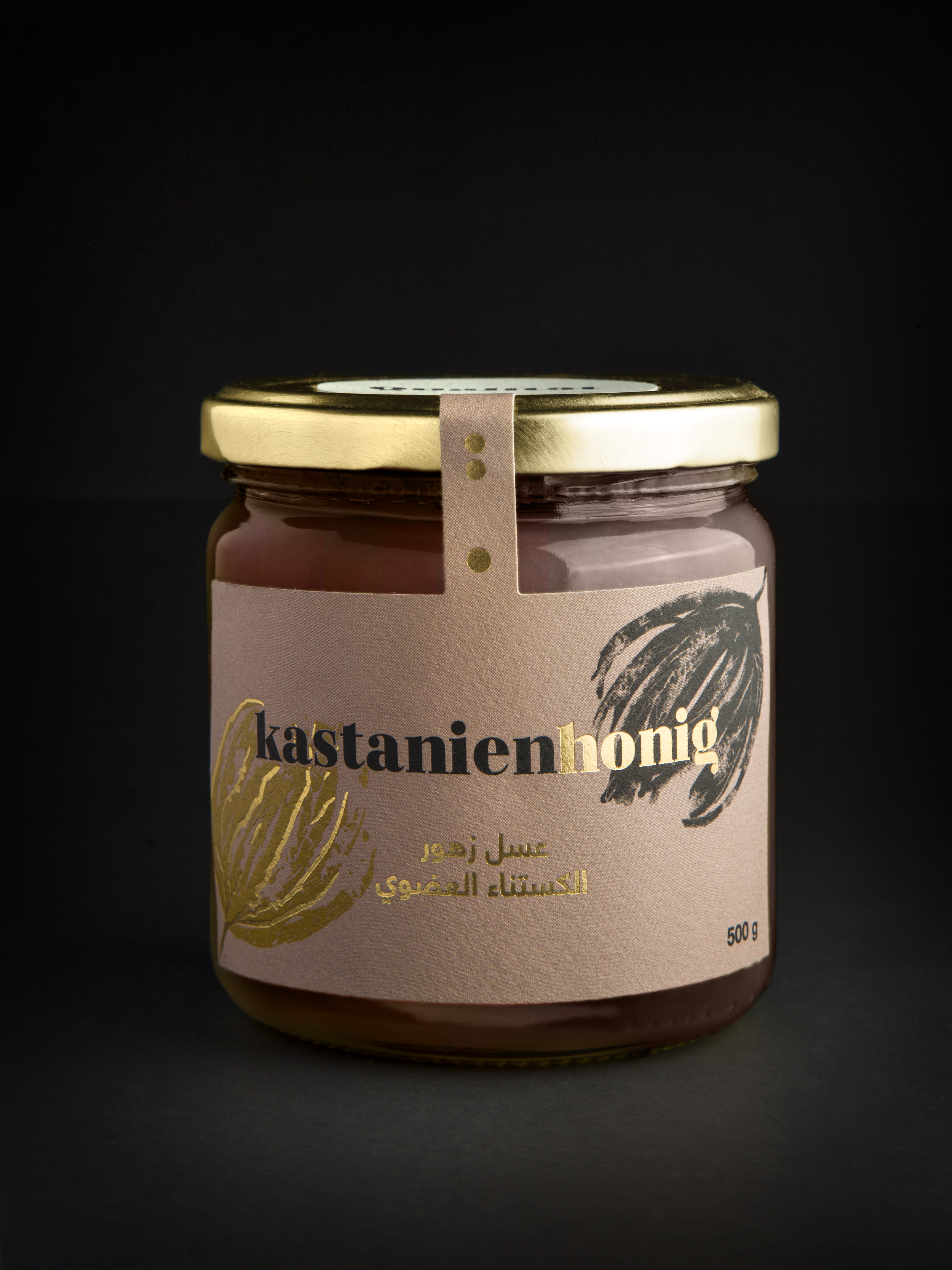
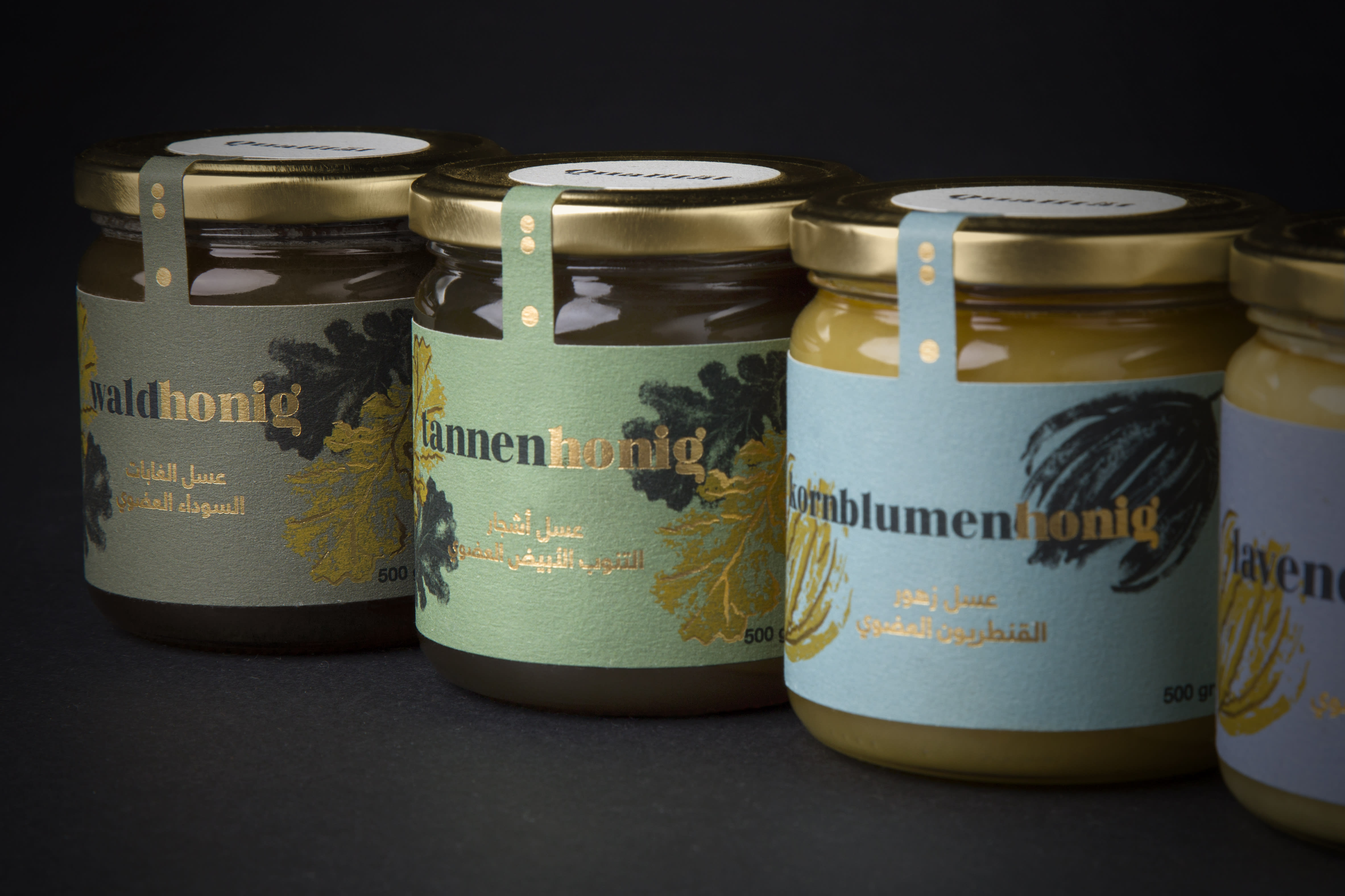
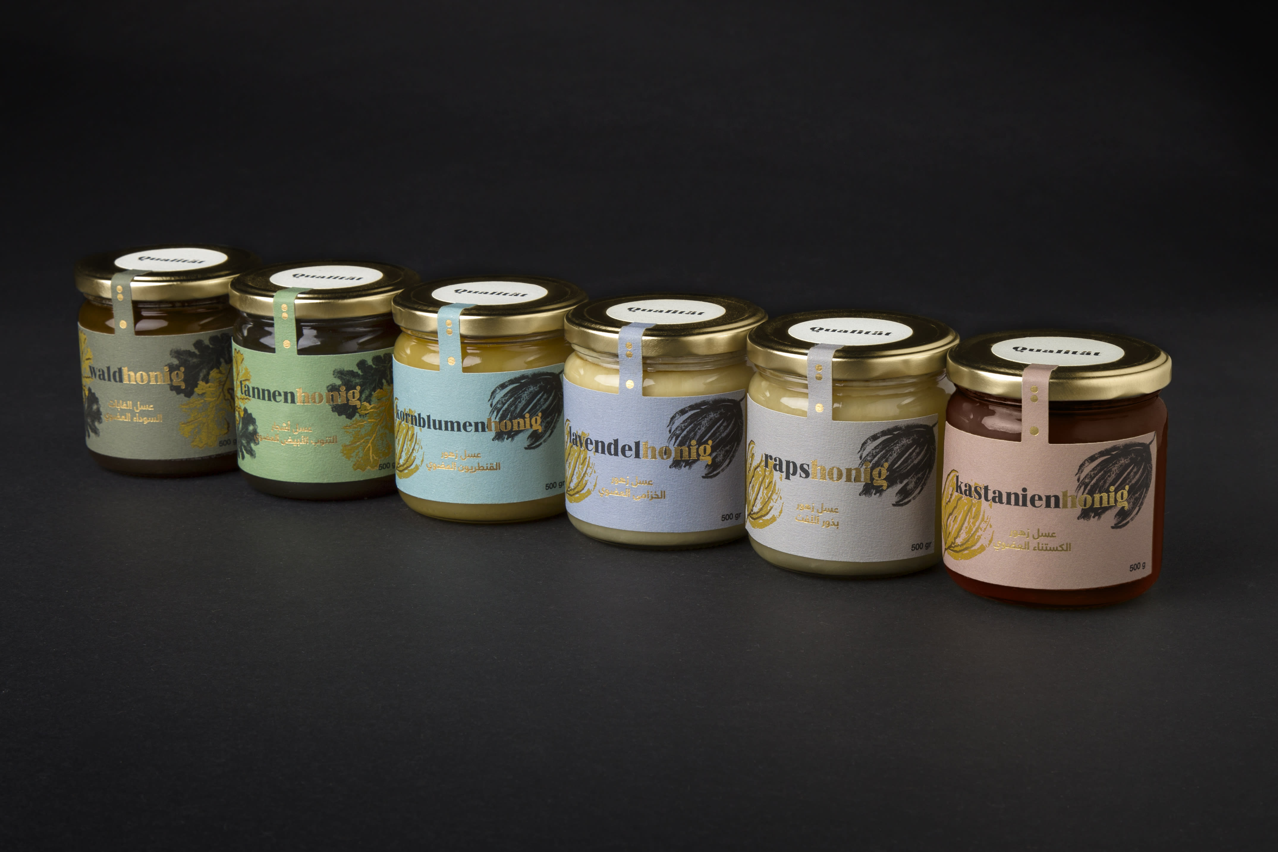
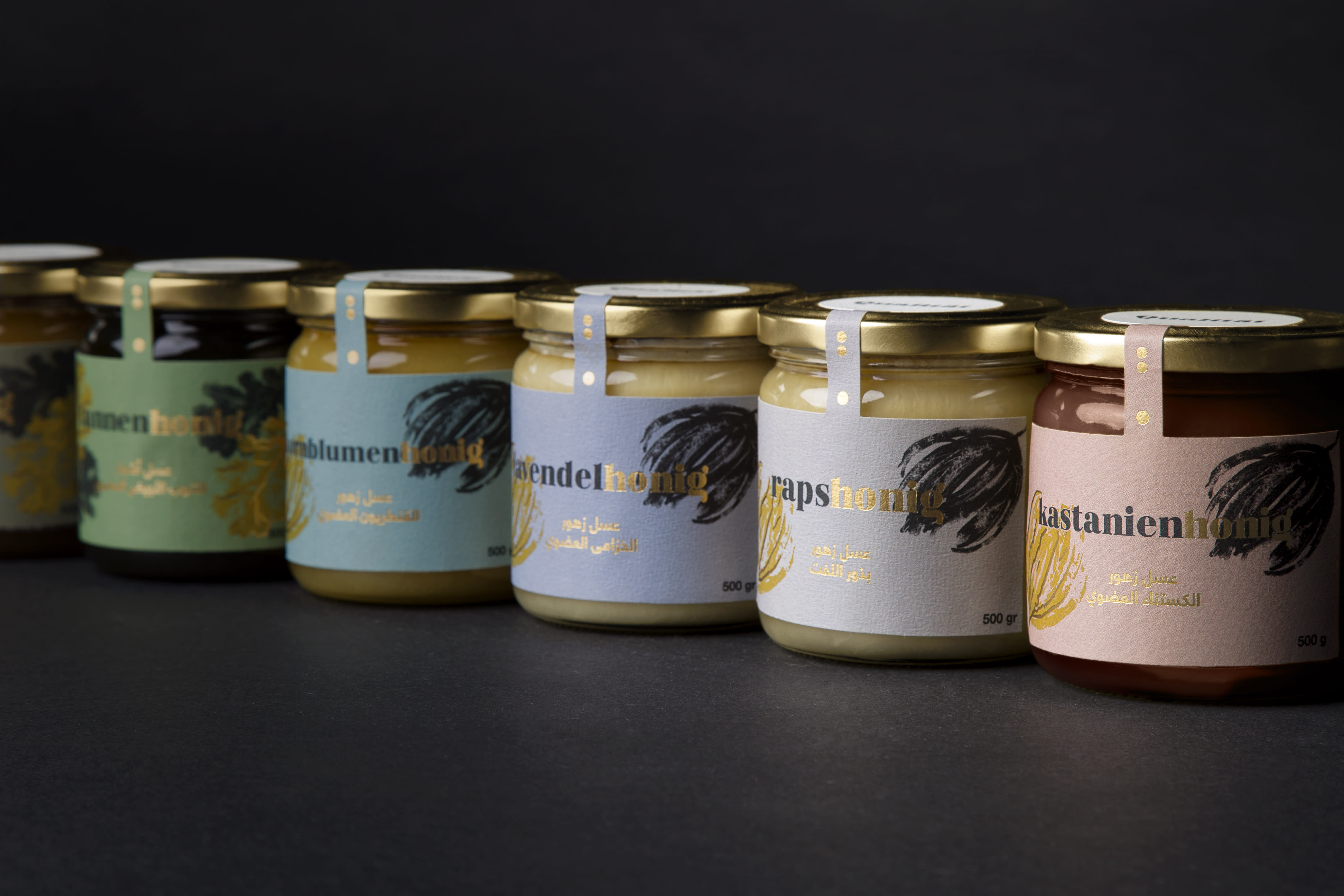
Diseñar el packaging de Qualität supone el reto de entremezclar culturas visuales tan diferentes como la europea y árabe. Qualität ofrece una selección de mieles orgánicas alemanas, comercializadas en Arabia Saudita.
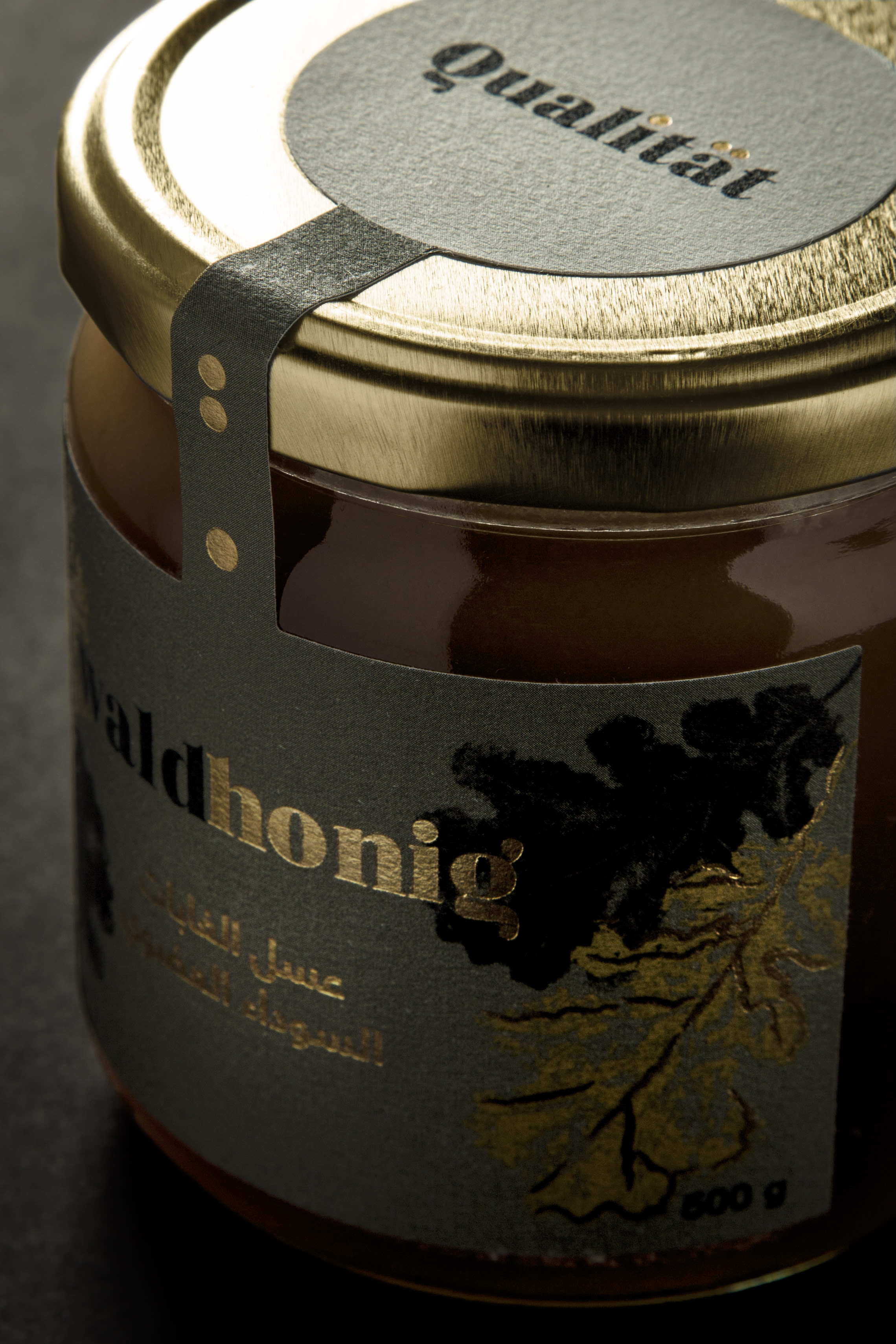
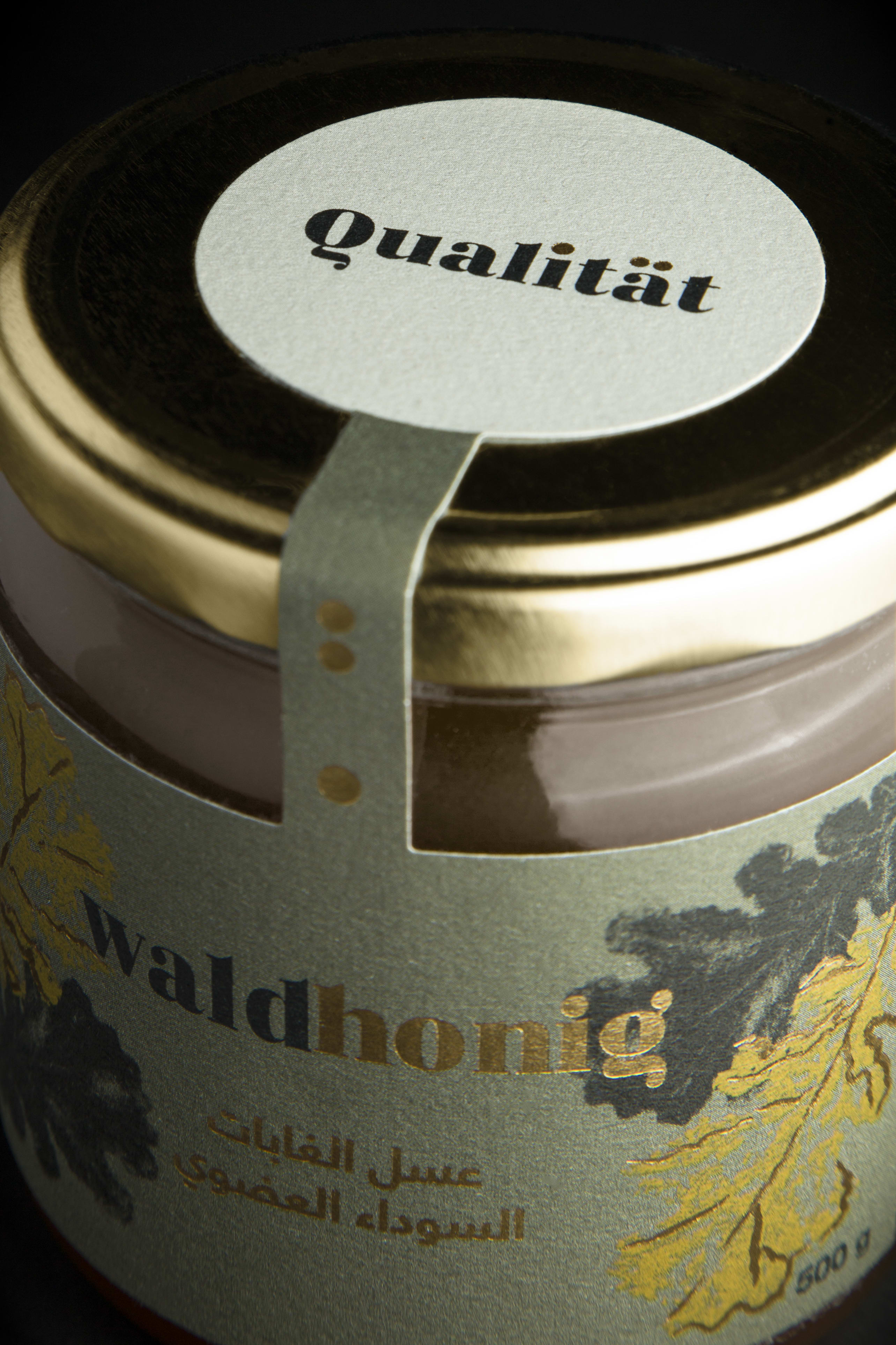
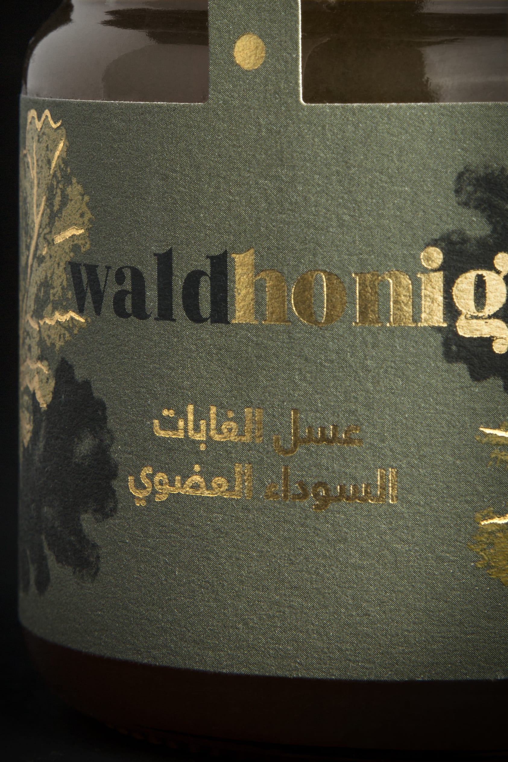
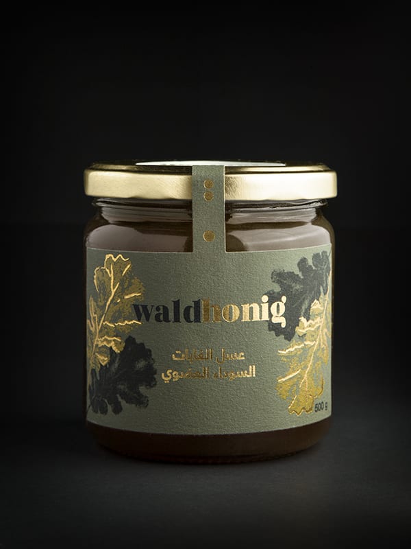
El nombre en alemán de la miel se divide en dos colores (negro y dorado) que pisan las ilustraciones de una hoja o un pétalo, haciendo un guiño a la procedencia de la miel (flor o bosque). La tipografía árabe acompaña el nombre en alemán. Una de las características del logo es su sencillez, que aporta elegancia a la marca, dejando que la tipografía hable por sí misma.
Los soportes y los acabados tienen una gran importancia en el etiquetado de su packaging. Usamos soportes con acabados naturales y aplicamos gamas de color desaturadas y elegantes para resaltar los dorados.
-
Designing the Qüalitat brand and packaging involves mixing visual cultures as different as European and Arab. One of the main problems that we had to solve as designers, was that the jar couldn't be modified so we were forced to work with a standard glass jar. For this reason, all visual communication responsibility depended on the label design.
The typography mixes wide and thin lines, reminding us of the organic movement of the honey. In the jars the typography divides into two colors (black and gold) wich represents the color of bees. The Arabic text shows a more minimalist typeface, to balance the visual design and give it a fresh touch. The dots present in the letters of the brand's logo, become the last drops of a stream of honey wich seals the front of the jars, being the minimal expression of the brand.
The gold evokes honey. The illustration of the oak leaf and the deep green color take us to the forest wich we print on a porous paper with a natural finish to the touch and sight. The forest in a glass jar.


0 commenti
Accedi o iscriviti gratuitamente per commentare