Poster Series: Music visualisation with simple images
par Rina Filonenko @katharina_fil
- 111
- 4
- 0
Firstly, thank you for this amazing and structured course! I think it is one of my favorites courses on Domestika!
My name is Rina, I'm a self-taught illustrator, who creates (a bit) conceptual illustrations based on my favorite songs. I like to visualize my emotions and feelings by listening to songs. Sometimes my images coincide with what was in the music video, but sometimes I show my vision of the world in my head.
I wanted to take this course because I'm looking for new ideas and trying to figure out how to convey the most meaning with a minimum number of elements.
That's why I'm here!
My favorite singer I take inspiration from is Russian singer, Sergey Lazarev. He represented his country twice at the Eurovision Song Contest and is very popular in Russia. He is known in other Russian-speaking countries (I'm from Ukraine, and I know him too).
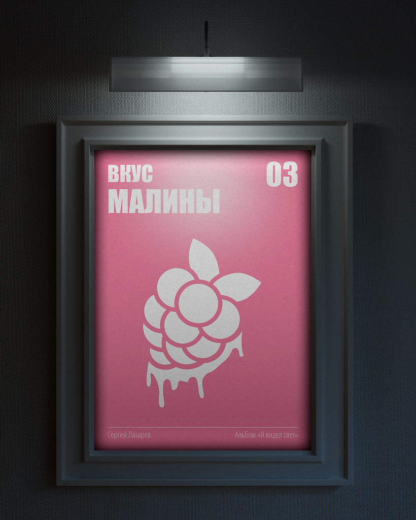
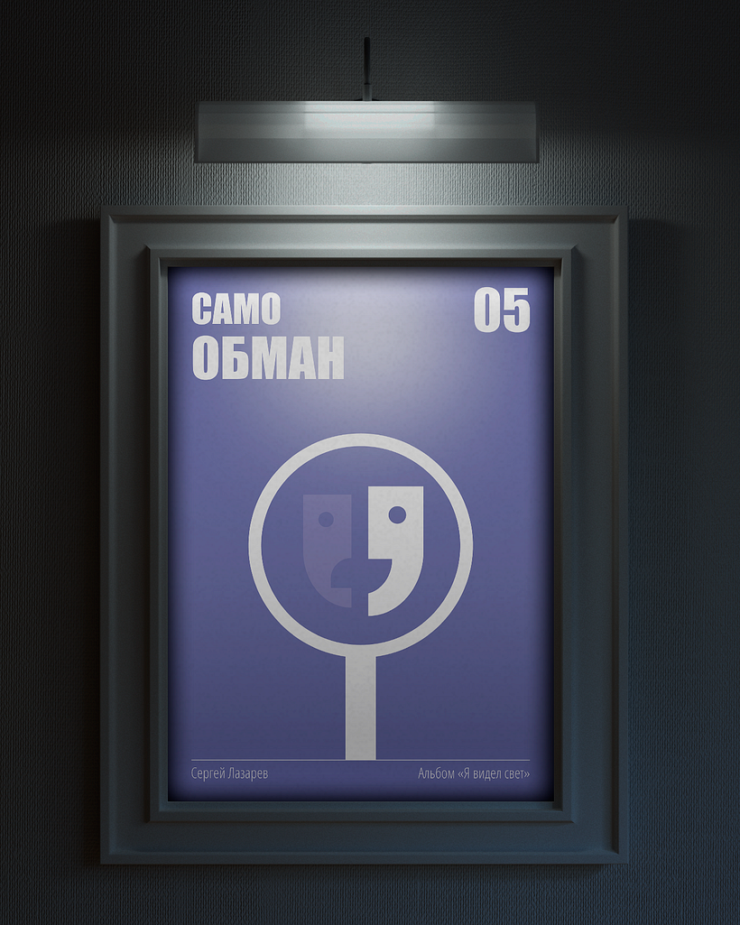
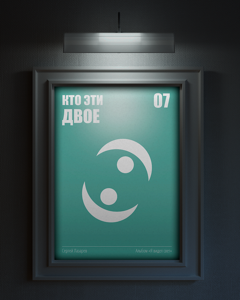
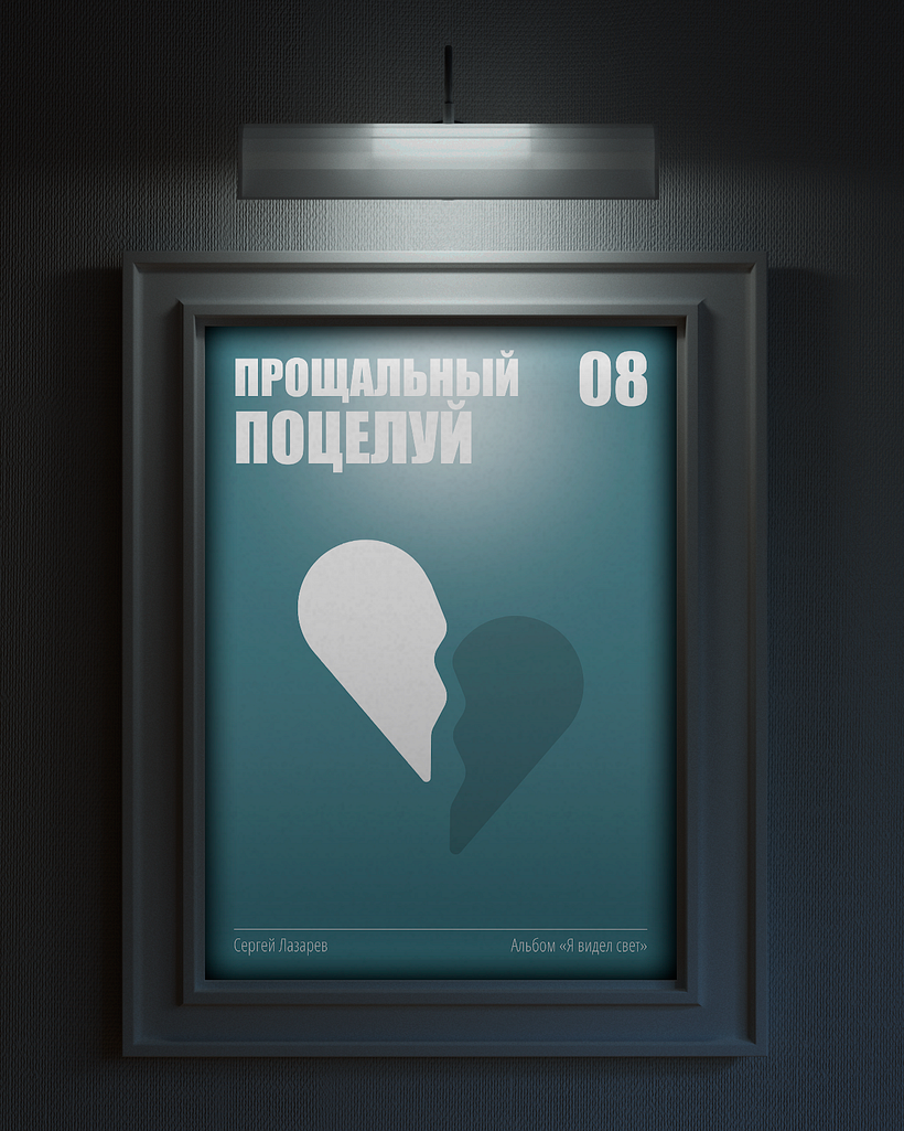
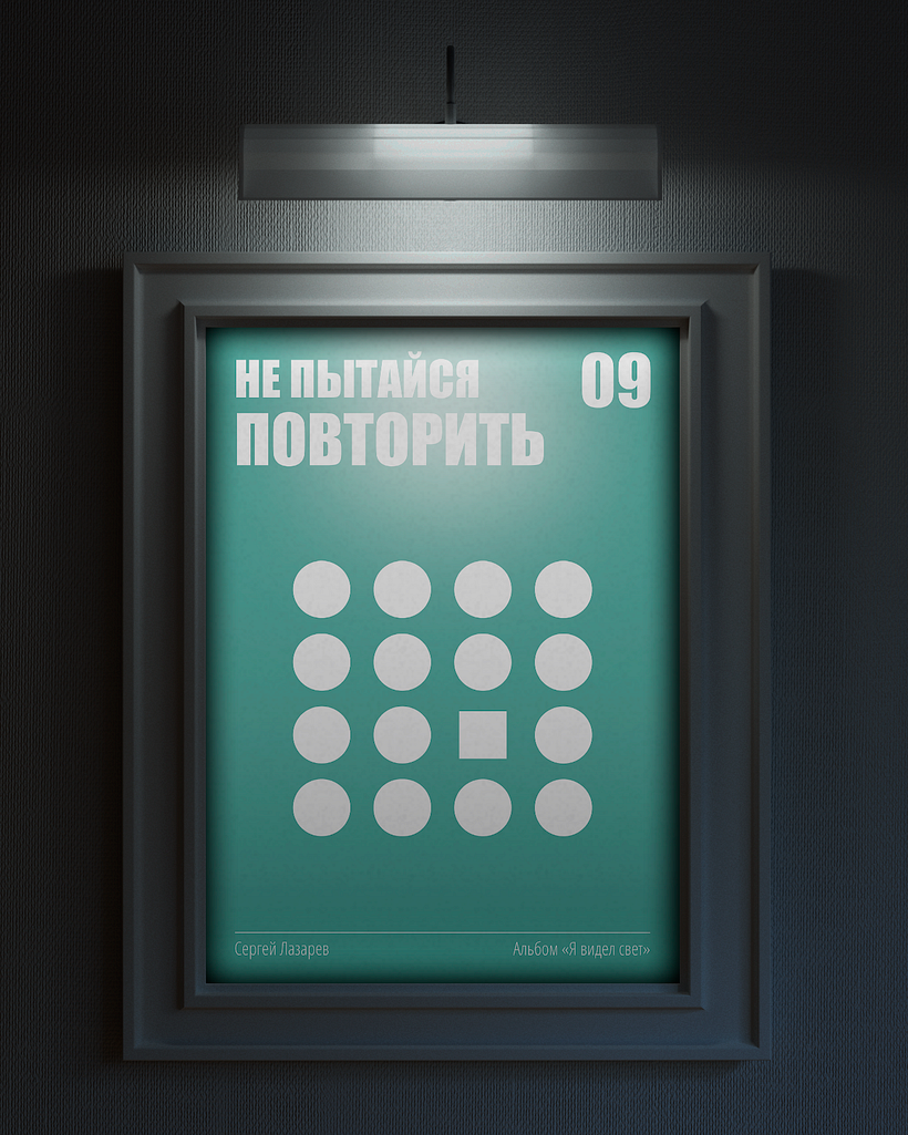
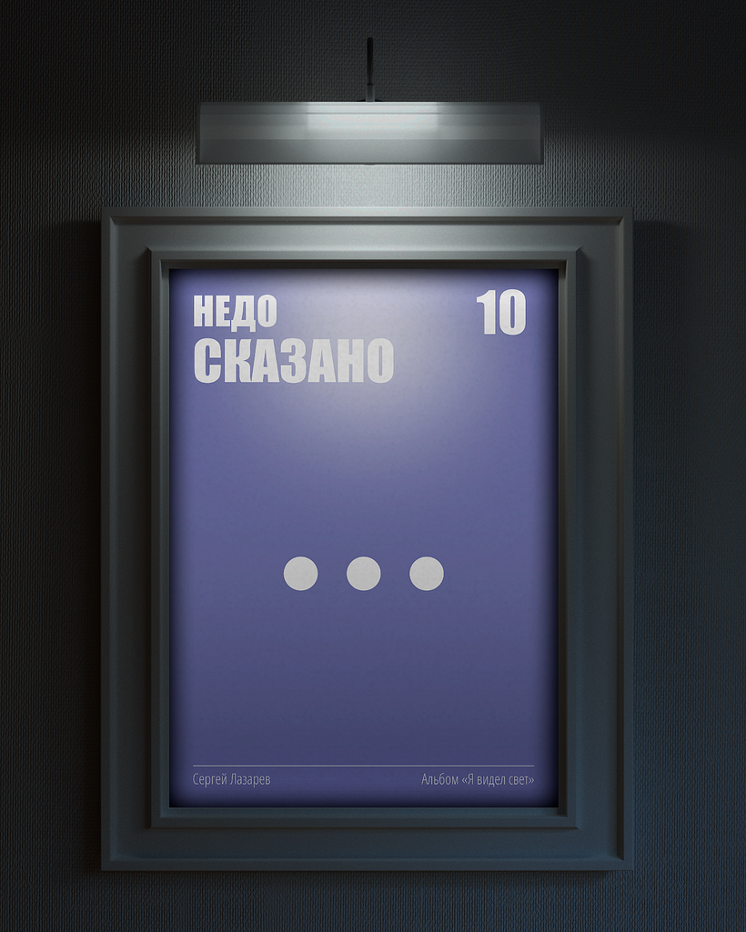
To create a project for this course, I chose songs from his latest album "I saw the light" ("Я видел свет" in Russian). It has 10 songs, and I wanted to create 10 different posters with one concept.
Creating posters based on songs is difficult because, on the one hand, you have to show the meaning of the title of the song and, on the other hand, the meaning of the song itself. What adds to the complexity is that these songs are in Russian, and not everyone knows Russian. I wanted to show the meaning of songs for those who don't understand the language.
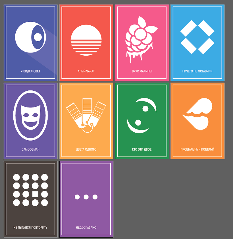
The album "I saw the light" includes 10 songs:
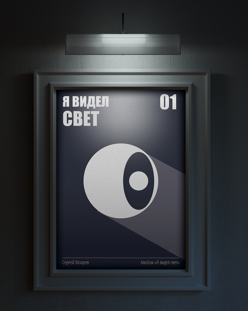
1. "I saw the light" ("Я видел свет")
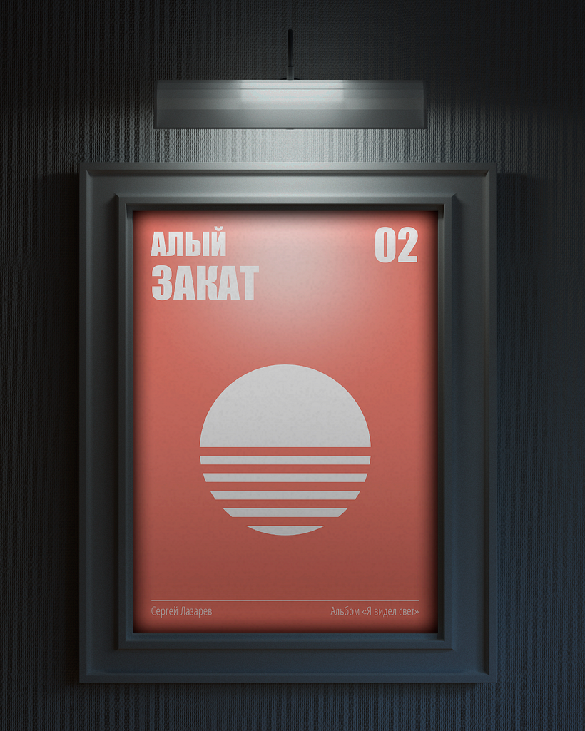
2. "Scarlet sunset" ("Алый закат")
3. "Raspberry flavor" ("Вкус малины")
4. "We left nothing" ("Мы ничего не оставили")
5. "Self-deception" ("Самообман")
6. "We were the same color" ("Цвета одного")
7. "Who are these two?" ("Кто эти двое?")
8. "Farewell kiss" ("Прощальный поцелуй")
9. "Don't try to repeat it" ("Не пытайся повторить")
10. "Unsaid" ("Недосказано")
First of all, I needed to understand the easiest way to show the titles of the songs. Some songs are too obvious. Some songs on the contrary are very incomprehensible. In order for people to understand the meaning of some songs, I had to leave complex images on the posters.
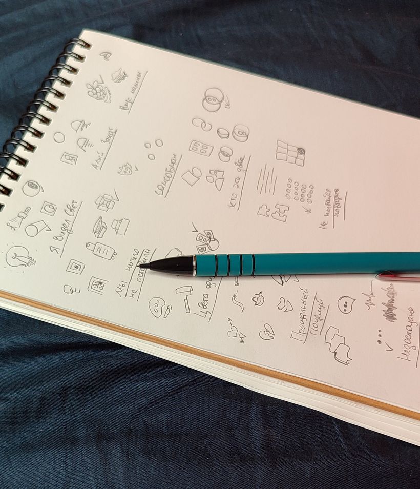
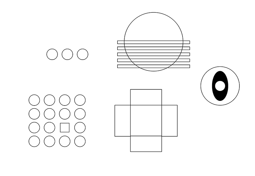
After I found the images, I started creating shapes in Adobe Illustrator. Some songs I created the right way, but some I had to think about for a very long time.
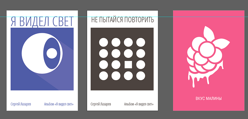
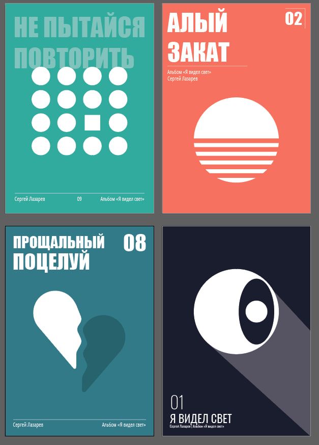
I immediately created posters on A4 format and signed each artboard with the name of the songs. I also chose a color for each song. I associate these colors with these songs.
I liked the idea of writing the song titles in a transparent color and in the background of posters. I think it adds a little brutality and modernity. I worked a little with colors and finaly created the posters.
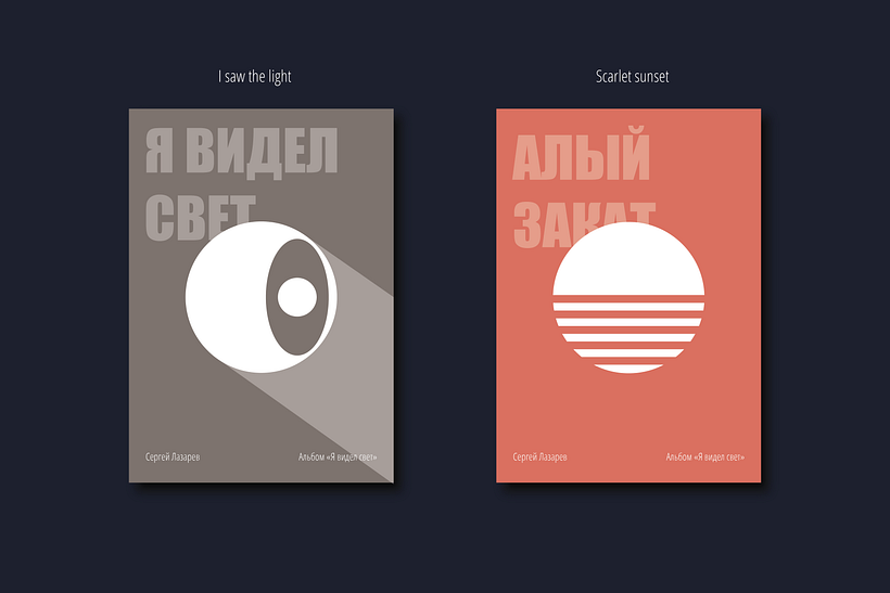
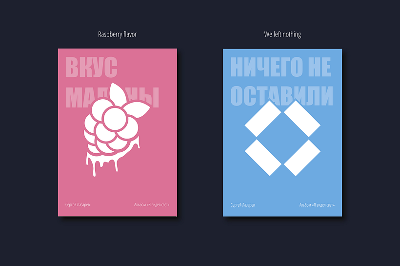
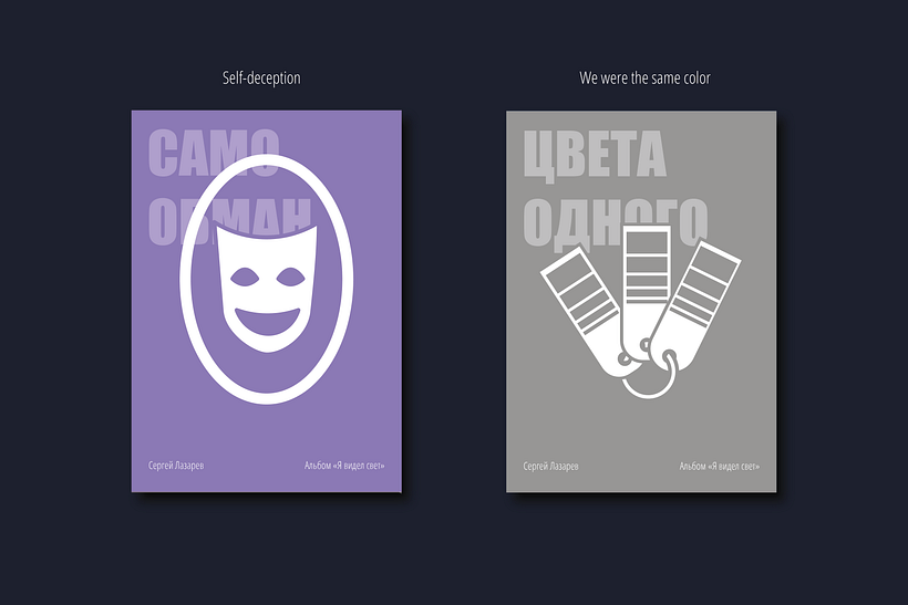
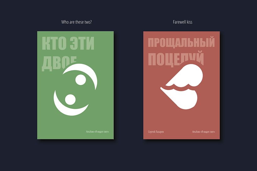
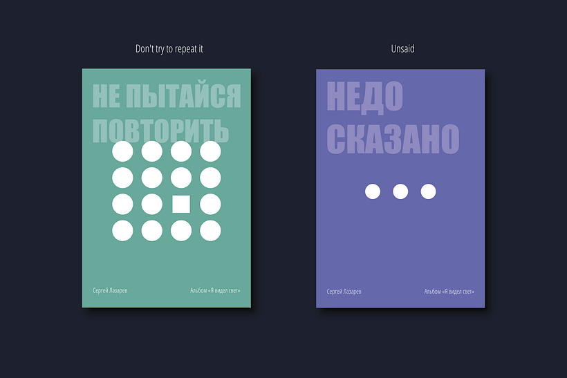
The most difficult thing for me was typography. Russian is much more difficult to handle than English. Firstly, the words are longer, and the inscription doesn't always look beautiful and harmonious and can't generally fit into the desired area. Secondly, there are letters that stand out from the general inscription (ex. "Й" with a symbol at the top).
I like the option with a white background and a square to match the color of the song. But I don't like that the inscriptions look different. I also don't like restrictions. I like freedom. So I wanted to create posters that have no boundaries.



0 commentaire
Connectez-vous ou inscrivez-vous gratuitement pour commenter