Where is the FOX?
Where is the FOX?
par Matthias und Anastasios @matthias_and_anastasios
- 177
- 0
- 0

The FUCHSJAGD brewery combines in its two pubs in the Düsseldorf districts of Eller and Gerresheim classic brewhouse atmosphere and modern gastronomic experience - with traditional home cooking, open kitchen and a contemporary, modern architectural concept.
BETTY + BETTY, together with the family-run business, is developing a clear identity that is reflected in both the interior and the design, and whose story is told through all communication tools.

BRANDING—LOGO
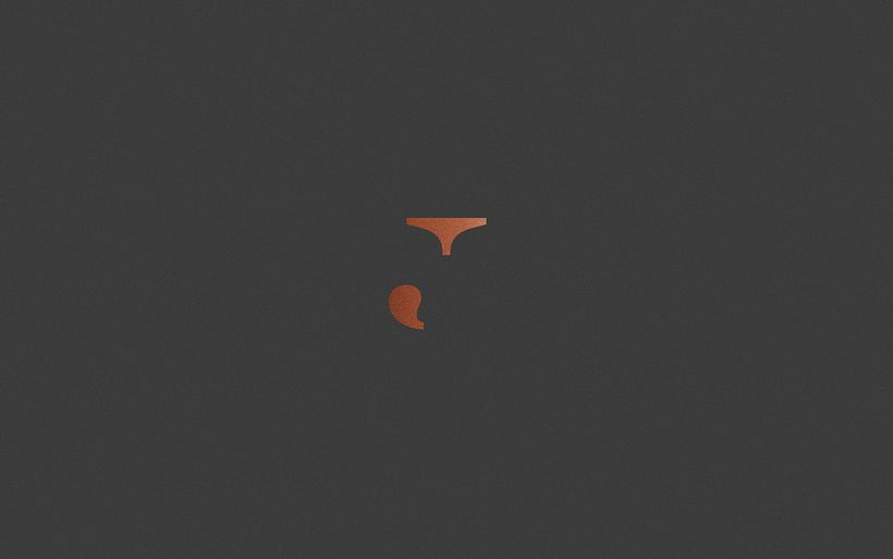
In the new Fuchsjagd logo, tradition and modernity merge by combining fonts with and without serifs. The "J" in serif forms the core in the centre as a symbol of the brewhouse tradition and is framed by modern sans-serif type. In addition, it is deconstructed in such a way that it simultaneously shows the distinctive features of the fox in the shape of its head and tail and leads directly to the history of the fox hunt.

BRAND DESIGN—STATIONERY
The signet as a central element is used on every communication medium. After all, it is all about hunting the fox, searching and finding it. That is why you never see him completely and never in the same place. The signet is sometimes in the middle, sometimes left or right.


BRAND IMPLEMENTATION—GASTRO ARTICLES
The new corporate design of the brewhouse was implemented across the board, starting with beer mats and napkins, matches, bags and lunch menus and ending with corporate clothing. The clothing concept is designed in such a way that waiters, head waiters as well as kitchen assistants, cooks and chefs can be clearly distinguished from each other, thus creating a differentiated yet homogenous image of all Fuchsjagd employees.


BRAND COMMUNICATION—MENU
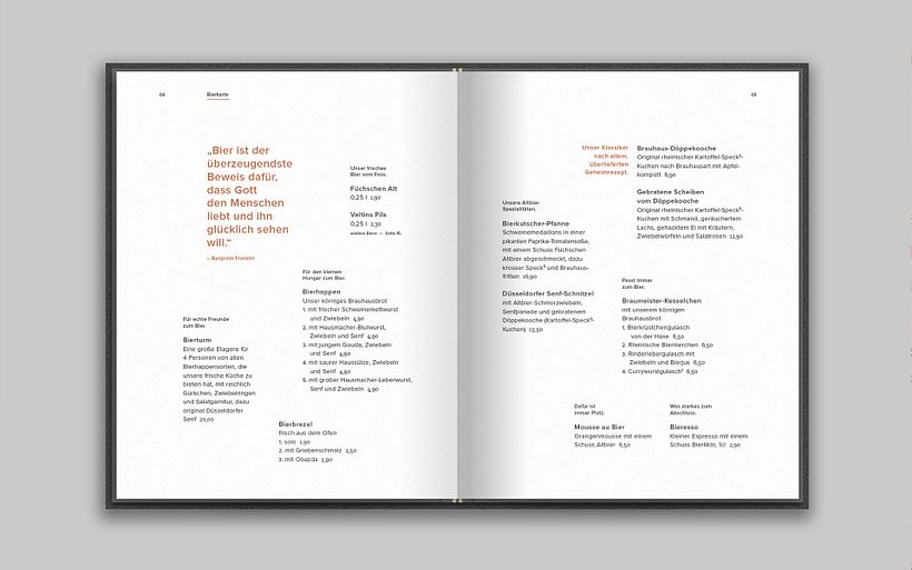
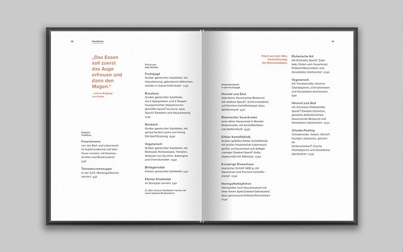
The menu is the central communication tool of a restaurant business and should, in contrast to a simple price catalogue of the dishes offered, reflect the philosophy of the business and its performance. Analogous to the concept of hunting, the guest goes on a search while reading the menu. He is accompanied by small hints on his hunt and can discover old and new delicacies. Two integrated rubber bands ensure that the menu remains flexible in its handling, can be changed at short notice, special actions and events can be announced and there is the possibility to integrate the weekly changing lunch menu into the menu.


AWARDS
ART DIRECTORS CLUB GERMANY
—SPECIAL MENTION, LOGODESIGN
GERMAN DESIGN AWARD
—SPECIAL MENTION, CORPORATE IDENTITY
GERMAN BRAND AWARD
—NOMINEE, CORPORATE IDENTITY
BEHANCE
—APPRECIATION, BRANDING
PRESS
DESIGN MADE IN GERMANY
MINIMAL STUFF MAGAZINE


0 commentaire
Connectez-vous ou inscrivez-vous gratuitement pour commenter