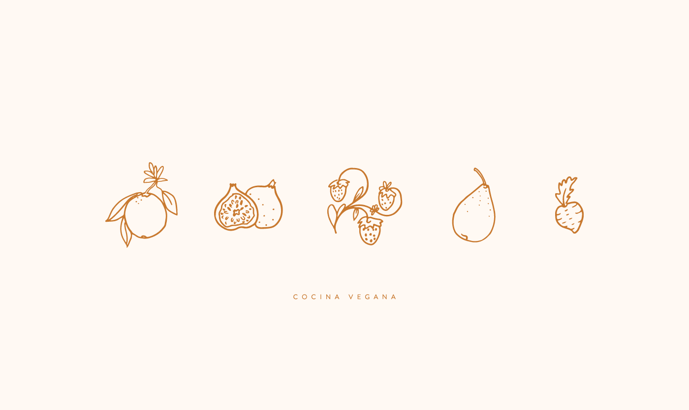
I love your project! very successful everything: typography, color, secondary illustration elements, and applications.
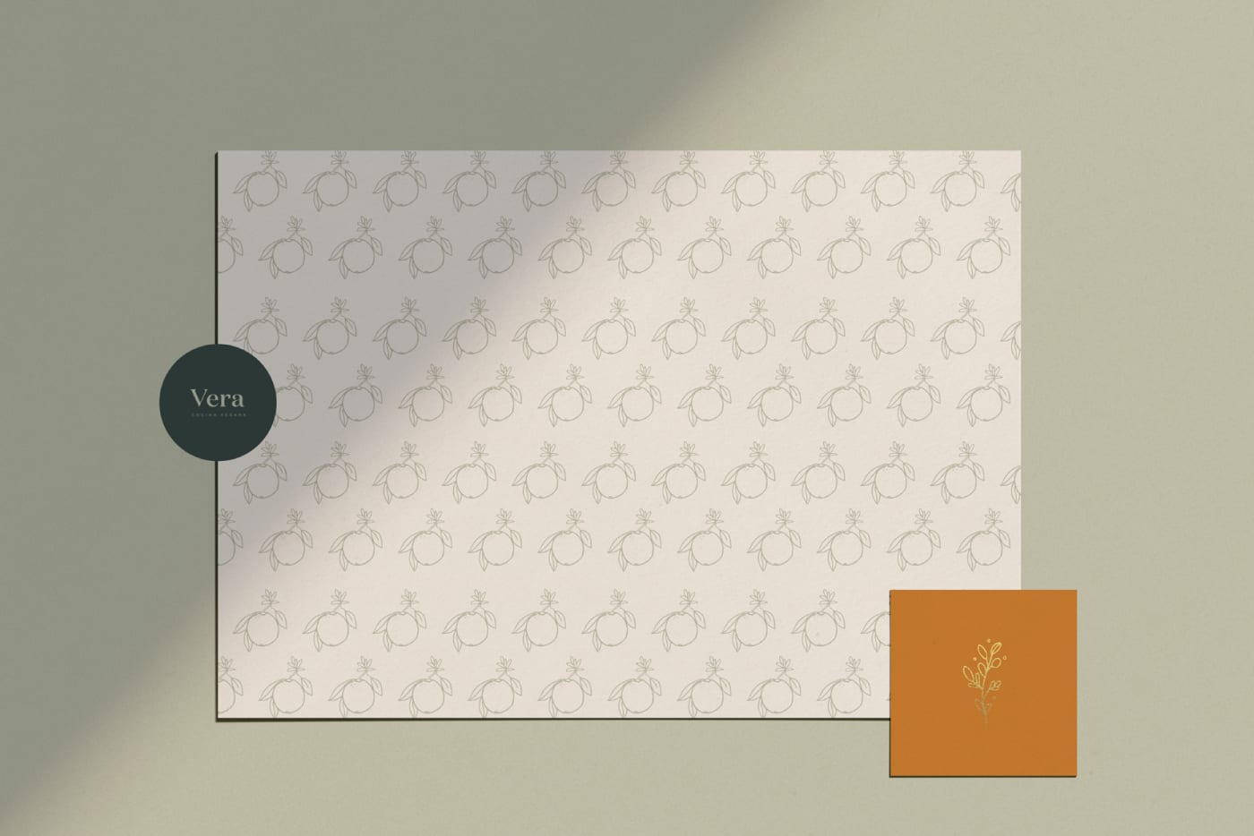
On wrapping paper, I would recommend trying a less square or predictable pattern, give it more air, and maybe combine all your illustration elements into one. It is a piece where as its name says: being wrapping paper, more is more;)


10 comments
microbians
StaffVery good color palette.
See original
Hide original
nadiamoreno
@microbians thank you!
See original
Hide original
mr_julls
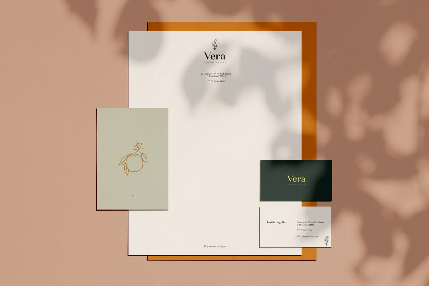
The typography and logo integration are great ...
See original
Hide original
daniel_co
What elegance that of France!
The application of identity in the graphic is memorable. Is the font of the logo custom?
Greetings.
See original
Hide original
nadiamoreno
@daniel_co thanks for the comment, the font is not custom
Cheers
See original
Hide original
mentabranding
Teacher PlusHello Nadia,
I love your project! very successful everything: typography, color, secondary illustration elements, and applications.
On wrapping paper, I would recommend trying a less square or predictable pattern, give it more air, and maybe combine all your illustration elements into one. It is a piece where as its name says: being wrapping paper, more is more;)
A hug!
Laura
See original
Hide original
mentabranding
Teacher PlusGuy is Domaine, right? good choice, it's beautiful!
See original
Hide original
nadiamoreno
@mentabranding
Thanks for the feedback Laura :) I appreciate it very much
I will take into account the comments for the printing of the paper
Exactly the font is Domaine Medium
Cheers!
See original
Hide original
rhnapoles2013
The project is very elegant and beautiful.
See original
Hide original
alemarques
Plustop
Log in or join for Free to comment