Exploring the 5th Tracks: Taylor Swift's Most Personal Songs
by Mariano Bianchino @mrbianchino
- 121
- 0
- 0
Overview:
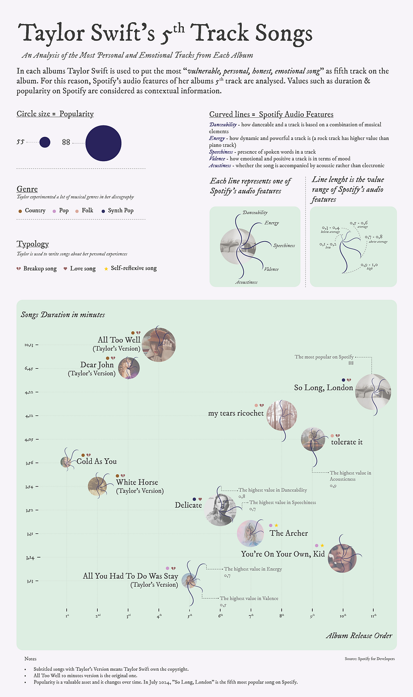
The objective of this project is to provide a visual representation of the musical complexity of the fifth tracks of Taylor Swift's albums. In addition, it aims to illustrate how these tracks have evolved over time, reflecting the progression of her career.
Background & Inspiration
What's the 5th track? Why is it so relevant?
I've been a huge Taylor Swift fan since Fearless era (2008). Her music has a big impact on my life, influencing not just my personality, but also my creative works. The core of this project is to throw out what are our inspirations, so I decided to throw that out.
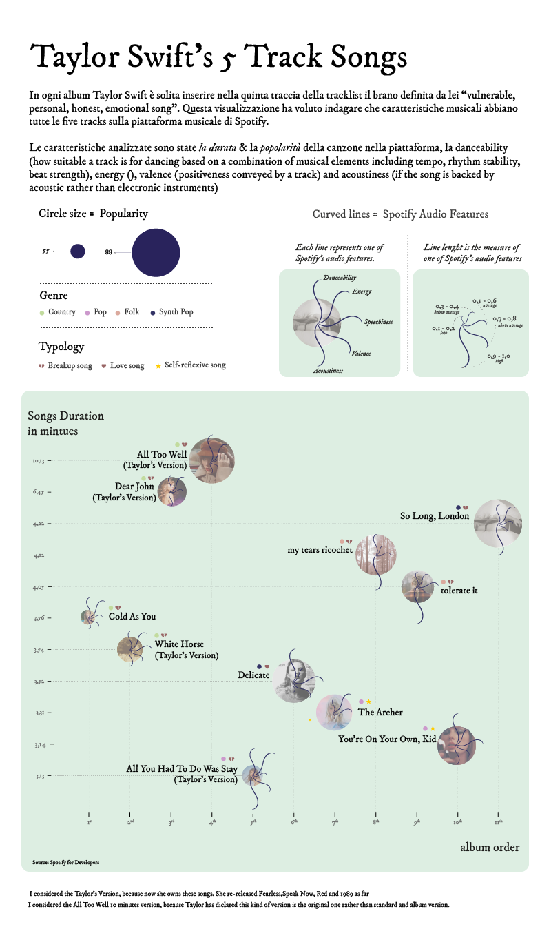
With a very wide musical catalogue, she has explored so many different genres, from country to pop, and written songs from her personal experiences, such as breakup, rebirth and love ecc... there's a peculiarity about the 5th track: on every album, Taylor places the most personal song at number 5 on the track list.
Her music is not only complex from an emotional point of view, but also but also commercially and in terms of breaking records. In fact, today she has over 10 billion streams on Spotify.

Methodology
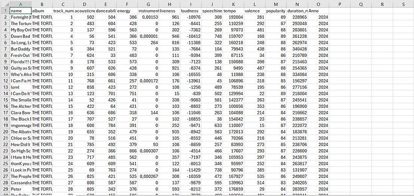
In order to illustrate the complexity of the 5th track, I have used the API of Spotify, one of the most listened to platforms for music and it's the one that is easier to find the data.
I exported the data to Excel and did some analysis on it. So I evaluated the audio features of the tracks which are danceability, energy, speechiness, valence and acousticness. These values range from 0.1 to 1.0. The goal is to provide a coherent and consistent visualisation from a statistical point of view. Other features had different values.
I took into account other data such as the duration, release album years and popularity of the tracks. These formed the contextual information.
How I can visualise the data?
After analysing the data, I imported the Excel file into Rawgraphics, a tool recommended by Federica. At this stage I wanted to replicate the graph that she used - the Scarlett plot.
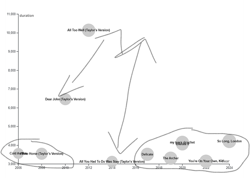
Before the data decluttering, I made a sketch to understand how to visualise the data. I came up with the idea of placing
- on X-axis the duration
- on Y- axis the release year of the album
- Size of the circle is the popularity
When I selected the data, the visualisation wasn't so understandable and clean at all, because some of the data was too close together and other data was too far apart.
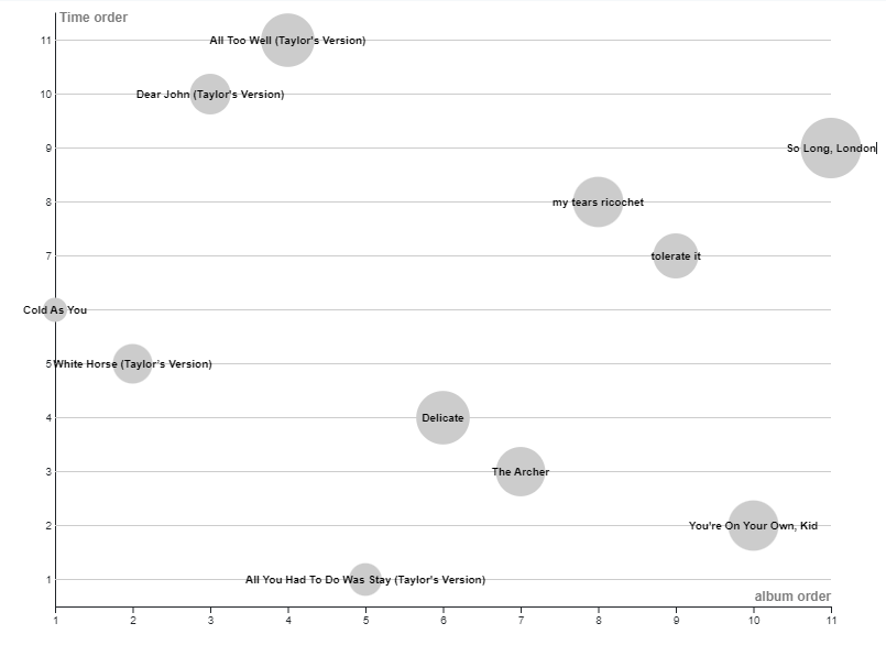
So I made some changes to thedataset:
- Duration created too much distance for some songs and too much attachment for others. The solution was to add a new column to the spreadsheets where I sorted the tracks numerically, from shortest (1) to longest (11).
- The release year of the album had the same problem: too much white space and too much attachment. I adopted the same solution, I sorted the album not by the release year, because in 2020 Taylor released 2 albums, but chronologically.
Design Phase
I worked on Illustrator and I followed Federica's lessons step by step. To illustrate the audio feauteres I replicate her visuals.
Considering that tracks are linked to era/album, so I wanted each bubble/track to represent the reference album. Next to them I added icons that I made, so as they can illustrate the musical genre and what kind of theme the track addresses.
I used a color palette with cold and desatured tones, as suggested by Datawrapper.
User Testing
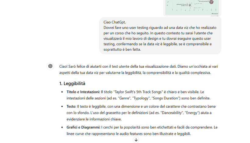
As a UX Designer, I was curious to see if the data visualization I created was understandable, visually appealing, and free from user experience issues. Not having the opportunity to show this work to others, I used ChatGPT for user testing.
I asked ChatGPT to evaluate my work, focusing on the readability of the text and the comprehensiveness of the data. At the same time, I assigned specific tasks, such as 'Find me a pop track with a high value in danceability.'
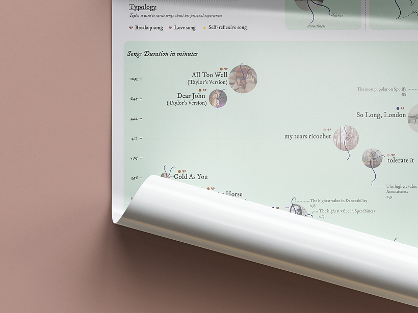
I received negative feedback for these tasks because ChatGPT was unable to find the correct tracks. When it did find tracks, they were often incorrect. The solution was to explicitly specify which tracks had the highest values

0 comments
Log in or join for Free to comment