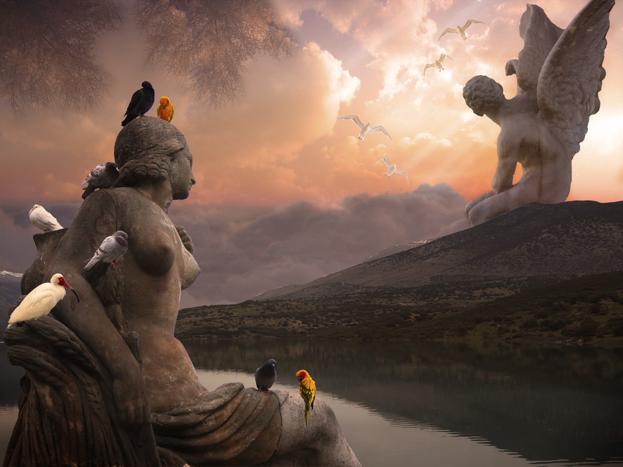
Hi Athena! Great work putting all the pieces of my image together, and I really like the new image that you created with the statues. I am loving the composition, color and lighting in this new piece because it feels very grand but also serene. The sky looks amazing and really sets up a nice color palette for this image. I also really like the statues and how they are incorporated into the scene, makes me think of them as reminders of a forgotten civilization. I particularly like the winged statued on the mountain staring into the distance because it feels very contemplative. So I think it is a great concept, and there is a lot of meaning you can read into this work.
There are just a few retouching suggestions that you could use to make it even better, or keep in mind for future projects. This image has really nice depth, but the one thing distracting from that are the hard white lines along the top of the mountains. I would recommend taking out all the white parts, either with the clone stamp on the layer or painting into the layer mask with a soft brush in black. For this image I would also make the seagulls much smaller and faded into the distance, and play around with the lighting and shading on the foreground birds. I think the darker ones are working the best in this to match the lighting and the mood of the piece. Finally, a good teacher once taught me that sometimes less is more, and I do this all the time in my own work. I put so many elements into one scene and sometimes it can be too much. But it is a good practice because then you have options and can see what is working well and then pull a few things back. For this piece I would mainly just think about taking out the tree branches at the top and instead using a darker vignette.
So those are just a few small retouching and composition ideas, but overall I think this is great. I really love the mood and concept of this image you created, and I think you are on the right track to creating some amazing work!


1 comment
nick_pedersen
Teacher PlusHi Athena! Great work putting all the pieces of my image together, and I really like the new image that you created with the statues. I am loving the composition, color and lighting in this new piece because it feels very grand but also serene. The sky looks amazing and really sets up a nice color palette for this image. I also really like the statues and how they are incorporated into the scene, makes me think of them as reminders of a forgotten civilization. I particularly like the winged statued on the mountain staring into the distance because it feels very contemplative. So I think it is a great concept, and there is a lot of meaning you can read into this work.
There are just a few retouching suggestions that you could use to make it even better, or keep in mind for future projects. This image has really nice depth, but the one thing distracting from that are the hard white lines along the top of the mountains. I would recommend taking out all the white parts, either with the clone stamp on the layer or painting into the layer mask with a soft brush in black. For this image I would also make the seagulls much smaller and faded into the distance, and play around with the lighting and shading on the foreground birds. I think the darker ones are working the best in this to match the lighting and the mood of the piece. Finally, a good teacher once taught me that sometimes less is more, and I do this all the time in my own work. I put so many elements into one scene and sometimes it can be too much. But it is a good practice because then you have options and can see what is working well and then pull a few things back. For this piece I would mainly just think about taking out the tree branches at the top and instead using a darker vignette.
So those are just a few small retouching and composition ideas, but overall I think this is great. I really love the mood and concept of this image you created, and I think you are on the right track to creating some amazing work!
Log in or join for Free to comment