Anti-Yawn Infographic
A course by relajaelcocoInfographic Designers and Graphic Designers
A course by relajaelcoco, Infographic Designers and Graphic Designers

Design a high impact infographic about the most absurd deaths
Win the battle against boring data. In this online course, Francesco and Pablo teach you the methodology to effortlessly turn a handful of information into an infographic poster. Design your own infographic about the stupidest deaths on the planet, from the choice of data to the final touches, working on the techniques with a relaxed and fun approach that you can apply in your future as a 21st century infographics artist.
What will you learn in this online course?
16 lessons & 16 downloads
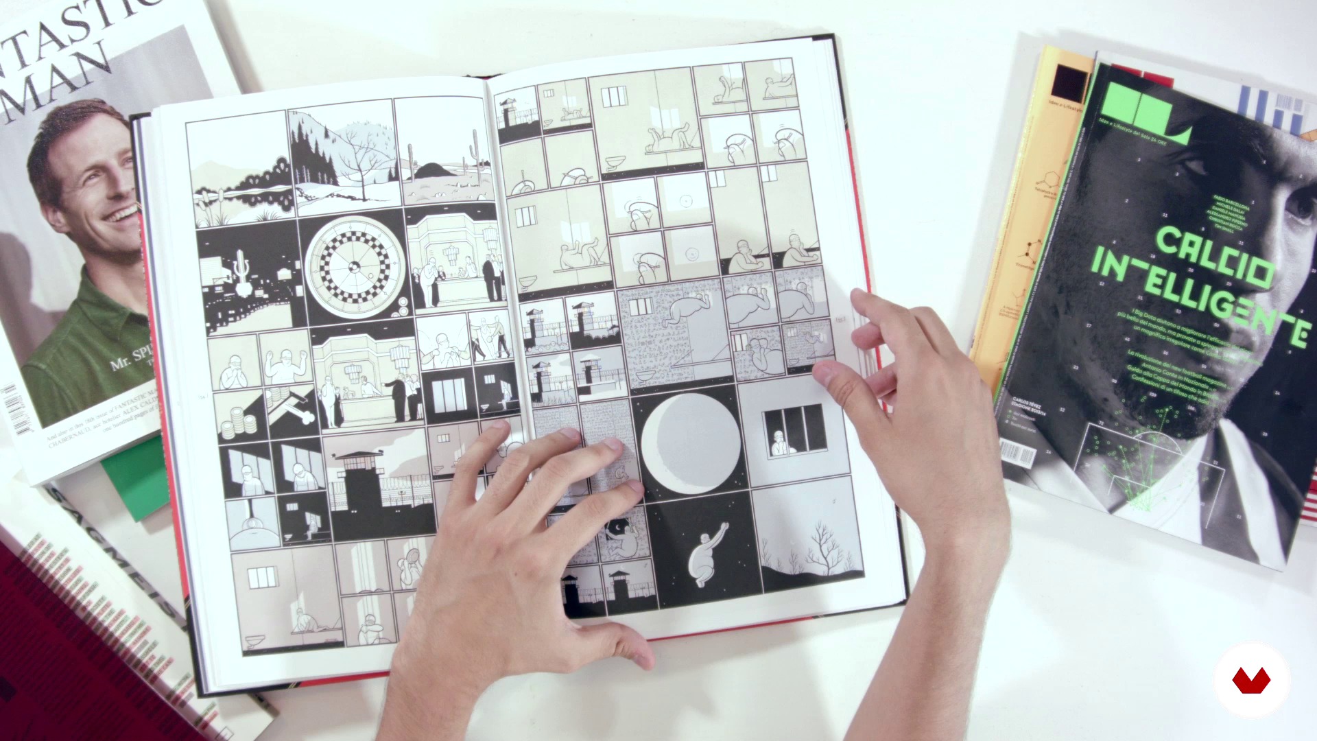
Graphic references
10 minutes, 46 seconds

The project: An infographic poster about the most stupid deaths
1 minute, 19 seconds
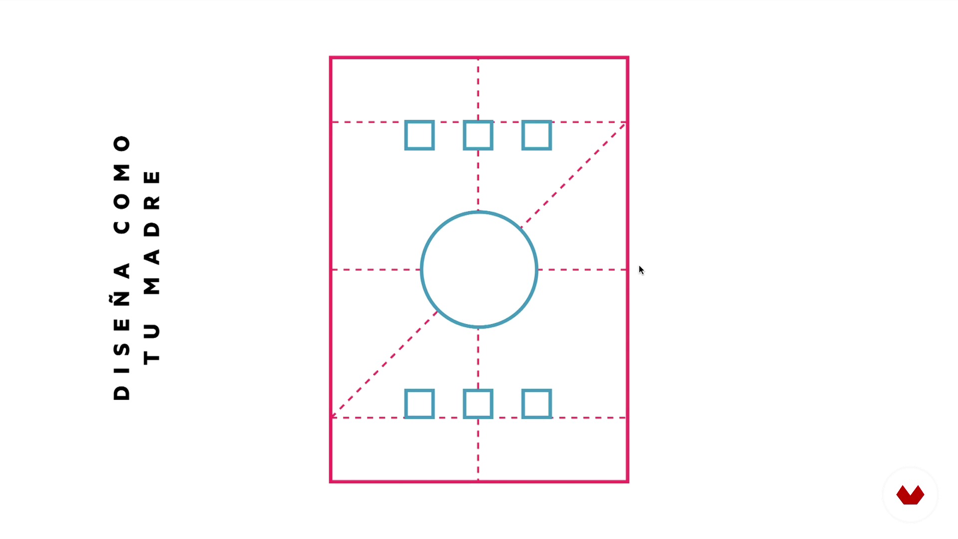
The infographic structures
5 minutes, 16 seconds
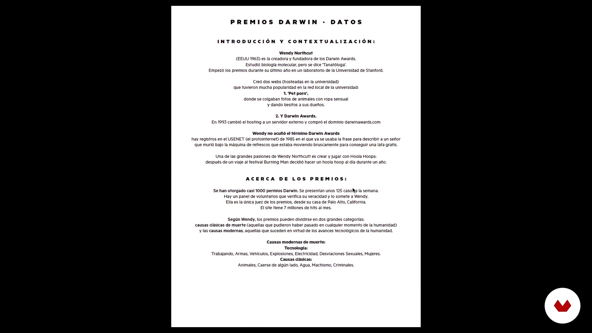
How to choose the data
4 minutes, 44 seconds

Conceptualization
2 minutes, 17 seconds
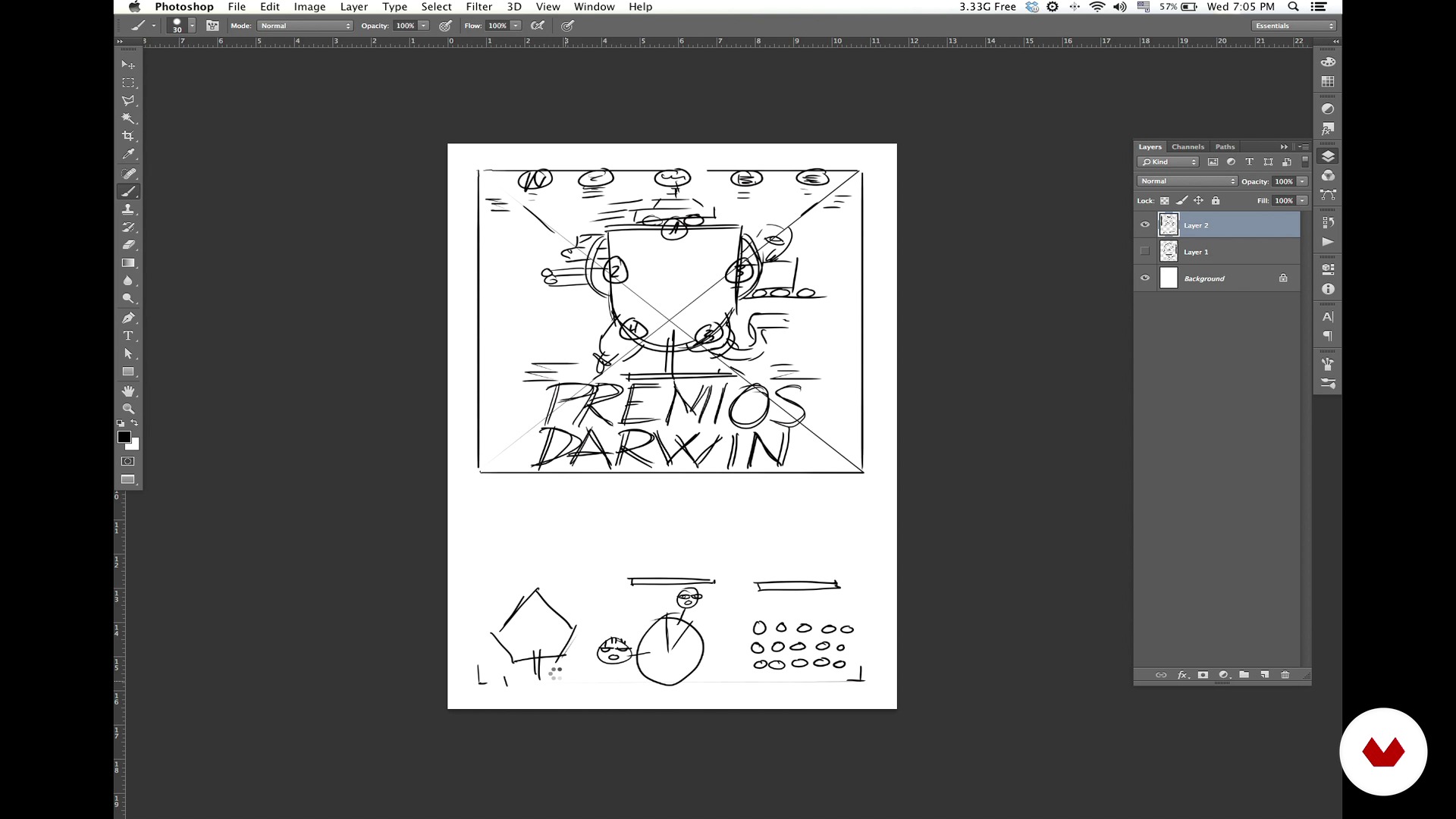
Sketches, reticles and storytelling
12 minutes, 20 seconds
What's included in this course?
Learn to develop a cool infographic and not die trying. The experts at Relajaelcoco provide you with a basic kit of tricks and tools to brighten up your projects, finding out how anti-yawning data is sought and how you can organize and transform it into an impressive infographic.
Explore the entire infographic workflow:
- The referents.
- Choice of information and data analysis.
- Sketch and structure of the grid. The secret to the perfect reticle!
- Typography, geometric vector, and color range.
- Preparation of the material and final touches.
Also discover tricks to organize yourself and divide your work into smaller, more manageable tasks. As if that were not enough, do it all while laughing in the face of death, in a graphic sense.
Recommended software & tools for this course
What is this course's project?
Make a high-impact infographic poster step by step, to allow you to graphically explain the essence of the evolution of the species—the Darwin Awards, with the Top 5 most stupid deaths on the planet.

Projects by course students


Who is this online course for?
Don't worry if infographics are not really your thing. In a few years, you may regret not having taken advantage of this course. So get ready, you'll thank yourself later. The course is open to anyone with the motto "Divide et impera," because it's the only way to live in the world of infographics.

Requirements and materials
You need basic knowledge of Adobe tools, you'll be fine with a bit of Photoshop, InDesign, and Illustrator. If you've worked with typography and visual hierarchy before, even better. If not, there's a first time for everything!
For materials, all you need is a computer and your brain in gear.
Reviews
- 1 year ago
Es un curso genial. La creatividad de Relajaelcoco no tiene límites y el sentido del humor es básico para una enseñanza relajada como ellos, jeje..
- dansolfrei_91PLUS2 years ago
Excelente, me está ayudando mucho para una infografía de la universidad!
- 2 years ago
Excelente curso
- 2 years ago
Excelente curso.
- 2 years ago
Exclente, muy buena dinamica para mostrar sus ejemplos, recomendado

They were born freelancers—hierarchies and bosses have always given them hives because they cage creativity. They claim graphic nomadism, traveling with and for the mind and intensely living design in all its facets, parties included. They work for national and international clients whose names cannot be revealed due to national security issues.
Domestika says: after a few calls, we have the green light to reveal some names. Their clients include Mini, BBC, Jot Down, Yorokobu, Mapping Residences, Vueling, and BBVA. They have also taught at the IED in Madrid and Barcelona, the IE Business School, the University of Salamanca, the Mr. Marcel School, and Trazos.
Content
- U1
Introduction
- Introduction
- Definition of "relaxed infographics"
- Graphic references
- U2
Let's do it
- The project: An infographic poster about the most stupid deaths
- The infographic structures
- How to choose the data
- U3
How to count it with data
- Conceptualization
- Sketches, reticles and storytelling
- U4
The graphic style
- The geometric vector
- The chromatic palette
- The typographical choice
- U5
This is how an infographic is done
- The preparation of the file
- The relationship between data and reticles
- Organization of the material
- U6
This is an infographic II
- We start with the headline
- Realization of the illustrated graphics
- FP
Final project
- Anti-smash infographics
What to expect from a Domestika course
Learn at your own pace
Enjoy learning from home without a set schedule and with an easy-to-follow method. You set your own pace.
Learn from the best professionals
Learn valuable methods and techniques explained by top experts in the creative sector.
Meet expert teachers
Each expert teaches what they do best, with clear guidelines, true passion, and professional insight in every lesson.
Certificates
PLUSIf you're a Plus member, get a custom certificate signed by your teacher for every course. Share it on your portfolio, social media, or wherever you like.
Get front-row seats
Videos of the highest quality, so you don't miss a single detail. With unlimited access, you can watch them as many times as you need to perfect your technique.
Share knowledge and ideas
Ask questions, request feedback, or offer solutions. Share your learning experience with other students in the community who are as passionate about creativity as you are.
Connect with a global creative community
The community is home to millions of people from around the world who are curious and passionate about exploring and expressing their creativity.
Watch professionally produced courses
Domestika curates its teacher roster and produces every course in-house to ensure a high-quality online learning experience.
FAQs
You’ll learn how to create effective infographics, apply visual systems, develop concepts, select color palettes, organize data, and work with illustration, typography, and urban maps to communicate information visually in a professional way.
This is an intermediate-level course, perfect for those with basic graphic design or illustration skills who want to deepen their knowledge in creating infographics and visual resources.
You’ll need a computer with access to graphic design software (like Adobe Illustrator or similar) and basic digital tool skills to get the most out of this course.
The course covers concept development, sketching, icon systems, color palettes, vector illustration, geometric composition, urban maps, digital lettering, visual storytelling, and infographic project management.
You’ll learn to manage projects from research through final artwork, apply effective workflows, define visual concepts, and organize data for clients or editorial publications.
Yes, the course includes practical exercises like designing infographic posters, urban maps, micro-infographics, and icon systems, blending theory and practice to strengthen your skills.
You’ll learn how to define and apply cohesive color palettes using color theory, the color wheel, and CMYK parameters to create strong visual identity and storytelling in your projects.